

TL;DR: Landing page optimization is the process of making targeted changes to increase the percentage of visitors who convert. Here’s what actually moves the needle:
- Landing page optimization: Making data-driven changes to page elements to increase the percentage of visitors who take your desired action.
- Diagnose first: Use heatmaps or analytics to find where visitors drop off before you change a single element.
- Headline clarity: Your offer must be understood in under 3 seconds or most visitors won’t scroll.
- CTA and social proof: A visible CTA button and real testimonials are the two highest-impact elements on any landing page.
- Test one thing at a time: A/B test single elements to isolate what’s actually driving the change in conversions.
- SeedProd shortcut: The drag-and-drop website builder lets you build and test landing page variants without touching code.
You’ve built the landing page. You’re driving traffic to it. And almost nobody converts.
Most optimization advice tells you what to change, but not how to know what’s actually broken.
In this guide, I’ll walk you through 17 specific fixes I use on SeedProd landing pages, starting with how to diagnose what’s wrong before you change a single element.
- What Is Landing Page Optimization?
- What Is a Landing Page Optimization Process?
- How Do You Know What to Fix on Your Landing Page?
- How to Optimize Your WordPress Landing Page with SeedProd
- 17 Landing Page Optimization Tips to Increase Conversions
- 1. What Should Your Landing Page Headline Include?
- 2. Keep Your Landing Page Design Simple
- 3. Use Contrasting Colors to Stand Out
- 4. Add Important Information Above the Fold
- 5. Make Your Offer Limited
- 6. What Makes a Landing Page CTA Button Convert?
- 7. Display Your Contact Information
- 8. Try Different Media Types
- 9. Experiment with Your Landing Page Copy
- 10. Keep Your Message Consistent
- 11. Repeat Your CTA on Long Pages
- 12. Persuade Undecided Users with Customer Testimonials
- 13. Add Trust Signals Beyond Testimonials
- 14. Experiment with Different Form Lengths
- 15. How Do You Optimize a Landing Page for SEO?
- 16. Recapture Abandoning Visitors with Exit Popups
- 17. Decrease Your Page Load Times
- 18. A/B Test Every Landing Page Element
- 19. Use AI Tools to Optimize Smarter
- Frequently Asked Questions
What Is Landing Page Optimization?
Landing page optimization is the process of making data-driven changes to your landing page elements to increase the percentage of visitors who convert. It’s a subset of conversion rate optimization (CRO), which covers your entire site.
CRO spans checkout pages, pricing pages, and navigation. Landing page optimization focuses specifically on campaign-specific pages designed to convert a single traffic source.
It includes things like A/B testing and experimentation to get the results you want.
Related: Landing Page vs Website: What’s The Difference?
What Is a Landing Page Optimization Process?
In online marketing, a landing page is one of your most important tools. If you optimize it effectively, it has the power to transform your marketing efforts and drive real revenue.
I typically start by looking at the scroll depth on my SeedProd pages. If fewer than 50% of visitors scroll past the fold, the above-fold elements are the problem. Start there before changing anything else.
A practical 3-step process for landing page optimization:
- Identify what’s broken: Use heatmaps, scroll maps, or analytics to find where visitors drop off.
- Form a hypothesis: One specific change, one specific expected outcome.
- Test and measure: A/B test that single element against a control before making it permanent.
When testing your landing page, the Eisenberg brothers’ conversion pyramid is also a useful framework. It identifies 5 stages your page must satisfy:
- Functional: Your page has no technical issues or friction that disrupts the user journey.
- Accessible: Visitors can find your landing page on any device via SEO, ads, or social media.
- Usable: The page is readable, clutter-free, and prompts users to take action.
- Intuitive: Visitors immediately understand what your page is about and what you want them to do.
- Persuasive: Your page convinces visitors to convert into leads, customers, or brand advocates.
How Do You Know What to Fix on Your Landing Page?
Before you start changing headlines and CTA colors, you need to know which problem you’re actually solving. These four diagnostic tools will show you where visitors are dropping off:
- Heatmaps: Tools like Hotjar or Microsoft Clarity show where visitors click and which areas they completely ignore.
- Scroll maps: Show how far down the page visitors scroll before leaving, so you know whether your key offer is visible.
- Google Analytics: Check bounce rate, time on page, and traffic source breakdowns to spot performance gaps by channel.
- Session recordings: Watch real visitor sessions to spot friction points you’d never notice from a static review.
Microsoft Clarity is free and integrates directly with WordPress, so it’s worth installing before you make any changes.
For search-specific insight, Google Search Console shows which queries are landing visitors on the page and at what position. If high-impression queries have low clicks, your meta description or title is the first thing to fix.
How to Optimize Your WordPress Landing Page with SeedProd
Most landing page optimization guides are written for SaaS tools like Unbounce or HubSpot. WordPress landing pages have specific optimization opportunities those guides skip entirely.
I build landing pages with SeedProd‘s drag-and-drop website builder, and there are three optimization workflows that are genuinely easier here than anywhere else.
- A/B testing via duplicate pages: Build Variant B by cloning your existing page and changing one element. Point two versions of your traffic to each URL and measure. No third-party A/B tool required.
- Mobile-first editing: SeedProd’s mobile preview lets you see and adjust element visibility per device in real time. You can hide elements on mobile that crowd the fold without affecting desktop layout.
- Built-in conversion blocks: Countdown timers, testimonials, optin forms, and star ratings are all drag-and-drop. No extra plugin required, which matters for page speed.
On page speed and in my own GTmetrix testing, a landing page built in SeedProd loaded in 556ms with 16 HTTP requests. The same page built in Elementor took 1,882ms with 32 requests. Slower pages drive real bounce rate increases, so this gap directly affects conversion, not just technical performance.
WordPress landing pages also benefit from page caching (which applies site-wide via a caching plugin) and site-wide image optimization. These improvements compound across every page you build.
17 Landing Page Optimization Tips to Increase Conversions
Creating a successful landing page doesn’t have to be hard. It takes effort to ensure the page you’ve created gets the results you want. Here are proven landing page optimization tips to boost your page’s performance.
1. What Should Your Landing Page Headline Include?
Your visitors should understand your offer in under 3 seconds. Start by thinking about your customer’s goal and address it directly in your page headline.
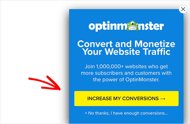
OptinMonster does this well:
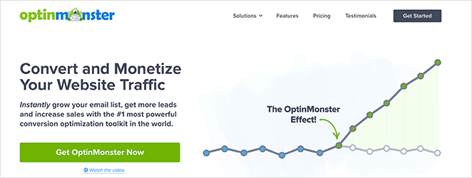
The words “Convert” and “Monetize” speak directly to their visitors’ pain points. Their audience wants traffic to turn into leads and sales, and the headline addresses that immediately.
2. Keep Your Landing Page Design Simple
A cluttered landing page distracts visitors from what you want them to do. You want visitors to focus on your call to action (CTA) and nothing else. So keep your landing page design simple, distraction-free, and to the point.
TrustPulse is an excellent example of this:
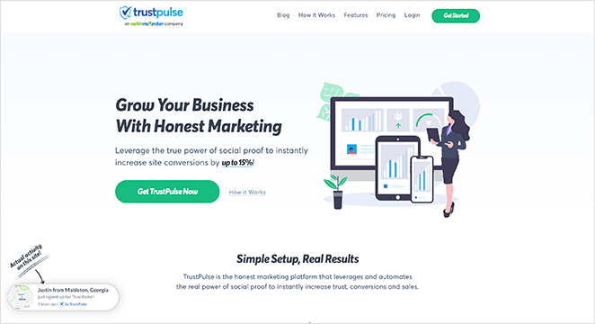
All the page elements above the fold tell users what the product is, how it looks, the benefits of using it, and how to get it. And it does all this without many words.
3. Use Contrasting Colors to Stand Out
The best landing pages use contrasting colors for clarity and to drive their message home. Instead of using color for its own sake, they use it to highlight important page elements and direct attention.
This example from Smash Balloon’s Social Wall plugin is hard to ignore.
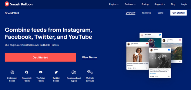
Your eye goes directly to the orange CTA button that stands out against the dark blue background.
4. Add Important Information Above the Fold
The term “above the fold” goes back to traditional newspapers. The most exciting stories ran above where the paper would fold, so readers saw the headlines before buying.
On mobile, the fold sits at approximately 600px, compared to 900px or more on desktop. That’s a significant difference.
What should be visible without scrolling on mobile: your headline, one core benefit, and your CTA button. Nothing else.
You can test this using Chrome DevTools Device Mode or SeedProd’s built-in mobile preview. Toggle to a mobile viewport and ask: can a visitor immediately understand what this page offers and how to act on it?
Did You Know: SeedProd’s drag-and-drop website builder lets you preview and edit your landing page in mobile view. You can show and hide elements on mobile, desktop, or both with one click.
5. Make Your Offer Limited
You’ve probably seen “limited quantity” and “limited-time deal” used frequently in marketing. Scarcity encourages visitors to act now, for fear of missing out if they wait.
Almost every online store uses scarcity marketing. On SeedProd, we use both a countdown timer and scarcity phrasing to create urgency for our sale.
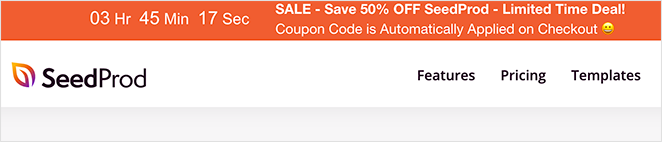
The countdown timer tells users how long is left until the offer runs out, adding an extra layer of urgency.
6. What Makes a Landing Page CTA Button Convert?
Your landing page call to action button should be easy to notice and shouldn’t confuse or stress visitors out.
Most companies stay away from complicated offers and language in their CTA buttons. Instead, they’re clear, concise, and obvious, with phrases like:
- Yes I Want This Deal
- Get Started Now
- Increase My Conversions
- Download Now
They explain exactly what users can expect from clicking. First-person CTA copy (“Get My Free Trial”) often outperforms second-person (“Start Free Trial”) because it mirrors the visitor’s intent.
For more help, see my guide on the top call to action best practices.
7. Display Your Contact Information
Giving visitors an easy way to get in touch helps solve obstacles in the buying process and convinces hesitant visitors to convert.
You can put your phone number and email address on your landing page, embed a simple contact form, or offer a live chat service.
Other companies include links to their help centers, where users know they can find answers to frequently asked questions.
Related: The Anatomy of a Landing Page
8. Try Different Media Types
Pages with embedded video tend to hold visitor attention longer. Video gives visitors a way to absorb your message without reading, which matters when most people don’t scroll past the fold.
Visitors are more likely to spend time on your landing page when passive consumption is an option. That extra time is often the difference between someone hearing your message and someone who doesn’t.
Say something meaningful with the media you use on your video landing page. A product demo screencast often works better than a high-production video. The key is getting your message across in the way that’s clearest for your visitors.
All in One SEO has a strong example of this on their landing page:
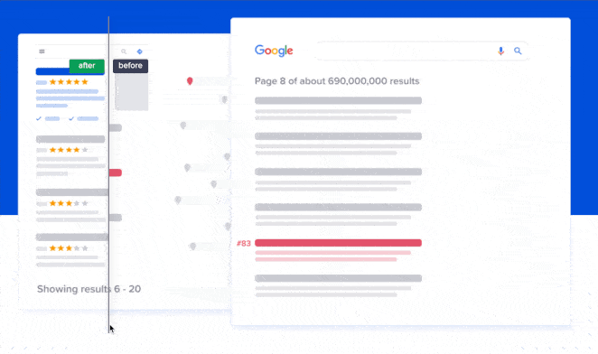
They used an interactive image slider to show SEO results before and after using their plugin. It’s a simple and effective way to get their message across without writing paragraphs of copy.
9. Experiment with Your Landing Page Copy
The copy mistake I see most often is writing for the product, not the visitor’s outcome. “Drag-and-drop editor” describes a feature. “Build your page without touching code” describes what the visitor gets.
Even though the world is visual, text still matters. Here are the copy elements worth testing:
- Headline format: Lead with the reader’s problem, follow with the outcome. “Struggling to get more email subscribers? Here’s how to grow your list with a single landing page.”
- CTA button copy: First-person usually wins. Test “Get My Free Trial” vs “Start Free Trial” and see which one your visitors respond to.
- Above-fold body copy: Shorter is almost always better. If a visitor has to scroll to understand your core offer, you’ve already lost most of them.
A quick SeedProd example: changing a headline from “Powerful WordPress Theme Builder” to “Build Your WordPress Site Without a Developer” directly addresses the outcome the visitor wants. The second version will almost always outperform.
You can A/B split test different headlines and copy on your landing page using SeedProd’s page duplication feature or a tool like OptinMonster.
10. Keep Your Message Consistent
Visual consistency matters just as much as on-brand messaging. Plus, it makes a significant difference in your landing page conversion rates.
Imagine you placed an ad on Facebook like the one below:

Then you created a landing page for when users click the ad.
You’ll want all the elements of your ad, such as the text, imagery, colors, and other elements to be reflected in your Facebook landing page.
Both should look visually similar and carry the same offer. If they don’t match, visitors get confused or irritated, and they leave. This “message match” also affects your Google Ads Quality Score, which means message mismatch costs you money on paid campaigns.
11. Repeat Your CTA on Long Pages
If you’ve created a long-form landing page, place your CTA at comfortable intervals throughout. When you repeat your core message and CTA, you reinforce your landing page’s purpose.
People react to content differently. Some visitors are two-thirds of the way down your page before they start believing what you’re saying. If there’s a button right at that point, those readers are more likely to convert.
12. Persuade Undecided Users with Customer Testimonials
Social proof plays a significant role in persuading hesitant users. It shows that other people have used your product, and research from BrightLocal consistently shows that reviews and testimonials are a major factor in purchasing decisions.
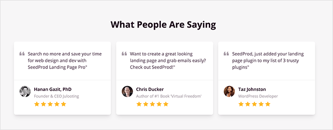
Testimonials are among the best ways to show social proof on your landing page. Ask customers to create video testimonials, show quotes with full name and headshot, or include a few case studies.
13. Add Trust Signals Beyond Testimonials
Testimonials are one layer of trust. The pages that convert best layer in several more signals that remove hesitation before the visitor even reads your copy.
Trust signals worth testing on your landing page:
- Security badges: SSL padlock indicators, payment processor logos (Visa, Mastercard, PayPal) reassure visitors that their data is safe at the point of action.
- Money-back guarantee: A visible “30-day guarantee” removes the risk of the decision. It doesn’t have to be prominent, but it has to be findable.
- User or customer count: “Over 700,000 sites use SeedProd” is more credible than “trusted by thousands.” Specific numbers work; vague volume language doesn’t.
- Star ratings with review count: A 4.9-star rating means more when the count is visible. “4.9 stars (2,847 reviews)” beats “4.9 stars” with nothing underneath.
- Industry certifications or press mentions: “As seen in Forbes” or a recognized certification badge adds authority at a glance.
SeedProd’s Star Rating block and Testimonials block let you add these elements via drag-and-drop. No custom code, no separate plugin.
14. Experiment with Different Form Lengths
Many marketers say short forms are the only forms you should use on your landing page. They believe asking for anything more than an email address is asking too much.
Yet, that’s not always the case.
If you want leads for high-value products or services, a longer form can be more effective. Sure, you’ll get fewer leads, but the leads you get will be more qualified and highly targeted.
For example, if you’re a web design business, asking a potential client for their budget can save significant time. People looking for a $600 web design won’t use your service if your cheapest package starts at $10,000.
And if you do decide you need a longer form, create a multi-page form with WPForms. A multi-page form splits long forms into multiple pages to improve user experience, which reduces form fatigue and boosts completions.
15. How Do You Optimize a Landing Page for SEO?
Most traffic online is organic traffic. Your landing page could be the answer a searcher clicks, but only if it’s optimized to be found.
Here’s what actually moves the needle for landing page SEO:
- Focus keyword in the H1, URL slug, and first 100 words. These three placements signal your topic to search engines without keyword stuffing.
- Write your meta description to match search intent. Answer the query directly in the first sentence. If someone searches “landing page optimization tips,” your meta should confirm this page delivers exactly that.
- Compress images and use descriptive filenames. A 2MB hero image damages page speed. A file named “landing-page-cta-button.png” tells search engines what they’re indexing.
- For PPC landing pages: match your ad copy to your headline. Google’s landing page experience score affects your cost-per-click. A headline that matches the ad keyword lowers your cost while improving quality.
Use tools like SEMRush to find the best keywords and use them in your headlines, body text, image alt text, and more to rank your landing page.
For a deeper guide, see WordPress SEO from WPBeginner.
One more thing: optimizing the page only helps if traffic is reaching it. The main channels are paid ads (Google Ads, Facebook Ads, each needing a dedicated landing page per campaign), email campaigns, organic SEO, and social media. Each traffic source brings visitors with different intent, so optimize your messaging for each source separately.
16. Recapture Abandoning Visitors with Exit Popups
Exit popups are lightbox popups that appear when visitors attempt to leave your landing page. They offer an extra opportunity to create a conversion.
Exit popups are less intrusive than popups that appear when users first arrive and help reduce your landing page bounce rate and shopping cart abandonment.
Use attention-grabbing copy, compelling imagery, and a strong call to action to encourage people to click. Adding an incentive like a special discount tends to make these work even better.
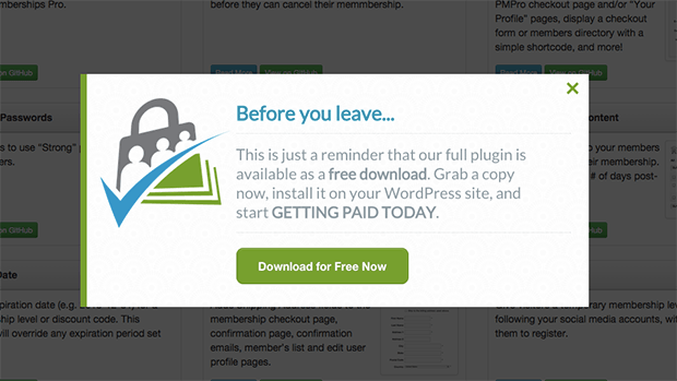
Using a tool like OptinMonster is the easiest way to add exit popups to your landing page. It has a strong A/B testing feature that shows you which variant gets the most conversions.
17. Decrease Your Page Load Times
As more people browse on mobile, page speed has a direct impact on conversions. Google’s research on Core Web Vitals shows that even a 1-second delay in load time increases bounce rates significantly. Slower pages drive real conversion losses, not just technical scores.
You can speed up your WordPress landing page load times by:
- Installing a WordPress caching plugin
- Compressing and optimizing your images
- Using fast and reliable WordPress hosting
- Keeping your website updated
Check out this guide to boost WordPress speed and performance.
Common Landing Page Mistakes That Kill Conversions
Before you run your next A/B test, check whether your page is making one of these conversion killers. These mistakes are common enough that fixing one can move your conversion rate more than any single optimization.
- Navigation menu left on: Your main site nav gives visitors 10 ways off your landing page. Remove it. The only exit should be conversion or close.
- Multiple competing CTAs: “Sign up,” “Download,” and “Contact us” on the same page split attention. Pick one action and point everything toward it.
- Ad message doesn’t match landing page headline: Message mismatch kills Quality Score in Google Ads, which raises your cost-per-click. The visitor also feels confused and bounces.
- Asking for too much in the form: Every extra field you add reduces completions. Only ask for what you genuinely need to follow up.
- No mobile optimization pass before publishing: Designing on desktop and assuming mobile looks fine is one of the most common mistakes. Preview on mobile before you go live.
18. A/B Test Every Landing Page Element
The more you A/B test your landing page elements, the more accurate your data becomes. Each test should include a single change to one thing, for instance, your CTA button color.
If you change too many things at once, you won’t know which one had the most impact on conversions.
Here are some A/B testing examples to give you an idea of what to try.

Once you have the data you need, apply the winning variant as your permanent default. Then document what you changed and by how much.
The insight from one test should inform the next hypothesis. Don’t just apply the winner and move on. The pattern you’re building over time is more valuable than any single result.
19. Use AI Tools to Optimize Smarter
AI is changing how landing page optimization works. The most useful applications aren’t the flashy ones.
- Smart traffic routing: Some A/B testing platforms now include AI-powered traffic routing that automatically sends visitors to the variant most likely to convert for their profile. Instead of waiting for statistical significance, the algorithm learns as traffic accumulates and adjusts routing before a test would traditionally reach significance.
- Dynamic text replacement: Swap your headline copy based on the ad keyword that brought the visitor. A visitor who clicked an ad for “WordPress landing page builder” sees that phrase in your headline. A visitor who clicked “drag and drop website builder” sees that instead. Same page, two different headlines.
- SeedProd Dynamic Text Personalization: SeedProd handles URL parameter-based dynamic text replacement natively for WordPress. You build one page and let the ad keyword personalize the headline automatically.
These tools work best alongside manual A/B testing, not as a replacement for understanding what your visitors actually respond to.
Frequently Asked Questions
How do I know which landing page elements to optimize first?
Start with the elements most visitors actually see: your headline, above-fold layout, and CTA button. These are the highest-traffic areas on any landing page.
Then use a heatmap tool like Microsoft Clarity or Hotjar to see where visitors click and where they stop scrolling. Focus your first round of tests on whichever of those three elements your data flags as underperforming.
What is a good landing page conversion rate?
Conversion rates vary by industry, offer type, and traffic source. For lead generation pages, a typical range is 2-5%, with high-performing pages reaching 10-15%.
According to Unbounce’s conversion benchmark data, the median landing page conversion rate across industries is about 4%. If you’re above that, focus on incremental gains. If you’re below it, start with the diagnostic steps above before optimizing individual elements.
How long should a landing page be?
Long enough to answer every objection, and short enough that visitors don’t have to search for the CTA.
Short-form pages work for low-commitment offers (free downloads, newsletter signups). Long-form pages work for high-ticket products where visitors need more information before they commit. The rule isn’t about word count. It’s about whether you’ve removed all the reasons to say no before you ask for the yes.
Should I use a short or long form on my landing page?
Short forms get more submissions. Long forms get higher-quality leads. Use form length to qualify visitors based on what your product actually needs from them.
If your product costs $10,000, asking for budget upfront saves everyone time. If you’re capturing email addresses for a free resource, asking for more than a name and email will hurt your conversions with nothing to show for it.
Start Optimizing Your Landing Page Today
You came to this page because traffic wasn’t converting. Now you have a diagnostic process, 17 specific fixes, and a list of the mistakes most likely killing your results.
SeedProd lets you build landing page variants, add countdown timers, preview your changes on mobile, and test with real visitors, all without touching code. Get started with SeedProd.
You might also like this article on how to edit your WordPress homepage and these landing page best practices for even more tips.
Thanks for reading! We’d love to hear your thoughts, so please feel free to join the conversation on YouTube, X and Facebook for more helpful advice and content to grow your business.


