If you want to understand what makes a great sales page, the easiest place to start is by looking at real examples. A sales page is a focused page designed to persuade visitors to buy a specific product, and the structure, copy, and visuals all play a role in how well it converts.
In this guide, I’ll walk you through 15 sales page examples from online courses, software tools, ecommerce brands, and coaching programs. You’ll see why each page works and what you can borrow to improve your own.
Each breakdown is quick and practical, so you can take the ideas that fit your business and apply them without overthinking the design process.
- What Is a Sales Page?
- 15 High-Converting Sales Page Examples
- 1. Stop Fighting Food (Course Sales Page Example)
- 2. Live Off Your Passion (Online Course Sales Page Example)
- 3. Digital Marketer (Marketing Funnel Sales Page Example)
- 4. OptinMonster University (Training Sales Page Example)
- 5. Zoma Sleep (Ecommerce Sales Page Example)
- 6. Somnifix (Product Sales Page Example)
- 7. PR Couture (Coaching Sales Page Example)
- 8. ConvertKit (Software Sales Page Example)
- 9. Ontrapalooza (Event Sales Page Example)
- 10. Design Sprint Masterclass (Masterclass Sales Page Example)
- 11. Dinnerly (Subscription Sales Page Example)
- 12. Eat Fat, Get Thin (Health Challenge Sales Page Example)
- 13. Slack (SaaS Sales Page Example)
- 14. WPForms (Black Friday Sales Page Example)
- 15. SeedProd (WordPress Builder Sales Page Example)
- FAQs About Sales Pages
What Is a Sales Page?
A sales page is a dedicated page designed to convince visitors to buy a specific product or offer. It removes distractions and focuses on clear benefits, proof, and calls to action that guide readers toward a purchase.
Unlike a general landing page that may collect leads or signups, a sales page has one job: turn interest into a sale.
Common elements include strong headlines, benefit-driven copy, social proof, comparison blocks, and a clear call to action.
15 High-Converting Sales Page Examples
Now that you know what a sales page is and how it works, it helps to look at real examples. Seeing how other businesses structure their pages makes it easier to spot patterns you can use yourself.
Below, you’ll find a mix of pages from different industries, along with quick notes on what each one does well.
1. Stop Fighting Food (Course Sales Page Example)
This page converts because it speaks to a painful problem and offers a clear, hopeful path forward. It feels personal, and that makes the message land fast.
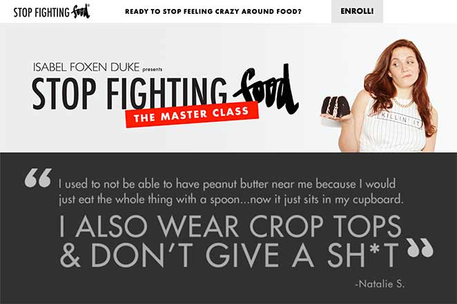
Stop Fighting Food is a masterclass by Isabel Foxen Duke. I like how the page leans into real emotional language, because it makes the offer feel supportive rather than salesy. The layout is simple, and every section leads you toward the next step without pressure.
| Why It Works | Areas to Improve |
|---|---|
| Relatable headlines speak directly to readers’ fears and frustrations. | Some imagery feels out of place and breaks the visual flow. |
| Red accents highlight key benefits and guide attention through the page. | Certain sections could use tighter spacing for a cleaner scan. |
| Bullets call out common struggles and offer simple, clear next steps. | |
| Testimonials and videos provide credible, real-world proof. | |
| The CTA text is strong and makes the next action feel easy. |
See these call to action best practices for more help.
2. Live Off Your Passion (Online Course Sales Page Example)
This page converts because it uses strong storytelling and personal proof to show readers what’s possible. It feels warm and aspirational, which fits the topic well.
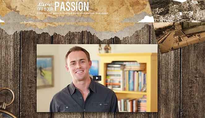
Live Off Your Passion is an online course that helps people find meaningful work. I like how the page blends video, relatable imagery, and calm copy to make the idea of changing careers feel more achievable.
| Why It Works | Areas to Improve |
|---|---|
| A short video gives a quick overview without overwhelming visitors. | The auto-play setting may frustrate some users and could be optional. |
| Copywriting empathizes with readers’ challenges and offers a clear path forward. | Testing a more contrasting CTA color might increase clicks. |
| The money-back guarantee reduces hesitation at the decision point. | |
| Case studies and testimonials build trust and add real-world proof. | |
| Multiple CTAs appear naturally throughout the page. |
You can also look at these landing page conversion tips if you want more ideas.
3. Digital Marketer (Marketing Funnel Sales Page Example)
The first thing that stands out here is how clearly the page explains the offer. The layout is long, but the pacing feels steady and keeps you moving without effort.
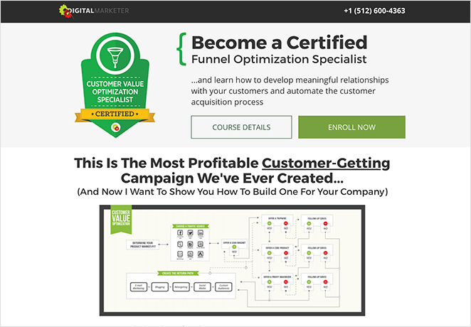
Digital Marketer uses this page to promote its Conversion Funnel Mastery course. I like how the copy stays focused on outcomes and breaks big ideas into simple, skimmable points. It feels practical and easy to digest, even though there’s a lot to cover.
| Why It Works | Areas to Improve |
|---|---|
| Headlines and subheads make the value clear before you read the details. | The main CTA text is generic and could feel more specific. |
| Bullet lists summarise key lessons in a way that’s quick to scan. | Increasing CTA contrast might help it stand out more. |
| Images and section breaks keep the long-form copy feeling light. | |
| The FAQ addresses common concerns without dragging out the page. | |
| Lack of navigation keeps attention on the offer. |
4. OptinMonster University (Training Sales Page Example)
The standout feature of this page is how quickly it builds trust. The headline is clear, the layout feels organised, and the social proof adds weight without overwhelming the reader.
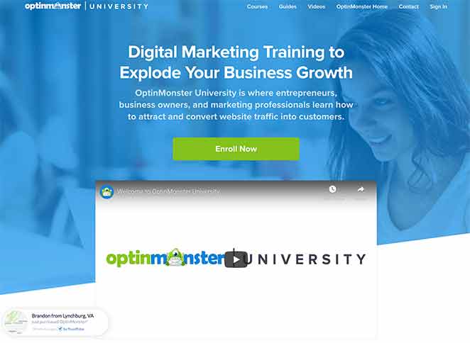
OptinMonster University offers digital marketing training. I like how the page speaks directly to business owners and marketers, using straightforward copy and familiar visuals that make the program feel credible and approachable.
| Why It Works | Areas to Improve |
|---|---|
| The headline and subhead explain the value right away. | Removing the navigation could reduce distractions. |
| A short video breaks down the program without taking over the page. | Replacing generic testimonial icons with real photos would feel more authentic. |
| Logos from well-known brands add authority and recognisability. | |
| Testimonials reinforce trust with clear, relatable experiences. | |
| Sections like “Who Should Enrol” help qualify the right audience. | |
| The FAQ clears up common questions toward the end. |
5. Zoma Sleep (Ecommerce Sales Page Example)
The most noticeable strength here is how quickly the page communicates value. The product visuals, trust badges, and clear explanations make it easy to understand what you’re buying and why it’s worth considering.
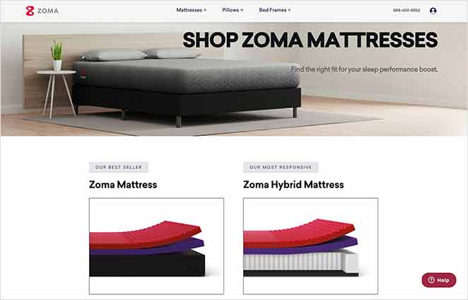
Zoma Sleep uses this page to promote its mattresses, and the structure feels practical and reassuring. I like how the benefits, reviews, and guarantees appear at the right moments, so you always know what makes the product trustworthy.
| Why It Works | Areas to Improve |
|---|---|
| High-quality images show the product from helpful angles. | The CTA colour blends into the layout and could stand out more. |
| An “In the News” section adds strong third-party credibility. | Rephrasing “Shop Now” with a more specific benefit could increase clicks. |
| Guarantees, free shipping, and a long warranty reduce purchase anxiety. | |
| Customer reviews with star ratings help with quick decision-making. | |
| The FAQ answers practical questions that often block a purchase. |
6. Somnifix (Product Sales Page Example)
The first thing you notice on this page is how clearly it frames the problem. It sets the context fast, and the rest of the content builds on that foundation in a way that feels easy to follow.
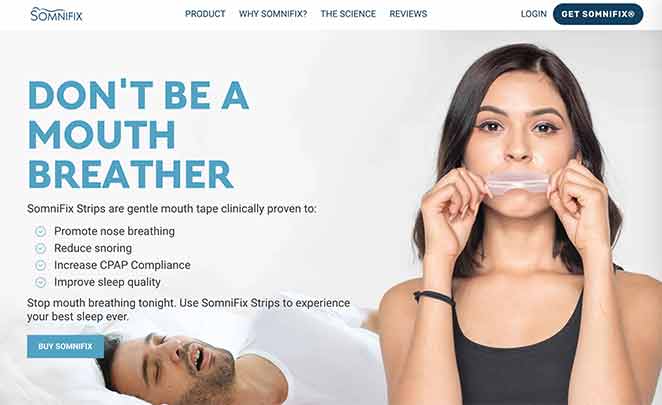
Somnifix sells sleep products designed to improve breathing quality. I like how the page uses simple explanations and clear visuals, because the product is unfamiliar to many people. The mix of education and reassurance works well here.
| Why It Works | Areas to Improve |
|---|---|
| The headline names a common issue and sets expectations quickly. | The animated GIF in the “How It Works” section can feel distracting. |
| Benefit-focused bullets explain the results in plain English. | A short, captioned video might demonstrate the product more clearly. |
| An explainer section (“Why Mouth Breathing Is Bad”) adds useful context. | |
| Customer reviews and star ratings build trust around an unusual product. | |
| The interactive quiz helps visitors decide if the product fits their needs. |
7. PR Couture (Coaching Sales Page Example)
This page immediately catches your eye with confident branding and a clear sense of who it’s speaking to. The tone feels tailored to PR professionals, which makes the whole offer feel more relevant.
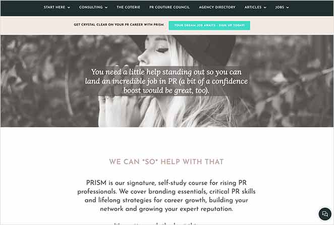
PR Couture promotes its PRISM course here, and the page has a polished, editorial feel. I like how the copy speaks in the audience’s language without overexplaining, which helps create a sense of trust right away.
| Why It Works | Areas to Improve |
|---|---|
| A clear overview of what’s included helps visitors see the value at a glance. | Moving the founder’s video higher could strengthen the personal connection. |
| The “Life After PRISM” section paints a strong picture of the desired outcome. | |
| Copy aligns with PR professionals’ goals and daily challenges. | |
| Consistent branding and a bright CTA colour help guide the eye. | |
| The FAQ addresses common questions without adding unnecessary length. | |
| An invitation to email directly adds a warm, human touch. |
8. ConvertKit (Software Sales Page Example)
The message on this page is clear from the start. It speaks directly to creators and shows how the tool fits into their daily work, which makes the offer feel practical and approachable.
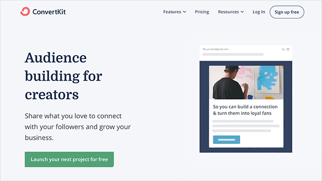
ConvertKit focuses on creators, and the sales page reflects that. I like how the copy stays grounded and uses simple visuals to walk you through the product. Nothing feels overly technical, which keeps the page easy to engage with.
| Why It Works | Areas to Improve |
|---|---|
| The headline speaks to a clear audience and sets expectations fast. | The “What’s New” module pulls focus away from the core message. |
| A short animation in the hero shows how the tool works at a glance. | Replacing that section with a compact FAQ might improve flow. |
| Testimonials come from real creators, which strengthens relevance. | |
| The free trial removes friction and encourages quick signups. | |
| Sections are short and easy to scan, even for new users. |
9. Ontrapalooza (Event Sales Page Example)
What stands out here is how quickly the page builds excitement around the event. The mix of video, colour, and clear CTAs makes the experience feel energetic and easy to act on.
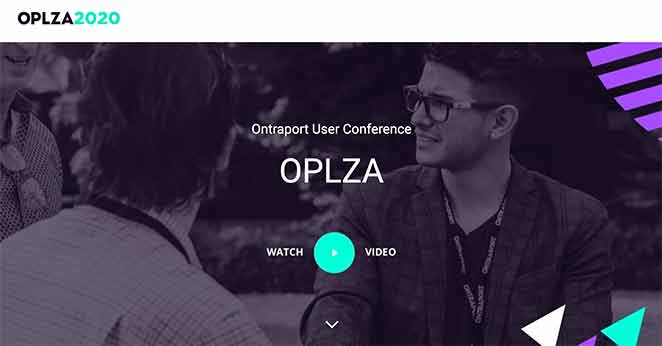
Ontrapalooza is a conference for Ontraport users, and the page does a good job showing what the experience is like. I like how the content moves between benefits, visuals, and urgency without feeling rushed.
| Why It Works | Areas to Improve |
|---|---|
| The video gives a quick look at the event and sets expectations clearly. | Adding trusted logos could give the page more authority. |
| Sticky navigation keeps the CTA visible while you explore. | More testimonials from past attendees could add helpful social proof. |
| Bright colour accents guide the reader through different sections. | |
| Urgency messaging helps visitors act while interest is high. | |
| The opt-in form offers extra details for people who aren’t ready to commit. |
10. Design Sprint Masterclass (Masterclass Sales Page Example)
The design here feels bold and confident, which suits a course aimed at professionals. The founders’ presence is felt early on, and that personal touch helps build trust quickly.

The Design Sprint Masterclass teaches sprint methodology, and the sales page mirrors the clarity you’d expect from the course. I like how the visuals, video, and trust logos work together to show that the team knows their field well.
| Why It Works | Areas to Improve |
|---|---|
| The value proposition is clear and sets strong expectations from the start. | There are more testimonials than needed, which can dilute impact. |
| The founders’ video adds personality and authority. | Some “sneak peek” content sections feel slightly off-brand. |
| Logos from well-known companies create instant credibility. | |
| Testimonials from recognisable clients support the offer. | |
| Live chat offers immediate support for hesitant visitors. | |
| Bold CTA buttons appear at helpful moments without feeling pushy. |
11. Dinnerly (Subscription Sales Page Example)
This page stands out because it gets straight to the value. The messaging is simple, the visuals are inviting, and the offer feels easy to understand even if you’ve never tried a meal kit before.
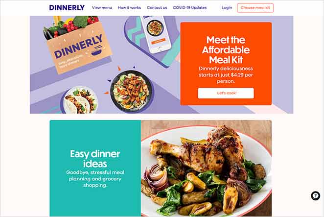
Dinnerly positions itself as a low-cost meal kit, and the page supports that message with straightforward copy and clear visuals. I like how the content doesn’t try to oversell. Instead, it focuses on what you get and why it’s good value.
| Why It Works | Areas to Improve |
|---|---|
| The headline speaks directly to a specific audience (the Reddit crowd in this case). | A stronger CTA colour could help increase clicks. |
| High-quality food images make the offer feel tangible. | A short explainer video near the top might help new customers understand the process. |
| Benefits and pricing are broken into simple, scannable sections. | |
| CTAs appear after key content to support natural decision-making. | |
| The plan selector is easy to use and helps visitors move forward quickly. |
12. Eat Fat, Get Thin (Health Challenge Sales Page Example)
The bold headline is the first thing that grabs you. It challenges common assumptions, which makes people curious enough to keep reading. The rest of the page reinforces that promise with data and real-world success stories.
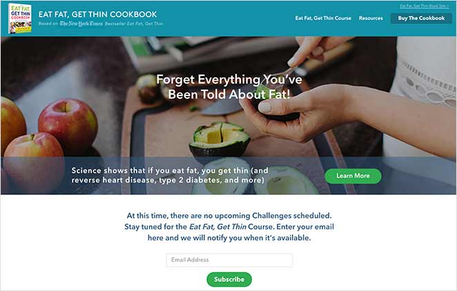
Eat Fat, Get Thin is a lifestyle and weight loss challenge from Dr. Hyman. I like how the page uses a mix of credibility markers—media logos, data, and testimonials—to help readers feel more confident about joining.
| Why It Works | Areas to Improve |
|---|---|
| The headline creates curiosity by pushing against familiar diet advice. | Placing the “Learn More” button later in the page might reduce premature exits. |
| “As Seen On” logos provide strong authority signals. | Some sections could benefit from a single, clearer CTA goal. |
| Benefit-driven subheads help readers focus on the outcomes. | |
| Data-backed results lend real credibility to the program. | |
| Testimonials highlight meaningful transformations from past participants. | |
| Content previews show exactly what participants will receive. |
13. Slack (SaaS Sales Page Example)
This page makes a strong first impression by showing the product in action. The demos and interactive elements help you understand how Slack fits into everyday teamwork without needing a long explanation.
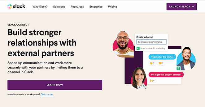
Slack focuses on clarity and usability, and the sales page reflects that approach. I like how the layout moves between product views, customer stories, and quick sign-up options. It feels balanced and straightforward.
| Why It Works | Areas to Improve |
|---|---|
| The headline communicates the core benefit in a single sentence. | A short video in the hero could add a more personal introduction. |
| Interactive demos let users explore features instantly. | |
| Logos and customer stories build trust through familiar brands. | |
| The option to launch a live demo removes friction from trying the product. | |
| CTAs appear often but feel natural within the flow. |
14. WPForms (Black Friday Sales Page Example)
This page has a very focused feel, which works well for a limited-time offer. The design is clean, the offer is easy to understand, and the urgency is handled in a way that pushes action without feeling overwhelming.
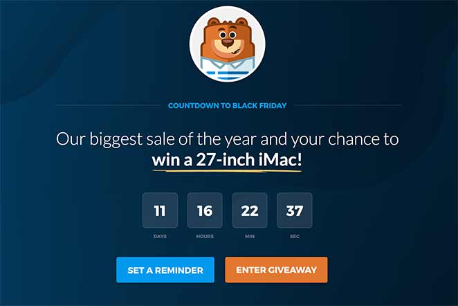
WPForms creates a special page each year for its Black Friday promotion. I like how the layout stays simple and points all of the attention toward the discount and bonus offer. Nothing distracts from the decision.
| Why It Works | Areas to Improve |
|---|---|
| The giveaway plus discount combination makes the offer feel more valuable. | Adding trust badges or customer logos could increase confidence. |
| The “Remind Me” feature keeps potential buyers engaged. | |
| A countdown timer adds urgency and encourages quicker decisions. | |
| The layout is simple and keeps the focus on the offer. | |
| No navigation means fewer reasons to leave the page. |
If you’re planning your own seasonal offer, this guide on Black Friday landing pages might give you some ideas.
15. SeedProd (WordPress Builder Sales Page Example)
What stands out on this page is how clean and organised everything feels. The layout is simple, the messaging is direct, and the page uses familiar elements that help people understand the offer without overthinking it.
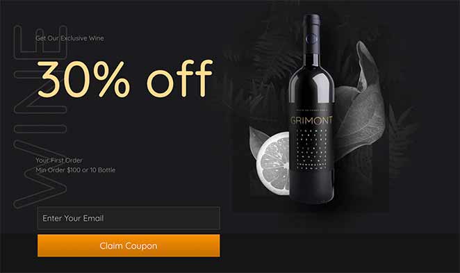
This example was built with one of the pre-designed SeedProd landing page templates. I like how flexible the structure is. You can swap out sections, adjust colours, or rewrite the copy without breaking the layout, which makes it feel approachable for beginners.
| Why It Works | Areas to Improve |
|---|---|
| The overall design is clean and consistent, which helps build trust. | Personalising the copy is essential to avoid a “template” feel. |
| A built-in opt-in form makes it easy for visitors to take the next step. | |
| Reviews and star ratings add social proof at the right moments. | |
| Multiple CTAs give visitors several natural points to convert. |
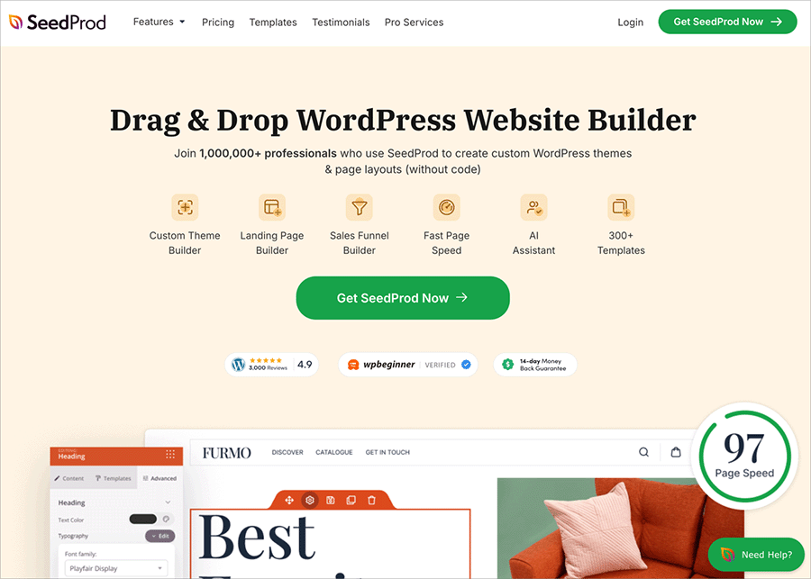
SeedProd makes it easy to build high-converting sales pages, coming soon pages, and full websites with a drag-and-drop editor and 100+ ready-made templates.
Each design loads fast and is optimised for conversions, so you don’t need to worry about performance.
FAQs About Sales Pages
I hope these sales page examples gave you some ideas you can use on your own site. Studying real pages is one of the quickest ways to understand what works and why.
If you want to build a page like this without starting from scratch, SeedProd makes it easy to design clean, high-converting layouts with simple drag-and-drop blocks and ready-made templates.
If you’d like more inspiration, check out these guides next:
And if you liked this article, please follow us on Twitter and Facebook for more useful content to help grow your business.

