

If you want more sign-ups and sales from your landing pages, focus on improving your conversion rate. Even small lifts like moving a call-to-action or trimming a form can turn more visitors into customers without buying extra traffic.
I build my own sites with SeedProd, so these are the changes I reach for first when a page brings in traffic but not customers. Each one is backed by an example you can copy today.
Here’s how to increase landing page conversions step by step:
- 1. Target the Right Audience
- 2. Cut Navigation and Distractions Down to One Goal
- 3. Write Headlines That Connect Emotionally
- 4. Ensure Your Copy Understands the Problem
- 5. Offer Value Above the Fold
- 6. Use the Right Images and Videos
- 7. Build Trust with Reviews, Testimonials, and Badges
- 8. Keep Forms Short and Simple
- 9. Make Your Call-to-Action Stand Out
- 10. Optimize for Mobile First
- 11. Optimize Page Speed
- 12. Personalize the Experience
- 13. Track Behavior and Run A/B Tests
- 14. Bonus: Always Keep Testing
What Is a Good Landing Page Conversion Rate?
The median landing page conversion rate is about 6.6%, based on data from 41,000 landing pages. For most businesses, 2% to 5% is typical, and 10% or more puts you in top-tier territory.
Those numbers vary a lot by industry, so treat them as a starting line, not a target. A small lift still adds up fast.
If a page gets 100,000 visits a month and your conversion rate climbs from 2% to 2.5%, that’s 500 more customers without any extra traffic.
For a deeper dive into what conversion rates are, how to calculate them, and what counts as “good” in your industry, see our full guide on landing page conversion rates.
Tips to Increase Landing Page Conversions
Now that you know what a good conversion rate looks like, how do you actually improve yours? Start with the tips below.
1. Target the Right Audience
No landing page will convert if it’s shown to the wrong people. Before you worry about design, make sure your page is reaching the visitors most likely to take action.
Ask yourself:
- Who will read this page?
- What do I want them to do?
- What problem are they trying to solve?
Your headline, copy, testimonials, and call-to-action buttons should all reflect those answers. If your page isn’t aligned with your audience’s intent, your conversion rate will always suffer.
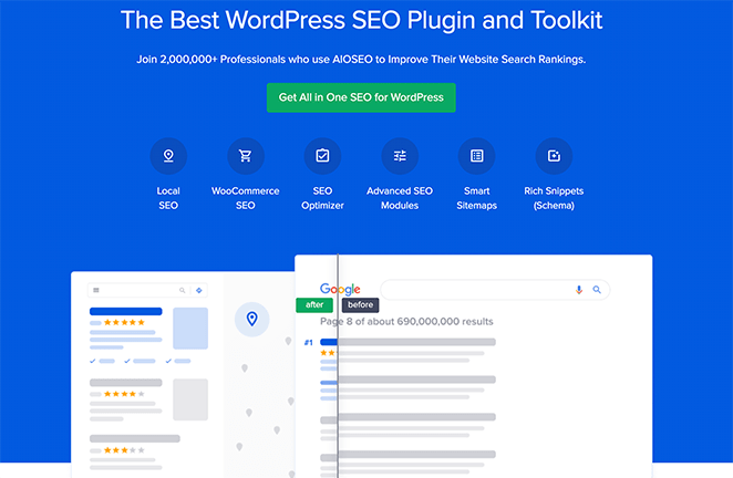
In this example, All in One SEO speaks directly to users looking for an easy-to-use WordPress SEO plugin, leaving no confusion about the value offered.
2. Cut Navigation and Distractions Down to One Goal
A landing page should have one job. Every link that leads somewhere else is a chance for the visitor to wander off before they act.
Strip out the main navigation menu, the sidebar, and any footer links that pull people away. The only meaningful action left on the page should be your call-to-action.
This is one of the most consistent wins I see. When I rebuilt a client’s sign-up page in SeedProd and removed the site header, the page stopped competing with itself and the form started getting noticed.
For more on why this works, read our guide on why landing page navigation is dead.
3. Write Headlines That Connect Emotionally
Your headline is the first thing visitors see, and you only have a few seconds to grab their attention. A strong headline should spark curiosity, show value, and connect emotionally with your audience.
Generic headlines like “Welcome” or “Sign Up Today” rarely work. Instead, lead with your value proposition, the benefit users get if they stick around.
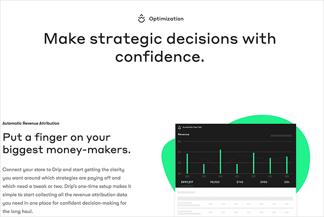
For example, Drip’s page instantly reassures visitors that they can “make strategic decisions with confidence,” addressing a common pain point for marketers.
To write better headlines, try these approaches:
- Highlight a clear benefit (“Grow Your Email List in 24 Hours”)
- Address a fear or pain point (“Stop Losing Visitors at Checkout”)
- Use action-oriented words (“Get Started Free,” “Boost Conversions Today”)
For more ideas, see our list of landing page headline formulas that are proven to increase conversions.
4. Ensure Your Copy Understands the Problem
High-converting landing pages show visitors you understand their problem. If your copy doesn’t reflect their pain points, they won’t trust your solution.
Use your landing page text to mirror what your audience is thinking. Make it clear you know their struggle and can guide them to a solution.
A proven framework is the story model:
- Introduce a character like your visitor
- Show their problem
- Present your product as the guide
- Offer a simple plan to solve it
- Invite them to take action
- Show what failure looks like if they don’t act
- End with success
Here’s how that looks in practice. Instead of “Our software manages your projects,” write “You’re drowning in spreadsheets and missed deadlines, and here’s the plan that gets your team back on track.”
This kind of storytelling helps visitors picture themselves achieving their goal with your product, which builds trust and increases conversions.
5. Offer Value Above the Fold
The first screen visitors see (above the fold) is prime real estate. Don’t waste it on generic introductions. Show immediate value by explaining how your product or service improves their lives.
If people have to scroll to find your value proposition, many will leave before they ever see it. Make sure the benefit is clear right away.
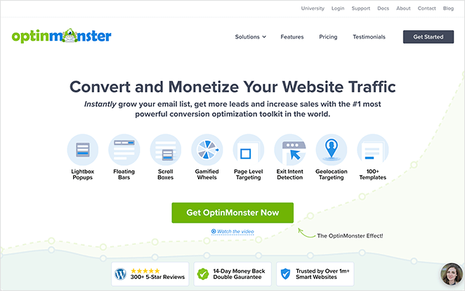
Here’s a strong example from OptinMonster. Before you scroll, it’s obvious what they do and how their software helps small businesses grow.
Ask yourself: if visitors only see the first screen, do they know what you offer and why it matters? If not, rewrite your top section to deliver that value instantly.
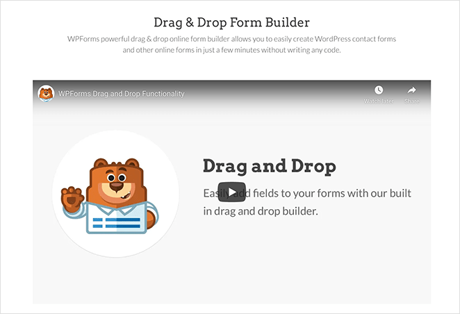
6. Use the Right Images and Videos
Visuals can make or break your landing page. The right image or video builds trust, creates emotion, and makes your offer easier to understand. The wrong one distracts or confuses visitors.
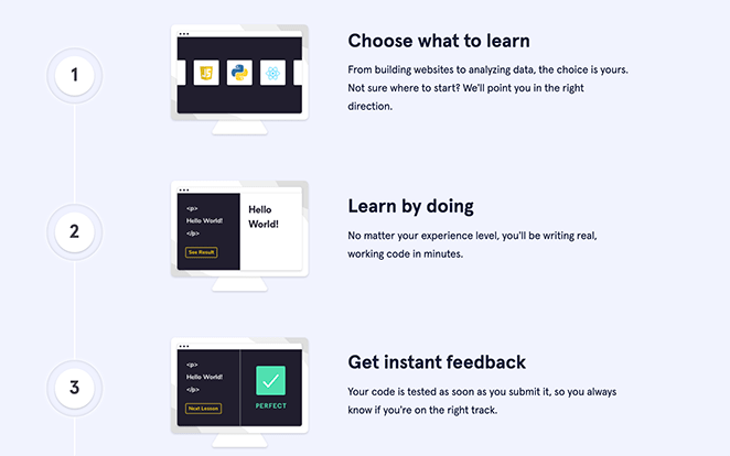
Every image should support your message. For example, Codecademy uses visuals that show learners exactly what success looks like, making the path forward feel achievable.
Videos are even more powerful for complex offers, especially in software or technical industries. A short demo or screencast can explain what paragraphs of text can’t, and keep visitors engaged longer.
You don’t need a big production budget. Simple options like:
- A quick product walkthrough
- Answers to common questions
- A welcome video from your founder
- A case study or customer story
Pair your copy with visuals that reinforce the value of your offer, and you’ll boost both trust and conversions.
Check out our guide on how to create a video landing page for the best results.
7. Build Trust with Reviews, Testimonials, and Badges
Most visitors won’t take action on your landing page unless they trust you. That’s why social proof and trust signals are essential for increasing conversions.
Customer reviews and testimonials show real people are happy with your product. Place them near key conversion points, like your call-to-action, so they reduce doubt right when it matters most.
Trust badges work the same way, borrowing credibility from brands and institutions people already recognize. Popular examples include:
- SSL security icons
- Money-back guarantees
- Accepted payment logos
- Industry awards
- Customer or client logos
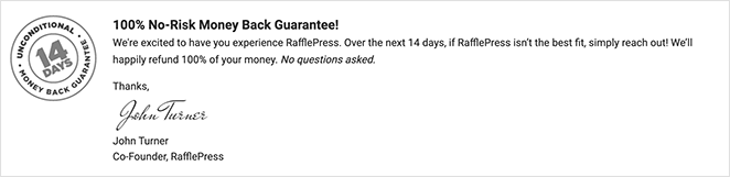
Together, reviews, testimonials, and trust badges signal that it’s safe to take the next step. The more credible your page feels, the higher your conversions will climb.
8. Keep Forms Short and Simple
Long forms scare people away. Ask only for the information you truly need right now.
For most offers, two or three fields (name, email) are enough. You can collect more details later in the journey.
On one of my own opt-in pages, I cut the form from five fields down to just name and email. Sign-ups went up because there was less standing between the visitor and the offer.
Shorter forms build trust and reduce abandonment. If you must add a field, explain why or make it optional.
Need ideas to combat drop-offs? See this guide on reducing form abandonment.
9. Make Your Call-to-Action Stand Out
Your CTA is the decision point. Make the text crystal clear, the button visually distinct, and the placement impossible to miss.
Write specific, benefit-driven copy. Skip generic labels like “Submit.” Tell visitors exactly what they’ll get when they click.
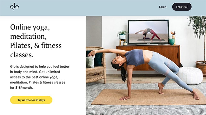
Glo’s button sets a clear expectation (a 15-day free trial). Use first-person or outcome-focused language like “Start My Free Trial,” “Get the Demo,” or “Send Me the Guide.”
For more ideas, see our CTA best practices.
- Design for contrast and tap-ability. Test button color, size, and shape so the CTA stands out from the page and is easy to tap on mobile. Give it breathing room, because crowded CTAs get ignored.
- Place CTAs where intent peaks. Use one CTA above the fold and repeat after key sections that build desire (features, proof, pricing).

In this flow, an early, low-friction CTA (“sounds good”) nudges visitors forward, then a stronger CTA closes after they’ve seen the value.
- Use visual cues to guide attention. Arrows and lines (explicit cues) or photos where a person looks toward the button (implicit cues) direct the eye to your CTA.
- Test one change at a time. Try two versions of a single variable (copy, color, size, or placement) so you can clearly see what lifts clicks and conversions.
10. Optimize for Mobile First
Most of your visitors are on a phone, so your landing page has to work there first. A page that looks great on desktop but fights the reader on mobile loses conversions before the offer even lands.
Run these checks on an actual phone, not just a shrunk browser window:
- Tap targets: Buttons and links are big enough to hit with a thumb, with space around them.
- Single-column layout: Content stacks cleanly with no sideways scrolling.
- Fast mobile load: The page opens quickly on a cellular connection, not just WiFi.
- Mobile-friendly form fields: Inputs trigger the right keyboard and are easy to fill on a small screen.
I always preview my own pages on my phone before publishing. Problems that hide on a big monitor, like a button too close to the edge, jump out right away.
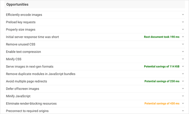
11. Optimize Page Speed
Slow pages don’t convert. If your landing page takes more than a few seconds to load, visitors bounce before they ever see your offer.
Start by testing your page and fixing the biggest bottlenecks first.
Run your URL through IsItWP’s free speed test, then fix the issues it flags.
- Compress and properly size images
- Defer non-critical JavaScript
- Use page caching and a CDN
- Remove heavy or unused plugins and scripts
- Minimize third-party embeds and tracking
Still building your page? Choose a lightweight builder to avoid bloat.
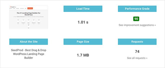
This is the main reason I build my landing pages with SeedProd. When I measured the same page across builders in GTmetrix, the SeedProd version loaded in 556ms, well under half the time of heavier builders, because it keeps the output code lean.
For more ideas, see our landing page optimization tips and the best WordPress landing page plugins.
Ready to act on this?
Build a fast, single-focus landing page that actually converts
SeedProd’s drag-and-drop website builder lets you strip the distractions, drop in one clear CTA, and ship a lean, fast page without touching code.
Start Building My Page12. Personalize the Experience
People convert more when the page speaks directly to them. Personalize copy, offers, and CTAs based on who the visitor is and what they care about.
Before anything else, match the message to the source. The headline a visitor lands on should echo the exact promise of the ad, email, or link that sent them, or they’ll feel like they’re in the wrong place and leave.
From there, a few more ways to personalize:
- Use location awareness: Show shipping, currencies, or hours based on country or city.
- Tailor CTAs to intent: Warm visitors see “Start My Free Trial.” Cold visitors see “Watch a 2-Minute Demo.”
- Welcome returning visitors: Replace “Get Started” with “Pick Up Where You Left Off.”
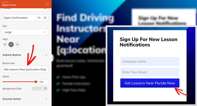
Here’s a tactic most people running paid ads never try. With SeedProd, you can use Dynamic Text to swap your headline based on a URL parameter, so a visitor who clicked an ad for “vegan protein powder” sees that exact phrase as your headline.
That one-to-one message match between the ad keyword and the page is what lifts Quality Score and conversions on PPC traffic. You run one page that adapts itself to every keyword.
For a full walkthrough, see our guide on how to create personalized landing pages.
13. Track Behavior and Run A/B Tests
If you don’t measure what’s happening on your landing page, you can’t improve it. Tracking and A/B testing show you what works and what doesn’t, so you’re not guessing.
Start with behavior tracking:
- Heatmaps: See where visitors click, scroll, or stop reading.
- Session recordings: Watch how people actually interact with your page.
- Form analytics: Spot where users abandon signups.
For WordPress sites, I use MonsterInsights to pull Google Analytics reports into my dashboard, so I can see performance without leaving WordPress.
Then run A/B tests:
- Test different headlines or CTAs to see which drives more clicks.
- Change form length, since fewer fields often mean more conversions.
- Experiment with button color, placement, or copy.
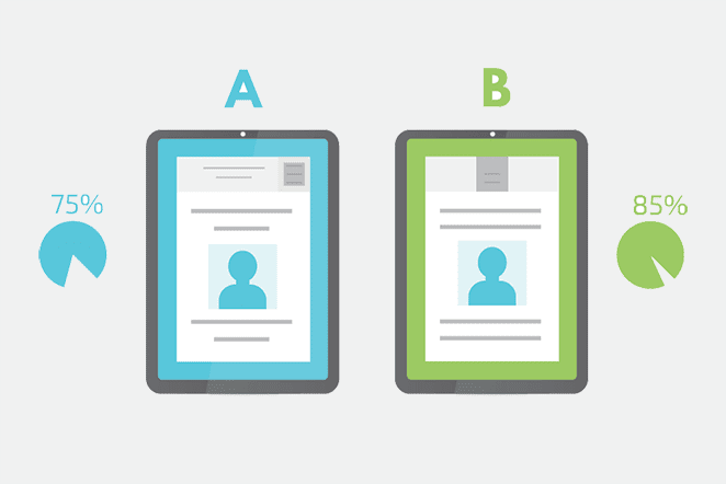
SeedProd makes A/B testing simple by letting you duplicate a page, tweak one element, and send half your traffic to each version. That way, you’ll know for sure which design actually converts better.
One thing to get right is how long you run the test. Let it run until each version has collected enough conversions to be reliable, usually a couple of weeks and at least a few hundred visitors per version, before you call a winner.
Ending a test after a day or two on a handful of clicks just measures luck, not what really converts.
See our full guide on how to do A/B testing in WordPress.
14. Bonus: Always Keep Testing
There’s no final version of a high-converting landing page. What works today might underperform tomorrow as audiences, offers, and competitors change.
The key is to keep testing. Treat every page element as an experiment, from headlines and CTAs to layouts and images. Change one thing at a time and let the data guide your next move.
Small, ongoing improvements compound. A 2% lift here and a 3% lift there can add up to hundreds, or even thousands, of extra conversions each month, and the best-performing pages get there through consistent testing rather than one big redesign.
FAQs on Increasing Landing Page Conversions
What is the best way to increase landing page conversions?
The fastest way is to remove friction. Keep forms short, make CTAs clear and visible, and show trust signals like reviews or guarantees.
Even small improvements in these areas can lift conversions quickly, without spending more on traffic.
What elements should every high-converting landing page have?
At minimum: a clear headline, benefit-focused copy, trust signals (reviews or badges), a short form, and a standout call-to-action.
Anything that distracts from the main goal, including the navigation menu, should be removed.
How many landing page conversions is “good” by industry?
The median landing page conversion rate is about 6.6% across industries, based on data from 41,000 landing pages. For most businesses, 2% to 5% is typical, and 10% or more is top-tier.
Rates vary widely by industry, so compare yourself to your own niche. Our landing page conversion rates guide breaks the benchmarks down further.
Should I remove the navigation menu from my landing page?
Yes, in most cases. A landing page has one goal, and the navigation menu gives visitors easy ways to leave before they take that action.
Removing the menu, sidebar, and competing links keeps attention on your CTA. Keep navigation only on pages meant for browsing, not converting.
How long should I run an A/B test before picking a winner?
Run it until each version has enough conversions to be reliable, usually at least a couple of weeks and a few hundred visitors per version.
Calling a winner after a day or two on a handful of clicks measures luck, not real performance. Give the test time to reach a steady result.
Keep Improving Your Landing Pages
Increasing your landing page conversions doesn’t require guesswork. Target the right audience, cut the distractions, simplify your forms, and build trust, and you’ll turn more visitors into leads and customers without buying extra traffic.
Small changes add up, so keep testing and refine as you go.
You may also find these guides helpful:
- Landing Page URL Examples and Best Practices
- Landing Page Not Converting? 9 Tips to Fix It Fast
- Anatomy of a Landing Page: 9 Essential Elements
Thanks for reading! We’d love to hear your thoughts, so please feel free to join the conversation on YouTube, X and Facebook for more helpful advice and content to grow your business.


