TL;DR
A squeeze page does one thing: it trades a valuable offer for an email address. These 21 examples show what high-converting design looks like across real industries.
- Squeeze page – A focused web page that collects email addresses by offering something valuable in exchange, with no navigation or distractions.
- Conversion benchmark – Well-optimized squeeze pages convert at 12% to 27%, which is 3 to 5 times higher than standard landing pages.
- What separates the best – A clear offer, a single form field, no navigation links, and at least one trust signal (testimonial, logo, or subscriber count).
- When to use one – Email list building, product launches, webinar registrations, and lead magnet delivery all benefit from a dedicated squeeze page.
- How to build one – SeedProd’s drag-and-drop builder lets you launch a professional squeeze page in WordPress without writing code.
Squeeze pages are short web pages designed to capture emails or other contact details in exchange for something valuable like an ebook, free trial, or webinar. They use focused design, minimal distractions, and clear calls-to-action to turn visitors into subscribers.
From my experience building landing pages, the best squeeze pages keep things simple and benefit-focused. In this guide, I’ll share real examples that convert well and explain what makes them work, so you can apply the same principles to your own site.
How I Chose These Examples
I’ve been writing about WordPress and testing landing page designs for over 15 years. Each example on this list met four criteria.
- Conversion fundamentals first. Every page here uses at least three core principles: a benefit-driven headline, minimal form fields, and a distraction-free layout. Pages that looked good but skipped the basics didn’t make the cut.
- Industry variety. Your real estate business or wellness blog doesn’t care how HubSpot handles lead gen. I pulled examples from health, finance, entertainment, coaching, and ecommerce so you can find something close to your context.
- A mix of brand sizes. Netflix and HubSpot show what works with a massive audience. Smaller operators like Turbine and Rated Trips prove you don’t need big brand recognition to convert.
- Real, live pages. Every example here is currently active or was recently live. You can visit each one and study the design yourself.
What Is a Squeeze Page?
A squeeze page is a simple web page created to collect a visitor’s contact details, usually an email address, in exchange for something valuable like a freebie, guide, or discount. Its main goal is to grow your email list by keeping the message short, clear, and focused on one call-to-action.
| Type | Goal | Form Fields | Distractions |
|---|---|---|---|
| Squeeze Page | Email signup | Usually 1 (email) | No |
| Landing Page | Varied (purchase, register, etc.) | Multiple possible | May include nav, footer |
Benefits of Using a Squeeze Page
Most businesses with strong email lists built them using dedicated squeeze pages. Here’s the strategic case for using one.
- You own the list. Social media followers disappear when an algorithm changes. An email list is yours regardless of platform decisions.
- Only interested people sign up. A single-purpose page filters out casual browsers. The people who opt in actually want what you’re offering.
- It starts an automated sequence. A squeeze page captures the email; your email provider handles the follow-up. The lead nurturing runs without you.
- It reduces third-party dependence. If Facebook ads get expensive or Instagram reduces reach, an email list keeps your marketing working.
- You can test offers fast. A squeeze page has one element to optimize: the offer. Changing the headline or lead magnet takes minutes and shows results quickly.
What Makes a Squeeze Page High-Converting?
A high-converting squeeze page gives visitors one clear reason to sign up. It removes distractions and highlights the value of joining your list in just a few seconds. Here’s what every effective squeeze page includes:
- Benefit-Driven Headline: Focus on the visitor’s gain, not your offer.
- Minimal Form Fields: Usually just an email field to reduce friction.
- Clear Call-to-Action: Use action-focused text like “Get My Free Guide.”
- Trust Signals: Add testimonials, expert names, or subscriber counts.
- Distraction-Free Design: No navigation or extra links that pull users away.
From what I’ve seen, pages that check all five boxes consistently outperform those that focus on just two or three. The best-converting squeeze pages hit 12% to 27%, compared to around 3% for a typical landing page.
When Should You Use a Squeeze Page?
You don’t need a squeeze page on every part of your site, but there are some moments where it can really make a difference. Here are a few situations where using one makes sense:
- Before a launch: Build a waitlist or hype list for a product, course, or event you’re about to release.
- When offering a free resource: If you’ve created a checklist, guide, discount, or template, use a squeeze page to collect emails in exchange.
- On social media bios or ads: Drive traffic from Instagram, Facebook, or paid ads to a distraction-free signup page.
- To test new lead magnets: Squeeze pages are great for quickly testing what kind of offer gets the most signups.
- As part of a funnel: Place a squeeze page before your sales page or thank you page to collect contact info early on.
If you’re working on building your list or launching something new, adding a squeeze page is one of the simplest ways to start getting results.
The Best Squeeze Page Examples
Here’s a quick overview of all 21 examples, grouped to help you find the most relevant ones for your use case.
| # | Brand / Name | Offer Type | Best For |
|---|---|---|---|
| 1 | Free Marketing Hacks eBook | Free eBook | Content and marketing list building |
| 2 | HubSpot | Free Template | B2B content and lead generation |
| 3 | Ramsay & White | Industry Guide | Finance and professional services |
| 4 | Mindful | Wellness Guide | Health and wellness brands |
| 5 | Sloane’s Media | Travel Guide | Travel and lifestyle blogs |
| 6 | Rated Trips | PDF Resource | Hospitality and travel brands |
| 7 | Kochava | Marketing Guide | B2B SaaS and tech companies |
| 8 | ZOE | Health Guide | Science-backed wellness brands |
| 9 | Vestd | Business Guide | B2B professional services |
| 10 | Turbine | Remote Work Guide | SaaS and productivity tools |
| 11 | Signup Template | Free Sales Guide | First-time list building |
| 12 | Netflix | Free Trial | Subscription and SaaS products |
| 13 | Business Template | Business Growth Tips | Service businesses and coaches |
| 14 | Real Estate Email Course | Free Email Course | Real estate and online education |
| 15 | Webinar Registration | Webinar Signup | Event and webinar promotion |
| 16 | Sneak Peek | Free Book Chapter | Authors and course creators |
| 17 | Urgency Example | Free Course Guide | Course creators with warm audiences |
| 18 | Video Squeeze | Free Course Access | Online educators |
| 19 | Coaching Page | Daily Coaching Advice | Coaches and consultants |
| 20 | Podcast Page | Podcast + Email Signup | Podcasters and media brands |
| 21 | Black Friday | Early Deal Access | Ecommerce flash sales |
Now, let’s dive into some of the best squeeze page examples I’ve found that you can use on your own website.
- 1. Free Marketing Hacks eBook
- 2. Free Marketing Plan Template
- 3. Guide to Bridging Finance
- 4. How to Meditate Guide
- 5. Free Instant Guide
- 6. Best UK Spas Guide
- 7. Marketer’s Guide to SKAdNetwork
- 8. Free Gut Health Guide
- 9. Best-in-Class Share Scheme Guide
- 10. Your Office in a Backpack
- 11. Signup Squeeze Page Template
- 12. Free Trial Streaming Service
- 13. Business Squeeze Page Template
- 14. Real Estate Squeeze Page
- 15. Webinar Registration Squeeze Page
- 16. Sneak Peak Squeeze Page
- 17. Urgency Squeeze Page Example
- 18. Engaging Video Squeeze Page
- 19. Coaching Squeeze Page
- 20. Podcast Squeeze Page
- 21. Black Friday Squeeze Page
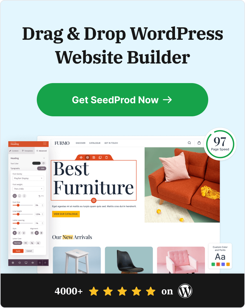
- How Do I Create a Squeeze Page in WordPress?
1. Free Marketing Hacks eBook
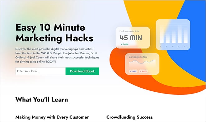
This squeeze page example offers a free eBook on marketing hacks. It uses a bold headline, a single email form field, and social proof with expert names and reader testimonials to build trust and encourage signups. The layout is longer than average but stays focused on the value of the free guide.
Visitors only need to enter their email address to get the download, making it a clear example of a high-performing lead magnet in action.
| Offer Type: Free eBook |
| Conversion Grade: B+ |
| Why It Works: 🔹 Benefit-focused headline using “easy” and “hacks” 🔹 Credibility from expert names and testimonials 🔹 Minimal, single-field opt-in form 🔹 Consistent visual design builds trust |
| Ways to Make It Better: 🔹 Add a more specific, outcome-focused headline 🔹 Include a small image of the eBook cover 🔹 Increase whitespace for readability |
Verdict: Best for content creators and marketers building a list around a specific topic. The social proof approach works well when you don’t have a well-known brand to lean on.
2. Free Marketing Plan Template
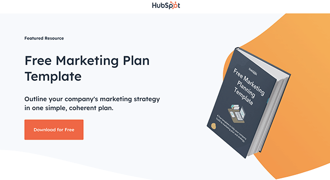
HubSpot’s squeeze page for its free marketing plan template features a clean, direct layout with a clear headline and short opt-in form. The design emphasizes simplicity and low friction, helping users understand the offer instantly and complete the signup without distractions.
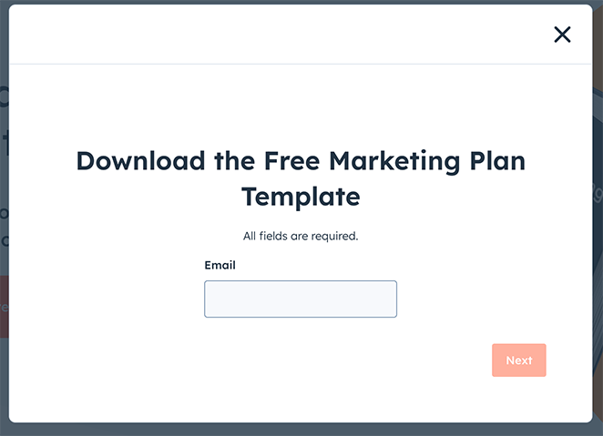
| Offer Type: Free Marketing Template |
| Conversion Grade: A |
| Why It Works: 🔹 Headline highlights “free” and “template” 🔹 Short form reduces signup barriers 🔹 Simple, benefit-driven copy 🔹 Clear CTA focused on action |
| Ways to Make It Better: 🔹 Add a preview image of the template 🔹 Include a short testimonial for trust 🔹 Offer optional newsletter signup checkbox |
Verdict: Best for marketers who want a clean, no-friction template to study and adapt. HubSpot’s restraint here is intentional, and it pays off in conversion simplicity.
3. Guide to Bridging Finance
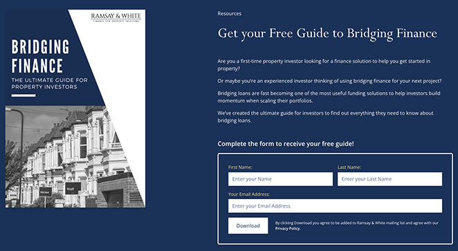
Ramsay & White uses this page to offer a professional-looking guide on bridging finance. The design feels trustworthy, and the minimal form keeps the barrier to entry low. It’s a good fit for financial services and industry experts.
| Offer Type: Industry Guide |
| Conversion Grade: A- |
| Why It Works: 🔹 Clear headline that explains the guide’s purpose 🔹 High-quality visuals boost credibility 🔹 Minimal form fields keep sign-up easy 🔹 Trust elements highlight expertise |
| Ways to Make It Better: 🔹 Use a more relevant image related to bridging finance 🔹 Add a testimonial or trust badge 🔹 Simplify the form by starting with email only |
Verdict: Best for finance professionals and B2B service firms that need to earn trust quickly. The conservative design builds credibility without looking plain.
4. How to Meditate Guide
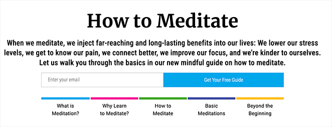
This calming design from Mindful matches its message perfectly. The imagery is soothing, the form is short, and the headline is clear. It’s a great fit for wellness topics where tone and trust matter.
| Offer Type: Wellness Guide |
| Conversion Grade: A |
| Why It Works: 🔹 Clear, benefit-focused headline 🔹 Soothing imagery fits the meditation theme 🔹 Simple, low-friction signup form 🔹 Trust from testimonials and design consistency |
| Ways to Make It Better: 🔹 Add more user testimonials 🔹 Use subtle animation or hover effect on the CTA button 🔹 Consider a brief author intro for more connection |
Verdict: Best for health, wellness, or mindfulness brands. When the page design matches the topic’s emotional tone, visitors trust the offer before they’ve read a single bullet point.
5. Free Instant Guide
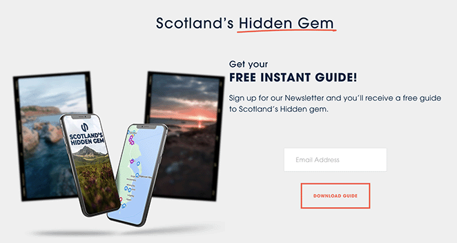
This page from Sloane’s Media promotes a free travel guide with a clean layout and a quick opt-in. The value is clear upfront, but a more scenic image could help match the visual to the topic.
| Offer Type: Travel Guide |
| Conversion Grade: B |
| Why It Works: 🔹 Headline promises instant, free value 🔹 Benefit-focused copy tells users what they’ll gain 🔹 Simple opt-in form with just an email field 🔹 CTA button is clear and action-oriented |
| Ways to Make It Better: 🔹 Use a more scenic image to reflect the travel topic 🔹 Make the description more vivid and sensory 🔹 Add a quote or stat to boost credibility |
Verdict: Best for travel bloggers or niche content sites testing a new lead magnet. The core structure is solid, but stronger visuals would close the gap between good and great.
6. Best UK Spas Guide
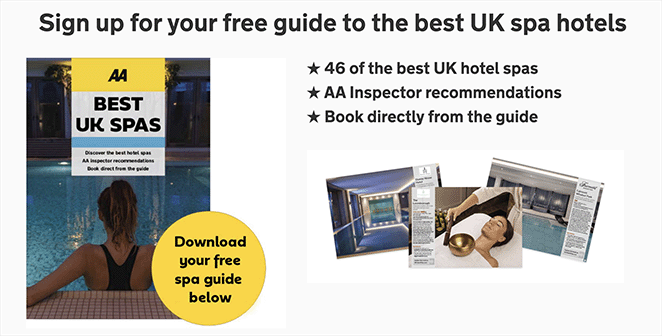
Rated Trips uses this page to share a curated spa guide with minimal distractions. The luxurious visuals are the highlight, but moving the form above the fold could make conversions even easier.
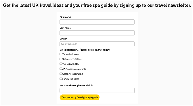
| Offer Type: PDF Resource Guide |
| Conversion Grade: B+ |
| Why It Works: 🔹 Clear and appealing headline 🔹 High-quality spa imagery enhances visual appeal 🔹 Minimal form fields reduce friction 🔹 Social proof from logos and brand recognition |
| Ways to Make It Better: 🔹 Move the form above the fold 🔹 Include a testimonial or excerpt from the guide 🔹 Add urgency with limited-time language |
Verdict: Best for hospitality, travel, or lifestyle brands with strong photography assets. The luxury imagery does real conversion work here, but a below-the-fold form means you’re relying on scroll-through visitors to convert.
7. Marketer’s Guide to SKAdNetwork
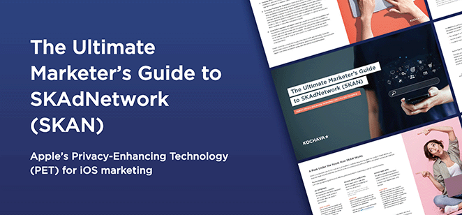
This page from Kochava offers a detailed guide for marketers navigating SKAdNetwork. The design feels polished and professional, with a direct headline and a form that doesn’t overcomplicate things.
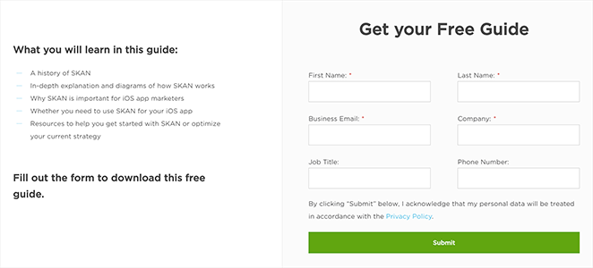
| Offer Type: Marketing Industry Guide |
| Conversion Grade: A- |
| Why It Works: 🔹 Headline is direct and value-focused 🔹 Professional design builds trust 🔹 Form is short and easy to complete 🔹 CTA button uses clear, action-based language |
| Ways to Make It Better: 🔹 Make the headline more benefit-driven 🔹 Add a short preview or TOC of the guide 🔹 Include a testimonial or stat to build urgency |
Verdict: Best for B2B SaaS and tech companies targeting informed, technical audiences. The professional design builds credibility without overwhelming with detail.
8. Free Gut Health Guide
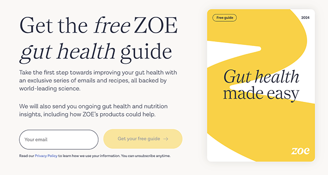
ZOE keeps this page clean and informative, with visuals tied to gut health and an easy opt-in form. It’s backed by scientific authority, which adds weight to the offer.
| Offer Type: Health & Wellness Guide |
| Conversion Grade: A |
| Why It Works: 🔹 Clear headline explains exactly what users will get 🔹 Relevant imagery connects visually to the topic 🔹 Simple opt-in form encourages signups 🔹 Scientific credibility and branding build trust |
| Ways to Make It Better: 🔹 Add a short video or expert quote 🔹 Use a stat or testimonial to build social proof 🔹 Highlight what’s inside the guide in 1-2 bullet points |
Verdict: Best for science-backed health brands that need to convert skeptical visitors. ZOE earns trust before asking for the email, which is the right order.
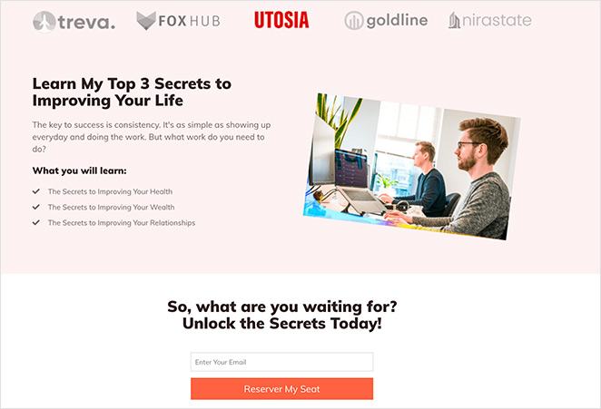
9. Best-in-Class Share Scheme Guide
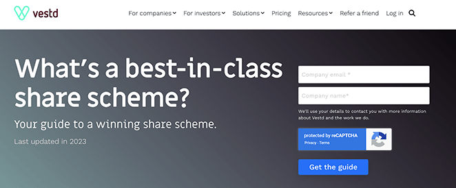
Vestd targets business owners with this offer, using sharp design and lead magnets to build credibility. A short explainer video or client logos would take it even further.
| Offer Type: Business Strategy Guide |
| Conversion Grade: A- |
| Why It Works: 🔹 Clear headline with a strong value promise 🔹 Professional visuals and layout create authority 🔹 Minimalist form design reduces friction 🔹 Social proof via testimonials and trust badges |
| Ways to Make It Better: 🔹 Add logos from companies that use the service 🔹 Include a short explainer video for key takeaways 🔹 Use a more specific CTA tied to business outcomes |
Verdict: Best for professional services firms and consultants with a complex offer to explain. The clean layout lets the headline and trust elements do the heavy lifting.
10. Your Office in a Backpack
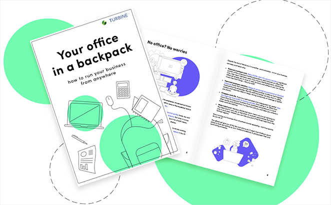
Turbine offers a smart guide for streamlining your mobile workspace. The design is clean and to the point, with visuals that help users picture what they’re getting before signing up.
| Offer Type: Remote Work Setup Guide |
| Conversion Grade: B+ |
| Why It Works: 🔹 Clear headline communicates the benefit instantly 🔹 Visuals show the product and make the offer tangible 🔹 Minimal form keeps sign-up friction low 🔹 CTA button stands out with strong contrast |
| Ways to Make It Better: 🔹 Use a more compelling CTA like “Get My Mobile Office Guide” 🔹 Add a trust element such as a review or badge 🔹 Consider showing a quick benefit list below the form |
Verdict: Best for SaaS companies or productivity tools targeting remote workers. Add a customer testimonial and this page moves from B+ to A territory.
11. Signup Squeeze Page Template
This example keeps things simple: a bold headline, a single-field form, and a clear description of the guide on offer. It’s a reminder that even basic squeeze page templates can work well when the message is clear and the value is obvious.
| Offer Type: Free Sales Guide |
| Conversion Grade: B |
| Why It Works: 🔹 Bold headline highlights clear benefits 🔹 Description sets expectations for the content 🔹 Single-field form reduces signup barriers 🔹 CTA stands out visually on the page |
| Ways to Make It Better: 🔹 Use a more relevant background image tied to the topic 🔹 Expand the description with specific takeaways 🔹 Add a testimonial or result from someone who used the guide |
Verdict: Best for beginners building their first list or testing a lead magnet idea. It’s functional without being impressive, and sometimes that’s exactly what you need to validate an offer before investing in design.
12. Free Trial Streaming Service
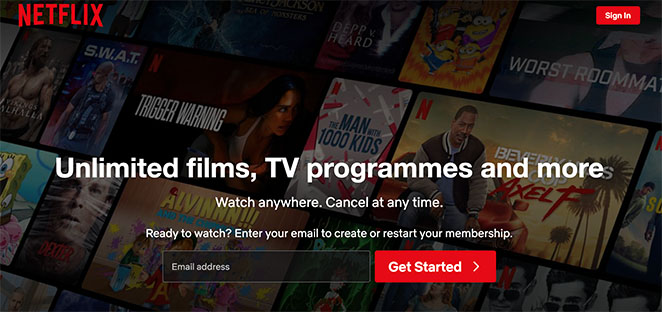
Netflix focuses this page entirely on account creation, using minimal text and strong brand recognition. The simplicity works, but adding urgency or specific trial perks could drive even more signups.
| Offer Type: Free Trial Offer |
| Conversion Grade: A- |
| Why It Works: 🔹 Headline clearly promotes the free trial 🔹 Minimalistic design keeps the focus on signing up 🔹 Form only asks for essentials 🔹 Brand authority (Netflix) builds instant trust |
| Ways to Make It Better: 🔹 Highlight specific trial benefits (e.g. ad-free, exclusive content) 🔹 Add a countdown timer to increase urgency 🔹 Include a few logos or user ratings for social proof |
Verdict: Best for subscription products or SaaS companies with strong brand recognition. Without Netflix’s reputation, a page this minimal would struggle to convert cold traffic.
13. Business Squeeze Page Template
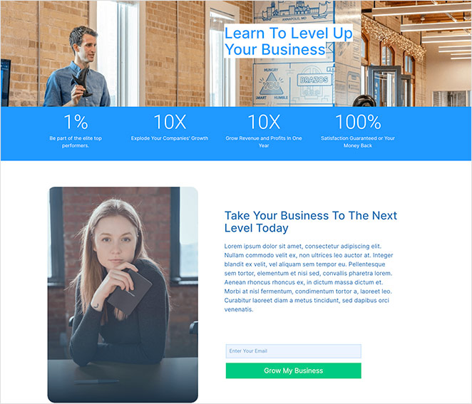
This example uses a numbers-focused headline and images of real people to build trust quickly. It’s a strong option if you’re promoting a service or lead magnet related to business growth. Just make sure the numbers you use are clear and credible.
| Offer Type: Business Growth Tips |
| Conversion Grade: B+ |
| Why It Works: 🔹 Engaging visuals with people to build trust 🔹 Number-driven headline makes a bold promise 🔹 Short form ensures quick conversions 🔹 CTA copy clearly ties to growth benefits |
| Ways to Make It Better: 🔹 Add context to the headline numbers 🔹 Refine the CTA to be more specific (“Get My Growth Plan Now”) 🔹 Include a quick summary of what the subscriber will receive |
Verdict: Best for service businesses and coaches who can back up their headline numbers with real context. Add a quick explanation of the metric and the page converts much harder.
14. Real Estate Squeeze Page
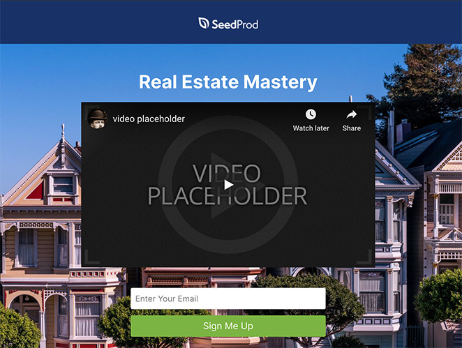
This design, featured in our guide to real estate landing page examples, uses video and a short form to promote an email course. The layout removes distractions, so visitors can focus on the offer, and the video makes the pitch more memorable.
| Offer Type: Free Real Estate Email Course |
| Conversion Grade: A- |
| Why It Works: 🔹 No navigation keeps focus on the message 🔹 Embedded video adds personality and clarity 🔹 Short form encourages quick signups 🔹 Clear CTA tells users exactly what to do |
| Ways to Make It Better: 🔹 Make the headline more benefit-driven 🔹 Include testimonials or results from past participants 🔹 Highlight 1-2 outcomes the email course promises |
Verdict: Best for real estate professionals and online course creators. Video on a squeeze page adds personality and reduces the trust gap before the signup.
15. Webinar Registration Squeeze Page
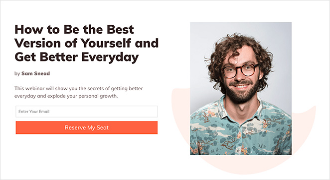
This page is all about registration. There’s no menu, no sidebar, just a bold headline, a few quick bullet points, and multiple CTAs. It could also double as a waitlist landing page depending on your goal.
| Offer Type: Free Webinar Registration |
| Conversion Grade: B+ |
| Why It Works: 🔹 Headline makes the webinar topic crystal clear 🔹 No navigation keeps users focused on registering 🔹 Trust signals include client logos and credibility markers 🔹 Short bullet list explains the benefits quickly |
| Ways to Make It Better: 🔹 Add a short speaker intro video for engagement 🔹 Make the two opt-in forms visually distinct 🔹 Use a time-based CTA like “Save My Seat Now” |
Verdict: Best for webinar hosts targeting cold audiences. The focused layout works, though having two separate opt-in forms on one page creates unnecessary friction for visitors who just want to register.
16. Sneak Peak Squeeze Page
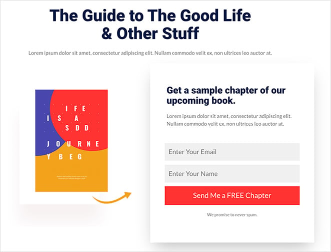
Instead of offering an entire ebook, this page gives away a free chapter, like a mini free trial landing page. The simple layout and product image do a great job of letting the content speak for itself.
| Offer Type: Free Book Chapter |
| Conversion Grade: B+ |
| Why It Works: 🔹 Straightforward headline explains the offer 🔹 Product image makes the preview feel tangible 🔹 Short opt-in form is quick to complete 🔹 CTA button aligns with the page’s branding |
| Ways to Make It Better: 🔹 Add a brief author bio and headshot 🔹 Use a more attention-grabbing CTA design 🔹 Include a quote from the chapter or early reader |
Verdict: Best for authors, course creators, and coaches who want to qualify subscribers with a taste of their content before asking for a full email commitment.
17. Urgency Squeeze Page Example
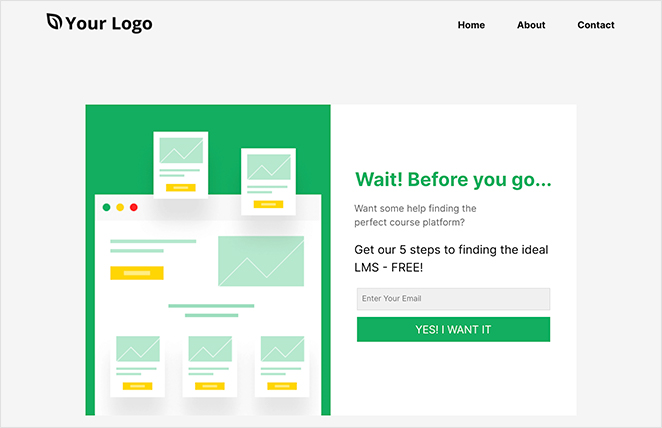
This one grabs attention with the word “Wait!” and a short pitch about a free guide for course creators. It’s quick, emotional, and uses urgency well. A more relevant image could help tie the offer together visually.
| Offer Type: Free Online Course Guide |
| Conversion Grade: A- |
| Why It Works: 🔹 Urgent headline captures attention (“Wait!”) 🔹 Concise description removes hesitation 🔹 Simple email-only form reduces friction 🔹 Emotive CTA copy helps drive action |
| Ways to Make It Better: 🔹 Use a stronger visual related to course content 🔹 Add testimonials from people who found the guide helpful 🔹 Remove navigation to keep users focused |
Verdict: Best for course creators and coaches targeting warm audiences who may already be leaving a page. The “Wait!” hook earns attention at the one moment visitors are most likely to reconsider.
18. Engaging Video Squeeze Page
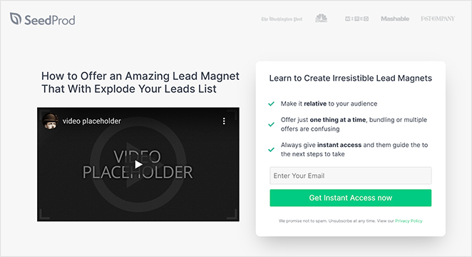
Video does most of the work here. The layout is built to support it, with a strong “how to” headline and bullet points that reinforce what users will get. If you’re offering a course, a sneak peek like this can do a lot to build trust and interest.
| Offer Type: Free Online Course Access |
| Conversion Grade: A- |
| Why It Works: 🔹 “How to” headline promises clear value 🔹 Video reinforces the offer and builds trust 🔹 Bullet list under form highlights benefits 🔹 CTA promises instant access for immediate reward |
| Ways to Make It Better: 🔹 Add captions or animations to the video 🔹 Include a countdown timer for urgency 🔹 Consider showing a preview of course content |
Verdict: Best for online educators and course creators. Embedding a preview video before the form shows visitors what they’re getting, which reduces second-guessing before they sign up.
19. Coaching Squeeze Page
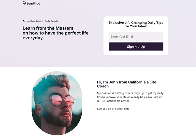
This page keeps things personal. The copy is friendly, the form is short, and the promise of daily advice from top coaches makes it feel valuable. Adding a client quote would strengthen the message even more.
| Offer Type: Daily Coaching Advice |
| Conversion Grade: B+ |
| Why It Works: 🔹 Headline promises expert advice from “masters” 🔹 Description clearly explains what subscribers will get 🔹 Personal introduction adds human connection 🔹 Short form with a focused CTA makes sign-up easy |
| Ways to Make It Better: 🔹 Add testimonials from coaching clients 🔹 Use urgency in the CTA (“Limited Spots Available”) 🔹 Include a sample of what the advice looks like |
Verdict: Best for coaches and consultants who want to build a personal, trust-first relationship before pitching a program. The conversational copy style works well with warm audiences.
20. Podcast Squeeze Page
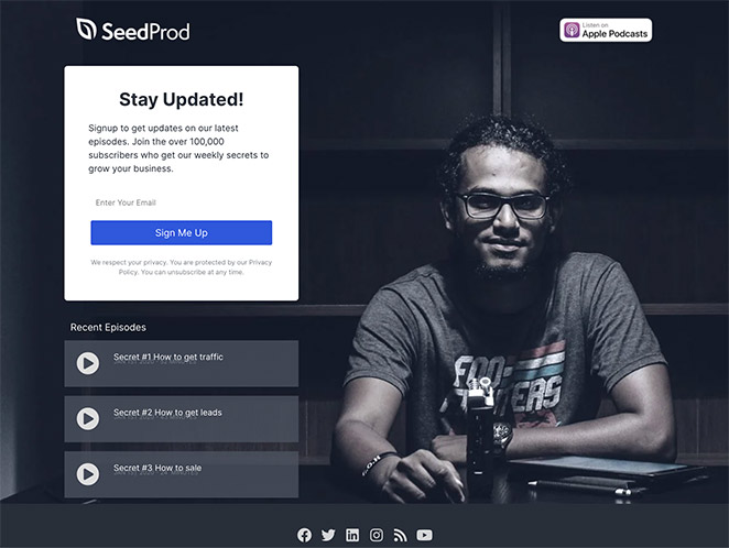
With podcast platform badges and playable episodes right on the page, this design makes it easy for visitors to sample content before subscribing. It’s also featured in our roundup of podcast landing page examples.
| Offer Type: Podcast Access + Email List Signup |
| Conversion Grade: A |
| Why It Works: 🔹 Platform badges show it’s available on popular apps 🔹 Embedded recent episodes let visitors preview content 🔹 Social buttons help build your audience across channels 🔹 No navigation keeps focus on subscribing or listening |
| Ways to Make It Better: 🔹 Add a podcast trailer or highlight reel 🔹 Include listener reviews or testimonials 🔹 Mention how often new episodes are released |
Verdict: Best for podcasters who want to convert listeners into email subscribers. Letting visitors play an episode before signing up is a smart way to prove value first.
21. Black Friday Squeeze Page
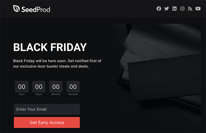
Urgency is the focus here, from the countdown timer to the no-exit layout. It’s bold, punchy, and designed to collect emails fast before the sale drops. A preview of top deals would make it even stronger.
| Offer Type: Early Access to Black Friday Deals |
| Conversion Grade: A- |
| Why It Works: 🔹 No navigation keeps visitors focused on the offer 🔹 Headline is simple but attention-grabbing 🔹 Urgent, witty copy drives immediate action 🔹 Countdown timer boosts fear of missing out (FOMO) |
| Ways to Make It Better: 🔹 Show a preview of top deals to build interest 🔹 Add a progress bar to gamify signups 🔹 Include testimonials or social proof if available |
Verdict: Best for ecommerce brands running flash sales or seasonal promotions. The countdown timer and no-exit layout create urgency without feeling manipulative.
Squeeze Page Examples for Ecommerce
If you run an online store, three examples on this list apply directly to ecommerce contexts.
- Example 21 (Black Friday) uses a countdown timer and no-exit layout to capture emails before a flash sale. It’s the most direct ecommerce template in the list.
- Example 12 (Netflix Free Trial) shows how to use a single-field form and brand authority to convert for a subscription product. Ecommerce brands can adapt this for trial offers or early-access product launches.
- Example 13 (Business Template) uses number-driven headlines to build trust quickly, a technique that works well for product launch campaigns and promotional offers.
A free trial squeeze page, an early-access deal page, or a product launch waitlist are the three most common ecommerce use cases. Each of these examples gives you a real design model to adapt.

“A squeeze page is a clickbait designed to capture leads by asking for visitors’ information:
On the other hand, a landing page is a more versatile tool that allows creators to track how many people have viewed it and update the content.
Asking people to register on the website or log in with their Facebook information.”
— Jackie Durbin – KvCORE Coaching
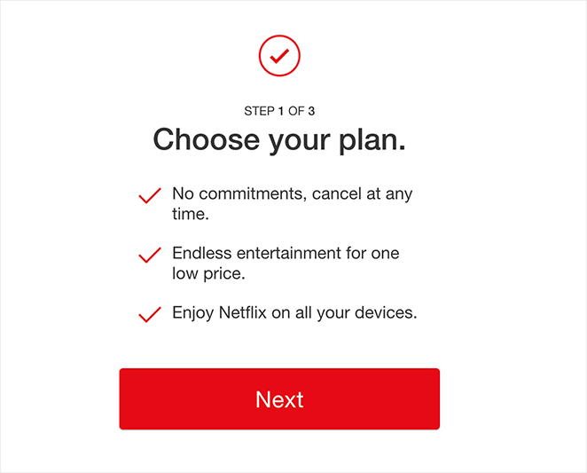
How Do I Create a Squeeze Page in WordPress?
The fastest way to create a squeeze page in WordPress is with a drag-and-drop website builder like SeedProd. It’s beginner-friendly, so you can design a professional page without coding or hiring a developer.
If you only need a basic opt-in form embedded in an existing page rather than a standalone squeeze page, a form plugin like WPForms may be quicker.

Here’s how to build your squeeze page step-by-step:
- Install SeedProd – Add and activate the plugin on your WordPress site.
- Choose a Squeeze Page Template – Pick a pre-made design that fits your goal.
- Customize the Content – Use the drag-and-drop editor to edit text, colors, and images.
- Add Your Opt-in Form – Include a short email form to collect signups.
- Connect Your Email Service – Link your email provider to automate new subscriber entries.
- Publish Your Page – Preview and launch it live on your domain.
This process lets you build high-converting pages quickly while keeping full control of your content and list. For a full walkthrough, see this guide on How to Create a Squeeze Page in WordPress.
Popular Use Cases for Squeeze Pages
Squeeze pages are ideal when your main goal is to grow your email list or generate leads with minimal distractions. Here are the most common times to use one:
- Lead magnets: Offering a free guide, checklist, or ebook? A squeeze page is perfect for gating the download behind a quick opt-in form.
- Product launches: Build a pre-launch waitlist by directing traffic to a squeeze page that promises early access or special perks.
- Social media traffic: Use your Instagram bio, TikTok link-in-bio, or Facebook ads to send users to a squeeze page, not your homepage.
- Webinar signups: Collect registrations for an upcoming training or workshop using a simple form and compelling headline.
- Free trials and sneak peeks: Let users access a sample chapter, video preview, or trial account after entering their email.
- Flash sales or seasonal promos: Pair a limited-time offer (like Black Friday deals) with a no-exit squeeze page and countdown timer.
More Questions About Squeeze Pages
What is a squeeze page vs. landing page?
The main difference between a squeeze page and a landing page is their purpose. A squeeze page specifically collects visitor emails or contact information, focusing on high-conversion lead generation. In contrast, a landing page is broader, often aiming to drive a particular action, such as a purchase or content download.
What is a good squeeze page conversion rate?
A good squeeze page conversion rate is at least 12%, which is 3 to 5 times higher than the average landing page conversion rate. With better optimization, a squeeze page’s conversion rate can increase to 27% or more.
What is another name for a squeeze page?
A squeeze page is also called a lead capture page, an opt-in page, or a landing page for email collection. All three terms describe the same format: a focused, distraction-free page designed to collect an email address in exchange for a valuable offer. “Squeeze page” is the most common term in the digital marketing and email list-building community.
What does a squeeze page look like?
A squeeze page typically has a single bold headline, a brief description of the offer, and a short form with one or two fields (usually just an email address). There’s no navigation menu, footer links, or sidebar. The only action a visitor can take is to sign up or leave. Most examples in this article follow this exact format.
How can I integrate my squeeze page with email marketing software?
Most email marketing software providers offer tools to help you create and integrate squeeze pages. In SeedProd, you can use the opt-in form block and integrate your email marketing software in the Connect tab.
Next, More Landing Page Inspiration
We hope this article gave you enough squeeze page examples to inspire your next design.
Ready to create a high-converting squeeze page without writing code?
If you need more inspiration, see the following landing page examples:
- Blog Landing Page Examples + How to Make One
- Best Email Subscription Popup Plugins
- Social Media Landing Page Examples to Grow Your Company
- Request a Demo Landing Page Examples Proven to Boost Leads
- Effective Email Unsubscribe Page Examples + Easy Tutorial
- Top eCommerce Landing Page Examples to Drive Sales
- Call to Action Best Practices
Thanks for reading! We’d love to hear your thoughts, so please feel free to join the conversation on YouTube, X and Facebook for more helpful advice and content to grow your business.