

TL;DR
An eCommerce landing page is a single focused page that turns traffic from one source into one action. The best ones share a handful of design moves you can copy today.
- One job per page: match the ad or email that sent the visitor, then ask for one clear action.
- Cut the exits: the strongest examples strip navigation so there is nowhere to wander off to.
- Show proof early: reviews, badges, and founder statements above the fold do real work.
- Make it personal: pages like Jolie and Tower 28 tailor the experience to the visitor.
- Benchmark to beat: the median landing page converts at about 6.6 percent, so you have a target.
- Build it fast: SeedProd lets you start from a template and add CTA, testimonial, and add-to-cart blocks without code.
You have traffic landing on your store, but it browses and leaves without buying. The page you are sending people to is doing too many jobs at once.
A good eCommerce landing page fixes that. It matches what the visitor clicked, keeps them focused on one action, and turns more of that traffic into sales.
This post breaks down 11 real examples, names the single element to copy from each, and shows you how to build your own.
Video Guide
What Is an eCommerce Landing Page?
An eCommerce landing page is a single focused page built to convert traffic from one source into one action, with navigation stripped out.
It is the page a visitor “lands on” after clicking a link from an email marketing campaign, a social post, or a Google ad.
The page matches the shopper’s intent and leans on engaging headlines, compelling copy, special offers, customer testimonials, and call to action buttons.
Here is a quick scenario. A shopper searches Google for “best food for kittens” and clicks a result titled “The Perfect Food for Kittens.”
When they land on the page, they see:
- A headline matching the ad
- Images of kittens
- A CTA button offering a 25% discount
- A money-back guarantee
- Testimonials from existing customers
Every element points at one outcome: buy the kitten food. That single focus is what separates a landing page from the rest of your store.
eCommerce Landing Pages vs. Product Pages
A product page and a landing page look similar, but they do different jobs. Product pages educate a broad audience and rank in search. Landing pages exist to convert one specific visitor.
Here is how the two compare side by side.
| Element | eCommerce Landing Page | Product Page |
|---|---|---|
| Call to action | One clear CTA | Can include multiple CTAs |
| Navigation | Exit paths like menus removed | Full navigation and product categories |
| Audience | Built for one specific audience | General content for a broad audience |
| Content focus | Conversion and the offer | Product descriptions and recommendations |
| Optimized for | Marketing campaigns | SEO and organic traffic |
Best eCommerce Landing Page Examples
It pays to test different versions of a page to see what your audience responds to, but getting started is usually the hard part. Here are 11 eCommerce landing page examples to borrow from.
1. OLIPOP

OLIPOP sells prebiotic soda and codes the whole page by flavor color. The hero pairs a short benefit line, “Real ingredients. Real refreshment,” with a tidy grid so dozens of flavors never feel overwhelming.
Why it works:
- Each flavor gets its own bright color, so the range reads at a glance
- A short benefit tagline says what the product does in one line
- Products are grouped into clear sections instead of one long list
- A clear “Shop Now” CTA anchors each section
Copy this: give a big catalog a simple color system and clear groupings. Shoppers pick faster when choice feels organized, not endless.
2. Premium Granola
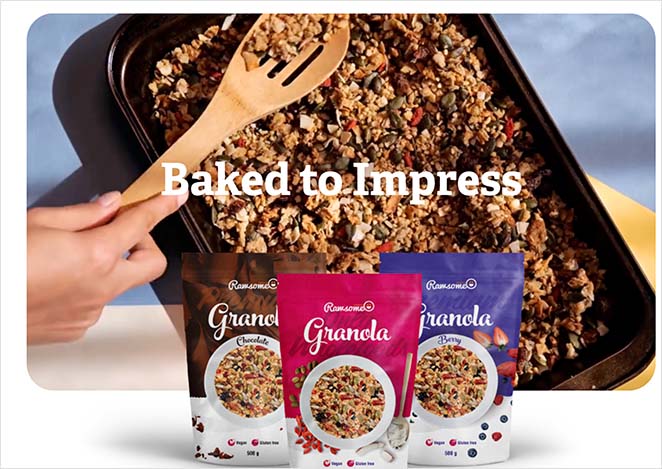
Premium Granola runs a bright, bold page that uses white space to spotlight the product. Visitors scroll through vibrant images and hear directly from the owner near the bottom.
Why it works:
- Clear value proposition
- Engaging product GIFs that capture attention
- No navigation menu
- High-quality product images
- A photo of the owner adds a human face
Steal the move: put the founder’s face on the page. A real person builds trust faster than another stock product shot.
3. Brightland

Brightland sells small-batch olive oils and pantry goods, and it borrows authority fast. Press logos from Vogue, Bon Appetit, and Food and Wine sit near the hero, so trust lands before you have read a word about the product.
Why it works:
- Recognizable press logos build trust instantly
- Lifestyle photography makes a pantry staple feel premium
- A single “Shop” CTA tied to the featured product
- Gift sets and build-your-own options widen the reasons to buy
The takeaway here: put the logos of outlets that covered you next to your hero. Borrowed credibility works before your own copy has to.
4. Samina Sleepsystem
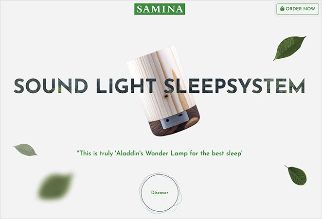
Samina runs a clean page for its sleep system. A neutral background sets off high-quality images and subtle animations that draw the eye to product details.
Why it works:
- Social proof above the fold
- Authority-building founder statement
- Navigation CTA stays visible
- High-quality product images
- Exit links kept in the footer only
Worth copying: push your social proof above the fold. Samina earns trust before the visitor has scrolled an inch.
5. Genki

Genki leads with one hero product shown as a large 3D render, not a crowded grid. The tone is education first, so the main button says “Learn more” instead of pushing you straight to checkout.
Why it works:
- One hero product with a large 3D render instead of a busy grid
- A soft “Learn more” CTA that invites exploration rather than forcing a buy
- An honest scarcity cue showing how many units are left in the current batch
- Modular sections that introduce the rest of the range as one ecosystem
- Location-based shipping shown upfront, so there are no surprises at checkout
Borrow this: give one product the spotlight and pair it with a low-pressure “Learn more” CTA. A curious shopper clicks to explore when they are not being pushed to buy.
6. Ion X1
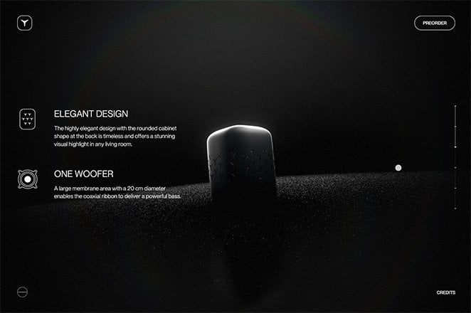
The Ion X1 smart speaker page leans on a refined, minimal design. The value proposition is visible right away, and a scrolling feature keeps the key information above the fold.
Why it works:
- Value proposition at the top of the page
- Scrolling transitions move between information while keeping it above the fold
- Straight-to-the-point copy
- Clear CTA button
One thing to try: lead with the value proposition before anything else. Ion X1 tells you why to care in the first screen.
7. Bearaby

Bearaby sells weighted blankets and leans on benefit-first product cards. Each card pairs a clean product photo with two or three plain-language benefits and a direct buy link.
Why it works:
- Product cards lead with the benefit, not the spec sheet
- Concrete promises like “deeper, calmer sleep” in plain words
- A “4,500+ 5-Star Reviews” line backs the claims with proof
- The layout is built for phones first, so it reads well on a small screen
What to lift: write product cards around the benefit, then add the proof. “Deeper sleep” sells harder than a list of materials.
8. Liquid Death

Liquid Death sells canned water, one of the most generic products there is, and wins on pure personality. Heavy-metal branding and a dark sense of humor make the page impossible to confuse with anyone else.
Why it works:
- A strong brand voice turns a commodity into something memorable
- Bold, consistent visual identity across every section
- Campaigns and contests give fans a reason to stay on the page
- Mobile-first layout art directed for small screens
Take this away: let your brand voice carry the page. Personality is a differentiator a generic template cannot fake.
9. ButcherBox

ButcherBox delivers meat by subscription and makes its offer impossible to miss. Instead of a vague discount, the hero promises a specific free product, and a sticky top banner repeats it as you scroll.
Why it works:
- The incentive is a concrete product, not an abstract percentage off
- A sticky banner keeps the offer visible the whole way down
- High-quality food photography makes the product the hero
- One “Get started” CTA points at a single next step
The lesson: make your offer a specific thing the shopper can picture, then keep it on screen. A “free ribeyes for a year” deal beats a vague percentage off.
10. Jolie

Jolie builds its whole page around personalization. The hero opens with “Beauty starts with clean water,” then a “Check My Water” tool asks for your ZIP code and returns a local water report before it pitches the product.
Why it works:
- The page reacts to the visitor’s own location
- A free, useful result earns the visitor’s attention first
- The product arrives as the answer to a problem the visitor just saw
- Clear, single CTA after the personalized moment
What to copy: personalize the page to the visitor’s situation, not just the product. A page that reacts to who is reading it feels built for them.
11. Tower 28

Tower 28 solves the hardest part of buying makeup online: picking the right shade. Its Find Your Match page offers a 3-minute shade quiz, a selfie “Shade Concierge” service, and Instagram DM matching.
Why it works:
- Three routes to the same guided recommendation
- Replaces a static product shot with an interactive path
- Removes the main reason people hesitate to buy
- Each route ends in a confident purchase decision
Steal the idea: replace a static product shot with a path that helps the visitor self-select the right variant. Guided matching turns “maybe later” into “this one.”
What Makes an eCommerce Landing Page Convert?
Across these 11 pages, the same handful of moves keep showing up. These are the principles worth applying to your own page.
- An ad-aligned headline: the headline should echo the ad or email that sent the visitor, so the page confirms they are in the right place.
- One single CTA: give the page one job and repeat the same action, rather than competing with menus and extra offers. These landing page best practices go deeper on focus.
- Social proof placed early: reviews, badges, or a founder statement above the fold answer “can I trust this?” before the visitor scrolls.
- Fast, mobile-first speed: a slow page loses sales on mobile, so trim heavy assets and test on a phone. If conversions stall, this guide on why a landing page isn’t converting can help.
- Benefit-first imagery: show the product in use and the result the buyer wants, not just a catalog shot on a white background.
Ready to act on this?
Build a landing page that hits these marks
SeedProd gives you the single-CTA layouts, social proof blocks, and add-to-cart buttons these examples rely on. No code, no theme wrestling.
I want to build my pageHow to Create an eCommerce Landing Page
You can build a landing page like the examples above without touching code. WordPress owners have plenty of landing page plugins to choose from, and I build mine with SeedProd.

SeedProd is a drag-and-drop website builder for WordPress. It lets you create, customize, and launch high-converting landing pages without code.
Here is what the build looks like in practice.
- Start from a template: pick a professionally designed landing page template so you are not staring at a blank page.
- Customize it visually: drag sections around, swap images, and edit copy live with the builder. What you see is what publishes.
- Add the conversion blocks: drop in a CTA button, reviews and testimonials, a countdown timer, and add-to-cart buttons where they fit the page.
You can also use SeedProd to build:
- Custom WordPress themes
- Coming soon and maintenance pages
- WooCommerce stores
- Login pages
- Custom 404 pages
For the full walkthrough, follow this guide on how to create a landing page in WordPress.
eCommerce Landing Page FAQs
How many landing pages should my online store have?
There is no fixed number. Build one focused landing page for each campaign, audience, or offer you run, rather than sending all your traffic to the same page.
A store running three ad campaigns often needs three landing pages, each matched to its own ad. More pages let you match intent more closely, which usually lifts conversions.
Can I use the same eCommerce landing page for Facebook and Google ads?
You can, but you usually shouldn’t. Facebook and Google traffic arrive with different intent, so a page that matches one tends to feel off for the other.
A better approach is to clone the page and tweak the headline and imagery to match each ad’s message. The closer the match, the higher the conversion rate.
What is a good conversion rate for an eCommerce landing page?
The median landing page converts at about 6.6 percent across industries, according to the Unbounce Conversion Benchmark Report. Top pages clear 10 percent.
Treat those as a guide, not a rule. Your own baseline matters more, so measure your current rate and aim to beat it with each new version.
Do landing page templates hurt my SEO?
No. A template is just a starting layout, and search engines rank your content and page experience, not whether you started from a blank page.
Most eCommerce landing pages are built for ad and email traffic anyway, so they are optimized for conversion rather than organic search.
Start Building Your eCommerce Landing Page
Pick the one example above that fits your product best, then model your page on it. Keep the headline aligned to your ad, lead with social proof, give the page one CTA, and show the product in use.
If you want a head start, SeedProd has the templates and conversion blocks to put one of these layouts live today. You can also read up on the difference between a landing page and a splash page before you start.
Thanks for reading! We’d love to hear your thoughts, so please feel free to join the conversation on YouTube, X and Facebook for more helpful advice and content to grow your business.


