

TL;DR: The best landing pages don’t win on design. They win by removing every reason to leave before the visitor reaches the CTA.
- Friction reduction: The fewer fields, steps, and clicks between a visitor and conversion, the higher the signup rate.
- Single CTA: One page, one action. Every extra option splits attention and reduces conversions across the board.
- Benefit-led headline: Your headline must answer “what’s in it for me?” in three seconds. If it describes your product instead of the outcome, rewrite it.
- Social proof at hesitation points: Testimonials, logos, and subscriber counts don’t just build trust; they answer objections at the exact moment visitors form them.
- Trust signals: “Cancel anytime,” money-back guarantees, and security badges remove the last friction before someone clicks.
- Conversion principle per type: Each landing page type uses a different primary lever. Signup pages reduce friction. Lead gen pages trade value. Sales pages handle objections. Free trial pages reverse risk.
You’ve built the page. Set up the ad. Sent the email. And your conversion rate is sitting at 1%. Something isn’t working, but looking at your own page, you can’t see what.
In my 15+ years working with WordPress and studying what makes pages work, I’ve noticed the same conversion patterns show up again and again in the ones that get results.
Most articles on this topic list brand pages without explaining the conversion principle behind each choice. This guide does the analysis work they skip.
I’ve collected 40 of the best landing page examples from Netflix, Shopify, HubSpot, Duolingo, Kajabi, and more. Each one is organized by type so you can jump straight to what’s relevant, and each includes the specific CRO principle it demonstrates so you can apply it to your own pages.
How I Selected These Examples
I selected each example because it demonstrates a specific, repeatable conversion principle, not just because the brand is recognizable. Here’s what I looked for:
- Conversion principle demonstrated: Every entry shows a clear CRO tactic you can extract and apply to your own page.
- Pattern repeatability: The technique works because of a principle, not because Netflix or Shopify has brand equity. Small sites can use the same approach.
- Goal diversity: The examples cover all six landing page types: signup, lead generation, sales, free trial, webinar, and promotional.
- Screenshot availability: Only examples with visible, analyzable pages are included, not just brand names.
What Is a Landing Page?
A landing page is a standalone web page designed for a single conversion goal, like a signup, purchase, download, or demo request, with no navigation menu to distract from that one action.
Unlike your homepage, which serves multiple purposes (browse, learn, contact), a landing page has one job. You send targeted traffic to it from a specific source, and the page is built to convert that traffic.
The distinction matters because pages without navigation menus convert at significantly higher rates than pages that keep them. When you remove the exit, visitors stay focused on the one action that matters.
What Is a Good Landing Page Conversion Rate?
The median landing page conversion rate is around 3-5%, according to research from Unbounce’s Conversion Benchmark Report. Top-performing pages in competitive niches can reach 10-15% or higher, depending on the traffic source and offer type.
The implication: if your page converts below 3%, the examples in this guide are where to look first. The gap between average and top-performing isn’t luck. It’s the specific principles each page uses.
What Makes a High-Converting Landing Page
Every high-converting landing page has the same core elements, no matter the industry or goal. The brands in this guide all use some version of this checklist.
- A clear, benefit-focused headline — Your headline needs to answer “what’s in it for me?” within 3 seconds. If it describes your product instead of the visitor’s outcome, rewrite it.
- A single call to action (CTA) — One page, one goal. Multiple CTAs compete with each other and reduce conversion across the board.
- A value proposition above the fold — Visitors should understand what you’re offering before they scroll. If they have to hunt for it, most won’t.
- Social proof — Testimonials, reviews, logos, and stats all tell the visitor “this worked for someone like you.” One relevant testimonial outperforms a paragraph of claims.
- A short, focused form — Every extra field reduces completion rates. Ask only for what you need to take the next step.
- An image or video that supports the message — Visuals should reinforce your copy, not decorate it. Show the product in use, the result, or the emotion you want the visitor to feel.
- Trust signals — Guarantees, security badges, “cancel anytime” copy, and money-back promises remove the last bit of hesitation before someone converts.
One element that’s often missing: no navigation menu. Pages that remove the main nav can see conversion rates increase by up to 100% compared to pages that keep it.
When you give visitors an exit, they take it. Keep them focused on the one action that matters.
For a deeper breakdown of what each element does and how to structure them, see our guide to the anatomy of a landing page.
Looking good is not the same as converting well. What separates the examples in this guide from the rest isn’t design. It’s the specific principle each one uses.
A page with a 12% conversion rate and a page with a 1% conversion rate can look nearly identical — the difference is in the friction, the trust signals, and the moment objections are addressed.
Types of Landing Pages (With Examples for Each)
There are 6 main types of landing pages, each built for a different conversion objective.
| Type | Goal | Best For |
|---|---|---|
| Lead capture page | Collect contact details in exchange for something valuable | Ebooks, guides, free tools, checklists |
| Click-through page | Warm up visitors before sending them to checkout or signup | Paid ads, cold email campaigns |
| Sales page | Sell a product or service directly | Courses, SaaS, physical products |
| Free trial page | Reduce the risk of commitment with a no-cost entry point | SaaS products, subscription services |
| Webinar/event registration page | Drive signups for a live or recorded event | Webinars, workshops, virtual summits |
| Squeeze page | Stripped-down page focused on a single email opt-in | Email list building, lead magnets |
Use this list to jump to the examples most relevant to your goal:
- Signup Landing Page Examples
- Lead Generation Landing Page Examples
- Sales Landing Page Examples
- Free Trial Landing Page Examples
- Webinar and Event Registration Landing Page Examples
- WordPress Landing Page Examples (Built with SeedProd)
- Promotional Landing Page Examples
- What to Do After Studying These Examples
- More Landing Page Examples by Industry
- Common Landing Page Mistakes That Kill Conversions
- Frequently Asked Questions About Landing Pages
Landing Page Examples at a Glance
| Landing Page Type | Best Example | Core CRO Principle |
|---|---|---|
| Signup | Netflix | Friction reduction: single email field, no commitment signals |
| Lead Generation | Taboola / Zoom | Value exchange: free resource trades contact details |
| Sales | OptinMonster | Objection handling: social proof and demos at every scroll point |
| Free Trial | Shopify | Risk reversal: specific trial length removes “what will this cost me?” |
| Webinar / Event | SEMrush | Anticipation building: speaker details and agenda visible above the fold |
| Promotional | Smash Balloon | Genuine urgency: real deadline with multiple reinforcing mechanisms |
Signup Landing Page Examples
The best signup landing pages minimize friction and lead with the benefit, not the product. The fewer steps between a visitor and the “submit” button, the higher your signup rate. These examples show how top companies have stripped the process down to what works.
CRO Principle: Friction Reduction
1. Netflix — Single-Field Signup
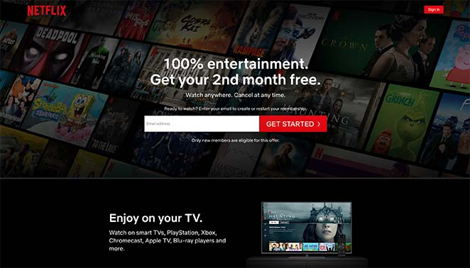
Netflix’s signup page is the gold standard for signup page design done right. It uses a single email field above the fold and removes every possible barrier between the visitor and the conversion.
- Headline — Benefit-driven and immediate. You know what you’re getting before you read anything else.
- Single form field — One email address. Netflix asks for less upfront and collects the rest during the signup flow.
- Trust copy — “Cancel anytime” appears before the CTA. It doesn’t address the objection after the fact; it removes it before the visitor even forms it.
- Second form at the bottom — For visitors who scroll past the hero, a second signup prompt catches them before they leave.
- FAQ section — The FAQ below the fold handles the most common objections in plain language.
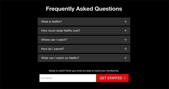
Key Takeaway: Netflix proves you can ask for less upfront and follow up for the rest later. The “Cancel anytime” line isn’t just reassurance — it removes the most common objection before the visitor even forms it.
What to A/B test:
- Headline copy: benefit-led (“Watch anywhere, cancel anytime”) vs. urgency-led (“Start watching tonight”)
- Trust copy position: “Cancel anytime” before the CTA vs. after it
- CTA button text: “Get Started” vs. “Start Watching”
2. Airbnb — Benefit-Led Host Signup
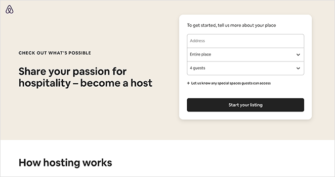
Airbnb’s host signup page demonstrates how to make a longer form feel shorter by structuring what you ask for and when. The page has a lot of information on it, but it never feels overwhelming.
- Signup form — 3 visible fields, with optional fields hidden under a tab. Visitors see a short form, not a long one.
- Resources section — Addresses common concerns about hosting without requiring the visitor to navigate away.
- Community proof — Shows how other people use the service, which helps hesitant visitors see themselves as potential hosts.
- Support visibility — Easy access to support information removes the “what if something goes wrong?” fear.
- Multiple CTAs — CTA buttons appear throughout, so there’s always a nearby action at every scroll point.
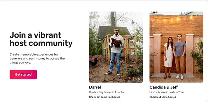
Key Takeaway: Hiding optional fields under a tab keeps the form looking short while still collecting what you need. Perceived effort matters as much as actual effort.
What to A/B test:
- Form field count: 3 visible fields vs. showing all optional fields upfront
- Headline framing: income-led (“Earn extra income”) vs. community-led (“Join 4 million hosts”)
- Social proof format: community photos vs. individual host income estimates
3. Slack — Feature Showcase Signup
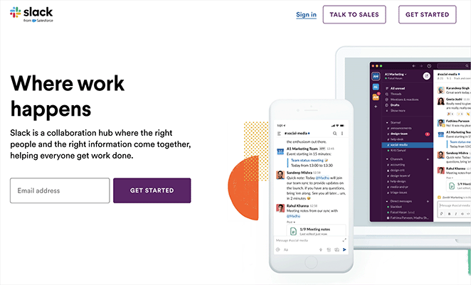
Slack’s signup page works because it shows the product before asking for the commitment. When your product is complex, showing it in action reduces the uncertainty that kills conversions.
- Engaging visuals — Detailed product screenshots let visitors see exactly what they’re signing up for.
- Testimonials — Real customer quotes add social proof at the moment of decision.
- Single CTA — One prominent signup button, no competing actions.
- Clear copy — Explains what Slack does and who it’s for without technical jargon.
- Linear layout — The page guides the visitor’s eye naturally from top to CTA.
Key Takeaway: When your product has a learning curve, show it in action before asking for the signup. Slack’s screenshots answer “will this work for me?” before the visitor has to ask.
4. Lyft — Minimalist Driver Application
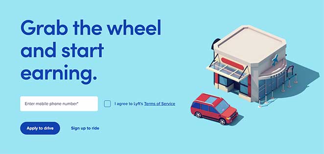
This application landing page from Lyft proves that targeted pages don’t need much. One field, one goal, one audience.
- Minimalist design — No distractions. The eye goes directly to the form.
- Single form field — Phone number only. The lower the ask, the higher the completion rate.
- Emotional image — The visual creates an immediate response that reinforces the decision to apply.
- CTA hierarchy — The primary action is prominent; the secondary action is present but less visible.
Key Takeaway: Lyft’s page works because it targets one audience (drivers) and asks for one thing. If you’re running a targeted ad campaign, your landing page should feel like it was built for that exact person, not a general audience.
5. Trello — Simple Project Management Signup
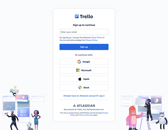
Trello’s signup page highlights the product’s simplicity and backs it up with imagery that shows the interface. For users who are on the fence, the guided tour option removes the commitment from the decision.
- Strong imagery — Product screenshots show exactly how the interface looks and works.
- Clear value proposition — The benefit statement is visible before any scrolling.
- Simple signup form — Easy to complete, low friction.
- Social proof — Testimonials from real users speak to the experience of using the tool.
- Guided tour option — Visitors who aren’t ready to commit can explore without signing up.
Key Takeaway: Offering a guided tour alongside the main signup reduces fear of commitment for hesitant visitors. Not everyone converts on the first visit — giving them a lower-stakes option keeps them engaged.
6. Calendly — Homepage as Landing Page
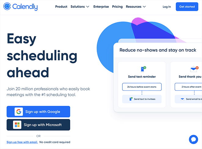
Calendly’s homepage is focused enough to function as a landing page. The scheduling benefit is front and center, the CTA is prominent, and there’s nothing on the page that competes with the primary action.
- Multi-purpose design — Works as both homepage and landing page because the goal is clear from the top.
- Scheduling benefits front and center — The headline communicates the core value proposition immediately.
- Customer testimonials — Social proof appears near the CTA, at the right moment in the decision process.
- Simple navigation — The layout guides visitors toward signup without distraction.
Key Takeaway: Not every landing page needs to be a separate page. If your homepage is focused enough and leads with a single goal, it can do both jobs. Calendly proves that clarity beats complexity.
7. MailerLite — Email Marketing Signup
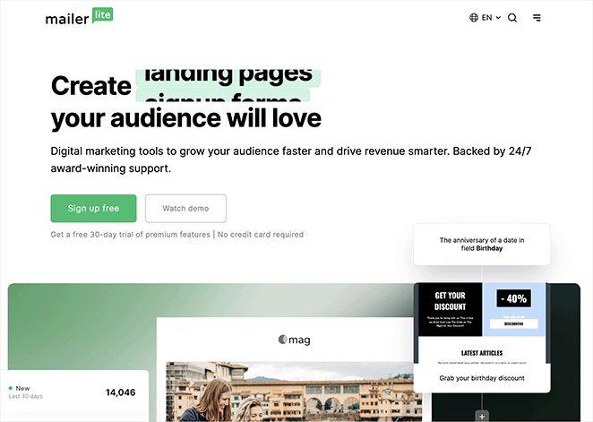
MailerLite’s page pairs feature highlights with customer reviews, answering “what does it do?” and “does it work?” in one pass. For email marketing tools, ease of use is the top objection — the page addresses it directly.
- Ease-of-use emphasis — The headline and copy focus on simplicity, which is the main concern for potential customers comparing tools.
- Clear CTAs — Prominent signups and free trial prompts throughout.
- Feature highlights — Key capabilities are outlined without overwhelming the visitor.
- Customer reviews — Real reviews provide social proof at multiple points on the page.
Key Takeaway: Pairing feature highlights with real reviews answers “what does it do” and “does it work” in one section. MailerLite’s page handles both questions without making visitors work to find either answer.
8. Duolingo — Gamified Language Selection

Duolingo’s registration page skips the traditional signup form entirely. Instead of asking for your name and email first, it asks you to pick a language. The very first interaction is a choice that reflects your goal, not a form that feels like paperwork.
- Goal-first onboarding — The page opens with “I want to learn…” and a grid of languages, putting the visitor’s goal ahead of the signup mechanics.
- Social proof built into the choice — Each language card shows learner counts (Spanish: 48.8M learners, French: 27.2M). The proof is embedded in the decision itself, not added below it.
- No nav, no distractions — Just the logo and a language selector. There’s nowhere to go except forward.
- Action precedes commitment — Visitors begin choosing before they’ve technically signed up. That first click is the real conversion — the account creation follows naturally.
Key Takeaway: Duolingo starts the user’s journey before asking for an account. Getting visitors to take their first goal-oriented action — even a single click — dramatically increases the chances they’ll complete the signup.
9. Spotify — Social Login as the Primary CTA

Spotify’s signup page is one of the cleanest examples of friction reduction in action. Social login is the primary choice, not an afterthought. The email signup option is present but visually secondary, which channels the majority of signups through the path that requires the least effort.
- Social login as the headline CTA — Google and Apple login appear at the top, before any form fields. Most users will take the path of least resistance.
- Hierarchy matters — The order and visual weight of options shapes behavior. By leading with one-click options, Spotify increases total signup rate.
- No marketing copy needed — No headline, no feature bullets. The page assumes visitors already know what Spotify is and just need an easy way in.
- Minimal form fallback — For users who prefer email, the form is there — but it doesn’t compete with the primary path.
Key Takeaway: When visitors already want what you offer, the landing page’s only job is to remove friction. Spotify’s page does that by making the easiest sign-in path the most prominent one.
10. Notion — Minimal Signup With Multiple Auth Paths

Notion’s signup page is stripped to the absolute minimum. Logo, tagline, five auth options, one email field, one button. No imagery, no testimonials, no feature copy. For a product that already has strong brand recognition, the page’s job is to get out of the way.
- Five authentication options — Google, Apple, Microsoft, Passkey, and SSO cover virtually every business user’s preferred login method. No one is left looking for their option.
- Work email framing — The field placeholder reads “name@company.com” and below it says “Use an organization email to easily collaborate with teammates.” This primes the visitor for a collaborative, professional use case immediately.
- Zero distraction — No navigation, no social proof, no hero image. The page trusts its brand equity and removes every barrier between intent and action.
- Single screen — Everything fits above the fold. No scrolling required.
Key Takeaway: When brand recognition is high, a signup page should minimize noise rather than add more persuasion. Notion’s page works because it respects the fact that visitors already decided — they just need a frictionless path to act.
11. Mailchimp — Free Plan Signup

Mailchimp’s free account signup page anchors everything around a single word: free. The “Free. Forever.” message appears early, and the page is structured to remove every question a cautious visitor might have about cost before they reach the form.
- “Free forever” commitment — Not “free trial,” not “free tier” — “Free. Forever.” The permanence of the free plan is the main selling point, and the page makes sure visitors believe it.
- Plan comparison below the form — After the free signup prompt, a plan comparison table shows what you get at each level without pressuring an upgrade before the visitor is ready.
- No credit card language — The page explicitly confirms no payment details are required for the free plan, removing the most common barrier to free tool signups.
- Single-step form — Email address, username, password. Everything needed to create the account without asking for more than necessary upfront.
Key Takeaway: When your free plan is genuinely valuable, commit to it in the headline. “Free forever” converts better than “free trial” because it removes the fear that costs will show up later.
Lead Generation Landing Page Examples
Lead generation landing pages trade something valuable — a guide, report, or tool — for contact details. The best lead gen pages offer something genuinely useful upfront and ask for the minimum information needed to deliver it.
CRO Principle: Value Exchange
12. Zoom — Gated Report Download
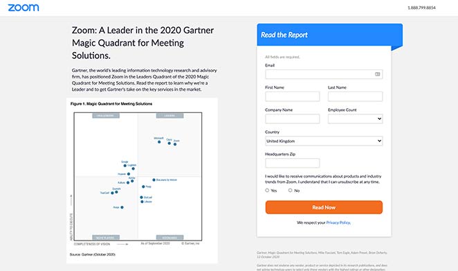
Zoom’s lead generation page uses a free industry report to position the brand as a thought leader. The page doesn’t promote Zoom’s features — it offers insight, and the implied message is that Zoom knows more about this space than anyone else.
- Free download offer — Removing the cost barrier makes the report more accessible and increases download rates.
- Short form — Only the information Zoom needs to follow up. More fields would increase form abandonment.
- Persuasive copy — Frames the report as essential reading, not a marketing piece, which builds curiosity.
- High-contrast CTA — The button color stands out against the page background, making it impossible to miss.
Key Takeaway: Gated content works best when the content itself signals your expertise, not just promotes your product. Zoom’s report makes the company look like an authority before the visitor has even opened the file.
13. Constant Contact — Industry-Specific Lead Gen
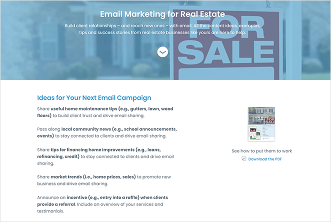
Constant Contact serves many industries, but this real estate landing page targets one audience specifically. The effect is that the offer feels built for that visitor, not generic.
- Audience targeting — Every element addresses real estate professionals, not a general marketing audience.
- PDF preview image — Showing the guide cover makes the offer feel more real and tangible.
- Double CTA — A free guide download and a free trial CTA, both low commitment.
- Testimonial — A client testimonial from a real estate user shows the product works in this specific context.
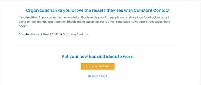
Key Takeaway: Narrowing to one audience makes the offer feel more relevant. A real estate agent seeing a page built for real estate agents is more likely to convert than someone who sees a generic marketing page.
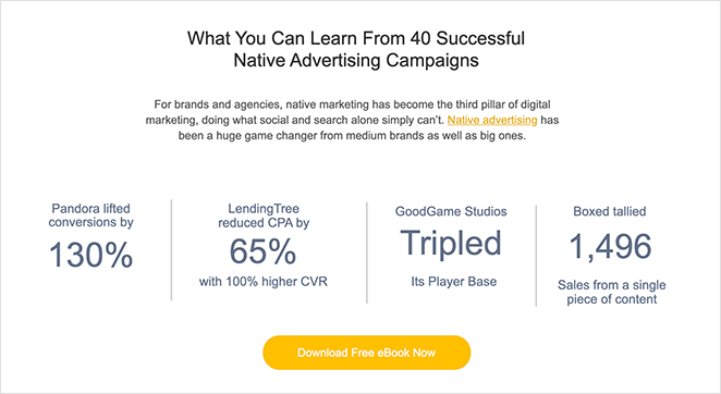
14. Taboola — Ebook Download
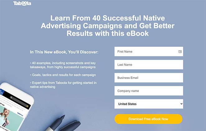
Taboola’s ebook landing page shows how to generate leads with a free resource. The headline uses a number, the layout is scannable, and the proof points are specific — all of which increase credibility.
- Numbers in the headline — “40 case studies” converts better than “many case studies” because it’s specific and concrete.
- Bullet list — Key points are easy to skim, reducing the reading work for the visitor.
- Short form — Only necessary fields, which keeps the barrier to download low.
- Statistics as proof — Data points about conversion results give the ebook credibility before the visitor downloads it.
- CTAs at top, middle, and bottom — Wherever the visitor is in the page, there’s always a nearby call to action.
For more examples in this category, see our ebook landing page examples.
Key Takeaway: Numbers in headlines make offers feel more concrete and credible. “40 case studies” signals volume and specificity — both of which increase confidence in the value of the download.
15. Dropbox — App Download via SMS
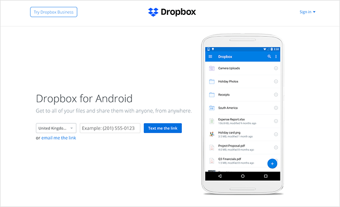
Dropbox’s app landing page removes the step most people skip: navigating the app store. Enter your phone number and the download link arrives by text. The process from “I want this” to “I have this” is as short as it gets.
- Ultra-minimal copy — No unnecessary information. The headline and description include only what the visitor needs to act.
- App preview image — Shows how the app looks on a device before the download, which reduces uncertainty.
- SMS delivery — One phone number field. No app store search, no navigation required. The download comes to the visitor.
Key Takeaway: The fewer steps between interest and product, the better. Dropbox removes the “find it in the app store” step entirely, which is a genuine friction point most mobile landing pages ignore.
16. Intercom — Interactive Product Demo Page

Intercom’s demo page takes an unusual approach: instead of a form, it shows you a live interactive demo of the product immediately. You experience Intercom before you talk to sales. The call to action isn’t “request a demo” — it’s “try the demo.”
- Product-first conversion — Visitors interact with a real Intercom chat widget, positioned inside a blurred customer site. The product sells itself before any sales team gets involved.
- Two-path CTA — “Start a trial instead” and “Try demo” are both available at the top. Visitors who are ready for a trial can go direct; curious visitors can explore first.
- Show, don’t sell — No feature list, no pricing talk, no testimonials above the fold. The experience is the proof.
- No friction to try — Nothing to fill out to access the demo. Lower the barrier to experiencing the product and more visitors will stay to explore.
Key Takeaway: For software products, letting visitors experience the product before asking for a commitment can outperform a traditional form-gated demo. Intercom’s demo page removes the friction of “request a call” entirely.
17. FreshBooks — Audience-Specific Accounting Page

FreshBooks’ small business accounting landing page leads with a third-party rating (4.5 stars based on 4,496 GetApp reviews) before any features are mentioned. The page speaks directly to small business owners with anxiety about accounting, addressing their real emotional objection: “Is this complicated?”
- Third-party validation first — The star rating from GetApp appears directly under the headline. It’s not self-reported; it’s independently verified.
- Risk-removing copy — “No credit card required. Cancel anytime.” appears immediately next to the trial CTA, handling the two most common objections in a single line.
- Limited-time offer banner — A “60% off for 3 months” promotion creates urgency at the top of the page without disrupting the main message.
- Product in context — The hero image shows a real invoice being paid, grounding an abstract service in a concrete outcome.
Key Takeaway: Third-party ratings convert better than first-party claims because they’re credible in a way that self-promotion isn’t. FreshBooks leads with an independent review score, which does more trust-building work than any feature description could.
18. Kit (ConvertKit) — Creator-First Email Platform

Kit’s homepage is built around a tight positioning statement: email marketing for online creators. It’s not for everyone, and it doesn’t pretend to be. By narrowing to one audience, the page feels personally relevant in a way that broader competitors can’t achieve.
- Category-defining positioning — “The email marketing platform built for creators” is a claim that excludes most of the market by design. That specificity makes the remaining audience feel understood.
- Creator testimonials — Social proof comes from recognizable names in the creator economy, not generic “satisfied customer” quotes. Visitors can see people like themselves using the product.
- Free plan lead-in — Up to 10,000 subscribers free. The page leads with the free plan, reducing the commitment of signing up to zero cost.
- Feature proof tied to creator use cases — Every feature is described in terms of what a creator does, not what the software does. The copy is audience-specific throughout, not just in the headline.
Key Takeaway: Narrowing your target audience in the headline reduces your total addressable market on paper — but increases conversion for the audience you actually want. Kit’s creator-specific positioning converts better for creators than a generic “email marketing” message would.
Sales Landing Page Examples
Sales pages carry more weight than signup pages because you’re asking for money, not just an email. These landing page examples show how to build trust and reduce risk at every stage of the page, answering objections before the visitor raises them.
CRO Principle: Objection Handling
19. OptinMonster — SaaS Sales Page
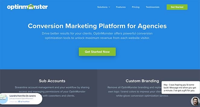
OptinMonster’s sales page is a case study in comprehensive conversion optimization. Every objection a potential buyer might have is addressed somewhere on the page, and social proof appears at every stage of the scroll.
- Section-based layout — Different page sections make it easy to find the information you’re looking for. The header’s value proposition captures attention first.
- Feature benefits — Features are presented in terms of what they do for the user, not what they are.
- Testimonial slider — Real customer testimonials rotate through, providing continuous social proof.
- Animated product demos — GIFs show exactly what the software does, without requiring the visitor to click away to a demo page.
- Live social proof — Real-time notifications and a customer count show popularity without any claims the visitor has to take on faith.
- Multiple CTAs — CTA buttons appear throughout the page at natural decision points.
- Live chat — Visitors can get questions answered immediately without leaving the page.
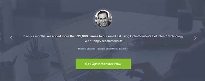
Key Takeaway: On a long sales page, social proof needs to appear at multiple points, not just at the top. OptinMonster places it at every stage where a visitor might hesitate, which means objections get addressed before they fully form.
20. HubSpot CRM — Free Product Sales Page
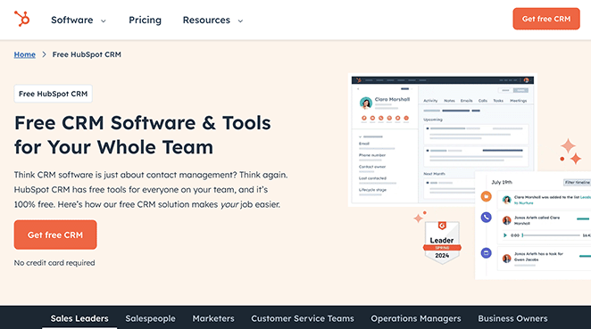
HubSpot’s CRM page removes the biggest sales objection before the visitor gets to it: the cost. When “free forever” is the first thing you see, the rest of the page is about confirming the decision, not making it.
- Straightforward copy — Clear and concise explanation of benefits and features, without hype.
- Free sign-up prominence — The free entry point is front and center. This removes the financial risk barrier at the very top of the page.
- User testimonials — Real customer feedback builds trust after the initial hook.
- Feature highlights — Key CRM capabilities are presented with enough detail to confirm the product does what the visitor needs.
Key Takeaway: When your entry point is free, say so prominently and repeatedly. It removes the biggest barrier for cautious buyers, and the rest of the page becomes about confirming value rather than overcoming cost resistance.
What to A/B test:
- Free plan framing: “Free forever” vs. “Get started free, no credit card”
- Social proof format: testimonial quotes vs. customer logos vs. user count
- Feature highlight order: email tools first vs. contact management first
21. Square — Retail POS Sales Page
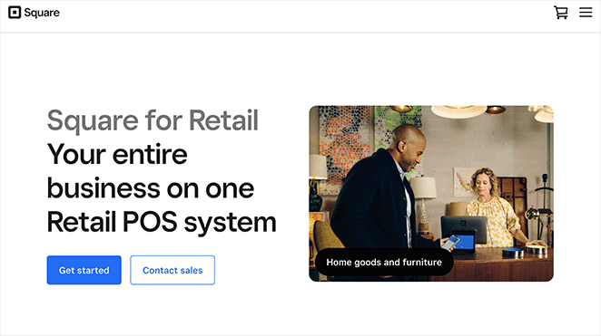
Square’s retail point-of-sale landing page makes the product feel real. For hardware and physical tools, showing the product in its actual environment converts better than specs ever will.
- High-quality hardware imagery — Product photos show the POS system in a real retail setting, not a studio shot.
- Feature highlights — Benefits and capabilities are laid out clearly, in plain language.
- Brand logos — Recognizable brands using Square add instant credibility.
- Multiple demo CTAs — Visitors who want to see more before committing can request a demo at several points on the page.
Key Takeaway: For physical products or hardware, showing the product in its real environment converts better than specifications alone. Square’s product photography answers “will this fit into my store?” visually, which copy can’t do.
22. Dadz — Audience-Matched Sales Page
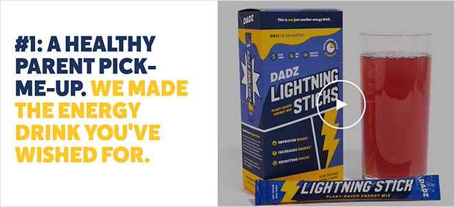
I found this page after clicking on a Google ad targeting family men. That detail matters: this landing page mirrors the audience of that ad exactly. The imagery, the copy, the case studies — all of it speaks to the same person the ad was targeting.
- Audience match — Everything on the page reflects the target persona. Visitors who clicked the ad feel like the page was built for them.
- Case studies — Social proof in the form of story-based outcomes, not just quotes.
- Video — An engaging video shows the product experience and creates an emotional connection before the ask.
- Instagram gallery — A thriving social media community signals that real people use and love the product.
- Multiple CTAs — Buying opportunities appear throughout the page, not just at the end.
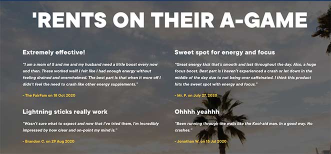
Key Takeaway: When a visitor arrives from a targeted ad, your landing page should feel like it was built for them specifically. Dadz achieves this by mirroring the language, imagery, and concerns of the exact audience the ad targeted.
23. Evernote — Pricing Comparison Page
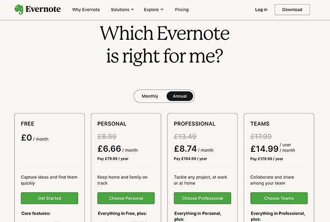
Evernote’s pricing page reduces decision fatigue by organizing the choice instead of leaving it to the visitor. A clear comparison table, visual hierarchy, and one CTA per plan do the decision-making work so the visitor doesn’t have to.
- Clear comparison table — Plans are laid out side by side, making the differences easy to identify at a glance.
- Visual hierarchy — Color and layout guide the eye toward the recommended plan without being heavy-handed.
- Trust logos — Recognizable brands using the product add credibility at the moment of decision.
- CTA per plan — Each plan has its own clear call to action, removing the need to search for where to click.
- Detailed information — Comprehensive feature lists let visitors confirm the right plan without leaving the page.
Key Takeaway: A comparison table reduces decision fatigue by organizing the choice rather than leaving it to the visitor. When people can see the options clearly, they’re more likely to pick one and act on it.
24. Kajabi — Aspirational Creator Positioning

Kajabi’s homepage reads like a landing page because it functions like one. The minimal navigation, single CTA, and identity-level headline all serve one goal: get creative professionals to start a free trial.
- Identity-based headline — “Turn what you know into what you’re known for” speaks to how the visitor wants to see themselves, not the features they’ll get. This kind of aspirational framing creates stronger emotional alignment than feature copy.
- Creator photo grid — A full-width mosaic of real, diverse Kajabi creators serves as social proof without a single written testimonial. The diversity of the group signals that this works for all kinds of people.
- Minimal nav — Just Product, Updates, Pricing — nothing that competes with the trial CTA.
- Single CTA throughout — “Start Free Trial” appears in the header and the hero. There’s only one action on this page.
Key Takeaway: An identity-based headline — one that speaks to who visitors want to become, not what the product does — can outperform feature-focused copy for aspirational audiences. Kajabi’s page sells the outcome, not the tool.
25. Basecamp — Flat-Pricing Contrarian Page

Basecamp’s pricing page leads with a contrarian value proposition in an industry that almost universally charges per seat. The flat-rate pricing model is the headline, and the page is built entirely to explain and justify that choice.
- Live social proof counter — “2,587 sign ups last week” appears in the hero, updated in real time. This is active proof of momentum, not a static testimonial.
- Extended trial lead — The Pro Unlimited plan leads with a 60-day free trial, twice the industry standard. It signals confidence in the product.
- Stress-reduction copy — “Don’t stress — you can always switch packages later.” This addresses one of the biggest hesitations on any pricing page: “what if I pick wrong?”
- Three-tier layout — Plans are displayed side by side, making differences obvious at a glance and reducing the research burden on the visitor.
Key Takeaway: When your pricing model is genuinely different from competitors, make it the headline. Basecamp’s flat-rate story is the most compelling thing on the page, and the live signup counter proves it’s working.
What to A/B test:
- Headline angle: flat-pricing story vs. “stop paying per seat” framing
- Live signup counter: real-time count shown vs. static social proof
- Trial offer: 30-day vs. 60-day free trial as the primary CTA
Free Trial Landing Page Examples
Free trial pages have one job: make starting feel safe. The best ones remove every signal that says “this will cost you” and lead with the benefit of trying. These examples show how to eliminate financial risk and make the first step as small as possible.
CRO Principle: Risk Reversal
26. Shopify — 14-Day Free Trial
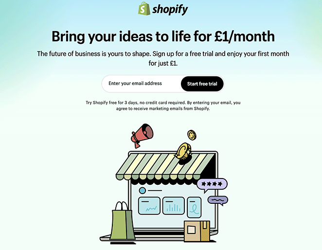
Shopify’s free trial page is one of the cleanest examples of a strong call to action done right. Among eCommerce landing page examples, this one stands out for doing a lot with very little.
- Headline with trial length — “14 days free” is specific. “Try for free” is vague. The specific promise sets a clear, low-commitment expectation.
- Minimalist layout — No clutter. Every element on the page exists to support the primary action.
- Brand logos as trust signals — Recognized brands using Shopify confirm it’s a legitimate, reliable choice.
- Short form — Only the essential information needed to start the trial.
Key Takeaway: Stating the trial length explicitly (“14 days free”) outperforms vague “try for free” copy. A specific commitment period sets a clear, low-pressure expectation and makes the decision feel smaller.
What to A/B test:
- Trial length phrasing: “14 days free” vs. “Start free, no credit card required”
- Trust signal type: recognizable brand logos vs. “1 million+ businesses use Shopify”
- CTA copy: “Start free trial” vs. “Try Shopify free”
27. Codecademy — Free Membership Trial
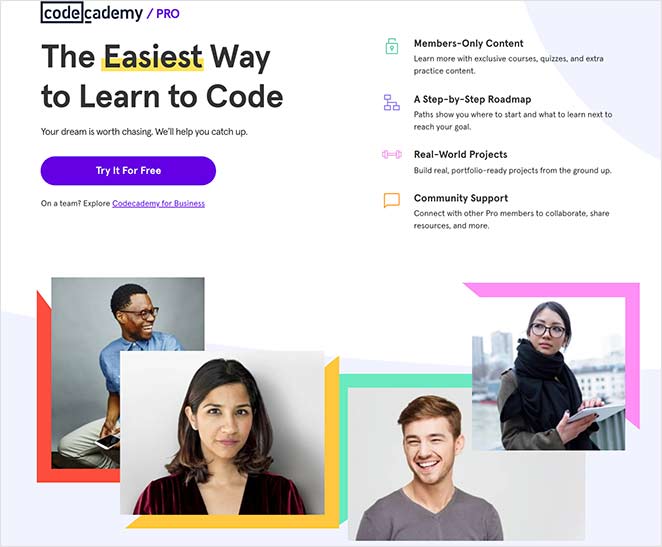
Codecademy’s landing page shows how white space and strategic color use can do as much work as copy. The membership page keeps things simple but uses bold color accents to direct attention where it matters most.
- Strategic color use — Bold color accents on CTAs draw the eye and make actions impossible to miss.
- Positive imagery — Happy professionals create an emotional association between using the product and achieving career success.
- Real testimonials — Customer reviews confirm the product delivers what the page promises.
- Clear pricing comparison — Visitors can identify the right plan at a glance, reducing decision friction.
- Contrasting CTA section — The final call to action uses a different background color, making it stand out from the rest of the page.

Key Takeaway: White space isn’t wasted space — it directs attention to what matters and prevents visual overwhelm. Codecademy’s minimalist design keeps the eye moving toward the CTA, not away from it.
28. Asana — Audience-Specific Free Trial
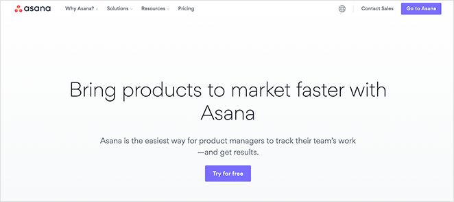
Asana’s page targeting product managers is one of the better examples of role-based messaging. The same product, when framed for a specific audience, converts better than a general page even when the features are identical.
- Role-based headlines — The page speaks directly to product managers, describing benefits in terms of their specific challenges.
- Multiple use cases — Shows how the product applies to this role’s actual work, not abstract scenarios.
- Video case study — A real brand explains how they use Asana for product management. This is more persuasive than copy alone.
- Free trial CTA — The final ask is a free trial, not a purchase. Lower commitment, higher conversion.
Key Takeaway: A landing page targeting “product managers” converts better for that audience than a general page, even if the product is identical. Specificity makes visitors feel seen, and that feeling drives action.
29. Grammarly — Freemium Upgrade Page

Grammarly’s Pro upgrade page is aimed at existing free users, which changes what the page needs to do. It doesn’t need to explain the product. It needs to justify the upgrade.
- Benefit-focused upgrade headline — “Upgrade your plan, up-level your work” frames the decision as a career move, not a product purchase. The framing reduces cost sensitivity.
- Feature tabs for comparison — Tabbed sections (Generative AI, Rewrites, Strategic coaching, Tone adjustment) let visitors explore specific capabilities without being overwhelmed by a feature list.
- Single above-fold CTA — One “Get Grammarly Pro” button in the hero. No competing options confuse the decision.
- Product screenshot in context — The hero shows the writing interface with Grammarly suggestions visible, reinforcing the value at the moment of the ask.
Key Takeaway: Upgrade pages for freemium products have a different job than acquisition pages — they’re converting users who already trust the product. Frame the upgrade as a career or productivity benefit, not a feature unlock.
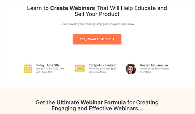
Webinar and Event Registration Landing Page Examples
Webinar pages have to sell the event, not just capture a registration. These examples show how to communicate value and build enough interest to get the yes. The key is answering “why should I show up?” before asking for the signup.
CRO Principle: Anticipation Building
30. SEMrush — Webinar Registration
SEMrush hosts regular webinars, and their registration page shows exactly what makes people sign up for one. The topic, the host, and the agenda are all visible above the fold. Visitors don’t have to dig for the “is this worth my time?” answer.
- Hero area with full context — Topic, hosts, and date are immediately visible. No scrolling required to understand what the webinar is about.
- Speaker details — People sign up for specific experts, not abstract events. SEMrush leads with who’s presenting.
- Short registration form — Minimal fields reduce friction at the point of commitment.
- Recommended content — Links to previous and future episodes encourage continued engagement beyond the single registration.
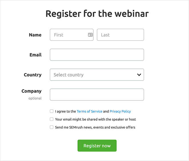
Key Takeaway: Showing who will present and what they’ll cover converts better than a generic “register now” page. People sign up for specific value, not events in general. Make the specific value obvious from the first scroll.
31. Wistia — Webinar Signup
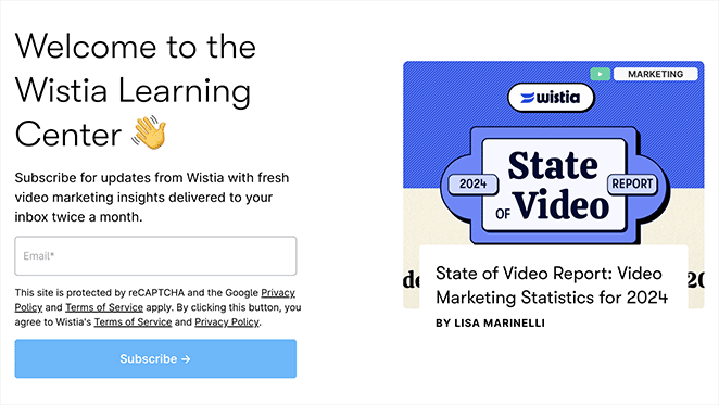
Wistia hosts webinars about video marketing — and their webinar registration landing page uses video elements throughout. The brand alignment isn’t accidental. A video company using video to promote a video-focused event builds trust through consistency.
- Video elements throughout — Promotes a video platform by using video, which reinforces the brand’s expertise.
- Bullet-point key takeaways — Visitors can quickly scan what they’ll learn before deciding to register.
- Simple registration form — Easy to find, easy to fill. No unnecessary friction.
- Compelling copy — Benefit-focused language makes the value of attending clear.
Key Takeaway: Your landing page design should reflect your product. A video hosting company using video on their webinar page builds trust through consistency — the page itself is a demonstration of what you’re teaching.
32. Dreamforce — Virtual Event Registration
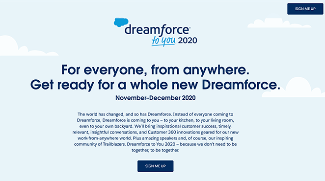
Dreamforce moved their annual conference online and needed a page that made the virtual event feel as worthwhile as the in-person version. The landing page uses full-width visuals, multiple information blocks, and several ways to stay connected after registering.
- Full-width animated hero — Sets the energy and scale of the event immediately.
- Four key information blocks — Each block answers a different “why attend?” question.
- Contrasting CTA buttons — Multiple visible signup points throughout the page.
- Email and calendar reminders — Visitors can choose to receive an email notification or add the event to their calendar. Both options dramatically reduce no-show rates.
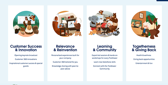
Key Takeaway: For large events, give visitors multiple ways to stay connected after registering. The email reminder and “add to calendar” options make it significantly easier for people to show up, not just sign up.
33. Digital Marketer — Online Course Enrollment
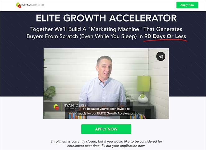
Digital Marketer’s Elite Growth Accelerator page leads with a founder video. For complex offers — coaching programs, courses, community memberships — video condenses hours of explanation into a few minutes and builds personal connection in a way copy can’t.
- Founder video at the top — Immediately establishes who’s behind the offer and builds personal trust.
- Step-by-step explanation — Walks visitors through how the program works, removing uncertainty about what they’re buying.
- Benefit-focused copy — The page explains what the training isn’t, which removes fears alongside what it is.
- Bonuses — Additional perks make the offer feel more valuable relative to the price.
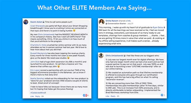
- Social proof screenshots — Testimonials from existing members add authenticity, not just polish.
- Discounted price — A crossed-out price reaffirms the deal is worth acting on now.
Key Takeaway: Video works especially well when the offer is complex. It condenses explanation into a few minutes and builds personal connection with the presenter — both of which are hard to achieve through copy alone.
34. LinkedIn — Identity-Driven Join Page

LinkedIn’s join page doesn’t sell a platform — it sells professional identity. The copy is built around who you’ll become and who you’ll connect with, not what features you’ll get.
- Professional identity framing — The headline positions joining as a career move, not signing up for a social network. Visitors are motivated by outcome, not features.
- Context-driven urgency — LinkedIn surfaces connections, companies, and jobs that are “near you” or “in your industry,” creating personalized relevance without being intrusive.
- Minimal form friction — First name, last name, email, and password. LinkedIn has the brand trust to keep the initial ask short and collect more later.
- Social proof through scale — “Join over 1 billion professionals” signals both legitimacy and network effect. The size of the community is itself the value proposition.
Key Takeaway: When your product’s primary value is the community, leading with scale (“join a billion professionals”) does the work that features can’t. The network effect is the headline, and it’s more persuasive than any feature description.
WordPress Landing Page Examples (Built with SeedProd)
I use SeedProd to build landing pages on WordPress, and I’ve seen how much a focused layout and the right template can change conversion rates. These templates work particularly well for small businesses and solopreneurs who need professional, conversion-focused pages without a separate landing page platform fee.
What makes WordPress landing pages different from the SaaS examples above isn’t the design, it’s the control. You own the page, the data, and the hosting. You’re not locked into a separate platform fee for every landing page you build.
35. Lead Generation Page
A lead generation page built in SeedProd can match the structure of the Zoom or Constant Contact examples above. The key conversion elements — a benefit-driven headline, a short form, a preview of the lead magnet — are all available as drag-and-drop blocks.
- Email opt-in form block — Connects directly to your email marketing provider. No third-party form plugin required.
- Lead magnet preview section — Show a cover image of the guide or report to make the offer feel tangible.
- Social proof block — Add a testimonial or subscriber count to build immediate credibility.
- No navigation menu — SeedProd landing pages don’t include the site header by default, keeping visitors focused on the one action.
Key Takeaway: The structural advantages of a dedicated lead gen page (no nav, single CTA, focused copy) are available in WordPress without leaving your existing site. SeedProd’s templates start with these best practices built in.
36. Sales/Product Page
For selling a product or service directly from WordPress, SeedProd’s sales page templates include the key conversion sections: hero with CTA, feature benefits, testimonials, and pricing. I’ve recommended these templates to clients because they start from a proven structure, not a blank canvas.
- Multi-section layout — Hero, features, social proof, pricing, and final CTA — all in one drag-and-drop template.
- WooCommerce integration — Connect your product page directly to your store checkout.
- Testimonial blocks — Add quotes, star ratings, and customer photos without custom code.
- Countdown timer block — For promotional sales, add a real deadline to create genuine urgency.
Key Takeaway: Starting from a template based on proven sales page structure is faster and more effective than designing from scratch. The conversion principles from OptinMonster, HubSpot, and Square above are baked into SeedProd’s sales templates.
37. Coming Soon Page
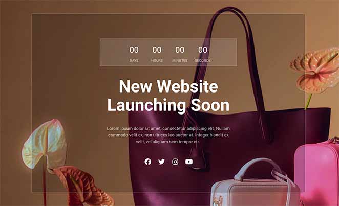
A coming soon page is often a business’s first landing page, and it’s frequently underused. Instead of just saying “coming soon,” the best coming soon pages start building your email list before you launch.
- Email capture form — Collect subscribers during the pre-launch period, so you have an audience ready on day one.
- Launch countdown timer — Creates anticipation and gives visitors a reason to come back.
- Social proof — Even early testimonials or press mentions build credibility before launch.
- Brand-consistent design — SeedProd’s coming soon templates let you control the first impression before your full site is ready.
Key Takeaway: Your coming soon page is a lead generation opportunity, not a placeholder. Start collecting emails and building anticipation before you launch — the list you build now is the audience you launch to later.
There is one use case the SaaS examples above don’t cover: the page you run before you’re ready to launch. SeedProd’s coming soon mode lets you publish a conversion-ready page while your full site is still in development. I’ve used it to build an email list before a product is live, which means launch day starts with an audience instead of silence.
38. Webinar Registration Page
SeedProd’s webinar landing page templates are built around the same principles the SEMrush and Wistia examples above demonstrate: topic, host, agenda, and a short form. For WordPress users hosting webinars directly through Zoom or any other platform, SeedProd lets you build the registration page on your own domain.
- Host introduction section — Add speaker bio, photo, and credentials to build personal trust.
- Agenda/key takeaways block — Let visitors know exactly what they’ll learn before registering.
- Registration form integration — Connects to your webinar platform or email provider directly.
- Countdown timer — Builds anticipation and creates a real deadline for registration.
If any of these examples match what you’re trying to build, SeedProd has templates for all of them. You can see the full library at SeedProd Templates, and our guide on how to create a simple landing page walks through the setup step by step.
Key Takeaway: Owning your webinar registration page means you control the visitor experience from click to conversion, without platform restrictions. SeedProd makes it possible to build this page in WordPress in under an hour.
Promotional Landing Page Examples
Promotional pages convert on urgency, but the urgency needs to feel real, not manufactured. Fake countdown timers and artificial scarcity have trained visitors to ignore urgency cues — the examples that still work are the ones where the deadline is genuine.
CRO Principle: Urgency and FOMO
39. Smash Balloon — Black Friday Page
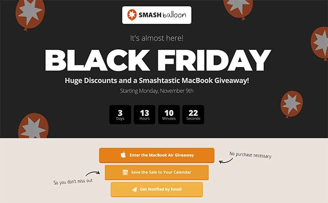
This Black Friday landing page from Smash Balloon creates urgency through multiple reinforcing mechanisms, not just a countdown timer. The timer announces the deadline; the other elements make sure visitors remember it.
- Countdown timer — A real countdown timer creates urgency when the deadline is genuine. Smash Balloon’s timer counts down to an actual event, which makes it credible.
- Giveaway entry — Adding a contest increases awareness of the promotion. More entries means more people talking about the deal.
- Email reminder option — Visitors can opt in to receive a notification when the deal goes live. This brings people back who aren’t ready to act yet.
- Calendar reminder option — Adding the promotion to a calendar creates a personal commitment to return.
- Branded design — Consistent branding reassures visitors they’re in the right place and dealing with a legitimate business.
Key Takeaway: A countdown timer only creates urgency if the deadline is real. Smash Balloon reinforces genuine urgency with reminders that bring people back when the deal goes live, which is more effective than relying on the timer alone.
40. RafflePress — Viral Giveaway Landing Page
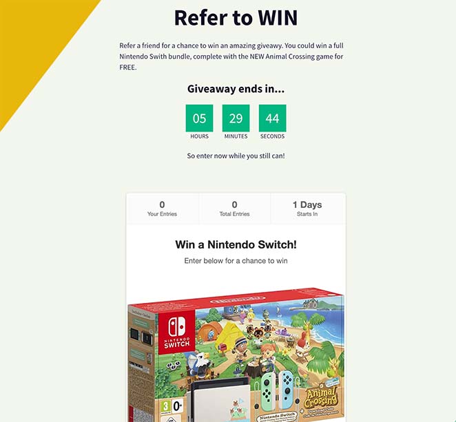
A giveaway landing page is one of the highest-converting page types available because the incentive is clear and the entry barrier is low. RafflePress builds pages specifically designed to go viral — each entry action is also a sharing trigger that brings in new visitors organically.
- High-visibility prize display — The prize is the headline. Visitors decide in seconds whether it’s worth entering, so the offer needs to be front and center.
- Social sharing built into the entry mechanic — Actions like “Share on Facebook” or “Tag a friend” are worth additional entries. Every entry becomes a distribution event.
- Entry deadline with countdown — A clear end date creates genuine urgency without manufactured scarcity. The contest ends when it ends.
- Email capture at signup — Every entrant becomes a lead. The giveaway incentive makes visitors willing to share their email address without friction.
- Bonus entry actions — Follow on social, subscribe to the newsletter, visit a page — each action grows the audience while giving entrants more chances to win.
Key Takeaway: Giveaway pages convert on incentive, not persuasion — the prize does the selling. The smart addition is making each entry action a distribution mechanism, so the page grows its own audience throughout the contest period.
What to Do After Studying These Examples
Studying examples is only useful if you act on them. Here’s the sequence that moves you from inspiration to a live, converting page:
- Identify your goal: Signup, lead capture, sales, free trial, webinar, or promotional. Your goal determines which CRO principle matters most.
- Pick the relevant type: Jump to the examples section that matches your goal and study the 2-3 entries closest to your situation.
- Choose a template that starts from a proven structure: Don’t build from a blank canvas. Every template in SeedProd’s library is based on one of the page types above.
- Apply the three core principles: Single CTA. Benefit-led headline. Trust signal before the form.
- Test one element at a time: Change the headline first. Measure. Then the CTA. Then the form fields. Testing multiple things at once makes it impossible to know what moved the number.
More Landing Page Examples by Industry
If you need landing page examples for a specific niche, here’s where to look. Each of these guides covers the design patterns and conversion techniques that work for that audience.
- Blog Landing Page Examples + How to Make One — Landing page examples for content creators, newsletters, and blog lead magnets.
- Real Estate Landing Page Examples — How real estate agents and agencies use landing pages to capture buyer and seller leads.
- Top eCommerce Landing Page Examples to Drive Sales — Product-specific landing pages and seasonal promotion pages for online stores.
- Social Media Landing Page Examples to Grow Your Company — Landing pages designed to convert social traffic, including bio link pages.
- Request a Demo Landing Page Examples Proven to Boost Leads — B2B demo request pages and how to reduce friction in the sales qualification process.
- Startup Landing Page Examples and How to Make One — Validation pages, waitlist pages, and early-stage launch pages for new products.
- Ebook Landing Page Examples — Lead magnet pages for downloadable guides, reports, and PDFs.
Common Landing Page Mistakes That Kill Conversions
Most landing pages that don’t convert fail for the same reasons. After reviewing hundreds of pages over 15 years, I’ve seen these five mistakes show up more than any others — and all of them are fixable.
- Too many goals. One page, one action. Multiple CTAs compete with each other and reduce conversion for all of them. If you want visitors to both sign up and read a blog post, choose one and build a second page for the other.
- Keeping the navigation menu. Leaving your main nav on a landing page gives visitors an easy exit. Remove it. Pages without navigation menus consistently outperform pages that keep them.
- Vague headline. “Welcome to our platform” tells the visitor nothing. Your headline should state what you offer, who it’s for, and what outcome they’ll get. If your headline could apply to any company in your industry, rewrite it.
- Too many form fields. Every extra field reduces completion rate. Ask only for what you genuinely need to take the next step.
- No social proof. Visitors need to see that others have taken this step and it worked out. One relevant testimonial outperforms a paragraph of claims every time.
“The average number of form fields on a landing page is 5, and many experts recommend using just 3 or 4. But in my experience, it isn’t always the best approach. Filling out a short form can result in more conversions, but you may get better quality leads by using a longer and more detailed form.”— John Turner, Co-Founder SeedProd, in an interview with WPBeginner.
The form field rule has nuance worth noting. The right number of fields depends on the quality of lead you need, not just the conversion rate you want. For more on this, see our call to action best practices and signup page design guide.
Frequently Asked Questions About Landing Pages
What is a good landing page conversion rate?
The median landing page conversion rate is around 3-5%, based on Unbounce’s Conversion Benchmark Report. Top-performing pages in high-intent niches can reach 10-15% or higher. If your page converts below 3%, the most common culprits are form friction (too many fields), a weak or vague headline, and missing trust signals near the CTA.
What should you A/B test on a landing page?
Start with the headline — it has the biggest impact on whether a visitor stays or leaves. From there, test CTA button copy (“Get started free” vs. “Start my trial”), form field count, and the position of your trust signals (testimonial above vs. below the CTA). Test one element at a time so you know what moved the number.
How many landing page examples should you study before building your own?
Study 3-5 examples in your specific category (signup, sales, free trial, etc.) rather than reading through every example in this guide. Look for the conversion principle each page uses, not just the visual design. Once you can name the principle, you can apply it. Studying more examples without extracting principles is just procrastination.
What is the difference between a squeeze page and a landing page?
A squeeze page is a specific type of landing page with one purpose: capturing an email address. It’s stripped down to a headline, a brief value statement, and an email opt-in form, with nothing else on the page. All squeeze pages are landing pages, but not all landing pages are squeeze pages. Most landing pages include more content, such as product features, testimonials, and pricing.
Do landing pages need to be on your main domain?
No. Landing pages can live on a subdomain (landing.yoursite.com), a subdirectory (yoursite.com/offer), or a completely separate domain. What matters for performance is page speed, message match between your ad and the landing page, and the absence of navigation menus — not the URL structure. For WordPress users, building landing pages within your existing domain using SeedProd gives you full control without a separate platform or additional hosting costs.
Is a landing page the same as a homepage?
No. A homepage serves multiple goals: introduce the brand, showcase products, provide navigation to other pages, and give visitors a general starting point. A landing page has exactly one goal. It removes navigation, reduces choices, and focuses everything on a single action. Sending paid traffic to a homepage instead of a dedicated landing page is one of the most common conversion mistakes — the homepage gives visitors too many places to go.
Ready to Build Your Own Landing Page?
You’ve now seen how real companies use landing pages to convert visitors into leads and customers. The principles are consistent across all of them: one goal, clear copy, minimal friction, and social proof at every hesitation point.
The next step is building your own.
Our guide on how to create a simple landing page walks through the setup without requiring any design or code skills.
SeedProd gives you drag-and-drop templates based on the same conversion principles you’ve seen in this guide, so you can get a high-converting page live in WordPress without starting from scratch.
Get Started with SeedProd Today
For more inspiration, check out these 404 landing page examples and our guide to A/B testing landing pages with Google’s optimization tools.
Thanks for reading! We’d love to hear your thoughts, so please feel free to join the conversation on YouTube, X and Facebook for more helpful advice and content to grow your business.


