Want to know what the anatomy of a landing page is? The best landing page layout includes a group of core building blocks. And it’s those essential landing page elements that make it easier to reach your conversion goals.
In this article, we’ll show the anatomy of a landing page, so you can create a landing page layout that boosts conversion rates.
What Is a Basic Landing Page?
A basic landing page is a standalone page on your website that helps you increase conversions. Unlike generic pages with lots of information, like your website homepage, landing pages help you reach a specific marketing goal.
For instance, you can create a landing page to:
- Sell a specific product or service
- Get people to download a free ebook
- Promote an upcoming event
- Collect email addresses to grow your list
- Accept registrations for your webinar
In addition, great landing pages work by moving visitors towards that goal with persuasive landing page copy and other convincing elements.
But why should you use a landing page instead of a typical page on your website?
Why Should You Use a Landing Page?
Imagine you’re searching for more information about a company. Typically, you’d type their name into a search engine and click one of the first results.
In many cases, that first result is the company’s homepage, where you can click around and learn everything you need to know. But the chances are you’re not quite ready to hand over your email address or buy something.
Yet in comparison, landing pages offer precise information. And digital marketers target them to people who already know what they’re looking for.
So when you type into Google “WordPress contact forms,” the page you click is more likely to be a landing page about contact forms for WordPress. And instead of getting lots of information, you learn exactly what you need to move you closer to buying.
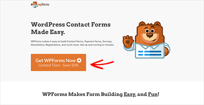
In the end, high-converting landing pages help people find what they’re looking for and help businesses reach their target audience with an offer tailored to their needs.
Related: How to Create a Landing Page without a Website
9 Essential Landing Page Elements
By now, you know what a landing page is and why you need one. But to create an effective landing page, you also need to know what building blocks to use.
So, how about we jump in and dissect the anatomy of a landing page? That way, we can show you what to include in your landing page layout.
1. Landing Page Headline
The first landing page element you should include is a compelling headline. Your landing page headline is the first thing people see, so it should describe what people can get from the page.
Additionally, your message should grab people’s attention right away and be strong enough to keep them around long enough to keep reading. So keep your headline short, and use active words like “get, achieve, accomplish” to help users visualize your offer’s benefits.
Similarly, you can follow your headline up with a supporting sub-heading to convince users to keep reading.
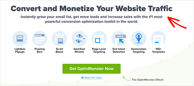
For example, OptinMonster uses the headline, “Convert and Monetize Your Website Traffic,” and follows up with a persuasive subheading that tells people exactly what they can achieve.
2. Unique Selling Proposition
Another crucial element to include in your landing page is your unique selling proposition (USP). Your USP is a statement that tells visitors why you’re different and why they should choose you over your competitors.
And the trick of creating a compelling USP is to get to it quickly before people move. So break it down to the most basic level and describe the benefits people get by choosing your products.
Let’s look at this USP example from RafflePress. As you can see, the USP is in the landing page subheading.

While the heading empowers the visitor, the supporting headline gets straight to the point. The plugin helps you grow your email list, subscribers, and social media followers.
And it’s not just the sub-headline where you can include your USP. Instead, you can use your USP in your:
- Main landing page headline
- Sub-headline
- Closing statement
But it needs to be where people can see it quickly to have the desired effect.
3. Limited Navigation
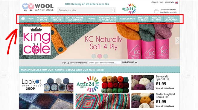
Having an attention-grabbing headline and USP is great, but if people click away from your page, the chance to convert them is gone. That’s why, when analyzing the anatomy of a landing page, you’ll see that many examples limit or completely remove the navigation menu.
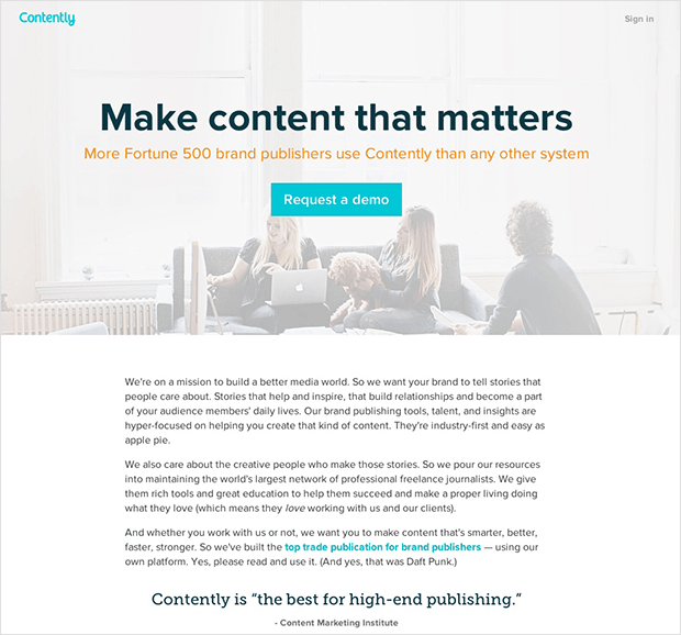
As a result of that, landing page visitors only have a few options:
- Close the browser tab or window
- Keep reading
- Convert
So think about your landing page goal, and remove any unnecessary links where people can quickly exit your page.
4. Eye-Catching Images or Video
Something that almost all landing page layouts have in common is they use hero images or videos to keep users engaged. And the reason for that is that visual content is much easier to remember than text alone.
Let’s look at some numbers to put that into perspective:
- 90% of information transmitted to the brain is visual
- Your brain processes visual information 60,000 times faster than text
- 40% of people respond better to visual information than text
With all that combined, it’s clear to see that using images on your landing page is a sure-fire way to increase engagement. But what type of visual content should you use?
First, stay away from generic stock photos because they look amateur and unprofessional. Instead, you can use high-quality screenshots and photos or animated GIFs of your products or services.
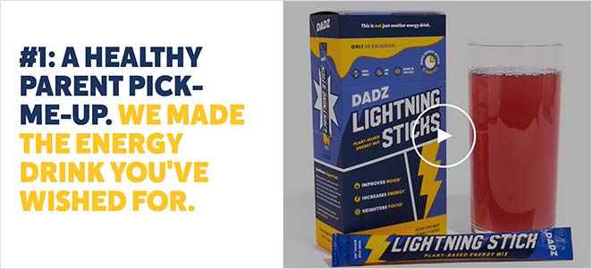
Second, try to use video to break down complicated information. 96% of consumers find videos helpful when making online buying decisions, so including them on your landing page is an excellent way to boost conversions.
And if you’re looking for the best approach, try using a combination of images and videos. Or you can follow this guide to create a video landing page step-by-step.
5. Product or Service Benefits
So far, we’ve looked at the importance of headlines, USPs, and imagery for your landing page layout. And while they’re ideal for grabbing visitors’ attention and motivating them to keep reading, they don’t address some of the questions people may have.
That’s why your page needs a features or benefits section like this:
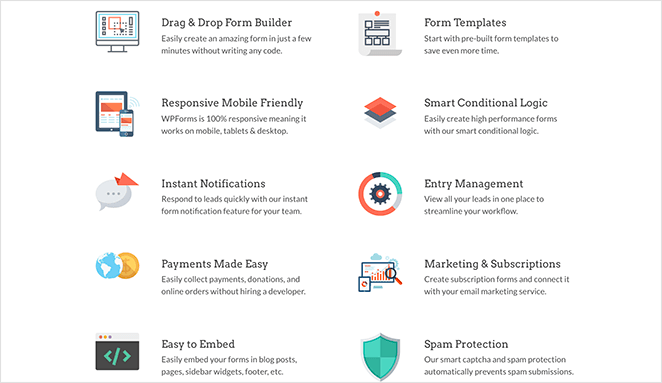
This essential element of your landing page is where you can explain what your products or services do. But when you’re introducing them, it’s best to frame them as benefits, so people know how they’ll directly impact them.
Look at it this way: your features describe what your product does, while your benefits describe the benefits they provide. So put yourself in your customer’s shoes and think, “how will this benefit me?”
Once you have your benefits mapped out, think of a good way to present them. If you go down the long-form route with a wall of text, it’s easy to lose your key message.
Instead, present your benefits in short summaries or bullet points that are easy to skim-read and absorb.
6. Credible Social Proof
If you’ve ever bought anything online, chances are you’ve looked at reviews before checking out. That is social proof, and it’s an excellent way to persuade potential customers to buy.
In essence, social proof is social signals showing that other people have bought, consumed, read, and approved of what you offer. And the idea is, more people will convert if other people have already done so.
So adding social proof to your landing page is one of the best ways to convince potential customers that your product or service is right for them.
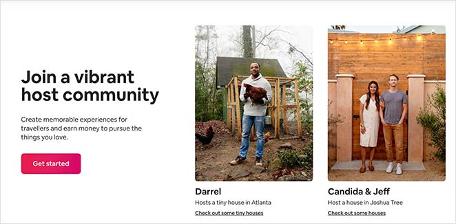
And you can show social proof by adding landing page elements like:
- Customer reviews and star ratings
- Total number of customers
- Trust seals establishing security information
- Expert testimonials
- Awards from credible organizations
7. Closing Argument
When comparing different landing page examples, you’ll notice that almost all include a closing statement. Typically, a closing argument is a few short sentences that, once again, communicate the benefits of your offer.
Many brands combine the closing statement with their call to action (CTA) button. By doing that, it adds weight to your CTA button’s power.

8. Call to Action Button
Now we’re at one of the most essential landing page elements: your call to action button. And it’s so important because it helps make your landing page goal a reality.
Typically, marketers display calls to action as standalone buttons. When users click the button, they head to a click-through page or a lead generation form.
But many people don’t put a lot of thought into their CTA buttons and use generic text like “Submit” or “Click Here.” The problem with that is it doesn’t really inspire action.
What’s the point of putting so much effort into your landing page layout if your most important element is lackluster?
Instead, a good landing page CTA ties back to your USP and tells people what they’ll get when they click.
Branch furniture has an excellent example of a compelling CTA button:
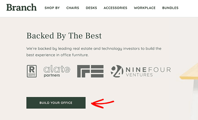
Instead of the generic terms, users can see that they can start building their office by clicking the button, something they ultimately want to achieve.
9. Mobile Responsive Landing Pages
By now, you have a pretty good idea of the anatomy of a landing page, but there’s one more thing to consider. And that’s if your landing page is mobile-friendly.
Most shoppers these days browse for goods and services from handheld devices like smartphones and tablets. So when you put your landing page together, it’s crucial you keep mobile users in mind.
The easiest way to do that in WordPress is to use a landing page builder like SeedProd, with mobile-friendly features built-in. That way, you won’t need to worry about coding a responsive landing page from scratch.
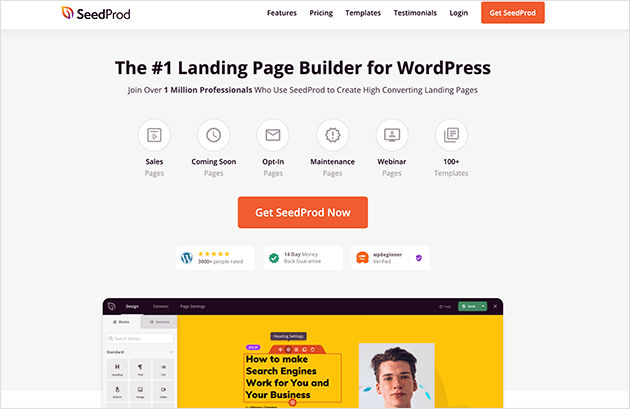
SeedProd is the best WordPress landing page builder with drag-and-drop functionality. It lets you create any landing page in WordPress without writing code or hiring a developer.
Additionally, SeedProd offers hundreds of responsive templates that let you create any landing page layout you like. From there, you can customize it with lead generation elements to increase leads and conversions.
So if you want to make a simple landing page in WordPress with SeedProd, follow this step-by-step guide:
How to Create a Landing Page in WordPress
And there you have it!
We hope our dissection of the anatomy of a landing page helped you find the essential landing page elements to include in your layout.
And after creating your page, follow this guide to run Google Optimize A/B split testing for the best results.
Thanks for reading. Please follow us on Twitter, Facebook, and YouTube for more helpful content to grow your business.

