

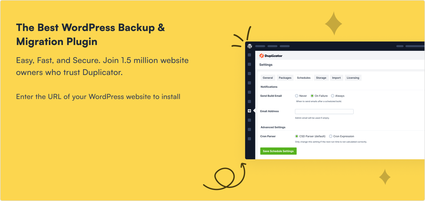
TL;DR: How to Make a Desktop Only Website Mobile-Friendly
Most WordPress sites can be fixed without rebuilding from scratch. Here are the key steps:
- Run a mobile test first: Use Google’s Mobile-Friendly Test or PageSpeed Insights to see exactly what’s broken.
- Switch to a responsive theme: A modern responsive theme fixes most layout issues automatically across all screen sizes.
- Fix navigation and info hierarchy: Simplify your menu to 3-5 key links and surface your most important content above the fold.
- Optimize fonts, images, and forms: Use 14-16px body text, compress images to WebP, and trim forms to the fewest fields possible.
- Use SeedProd for landing pages: SeedProd’s drag-and-drop builder lets you design, preview, and fine-tune mobile layouts without writing code.
- Check speed last: Run PageSpeed Insights and fix Core Web Vitals issues before you publish.
If your WordPress site is still desktop-only, you’re losing visitors. About 60% of all web traffic now comes from mobile devices, according to Statista, and if your site isn’t mobile-friendly, they’ll leave fast.
I learned this the hard way when one of my older sites looked fine on desktop but broke completely on mobile. The text was tiny, the menu didn’t work, and my bounce rate shot up. After fixing it, my traffic and signups improved almost overnight.
In this guide, I’ll show you exactly how to make a desktop-only WordPress website mobile-friendly. These steps work for any WordPress site, even if you’ve never touched code.
- 1. See if Your Site is Already Mobile-Friendly
- 2. Choose a Mobile Responsive WordPress Theme
- 3. Simplify Your Navigation Menu
- 4. Use Large and Readable Font Sizes
- 5. Keep Contact and Optin Forms Short
- 6. Make Your Landing Pages Mobile Responsive
- 7. Change Your CTA Button Size and Placement
- 8. Remove or Simplify Mobile Popups
- 9. Use Mobile-Friendly WordPress Plugins
- 10. Optimize Images for Mobile
- 11. Make Website Speed a Priority
1. See if Your Site is Already Mobile-Friendly
Before you change anything, check if your site is already mobile-friendly. Many newer WordPress themes are responsive by default, so you might be halfway there without realizing it.
The quickest way to check is with Google’s free Mobile-Friendly Test. Paste in your URL, hit enter, and you’ll get results in seconds.
The report shows whether your site passes, a screenshot of how it looks on a phone, and suggested fixes if something isn’t working.

When I ran this on one of my older sites, the results were eye-opening. Fonts were too small, buttons overlapped, and menus didn’t open. That test gave me a clear to-do list.
For a deeper look, you have two more options:
- Google PageSpeed Insights: Has a dedicated mobile tab with real-world performance data, including Core Web Vitals scores.
- Chrome DevTools device emulation: Open DevTools (F12), click the device toggle icon, and simulate any phone screen size directly in your browser. No phone needed.
If your site doesn’t pass, make this your top priority. Even if it does, keep reading. You’ll still find ways to improve the mobile experience further.
One thing worth checking: make sure your theme outputs the viewport meta tag. It looks like this:
<meta name="viewport" content="width=device-width, initial-scale=1.0">.
Without it, mobile browsers render your site at full desktop width and shrink it down, which is why some sites look tiny on phones. Most modern responsive themes include it automatically, but older themes sometimes leave it out. The Mobile-Friendly Test will flag it if it’s missing.
2. Choose a Mobile Responsive WordPress Theme
If your current theme isn’t mobile-friendly, the fastest fix is to switch to a responsive WordPress theme. A responsive theme automatically adjusts to fit any screen size, so visitors don’t have to zoom or scroll sideways.
You can find free options right inside WordPress. Go to Appearance » Themes » Add New and search for “Responsive.” You’ll see a range of mobile-ready themes you can install with one click.

When I first tested this on one of my older sites, swapping to a responsive theme instantly solved half my layout issues. It was the easiest improvement I could have made.
A good responsive theme also handles screen orientation automatically. Whether a visitor holds their phone upright or rotates it sideways, the layout reflows correctly. If you have fixed-width sections or custom CSS, those can still break in landscape mode, so it’s worth checking both orientations when you preview.
If you’d rather build something unique, I recommend SeedProd. It’s a drag-and-drop website builder that lets you design your own responsive WordPress theme without writing code.

You can start with a premade template or build each section step by step. Either way, you’ll see your changes live in the visual editor, and everything you create will be fully mobile responsive.

That means your website will look great and function smoothly on phones, tablets, and desktops without any extra tweaking needed.
3. Simplify Your Navigation Menu
Long, complicated menus don’t work on small screens. Limit your menu to 3-5 key items so visitors can get where they need to go without zooming or scrolling sideways.

When I simplified one of my own menus down to three main links, users spent more time on the site because they could actually find what they needed.
Also think about where your most important content sits. Mobile visitors are usually looking for something specific: a quick answer, contact details, or your top service. If that information is buried, they’ll leave before finding it.
Some easy ways to surface key information:
- Add a small FAQ section with quick answers near the top
- Highlight your top features or services above the fold
- Make your phone number or contact button visible without scrolling
For a step-by-step walkthrough, see this guide on creating a mobile-ready WordPress menu.
4. Use Large and Readable Font Sizes
Tiny text on a phone is almost impossible to read. If visitors have to pinch and zoom just to see your content, they won’t stick around.
A good rule of thumb is to keep your body text at least 14-16px. Headlines and buttons should be even larger so they’re easy to scan and tap.

Stick with clean, standard fonts that load quickly. Fancy custom fonts might look nice on desktop, but on mobile they can slow down your site and make reading harder.
When I increased font sizes on one of my blogs, the difference was instant. Bounce rates dropped, and readers stayed on pages longer because they could actually read comfortably on their phones.
For more details, see our guide on typography in web design.
5. Keep Contact and Optin Forms Short
Long forms are one of the biggest turn-offs on mobile. Typing lots of details on a small screen is frustrating, and most people won’t finish.
Look at your forms and ask if every field is truly needed. For example, if you’re building an email list, you usually only need a name and email address.

If your goal is sales, keep checkout forms as short as possible. Just billing and shipping info. Asking for extra details adds friction and increases cart abandonment.
I once cut a client’s signup form from six fields to two, and conversions nearly doubled. On mobile, shorter always wins.
6. Make Your Landing Pages Mobile Responsive
Landing pages are where most conversions happen, but if they don’t work well on mobile, you’re leaving money on the table. I’ve seen pages that looked perfect on desktop completely fall apart on a phone, with buttons cut off, text overlapping, and forms impossible to fill out.
The easiest fix is to use a drag-and-drop website builder with mobile controls built in. That way, you can design once and know it will look right on every screen.
SeedProd is a drag-and-drop website builder that lets you build fully responsive WordPress pages and themes without writing code. It includes a library of responsive landing page templates you can import with one click. From there, you can customize everything in the visual editor.
The real benefit is launch confidence. You can preview the mobile version live, tweak spacing and button placement for smaller screens, and publish knowing the page converts on both desktop and mobile.

SeedProd lets you toggle between desktop and mobile views instantly. You can adjust spacing, font sizes, and button placement specifically for smaller screens, all from the same page.
7. Change Your CTA Button Size and Placement
Your call-to-action (CTA) buttons are the most important part of your page, but on mobile they often get lost. If visitors can’t see or tap them easily, you’ll miss conversions.

Make your buttons large enough to tap with a thumb and place them where users naturally scroll, usually near the middle or bottom of the screen. Avoid stacking too many CTAs on one page, as that creates confusion.
I once moved a signup button higher on a landing page and doubled conversions on mobile. Sometimes a simple placement change makes the biggest difference.
8. Remove or Simplify Mobile Popups
Popups can work well on desktop, but on mobile they often do more harm than good. Small screens make it hard to close them, and if a user taps the wrong spot, they may be sent to another page by mistake.
The best solution is to keep popups light and unobtrusive. Instead of a full-screen popup, try a floating hello bar or a small slide-in that doesn’t block the whole view.

On one site I worked with, replacing a large entry popup with a small bottom bar reduced complaints and actually improved conversions. Users could keep browsing without feeling interrupted.
If you want more ideas, check out this guide on the best WordPress popup plugins for mobile-friendly options that won’t frustrate your visitors.
9. Use Mobile-Friendly WordPress Plugins
Not every WordPress plugin is built with mobile in mind. Choosing the right ones can make a big difference in how smooth your site feels on a phone.
Look for plugins that are lightweight, responsive, and tested on small screens. Three plugin types have the biggest impact on mobile performance:
- Lightweight form plugins: Heavy form scripts are a common cause of slow mobile load times. A lightweight option like WPForms loads only what it needs, keeping your page fast.
- Caching plugins: A caching plugin like WP Rocket or LiteSpeed Cache stores static versions of your pages so mobile visitors don’t wait for the server to rebuild them on every visit.
- Responsive menu plugins: If your current theme’s menu doesn’t collapse cleanly into a hamburger menu on small screens, a responsive menu plugin fixes that without a full theme switch.
On one of my own sites, switching to a lighter form plugin cut the mobile load time in half. The experience felt smoother, and conversions went up right away.
You can see more recommendations in this full roundup of the best WordPress mobile plugins.
10. Optimize Images for Mobile
Images are the single biggest cause of slow mobile load times, yet most WordPress sites serve full-size desktop images to phone users. That’s a fixable problem.
I’ve seen sites cut their mobile load times significantly just by addressing images, with no theme changes or plugin overhaul required. Here’s what to do:
- Compress before upload: Use a tool like Squoosh or ShortPixel to reduce file size before images hit your media library.
- Switch to WebP: WebP images are typically 25-35% smaller than JPEG at equivalent quality. Most WordPress image optimization plugins can convert your existing library automatically.
- Enable lazy loading: WordPress enables lazy loading by default, which means images below the fold only load as the user scrolls to them. Check that your theme isn’t disabling this.
- Set image dimensions in the block editor: Always define width and height on your images. This prevents Cumulative Layout Shift (CLS), which is both a bad user experience and a Core Web Vitals signal Google uses for rankings.
If you’re using a plugin like ShortPixel or Imagify, compression and WebP conversion happen automatically on upload. You set it up once and stop thinking about it.
11. Make Website Speed a Priority
A slow site is a deal-breaker on mobile. Research from Google shows that 53% of mobile visitors leave if a page takes more than 3 seconds to load. On small screens where people expect instant results, speed matters even more.
The simplest way to keep your site fast is to use a clean design and avoid unnecessary clutter. Every extra script, image, or plugin adds load time.
Some proven ways to boost your site speed include:
- Resize and compress large images (see Step 10)
- Use a content delivery network (CDN)
- Enable lazy loading for images and videos
- Keep WordPress, themes, and plugins updated
- Minify CSS and JavaScript files
- Reduce heavy background processes
When I optimized images and added a CDN on one of my sites, mobile load times dropped by half. The bounce rate fell immediately, and users spent longer on each page.
One thing worth measuring is your Core Web Vitals score. Google uses three signals for ranking mobile pages: Largest Contentful Paint (LCP), Cumulative Layout Shift (CLS), and Interaction to Next Paint (INP). You can check all three in the mobile tab of Google PageSpeed Insights.
For more detailed tips, check out this ultimate guide to WordPress speed and performance.
Frequently Asked Questions About Making a Website Mobile-Friendly
Does making a website mobile-friendly affect SEO?
Yes, significantly. Google uses mobile-first indexing, which means it crawls and ranks your site based on the mobile version, not the desktop version. If your mobile experience is broken or slow, your rankings suffer even if the desktop version is perfect.
Google also uses Core Web Vitals (LCP, CLS, INP) as ranking signals, and these are measured on mobile. A mobile-friendly site is a direct SEO requirement, not just a nice-to-have.
How do I fix a WordPress site that looks broken on mobile?
Start with Google’s Mobile-Friendly Test to identify exactly what’s broken. The most common causes are an outdated non-responsive theme, a missing viewport meta tag, fixed-width layouts, or overlapping elements caused by custom CSS.
Switching to a responsive theme fixes the majority of layout problems immediately. For everything else, the steps in this guide cover each issue in order of impact.
Can I make individual pages mobile-friendly without changing my whole theme?
Yes. A tool like SeedProd lets you rebuild specific pages, including your landing pages, sales pages, or homepage, with a fully responsive drag-and-drop editor, while leaving the rest of your site on its existing theme.
This is useful if your theme is mostly fine but a few key conversion pages are broken on mobile. You get the mobile fix where it matters most without a full site redesign.
What is the viewport meta tag and do I need it?
The viewport meta tag tells browsers how to scale your page on mobile devices. Without it, mobile browsers render your site at desktop width and then shrink it down, making everything look tiny.
The tag looks like this: <meta name="viewport" content="width=device-width, initial-scale=1.0">. Most modern responsive themes include it automatically. If yours doesn’t, Google’s Mobile-Friendly Test will flag it as a problem.
How do I test my WordPress site on mobile without a phone?
Open Chrome and press F12 to open DevTools, then click the device toggle icon (or press Ctrl+Shift+M on Windows, Cmd+Shift+M on Mac). This activates device emulation mode where you can simulate any phone screen size.
For more realistic results, use Google PageSpeed Insights, which simulates mobile loading conditions and shows real performance data, not just how the layout looks.
I hope this post helped you learn how to make a desktop-only website mobile-friendly. You might also like this article on the best SEO plugins for WordPress.
While you’re here, don’t forget to follow us on Facebook, Twitter, and YouTube for more helpful tips and tutorials.