

I’ve worked on a lot of WordPress websites, and one thing I’ve learned is this: if your site isn’t mobile-friendly, you’re losing visitors. Especially now that most traffic comes from phones.
Some WordPress themes handle mobile okay, but often you need more control. That’s where the right plugin can make a huge difference.
In this guide, I’ll show you the best WordPress mobile plugins I’ve tested. Tools that help you improve speed, usability, design, and conversions across all devices.
Quick Comparison: Best WordPress Mobile Plugins
If you’re short on time, here’s a quick side-by-side look at the best plugins I tested:
| # | Plugin | Best For | Free Plan | Starting Price | Mobile Features |
|---|---|---|---|---|---|
| 🥇 | SeedProd | Mobile landing pages & full sites | ✅ | $39.50/year | ⚡ Mobile editing, preview mode, theme builder |
| 🥈 | WPForms | Responsive forms and file uploads | ✅ | $49.50/year | 📱 Mobile-friendly layouts, smart logic |
| 🥉 | WPtouch | Instant mobile site conversion | ✅ | $79/year | 📲 Mobile themes, touch UI, caching |
| 4 | OptinMonster | Mobile lead generation | ✅ | $9/month | 🔔 Device targeting, slide-ins, popups |
| 5 | Smush | Mobile image optimization | ✅ | $60/year | 📷 Lazy loading, smart resize, WebP |
| 6 | AMP | Faster mobile post rendering | ✅ | Free | 🚀 AMP markup, stripped-down mobile speed |
| 7 | Responsive Menu | Mobile navigation menus | ✅ | $29/year | 📂 Touch-optimized, animated slide menus |
| 8 | Jetpack | Performance + responsive tools | ✅ | $4.95/month | 📦 CDN, mobile theme tools, lazy load |
| 9 | Elementor | Mobile site customization | ✅ | $59/year | 📐 Device breakpoints, responsive sections |
| 10 | Simple Mobile URL Redirect | Redirecting mobile visitors | ✅ | Free | 🔁 Redirect mobile traffic to app, landing page, etc. |
What Are WordPress Mobile Plugins?
A WordPress mobile plugin is a WordPress plugin that makes elements of your website display correctly on mobile devices. Some solutions allow you to create an entire mobile website, while others adapt your site features so they’re easier for mobile users to see.
Why Make Your WordPress Site Mobile-Friendly?
Making your WordPress site mobile-friendly has several benefits, including:
- Improved Browsing Experience. Showing a mobile version of your website makes it easier for mobile users to browse your site. Instead of seeing a typical desktop site, mobile users see a design that adapts to suit their screen size.
- Boost Leads and Sales. Since responsive websites are more user-friendly, potential customers will spend more time browsing. Plus, crucial elements like your call to action buttons are easier to see, increasing conversions.
- Better Search Engine Rankings. Search engines like Google now take into account how mobile-friendly your site is when ranking it. Responsive websites have a much better chance of ranking higher than desktop websites.
As you can see, making your WordPress site mobile-friendly is an effective way to serve your audience better, boost Google rankings, and grow your business.
How I Tested the Best WordPress Mobile Plugins
To find the best mobile plugins for WordPress, I ran hands-on tests using a clean WordPress install and a mobile-optimized starter theme.
Here’s what I focused on:
- Mobile layout and responsiveness: I checked how each plugin handled screen resizing, spacing, and layout across different devices.
- Page speed performance: I used GTmetrix and PageSpeed Insights to measure how each plugin affected mobile load times.
- Touch usability: I tested forms, menus, buttons, and popups on real mobile devices to see how smooth and easy they were to use.
- Ease of setup: I gave higher marks to plugins that were quick to configure and didn’t require complex settings or custom code.
- Compatibility: I tested with popular themes and page builders to make sure each plugin worked well across different setups.
These tests helped me figure out which plugins actually improve the mobile experience for your visitors and which ones are more trouble than they’re worth.
Best WordPress Mobile Plugins to Make Your Site Mobile-Friendly
Below, you’ll find a variety of the best mobile plugins for WordPress. They include plugins for creating responsive pages, forms, popups, and even social media feeds. You’ll also find a plugin that turns your desktop website into a mobile responsive design.
- 1. Best for Mobile-Friendly Page Building: SeedProd
- 2. Best for Mobile-Friendly Forms: WPForms
- 3. Best for Mobile Popups and Lead Gen: OptinMonster
- 4. Best for Mobile-Friendly Giveaways: RafflePress
- 5. Best for Mobile-Friendly Social Feeds: Smash Balloon
- 6. Best for Mobile-Friendly Click-to-Call: WP Call Button
- 7. Best for Mobile-Only Themes: WPtouch
- 8. Best for Faster Mobile Load Times: AMP for WP
- 9. Best All-in-One Option for Mobile + Performance: Jetpack
- 10. Best for Custom Mobile Navigation: WP Mobile Menu
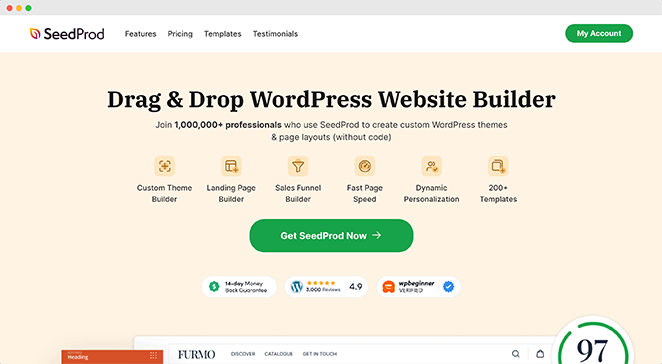
1. Best for Mobile-Friendly Page Building: SeedProd
| Pricing: Starts at $39.50/year |
| Free Plan / Trial: Free version available |
| Standout Features: |
| 🔹 Drag-and-drop page builder 🔹 Mobile editing and preview mode 🔹 Theme builder for full-site control 🔹 WooCommerce integration 🔹 AI website generator |
| Rating: A+ |
| Best For: Building fast, mobile-optimized pages and themes without code |
I’ve used SeedProd to build everything from quick landing pages to full client sites. What makes it stand out is how easy it is to control the mobile design as you go. You can switch to mobile preview right inside the builder and adjust spacing, fonts, and sections without touching code.
When I first tried it, I was just looking for a landing page tool. But after seeing how smooth the mobile preview and layout controls were, I started using it to build entire sites.
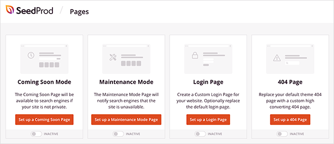
One of my favorite features is the built-in coming soon and maintenance mode. You can publish a mobile-friendly placeholder page in minutes, then replace it with your full theme later.
Once you’re inside the builder, it works just like you’d expect. Drag and drop elements where you want them.
Then toggle mobile view to fine-tune padding and layout.

I also like that it includes pre-made sections. These saved me a lot of time when building mobile layouts. I didn’t have to start from scratch. Just insert and customize.
The editor runs smoothly even on large pages with dozens of elements, which isn’t always the case with other builders.
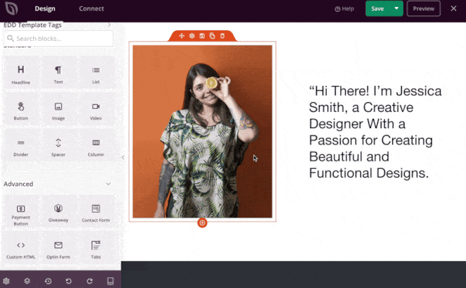
If you’re building an online store, SeedProd also supports custom WooCommerce and Easy Digital Downloads blocks. That means your product pages stay mobile-optimized without installing extra plugins.
And now there’s even a full AI website builder. I tested it on a basic niche site and it spun up a clean mobile theme in under a minute.

⏵ Pros
- Built-in mobile editing and preview mode
- Pre-designed mobile-ready templates and sections
- Clean, lightweight output that loads fast on mobile
- Can be used to build full WordPress themes without code
⏵ Cons
- Some mobile styling options (like breakpoints) require a paid plan
- Advanced ecommerce customization may need WooCommerce add-ons
My Verdict: I use SeedProd for nearly every site I build. It’s fast, intuitive, and makes responsive design effortless, even for beginners.
2. Best for Mobile-Friendly Forms: WPForms

| Pricing: Starts at $49.50/year |
| Free Plan / Trial: Free version available |
| Standout Features: |
| 🔹 Mobile-ready drag-and-drop builder 🔹 Smart conditional logic 🔹 Conversational forms 🔹 Instant form previews on mobile 🔹 1-click form embedding in SeedProd |
| Rating: A+ |
| Best For: Creating forms that work and look great on phones and tablets |
Every time I build a contact or lead form, I reach for WPForms. It’s easy to use and every form you create automatically adapts to mobile screens, with no extra styling required.
One thing I like most is that WPForms makes mobile responsiveness a default. Spacing, input fields, and buttons are touch-friendly right out of the gate, which saves a ton of time when you’re testing across devices.

You can even create conversational forms, which turn a basic form into a step-by-step experience. It works great on mobile where multi-field forms can feel cramped or overwhelming.

I also like how well it works with SeedProd. You can embed WPForms in any page or theme layout using the native block, no shortcode juggling required.
⏵ Pros
- All forms are mobile-responsive by default
- Conversational layout improves mobile user experience
- Seamless integration with SeedProd’s visual builder
- Dozens of pre-built templates for fast setup
⏵ Cons
- Some advanced features (like conditional logic) require higher-tier plans
- Free version is limited compared to paid
My Verdict: WPForms takes the pain out of building forms for mobile. It just works — and looks good doing it.
3. Best for Mobile Popups and Lead Gen: OptinMonster

| Pricing: Starts at $108/year |
| Free Plan / Trial: Free plugin on WordPress.org (requires paid account) |
| Standout Features: |
| 🔹 Mobile-optimized popups 🔹 Slide-ins and floating bars 🔹 Exit-intent for mobile 🔹 Drag-and-drop builder 🔹 Advanced targeting and A/B testing |
| Rating: A |
| Best For: Growing email lists with popups that work on mobile |
OptinMonster is my go-to popup builder when I need to grow a list without annoying mobile visitors. Every campaign you create is responsive by default, and you can customize how popups behave on mobile versus desktop.

What I like most is the mobile-specific targeting. You can show or hide campaigns based on screen size, delay timing, or scroll depth. That way, you’re not slamming users with popups the second they land on a phone.
I tested it recently on a mobile blog layout and used a floating bar instead of a full-screen popup. It looked clean, stayed fixed on scroll, and converted better than the larger version.
You can also A/B test mobile variants and run them with separate rules. That’s helped me dial in offer timing and placement across different devices.
⏵ Pros
- Instant mobile menus with no coding
- Works with any theme and page builder
- Supports logos, social links, and WooCommerce
- Easy to customize for touch navigation
⏵ Cons
- Interface feels a bit dated in places
- Some advanced features require Pro version
My Verdict: If you’re serious about mobile lead generation, OptinMonster gives you more control than any other popup builder I’ve tried.
For more details, see my guide on how to create an exit intent popup in WordPress.
4. Best for Mobile-Friendly Giveaways: RafflePress

| Pricing: Starts at $39.50/year |
| Free Plan / Trial: Yes |
| Standout Features: |
| 🔹 Mobile-responsive giveaway builder 🔹 Drag-and-drop interface 🔹 Viral refer-a-friend sharing 🔹 Social media entry actions 🔹 Email marketing integrations |
| Rating: A |
| Best For: Running viral giveaways that work perfectly on phones |
Giveaways are a proven way to grow your audience, but if your contest doesn’t work on mobile, you’ll lose a big chunk of potential entries. That’s why I always recommend RafflePress — the best WordPress giveaway plugin I’ve tested for mobile responsiveness.
The drag-and-drop interface makes it simple to launch a new giveaway without code, and every element adjusts automatically to look great on phones and tablets.
I’ve used RafflePress on several sites, and the mobile version is always clean, fast, and easy to navigate — whether users are entering from Instagram or checking results from an email link.
⏵ Pros
- Mobile-friendly design that works great on all devices
- Drag-and-drop builder is easy to use for beginners
- Includes social media and refer-a-friend actions to boost shares
- Pre-made templates make setup fast
- Integrates with popular email marketing tools
⏵ Cons
- Advanced features like analytics and entry conditions require a paid plan
- Template designs can feel limited if you need heavy customization
My Verdict: If you want a mobile-optimized contest that gets results, RafflePress is the easiest and most effective tool I’ve used.
5. Best for Mobile-Friendly Social Feeds: Smash Balloon

| Pricing: Free; Pro version starts at $49/year |
| Free Plan / Trial: Yes |
| Standout Features: |
| 🔹 Mobile-responsive social feeds 🔹 Supports Facebook, Instagram, Twitter, and YouTube 🔹 Combine feeds into a social wall 🔹 No coding required 🔹 Multiple feed layouts and filters |
| Rating: A |
| Best For: Displaying social media content that looks great on mobile |
Cross-promoting your social media content on your site is a great way to grow followers and keep your site fresh. But making those feeds responsive on mobile? That can get tricky if you’re not a developer.
Smash Balloon makes it easy to embed mobile-friendly social feeds in WordPress. It supports all the major platforms—Instagram, YouTube, Facebook, and Twitter—and every feed is 100% responsive out of the box.
You can also combine feeds into a single social wall and choose layouts that automatically adjust to phones, tablets, and desktop screens. I found this especially helpful for event pages and homepages where you want dynamic, visual content that still loads fast.
It doesn’t require any coding or API headaches either. Just install the plugin, connect your social account, and customize the look with a few clicks. It works great even if you’re brand new to WordPress.
Want a full walkthrough? Check out our Smash Balloon review.
⏵ Pros
- Feeds look great on mobile without any extra styling
- Works with all major social networks
- No coding required to set up
- Lets you combine feeds into one responsive wall
- Built-in customization options and layouts
⏵ Cons
- Best features (like filtering or hashtag feeds) require a paid license
- More styling control may need some CSS knowledge
My Verdict: Smash Balloon is the easiest way I’ve found to add mobile-friendly social content to a WordPress site. It just works with no code, no layout issues, and no broken feeds on mobile.
6. Best for Mobile-Friendly Click-to-Call: WP Call Button

| Pricing: Free |
| Free Plan / Trial: Yes |
| Standout Features: |
| 🔹 Mobile-only call display option 🔹 Floating call buttons 🔹 Sidebar widget support 🔹 Custom styles and colors 🔹 Google Analytics event tracking |
| Rating: B+ |
| Best For: Local businesses and service providers who rely on phone calls |
One of the easiest ways to lose conversions on mobile is by making it too hard for users to get in touch. If your CTA button is too small or hidden, people may just leave your site without calling.
WP Call Button fixes that by giving you a simple way to add a click-to-call button to WordPress. It’s mobile responsive, customizable, and doesn’t require any coding to set up.
You can choose to display the call button only on mobile devices, add it to your sidebar, or float it at the bottom of the screen for easy access. It even supports event tracking through Google Analytics, so you can see how often people tap to call.
For small business websites and service providers, this plugin can make a real difference in mobile engagement and lead generation.
⏵ Pros
- Mobile-first design with responsive layout
- Option to show or hide the button on specific devices
- Floating and static button styles included
- Fully customizable text, colors, and positioning
- Click tracking with Google Analytics
- Free to use
⏵ Cons
- Only useful for phone-based contact (not live chat or forms)
- Not ideal for businesses that don’t take calls directly
My Verdict: WP Call Button is one of the simplest ways to make it easier for mobile visitors to reach you. If phone calls matter to your business, this plugin is a must-have.
7. Best for Mobile-Only Themes: WPtouch

| Pricing: Free; Pro version starts at $79/year |
| Free Plan / Trial: Yes |
| Standout Features: |
| 🔹 Mobile-specific themes 🔹 Recommended by Google 🔹 WordPress customizer support 🔹 Show/hide mobile layouts by page 🔹 Easy menu and layout control |
| Rating: B |
| Best For: Site owners who want a quick mobile theme without editing their main design |
If you want a fast way to make your WordPress site mobile-friendly, WPtouch is a solid option. It creates a mobile-specific version of your site that loads automatically on phones without changing your actual theme.
This makes it ideal if your main theme isn’t responsive, or if you want a lightweight mobile experience without touching code. I’ve seen it used on blogs and info sites where fast mobile readability is the main priority.
The free version includes basic customization via the WordPress customizer. You can also choose which pages use the mobile version, and easily control menus and layouts.
WPtouch is also recommended by Google, so it helps with mobile SEO and can improve your scores in mobile usability tests.
⏵ Pros
- Mobile version runs independently of your main theme
- Google-friendly and SEO-conscious
- Quick to set up with no developer help needed
- Works well for simple content sites and blogs
⏵ Cons
- Mobile theme is separate from your core design
- More advanced features require WPtouch Pro
- Not ideal for highly customized or interactive layouts
My Verdict: WPtouch is a quick fix if your site isn’t mobile-ready. It’s not a full design solution, but it gives you a clean mobile theme without needing to change your existing setup.
8. Best for Faster Mobile Load Times: AMP for WP

| Pricing: Free |
| Free Plan / Trial: Yes |
| Standout Features: |
| 🔹 Adds Google AMP to WordPress 🔹 Infinite scroll support 🔹 SEO plugin compatibility 🔹 Page builder integration 🔹 GDPR and Analytics support |
| Rating: B |
| Best For: Site owners focused on lightning-fast mobile performance |
If you want to improve page speed and mobile performance, AMP for WP is built to do exactly that. It adds Accelerated Mobile Pages (AMP) to your WordPress site — a stripped-down, fast-loading version of your content for mobile visitors.
This plugin is ideal if speed is your top priority. Pages load almost instantly on mobile, which helps reduce bounce rates and improve your Core Web Vitals score. It also includes support for infinite scroll, Google Analytics, AdSense, and GDPR compliance out of the box.
It works with major page builders, and integrates cleanly with top SEO plugins, making it easier to maintain performance without giving up features.
⏵ Pros
- Instant-loading AMP pages improve mobile speed
- Compatible with major SEO and page builder plugins
- Built-in infinite scroll, analytics, and GDPR support
- Helpful documentation for setup and testing
- Totally free to use
⏵ Cons
- AMP layouts are more limited in design and branding
- Can require extra setup to match your main theme’s look
- Plugin settings can be overwhelming for beginners
My Verdict: AMP for WP is a good choice if speed matters more than design control. It’s not for everyone, but it can seriously improve your mobile load times if used correctly.
9. Best All-in-One Option for Mobile + Performance: Jetpack

| Pricing: Free; paid plans from $9.95/month |
| Free Plan / Trial: Yes |
| Standout Features: |
| 🔹 Optional mobile theme 🔹 Image CDN and lazy loading 🔹 Website backups and stats 🔹 AMP integration 🔹 Works with mobile app |
| Rating: B+ |
| Best For: Users who want mobile optimization bundled with performance and security tools |
Jetpack is more than just a mobile plugin. It’s a full toolkit for improving WordPress speed, security, and content delivery. But it also includes mobile-focused features that can improve your site’s performance on smartphones.
One standout option is the Jetpack mobile theme. When enabled, it shows a simplified mobile view to visitors browsing on smaller screens. You can customize what appears on the homepage, tweak header and color settings, and even allow users to switch between desktop and mobile versions.
Behind the scenes, Jetpack also helps with performance through lazy loading, image CDN, AMP support, and more. It integrates with the WordPress mobile app, so you can manage your site on the go, and even handle backups, spam filtering, and analytics.
Jetpack also recommends pairing its features with WP Super Cache for even faster loading.
⏵ Pros
- Mobile theme for better small-screen usability
- Improves mobile speed with image CDN and AMP support
- Includes extras like backups, security, and analytics
- Integrated with WordPress.com and mobile app
- Free to get started
⏵ Cons
- Some features require connecting to WordPress.com
- Paid plans add up if you only need one or two features
- Mobile theme is basic compared to full responsive designs
My Verdict: Jetpack is a great all-in-one solution for mobile performance, especially if you also want backups, spam protection, and analytics in one place. But the mobile theme isn’t a replacement for a fully responsive design.
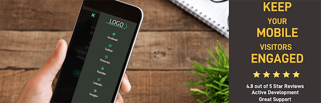
10. Best for Custom Mobile Navigation: WP Mobile Menu
| Pricing: Free; Pro version starts at $77/year |
| Free Plan / Trial: Yes |
| Standout Features: |
| 🔹 Fully responsive mobile menus 🔹 Slide-in and overlay styles 🔹 Custom styling and branding 🔹 Hide desktop elements on mobile 🔹 Google Fonts support |
| Rating: B+ |
| Best For: Improving mobile menu usability without changing your theme |
If your site’s navigation is hard to use on mobile, WP Mobile Menu can help. This free plugin adds slide-out or overlay menus designed specifically for small screens, no coding required.
It’s compatible with any responsive WordPress theme and gives you full control over how your mobile menu appears. You can hide specific elements, brand your menu with a logo and custom colors, and even use Google Fonts for styling.
The free version includes support for up to three menu depth levels and lets you choose when and where the menu should appear. If you need more advanced behavior like disabling menus on certain pages or adding animation effects, you can upgrade to the premium version.
⏵ Pros
- Easy to install and customize with no developer help
- Works alongside any existing WordPress theme
- Responsive design with multiple layout types
- Logo and text branding options included
⏵ Cons
- Some key features locked behind the premium version
- Doesn’t support mega menus or advanced conditional logic
My Verdict: WP Mobile Menu is a quick win if your site’s default navigation doesn’t work well on phones. It’s flexible, free, and works with nearly any theme.
Bonus: Google Mobile-Friendly Test
While this isn’t a WordPress plugin, you can see if your WordPress site is mobile-friendly with this free tool. Google’s mobile-friendly test shows you how your site looks on mobile screens and offers mobile usability reports.
For example, here are the results for SeedProd:

And here are the results for a site that isn’t mobile-optimized:

If your site isn’t mobile-friendly, the tool offers resources on how to fix those issues. With this information, you can improve your website to make it more accessible for mobile users and, as a result, grow your business.
Which WordPress Mobile Plugins Are Best?
If you can’t decide which WordPress mobile plugins to choose for your website, here are our top picks:
- SeedProd is the best WordPress mobile plugin for creating responsive WordPress themes and landing pages without code.
- WPForms is best for building mobile-friendly WordPress forms.
- OptinMonster is the top tool for creating responsive lead-generation and popup campaigns.
There you have it!
We hope this post helped you find the best WordPress mobile plugins for your site. All of the suggestions above can dramatically improve the user experience of your site for mobile visitors.
You might also like this article on how to preview your WordPress site before going live to ensure everything looks great on all devices.
If you liked this post, then please follow us on YouTube, Twitter, and Facebook for more helpful content to help grow your business.