

He trabajado en muchos sitios web de WordPress y una cosa que he aprendido es esta: si tu sitio no es adaptable a móviles, estás perdiendo visitantes. Especialmente ahora que la mayor parte del tráfico proviene de teléfonos.
Algunos temas de WordPress manejan bien los móviles, pero a menudo necesitas más control. Ahí es donde el plugin adecuado puede marcar una gran diferencia.
En esta guía, te mostraré los mejores plugins móviles de WordPress que he probado. Herramientas que te ayudan a mejorar la velocidad, la usabilidad, el diseño y las conversiones en todos los dispositivos.
Comparación rápida: Los mejores plugins móviles de WordPress
Si tienes poco tiempo, aquí tienes una comparativa rápida de los mejores plugins que he probado:
| # | Plugin | Mejor para | Plan gratuito | Precio inicial | Funciones móviles |
|---|---|---|---|---|---|
| 🥇 | SeedProd | Páginas de destino y sitios completos para móviles | ✅ | 39,50 $/año | ⚡ Edición móvil, modo de vista previa, constructor de temas |
| 🥈 | WPForms | Formularios y cargas de archivos adaptables a móviles | ✅ | 49,50 €/año | 📱 Diseños adaptables a móviles, lógica inteligente |
| 🥉 | WPtouch | Conversión instantánea de sitios a móviles | ✅ | 79 $/año | 📲 Temas móviles, interfaz táctil, caché |
| 4 | OptinMonster | Generación de leads móviles | ✅ | 9 €/mes | 🔔 Segmentación por dispositivo, deslizamientos, ventanas emergentes |
| 5 | Smush | Optimización de imágenes para móviles | ✅ | 60 $/año | 📷 Carga diferida, redimensionamiento inteligente, WebP |
| 6 | AMP | Renderizado más rápido de publicaciones móviles | ✅ | Gratis | 🚀 Marcado AMP, velocidad móvil simplificada |
| 7 | Menú adaptable | Menús de navegación para móviles | ✅ | 29 $/año | 📂 Menús deslizantes animados, optimizados para el tacto |
| 8 | Jetpack | Herramientas de rendimiento y responsividad | ✅ | 4,95 €/mes | 📦 CDN, herramientas de tema móvil, carga diferida |
| 9 | Elementor | Personalización del sitio móvil | ✅ | 59 $/año | 📐 Puntos de interrupción de dispositivos, secciones adaptables |
| 10 | Redirección simple de URL móvil | Redirigiendo visitantes móviles | ✅ | Gratis | 🔁 Redirigir tráfico móvil a la app, página de destino, etc. |
¿Qué son los plugins móviles para WordPress?
Un plugin móvil para WordPress es un plugin de WordPress que hace que los elementos de tu sitio web se muestren correctamente en dispositivos móviles. Algunas soluciones te permiten crear un sitio web móvil completo, mientras que otras adaptan las funciones de tu sitio para que sean más fáciles de ver para los usuarios móviles.
¿Por qué hacer que tu sitio de WordPress sea compatible con móviles?
Hacer que tu sitio de WordPress sea compatible con móviles tiene varios beneficios, que incluyen:
- Mejor experiencia de navegación. Mostrar una versión móvil de tu sitio web facilita que los usuarios móviles naveguen por tu sitio. En lugar de ver un sitio de escritorio típico, los usuarios móviles ven un diseño que se adapta a su tamaño de pantalla.
- Impulsa clientes potenciales y ventas. Dado que los sitios web adaptables son más fáciles de usar, los clientes potenciales pasarán más tiempo navegando. Además, elementos cruciales como tus botones de llamada a la acción son más fáciles de ver, lo que aumenta las conversiones.
- Mejores rankings en motores de búsqueda. Los motores de búsqueda como Google ahora tienen en cuenta la compatibilidad de tu sitio con móviles al clasificarlo. Los sitios web adaptables tienen muchas más posibilidades de clasificarse más alto que los sitios web de escritorio.
Como puedes ver, hacer que tu sitio de WordPress sea compatible con móviles es una forma eficaz de servir mejor a tu audiencia, mejorar los rankings de Google y hacer crecer tu negocio.
Cómo probé los mejores plugins móviles para WordPress
Para encontrar los mejores plugins móviles para WordPress, realicé pruebas prácticas utilizando una instalación limpia de WordPress y un tema de inicio optimizado para móviles.
Esto es en lo que me he centrado:
- Diseño móvil y adaptabilidad: Comprobé cómo cada plugin manejaba el redimensionamiento de pantalla, el espaciado y el diseño en diferentes dispositivos.
- Rendimiento de velocidad de página: Utilicé GTmetrix y PageSpeed Insights para medir cómo cada plugin afectaba los tiempos de carga móvil.
- Usabilidad táctil: Probé formularios, menús, botones y ventanas emergentes en dispositivos móviles reales para ver lo fluidos y fáciles que eran de usar.
- Facilidad de configuración: Di puntuaciones más altas a los plugins que fueron rápidos de configurar y no requirieron configuraciones complejas ni código personalizado.
- Compatibilidad: Probé con temas populares y constructores de páginas para asegurarme de que cada plugin funcionara bien en diferentes configuraciones.
Estas pruebas me ayudaron a determinar qué plugins realmente mejoran la experiencia móvil para tus visitantes y cuáles son más problemáticos que útiles.
Los mejores plugins móviles para WordPress para hacer que tu sitio sea compatible con móviles
A continuación, encontrarás una variedad de los mejores plugins móviles para WordPress. Incluyen plugins para crear páginas, formularios, ventanas emergentes e incluso feeds de redes sociales adaptables. También encontrarás un plugin que convierte tu sitio web de escritorio en un diseño adaptable para móviles.
- 1. El mejor para la creación de páginas compatibles con móviles: SeedProd
- 2. El mejor para formularios compatibles con móviles: WPForms
- 3. El mejor para ventanas emergentes móviles y generación de leads: OptinMonster
- 4. Lo mejor para sorteos optimizados para móviles: RafflePress
- 5. Lo mejor para feeds sociales optimizados para móviles: Smash Balloon
- 6. Lo mejor para llamadas a la acción optimizadas para móviles: WP Call Button
- 7. Lo mejor para temas solo para móviles: WPtouch
- 8. Lo mejor para tiempos de carga móviles más rápidos: AMP for WP
- 9. La mejor opción todo en uno para móviles + rendimiento: Jetpack
- 10. Lo mejor para la navegación móvil personalizada: WP Mobile Menu
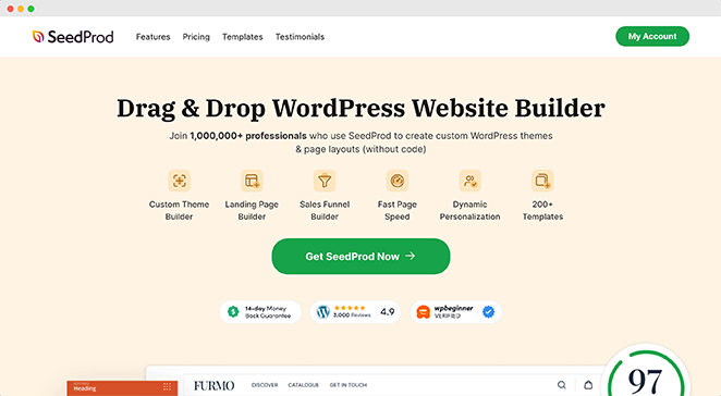
1. Lo mejor para crear páginas optimizadas para móviles: SeedProd
| Precios: A partir de 39,50 $/año |
| Plan gratuito / Prueba: Versión gratuita disponible |
| Funciones destacadas: |
| 🔹 Creador de páginas de arrastrar y soltar 🔹 Modo de edición y vista previa para móviles 🔹 Creador de temas para control total del sitio 🔹 Integración con WooCommerce 🔹 Generador de sitios web con IA |
| Calificación: A+ |
| Ideal para: Crear páginas y temas rápidos y optimizados para móviles sin código |
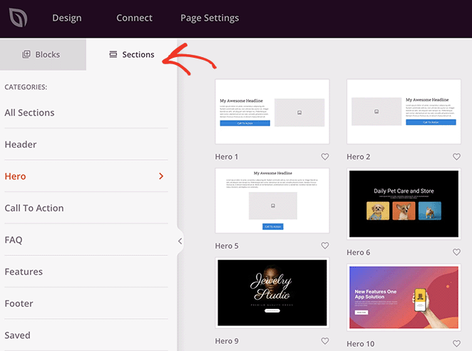
He usado SeedProd para crear desde páginas de destino rápidas hasta sitios completos para clientes. Lo que lo hace destacar es lo fácil que es controlar el diseño móvil sobre la marcha. Puedes cambiar a la vista previa móvil directamente dentro del creador y ajustar el espaciado, las fuentes y las secciones sin tocar el código.
Cuando lo probé por primera vez, solo buscaba una herramienta para páginas de destino. Pero después de ver lo fluidos que eran los controles de vista previa y diseño para móviles, empecé a usarlo para crear sitios enteros.
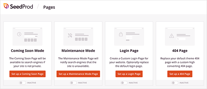
Una de mis funciones favoritas es el modo de "próximamente" y mantenimiento integrado. Puedes publicar una página de marcador de posición optimizada para móviles en minutos, y luego reemplazarla con tu tema completo más tarde.
Una vez que estás dentro del creador, funciona como esperas. Arrastra y suelta elementos donde quieras.
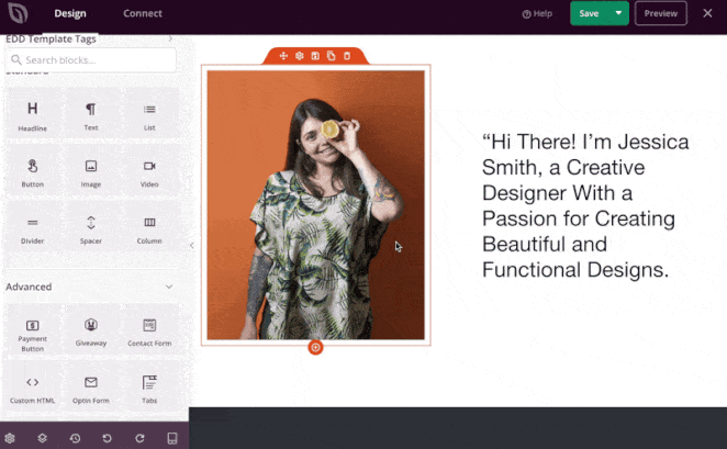
Luego, activa la vista móvil para ajustar el relleno y el diseño.

También me gusta que incluye secciones predefinidas. Estas me ahorraron mucho tiempo al crear diseños para móviles. No tuve que empezar desde cero. Solo insertar y personalizar.
El editor funciona sin problemas incluso en páginas grandes con docenas de elementos, lo que no siempre ocurre con otros creadores.
Si estás creando una tienda online, SeedProd también admite bloques personalizados de WooCommerce y Easy Digital Downloads. Eso significa que tus páginas de productos se mantienen optimizadas para móviles sin instalar complementos adicionales.
Y ahora incluso hay un creador de sitios web con IA completo. Lo probé en un sitio básico de nicho y generó un tema móvil limpio en menos de un minuto.

⏵ Ventajas
- Modo de edición y vista previa para móviles integrado
- Plantillas y secciones pre-diseñadas listas para móviles
- Salida limpia y ligera que carga rápido en móviles
- Se puede usar para crear temas completos de WordPress sin código
⏵ Desventajas
- Algunas opciones de estilo para móviles (como los puntos de interrupción) requieren un plan de pago
- La personalización avanzada de comercio electrónico puede necesitar complementos de WooCommerce
Mi veredicto: Uso SeedProd para casi todos los sitios que creo. Es rápido, intuitivo y hace que el diseño adaptable sea fácil, incluso para principiantes.
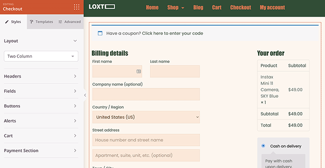
2. Lo mejor para formularios optimizados para móviles: WPForms

| Precio: A partir de 49,50 €/año |
| Plan gratuito / Prueba: Versión gratuita disponible |
| Funciones destacadas: |
| 🔹 Creador de arrastrar y soltar listo para móviles 🔹 Lógica condicional inteligente 🔹 Formularios conversacionales 🔹 Vistas previas instantáneas de formularios en móviles 🔹 Incrustación de formularios en un clic en SeedProd |
| Calificación: A+ |
| Ideal para: Crear formularios que funcionan y se ven geniales en teléfonos y tabletas |
Cada vez que creo un formulario de contacto o de cliente potencial, recurro a WPForms. Es fácil de usar y cada formulario que creas se adapta automáticamente a las pantallas móviles, sin necesidad de estilos adicionales.
Una cosa que me gusta más es que WPForms hace que la adaptabilidad móvil sea una opción predeterminada. El espaciado, los campos de entrada y los botones son táctiles desde el principio, lo que ahorra mucho tiempo cuando se prueba en diferentes dispositivos.

Incluso puedes crear formularios conversacionales, que convierten un formulario básico en una experiencia paso a paso. Funciona muy bien en móviles, donde los formularios con varios campos pueden resultar apretados o abrumadores.

También me gusta lo bien que funciona con SeedProd. Puedes incrustar WPForms en cualquier diseño de página o tema usando el bloque nativo, sin necesidad de malabares con códigos cortos.
⏵ Ventajas
- Todos los formularios son adaptables a móviles por defecto
- El diseño conversacional mejora la experiencia del usuario móvil
- Integración perfecta con el constructor visual de SeedProd
- Docenas de plantillas predefinidas para una configuración rápida
⏵ Desventajas
- Algunas funciones avanzadas (como la lógica condicional) requieren planes de nivel superior
- La versión gratuita es limitada en comparación con la de pago
Mi Veredicto: WPForms elimina las molestias de crear formularios para móviles. Simplemente funciona, y lo hace con estilo.
3. Mejor para Popups y Generación de Leads en Móviles: OptinMonster

| Precio: A partir de 108 $/año |
| Plan Gratuito / Prueba: Plugin gratuito en WordPress.org (requiere cuenta de pago) |
| Funciones destacadas: |
| 🔹 Popups optimizados para móviles 🔹 Deslizables y barras flotantes 🔹 Intención de salida para móviles 🔹 Constructor de arrastrar y soltar 🔹 Segmentación avanzada y pruebas A/B |
| Calificación: A |
| Ideal para: Hacer crecer listas de correo electrónico con popups que funcionan en móviles |
OptinMonster es mi constructor de popups preferido cuando necesito hacer crecer una lista sin molestar a los visitantes móviles. Cada campaña que creas es adaptable por defecto, y puedes personalizar cómo se comportan los popups en móviles frente a escritorio.

Lo que más me gusta es la segmentación específica para móviles. Puedes mostrar u ocultar campañas según el tamaño de la pantalla, el tiempo de retraso o la profundidad de desplazamiento. De esa manera, no abrumas a los usuarios con popups en cuanto aterrizan en un teléfono.
Lo probé recientemente en un diseño de blog móvil y usé una barra flotante en lugar de un popup a pantalla completa. Se veía limpio, se mantenía fijo al desplazarse y convertía mejor que la versión más grande.
También puedes hacer pruebas A/B de variantes móviles y ejecutarlas con reglas separadas. Eso me ha ayudado a ajustar el momento y la ubicación de las ofertas en diferentes dispositivos.
⏵ Ventajas
- Menús móviles instantáneos sin necesidad de código
- Funciona con cualquier tema y constructor de páginas
- Soporta logos, enlaces sociales y WooCommerce
- Fácil de personalizar para la navegación táctil
⏵ Desventajas
- La interfaz se siente un poco anticuada en algunos aspectos
- Algunas funciones avanzadas requieren la versión Pro
Mi Veredicto: Si te tomas en serio la generación de leads en móviles, OptinMonster te ofrece más control que cualquier otro constructor de popups que haya probado.
Para más detalles, consulta mi guía sobre cómo crear un popup de intención de salida en WordPress.
4. Mejor para Sorteos Amigables con Móviles: RafflePress

| Precios: A partir de 39,50 $/año |
| Plan gratuito / Prueba: Sí |
| Funciones destacadas: |
| 🔹 Creador de sorteos adaptable a móviles 🔹 Interfaz de arrastrar y soltar 🔹 Compartir viral de "invita a un amigo" 🔹 Acciones de participación en redes sociales 🔹 Integraciones de marketing por correo electrónico |
| Calificación: A |
| Ideal para: Realizar sorteos virales que funcionen perfectamente en teléfonos |
Los sorteos son una forma probada de hacer crecer tu audiencia, pero si tu concurso no funciona en móviles, perderás una gran parte de las posibles participaciones. Por eso siempre recomiendo RafflePress, el mejor plugin de sorteos para WordPress que he probado en cuanto a adaptabilidad a móviles.
La interfaz de arrastrar y soltar facilita el lanzamiento de un nuevo sorteo sin necesidad de código, y cada elemento se ajusta automáticamente para que se vea genial en teléfonos y tabletas.
He usado RafflePress en varios sitios, y la versión móvil siempre es limpia, rápida y fácil de navegar, ya sea que los usuarios participen desde Instagram o consulten los resultados desde un enlace de correo electrónico.
⏵ Ventajas
- Diseño adaptable a móviles que funciona genial en todos los dispositivos
- El creador de arrastrar y soltar es fácil de usar para principiantes
- Incluye acciones en redes sociales y de "invita a un amigo" para aumentar las comparticiones
- Las plantillas predefinidas agilizan la configuración
- Se integra con herramientas populares de marketing por correo electrónico
⏵ Desventajas
- Las funciones avanzadas como análisis y condiciones de participación requieren un plan de pago
- Los diseños de las plantillas pueden resultar limitados si necesitas mucha personalización
Mi veredicto: Si quieres un concurso optimizado para móviles que obtenga resultados, RafflePress es la herramienta más fácil y efectiva que he utilizado.
5. El mejor para feeds sociales adaptables a móviles: Smash Balloon

| Precios: Gratuito; la versión Pro comienza en 49 $/año |
| Plan gratuito / Prueba: Sí |
| Funciones destacadas: |
| 🔹 Feeds sociales adaptables a móviles 🔹 Soporta Facebook, Instagram, Twitter y YouTube 🔹 Combina feeds en un muro social 🔹 No se requiere codificación 🔹 Múltiples diseños y filtros de feed |
| Calificación: A |
| Ideal para: Mostrar contenido de redes sociales que se vea genial en móviles |
La promoción cruzada de tu contenido de redes sociales en tu sitio es una excelente manera de conseguir seguidores y mantener tu sitio actualizado. ¿Pero hacer que esos feeds sean adaptables en móviles? Eso puede ser complicado si no eres desarrollador.
Smash Balloon facilita la inserción de feeds sociales adaptables a móviles en WordPress. Soporta todas las plataformas principales —Instagram, YouTube, Facebook y Twitter— y cada feed es 100% adaptable desde el primer momento.
También puedes combinar feeds en un único muro social y elegir diseños que se ajustan automáticamente a teléfonos, tabletas y pantallas de escritorio. Encontré esto especialmente útil para páginas de eventos y páginas de inicio donde deseas contenido dinámico y visual que aún se cargue rápido.
Tampoco requiere codificación ni dolores de cabeza con la API. Simplemente instala el plugin, conecta tu cuenta social y personaliza el aspecto con unos pocos clics. Funciona genial incluso si eres completamente nuevo en WordPress.
¿Quieres un tutorial completo? Echa un vistazo a nuestra reseña de Smash Balloon.
⏵ Ventajas
- Los feeds se ven geniales en móviles sin ningún estilo adicional
- Funciona con todas las redes sociales principales
- No se requiere codificación para la configuración
- Permite combinar feeds en un muro adaptable
- Opciones de personalización y diseños integrados
⏵ Desventajas
- Las mejores funciones (como filtros o feeds de hashtags) requieren una licencia de pago
- Un mayor control de estilo puede requerir conocimientos de CSS
Mi veredicto: Smash Balloon es la forma más fácil que he encontrado para añadir contenido social compatible con móviles a un sitio WordPress. Simplemente funciona sin código, sin problemas de diseño y sin feeds rotos en móviles.
6. El mejor para llamadas click-to-call optimizadas para móviles: WP Call Button

| Precios: Gratis |
| Plan gratuito / Prueba: Sí |
| Funciones destacadas: |
| 🔹 Opción de visualización de llamadas solo para móviles 🔹 Botones de llamada flotantes 🔹 Soporte de widget de barra lateral 🔹 Estilos y colores personalizados 🔹 Seguimiento de eventos de Google Analytics |
| Calificación: B+ |
| Ideal para: Negocios locales y proveedores de servicios que dependen de las llamadas telefónicas |
Una de las formas más fáciles de perder conversiones en móviles es dificultando demasiado que los usuarios se pongan en contacto. Si tu botón de CTA es demasiado pequeño o está oculto, la gente puede abandonar tu sitio sin llamar.
WP Call Button soluciona eso al ofrecerte una forma sencilla de añadir un botón de click-to-call a WordPress. Es responsive para móviles, personalizable y no requiere ningún código para configurarlo.
Puedes elegir mostrar el botón de llamada solo en dispositivos móviles, añadirlo a tu barra lateral o hacerlo flotante en la parte inferior de la pantalla para un fácil acceso. Incluso soporta el seguimiento de eventos a través de Google Analytics, para que puedas ver cuántas veces las personas tocan para llamar.
Para sitios web de pequeñas empresas y proveedores de servicios, este plugin puede marcar una gran diferencia en la interacción móvil y la generación de leads.
⏵ Ventajas
- Diseño mobile-first con diseño responsive
- Opción para mostrar u ocultar el botón en dispositivos específicos
- Estilos de botón flotantes y estáticos incluidos
- Texto, colores y posicionamiento totalmente personalizables
- Seguimiento de clics con Google Analytics
- Gratis de usar
⏵ Desventajas
- Solo útil para contacto telefónico (no chat en vivo ni formularios)
- No ideal para negocios que no atienden llamadas directamente
Mi veredicto: WP Call Button es una de las formas más sencillas de facilitar que los visitantes móviles se pongan en contacto contigo. Si las llamadas telefónicas son importantes para tu negocio, este plugin es imprescindible.
7. El mejor para temas solo para móviles: WPtouch

| Precios: Gratis; la versión Pro comienza en 79 $/año |
| Plan gratuito / Prueba: Sí |
| Funciones destacadas: |
| 🔹 Temas específicos para móviles 🔹 Recomendado por Google 🔹 Soporte del personalizador de WordPress 🔹 Mostrar/ocultar diseños móviles por página 🔹 Control fácil de menús y diseños |
| Calificación: B |
| Ideal para: Propietarios de sitios que desean un tema móvil rápido sin editar su diseño principal |
Si quieres una forma rápida de hacer que tu sitio WordPress sea compatible con móviles, WPtouch es una opción sólida. Crea una versión específica para móviles de tu sitio que se carga automáticamente en teléfonos sin cambiar tu tema actual.
Esto lo hace ideal si tu tema principal no es responsive, o si deseas una experiencia móvil ligera sin tocar código. Lo he visto utilizado en blogs y sitios de información donde la legibilidad rápida en móviles es la principal prioridad.
La versión gratuita incluye personalización básica a través del personalizador de WordPress. También puedes elegir qué páginas utilizan la versión móvil y controlar fácilmente los menús y los diseños.
WPtouch también es recomendado por Google, por lo que ayuda con el SEO móvil y puede mejorar tus puntuaciones en las pruebas de usabilidad móvil.
⏵ Ventajas
- La versión móvil se ejecuta de forma independiente de tu tema principal
- Amigable con Google y consciente del SEO
- Rápido de configurar sin necesidad de ayuda de un desarrollador
- Funciona bien para sitios de contenido simple y blogs
⏵ Desventajas
- El tema móvil está separado de tu diseño principal
- Las funciones más avanzadas requieren WPtouch Pro
- No es ideal para diseños altamente personalizados o interactivos
Mi veredicto: WPtouch es una solución rápida si tu sitio no está preparado para móviles. No es una solución de diseño completa, pero te proporciona un tema móvil limpio sin necesidad de cambiar tu configuración actual.
8. El mejor para tiempos de carga móvil más rápidos: AMP for WP

| Precios: Gratis |
| Plan gratuito / Prueba: Sí |
| Funciones destacadas: |
| 🔹 Añade Google AMP a WordPress 🔹 Soporte de scroll infinito 🔹 Compatibilidad con plugins SEO 🔹 Integración con constructores de páginas 🔹 Soporte para GDPR y Analíticas |
| Calificación: B |
| Ideal para: Propietarios de sitios centrados en un rendimiento móvil ultrarrápido |
Si quieres mejorar la velocidad de las páginas y el rendimiento móvil, AMP for WP está diseñado para hacer exactamente eso. Añade Accelerated Mobile Pages (AMP) a tu sitio de WordPress, una versión simplificada y de carga rápida de tu contenido para visitantes móviles.
Este plugin es ideal si la velocidad es tu máxima prioridad. Las páginas cargan casi instantáneamente en móviles, lo que ayuda a reducir las tasas de rebote y a mejorar tu puntuación de Core Web Vitals. También incluye soporte para scroll infinito, Google Analytics, AdSense y cumplimiento de GDPR de serie.
Funciona con los principales constructores de páginas e se integra limpiamente con los principales plugins SEO, lo que facilita el mantenimiento del rendimiento sin renunciar a funciones.
⏵ Ventajas
- Las páginas AMP de carga instantánea mejoran la velocidad móvil
- Compatible con los principales plugins SEO y constructores de páginas
- Scroll infinito, analíticas y soporte GDPR integrados
- Documentación útil para la configuración y las pruebas
- Totalmente gratuito
⏵ Desventajas
- Los diseños AMP son más limitados en diseño y marca
- Puede requerir configuración adicional para que coincida con el aspecto de tu tema principal
- La configuración del plugin puede ser abrumadora para principiantes
Mi veredicto: AMP for WP es una buena opción si la velocidad importa más que el control del diseño. No es para todos, pero puede mejorar seriamente tus tiempos de carga móvil si se usa correctamente.
9. La mejor opción todo en uno para Móvil + Rendimiento: Jetpack

| Precios: Gratuito; planes de pago desde 9,95 $/mes |
| Plan gratuito / Prueba: Sí |
| Funciones destacadas: |
| 🔹 Tema móvil opcional 🔹 CDN de imágenes y carga diferida 🔹 Copias de seguridad y estadísticas del sitio web 🔹 Integración AMP 🔹 Funciona con la aplicación móvil |
| Calificación: B+ |
| Ideal para: Usuarios que desean optimización móvil junto con herramientas de rendimiento y seguridad |
Jetpack es más que un simple plugin móvil. Es un conjunto completo de herramientas para mejorar la velocidad, la seguridad y la entrega de contenido de WordPress. Pero también incluye funciones centradas en móviles que pueden mejorar el rendimiento de tu sitio en smartphones.
Una opción destacada es el tema móvil de Jetpack. Cuando está activado, muestra una vista móvil simplificada a los visitantes que navegan en pantallas más pequeñas. Puedes personalizar lo que aparece en la página de inicio, ajustar la configuración de encabezado y colores, e incluso permitir a los usuarios cambiar entre versiones de escritorio y móvil.
Detrás de escena, Jetpack también ayuda con el rendimiento a través de la carga diferida, CDN de imágenes, soporte AMP y más. Se integra con la aplicación móvil de WordPress, para que puedas administrar tu sitio sobre la marcha, e incluso gestionar copias de seguridad, filtrado de spam y análisis.
Jetpack también recomienda emparejar sus funciones con WP Super Cache para una carga aún más rápida.
⏵ Ventajas
- Tema móvil para una mejor usabilidad en pantallas pequeñas
- Mejora la velocidad móvil con CDN de imágenes y soporte AMP
- Incluye extras como copias de seguridad, seguridad y análisis
- Integrado con WordPress.com y la aplicación móvil
- Gratis para empezar
⏵ Desventajas
- Algunas funciones requieren conexión a WordPress.com
- Los planes de pago aumentan si solo necesitas una o dos funciones
- El tema móvil es básico en comparación con los diseños totalmente adaptables
Mi Veredicto: Jetpack es una excelente solución todo en uno para el rendimiento móvil, especialmente si también deseas copias de seguridad, protección contra spam y análisis en un solo lugar. Pero el tema móvil no reemplaza un diseño totalmente adaptable.
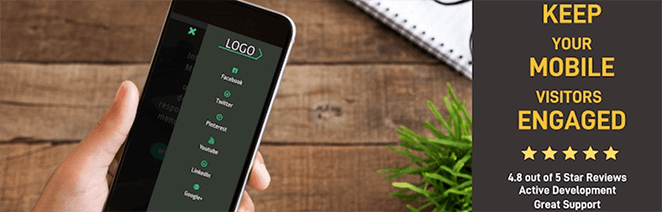
10. Mejor para Navegación Móvil Personalizada: WP Mobile Menu
| Precios: Gratis; la versión Pro comienza en $77/año |
| Plan gratuito / Prueba: Sí |
| Funciones destacadas: |
| 🔹 Menús móviles totalmente adaptables 🔹 Estilos de deslizamiento y superposición 🔹 Estilo y marca personalizados 🔹 Ocultar elementos de escritorio en móvil 🔹 Soporte de Google Fonts |
| Calificación: B+ |
| Ideal para: Mejorar la usabilidad del menú móvil sin cambiar tu tema |
Si la navegación de tu sitio es difícil de usar en móvil, WP Mobile Menu puede ayudar. Este plugin gratuito añade menús desplegables o superpuestos diseñados específicamente para pantallas pequeñas, sin necesidad de código.
Es compatible con cualquier tema adaptable de WordPress y te da control total sobre cómo aparece tu menú móvil. Puedes ocultar elementos específicos, personalizar tu menú con un logo y colores personalizados, e incluso usar Google Fonts para el estilo.
La versión gratuita incluye soporte para hasta tres niveles de profundidad de menú y te permite elegir cuándo y dónde debe aparecer el menú. Si necesitas un comportamiento más avanzado, como deshabilitar menús en páginas específicas o añadir efectos de animación, puedes actualizar a la versión premium.
⏵ Ventajas
- Fácil de instalar y personalizar sin ayuda de desarrollador
- Funciona junto con cualquier tema existente de WordPress
- Diseño adaptable con múltiples tipos de diseño
- Opciones de marca con logo y texto incluidas
⏵ Desventajas
- Algunas funciones clave bloqueadas detrás de la versión premium
- No soporta mega menús ni lógica condicional avanzada
Mi Veredicto: WP Mobile Menu es una victoria rápida si la navegación predeterminada de tu sitio no funciona bien en teléfonos. Es flexible, gratuito y funciona con casi cualquier tema.
Extra: Prueba de Google de optimización móvil
Aunque este no es un plugin de WordPress, puedes comprobar si tu sitio de WordPress es compatible con dispositivos móviles con esta herramienta gratuita. La prueba de optimización para móviles de Google te muestra cómo se ve tu sitio en pantallas móviles y ofrece informes de usabilidad móvil.
Por ejemplo, aquí están los resultados para SeedProd:

Y aquí están los resultados para un sitio que no está optimizado para móviles:

Si tu sitio no es compatible con dispositivos móviles, la herramienta ofrece recursos sobre cómo solucionar esos problemas. Con esta información, puedes mejorar tu sitio web para hacerlo más accesible para los usuarios móviles y, como resultado, hacer crecer tu negocio.
¿Cuáles son los mejores plugins móviles para WordPress?
Si no puedes decidir qué plugins móviles para WordPress elegir para tu sitio web, aquí tienes nuestras mejores opciones:
- SeedProd es el mejor plugin móvil para WordPress para crear temas y páginas de destino responsivos para WordPress sin código.
- WPForms es el mejor para crear formularios de WordPress compatibles con dispositivos móviles.
- OptinMonster es la mejor herramienta para crear campañas de generación de leads y pop-ups responsivos.
¡Ahí lo tienes!
Esperamos que esta publicación te haya ayudado a encontrar los mejores plugins móviles para WordPress para tu sitio. Todas las sugerencias anteriores pueden mejorar drásticamente la experiencia del usuario de tu sitio para los visitantes móviles.
También te puede interesar este artículo sobre cómo previsualizar tu sitio de WordPress antes de publicarlo para asegurarte de que todo se vea bien en todos los dispositivos.
Si te ha gustado esta publicación, síguenos en YouTube, Twitter y Facebook para obtener más contenido útil que te ayude a hacer crecer tu negocio.