

Need some inspiration for your WordPress 404 page?
A great 404 page doesn’t just stop people from leaving your site. It can guide them to the right place, build trust in your brand, and even turn a lost visitor into a customer.
In this guide, I’ll show you some of the best 404 page examples I’ve found, plus tips for designing one that actually helps your website, not hurts it.
And if you’re using a visual builder like SeedProd, you can customize your 404 page without touching code.
- Why Custom 404 Pages Matter
- 19 Best 404 Page Examples
- How to Build Your Own 404 Page
- FAQ: 404 Page Design Tips
Why Custom 404 Pages Matter
When a visitor lands on a broken link, they’re usually seconds away from bouncing. A good 404 page gives them a reason to stay.
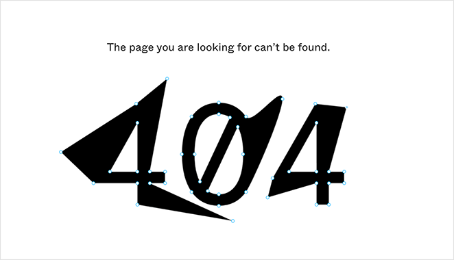
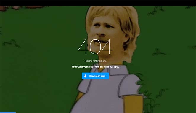
Instead of showing a boring “page not found” error like this:

You can turn that moment into something helpful, or even profitable. Add product recommendations, suggest popular blog posts, or offer an email signup form.
That’s why I always set up custom 404 pages on client sites, and I use SeedProd to do it because it’s quick, flexible, and beginner-friendly.
11 Best 404 Page Examples from Real Brands
The following 404 error page designs are taken from genuine brands online. I’ll explain why that particular design works and offer some tips for how to do it yourself.
- 1. Lego – On-Brand Humor with a CTA
- 2. Slack – Scrollable Interactive Experience
- 3. Mantra Labs – Countdown Redirection
- 4. 20th Century Studios – Cross-Promote with Product Suggestions
- 5. Figma – Interactive Design Teaser
- 6. Behance – Curated Alternatives and Browsing Paths
- 7. eBay – Trending Deals and Help Options
- 8. 9gag – Meme-Driven CTA
- 9. IMDB – Movie Quotes and Links
- 10. Ueno – Animated Creativity
- 11. CloudSigma – Developer Humor
- 12. Brett Terpstra – Simple but Helpful
- 13. Marvel – Character-Themed 404s
- 14. CSS-Tricks – Developer-Inspired Minimalism
- 15. Mailchimp – Animated and Honest
- 16. Broken Egg – Simple & Customizable (SeedProd)
- 17. SeedProd – eCommerce Oops Template
- 18. SeedProd – Sunset Fullscreen Template
- 19. SeedProd – Funny Dog Template
1. Lego – On-Brand Humor with a CTA
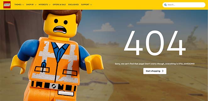
Lego’s 404 page is a masterclass in using humor and branding to soften the blow of a broken link.
It features Emmet from The Lego Movie with a cheerful “Everything is awesome” reference. That instantly puts the visitor at ease, while the CTA encourages them to start shopping.
The copy is friendly, the visuals are playful, and it all fits perfectly with Lego’s identity.
Why It Works: It builds trust by matching user expectations, uses brand recognition, and keeps visitors moving forward with a clear next step.
2. Slack – Scrollable Interactive Experience
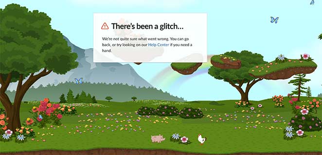
Slack’s 404 page is one of the most immersive experiences you’ll find. The horizontal scrolling landscape is filled with charming animals and nature animations — no tech jargon in sight.
There’s no mention of “404.” Instead, users get a friendly nudge to go back or head to the help center. The whole thing feels calm, intentional, and very Slack.
Why It Works: This page gently redirects users without friction, using visuals and subtle motion to keep attention focused and reduce bounce.
3. Mantra Labs – Countdown Redirection
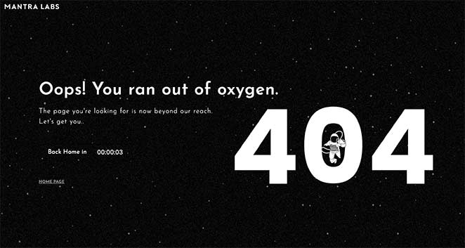
Mantra Labs takes a smart approach by using a short countdown to redirect users to the homepage.
The page features a floating astronaut over a “404” headline, with the message: “Oops! You ran out of oxygen.” It’s simple, on-theme, and cleverly buys 10 seconds to hold the visitor’s attention.
Redirects like this are great for reducing exit rates , and you can build one easily using SeedProd’s redirect features.
Why It Works: The automatic redirect keeps users on-site without needing action, which is ideal for mobile or confused visitors.
4. 20th Century Studios – Cross-Promote with Product Suggestions
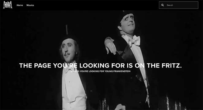
20th Century Studios uses their 404 page as a marketing tool, and it works beautifully.
When you land on a broken link, you see a still from one of their iconic movies. Just below, they suggest other films to check out with clickable images and links.
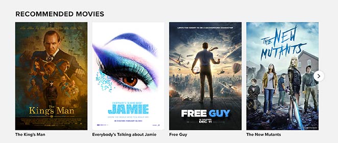
It’s subtle cross-promotion that feels helpful, not pushy — a perfect fit for entertainment brands.
Why It Works: It keeps users engaged with related offers and moves them closer to conversion. It’s a smart move for ecommerce or digital content sites.
5. Figma – Interactive Design Teaser
Figma’s 404 page is simple at first glance, but also brilliant.
Instead of just displaying an error message, it lets you interact with the vector points of the “404” text. It’s a fun surprise that instantly reflects what the product does.
Figma also includes navigation and helpful links so users can easily move on and explore the site.
Why It Works: This page reinforces product value while keeping users curious. A playful interaction turns a dead end into a brand moment.
6. Behance – Curated Alternatives and Browsing Paths
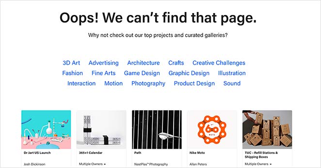
Behance’s 404 page is smartly designed for exploration. Instead of just saying “Oops,” it invites users to browse curated project categories.
You can jump directly into visual inspiration, featured work, trending tags, and relevant searches are all front and center.
It turns the 404 moment into a discovery path, which fits Behance’s audience perfectly.
Why It Works: It reduces user friction by offering immediate alternatives and reinforces the value of staying onsite.
7. eBay – Trending Deals and Help Options
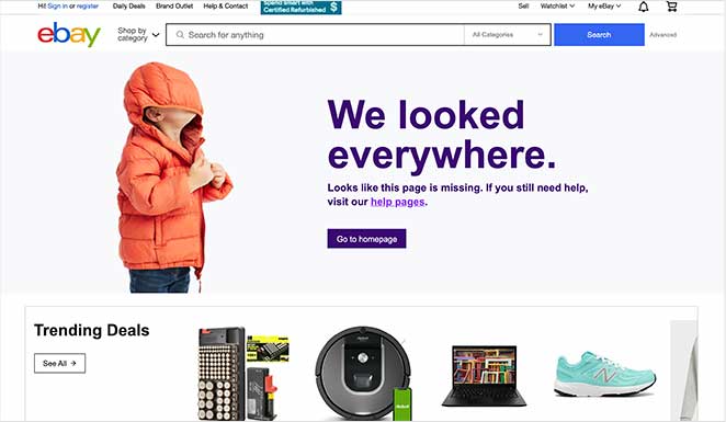
eBay’s 404 page is playful and purposeful. It shows a quirky image with the message that they “looked everywhere” for the page.
Then, it offers quick links to trending deals and the help center — two of the most common destinations users might need next.
Why It Works: The design is lighthearted but strategic. It guides users toward shopping or support without causing frustration.
8. 9gag – Meme-Driven CTA
9gag speaks directly to its audience with humor and familiarity. Their 404 page features a popular meme and a message that feels right at home.
Then they pitch the 9gag app with a bold CTA. It’s fun, fast, and perfectly in tune with their users.
Why It Works: This example nails audience targeting and turns an error into a conversion opportunity.
9. IMDB – Movie Quotes and Links
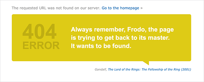
IMDB uses its 404 page to celebrate its brand, with custom quotes from famous films.
The page also links to the film referenced, giving users an easy path back into their browsing experience.
Why It Works: It stays 100% on-brand and invites movie lovers to keep exploring instead of bouncing.
10. Ueno – Animated Creativity
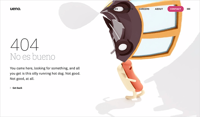
Ueno’s 404 page showcases their design skills with a surreal animation of a hotdog running through dreamlike scenery.
Every time you refresh the page, the message changes. It’s a creative way to prove what the agency is capable of.
Why It Works: The page isn’t just entertaining, it doubles as a live portfolio that wins trust instantly.
11. CloudSigma – Developer Humor
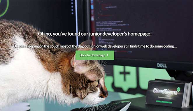
CloudSigma uses lighthearted developer humor to make its 404 page feel personal.
The message is tongue-in-cheek, poking fun at bugs and coding errors, something devs and tech-savvy users will instantly get.
Why It Works: Humor disarms frustration and creates a quick emotional connection with their technical audience.
12. Brett Terpstra – Simple but Helpful
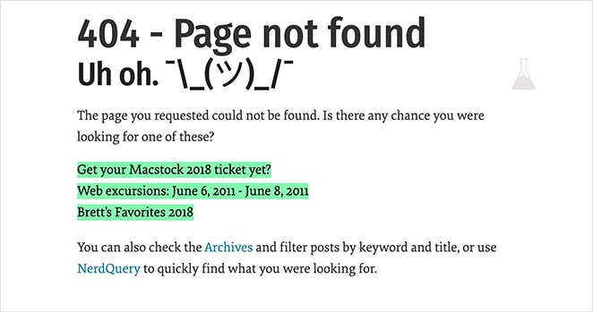
Brett Terpstra’s 404 page is a great example of doing the basics right. It’s clean, clear, and offers direct links to useful content.
This approach is perfect if you don’t need fancy design. Just give your users fast options and move them along.
Why It Works: Straightforward UX wins over confusion. It’s functional, practical, and user-first.
13. Marvel – Character-Themed 404s
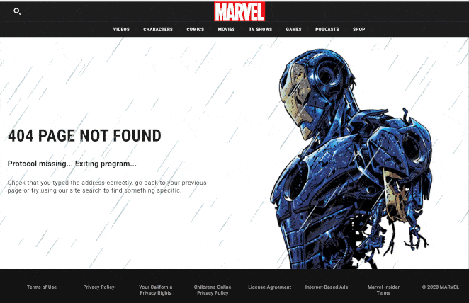
Marvel’s 404 pages are a fan favorite. They feature different characters, and in this example, Iron Man animates the screen with a GIF that draws attention.
The design also includes a clear path forward. Either go back or search the site.
Why It Works: It entertains, surprises, and keeps users immersed in the brand universe.
14. CSS-Tricks – Developer-Inspired Minimalism
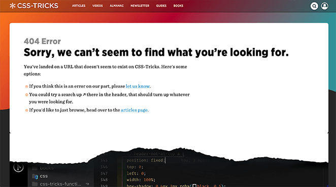
CSS-Tricks keeps its 404 page ultra-simple, but with a fun twist.
There’s a visual “tear” that reveals actual CSS code underneath, which devs will instantly appreciate. It also links to helpful content to keep visitors moving.
Why It Works: The design speaks directly to its developer audience without overexplaining. It’s clean, geeky, and clever.
15. Mailchimp – Animated and Honest
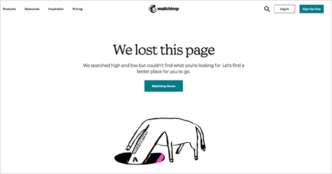
Mailchimp’s 404 page uses a simple animation of a character searching and a candid message admitting the page is lost.
But they don’t stop there, a button guides you straight to the homepage to help you recover quickly.
Why It Works: The humor and honesty make the brand feel human, while the CTA helps users move forward fast.
16. Broken Egg – Simple & Customizable (SeedProd)
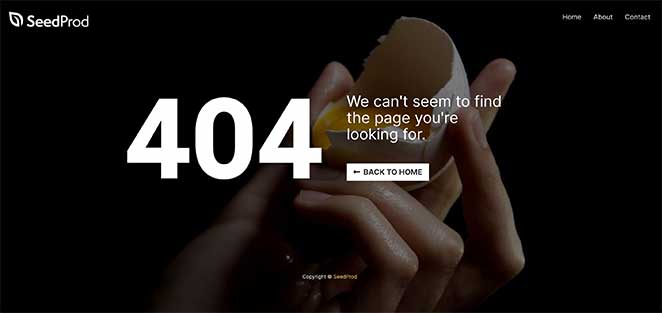
This 404 page template from SeedProd offers a clean, branded layout that’s ready to go.
It includes a custom message, logo area, nav menu, and CTA button — everything you need to guide users home.
Why It Works: It’s flexible, fast to launch, and built with conversions in mind.
17. SeedProd – eCommerce Oops Template
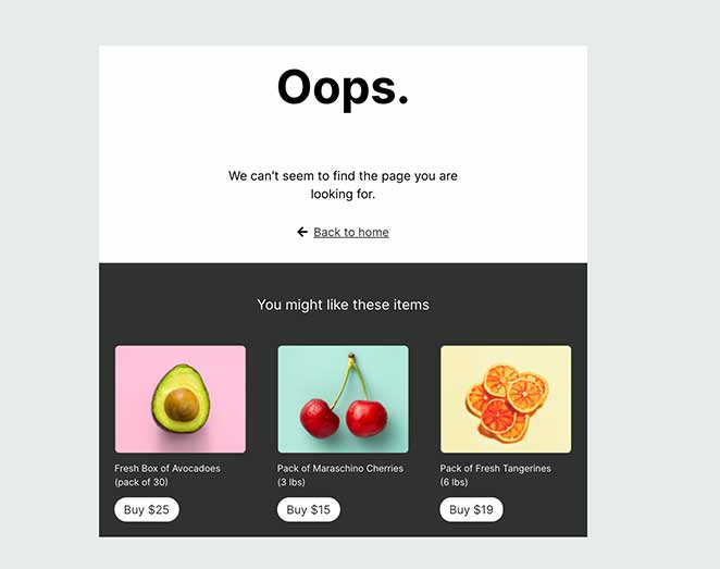
This SeedProd 404 template is ideal for online stores. It blends a soft “oops” message with product blocks to help visitors keep shopping.
Just plug it into your WooCommerce site and customize it in the drag-and-drop editor.
Why It Works: It turns lost visitors into buyers by showing relevant products, even after a 404 error.
18. SeedProd – Sunset Fullscreen Template
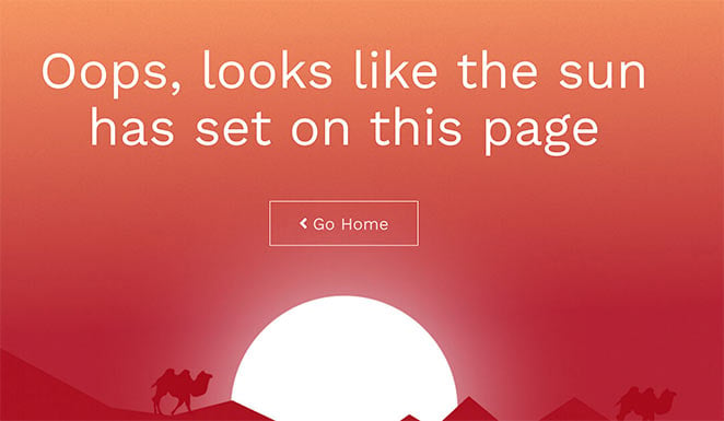
This full-screen 404 page design from SeedProd uses a beautiful background and large CTA button to direct users home.
It’s simple, modern, and perfect for visual brands or travel sites.
Why It Works: Bold visuals make a big impression and keep users calm and curious.
19. SeedProd – Funny Dog Template
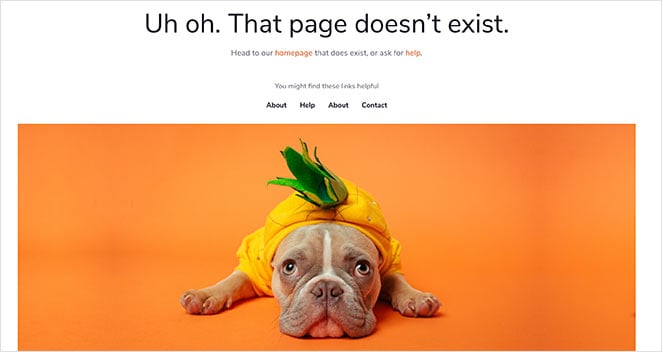
This lighthearted 404 template shows a dog in a pineapple costume, with a clear message and big homepage button.
It also includes a navigation menu to help users keep exploring.
Why It Works: It’s impossible not to smile. Humor disarms and helps reduce bounce, especially for casual brands.
404 Page FAQ
I’ve seen too many websites treat their 404 pages like an afterthought. Just a dead end with no help or direction. But as you’ve seen in the examples above, a custom 404 page can actually guide visitors back into your site, build trust, and even boost conversions.
Whether you want something simple and helpful or bold and on-brand, the key is giving users a way forward.
And if you want to build one without touching code, SeedProd makes it easy. I use it to create 404 pages, landing pages, and even full websites with its drag-and-drop builder.
Here are some related tutorials if you’re ready to take the next step:
- How to Make a 404 Page in WordPress
- How to Grow Your Email List
- How to Add a Search Bar to WordPress
And if you liked this article, please follow us on Twitter and Facebook for more useful content to help grow your business.


