

TL;DR
A high-converting landing page does a few things well, then cuts everything else. These are the practices I keep coming back to after years of building and testing pages.
- One clear offer: Every page should drive a single action, so visitors never have to choose what to do next.
- A standout CTA: Value-focused copy, a contrasting color, and a spot above the fold do most of the conversion work.
- Visual focus: Directional cues, white space, and fewer distractions guide the eye straight to your CTA.
- Mobile-first forms: Tappable fields, short forms, and fast load times keep mobile visitors from bouncing.
- SEO basics: Keywords, metadata, and descriptive image alt text bring in free organic traffic.
- Test everything: A/B testing headlines, images, and buttons is the only way to know what actually moves the needle.
Most of the landing pages I built early on looked fine. But they barely converted, and I had no idea why. I’d tweak the colors, change the fonts, even swap out the hero image, and still nothing.
It wasn’t until I dug into landing page best practices that things changed. I’d been missing the basics: a clear offer, a strong CTA, fast load times.
This guide walks you through 31 practical tips I’ve used on my own projects and client sites, with examples and quick wins you can start using right away.
- Landing Page Design Best Practices
- Landing Page CTA Best Practices
- Landing Page Writing Best Practices
- How Do You Optimize a Landing Page for SEO?
- How Do You Design a High-Converting Landing Page Form?
- How Do You Make a Landing Page Mobile-Friendly?
- eCommerce Landing Page Best Practices
- Which Practices Move Conversions the Most?
- FAQs About Landing Page Best Practices
Landing Page Design Best Practices
Before you touch a single design element, get clear on two things: who the page is for, and the one action you want them to take. Every tip below works better when you’ve answered those first, because design choices that fit a budget-shopper audience flop with a luxury one.
Design has a big impact on your landing page conversion rates. A good design also looks different depending on the page type.
A homepage might focus on consistent branding, while a sales page design is built to convert visitors into customers, so it leans on persuasive elements like case studies.
With that in mind, here are the top practices for designing a high-converting page.
1. Stick to a Single Landing Page Idea
Landing pages should be laser-focused on a single conversion goal. A page with more than one idea or offer pulls potential customers away from the action you want.
Give visitors too many options and they get confused, which sends them straight to the back button.
To avoid that, keep your landing page to a single idea.
If you’re selling more than one product, build separate landing pages for each. That makes it easier to optimize your landing page for one outcome without overwhelming visitors.
2. Experiment with Different Color Palettes
Color has a powerful effect on visitors. It stems from our real-world experiences and color psychology, which is our natural response to certain colors.
Red summons feelings of power and vitality, which is why so many sports brands use it. Green signals newness, growth, and health, making it a top choice for wellness brands.
When you’re exploring colors for your landing page, ask yourself a few questions:
- What kind of products or services are you selling?
- What emotions do you want people to feel?
- How old is your target audience?
Once you have the answers, you can test your landing page with different color combinations to see which works best.
To give you a head start, SeedProd includes over 20 ready-made color palettes to perfect your landing page design.
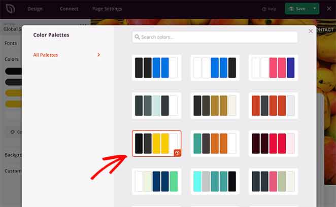
Adding a color scheme to your page is as simple as finding one you like and clicking it.
3. Minimize Distracting Visuals
It’s tempting to fill your landing page with all the latest bells and whistles. Surely your audience wants to see how good you are at design?
The truth is that fancy animations, flashing banners, and similar elements distract people from what you want them to do: convert.
Does a page like this really inspire you to take action?
While people admire your animation, they’re not reading the message that gets them to convert. And if there’s too much going on, the whole page looks like a hot mess.
If you’re set on adding effects, keep them to key areas like your call-to-action button. That draws the eye to where you want it.
4. Remove Your Navigation Menu
The last thing you want is for visitors to click away from your landing page. If someone taps a logo or a nav link, they never see your message.
That not only reduces your conversion rate, it can also push up your landing page bounce rate.
To fix this, remove unnecessary external and internal links, such as your navigation menu, social media buttons, and footer links. That leaves your CTA button as the only thing to click.
5. Choose Images Carefully
The images you choose shape how visitors perceive your landing page. Obvious stock photos come across as cringe-worthy and unprofessional.
A generic stock image creates a disconnect between you and your audience.
Let’s face it, does your office really look like this?

Probably not. When choosing landing page images, pick something that represents how you want your users to feel.
Take this example from All in One SEO.
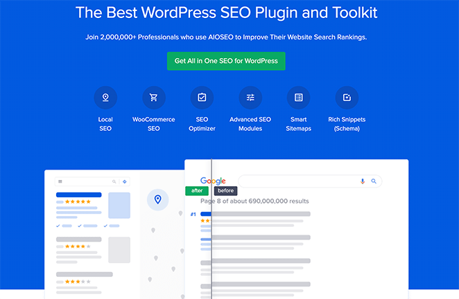
Instead of a standard stock image, they use a simple before-and-after slider.
The before shot represents their audience’s current search results. The after view shows what people can achieve with the product.
6. Use Directional Cues
Directional cues are another clever tactic when choosing landing page images. They steer attention to the areas you want people to focus on.
On client pages I’ve worked on, moving a hero image so the subject’s gaze pointed toward the form was one of the smallest changes that made a noticeable difference. People follow eyes and arrows without realizing it.
Directional cues come in two styles: explicit and implicit.
Explicit cues point people directly at the area you want their attention, using arrows, lines, or pointing fingers.
Implicit cues are subtler and often go unnoticed. They work by highlighting visual elements with contrasting colors and white space to draw the eye.
Learn how to add and remove white space in this guide.
7. Consider Using a Landing Page Template
Everyone wants a stunning landing page design. But if you’re just starting out or have limited design experience, getting the look you want isn’t easy.
In that case, start with a landing page template and customize it to fit your brand. Ready-made designs can get results just as impressive as a build from scratch.
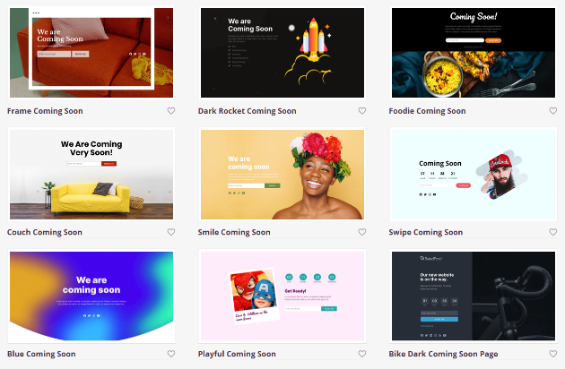
SeedProd offers a growing library of mobile-friendly landing page templates for any digital marketing strategy, including:
- Coming soon pages
- Maintenance mode templates
- Custom 404 pages
- WordPress thank you pages
- Product pages
- Squeeze page templates
- Sales landing pages
- Webinar page templates
- Video landing pages
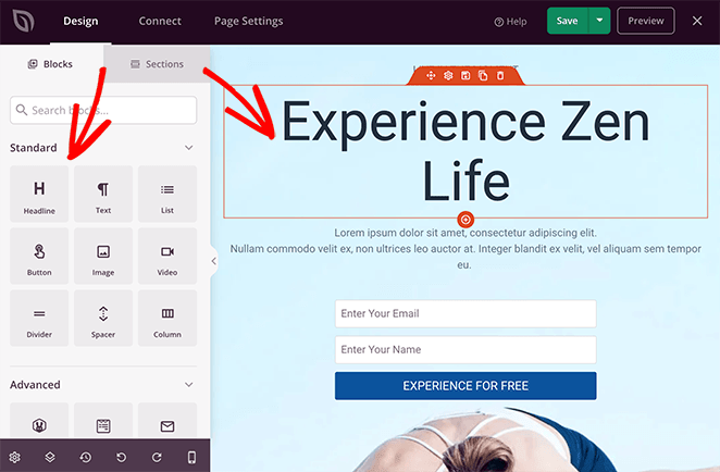
Every template is designed with landing page best practices in mind. They’re also easy to customize in SeedProd’s drag-and-drop WordPress landing page builder.
Related: How to Create a Landing Page without a Website
Landing Page CTA Best Practices
Your call to action (CTA) is the next thing to nail. The color, position, size, and copy of your CTA button all influence your conversion rates.
Here are some popular landing page CTA best practices.
8. Show Value Not Action
It’s tempting to use action words in your CTA button. It’s called a call to action, after all.
Action words like “Click,” “Start,” and “Go” beat vague ones like “Next” or “Continue.” But they can still undersell the promise of your page’s message.
Use value-focused copy instead, so the button emphasizes what people get from taking action.
Instead of “Learn More,” try “Grow Your Business.” When I’ve swapped generic button labels for benefit-led copy on pages I manage, the value-focused version has consistently been the one I keep after testing.
9. Use Contrasting CTA Colors
If people can’t see your CTA, they can’t click it. Use contrasting colors for your CTA button so it stands out instead of blending in.
If your entire page is green, a red button will really pop.
The best way to find contrasting colors is a color wheel like the one below.
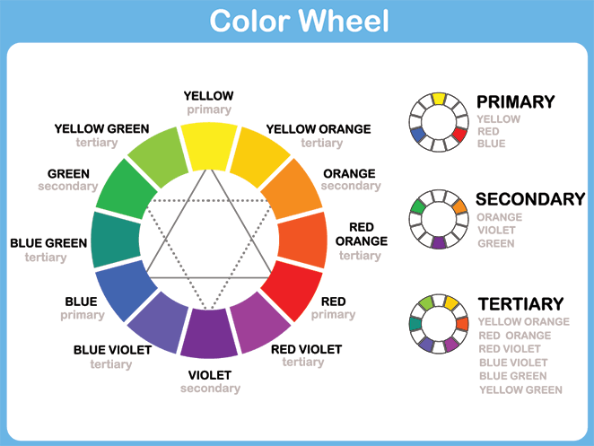
Colors opposite each other on the wheel tend to contrast well. Even so, A/B split test different colors to see which performs best.
10. Try Different CTA Sizes and Positions
How clickable your CTA is depends on its size and position. A larger button is easier to click because it takes up more space.
That doesn’t mean you need a giant CTA, which would just distract. Aim to make it larger than the elements around it.
Position matters just as much. Keep your CTA near the mouse cursor’s default resting spot, which for many people is around the center of the page.
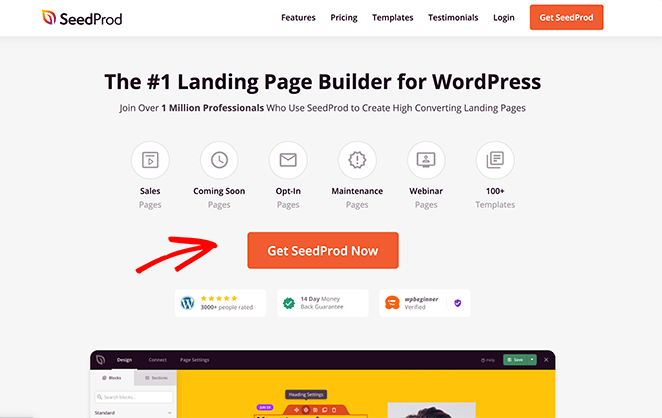
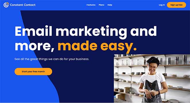
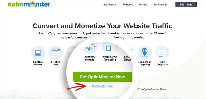
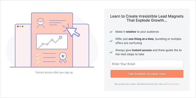
This is why SeedProd’s own CTA button sits front and center, above the fold. The area visitors see before scrolling is the most valuable space on the page, and it should carry the four things that drive a decision:
- A clear headline: States what the page is about in plain language.
- Your value proposition: One line on why the offer is worth their time.
- A visible CTA: The main action button, easy to spot without scrolling.
- A supporting hero image: A visual that reinforces the offer instead of decorating around it.
When I rebuild a page that isn’t converting, the top of the screen is the first place I look. If a visitor can’t tell what the page offers and what to do about it before scrolling, the rest of the design rarely saves it.
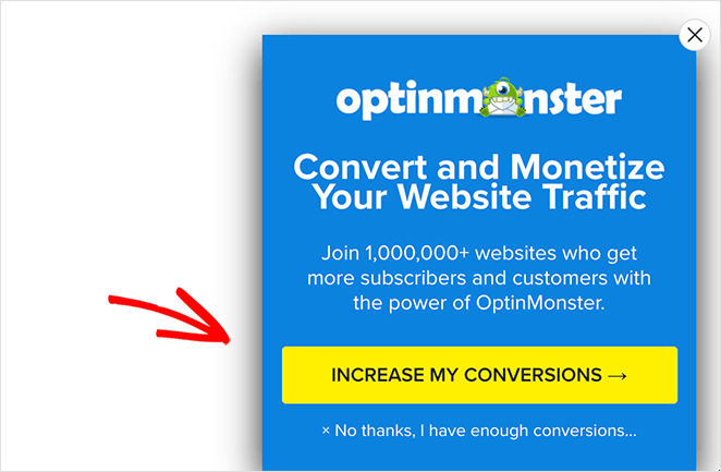
11. Support Your CTA with Extra Copy
A good CTA button is short and to the point. But what if you want to reinforce the value it offers?
One of the best ways is to add a line of supporting copy near your CTA. Here’s an example from OptinMonster.
Beneath the button, they link to a video that opens in a lightbox popup. Video is one of the best ways to explain complex information, so it’s an easy way to demonstrate the product’s value.
Landing Page Writing Best Practices
Do you need clever, witty copywriting on a landing page, or should you keep things simple?
If that feels confusing, these writing best practices will help you create high-converting landing page copy.
12. Make Your Headline’s Value Proposition Clear
Many landing pages bury their message under jargon and brand-focused copy. As a result, it’s hard to tell what the page is even about.
Focus your headline on the value proposition rather than your brand or technical features. A clear headline that spells out the benefit means people don’t have to guess what to do next.
Here are a few tips for clearer headlines:
- Get rid of the jargon and speak in plain language.
- Make the subject of your page clear and explain what people get.
- Focus on the benefits and the results your audience wants.
13. Meet Your Visitor’s Expectations
When creating a landing page, send people to a page that matches what they expected. Otherwise you miss the mark and lose conversions.
A PPC ad for budget running shoes that lands on a page about luxury sneakers doesn’t match expectations. It’s more likely to drive people away than convert them.
Make sure your ads and landing pages line up. You can do this by:
- Using the same headlines
- Keeping consistent color schemes
- Using similar copy
- Having the same images
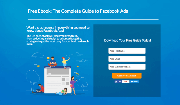
Take this Facebook ad, for example.
When you click through, the landing page headline, message, and branding all match the ad.
14. Address Their Fears and Objections
People hesitate before clicking a CTA or buying for all sorts of reasons. They might be confused by a feature or want to know whether you offer a guarantee.
These fears and doubts stop visitors from converting, or push them toward a competitor.
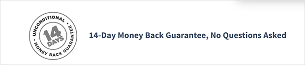
To keep them around, address those concerns right on the page. To ease worries about returns, for example, you could offer a money-back guarantee.
Another effective option is adding an FAQ section to your landing page. With SeedProd, that’s easy.
Use one of the built-in landing page sections, and a single click adds a customizable FAQ section anywhere on your page.
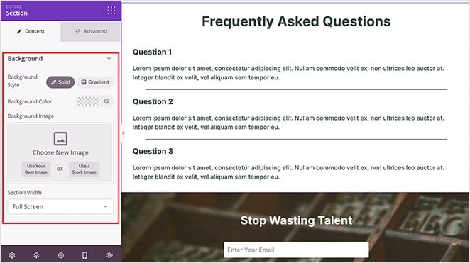
Then fill it with answers to your most common questions to ease visitor objections.
15. Grab Attention with Power Words
Power words are words and phrases that grab attention instantly and stir emotion. They turn dull copy into something that creates a connection.
Some popular power words include:
- Bargain
- Exclusive
- Limited
- Astonishing
Use them in your copy, but sparingly. Too many complex words can have the opposite effect and put visitors off.
OptinMonster has put together a list of over 700 power words to get you started.
16. Make Your Copy Readable
You could write the most compelling copy in the world, but if it isn’t readable, no one will absorb it.
The way people consume information has changed. We skim-read, picking up only the details that matter.
So tailor your landing page copy to a busy, distracted audience. You can do this with:
- Subheadings to highlight different topics and sub-topics
- Bullet points to break down steps and benefits
- Short paragraphs of two to three sentences
- Images to break up text and illustrate key points
Keep in mind that all your copy should lead naturally to a single goal: your CTA.
How Do You Optimize a Landing Page for SEO?
You optimize a landing page for SEO by targeting the right keywords, structuring your content for search engines, and optimizing your images and metadata. Organic traffic is the most valuable type to attract, because these are people actively searching for a solution your product fits.
Optimizing for search means people looking for your product can find it easily in engines like Google. Here are the practices to start with.
17. Use Keywords Strategically
Chances are you already have ideas about the phrases people use to search for your product. These are your primary, secondary, and semantic keywords.
Here’s a quick example of what we mean:
- Primary keyword: webinar landing page
- Secondary keywords: landing pages, best webinar landing pages, webinar landing page examples
- Semantic keywords: sign up to webinar, webinar registration, webinar CTA
Structure your content so search engine bots can read it easily. That helps them understand your page and index it correctly.
Include a mix of primary, secondary, and semantic keywords in your page title, sub-headings, and body copy.
Don’t overdo it, though. “Keyword stuffing” can hurt your rankings, so keep your placement natural and easy to read.
Most SEO experts put the ideal keyword density at around 1 to 2%, which works out to about one keyword per 100 words.
18. Tell Search Engines What Your Pictures Are
Optimizing images for search is something many site owners overlook.
Search engine bots crawl images just like your text. Two separate things help them understand an image, and they’re easy to confuse:
- Descriptive file name: The actual file name you upload, like
buddha-beans-organic-hemp-infused-coffee.jpg, gives search engines context before the page even loads. - Alt text: A short description attached to the image in your page’s HTML, which describes the image for both search engines and screen readers.
Take this image of some coffee, for example.
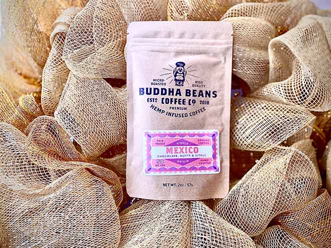
You could call the file something like “coffee-beans,” but how would that stand out from every other coffee image online?
Name the file “buddha-beans-organic-hemp-infused-coffee” and write matching alt text, and both users and search engines understand it far better.
19. Don’t Forget Your Metadata
A few other areas of your landing page need SEO attention: your meta tags, or metadata. Visitors don’t always see this information, but it helps search engines decide how to index your page.
Here’s what to include in your landing page metadata:
- SEO title tag: Keep it short and put your primary keyword toward the left, with less important words last.
- Image alt tags: Describe what each image shows and include at least one keyword variation.
- Meta description: A short, clear statement of what your page is about. Use your keyword or a variation at least once.
If SEO feels confusing, this complete SEO guide can help.
How Do You Design a High-Converting Landing Page Form?
You design a high-converting form by asking for as little as possible and making it easy to complete. Your contact form is your second most important element after the CTA, because it’s where you turn visitors into leads and customers.
How your form looks plays a big role in conversion rates. Here are the best practices to follow.
20. Ask for Less Painful Information First
Picture landing on a page for a free download, only to be asked for your credit card number. You’d hit the back button and leave.
People weigh their personal information differently. A first name feels far less risky to hand over than a credit card number or home address.
When designing your form, ask for the least painful details first. Once someone gives their name, it’s easier for them to share an email address too.
You can even show progress with a dynamic progress bar, which makes the form feel faster and easier to finish.
21. But Don’t Ask for Too Many Details
While we’re on forms, don’t ask for too many details. Do you really need their zip code, business email, and company name? Probably not.
Once you have someone’s email, there are plenty of other ways to gather extra information, like email marketing campaigns.
So keep your form minimal and only ask for the details you need to qualify a lead.
If you absolutely need more detail up front, create a multi-page form with WPForms. A multi-page form splits long forms into easy steps, reducing form fatigue and boosting conversions.
22. Use Mobile-Friendly Form Elements
More and more people browse and shop from mobile devices. Their screens are smaller and their keyboards more cumbersome.
Asking mobile users to fill in the same form as desktop users leads to low conversions.
Take date of birth fields. On desktop, you’d normally click the date.
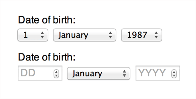
On mobile, that’s harder. The small size makes individual dates tricky to tap.
Instead, use a scrolling date selector so people can swipe and tap to choose.
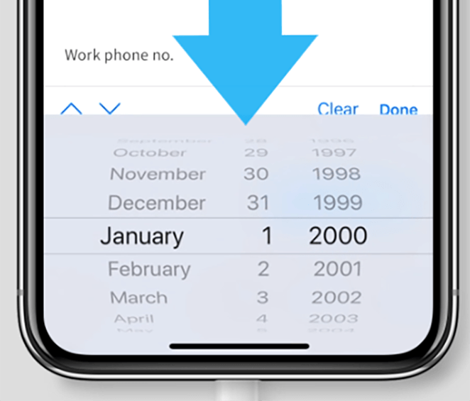
This applies to every form element. Buttons and drop-downs should all be built to tap or swipe, not click.
How Do You Make a Landing Page Mobile-Friendly?
You make a landing page mobile-friendly by speeding up load times, using tappable buttons, and keeping your CTA easy to reach on a small screen. Optimizing for mobile is the best way to serve a growing share of your audience.
Here are proven ways to improve landing page performance on smaller screens.
23. Reduce Your Landing Page Size
Fast load times should be a top priority, and for mobile users, page size matters even more.
According to Google’s mobile page speed data, conversion rates rose by 8.4% for retail and 10.1% for travel when brands cut their mobile load times by just one tenth of a second.
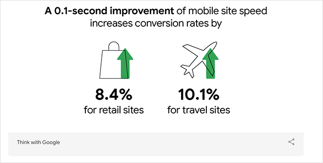
Here are some tips to speed up your landing page:
- Check your current speeds with a website speed test tool
- Compress all your images to smaller sizes
- Reduce total requests by combining JavaScript and CSS files and removing custom fonts
- Move faster-loading elements above the page fold
For more, see our guide on how to speed up your WordPress website.
24. Use Click-to-Call Buttons
Mobile users don’t always have time to hunt for the information they need. If they did, they’d probably be on a desktop with better functionality.
If one of your main goals is for people to get in touch, why not use a click-to-call button?
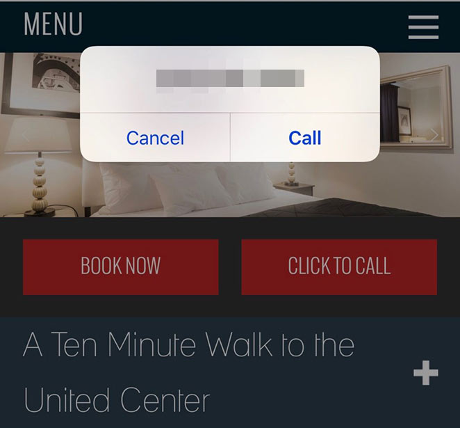
These buttons load your phone number into someone’s phone, so a single tap places the call.
25. Try Scrolling CTAs on Mobile
Space is limited on mobile, so put your CTA where it’s easy to see. If users have to scroll endlessly to find it, they might miss it entirely.
Solve this with a sticky or scrolling CTA that moves with the screen as people scroll. Trello’s mobile landing page does this well.
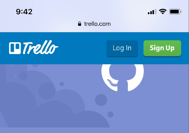
Just keep this element small and discreet so it doesn’t crowd the screen or annoy users.
eCommerce Landing Page Best Practices
Our last section covers best practices for eCommerce sites. For most online stores the goal is more sales, so optimize your page around that.
Here are our eCommerce landing page best practices for driving sales.
26. Make It Easy to Convert
Many stores do all the right things when building landing pages. Where they fall short is making checkout easy.
A complicated checkout leads to abandoned carts, so aim for speed and simplicity. This example from RafflePress ticks the right boxes.
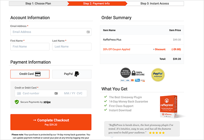
Everything is visible on a single page, above the fold, including:
- Order summary
- Payment and pricing details
- Trust badges
- Testimonials
- Clear CTA
You can create a custom checkout page like this with SeedProd. It comes with WooCommerce blocks like add to cart, checkout, shopping cart, and products grid.
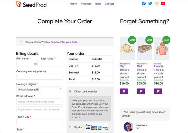
That makes it easy to build better landing pages and customize your WooCommerce checkout for higher conversions.
27. Show Your Shipping Costs
If you optimize your product pages but hide your shipping costs, you’re throwing money away.
Even a ready-to-buy customer is tallying their cart total as they shop. Surprise them with a $10 shipping fee at the checkout page and they’ll run for the hills.
So show your shipping costs clearly on your landing page, so shoppers know what to expect.
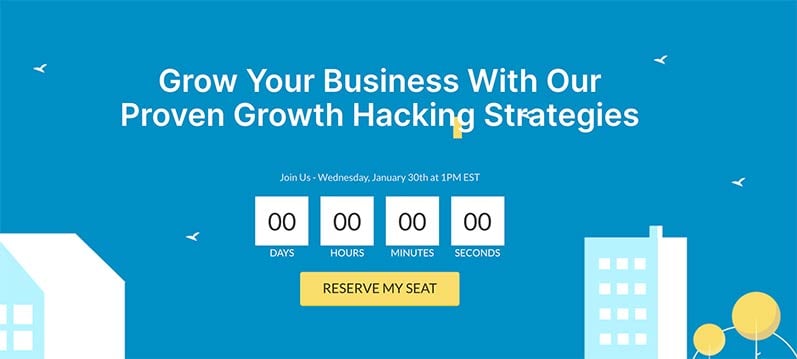
28. Encourage Action with Urgency
Ever landed on a site with a timer counting down a special deal? That’s urgency marketing at its finest.
A countdown clock spurs people to act for fear of missing out, so they grab your deal now rather than risk losing it.
It’s easy to add countdown timers and limited-time deals to your page with SeedProd.
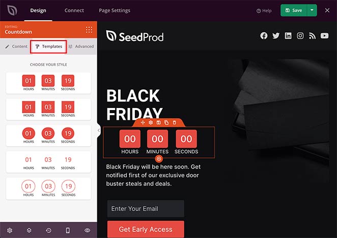
Just drag and drop the countdown timer block onto your page to customize it.
29. Show Value with Social Proof
Another way to boost sales is to show testimonials and reviews from real customers.
People trust honest opinions from others more than a brand’s word, so social proof can be the push they need to act.
With SeedProd, you can use the star rating block to display social proof on your page.
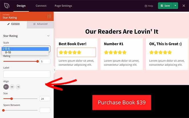
It’s also a good idea to include a photo of the reviewer, so visitors can relate to it more.
30. Demonstrate Credibility with Trust Badges
Another way to make your brand and landing page feel more trustworthy is to use trust badges. These are logos and symbols from credible brands that people recognize.
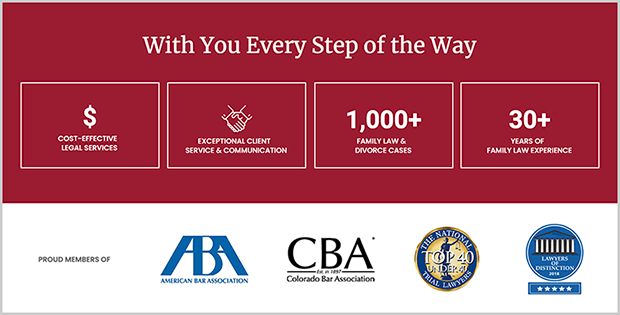
Trust badges can include:
- SSL certificate logos
- Payment option icons
- Money-back guarantees
- Awards and certifications
- Data privacy icons
Learn more about how to use trust badges to secure more conversions here.
31. A/B Test Everything
Our final best practice is one every site owner should follow, no matter what type of landing page you build: A/B split test everything.
You can’t know what works best without comparing different elements. Is a green CTA button more effective than a red one? Is one hero image more convincing than another?
The results have surprised me more than once. On pages I was sure about, the version I expected to win has lost the test, which is exactly why I stopped trusting my gut and started testing.
Check out these A/B test examples for ideas on what to test.
Which Practices Move Conversions the Most?
All 31 tips help, but they don’t all carry the same weight. If I could only fix three things on an underperforming page, here’s the order I’d work in.
- One clear offer (tip 1): A page trying to do two things converts worse than a page that does one thing well. This is the change that’s moved the needle most on pages I’ve rebuilt.
- The above-the-fold CTA (tips 8 and 10): If a visitor can’t see the offer and the action without scrolling, the rest of the page rarely gets a chance to work.
- A/B testing (tip 31): Once the first two are right, testing is what turns good guesses into reliable gains. It’s last in priority but never optional.
Everything else, from color palettes to trust badges, refines a page that’s already built on those three. Get the foundation right first.
FAQs About Landing Page Best Practices
How long should a landing page be?
There’s no fixed length. The right length is however much it takes to make your offer clear and answer the visitor’s main questions, and nothing more.
A simple email opt-in can convert with a single screen, while a high-priced product often needs more proof, detail, and objection handling. Match the length to how big a decision you’re asking the visitor to make.
What is a good landing page conversion rate?
A typical landing page conversion rate sits around 2 to 5%, and anything above 10% is strong. The right benchmark depends heavily on your industry, traffic source, and offer.
Rather than chase a universal number, track your own rate and work to beat it. Our guide to landing page conversion rates breaks down the benchmarks in more detail.
How is a landing page different from a regular web page?
A landing page is built around a single goal and strips away anything that distracts from it, like navigation menus and footer links. A regular web page, such as your homepage, is built for browsing and gives visitors many paths to follow.
That focus is the whole point. Sending paid or campaign traffic to a focused landing page almost always converts better than sending it to a general page.
I hope these landing page tips help you create better pages that convert more visitors and grow your business. Pick one practice from the priority list above and apply it to your weakest page today.
If you want to support your landing page with live chat, you’ll love these best live chat plugins for WordPress. You can also see the anatomy of a landing page here.
Thanks for reading! We’d love to hear your thoughts, so please feel free to join the conversation on YouTube, X and Facebook for more helpful advice and content to grow your business.


