Landing pages are designed to convert visitors into leads by directing them toward a single, specific action—like signing up, buying, or subscribing.
They play a critical role in digital marketing because they eliminate distractions and focus on a single conversion goal. But with so many types of landing pages available, how do you know which one is right for your business?
In this guide, I’ll break down 11 proven landing page types, explain when to use each, and show real-world examples to help you choose the best format for your goals.
Landing Page Comparison Table
| Page Type | Best For | Goal | Key Feature |
|---|---|---|---|
| Squeeze Page | Growing email list | Collect email addresses | Simple form with lead magnet |
| Splash Page | Notices or age verification | Pre-content announcements | Temporary, entry gate |
| Lead Capture Page | Gathering deeper contact info | Qualify leads | Detailed forms |
| Click-Through Page | Warming up traffic | Guide to sales/pricing page | Benefits + CTA |
| Long-Form Sales Page | Selling complex/high-ticket offers | Direct purchase | Full persuasive copy |
| Coming Soon Page | Product/site launches | Build anticipation + collect emails | Countdown timer, opt-in form |
| 404 Page | Retaining lost traffic | Redirect or capture new interest | Humor + useful links |
| Thank You Page | Post-action upsells | Drive next engagement | Recommendations/referrals |
| Event Page | Webinars, conferences | Drive event registrations | Event info + form |
| Login Page | Account access | Deliver value + promote features | Feature promotion |
| Pricing Page | Decision-making | Convert interest into purchase | Pricing tiers + FAQs |
What Are Landing Pages in a Website?
A landing page is a focused web page designed to convert visitors by guiding them to take a specific action—like signing up or buying. Most often, it’s where users land after clicking on a digital ad. For example, search engine text ads, display ads, or ads from social media marketing campaigns.
Some marketers often direct the traffic from those ads to their homepage. But this can be a mistake that leads to lost leads and revenue.
When users click through to your homepage, there are lots of distractions that can lead them away from converting, like:
- Blog posts
- Social media links
- Third-party ads
Yet, a landing page is more focused and has none of the typical distractions. Instead, landing pages work by driving potential customers toward a specific goal like signing up to your email list or buying a product.
What Are the Best Types of Landing Pages to Increase Conversions?
There are many different types of landing pages you can create with different goals and purposes. Knowing which landing page design to use for your digital marketing campaigns is tricky.
But don’t worry. Below we share the most common types of landing pages and when to use them for your business.
Video Guide
Keep reading if you prefer to read the written guide.
1. What Is a Squeeze Page?
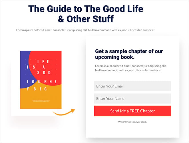
A squeeze page is a focused landing page that collects email addresses in exchange for a free resource. It’s ideal for growing your email list with lead magnets like eBooks, checklists, or newsletters.After capturing the address, you can nurture those visitors with relevant content and other offers.
The most popular squeeze pages offer an incentive for users to enter their contact information, like:
- Newsletters
- eBooks
- Whitepapers
- Free trial
In my experience, the highest-converting squeeze pages always use a single form field and offer something immediately actionable, like a 5-minute checklist.
By giving users something in return for handing over their email, you build trust and offer people value, which is great for building long-lasting customer relationships.
When putting your squeeze page together, keep your design simple and easy to use. Your CTA button (call-to-action) should be tempting enough for people to click and clear enough for mobile users to spot.
2. When to Use a Splash Page
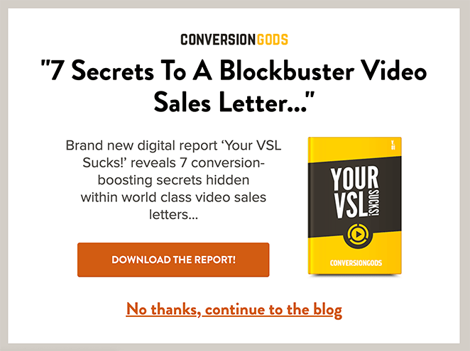
A splash page is a temporary page that appears before users access your main site content. It’s often used for announcements, age verification, or redirecting traffic during maintenance.
For example, when users click a social media link, you can show an intermediary page to verify their age before sending them to the link’s destination. Or your splash page might show an ad that you earn revenue from when people click the link.
Here are some other ways you can use splash pages:
- Promote your social media profiles
- Tell visitors your new website is coming soon
- Show a maintenance notice
- Ask users to set their language preferences
To put it simply, a splash welcomes users to your website with familiar branding and shows users an ad or message that benefits your business.
Learn the difference between a landing page and a splash page here.
3. Lead Capture vs. Squeeze Page
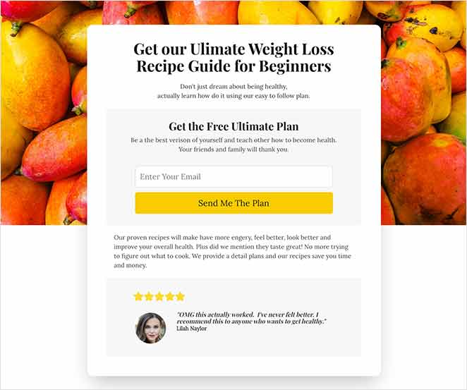
A lead capture page collects more detailed contact information from potential leads beyond just an email address. Use it to qualify visitors by asking for names, job titles, or company info.
This type of landing page might ask for a lead’s:
- Name
- Business name
- Job title
- Phone number
- Industry
But the information you collect largely depends on your marketing goals and where that user is in your sales funnel.
For instance, if your lead capture page is at the top of your sales funnel, you don’t want to hit prospects with a form that asks for their life story. Instead, use a short form that asks for minimal information.
But if someone lands on your page after showing interest in your product or service, maybe they already downloaded a few case studies, it’s easier to ask for more information to qualify them as a lead.
4. What Is a Click-Through Page?
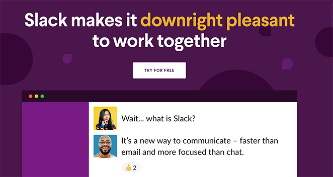
A click-through landing page educates users before sending them to a pricing or sign-up page. It warms up cold traffic by highlighting benefits without an immediate sales pitch.
The CTA button on this type of landing page often takes users to a second landing page that provides pricing details or information on signing up for a free trial. When users land on that page, they’re fully educated on why they should move forward.
5. When to Use a Long-Form Sales Page
A long-form sales page provides detailed product or service information to persuade visitors to buy. It addresses objections, explains benefits, and ends with a strong call to action.
By the time users scroll to the bottom of your page, they’ll know all the benefits they’ll get by making a purchase.
Take this sales page example from OptinMonster University.
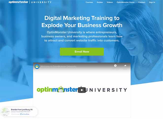
It starts with an eye-catching headline and a video explaining how their digital marketing training can help you grow your business. You then see logos of companies that trust OptinMonster, positioning them as credible experts in their industry.
Quotes and testimonials serve as powerful social proof.
The page finishes with a CTA to enroll for free—made more persuasive with a strike-through of the regular price to create.
A sales landing page has plenty of detail without the minimalism of a squeeze page. This is because your goal for the page is to close business.
Don’t assume more copy equals better results. I’ve tested pages where cutting 30% of the text actually lifted conversions. Brevity can be powerful if your offer is clear.
Click here to learn how to create a sales page in WordPress.
6. How to Use a Coming Soon Page
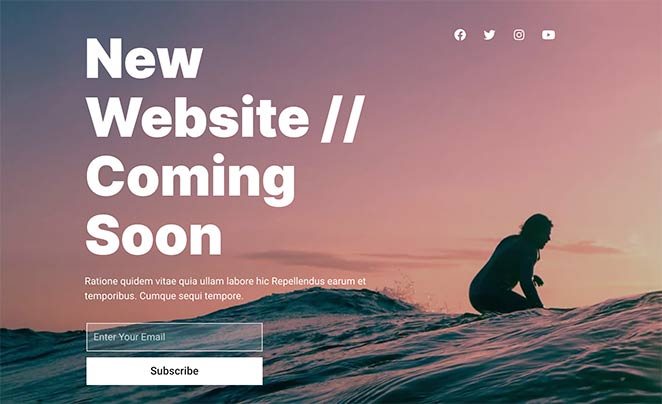
A coming soon page teases an upcoming product, event, or website before it launches. It collects email addresses for early interest and helps build momentum before launch day.
A coming soon page allows you to display a place-holder page on your site with a friendly notice saying you’re launching soon.
Add a countdown timer to your coming soon page, counting down to launch day. You can even show your social media profile links to encourage users to follow you on social media.
You can learn how to create a coming soon page in WordPress here.
7. Optimizing a 404 Landing Page
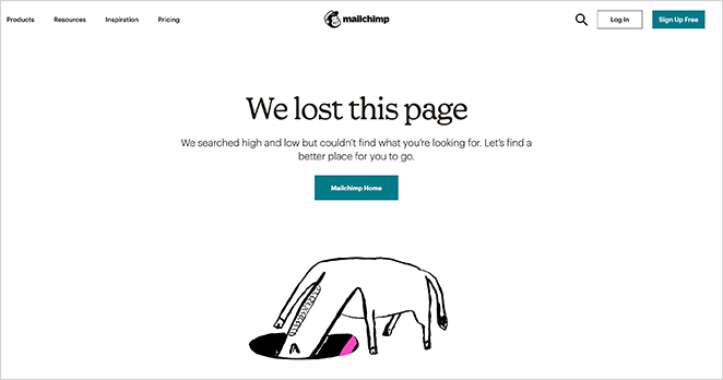
A 404 landing page turns a dead-end error message into an opportunity to retain visitors. It can redirect users to helpful pages, feature product offers, or collect leads.
Humor is an excellent way to offset the discomfort of the error, so get creative with your 404 page message and design. You should also offer ways for people to get back to your website by showing a link to your homepage or other pages.
Your 404 page doesn’t have just to sit there waiting either. Put it to work and use it as a lead generation tool. You could offer users a free demo, showcase featured products, or even send people to relevant articles.
I’ve seen 404 pages outperform standard blog posts in lead capture, especially when paired with a clever message and a valuable freebie.
8. What to Include on a Thank You Page
A thank you page confirms a user’s action—like a purchase or sign-up—and encourages next steps. It’s a great place to upsell, offer bonuses, or invite social sharing. But too often, marketers don’t use this type of page for anything else.
Because the people that visit your thank you page are already motivated and interested in your brand, you can use this page to offer more value.
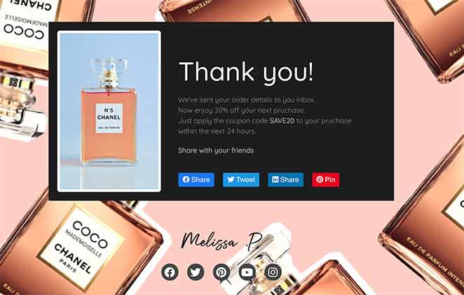
For example, you could invite users to:
- Enter a giveaway
- Browse recommended products
- Follow your social media profiles
- Refer other people to your business
- Leave a product review
You can even use a thank you page to provide an extra offer to users, based on their last action.
For instance, if users visit your thank you page after downloading an ebook about the best keto ingredients, you could offer them a free swipe file download of keto recipes. The only difference is you can ask for different information on your sign-up form this time to better craft the next offer you send their way.
One thing I’ve found effective is using the thank you page to introduce a limited-time offer. It leverages momentum while your lead is still warm.
9. What Is an Event Landing Page?
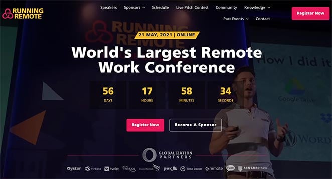
An event landing page is built to drive registrations for a specific event like a webinar, conference, or seminar. It highlights event details, speaker info, and includes a registration form. Sometimes this type of landing is called an event registration landing page because the goal is to convince users to register for the event.
The type of event your landing page promotes could be a:
- Webinar
- Conference
- Seminar
- On-demand event
Every event landing page has several things in common. First, they include the event details, like the time, date, and location. They also include details about who is speaking at the event and event sponsors.
Above all, your event landing page should have a short registration form where users can register their interest and where you can collect leads.
10. Login Page as a Marketing Tool
A login page grants access to a restricted area of your website through user credentials. You can enhance it by promoting new features, updates, or upgrades beside the login form.
Many businesses have a simple login page that only includes a login form. But what you might not know is you can use this space to offer more value to users.
Take this example from WPForms.
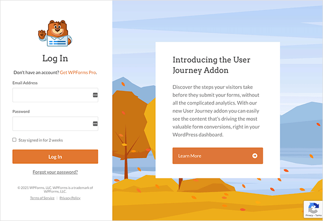
Next to the login form is an area introducing users to a new WPForms feature and a button to learn more. Since many people might not know about this update, it’s a great way to let them know in a place WPForms know they’ll visit.
Other ways to use valuable space on your login page include:
- Highlighting specific features
- Offering discounts for upgrades
- Promoting partner products
Just make sure your offer is relevant to your users.
11. What Makes a Great Pricing Page?
A pricing landing page helps visitors evaluate and choose from your product or service plans. It should clearly list features, offer social proof, and address common objections with FAQs.
Take this pricing page from SeedProd. It clearly outlines the 4 tiered packages, with links to more information or to get started.
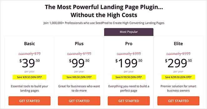
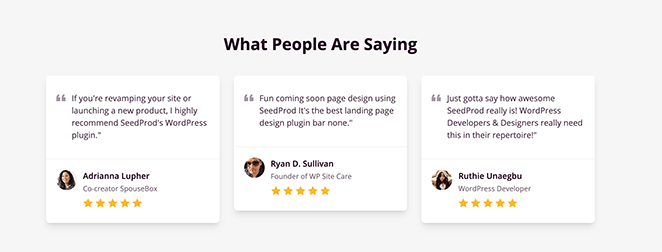
Directly after the pricing table is a money-back guarantee that reassures users with an unconditional refund if SeedProd isn’t the best fit. What we love about this pricing page are the 3 boxes right after the guarantee with testimonials from satisfied customers.
And towards the end of the page is a FAQ section addressing common questions before users even have to ask them. With all the above, users can have their fears and objections addressed and see the benefits of signing up.
That’s it!
We hope this article helped you learn about the different types of landing pages you can make for your business.
The next step is to dive in and make one yourself. To help, we put together this step-by-step guide on how to create a landing page in WordPress. You might also like to know what the best landing page conversion rates are.
While you’re here, please follow us on Facebook and Twitter for more helpful tips and tutorials.

