


TL;DR A demo landing page is a single-purpose page where visitors sign up to see your product in action. Here’s what separates the pages that fill calendars from the ones that sit empty:
- One goal: A demo page has no navigation, no footer links, and nowhere to go except the signup form.
- Short form: 3-5 fields is the sweet spot. More than 5 and drop-off climbs fast.
- Trust signals: Testimonials, award badges, and recognizable customer logos lower the barrier before visitors commit.
- Video option: A short product video above the form warms leads before they fill it out.
- Clear CTA: The button copy should tell visitors exactly what happens next, not just say “Submit.”
- Build your own: SeedProd has demo page templates you can customize without touching code.
Your SaaS tool is getting solid traffic. Visitors browse the pricing page, click around, and leave without booking anything.
In my 13+ years writing about WordPress and digital marketing, I’ve seen this pattern repeat across B2B and SaaS sites constantly. The fix is usually the same: a dedicated SaaS demo landing page that removes every distraction and puts the signup form front and center.
In this guide, I’ll walk you through seven real SaaS and B2B demo pages, what makes each one work, and how to build your own.
What Is a Request a Demo Landing Page?
A demo landing page is a dedicated web page where visitors sign up to watch your product in action, the most direct route from interest to a sales conversation.
It’s most common for SaaS businesses because it turns casual interest into qualified leads. Unlike a homepage with 10 competing links, a demo page has one goal: the demo signup.
Let’s look at what the best ones have in common before diving into the examples.
What to Include on Your Demo Landing Page
I reviewed each of these pages against the same checklist. At minimum, every demo page needs:
- A clear headline: State what visitors will see and how long it takes.
- Social proof: Testimonials, customer logos, or award badges that confirm you’re worth their time.
- A short product video: A 2-3 minute walkthrough above the form warms leads before asking them to commit to a call.
- A signup form: Keep it to 3-5 fields. WPForms data shows limiting to 3 fields slashes abandonment rates. For high-ticket SaaS, 5 fields (name, email, company, role, team size) is the outer limit before drop-off climbs.
- A single CTA button: Tell visitors exactly what happens next (“Book Your 20-Minute Demo” beats “Submit”).
- No navigation links: Every exit path you remove is a visitor you keep. See how to build a landing page without navigation for the technical side.
On the video vs. form question: request a demo forms are high-intent but high-friction. A visitor has to commit to a sales call before they’ve seen anything. A product video above the form earns the right to ask for it. The form captures the qualified lead; the video does the convincing. Podia’s page (example 5 below) shows this working in practice.
How I Chose These Examples
I personally reviewed each of these demo pages. Here’s what I evaluated:
- Conversion elements: Does the page have a form, a clear CTA, and trust signals in the right places?
- Form friction: How many fields does the form require, and does it match the product’s sales complexity?
- Trust signals: Testimonials, awards, customer logos, and social proof that lower skepticism before the ask.
- Design clarity: Is the form the focal point, or is it buried in distractions?
- WordPress applicability: Could a WordPress site owner replicate this approach with SeedProd?
7 Demo Landing Page Examples Worth Studying
Here’s a quick breakdown of all seven pages before we dig in:
| Company | Best For | Standout Feature | Demo Format |
|---|---|---|---|
| OptinMonster | Layered trust signals | Exit-intent popup as second-chance CTA | Form |
| Nextiva | Multi-path conversions | Form, phone, and chat options on one page | Form + Chat |
| Salesforce | High-value content access | One form unlocks multiple resources | Form |
| Hootsuite | Award-backed authority | Award badges as friction reducers | Multi-step form |
| Podia | Video-first product tours | Live demo site + weekly webinar form | Video + Form |
| SharpSpring | Two-path buyers | Free trial or personalized demo split | Form + Calendar |
| Keap | Email-only capture | Minimal design with single-field form | Form |
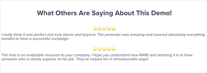
OptinMonster: Best for Layered Trust Signals
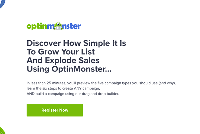
OptinMonster’s demo page works because it removes friction first: a clean layout, a bold headline, and a promise that the demo takes less than 25 minutes. Visitors know exactly what they’ll get and how long it will take.
Trust is layered throughout the page. Testimonials reassure hesitant users, while awards and accolades confirm credibility before the final CTA.
To catch last-minute drop-offs, an exit-intent popup offers a discount, turning an abandoned visit into a second chance at conversion.
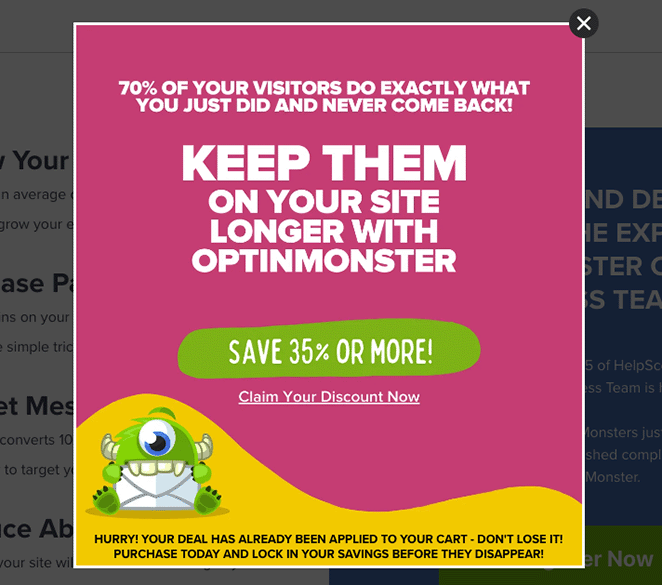
Use OptinMonster’s approach if you need to book demos from skeptical buyers. The exit popup alone is doing heavy lifting that most SaaS pages don’t bother with.
Nextiva: Best for Multi-Path Conversions
Nextiva makes booking a demo impossible to miss. Its homepage highlights the option right beside pricing, and clicking opens a full-screen form dedicated to demo requests.
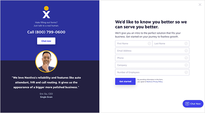
What makes this product demo page stand out is choice: users can fill the form, call a sales rep, or use the live chat window. This flexibility caters to different buyer preferences and reduces friction across all of them.
The contact form asks for five fields. Cutting it to three would reduce abandonment, though collecting more data upfront can qualify leads before the call. Trust signals seal the deal: customer testimonials with headshots, a clean branded design, and clear CTAs guide visitors to the next step.
- Multiple demo request options (form, call, or chat)
- Simple, minimal design that keeps focus
- Testimonials and branding that build credibility
Want a similar look? Try this SeedProd landing page template to design your own demo page.
Nextiva works well when your buyers come from different channels with different preferences. If your audience is homogenous and you want to simplify the decision, three paths may be more than you need.
Salesforce: Best for High-Value Content Access
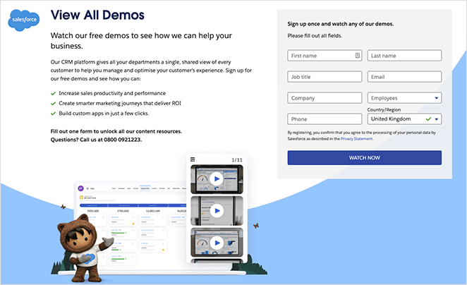
Salesforce’s book a demo page goes beyond a single product walk-through. It uses one form to unlock access to all its content resources, creating higher perceived value while keeping lead capture simple.
The form copy spells out exactly what visitors will gain, which helps reduce hesitation about sharing contact details. A phone number is also available for prospects who prefer not to fill out a form at all.
- Single form unlocks multiple resources
- Compelling copy explains benefits upfront
- Alternative option to call instead of form-fill
Use Salesforce’s approach if you have a content library or multiple demo formats. The “one form, everything unlocked” framing works because it reframes the ask as a trade the visitor wins.
Hootsuite: Best for Award-Backed Authority
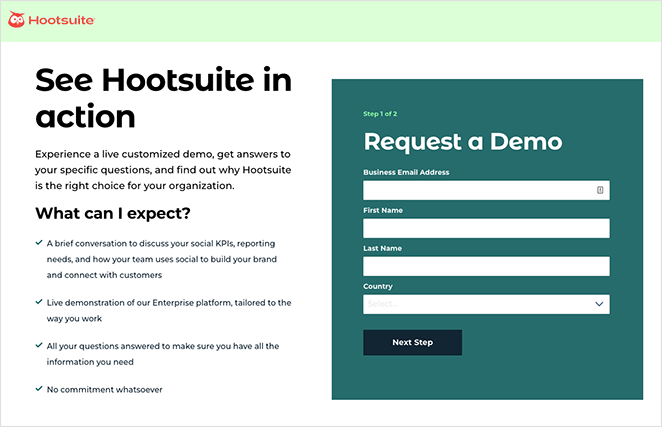
Hootsuite’s demo page grabs attention with a bold headline and backs it up with actionable copy that tells visitors exactly what they’ll learn. The design is clean, distraction-free, and puts the signup form front and center with a contrasting background color.

The form is short, and the award badges sitting next to it do the trust-building work before visitors commit. It’s a lean page that relies on authority signals rather than volume of content.
- Multi-step form sets expectations and eases completion
- Minimalist design keeps focus on conversion
- Award badges add authority and reduce friction
Want this look? Use this SeedProd template to build a similar SaaS demo page.
Hootsuite’s approach works best when you have third-party validation (industry awards, G2 rankings, analyst reports). Without those badges, the page would feel thin. If you’re earlier-stage, lead with customer testimonials and specific results instead.
Podia: Best for Video-First Product Tours
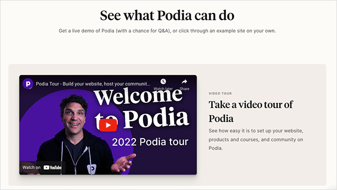
Podia takes a more interactive approach to the demo page. Instead of just a form, it leads with a video tour of the platform so prospects see exactly how it works before signing up.
Visitors can also click through to a live demo site, giving them a test drive of real course and product pages. At the bottom, a quick 3-field registration form makes it easy to join a weekly live webinar.
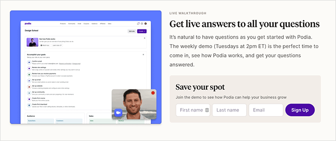
This is the video-above-form pattern I mentioned in the elements section. The video earns the right to ask for the form fill. What could improve this page? Removing the navigation and footer menus to cut exits, adding trust badges, and using a countdown timer to build urgency would likely boost conversions further.
- Video + live demo site = instant product value
- 3-field webinar registration form = low friction
- Could improve with trust signals and urgency elements
Want to try something similar? Start with this SeedProd landing page template.
Use Podia’s approach if your product is visual and complex enough to warrant a walk-through. It adds a step but converts warmer leads, which means fewer wasted sales calls.
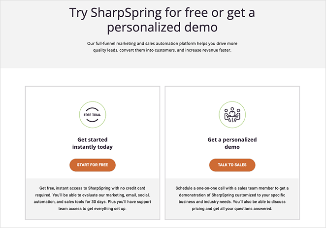
SharpSpring: Best for Two-Path Buyers
Note: SharpSpring was acquired by Constant Contact in 2023 and rebranded to Constant Contact Lead Gen & CRM. The page shown here reflects the SharpSpring era and some UI elements have changed, but the two-path conversion structure is still a strong reference.
SharpSpring’s demo page makes itself flexible by offering two clear paths: start with a free trial or book a personalized demo with sales. This split lets users choose based on where they are in the buying journey.
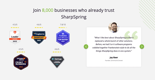
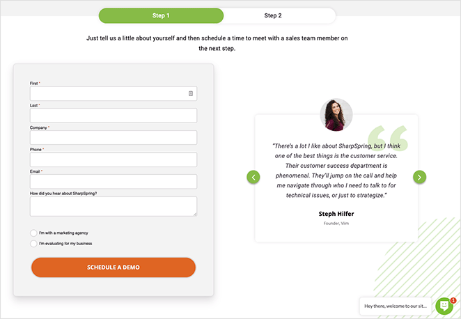
Scrolling down adds extra reassurance: testimonials, award badges, and feature highlights build trust for undecided visitors. The “Talk to Sales” option opens a multi-step form followed by a calendar, letting prospects book a 30-minute chat at a time that suits them.
- Two conversion options: free trial or custom demo
- Trust signals: testimonials and award badges
- Built-in scheduling = frictionless next step
Use SharpSpring’s approach if you’re serving buyers at different stages simultaneously. It outperforms a single-path page when some visitors are ready to buy and others still need convincing.
Keap: Best for Email-Only Capture
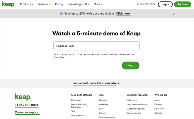
Keap proves that even a simple book a demo page can convert when it includes the essentials: a clear headline, a minimal sign-up form, and a bold CTA button. Nothing extra distracts from the goal.
- Action-driven headline sets expectations
- Short form reduces friction
- Bold CTA button directs attention
The page could perform better with a few additions. A product video or gif would make it more engaging, while testimonials and a no-spam disclaimer could build trust. Removing extra menu links would keep visitors focused on converting.
- Use a testimonial carousel for social proof
- Add a visual element before the form
- Include a trust disclaimer below the form
- Limit navigation links to prevent exits
Keap’s approach works if you’re capturing low-commitment leads who’ll get a follow-up sequence rather than an immediate sales call. It’s not the right fit for enterprise SaaS where buyers want to know more before they hand over an email.
Note: These screenshots were captured to illustrate the conversion principles at the time of writing. Demo pages change frequently, so the live pages may look different today.
What to A/B Test on Your Demo Page
Once your demo landing page is live, these are the four elements worth testing first:
- CTA copy: “Request a Demo” vs “Watch a 5-Minute Demo” vs “See It in Action” — the verb choice changes the perceived commitment level.
- Form field count: 3 fields vs 5 fields. Fewer fields improve completion; more fields improve lead quality. Test which tradeoff fits your sales process.
- Headline benefit claim: Test a specific outcome (“Cut your reporting time in half”) against a generic one (“See how [Product] works”).
- Social proof placement: Above the form vs below the form. Some audiences need reassurance before they read the copy; others need the pitch first.
Once the page is live, track your demo request conversion rate (form completions / unique visitors). A solid SaaS demo page converts at 10-20% for warm traffic; paid traffic typically runs 5-10%. If you’re below 5%, the form is likely too long or the page lacks social proof. For deeper landing page optimization tips, that guide covers the full process.
How to Create a Demo Landing Page in WordPress
I use SeedProd to build landing pages on my own site, and it has templates that map directly to what you just saw in these examples: form-focused layouts with built-in countdown timers and testimonial blocks.

SeedProd is a visual WordPress landing page builder with 200+ responsive templates and a drag-and-drop editor that requires no coding. Here’s what makes it a good fit for a demo page specifically:
- Bloat-free page speed: In my own testing with GTmetrix, SeedProd-built pages loaded in 556ms vs Elementor at 1,882ms. A fast demo page keeps PPC costs down.
- Form integrations: Connect directly to your CRM or email platform through 15+ native integrations with tools like Mailchimp, HubSpot, and ActiveCampaign. Demo signups flow straight into your sales sequence without extra setup.
- Dynamic Text Replacement: If you’re running ads to your demo page, SeedProd’s Dynamic Text Replacement lets you personalize the headline for each ad keyword. A visitor from a “CRM demo” ad sees “See the CRM Demo” instead of a generic headline. None of the seven companies above do this natively.
It also integrates with top email marketing tools, works with your favorite plugins, and produces lightweight, fast-loading pages.
Follow this step-by-step guide to build your demo landing page, or Get SeedProd Now to get started today.
FAQs About Demo Landing Pages
What should a demo landing page include to get more signups?
Every demo landing page needs a clear headline that states what visitors will see and how long it takes. Add social proof (testimonials, customer logos, or award badges), a short product video above the form, and a signup form with 3-5 fields maximum.
Remove navigation links so visitors have nowhere to go but the form. A single, specific CTA button completes the page (“Book Your 20-Minute Demo” beats “Submit”).
How many form fields should a demo landing page have?
Keep your form to 3-5 fields. WPForms data shows limiting to 3 fields slashes abandonment rates.
For high-ticket SaaS where lead quality matters more than volume, 5 fields (name, email, company, role, team size) is the outer limit before drop-off climbs significantly.
Should I use a video demo or a form on my demo landing page?
Use both. A short product video above the form warms leads before they commit to a sales call. The video earns the right to ask for the form fill; the form captures the qualified lead.
It’s also worth knowing the distinction between a demo request page (visitors book a live call with sales) and a self-serve product tour page (an interactive embedded demo, no call required). For lower-priced SaaS, a self-serve product tour may convert better because it removes the sales call entirely. For enterprise or complex products, a booked demo is the right fit because buyers expect a personalized conversation.
How is a demo landing page different from a homepage?
A homepage has 10+ competing links, multiple goals, and serves visitors at every stage of awareness. A demo landing page has one goal: the demo signup.
It removes navigation, focuses all copy on a single action, and uses trust signals to lower the specific objection of “is this worth my time?” A homepage generates interest; a dedicated demo page converts it.
Related Reading
You came here because visitors were browsing and leaving without booking. Now you have 7 proven page structures to steal from.
- 7 Landing Page URL Examples and Best Practices
- 8 Effective Email Unsubscribe Page Examples + Easy Tutorial
- 9 Top eCommerce Landing Page Examples to Drive Sales
- How to Create a Quick Landing Page to Test Ideas
- A/B testing guide to increase landing page conversions
Thanks for reading! We’d love to hear your thoughts, so please feel free to join the conversation on YouTube, X and Facebook for more helpful advice and content to grow your business.


