Building a SaaS landing page that actually converts can feel impossible. You see other companies getting thousands of signups, but your page just sits there looking pretty while visitors bounce away.
I’ve spent countless hours studying what separates high-converting SaaS pages from the ones that flop. The difference isn’t fancy design or clever copy – it’s understanding what actually makes visitors click “sign up” instead of hitting the back button.
I’ve collected 10 SaaS landing page examples that are crushing it right now. Each one teaches a specific lesson you can apply to your own pages.
What Makes a SaaS Landing Page Convert?
Building a high-converting landing page for your SaaS product comes down to a few key elements that I see in every successful page.
- Clear value in 5 seconds or less. Your visitors should understand what your software does and why they need it before they even think about scrolling. Skip the clever taglines and get straight to the benefit.
- Show your product in action. Screenshots, demos, or videos of your actual software work better than stock photos or illustrations. People want to see what they’re signing up for.
- Remove obvious concerns upfront. Address pricing, security, and ease of use before diving into features. These are the questions that make people hesitate.
- One clear next step. Every element on your page should guide visitors toward your main call-to-action. Multiple competing buttons just create confusion.
- Social proof that matters. Customer logos, real testimonials, or usage stats build trust faster than feature lists. Show that other people already love your software.
Now let’s see how successful SaaS companies put these principles to work.
10 Best SaaS Landing Page Examples
The following examples offer an excellent overview of effective landing page designs. We’ll look at each design, explore the different elements they use, and explain why they work.
That way, you can use similar tactics for your SaaS page design.
- Video Guide
- 1. OptinMonster – Above-the-Fold Simplicity
- 2. TrustPulse – Minimal Design with Maximum Impact
- 3. MonsterInsights – Focused Upgrade Page
- 4. WPForms – Urgency-Driven PPC Page
- 5. Asana – Interactive Demo Experience
- 6. Muzzle – Show Don't Tell Approach
- 7. Mouseflow – Competitor Comparison Strategy
- 8. Close CRM – Dual-Path Conversion Strategy
- 9. Helpwise – Alternative Positioning Strategy
- 10. MOZ – Strategic Video Placement
Video Guide
1. OptinMonster – Above-the-Fold Simplicity
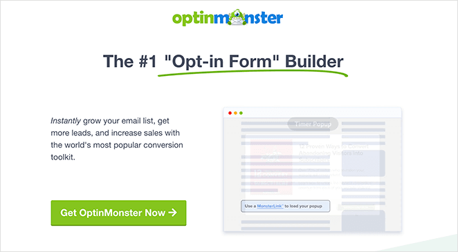
The OptinMonster team created this page to target users searching for optin form builders through PPC campaigns. What makes this example perfect to start with is how they pack everything a visitor needs to make a decision into the first screen you see.
What they do right:
- Everything visitors need appears above the fold (headline, description, demo GIF, CTA)
- Animated GIF shows the product working in real-time
- Multiple call-to-action buttons throughout each section
- Social proof section with recognizable brand logos and user count
- 3-step visual guide removes confusion about how the software works
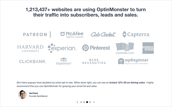
Why it works: Visitors can decide in 5 seconds without scrolling. The animated GIF proves the software actually works instead of just describing it. Each section ends with a CTA, so they capture people at different stages of the decision process.
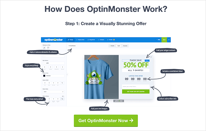
Steal this idea: Put your core value proposition, product demo, and call-to-action above the fold. If someone has to scroll to understand what you’re selling, you’ve already lost them. Use GIFs or videos to show your software in action rather than static screenshots.
2. TrustPulse – Minimal Design with Maximum Impact
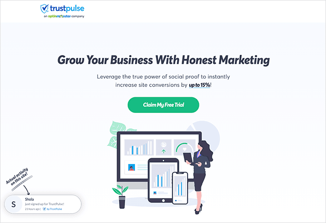
This TrustPulse landing page shows how powerful simplicity can be for SaaS conversions. Instead of cramming every feature onto the page, they focus on the core benefit and let their product demonstration do the talking.
What they do right:
- Value-driven headline that promises a specific outcome
- Description includes social proof numbers right in the copy
- Live software demo showing real notifications in action
- Strategic FAQ section addresses common objections
- Call-to-action buttons in every section without being pushy
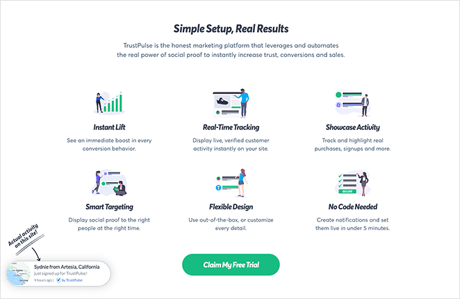
Why it works: The live demo removes all guesswork about what the product does. Visitors can see the actual notifications appearing on screen, which is much more convincing than describing “social proof software.” The FAQ section tackles hesitations before they become reasons to leave.
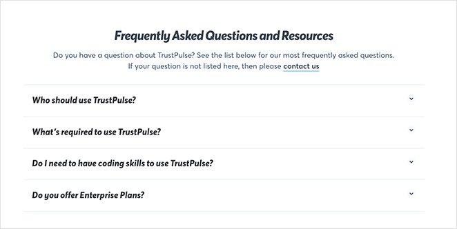
Steal this idea: Show your software working in real-time on your landing page. If your product has a visual output (notifications, dashboards, reports), demonstrate it live instead of using static screenshots. Add an FAQ section to handle common questions before visitors have to ask.
Need more inspiration? These business website examples have some excellent designs.
3. MonsterInsights – Focused Upgrade Page
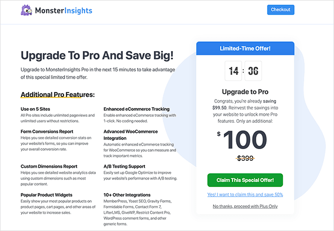
MonsterInsights created this upgrade page specifically for existing users of their basic plan. Unlike other examples that need to explain what the software does, this page focuses entirely on convincing current users to upgrade with urgency and clear benefits.
What they do right:
- Headline immediately explains the page’s purpose (upgrade offer)
- Countdown timer creates urgency right at the top
- Benefit-focused reasons for upgrading (not just feature lists)
- Large discount percentage prominently displayed
- Removed navigation menu to eliminate distractions
- Only two options: upgrade or leave the page
Why it works: This page knows its audience already understands the product, so it skips education and goes straight to motivation. The countdown timer triggers fear of missing out, while the discount makes the upgrade feel like a smart financial decision. Removing navigation keeps users focused on the single goal.
Steal this idea: For existing users or warm leads, create dedicated pages that skip the basics and focus on benefits. Use urgency (countdown timers, limited offers) to push people off the fence. Remove all navigation except your main CTA to eliminate escape routes.
4. WPForms – Urgency-Driven PPC Page
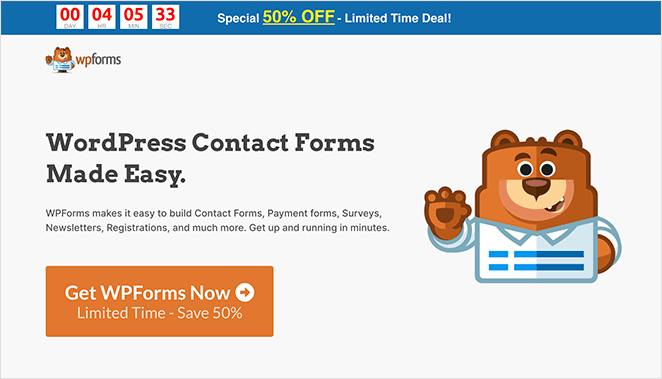
WPForms designed this PPC landing page to convert visitors coming from paid search ads. The page immediately grabs attention with a countdown timer at the very top, making the limited-time offer impossible to ignore.
What they do right:
- Countdown timer at the top creates immediate urgency
- Benefit-driven headline focuses on outcomes, not features
- Clear value proposition in the description
- Recognizable branding builds trust with WordPress users
- Bullet point features are easy to scan quickly
- No navigation menu to distract from the main goal
- Multiple call-to-action buttons throughout the page
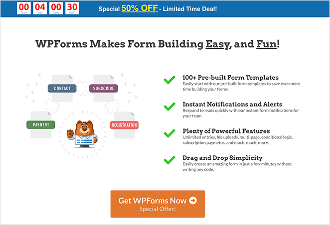
Why it works: The countdown timer hits visitors with urgency before they even read the headline. For PPC traffic that’s already motivated to find a solution, this pushes them to act quickly rather than compare options. The streamlined design keeps focus on the discount offer.
Steal this idea: Use countdown timers for limited-time offers, especially on PPC pages where people are ready to buy. Put the timer at the very top so it’s the first thing visitors see. Remove navigation menus on promotional pages to keep people focused on your offer.
Before we move on to the following example, there’s one more thing the above 4 examples all share in common: they are all made using SeedProd without writing a single line of code. I’ll show you how you can make code-free SaaS landing pages later.
5. Asana – Interactive Demo Experience
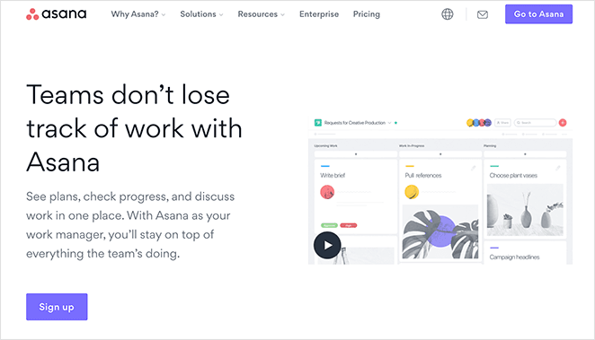
Asana’s landing page tackles the challenge every project management tool faces: how do you explain complex workflows in a simple way? Their solution is brilliant – instead of describing project management, they let you experience it through interactive elements and visual storytelling.
What they do right:
- Compelling headline paired with video that opens in a lightbox popup
- Animated GIFs showing real product workflows in action
- Scrolling case studies panel optimized for mobile swiping
- Features and benefits explained through visual examples
- Multiple calls-to-action without feeling overwhelming
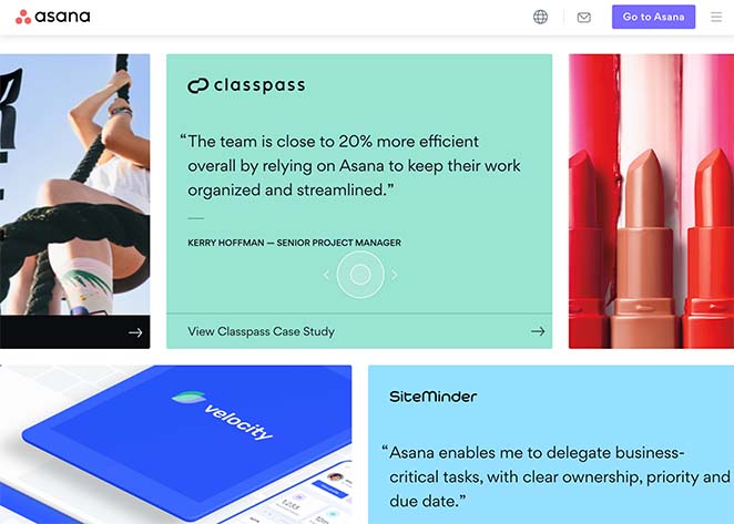
Why it works: Project management is complex to explain but easy to understand when you see it happening. The animated GIFs and interactive elements remove guesswork about how the software actually works. The mobile-optimized case study slider lets people quickly browse success stories without overwhelming the page.
Steal this idea: For complex software, show workflows in action rather than describing them. Use animated GIFs or short videos to demonstrate your product’s key features. Create mobile-friendly interactive elements like sliders for social proof that work well on small screens.
6. Muzzle – Show Don’t Tell Approach
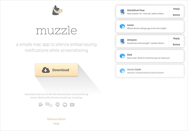
Muzzle offers a simple Mac app that silences notifications when you’re sharing your screen. Their landing page is a masterclass in product demonstration – they show you exactly what the app does in real-time, making the value instantly clear.
What they do right:
- Live demonstration of the product working on the actual page
- Minimal text lets the product demo speak for itself
- Instantly relatable pain point (embarrassing notifications during presentations)
- Clean, distraction-free design focuses attention on the demo
- Simple value proposition that anyone can understand immediately
Why it works: The page solves a universally embarrassing problem that every presenter has experienced. Instead of explaining how notification blocking works, they demonstrate it happening in real-time. The simplicity is powerful – visitors understand the entire value proposition in seconds.
Steal this idea: If your product solves a specific, relatable problem, demonstrate the solution visually on your landing page. Sometimes showing beats explaining – especially for simple tools that solve obvious pain points. Keep copy minimal when your product demo tells the whole story.
7. Mouseflow – Competitor Comparison Strategy
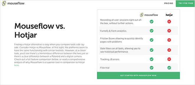
Mouseflow created this comparison page to capture users specifically searching for “Hotjar” on Google. It’s a smart competitive strategy – they intercept people looking for their main competitor and present themselves as the better alternative with direct feature comparisons.
What they do right:
- Direct comparison headline targets competitor searches
- Detailed software description establishes their expertise
- Quick comparison table for users who want fast answers
- Expanded feature comparison table for detailed evaluation
- Strategic placement of call-to-action buttons throughout
- Visual side-by-side comparison shows clear advantages
Why it works: People searching for “Hotjar” are already educated about the product category and ready to buy. Mouseflow positions themselves as the logical upgrade with better features and capabilities. The detailed comparison tables let prospects evaluate everything before making a decision.
Steal this idea: Create comparison pages targeting your main competitors’ brand names. Focus on your unique advantages and better features rather than attacking the competition. Use detailed comparison tables to help prospects make informed decisions in your favor.
8. Close CRM – Dual-Path Conversion Strategy
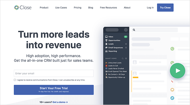
Close CRM uses clever animations and visual storytelling to show how their software gives sales teams a complete picture of customer relationships. Their page stands out because it offers two clear conversion paths instead of forcing everyone through the same funnel.
What they do right:
- Actionable headline that promises a specific outcome
- Clear description of what the software accomplishes
- Signup form and call-to-action button both above the fold
- Explainer video for people who need more information
- Two conversion options: free trial or sales consultation
- Animations and testimonials support claims further down
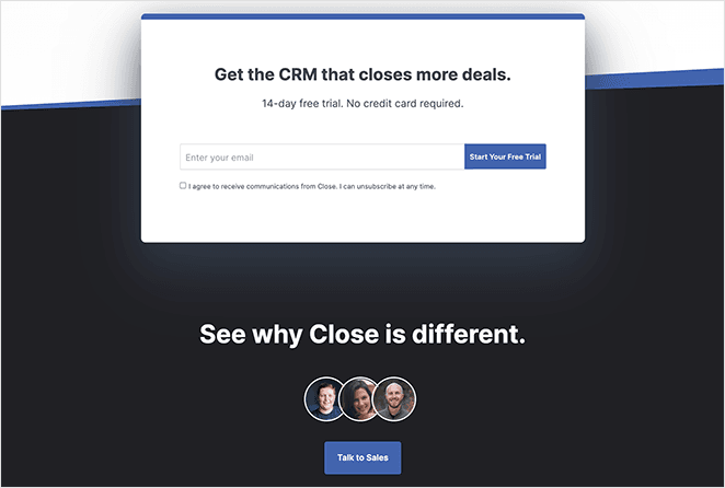
Why it works: CRM software appeals to both small businesses (who want to try it themselves) and larger companies (who prefer sales consultations). The dual-path approach captures both audiences instead of losing one group. Both actions generate qualified leads for their business.
Steal this idea: If your SaaS serves different customer segments, offer multiple conversion paths on your landing page. Combine self-service options (free trials, demos) with assisted sales (consultations, calls) to capture leads at different stages of the buying process.
9. Helpwise – Alternative Positioning Strategy
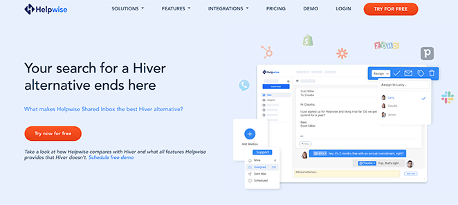
Helpwise targets users specifically searching for “Hiver alternative” with this dedicated landing page. They understand that people looking for alternatives are already frustrated with their current solution and ready to switch – they just need to be convinced that Helpwise is the better choice.
What they do right:
- Headline directly addresses search intent (“Hiver alternative”)
- Clear comparison table showing primary feature differences
- Cost savings prominently displayed at bottom of comparison
- Easy-to-digest bullet points explaining key advantages
- Customer testimonials with star ratings for credibility
- Multiple CTA buttons without overwhelming the page
- Helpful FAQ accordion addresses switching concerns
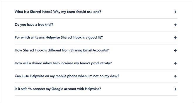
Why it works: People searching for alternatives are already motivated to switch – they just need proof that the new option is better. The comparison table and cost savings appeal to logical decision-making, while testimonials provide social proof. The FAQ section handles common switching objections upfront.
Steal this idea: Create dedicated “alternative to [competitor]” pages targeting switching intent. Focus on your key advantages and cost benefits rather than general features. Include an FAQ section that addresses common concerns about switching from their current solution.
10. MOZ – Strategic Video Placement
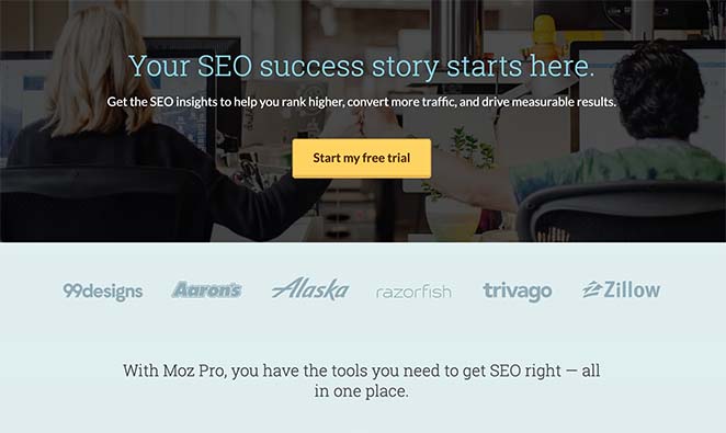
MOZ designed this landing page to convert visitors into free trial users for their SEO tools. What makes this page effective is how they use video strategically as a final conversion tool rather than just decoration at the top.
What they do right:
- Benefit-driven headline focuses on outcomes, not features
- Descriptive subheading clarifies exactly what visitors get
- Bold CTA button stands out without being overwhelming
- Features and benefits section addresses key user needs
- Client logos provide immediate credibility
- Explainer video positioned above final call-to-action
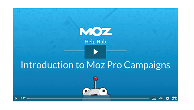
Why it works: The video placement is brilliant – it appears right before the final CTA when people are deciding whether to sign up. For visitors who need that extra push, the explainer video provides the detailed information they want. The straightforward design keeps focus on the free trial offer without distractions.
Steal this idea: Place explainer videos strategically near your final call-to-action instead of just at the top of your page. This catches people who’ve read everything but still need more convincing. Keep your page design simple when offering free trials – remove friction, not add more elements.
How to Create Your Own High-Converting SaaS Landing Page
After studying these 10 examples, you might be wondering how to apply these insights to your own SaaS landing page. Here’s a step-by-step approach based on what actually works:
Step 1: Choose Your Landing Page Strategy
First, decide what type of SaaS landing page you need:
- New visitor page (like OptinMonster) – Explains your product from scratch
- Upgrade page (like MonsterInsights) – Convinces existing users to pay more
- Competitor alternative page (like Helpwise) – Targets people switching from rivals
- Free trial page (like MOZ) – Focuses entirely on getting people to try your software
Your strategy determines everything else about your page design and messaging.
Step 2: Craft Your Above-the-Fold Section
Based on what we learned from these examples, your hero section needs:
- Benefit-focused headline – What outcome do users get? (Not what your software does)
- Visual product demo – Screenshot, GIF, or video of your software working
- Clear call-to-action – One obvious next step (start trial, get demo, etc.)
- Trust signal – Customer logo, user count, or rating that builds credibility
Remember: visitors decide whether to stay or leave in the first 5 seconds. Make those seconds count.
Step 3: Add Strategic Social Proof
Every high-converting example we studied uses social proof, but they place it strategically:
- Customer logos near the top for immediate credibility
- Testimonials in the middle to overcome objections
- Usage statistics that show scale and adoption
- Case studies or success stories for final convincing
Don’t just add testimonials because you think you should. Place them where people need that extra push to convert.
Step 4: Build Your Page with SeedProd
The easiest way to create a SaaS landing page that converts is with SeedProd. You can build pages like the examples we studied without writing any code.
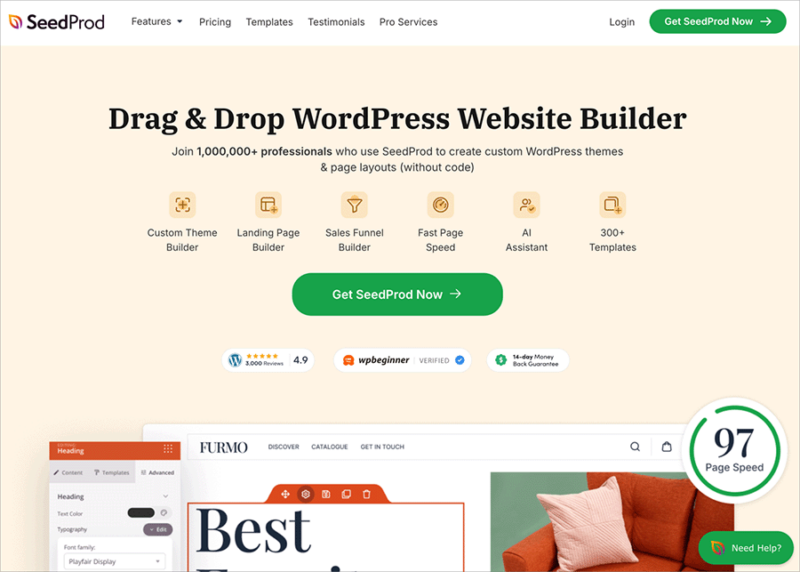
SeedProd is the best WordPress page builder for creating SaaS landing pages. It includes everything you need to build high-converting pages:
- 150+ responsive templates including SaaS-specific designs
- Drag-and-drop editor for easy customization
- Conversion-focused blocks for CTAs, forms, testimonials, and pricing tables
- A/B testing features to optimize your conversion rates
- Email marketing integrations to capture and nurture leads
Plus, every design is 100% mobile responsive, which is crucial since most of your SaaS traffic will come from mobile devices.
Step 5: Test and Improve Your Results
The best SaaS landing pages are never “finished.” Here’s what to test first:
- Headlines – Try benefit-focused vs feature-focused versions
- Call-to-action buttons – Test different colors, sizes, and text
- Social proof placement – Move testimonials around to see what works
- Video vs static images – Some audiences prefer different media types
SeedProd’s built-in A/B testing makes it easy to try different versions and see which converts better.
Ready to get started? Follow our step-by-step guide to create a landing page with SeedProd.
Start Building Your High-Converting SaaS Landing Page
These 10 SaaS landing page examples prove that conversion comes down to a few key principles: clear value propositions, strategic social proof, and removing friction from your signup process.
You don’t need to reinvent the wheel. Pick one example that matches your SaaS positioning and adapt their approach:
- If you’re targeting new users – Follow OptinMonster’s above-the-fold simplicity
- If you have a complex product – Use Asana’s interactive demo approach
- If you’re competing with established players – Try Mouseflow’s comparison strategy
- If you solve a specific pain point – Copy Muzzle’s show-don’t-tell method
The most important thing? Start building and testing. Your first landing page won’t be perfect, but it will be better than sending traffic to a generic homepage.
Remember: your landing page is often the first real interaction people have with your SaaS product. Make it count by focusing on what visitors actually care about – solving their problems quickly and reliably.
Ready to create your own high-converting SaaS landing page? Get started with SeedProd and use one of our proven templates as your foundation.
You might also like these complimentary WordPress login page plugins.
Thanks for reading. Please follow us on YouTube, Twitter, and Facebook for more helpful content to grow your business if you liked this article.

