

Lust auf Inspiration für Ihr nächstes Projekt? In diesem Leitfaden stelle ich Ihnen die besten mobilfreundlichen Website-Beispiele vor, die genau zeigen, wie man für kleine Bildschirme gestaltet und warum sie funktionieren.
Heute verwendet Google Mobile-First-Indexing, was bedeutet, dass Websites, die sich nicht an Smartphones und Tablets anpassen, an Sichtbarkeit verlieren. Ich habe dies selbst beim Testen von Designs erlebt; ein responsives Layout schneidet bei der Suche fast immer besser ab und hält die Besucher bei der Stange.
Die gute Nachricht ist, dass Sie nicht bei Null anfangen müssen. Mit Tools wie SeedProd können Sie responsive Seiten erstellen, die auf jedem Gerät fantastisch aussehen. Sehen wir uns neun Beispiele an, von denen Sie jetzt lernen können.
Was sind mobilfreundliche Websites?
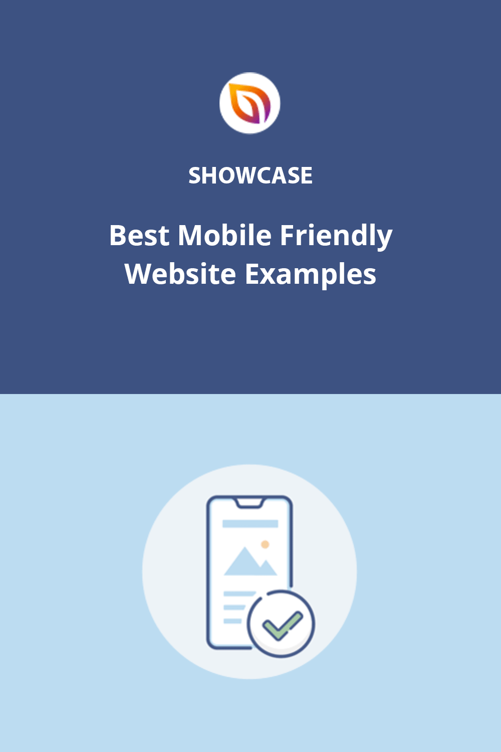
Eine mobilfreundliche Website passt sich automatisch jeder Bildschirmgröße an, sodass Benutzer ohne Zoomen oder Kneifen surfen können. Text bleibt lesbar, Menüs werden zu einfach zu bedienenden Hamburger-Symbolen und Schaltflächen werden für Finger statt für Mausklicks vergrößert.

Zum Beispiel kann ein normales Navigationsmenü auf Mobilgeräten zu einem Hamburger-Menü zusammenklappen. Sie werden auch größere Schriftarten und Call-to-Action-Schaltflächen bemerken, die für einfaches Tippen ausgelegt sind.
Indem Sie sich auf responsives Design konzentrieren, machen Sie es Besuchern leicht, mit nur wenigen Wischbewegungen und ohne zusätzliches Zoomen durch Ihre Website zu navigieren.
9 inspirierende Beispiele für mobilfreundliche Websites
Es gibt so viele beeindruckende mobile Website-Designs, dass es unmöglich ist, sie alle in diesem Beitrag aufzunehmen. Stattdessen finden Sie hier eine Auswahl unserer bevorzugten mobilfreundlichen Website-Beispiele von talentierten Webdesignern und versierten Marken.
1. Microsoft in Zahlen
Microsoft by the Numbers ist eine großartige mobilfreundliche Website, da sie wischbare Statistiken, ein Hamburger-Menü und tipperfreundliche Verknüpfungen verwendet. Diese Elemente sind Kernmerkmale des responsiven Designs, die auf jedem Gerät funktionieren.

Das Layout der Website fördert die Interaktion. Wenn Sie nach oben scrollen, werden positive Statistiken angezeigt, während beim Scrollen nach unten negative Statistiken angezeigt werden. Sie können auch nach links oder rechts wischen, um den gleichen Effekt zu erzielen, was sie für mobile Bildschirme sehr benutzerfreundlich macht.

Die Navigation ist reibungslos mit einem Hamburger-Menü, Social-Icons und einem Sprachselektor – alles für Daumen optimiert, nicht für Cursor.
- Wischbare Navigation mit interaktiven Statistiken
- Einfach zu bedienendes Hamburger-Menü
- Mobiles Surfen, das sich schnell und flüssig anfühlt
Insgesamt ist Microsoft by the Numbers ein perfektes Beispiel für richtig gemachtes Mobile-First-Webdesign.
2. Prostudio Agentur
Prostudio Agency ist ein starkes Beispiel für eine mobilfreundliche Website, da sie ihr Desktop-Portfolio und ihre Dienstleistungen auf Mobilgeräten in wischbare Karten verwandelt. Dies erleichtert das Durchsuchen von Projekten und Nachweisen von Fachwissen auf einem Telefon oder Tablet.

Auf dem Desktop zeigt Prostudio beim Scrollen aktuelle Arbeiten, soziale Bewährtheit und Dienstleistungen an. Auf Mobilgeräten verwandeln sich diese in wischbare Abschnitte, die auf kleinere Bildschirme passen, ohne die visuelle Attraktivität zu verlieren.

Weitere reaktionsfähige Funktionen sind ein Hamburger-Menü, ein Blogbeitrag-Slider und große CTA-Schaltflächen, die auf jedem Gerät einfach zu tippen sind.
- Wischbare Portfolio- und Servicekarten
- Einfach zu bedienendes Hamburger-Menü
- Große Call-to-Action-Schaltflächen für Mobilgeräte
Zusammen zeigen diese Funktionen, wie Prostudio elegantes Design mit mobiler Benutzerfreundlichkeit in Einklang bringt.
3. American Copper
American Copper ist ein herausragendes Beispiel für eine mobilfreundliche Website, da sie Luxus-Branding mit reaktionsfähigem Design kombiniert. Die Website passt sich nahtlos an jede Bildschirmgröße an und erleichtert Benutzern das Scrollen, Tippen und Anzeigen von Wohnungen auf Mobilgeräten.

Ein Highlight ist die automatische Diashow von Wohnungen. Sie bietet Besuchern ein immersives visuelles Erlebnis und ermöglicht es ihnen gleichzeitig, für eine genauere Betrachtung anzuhalten.

Der Vermietungsbereich enthält auch einen wischbaren Bildkarussell, der es einfach macht, mehrere Angebote zu präsentieren, ohne die Seite zu überladen.
Auf der gesamten Website finden Sie große CTA-Schaltflächen, minimalistische Kontaktformulare und sogar eine Click-to-Call-Option – alles für mobile Interaktionen optimiert.
- Automatische Diashow mit mobilen Wischsteuerungen
- Reaktionsfähiges Bildkarussell für Wohnungsangebote
- Große CTAs, minimale Formulare und Click-to-Call-Funktionen
Diese Website zeigt, wie selbst Luxus-Immobilienmarken ein reibungsloses, Mobile-First-Browsing-Erlebnis bieten können.
4. Inspod
Inspod ist ein großartiges Beispiel für eine mobilfreundliche Website, da sie für App-Benutzer entwickelt wurde und mit einem echten Mobile-First-Ansatz gestaltet ist. Besucher können die Funktionen, Vorteile und visuellen Elemente der App ohne Reibungsverluste schnell durchscrollen.

Das Design verwendet große, gut lesbare Schriftarten und klare Grafiken, um Benutzer durch die Seite zu führen. Schaltflächen und Symbole erscheinen im richtigen Moment, um zum Handeln aufzufordern, was eine bewährte Methode für hochkonvertierende Landingpages ist.
Ein wischbares Fähigkeiten-Karussell sorgt für Interaktivität und ermöglicht es Besuchern, mehr Informationen zu erkunden, ohne zusätzlich scrollen zu müssen. Dies erleichtert die Nutzung der Website auf kleineren Bildschirmen.

Das gesamte Layout ist minimalistisch und reaktionsfähig, was schnelle Ladezeiten und ein nahtloses Surferlebnis auf Mobilgeräten gewährleistet.
- Einfaches Scrollen mit großen Schriftarten und Bildern
- Schaltflächen und CTAs erscheinen im richtigen Moment
- Wischbares Karussell für zusätzliche Interaktivität
Inspod zeigt, wie App-fokussierte Marken Mobile-First-Design nutzen können, um Funktionen hervorzuheben und gleichzeitig die Benutzererfahrung einfach und ansprechend zu gestalten.
5. Crane Capital
Crane Capital ist ein starkes Beispiel für eine mobilfreundliche Website, da sie ein minimalistisches Design mit reibungslosem Scrollen und tipperfreundlichen Elementen kombiniert. Alles ist so konzipiert, dass es schnell geladen wird und auf kleineren Bildschirmen nahtlos funktioniert.

Die Website verfügt über alle Merkmale eines reaktionsfähigen Layouts, einschließlich eines Hamburger-Menüs, reibungslosem Scrollen und großen CTA-Schaltflächen. Ihre minimalistischen Kontaktformulare halten die Eingabe einfach, was ideal für mobile Benutzer ist.
- Hamburger-Menü und einfache Navigation
- Reibungsloses Scrollen mit leichtgewichtigem Design
- Große CTAs und minimale Kontaktformulare
Testimonials werden auch in einem responsiven Slider angezeigt, sodass Benutzer tippen oder wischen können, um Kundenfeedback zu lesen. Dezente Animationen lenken die Aufmerksamkeit auf wichtige Landingpage-Elemente, ohne die Benutzererfahrung zu beeinträchtigen.

Insgesamt zeigt Crane Capital, wie ein sauberes, responsives Design professionell wirken kann und gleichzeitig einfach auf Mobilgeräten zu bedienen ist.
6. Bande a Part
Bande a Part ist ein großartiges Beispiel für eine mobilfreundliche Website, da es beweist, dass medienlastige Magazin-Websites auf kleinen Bildschirmen immer noch responsiv und einfach zu durchsuchen sein können. Sein Design vereint visuelle Elemente mit Benutzerfreundlichkeit.

Die Seite öffnet sich mit einem wischbaren Bild-Slider, gefolgt von einem Masonry-Grid mit Inhalten, das sich automatisch an jede Bildschirmgröße anpasst. Dies hält Artikel und Bilder organisiert, ohne mobile Benutzer zu überfordern.

Mobile Besucher profitieren auch von unendlichem Scrollen, Social-Icons zum schnellen Folgen und einer einfach zu tippenden Suchleiste. Diese Elemente sind darauf ausgelegt, Leser zu fesseln und die Navigation intuitiv zu gestalten.
- Wischbarer Bild-Slider für hervorgehobene Inhalte
- Responsives Masonry-Grid-Layout
- Unendliches Scrollen und einfache mobile Suche
Bande a Part ist ein starkes Beispiel für inhaltsreiche Websites, die visuell ansprechend bleiben möchten, ohne die mobile Benutzerfreundlichkeit zu beeinträchtigen.
7. Cheetos
Cheetos ist ein unterhaltsames, mobilfreundliches Website-Beispiel, da es kräftige visuelle Elemente und interaktive Medien verwendet und die Website dennoch schnell und responsiv hält. Es zeigt, wie Marken mit verspielten Inhalten ein reibungsloses Benutzererlebnis auf Mobilgeräten bieten können.

Mobile Besucher können Bild- und Videoslider durchsuchen, ohne an Geschwindigkeit zu verlieren. Die Website hebt auch beliebte Produkte, skurrile Videos und Rezepte in wischfreundlichen Bereichen für kleinere Bildschirme hervor.
Der Abschnitt „Get Social“ fördert die Interaktion mit einem responsiven Instagram-Grid. Sie können sogar eine ähnliche Instagram-Galerie zu WordPress hinzufügen, um dieses Design zu replizieren.

- Schnell ladende Bild- und Videoslider
- Mobilfreundliche Produkt- und Rezeptbereiche
- Instagram-Galerie für kleine Bildschirme
Cheetos beweist, dass selbst medienlastige, verspielte Marken ein reibungsloses und ansprechendes Mobile-First-Design anbieten können.
8. Denys Nevozhai
Die Website von Denys Nevozhai ist ein großartiges Beispiel für eine mobilfreundliche Website, da sie klare visuelle Elemente, flüssiges Scrollen und interaktive Designelemente verwendet, um seine Arbeit zu präsentieren, ohne den Benutzer zu verlangsamen. Sie ist ein starkes Modell für persönliche Portfolios.

Von Anfang an lädt ein animierter Pfeil die Benutzer zum Scrollen ein. Das Design ist minimalistisch mit kräftigen Farben, um Abschnitte über seine Fähigkeiten und Erfahrungen hervorzuheben. Eine responsive Zeitleiste ermöglicht es Besuchern, durch Tippen seinen Hintergrund in einem klaren, mobilfreundlichen Format zu erkunden.

Der Portfolio-Bereich lädt schnell und verwendet einen Bild-Slider, um Erfolge hervorzuheben. Auszeichnungen und Anerkennungen werden in einer wischbaren Galerie angezeigt, ähnlich einem WordPress-Bilderkarussell.

- Minimalistisches Mobil-Design mit kräftigen Akzenten
- Interaktive Zeitleiste zum Erkunden durch Tippen
- Portfolio-Slider und wischbare Auszeichnungsgalerie
Dieses Portfolio ist ein starkes Beispiel dafür, wie Kreative ihre Arbeit auf eine mobile-First- Weise präsentieren können, ohne Unordnung oder langsame Ladezeiten.
9. Skyline Furniture
Skyline Furniture ist ein großartiges Beispiel für eine mobilfreundliche Website, da es wischbare Slider, Kontaktformulare im Akkordeon-Stil und eine klare Navigation verwendet, um das Surfen auf jedem Gerät zu erleichtern. Das Design zeigt, wie B2B-Marken dennoch ansprechende Mobile-First-Erlebnisse schaffen können.

Die Homepage verfügt über einen wischbaren Slider, mit dem Benutzer das Unternehmen auf einen Blick kennenlernen können. Navigationsmenüs sind tipperfreundlich und leiten Besucher zu verschiedenen Bereichen der Website.
Die Galerie-Seite verwendet das gleiche mobile Slider-Format, um Produkte zu präsentieren, ohne kleine Bildschirme zu überladen. Jedes Element ist für Touch-Interaktionen optimiert.
Die Kontaktseite ist besonders effektiv. Sie verwendet ein Akkordeon-Design, um verschiedene Formulare in erweiterbaren Panels anzuzeigen. Dies spart Platz und macht die Inhalte für mobile Benutzer übersichtlicher.

- Wischbare Slider auf der Homepage und für Produkte
- Tipperfreundliche Navigationsmenüs
- Kontaktformulare im Akkordeon-Stil für mobile Benutzerfreundlichkeit
Skyline Furniture zeigt, wie auch Großhandelsmarken Mobile-First-Websites erstellen können, die modern, einfach und leicht zu navigieren sind.
Wie erstellt man eine mobilfreundliche Website?
Der einfachste Weg, eine mobilfreundliche Website zu erstellen, ist die Verwendung von Tools, die Ihr Design automatisch an jede Bildschirmgröße anpassen. In WordPress haben Sie drei einfache Optionen:
- Wählen Sie ein mobil-responsives Theme, das Layouts für Telefone und Tablets anpasst.
- Installieren Sie ein WordPress Mobile Plugin, um die Responsivität zu handhaben, falls Ihr Theme nicht optimiert ist.
- Erstellen Sie mit einem Website-Builder wie SeedProd, der standardmäßig Mobile-First-Funktionen enthält.
Wenn Sie bereits eine reine Desktop-Site haben, folgen Sie unserer Anleitung zum Erstellen einer Desktop-Website für Mobilgeräte, um sie Schritt für Schritt zu beheben.
Bereit, mit responsivem Website-Design loszulegen?
Danke fürs Lesen! Wir würden uns freuen, Ihre Gedanken zu hören. Treten Sie also gerne der Unterhaltung auf YouTube, X und Facebook bei, um weitere hilfreiche Ratschläge und Inhalte für das Wachstum Ihres Unternehmens zu erhalten.