Are you looking for an easy way to hide an image in mobile view on your WordPress website?
Displaying every design element of your website on mobile screens can make the viewing experience cluttered and overwhelming. When that happens, it’s harder for visitors to find what they’re looking for, and can even cause them to abandon your site.
Wouldn’t it be great if you could “turn off” certain design elements just for mobile viewers?
This article will show you how to hide images on mobile in WordPress, enabling you to offer a better user experience to website visitors.
Why Hide Image in Mobile View on WordPress?
A cluttered mobile website can turn off your visitors, but that’s not the only reason to hide content on mobile devices.
Sometimes, you may want to reach desktop visitors with a targeted offer. In that case, you’ll want to hide your promotional images from mobile visitors so you don’t target them accidentally and skew your results.
Another reason for hiding images is they may be too big to display on mobile screens. A huge hero image may look great on a desktop, but it can take up a lot of valuable space on mobile devices, in which case, the best solution is to hide it.
How to Show and Hide Image in Mobile View on WordPress
The solutions for hiding images on mobile screens may seem complex for users unfamiliar with coding languages. A quick Google search reveals instructions for writing custom CSS, div classes, and all manner of technical jargon.
Don’t worry. You won’t need any technical expertise for the methods we cover below. All you need is a WordPress plugin, a WordPress website, and the ability to follow some easy steps.
Method 1: Hide Image in Mobile View on Website
We’ll use a powerful WordPress plugin to hide images in mobile view for the first method.
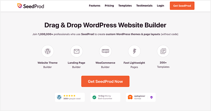
SeedProd is the best website builder for WordPress. It lets you create WordPress themes, landing pages, and responsive layouts without writing code.
It includes hundreds of premade templates, and you can customize every inch of your website with the visual drag-and-drop page builder, blocks, and sections. You can also use Device Visibility settings to hide specific content on mobile and desktop views.
SeedProd also offers built-in modes, such as coming soon, maintenance mode, 404 page, and login page. You can turn each mode on and off with one click, allowing you to hide your website from the public while working on its design.
Follow the steps below to hide images in mobile view on your WordPress website.
Step 1. Install and Activate SeedProd
First, click the button below to get your copy of SeedProd.
Note: To use SeedProd’s website builder feature, you need a SeedProd Pro license.
After downloading the plugin, install and activate it on your WordPress site. You can follow this guide on installing a WordPress plugin if you need help.
Next, go to SeedProd » Settings and enter your license key.
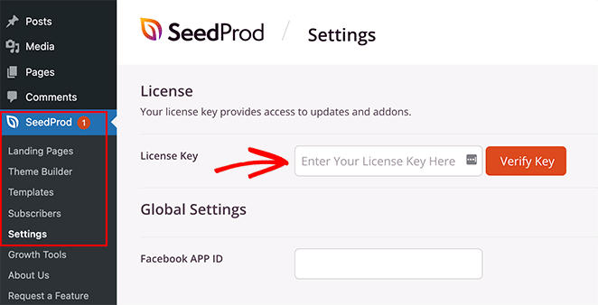
You can find your key in your SeedProd account dashboard under the ‘Downloads’ section.
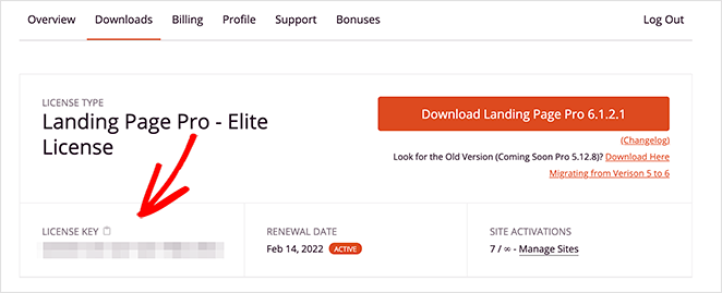
Click the Verify Key button to unlock your SeedProd license, then move on to the next step.
Step 2. Choose a Website Template
The next step involves creating a custom WordPress theme. That will allow you to use SeedProd’s ‘Device Visibility’ settings to show and hide different content on desktop and mobile.
Go to SeedProd » Theme Builder and click the Themes button to choose a website template.
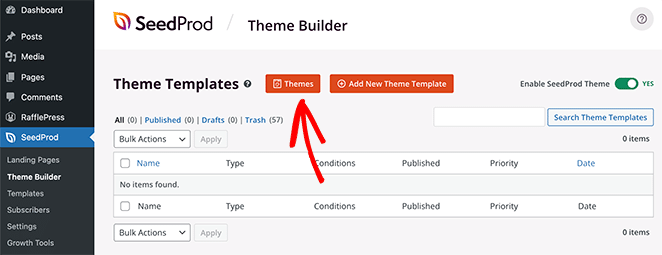
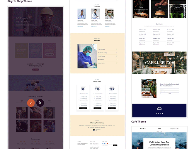
Many themes are available for various industries and website types, including eCommerce, blogs, portfolios, etc.
Once you find a theme you like, hover over it and click the checkmark icon to import it to your site.
You’ll now see the different parts that make up your WordPress theme.
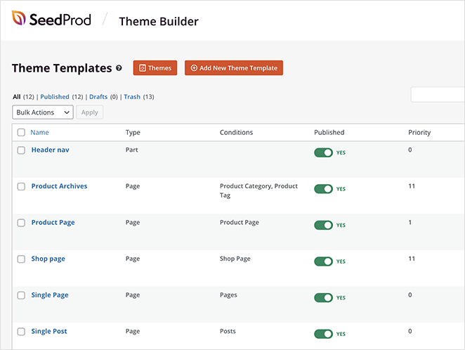
Typically, you’d need to customize these manually with code, but with SeedProd, you can visually edit each part of your website with the drag-and-drop page builder.
To customize any part of your website, hover over a theme template and click the ‘Edit Design’ design link. For this guide, we’re starting with the homepage.

Step 3. Customize Your Website Design
You’ll see SeedProd’s visual page editor when you open a theme template. It has blocks and sections on the left for adding custom content and a live preview on the right.
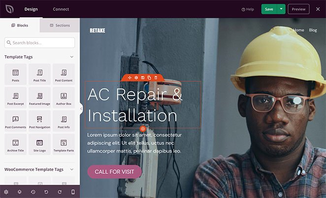
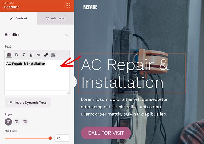
You can click any element to see its settings and change the design and layout. For example, the headline element allows you to edit the content, alignment, heading level, etc.
It’s also easy to add new elements to your design. Simply drag a block from the left and drop it onto your live preview.
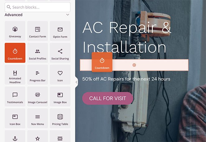
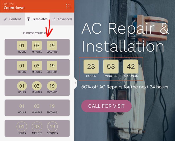
We used the ‘Countdown’ block in this example. Countdown timers are an excellent way to add urgency to your site and encourage visitors to act before missing out.
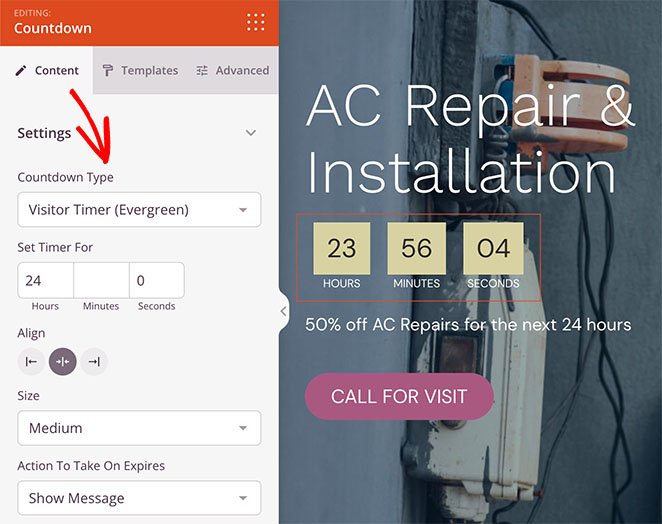
Like all SeedProd blocks, you can click it to:
- Change the timer type
- Adjust the timer alignment
- Add a custom message
- Redirect users when the timer ends
- Change the timer size
You can also click the ‘Templates’ tab to choose a different style quickly.
Step 4. Hide Website Images on Mobile with Device Visibility
Hiding images in mobile view is easy with SeedProd’s ‘Device Visibility’ settings. You can hide images individually or entire image sections with a single click.
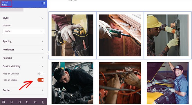
To hide images individually, find the image you wish to hide, then click on it to open the content settings.
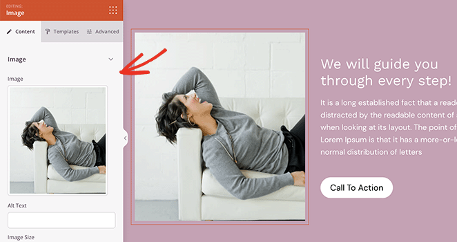
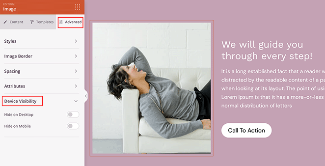
Next, click the ‘Advanced’ tab, and expand the ‘Device Visibility’ section.
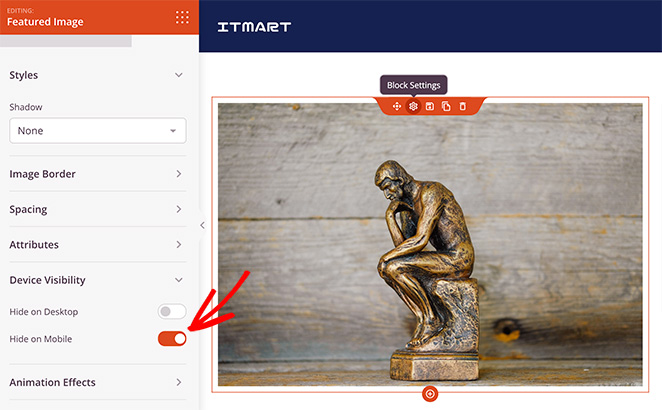
To hide the image on mobile, click the toggle next to the ‘Hide on Mobile’ heading.
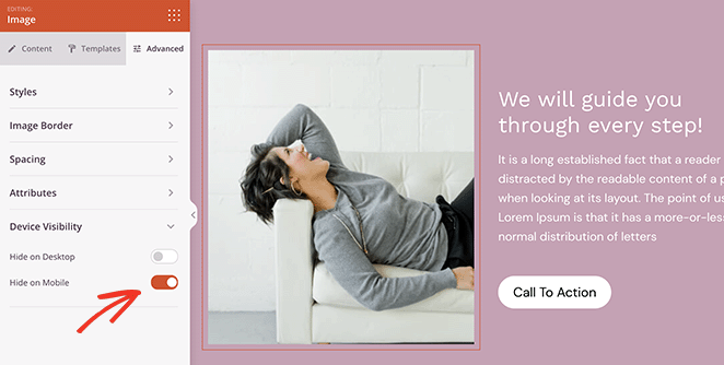
That image will now only display to desktop visitors and is hidden on mobile.
You can follow the same steps to hide entire image rows with SeedProd. Simply open the row’s settings, and in the ‘Advanced’ Tab, use the ‘Device Visibility’ settings to hide the image row on mobile.
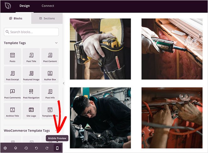
You can preview your changes by clicking the ‘Mobile Preview’ icon in the bottom toolbar.
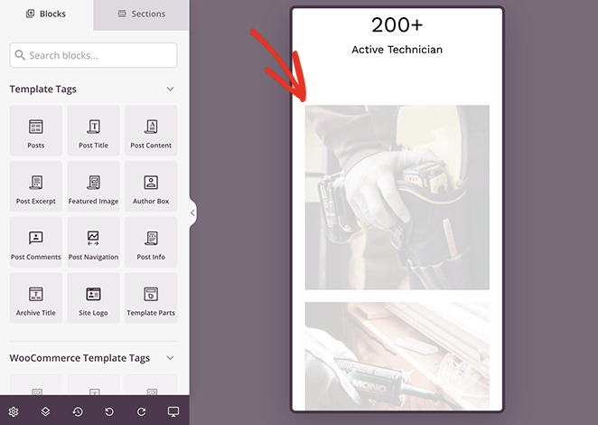
Any ‘greyed out’ images won’t be visible to mobile website visitors.
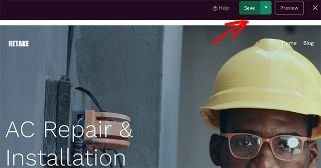
When you’re happy with how your design looks, click the Save button in the top-right corner of your screen.
Follow the steps above to hide images in mobile view for any other theme template, such as your Sidebar, Single Posts, Pages, etc.
For example, if you want to hide your blog post featured images on mobile, you can edit your Single Post template and change the visibility settings on the Featured Image block like this:
Step 5. Publish Your WordPress Website
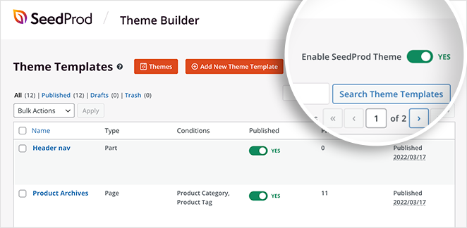
When you’re ready to make your custom theme live, go to SeedProd » Theme Builder and turn the ‘Enable SeedProd Theme’ toggle to the ‘On’ position.
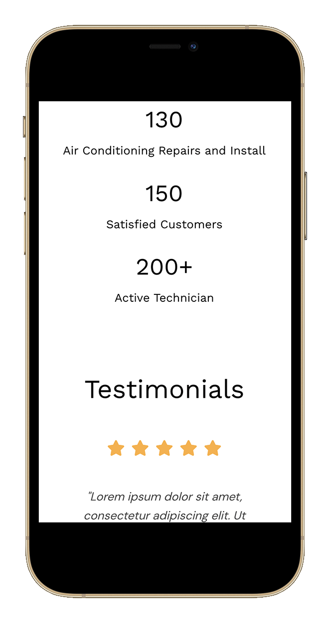
Now you can preview your website to view the changes. As you can see from this example, the images we chose earlier are hidden on mobile.
Method 2: Hide Images in Mobile View on Landing Pages
You can also use SeedProd to hide image in mobile view for individual landing pages. This is an excellent solution if you want to keep your existing WordPress theme and create high-converting landing pages in WordPress.
Step 1. Install and Activate SeedProd
First, follow the steps from above to install the SeedProd plugin and activate it on your website.
Note: You can use the free version of SeedProd for this method, as Device Visibility settings are available for all users. However, we’ll use SeedProd Pro for the larger variety of landing page templates.
Step 2. Choose a Landing Page Template
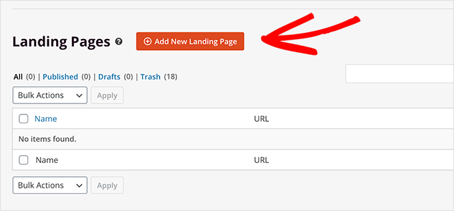
Next, go to SeedProd » Landing Pages and click the Add New Landing Page button.
You can choose any landing page template on the next page, including:
When you find a template you like, hover over it and click the checkmark icon.
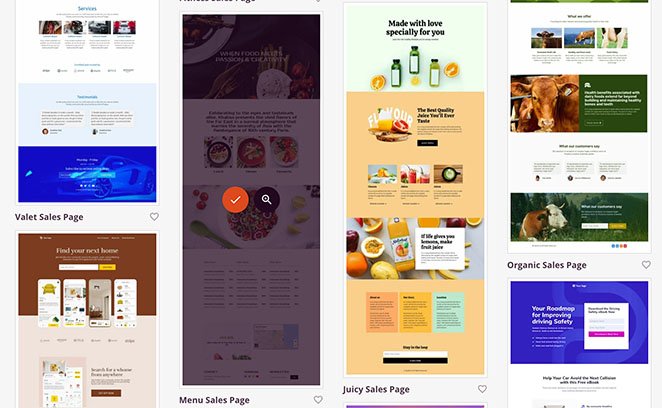
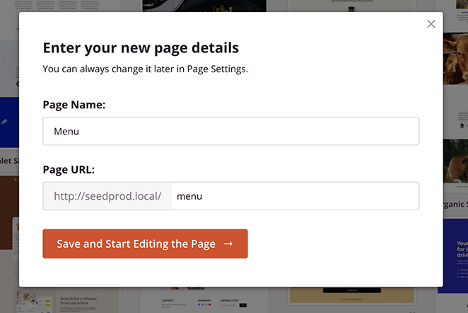
You can then give your landing page a name and click the Save and Start Editing the Page button.
Step 3. Customize Your Landing Page Design
Your landing page template will open in the same page builder we used to customize the WordPress theme earlier. It works the same way and includes the same sections and elements as the theme builder.

The only blocks you can’t use on your landing page are the WordPress and WooCommerce template tags. Those blocks are hidden because landing pages don’t use dynamic WordPress content, such as blog posts, categories, tags, etc.
Instead, you can customize your landing page with:
- Giveaways
- Animated headlines
- Optin forms
- Countdown timers
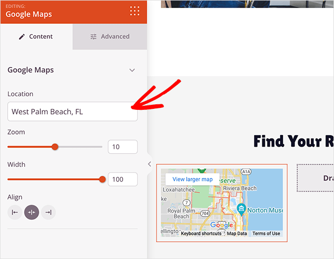
- Google maps
- Social media embeds
- And much more.
Step 4. Hide Images with Device Visibility
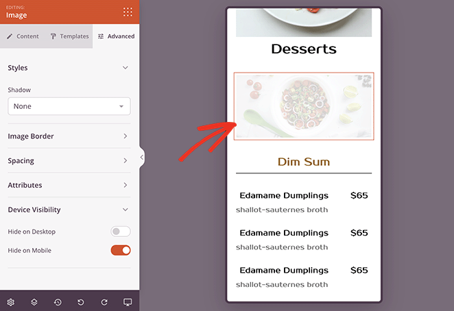
You can hide images in mobile on your landing page the same as you did with the theme builder. Simply click the image you want to hide. Then in the ‘Advanced’ tab, turn the ‘Hide on Mobile’ toggle to the ‘On’ position.
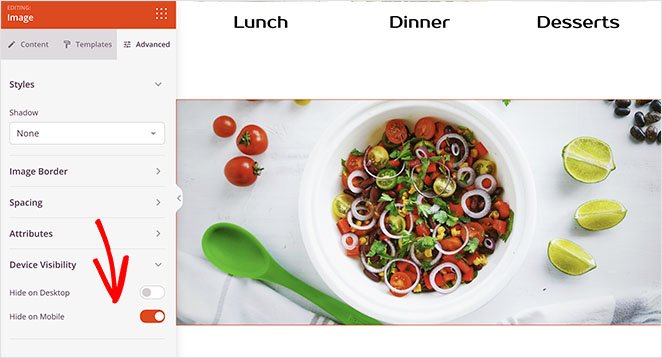
The image will be ‘greyed out’ when you preview it on mobile, which indicates that the image is hidden for mobile visitors.
Continue customizing your landing page until you’re happy with how it looks.
Step 5. Publish Your Landing Page
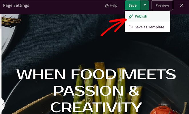
To publish your custom landing page, click the dropdown arrow on the Save button. Then select the Publish option.
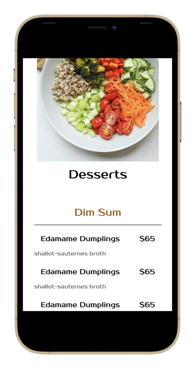
When you preview your landing page on a mobile device, you won’t be able to see the image you hid with the visibility settings.
Method 3: Hide an Image on Mobile with CSS
We understand that some website owners prefer to customize their sites manually. For that reason, the following method will show you how to hide images on mobile using custom CSS.
Note: we only recommend this method if you’re comfortable working with coding languages. You can use the built-in WordPress customizer to add custom CSS to your website.
First, find the class of the content element that contains your image. For example, your blog posts’ featured image. You can then hide it by using the following CSS class:
@media only screen and (max-width : 320px) {
.your-element-class {
display: none;
}
}
You’ll need to replace the ‘your-element-class’ with the CSS class that contains your image. You may also need to adjust the max device width to suit your WordPress theme and media query.
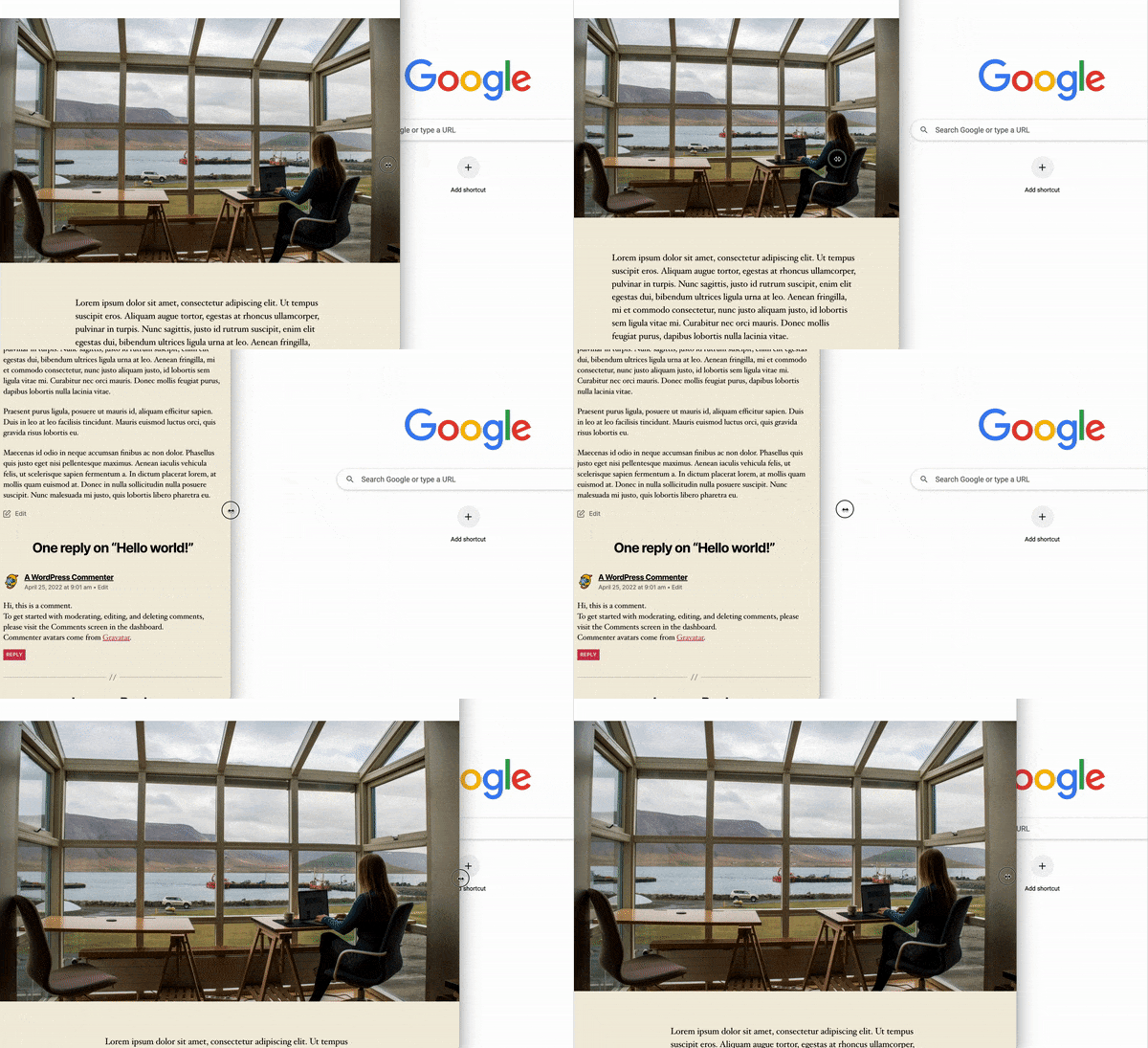
In this example, we hid the post featured image on mobile by targeting the ‘.featured-media img class’:
@media only screen and (max-width: 782px) {
.featured-media img{
display: none;
}
}
As you can see, the image disappears automatically on smaller screen sizes.
There you have it!
We hope this article helped you learn how to hide images in mobile view on WordPress. You might also like this guide on adding an author box to WordPress.
Thanks for reading! We’d love to hear your thoughts, so please feel free to leave a comment with any questions and feedback.
You can also follow us on YouTube, X (formerly Twitter), and Facebook for more helpful content to grow your business.

