

TL;DR: Die besten Landing Pages gewinnen nicht durch Design. Sie gewinnen, indem sie jeden Grund entfernen, die Seite zu verlassen, bevor der Besucher die CTA erreicht.
- Reibungsreduzierung: Je weniger Felder, Schritte und Klicks zwischen einem Besucher und der Conversion liegen, desto höher ist die Anmelderate.
- Einzelne CTA: Eine Seite, eine Aktion. Jede zusätzliche Option teilt die Aufmerksamkeit und reduziert die Konversionen insgesamt.
- Nutzenorientierte Überschrift: Ihre Überschrift muss in drei Sekunden die Frage „Was springt für mich dabei raus?“ beantworten. Wenn sie Ihr Produkt statt des Ergebnisses beschreibt, schreiben Sie sie neu.
- Sozialer Beweis an Zögerungspunkten: Testimonials, Logos und Abonnentenzahlen bauen nicht nur Vertrauen auf; sie beantworten Einwände genau in dem Moment, in dem Besucher sie entwickeln.
- Vertrauenssignale: „Jederzeit kündbar“, Geld-zurück-Garantien und Sicherheitsabzeichen entfernen die letzte Hürde, bevor jemand klickt.
- Konversionsprinzip pro Typ: Jeder Landing-Page-Typ nutzt einen anderen primären Hebel. Anmeldeseiten reduzieren Reibung. Lead-Generierungsseiten tauschen Wert. Verkaufsseiten bearbeiten Einwände. Kostenlose Testseiten kehren das Risiko um.
Sie haben die Seite erstellt. Die Anzeige geschaltet. Die E-Mail gesendet. Und Ihre Konversionsrate liegt bei 1 %. Etwas funktioniert nicht, aber wenn Sie sich Ihre eigene Seite ansehen, können Sie nicht erkennen, was.
In meinen über 15 Jahren Erfahrung mit WordPress und der Untersuchung dessen, was Seiten erfolgreich macht, habe ich festgestellt, dass sich die gleichen Konversionsmuster immer wieder bei denen zeigen, die Ergebnisse erzielen.
Die meisten Artikel zu diesem Thema listen Marken-Seiten auf, ohne das Konversionsprinzip hinter jeder Wahl zu erklären. Dieser Leitfaden übernimmt die Analysearbeit, die sie überspringen.
Ich habe 40 der besten Landing-Page-Beispiele von Netflix, Shopify, HubSpot, Duolingo, Kajabi und anderen gesammelt. Jede ist nach Typ organisiert, damit Sie direkt zu dem springen können, was relevant ist, und jede enthält das spezifische CRO-Prinzip, das sie demonstriert, damit Sie es auf Ihre eigenen Seiten anwenden können.
Wie ich diese Beispiele ausgewählt habe
Ich habe jedes Beispiel ausgewählt, weil es ein spezifisches, wiederholbares Konversionsprinzip demonstriert, nicht nur, weil die Marke bekannt ist. Hier ist, wonach ich gesucht habe:
- Demonstriertes Konversionsprinzip: Jeder Eintrag zeigt eine klare CRO-Taktik, die Sie extrahieren und auf Ihre eigene Seite anwenden können.
- Wiederholbarkeit des Musters: Die Technik funktioniert aufgrund eines Prinzips, nicht weil Netflix oder Shopify Markenwert haben. Kleine Websites können den gleichen Ansatz verwenden.
- Zielvielfalt: Die Beispiele decken alle sechs Landing-Page-Typen ab: Anmeldung, Lead-Generierung, Verkauf, kostenlose Testversion, Webinar und Promotion.
- Verfügbarkeit von Screenshots: Nur Beispiele mit sichtbaren, analysierbaren Seiten sind enthalten, nicht nur Markennamen.
Was ist eine Landingpage?
Eine Landing Page ist eine eigenständige Webseite, die für ein einzelnes Konversionsziel konzipiert ist, wie z. B. eine Anmeldung, ein Kauf, ein Download oder eine Demoanfrage, ohne Navigationsmenü, das von dieser einen Aktion ablenkt.
Im Gegensatz zu Ihrer Homepage, die mehreren Zwecken dient (Stöbern, Lernen, Kontaktieren), hat eine Landing Page eine Aufgabe. Sie leiten gezielten Traffic von einer bestimmten Quelle dorthin, und die Seite ist darauf ausgelegt, diesen Traffic zu konvertieren.
Der Unterschied ist wichtig, denn Seiten ohne Navigationsmenüs konvertieren deutlich besser als Seiten, die sie beibehalten. Wenn Sie den Ausstieg entfernen, bleiben die Besucher auf die eine wichtige Aktion fokussiert.
Was ist eine gute Landingpage-Conversion-Rate?
Die durchschnittliche Conversion-Rate von Landingpages liegt laut Forschungsergebnissen aus Unbounce’s Conversion Benchmark Report bei etwa 3-5 %. Spitzenreiter-Seiten in wettbewerbsintensiven Nischen können je nach Traffic-Quelle und Angebotstyp 10-15 % oder mehr erreichen.
Die Schlussfolgerung: Wenn Ihre Seite unter 3 % konvertiert, sind die Beispiele in diesem Leitfaden der erste Anlaufpunkt. Der Unterschied zwischen durchschnittlichen und Spitzenleistungen ist kein Zufall. Es sind die spezifischen Prinzipien, die jede Seite nutzt.
Was macht eine hochkonvertierende Landingpage aus
Jede hochkonvertierende Landingpage hat die gleichen Kernelemente, unabhängig von Branche oder Ziel. Die Marken in diesem Leitfaden verwenden alle eine Version dieser Checkliste.
- Eine klare, nutzenorientierte Überschrift — Ihre Überschrift muss innerhalb von 3 Sekunden die Frage „Was springt für mich dabei raus?“ beantworten. Wenn sie Ihr Produkt statt des Ergebnisses für den Besucher beschreibt, schreiben Sie sie neu.
- Ein einziger Call to Action (CTA) — Eine Seite, ein Ziel. Mehrere CTAs konkurrieren miteinander und reduzieren die Konversionen insgesamt.
- Ein Wertversprechen über der Falzlinie — Besucher sollten verstehen, was Sie anbieten, bevor sie scrollen. Wenn sie danach suchen müssen, werden die meisten es nicht tun.
- Sozialer Beweis — Testimonials, Bewertungen, Logos und Statistiken sagen dem Besucher: „Das hat für jemanden wie Sie funktioniert.“ Ein relevantes Testimonial übertrifft einen Absatz mit Behauptungen.
- Ein kurzes, fokussiertes Formular — Jedes zusätzliche Feld reduziert die Abschlussraten. Fragen Sie nur nach dem, was Sie für den nächsten Schritt benötigen.
- Ein Bild oder Video, das die Botschaft unterstützt — Visuelle Elemente sollten Ihren Text unterstützen, nicht nur schmücken. Zeigen Sie das Produkt in Aktion, das Ergebnis oder die Emotion, die der Besucher fühlen soll.
- Vertrauenssignale — Garantien, Sicherheitsabzeichen, „jederzeit kündbar“-Texte und Geld-zurück-Versprechen beseitigen den letzten Zögern, bevor jemand konvertiert.
Ein Element, das oft fehlt: kein Navigationsmenü. Seiten, die die Hauptnavigation entfernen, können eine Steigerung der Konversionsraten um bis zu 100 % verzeichnen, verglichen mit Seiten, die sie beibehalten.
Wenn Sie Besuchern einen Ausweg bieten, nehmen sie ihn. Halten Sie sie auf die eine Aktion fokussiert, die zählt.
Für eine detailliertere Aufschlüsselung, was jedes Element bewirkt und wie Sie es strukturieren, siehe unseren Leitfaden zur Anatomie einer Landingpage.
Gut auszusehen ist nicht dasselbe wie gut zu konvertieren. Was die Beispiele in diesem Leitfaden vom Rest unterscheidet, ist nicht das Design. Es ist das spezifische Prinzip, das jedes einzelne nutzt.
Eine Seite mit einer Conversion-Rate von 12 % und eine Seite mit einer Conversion-Rate von 1 % können fast identisch aussehen – der Unterschied liegt in der Reibung, den Vertrauenssignalen und dem Moment, in dem Einwände behandelt werden.
Arten von Landingpages (mit Beispielen für jede)
Es gibt 6 Haupttypen von Landingpages, die jeweils für ein anderes Konversionsziel erstellt wurden.
| Typ | Ziel | Am besten für |
|---|---|---|
| Lead-Capture-Seite | Kontaktdaten im Austausch für etwas Wertvolles sammeln | E-Books, Leitfäden, kostenlose Tools, Checklisten |
| Click-through-Seite | Besucher aufwärmen, bevor sie zur Kasse oder zur Anmeldung geschickt werden | Bezahlte Anzeigen, Kaltakquise-E-Mails |
| Verkaufsseite | Ein Produkt oder eine Dienstleistung direkt verkaufen | Kurse, SaaS, physische Produkte |
| Kostenlose Testseite | Reduzieren Sie das Risiko einer Verpflichtung mit einem kostenlosen Einstiegspunkt | SaaS-Produkte, Abonnementdienste |
| Webinar-/Veranstaltungsregistrierungsseite | Anmeldungen für eine Live- oder aufgezeichnete Veranstaltung fördern | Webinare, Workshops, virtuelle Gipfeltreffen |
| Squeeze Page | Reduzierte Seite, die sich auf eine einzige E-Mail-Opt-in konzentriert | Aufbau einer E-Mail-Liste, Lead-Magnete |
Verwenden Sie diese Liste, um zu den Beispielen zu springen, die für Ihr Ziel am relevantesten sind:
- Anmelde-Landingpage-Beispiele
- Beispiele für Landingpages zur Lead-Generierung
- Beispiele für Vertriebs-Landingpages
- Beispiele für Landing Pages mit kostenloser Testversion
- Beispiel-Landingpages für Webinar- und Veranstaltungsanmeldungen
- WordPress Landingpage-Beispiele (Erstellt mit SeedProd)
- Beispiele für Werbe-Landingpages
- Was tun, nachdem Sie diese Beispiele studiert haben
- Weitere Landingpage-Beispiele nach Branche
- Häufige Landingpage-Fehler, die Conversions zunichtemachen
- Häufig gestellte Fragen zu Landing Pages
Landingpage-Beispiele im Überblick
| Landingpage-Typ | Bestes Beispiel | Kernprinzip der CRO |
|---|---|---|
| Anmeldung | Netflix | Reibungsreduzierung: einzelnes E-Mail-Feld, keine Verpflichtungssignale |
| Lead-Generierung | Taboola / Zoom | Wertetausch: Kostenlose Ressource gegen Kontaktdaten |
| Verkäufe | OptinMonster | Einwandbehandlung: Social Proof und Demos an jedem Scrollpunkt |
| Kostenlose Testversion | Shopify | Risikoumkehr: Spezifische Testdauer beseitigt die Frage „Was kostet mich das?“ |
| Webinar / Veranstaltung | SEMrush | Vorfreude aufbauen: Referenteninformationen und Agenda oberhalb des Falzes sichtbar |
| Werbeaktion | Smash Balloon | Echte Dringlichkeit: Echtes Enddatum mit mehreren verstärkenden Mechanismen |
Anmelde-Landingpage-Beispiele
Die besten Anmelde-Landingpages minimieren Reibungsverluste und stellen den Nutzen in den Vordergrund, nicht das Produkt. Je weniger Schritte zwischen einem Besucher und dem „Senden“-Button liegen, desto höher ist Ihre Anmelderate. Diese Beispiele zeigen, wie Top-Unternehmen den Prozess auf das Wesentliche reduziert haben, was funktioniert.
CRO-Prinzip: Reibungsreduzierung
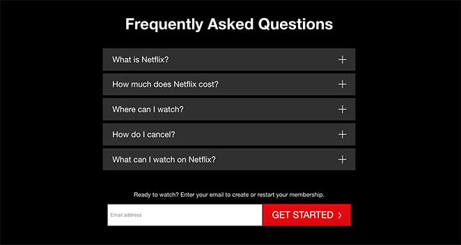
1. Netflix – Anmeldung mit einem Feld
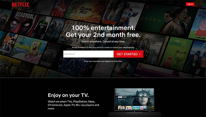
Die Anmeldeseite von Netflix ist der Goldstandard für Anmeldeseitendesign, das richtig gemacht wurde. Sie verwendet ein einziges E-Mail-Feld oberhalb der Falzlinie und entfernt alle möglichen Barrieren zwischen dem Besucher und der Konversion.
- Überschrift — Nutzenorientiert und unmittelbar. Sie wissen, was Sie bekommen, bevor Sie etwas anderes lesen.
- Ein Formularfeld — Eine E-Mail-Adresse. Netflix fragt anfangs nach weniger und sammelt den Rest während des Anmeldevorgangs.
- Vertrauensbildender Text — „Jederzeit kündbar“ erscheint vor dem CTA. Er geht nicht nachträglich auf den Einwand ein; er beseitigt ihn, bevor der Besucher ihn überhaupt formuliert.
- Zweites Formular unten — Für Besucher, die am Helden-Bereich vorbeiscrollen, fängt ein zweiter Anmeldeaufforderung sie auf, bevor sie die Seite verlassen.
- FAQ-Bereich — Die FAQs unterhalb der Falzlinie behandeln die häufigsten Einwände in einfacher Sprache.
Wichtigste Erkenntnis: Netflix beweist, dass man anfangs nach weniger fragen und den Rest später nachreichen kann. Die Zeile „Jederzeit kündbar“ ist nicht nur eine Zusicherung – sie beseitigt den häufigsten Einwand, bevor der Besucher ihn überhaupt formuliert.
Was A/B-getestet werden soll:
- Überschriften-Text: Nutzenorientiert („Überall ansehen, jederzeit kündigen“) vs. Dringlichkeitsorientiert („Jetzt ansehen“)
- Position des Vertrauens-Textes: „Jederzeit kündbar“ vor dem CTA vs. danach
- Text des CTA-Buttons: „Loslegen“ vs. „Jetzt ansehen“
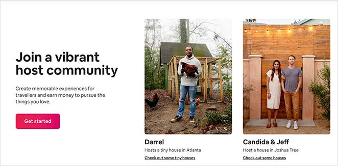
2. Airbnb – Nutzenorientierte Host-Anmeldung
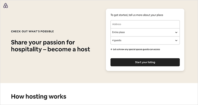
Die Host-Anmeldeseite von Airbnb zeigt, wie man ein längeres Formular kürzer wirken lässt, indem man strukturiert, was und wann man fragt. Die Seite enthält viele Informationen, aber sie wirkt nie überwältigend.
- Registrierungsformular — 3 sichtbare Felder, mit optionalen Feldern, die unter einem Tab ausgeblendet sind. Besucher sehen ein kurzes Formular, kein langes.
- Ressourcenbereich — Beantwortet häufige Bedenken bezüglich des Hostings, ohne dass der Besucher navigieren muss.
- Community-Nachweis — Zeigt, wie andere Leute den Dienst nutzen, was zögerlichen Besuchern hilft, sich selbst als potenzielle Gastgeber zu sehen.
- Support-Sichtbarkeit — Einfacher Zugriff auf Support-Informationen beseitigt die Angst „Was passiert, wenn etwas schiefgeht?“.
- Mehrere CTAs — CTA-Schaltflächen erscheinen durchgängig, sodass an jedem Scrollpunkt eine nahegelegene Aktion verfügbar ist.
Wichtigste Erkenntnis: Das Ausblenden optionaler Felder unter einem Tab lässt das Formular kurz erscheinen, während Sie trotzdem die benötigten Informationen sammeln. Der wahrgenommene Aufwand ist genauso wichtig wie der tatsächliche Aufwand.
Was A/B-getestet werden soll:
- Anzahl der Formularfelder: 3 sichtbare Felder vs. Anzeige aller optionalen Felder im Voraus
- Framing der Überschrift: Einkommensorientiert („Zusätzliches Einkommen erzielen“) vs. Gemeinschaftsorientiert („Schließen Sie sich 4 Millionen Gastgebern an“)
- Format des Social Proof: Fotos der Gemeinschaft vs. individuelle Einkommensschätzungen der Gastgeber
3. Slack — Feature Showcase Registrierung
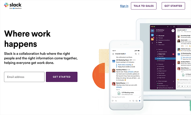
Slacks Registrierungsseite funktioniert, weil sie das Produkt zeigt, bevor sie nach der Verpflichtung fragt. Wenn Ihr Produkt komplex ist, reduziert die Darstellung in Aktion die Unsicherheit, die Konversionen verhindert.
- Ansprechende Grafiken — Detaillierte Produkt-Screenshots lassen Besucher genau sehen, wofür sie sich anmelden.
- Testimonials — Echte Kundenstimmen fügen im Moment der Entscheidung sozialen Beweis hinzu.
- Einzelner CTA — Eine prominente Registrierungsschaltfläche, keine konkurrierenden Aktionen.
- Klare Texte — Erklärt, was Slack tut und für wen es ist, ohne Fachjargon.
- Lineares Layout — Die Seite führt das Auge des Besuchers natürlich von oben zum CTA.
Wichtigste Erkenntnis: Wenn Ihr Produkt eine Lernkurve hat, zeigen Sie es in Aktion, bevor Sie sich zur Registrierung anmelden. Slacks Screenshots beantworten die Frage „Funktioniert das für mich?“, bevor der Besucher fragen muss.
4. Lyft — Minimalistische Fahrerbewerbung
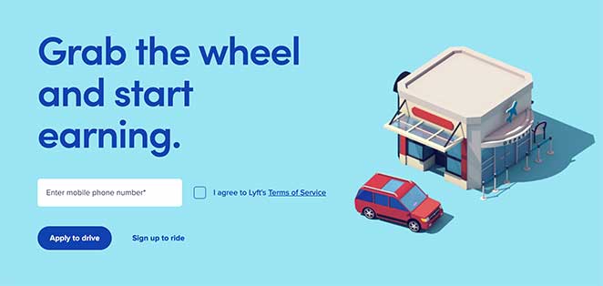
Diese Bewerbungs-Landingpage von Lyft beweist, dass gezielte Seiten nicht viel brauchen. Ein Feld, ein Ziel, ein Publikum.
- Minimalistisches Design — Keine Ablenkungen. Das Auge richtet sich direkt auf das Formular.
- Einzelnes Formularfeld — Nur Telefonnummer. Je geringer die Anforderung, desto höher die Abschlussrate.
- Emotionales Bild — Das Bild erzeugt eine sofortige Reaktion, die die Entscheidung zur Bewerbung bestärkt.
- CTA-Hierarchie — Die primäre Aktion ist prominent; die sekundäre Aktion ist vorhanden, aber weniger sichtbar.
Wichtigste Erkenntnis: Lyfts Seite funktioniert, weil sie sich an ein Publikum (Fahrer) richtet und nach einer Sache fragt. Wenn Sie eine gezielte Werbekampagne durchführen, sollte sich Ihre Landingpage so anfühlen, als wäre sie für genau diese Person erstellt worden, nicht für ein allgemeines Publikum.
5. Trello — Einfache Projektmanagement-Registrierung
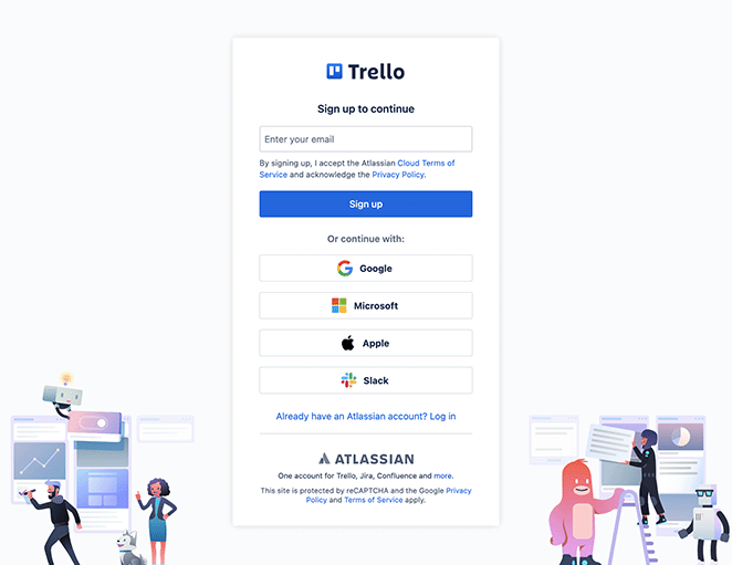
Trellos Registrierungsseite hebt die Einfachheit des Produkts hervor und untermauert dies mit Bildern, die die Benutzeroberfläche zeigen. Für Nutzer, die noch unentschlossen sind, nimmt die geführte Tour-Option die Verpflichtung aus der Entscheidung.
- Starke Bilder — Produkt-Screenshots zeigen genau, wie die Benutzeroberfläche aussieht und funktioniert.
- Klare Wertversprechen — Die Nutzenangabe ist sichtbar, bevor gescrollt werden muss.
- Einfaches Anmeldeformular — Leicht auszufüllen, geringe Hürden.
- Sozialer Beweis — Testimonials von echten Nutzern sprechen für die Erfahrung mit dem Tool.
- Geführte Tour-Option — Besucher, die noch nicht bereit sind, sich zu binden, können erkunden, ohne sich anzumelden.
Wichtigste Erkenntnis: Das Anbieten einer geführten Tour neben der Hauptanmeldung reduziert die Bindungsangst bei zögerlichen Besuchern. Nicht jeder konvertiert beim ersten Besuch – eine Option mit geringerem Risiko hält sie bei der Stange.
6. Calendly — Homepage als Landingpage
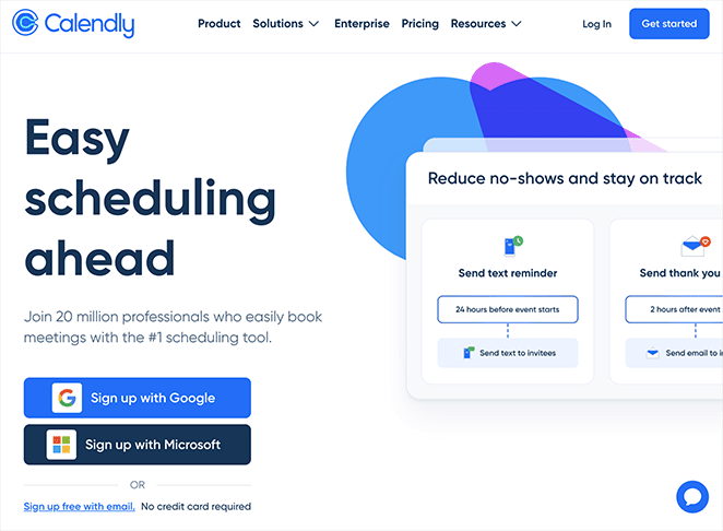
Die Homepage von Calendly ist fokussiert genug, um als Landingpage zu fungieren. Der Vorteil der Terminplanung steht im Vordergrund, der CTA ist prominent und nichts auf der Seite konkurriert mit der primären Aktion.
- Mehrzweck-Design — Funktioniert sowohl als Homepage als auch als Landingpage, da das Ziel von Anfang an klar ist.
- Terminplanungs-Vorteile im Vordergrund — Die Überschrift kommuniziert sofort das Kernwertversprechen.
- Kunden-Testimonials — Sozialer Beweis erscheint in der Nähe des CTA, zum richtigen Zeitpunkt im Entscheidungsprozess.
- Einfache Navigation — Das Layout führt Besucher ohne Ablenkung zur Anmeldung.
Wichtigste Erkenntnis: Nicht jede Landingpage muss eine separate Seite sein. Wenn Ihre Homepage fokussiert genug ist und ein einziges Ziel verfolgt, kann sie beide Aufgaben erfüllen. Calendly beweist, dass Klarheit Komplexität schlägt.
7. MailerLite — E-Mail-Marketing-Anmeldung
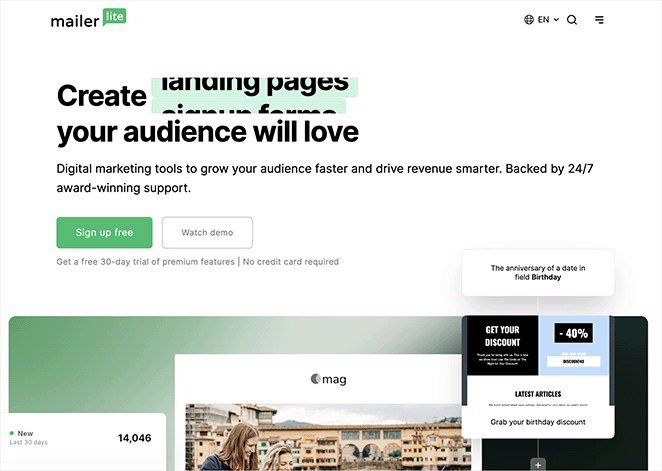
Die Seite von MailerLite kombiniert Funktions-Highlights mit Kundenbewertungen und beantwortet auf einen Streich „Was macht es?“ und „Funktioniert es?“. Bei E-Mail-Marketing-Tools ist die einfache Bedienung das größte Bedenken – die Seite geht direkt darauf ein.
- Fokus auf einfache Bedienung — Die Überschrift und der Text konzentrieren sich auf Einfachheit, was die Hauptsorge für potenzielle Kunden beim Vergleich von Tools ist.
- Klare CTAs — Prominente Anmeldungs- und kostenlose Testversion-Aufforderungen durchgehend.
- Funktions-Highlights — Wichtige Funktionen werden umrissen, ohne den Besucher zu überfordern.
- Kundenbewertungen — Echte Bewertungen liefern an mehreren Stellen der Seite sozialen Beweis.
Wichtigste Erkenntnis: Die Kombination von Funktions-Highlights mit echten Bewertungen beantwortet „Was macht es?“ und „Funktioniert es?“ in einem Abschnitt. Die Seite von MailerLite beantwortet beide Fragen, ohne dass Besucher danach suchen müssen.
8. Duolingo — Gamifizierte Sprachauswahl

Die Registrierungsseite von Duolingo verzichtet komplett auf das traditionelle Anmeldeformular. Anstatt zuerst nach Ihrem Namen und Ihrer E-Mail zu fragen, werden Sie aufgefordert, eine Sprache auszuwählen. Die allererste Interaktion ist eine Wahl, die Ihr Ziel widerspiegelt, kein Formular, das sich wie Papierkram anfühlt.
- Zielorientiertes Onboarding — Die Seite öffnet sich mit „Ich möchte lernen…“ und einem Raster von Sprachen, wodurch das Ziel des Besuchers Vorrang vor den Anmeldemechanismen erhält.
- Sozialer Beweis in die Auswahl integriert — Jede Sprachkarte zeigt die Anzahl der Lernenden an (Spanisch: 48,8 Mio. Lernende, Französisch: 27,2 Mio.). Der Beweis ist in die Entscheidung selbst eingebettet und nicht darunter hinzugefügt.
- Keine Navigation, keine Ablenkungen — Nur das Logo und eine Sprachauswahl. Es gibt keinen anderen Weg als vorwärts.
- Handlung vor Verpflichtung — Besucher beginnen mit der Auswahl, bevor sie sich technisch angemeldet haben. Dieser erste Klick ist die eigentliche Konversion — die Kontoerstellung folgt natürlich.
Wichtigste Erkenntnis: Duolingo beginnt die Reise des Benutzers, bevor es um ein Konto bittet. Wenn Besucher ihre erste zielorientierte Aktion ausführen – selbst einen einzigen Klick –, erhöht sich die Wahrscheinlichkeit, dass sie die Anmeldung abschließen, dramatisch.
9. Spotify — Social Login als primärer CTA

Die Anmeldeseite von Spotify ist eines der saubersten Beispiele für Reibungsreduzierung in Aktion. Social Login ist die primäre Wahl, kein nachträglicher Gedanke. Die E-Mail-Anmeldeoption ist vorhanden, aber visuell zweitrangig, was den Großteil der Anmeldungen über den Weg mit dem geringsten Aufwand leitet.
- Social Login als Headline CTA — Google- und Apple-Login erscheinen ganz oben, vor allen Formularfeldern. Die meisten Benutzer wählen den Weg des geringsten Widerstands.
- Hierarchie zählt — Die Reihenfolge und das visuelle Gewicht der Optionen prägen das Verhalten. Indem Spotify mit Ein-Klick-Optionen beginnt, erhöht es die Gesamtanmeldungsrate.
- Kein Marketingtext erforderlich — Keine Überschrift, keine Feature-Aufzählungen. Die Seite geht davon aus, dass Besucher bereits wissen, was Spotify ist, und nur einen einfachen Einstieg benötigen.
- Minimaler Formular-Fallback — Für Benutzer, die E-Mail bevorzugen, ist das Formular vorhanden – aber es konkurriert nicht mit dem primären Weg.
Wichtigste Erkenntnis: Wenn Besucher bereits wollen, was Sie anbieten, besteht die einzige Aufgabe der Landingpage darin, Reibung zu beseitigen. Die Seite von Spotify tut dies, indem sie den einfachsten Anmelde-Pfad zum prominentesten macht.
10. Notion — Minimale Anmeldung mit mehreren Authentifizierungspfaden

Die Anmeldeseite von Notion ist auf das absolute Minimum reduziert. Logo, Slogan, fünf Authentifizierungsoptionen, ein E-Mail-Feld, ein Button. Keine Bilder, keine Testimonials, keine Feature-Texte. Für ein Produkt, das bereits eine starke Markenbekanntheit hat, besteht die Aufgabe der Seite darin, sich nicht einzumischen.
- Fünf Authentifizierungsoptionen — Google, Apple, Microsoft, Passkey und SSO decken praktisch jede bevorzugte Anmeldemethode von Geschäftsanwendern ab. Niemand sucht nach seiner Option.
- Framing für geschäftliche E-Mail — Der Platzhalter im Feld lautet „name@company.com“ und darunter steht „Verwenden Sie eine E-Mail-Adresse Ihrer Organisation, um einfach mit Teamkollegen zusammenzuarbeiten.“ Dies bereitet den Besucher sofort auf einen kollaborativen, professionellen Anwendungsfall vor.
- Keine Ablenkung — Keine Navigation, kein Social Proof, kein Hero-Image. Die Seite vertraut auf ihre Markenbekanntheit und beseitigt jede Hürde zwischen Absicht und Handlung.
- Ein Bildschirm — Alles passt oberhalb des sichtbaren Bereichs. Kein Scrollen erforderlich.
Wichtigste Erkenntnis: Wenn die Markenbekanntheit hoch ist, sollte eine Anmeldeseite das Rauschen minimieren, anstatt mehr Überzeugungsarbeit zu leisten. Notions Seite funktioniert, weil sie die Tatsache respektiert, dass Besucher bereits eine Entscheidung getroffen haben — sie brauchen nur einen reibungslosen Weg zum Handeln.
11. Mailchimp — Anmeldung für kostenlosen Plan

Mailchimps Anmeldeseite für kostenlose Konten konzentriert sich auf ein einziges Wort: kostenlos. Die Botschaft „Kostenlos. Für immer.“ erscheint früh, und die Seite ist so aufgebaut, dass sie jede Frage beseitigt, die ein vorsichtiger Besucher zum Thema Kosten haben könnte, bevor er das Formular erreicht.
- „Für immer kostenlos“-Verpflichtung — Nicht „kostenlose Testversion“, nicht „kostenlose Stufe“ — „Kostenlos. Für immer.“ Die Dauerhaftigkeit des kostenlosen Plans ist das Hauptverkaufsargument, und die Seite stellt sicher, dass die Besucher dies glauben.
- Plankomparation unter dem Formular — Nach der Aufforderung zur kostenlosen Anmeldung zeigt eine Plankomparationstabelle, was Sie auf jeder Ebene erhalten, ohne ein Upgrade zu drängen, bevor der Besucher bereit ist.
- Keine Angabe von Kreditkartendaten — Die Seite bestätigt ausdrücklich, dass für den kostenlosen Plan keine Zahlungsdaten erforderlich sind, und beseitigt so die häufigste Hürde bei der Anmeldung für kostenlose Tools.
- Einzelschritt-Formular — E-Mail-Adresse, Benutzername, Passwort. Alles, was benötigt wird, um das Konto zu erstellen, ohne im Voraus mehr zu verlangen als nötig.
Wichtigste Erkenntnis: Wenn Ihr kostenloser Plan wirklich wertvoll ist, bekennen Sie sich im Titel dazu. „Kostenlos für immer“ konvertiert besser als „kostenlose Testversion“, da es die Angst beseitigt, dass später Kosten anfallen.
Beispiele für Landingpages zur Lead-Generierung
Lead-Generierungs-Landingpages tauschen etwas Wertvolles — einen Leitfaden, einen Bericht oder ein Tool — gegen Kontaktdaten. Die besten Lead-Generierungsseiten bieten im Voraus etwas wirklich Nützliches an und verlangen nur die minimalen Informationen, die zur Lieferung benötigt werden.
CRO-Prinzip: Wertetausch
12. Zoom — Gated Report Download
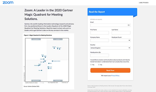
Zooms Lead-Generierungsseite nutzt einen kostenlosen Branchenbericht, um die Marke als Vordenker zu positionieren. Die Seite bewirbt nicht die Funktionen von Zoom — sie bietet Einblicke, und die implizite Botschaft ist, dass Zoom in diesem Bereich mehr weiß als jeder andere.
- Kostenloses Download-Angebot — Die Beseitigung der Kostenbarriere macht den Bericht zugänglicher und erhöht die Download-Raten.
- Kurzes Formular — Nur die Informationen, die Zoom benötigt, um nachzufassen. Mehr Felder würden zu mehr Formularabbrüchen führen.
- Überzeugende Texte — Rahmt den Bericht als essentielle Lektüre, nicht als Marketingstück, was die Neugier weckt.
- Kontrastreicher CTA — Die Schaltfläche hebt sich farblich vom Seitenhintergrund ab und macht sie unübersehbar.
Wichtigste Erkenntnis: Gated Content funktioniert am besten, wenn der Inhalt selbst Ihre Expertise signalisiert und nicht nur Ihr Produkt bewirbt. Der Bericht von Zoom lässt das Unternehmen wie eine Autorität erscheinen, noch bevor der Besucher die Datei geöffnet hat.
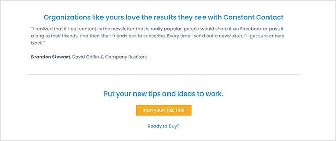
13. Constant Contact — Branchenspezifische Lead-Generierung
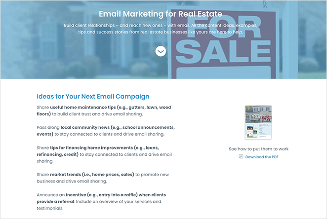
Constant Contact bedient viele Branchen, aber diese Immobilien-Landingpage richtet sich speziell an eine Zielgruppe. Dies hat zur Folge, dass das Angebot auf diesen Besucher zugeschnitten wirkt und nicht generisch ist.
- Zielgruppen-Targeting — Jedes Element richtet sich an Immobilienprofis, nicht an ein allgemeines Marketingpublikum.
- PDF-Vorschaubild — Die Anzeige des Guide-Covers lässt das Angebot realer und greifbarer erscheinen.
- Doppelter CTA — Ein kostenloser Guide-Download und ein kostenloser Test-CTA, beides mit geringer Verpflichtung.
- Testimonial — Ein Kunden-Testimonial von einem Immobiliennutzer zeigt, dass das Produkt in diesem spezifischen Kontext funktioniert.
Wichtigste Erkenntnis: Die Fokussierung auf eine Zielgruppe macht das Angebot relevanter. Ein Immobilienmakler, der eine Seite sieht, die für Immobilienmakler erstellt wurde, wird eher konvertieren als jemand, der eine generische Marketingseite sieht.
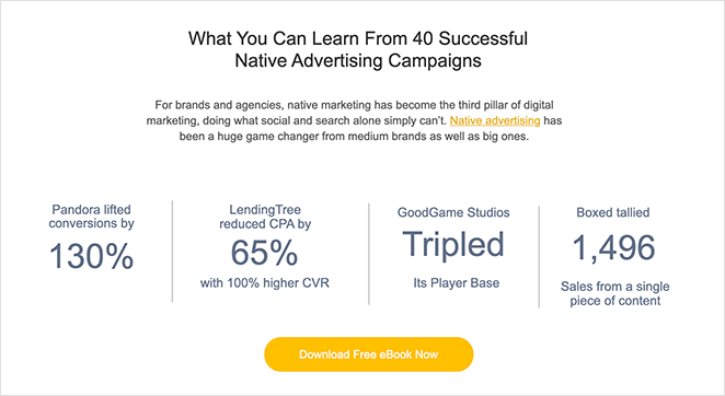
14. Taboola — Ebook-Download
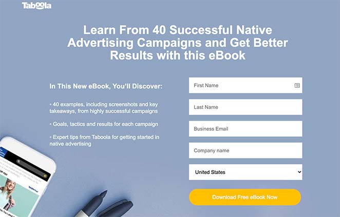
Die Ebook-Landingpage von Taboola zeigt, wie man mit einer kostenlosen Ressource Leads generiert. Die Überschrift verwendet eine Zahl, das Layout ist übersichtlich und die Beweispunkte sind spezifisch — all das erhöht die Glaubwürdigkeit.
- Zahlen in der Überschrift — „40 Fallstudien“ konvertiert besser als „viele Fallstudien“, da es spezifisch und konkret ist.
- Aufzählungsliste — Wichtige Punkte sind leicht zu überfliegen, was den Leseaufwand für den Besucher reduziert.
- Kurzes Formular — Nur die notwendigen Felder, was die Hürde für den Download niedrig hält.
- Statistiken als Beweis — Datenpunkte zu Konversionsergebnissen verleihen dem Ebook Glaubwürdigkeit, bevor der Besucher es herunterlädt.
- CTAs oben, in der Mitte und unten — Wo auch immer sich der Besucher auf der Seite befindet, gibt es immer eine nahegelegene Handlungsaufforderung.
Weitere Beispiele in dieser Kategorie finden Sie in unseren Beispielen für Ebook-Landingpages.
Wichtigste Erkenntnis: Zahlen in Überschriften lassen Angebote konkreter und glaubwürdiger erscheinen. „40 Fallstudien“ signalisiert Umfang und Spezifität — beides erhöht das Vertrauen in den Wert des Downloads.
15. Dropbox — App-Download per SMS
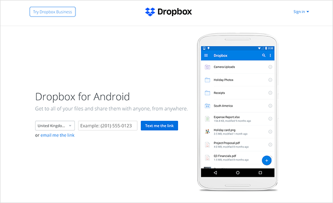
Die App-Landingpage von Dropbox eliminiert den Schritt, den die meisten Leute überspringen: die Navigation im App Store. Geben Sie Ihre Telefonnummer ein und der Download-Link kommt per SMS. Der Prozess von „Ich will das“ bis „Ich habe das“ ist so kurz wie möglich.
- Ultra-minimalistischer Text — Keine unnötigen Informationen. Die Überschrift und die Beschreibung enthalten nur das, was der Besucher zum Handeln benötigt.
- App-Vorschaubild — Zeigt, wie die App vor dem Download auf einem Gerät aussieht, was die Unsicherheit reduziert.
- SMS-Zustellung — Ein Feld für die Telefonnummer. Keine App-Store-Suche, keine Navigation erforderlich. Der Download kommt zum Besucher.
Wichtigste Erkenntnis: Je weniger Schritte zwischen Interesse und Produkt liegen, desto besser. Dropbox eliminiert den Schritt „im App Store finden“ vollständig, was ein echtes Hindernis darstellt, das die meisten mobilen Landingpages ignorieren.
16. Intercom — Interaktive Produktdemo-Seite

Die Demo-Seite von Intercom verfolgt einen ungewöhnlichen Ansatz: Anstatt eines Formulars wird Ihnen sofort eine Live-interaktive Demo des Produkts angezeigt. Sie erleben Intercom, bevor Sie mit dem Vertrieb sprechen. Der Call-to-Action lautet nicht „Demo anfordern“ – sondern „Demo ausprobieren“.
- Produkt-zuerst-Konvertierung — Besucher interagieren mit einem echten Intercom-Chat-Widget, das in eine unscharfe Kunden-Website eingebettet ist. Das Produkt verkauft sich selbst, bevor sich ein Vertriebsteam damit beschäftigt.
- Zwei-Wege-CTA — „Testversion starten“ und „Demo ausprobieren“ sind beide oben verfügbar. Besucher, die bereit für eine Testversion sind, können direkt loslegen; neugierige Besucher können zuerst erkunden.
- Zeigen, nicht verkaufen — Keine Feature-Liste, keine Preisgespräche, keine Testimonials oberhalb der „Fold“. Das Erlebnis ist der Beweis.
- Keine Hürden zum Ausprobieren — Nichts auszufüllen, um auf die Demo zuzugreifen. Senken Sie die Hürde, das Produkt zu erleben, und mehr Besucher werden bleiben, um es zu erkunden.
Wichtigste Erkenntnis: Bei Softwareprodukten kann es besser sein, Besuchern das Produkt erleben zu lassen, bevor sie eine Verpflichtung eingehen, als eine traditionelle, formularbasierte Demo anzubieten. Die Demo-Seite von Intercom beseitigt die Hürde „Anruf anfordern“ vollständig.
17. FreshBooks — Zielgruppenspezifische Buchhaltungsseite

Die Landingpage für Buchhaltung für Kleinunternehmen von FreshBooks beginnt mit einer Drittanbieter-Bewertung (4,5 Sterne basierend auf 4.496 GetApp-Bewertungen), bevor überhaupt Funktionen erwähnt werden. Die Seite spricht Kleinunternehmer direkt an, die Angst vor der Buchhaltung haben, und adressiert ihre tatsächlichen emotionalen Einwände: „Ist das kompliziert?“
- Validierung durch Dritte zuerst — Die Sternebewertung von GetApp erscheint direkt unter der Überschrift. Sie ist nicht selbst angegeben; sie ist unabhängig verifiziert.
- Risikomindernde Texte — „Keine Kreditkarte erforderlich. Jederzeit kündbar.“ erscheint direkt neben dem Test-CTA und behandelt die beiden häufigsten Einwände in einer einzigen Zeile.
- Zeitlich begrenztes Angebotsbanner — Eine Aktion „60 % Rabatt für 3 Monate“ erzeugt Dringlichkeit am oberen Rand der Seite, ohne die Hauptbotschaft zu stören.
- Produkt im Kontext — Das Hero-Bild zeigt eine echte bezahlte Rechnung und verankert eine abstrakte Dienstleistung in einem konkreten Ergebnis.
Wichtigste Erkenntnis: Bewertungen von Drittanbietern konvertieren besser als Behauptungen von Erstparteien, weil sie glaubwürdig sind, auf eine Weise, wie es Eigenwerbung nicht ist. FreshBooks beginnt mit einer unabhängigen Bewertungszahl, die mehr Vertrauen aufbaut als jede Funktionsbeschreibung.
18. Kit (ConvertKit) — Creator-First-E-Mail-Plattform

Kits Homepage ist auf eine klare Positionierungsaussage ausgerichtet: E-Mail-Marketing für Online-Ersteller. Es ist nicht für jeden und gibt sich auch nicht als solches aus. Durch die Fokussierung auf eine Zielgruppe fühlt sich die Seite persönlich relevant an, auf eine Weise, die breitere Wettbewerber nicht erreichen können.
- Kategorie-definierende Positionierung — „Die E-Mail-Marketing-Plattform für Ersteller“ ist eine Aussage, die per Design den größten Teil des Marktes ausschließt. Diese Spezifität gibt dem verbleibenden Publikum das Gefühl, verstanden zu werden.
- Ersteller-Testimonials — Sozialer Beweis kommt von bekannten Namen in der Creator Economy, nicht von generischen „zufriedenen Kunden“-Zitaten. Besucher sehen Leute wie sich selbst, die das Produkt nutzen.
- Kostenloser Plan als Einstieg — Bis zu 10.000 Abonnenten kostenlos. Die Seite beginnt mit dem kostenlosen Plan und reduziert die Verpflichtung zur Anmeldung auf null Kosten.
- Funktionsnachweise, die an Ersteller-Anwendungsfälle gebunden sind — Jede Funktion wird im Hinblick darauf beschrieben, was ein Ersteller tut, nicht was die Software tut. Der Text ist durchgängig zielgruppenspezifisch, nicht nur in der Überschrift.
Wichtigste Erkenntnis: Die Eingrenzung Ihrer Zielgruppe in der Überschrift reduziert Ihren adressierbaren Gesamtmarkt auf dem Papier – erhöht aber die Konversion für die Zielgruppe, die Sie tatsächlich wollen. Kits erstellerspezifische Positionierung konvertiert für Ersteller besser als eine generische „E-Mail-Marketing“-Botschaft.
Beispiele für Vertriebs-Landingpages
Vertriebsseiten wiegen mehr als Anmeldeseiten, da Sie Geld verlangen, nicht nur eine E-Mail. Diese Beispiele für Landingpages zeigen, wie Sie Vertrauen aufbauen und das Risiko in jeder Phase der Seite reduzieren können, indem Sie Einwände beantworten, bevor der Besucher sie äußert.
CRO-Prinzip: Einwandbehandlung
19. OptinMonster — SaaS-Vertriebsseite
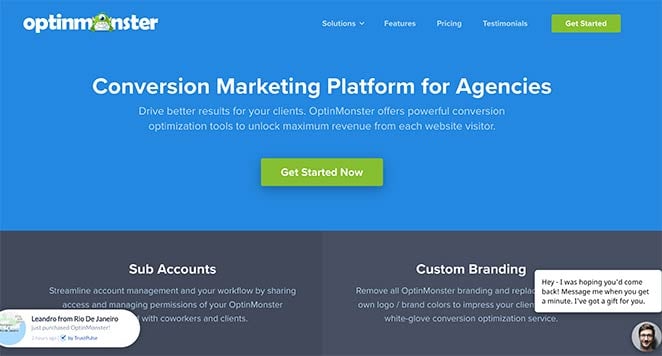
OptinMonsters Vertriebsseite ist eine Fallstudie in umfassender Konversionsoptimierung. Jeder Einwand, den ein potenzieller Käufer haben könnte, wird irgendwo auf der Seite angesprochen, und sozialer Beweis erscheint in jeder Phase des Scrollens.
- Abschnittsbasierte Struktur — Verschiedene Seitenabschnitte erleichtern das Auffinden der gesuchten Informationen. Das Wertversprechen des Headers erregt zuerst Aufmerksamkeit.
- Funktionsvorteile — Funktionen werden im Hinblick darauf präsentiert, was sie für den Benutzer tun, nicht was sie sind.
- Testimonial-Slider — Echte Kundenbewertungen rotieren und bieten kontinuierlichen sozialen Beweis.
- Animierte Produktdemos — GIFs zeigen genau, was die Software tut, ohne dass der Besucher zu einer Demoseite klicken muss.
- Live Social Proof — Echtzeit-Benachrichtigungen und eine Kundenzahl zeigen die Beliebtheit, ohne dass der Besucher etwas glauben muss.
- Mehrere CTAs — CTA-Schaltflächen erscheinen während der gesamten Seite an natürlichen Entscheidungspunkten.
- Live-Chat — Besucher können Fragen sofort beantworten lassen, ohne die Seite zu verlassen.

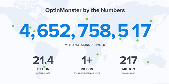
Wichtigste Erkenntnis: Auf einer langen Verkaufsseite muss sozialer Beweis an mehreren Stellen erscheinen, nicht nur am Anfang. OptinMonster platziert ihn an jeder Stelle, an der ein Besucher zögern könnte, was bedeutet, dass Einwände angesprochen werden, bevor sie vollständig entstehen.
20. HubSpot CRM — Kostenlose Produktverkaufsseite
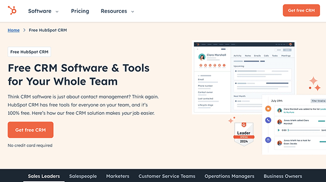
Die CRM-Seite von HubSpot räumt das größte Verkaufsargument aus dem Weg, bevor der Besucher dazu kommt: die Kosten. Wenn „kostenlos für immer“ das Erste ist, was Sie sehen, geht es auf dem Rest der Seite darum, die Entscheidung zu bestätigen, nicht darum, sie zu treffen.
- Geradlinige Texte — Klare und prägnante Erklärung von Vorteilen und Funktionen, ohne Übertreibung.
- Hervorhebung der kostenlosen Anmeldung — Der kostenlose Einstiegspunkt steht im Vordergrund. Dies beseitigt die finanzielle Risiko-Barriere ganz oben auf der Seite.
- Benutzer-Testimonials — Echtes Kundenfeedback schafft Vertrauen nach dem anfänglichen Haken.
- Funktions-Highlights — Wichtige CRM-Funktionen werden detailliert genug dargestellt, um zu bestätigen, dass das Produkt das tut, was der Besucher benötigt.
Wichtigste Erkenntnis: Wenn Ihr Einstiegspunkt kostenlos ist, sagen Sie es prominent und wiederholt. Es beseitigt die größte Hürde für vorsichtige Käufer, und der Rest der Seite dient dazu, den Wert zu bestätigen, anstatt Kostenwiderstände zu überwinden.
Was A/B-getestet werden soll:
- Framing des kostenlosen Plans: „Für immer kostenlos“ vs. „Kostenlos starten, keine Kreditkarte“
- Social Proof-Format: Testimonial-Zitate vs. Kundenlogos vs. Nutzeranzahl
- Reihenfolge der Feature-Highlights: E-Mail-Tools zuerst vs. Kontaktverwaltung zuerst
21. Square — Verkaufsseite für Einzelhandels-POS
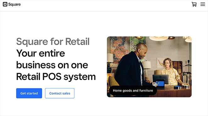
Die Landingpage für das Einzelhandels-Point-of-Sale-System von Square lässt das Produkt real wirken. Bei Hardware und physischen Werkzeugen konvertiert die Darstellung des Produkts in seiner tatsächlichen Umgebung besser als reine Spezifikationen.
- Hochwertige Hardware-Bilder — Produktfotos zeigen das Kassensystem in einer echten Einzelhandelsumgebung, nicht im Studio.
- Funktions-Highlights — Vorteile und Funktionen werden klar und in einfacher Sprache dargestellt.
- Markenlogos — Bekannte Marken, die Square verwenden, verleihen sofortige Glaubwürdigkeit.
- Mehrere Demo-CTAs — Besucher, die mehr sehen möchten, bevor sie sich festlegen, können an mehreren Stellen auf der Seite eine Demo anfordern.
Wichtigste Erkenntnis: Bei physischen Produkten oder Hardware konvertiert die Darstellung des Produkts in seiner realen Umgebung besser als reine Spezifikationen. Die Produktfotografie von Square beantwortet visuell die Frage „Passt das in mein Geschäft?“, was Text nicht leisten kann.
22. Dadz — Auf die Zielgruppe abgestimmte Verkaufsseite
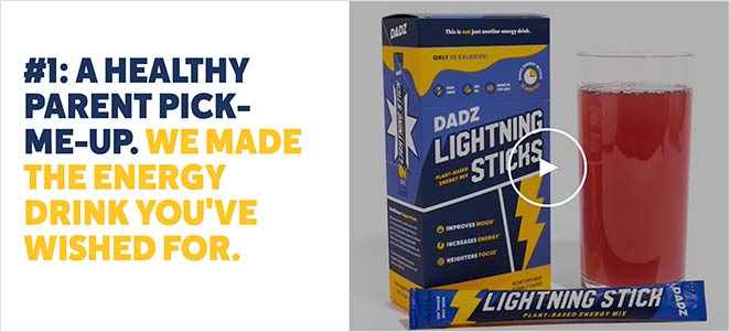
Ich habe diese Seite gefunden, nachdem ich auf eine Google-Anzeige geklickt habe, die auf Familienväter abzielte. Dieses Detail ist wichtig: Diese Landingpage spiegelt genau die Zielgruppe dieser Anzeige wider. Die Bilder, der Text, die Fallstudien – alles spricht dieselbe Person an, die die Anzeige anvisierte.
- Zielgruppen-Abgleich — Alles auf der Seite spiegelt die Zielpersona wider. Besucher, die auf die Anzeige geklickt haben, haben das Gefühl, dass die Seite für sie erstellt wurde.
- Fallstudien — Sozialer Beweis in Form von ergebnisbasierten Geschichten, nicht nur Zitate.
- Video — Ein ansprechendes Video zeigt das Produkterlebnis und schafft eine emotionale Verbindung, bevor die Aufforderung zum Handeln erfolgt.
- Instagram-Galerie — Eine florierende Social-Media-Community signalisiert, dass echte Menschen das Produkt nutzen und lieben.
- Mehrere CTAs — Kaufmöglichkeiten erscheinen auf der gesamten Seite, nicht nur am Ende.
Wichtigste Erkenntnis: Wenn ein Besucher von einer gezielten Anzeige kommt, sollte Ihre Landingpage das Gefühl vermitteln, speziell für ihn erstellt worden zu sein. Dadz erreicht dies, indem die Sprache, die Bilder und die Anliegen der genauen Zielgruppe, die die Anzeige ansprach, gespiegelt werden.
23. Evernote — Preisvergleichsseite
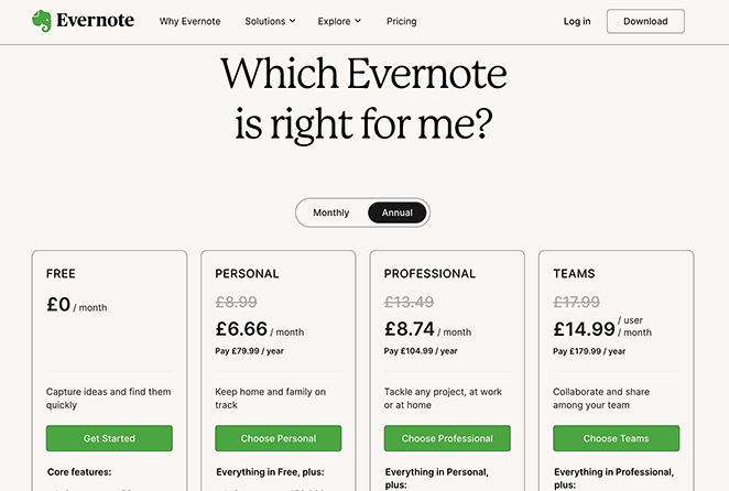
Die Preisseite von Evernote reduziert die Entscheidungsermüdung, indem sie die Auswahl organisiert, anstatt sie dem Besucher zu überlassen. Eine klare Vergleichstabelle, visuelle Hierarchie und ein CTA pro Plan erledigen die Entscheidungsarbeit, damit der Besucher dies nicht tun muss.
- Klare Vergleichstabelle — Pläne werden nebeneinander dargestellt, sodass die Unterschiede auf einen Blick leicht zu erkennen sind.
- Visuelle Hierarchie — Farbe und Layout lenken das Auge zum empfohlenen Plan, ohne aufdringlich zu sein.
- Vertrauenslogos — Bekannte Marken, die das Produkt nutzen, schaffen Glaubwürdigkeit im Moment der Entscheidung.
- CTA pro Plan — Jeder Plan hat seinen eigenen klaren Call to Action, sodass nicht gesucht werden muss, wohin geklickt werden soll.
- Detaillierte Informationen — Umfassende Funktionslisten ermöglichen es Besuchern, den richtigen Plan zu bestätigen, ohne die Seite verlassen zu müssen.
Wichtigste Erkenntnis: Eine Vergleichstabelle reduziert die Entscheidungsermüdung, indem sie die Auswahl organisiert, anstatt sie dem Besucher zu überlassen. Wenn Menschen die Optionen klar sehen können, wählen sie eher eine aus und handeln danach.
24. Kajabi — Aspirationale Creator-Positionierung

Die Homepage von Kajabi liest sich wie eine Landingpage, weil sie auch so funktioniert. Die minimale Navigation, der einzelne CTA und die identitätsbezogene Überschrift dienen alle einem Ziel: Kreativprofis dazu zu bringen, eine kostenlose Testversion zu starten.
- Identitätsbasierte Überschrift — „Verwandle, was du weißt, in das, wofür du bekannt bist“ spricht an, wie der Besucher sich selbst sehen möchte, nicht die Funktionen, die er erhalten wird. Diese Art von aspirationaler Formulierung schafft eine stärkere emotionale Ausrichtung als Funktionsbeschreibungen.
- Creator-Fotogitter — Ein durchgehendes Mosaik echter, vielfältiger Kajabi-Creator dient als sozialer Beweis ohne ein einziges schriftliches Testimonial. Die Vielfalt der Gruppe signalisiert, dass dies für alle Arten von Menschen funktioniert.
- Minimale Navigation — Nur Produkt, Updates, Preise — nichts, was mit dem Testversions-CTA konkurriert.
- Ein CTA durchgehend — „Kostenlose Testversion starten“ erscheint im Header und im Hero-Bereich. Es gibt nur eine Aktion auf dieser Seite.
Wichtigste Erkenntnis: Eine identitätsbasierte Überschrift – eine, die davon spricht, wer Besucher werden wollen, nicht was das Produkt tut – kann für aspirational orientierte Zielgruppen besser abschneiden als funktionsorientierte Beschreibungen. Kajabis Seite verkauft das Ergebnis, nicht das Werkzeug.
25. Basecamp — Flat-Pricing Contrarian Page

Die Preisgestaltungs-Seite von Basecamp beginnt mit einem konträren Wertversprechen in einer Branche, die fast universell pro Nutzer abrechnet. Das Pauschalpreismodell ist die Schlagzeile, und die Seite ist vollständig darauf ausgelegt, diese Entscheidung zu erklären und zu rechtfertigen.
- Live Social Proof Zähler — „2.587 Anmeldungen letzte Woche“ erscheint im Hero-Bereich und wird in Echtzeit aktualisiert. Dies ist ein aktiver Beweis für Dynamik, kein statischer Erfahrungsbericht.
- Erweiterte Testversion-Anzeige — Der Pro Unlimited Plan beginnt mit einer 60-tägigen kostenlosen Testversion, doppelt so lang wie der Industriestandard. Dies signalisiert Vertrauen in das Produkt.
- Stressreduzierender Text — „Kein Stress – Sie können Pakete später immer noch wechseln.“ Dies adressiert eine der größten Bedenken auf jeder Preisgestaltungs-Seite: „Was, wenn ich die falsche Wahl treffe?“
- Drei-Ebenen-Layout — Pläne werden nebeneinander angezeigt, wodurch Unterschiede auf einen Blick ersichtlich werden und der Rechercheaufwand für den Besucher reduziert wird.
Wichtigste Erkenntnis: Wenn sich Ihr Preismodell grundlegend von dem der Wettbewerber unterscheidet, machen Sie es zur Schlagzeile. Die Pauschalpreis-Geschichte von Basecamp ist das überzeugendste Element auf der Seite, und der Live-Anmelde-Zähler beweist, dass sie funktioniert.
Was A/B-getestet werden soll:
- Headline-Ansatz: Flat-Pricing-Story vs. „Hören Sie auf, pro Nutzer zu zahlen“-Framing
- Live-Anmelde-Zähler: Echtzeit-Zähler angezeigt vs. statisches Social Proof
- Testangebot: 30-tägige vs. 60-tägige kostenlose Testversion als primärer CTA
Beispiele für Landing Pages mit kostenloser Testversion
Seiten mit kostenloser Testversion haben eine Aufgabe: den Start sicher erscheinen zu lassen. Die besten Seiten entfernen jedes Signal, das „das wird Sie etwas kosten“ sagt, und stellen den Nutzen des Ausprobierens in den Vordergrund. Diese Beispiele zeigen, wie man finanzielle Risiken eliminiert und den ersten Schritt so klein wie möglich macht.
CRO-Prinzip: Risikoumkehr
26. Shopify — 14-tägige kostenlose Testversion
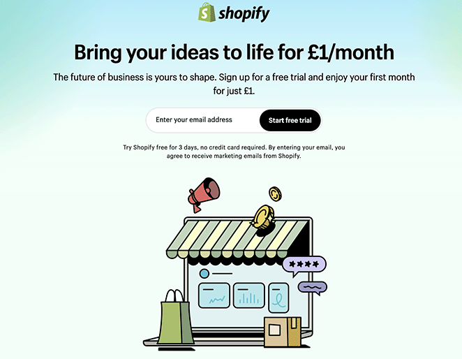
Die kostenlose Testversion-Seite von Shopify ist eines der saubersten Beispiele für einen starken Call to Action, der richtig gemacht ist. Unter den Beispielen für E-Commerce-Landing-Pages sticht diese hervor, weil sie mit sehr wenig viel erreicht.
- Schlagzeile mit Testdauer — „14 Tage kostenlos“ ist spezifisch. „Kostenlos testen“ ist vage. Das spezifische Versprechen setzt eine klare Erwartung mit geringer Verpflichtung.
- Minimalistisches Layout — Keine Unordnung. Jedes Element auf der Seite dient dazu, die primäre Aktion zu unterstützen.
- Markenlogos als Vertrauenssignale — Bekannte Marken, die Shopify nutzen, bestätigen, dass es eine legitime, zuverlässige Wahl ist.
- Kurzes Formular — Nur die wesentlichen Informationen, die zur Einleitung der Testversion benötigt werden.
Wichtigste Erkenntnis: Die explizite Angabe der Testdauer („14 Tage kostenlos“) übertrifft vage Formulierungen wie „kostenlos testen“. Ein spezifischer Zeitraum setzt eine klare, druckfreie Erwartung und lässt die Entscheidung kleiner erscheinen.
Was A/B-getestet werden soll:
- Formulierung der Testlänge: „14 Tage kostenlos“ vs. „Kostenlos starten, keine Kreditkarte erforderlich“
- Art des Vertrauenssignals: Erkennbare Markenlogos vs. „Über 1 Million Unternehmen nutzen Shopify“
- CTA-Text: „Kostenlose Testversion starten“ vs. „Shopify kostenlos testen“
27. Codecademy — Kostenlose Mitgliedschaft Testversion

Die Landing Page von Codecademy zeigt, wie Weißraum und strategischer Farbeinsatz genauso viel bewirken können wie Text. Die Mitgliederseite hält die Dinge einfach, verwendet aber kräftige Farb-Akzente, um die Aufmerksamkeit auf das Wesentliche zu lenken.
- Strategischer Farbeinsatz — Kräftige Farb-Akzente auf CTAs ziehen die Blicke auf sich und machen Aktionen unübersehbar.
- Positive Bilder — Glückliche Fachleute schaffen eine emotionale Verbindung zwischen der Nutzung des Produkts und dem Erreichen von Karriereerfolg.
- Echte Testimonials — Kundenbewertungen bestätigen, dass das Produkt das hält, was die Seite verspricht.
- Klarer Preisvergleich — Besucher können auf einen Blick den richtigen Plan erkennen und so die Entscheidungsfindung erleichtern.
- Kontrastierender CTA-Bereich — Der letzte Call-to-Action verwendet eine andere Hintergrundfarbe, wodurch er sich vom Rest der Seite abhebt.

Wichtigste Erkenntnis: Weißraum ist kein verschwendeter Platz – er lenkt die Aufmerksamkeit auf das Wesentliche und verhindert visuelle Überforderung. Das minimalistische Design von Codecademy lenkt den Blick auf den CTA und nicht davon weg.
28. Asana — Zielgruppenspezifische kostenlose Testversion
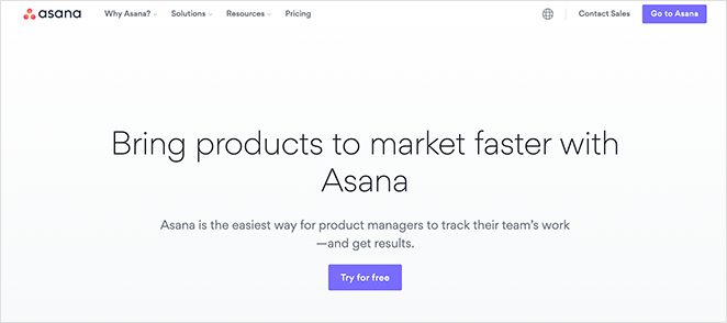
Die Seite von Asana, die sich an Produktmanager richtet, ist eines der besseren Beispiele für rollenbasierte Botschaften. Das gleiche Produkt, wenn es für eine bestimmte Zielgruppe formuliert wird, konvertiert besser als eine allgemeine Seite, auch wenn die Funktionen identisch sind.
- Rollenspezifische Überschriften — Die Seite spricht Produktmanager direkt an und beschreibt Vorteile in Bezug auf ihre spezifischen Herausforderungen.
- Mehrere Anwendungsfälle — Zeigt, wie das Produkt auf die tatsächliche Arbeit dieser Rolle angewendet wird, nicht auf abstrakte Szenarien.
- Video-Fallstudie — Eine echte Marke erklärt, wie sie Asana für das Produktmanagement einsetzt. Das ist überzeugender als nur Text.
- Kostenlose Testversion CTA — Die letzte Aufforderung ist eine kostenlose Testversion, kein Kauf. Geringere Verpflichtung, höhere Konversion.
Wichtigste Erkenntnis: Eine Landingpage, die sich an „Produktmanager“ richtet, konvertiert für diese Zielgruppe besser als eine allgemeine Seite, selbst wenn das Produkt identisch ist. Spezifität gibt den Besuchern das Gefühl, gesehen zu werden, und dieses Gefühl treibt zum Handeln an.
29. Grammarly — Freemium-Upgrade-Seite

Die Pro-Upgrade-Seite von Grammarly richtet sich an bestehende kostenlose Nutzer, was die Aufgaben der Seite verändert. Sie muss das Produkt nicht erklären. Sie muss das Upgrade rechtfertigen.
- Vorteilsorientierte Upgrade-Überschrift — „Upgrade your plan, up-level your work“ (Verbessern Sie Ihren Plan, heben Sie Ihre Arbeit auf ein höheres Niveau) rahmt die Entscheidung als Karriereschritt und nicht als Produktkauf. Die Formulierung reduziert die Preissensibilität.
- Funktions-Tabs für den Vergleich — Registerkartenbereiche (Generative KI, Umschreibungen, Strategische Beratung, Tonanpassung) ermöglichen es Besuchern, spezifische Funktionen zu erkunden, ohne von einer Funktionsliste überwältigt zu werden.
- Ein CTA oberhalb der Falz — Ein „Grammarly Pro erhalten“-Button im Hero-Bereich. Keine konkurrierenden Optionen verwirren die Entscheidung.
- Produkt-Screenshot im Kontext — Der Hero-Bereich zeigt die Schreiboberfläche mit sichtbaren Grammarly-Vorschlägen und verstärkt den Wert im Moment der Aufforderung.
Wichtigste Erkenntnis: Upgrade-Seiten für Freemium-Produkte haben eine andere Aufgabe als Akquise-Seiten – sie konvertieren Nutzer, die dem Produkt bereits vertrauen. Rahmen Sie das Upgrade als Karriere- oder Produktivitätsvorteil, nicht als Freischaltung von Funktionen.
Beispiel-Landingpages für Webinar- und Veranstaltungsanmeldungen
Webinarseiten müssen die Veranstaltung verkaufen, nicht nur eine Anmeldung erfassen. Diese Beispiele zeigen, wie man Wert kommuniziert und genügend Interesse weckt, um ein „Ja“ zu erhalten. Der Schlüssel ist, die Frage „Warum sollte ich teilnehmen?“ zu beantworten, bevor man nach der Anmeldung fragt.
CRO-Prinzip: Vorfreude aufbauen
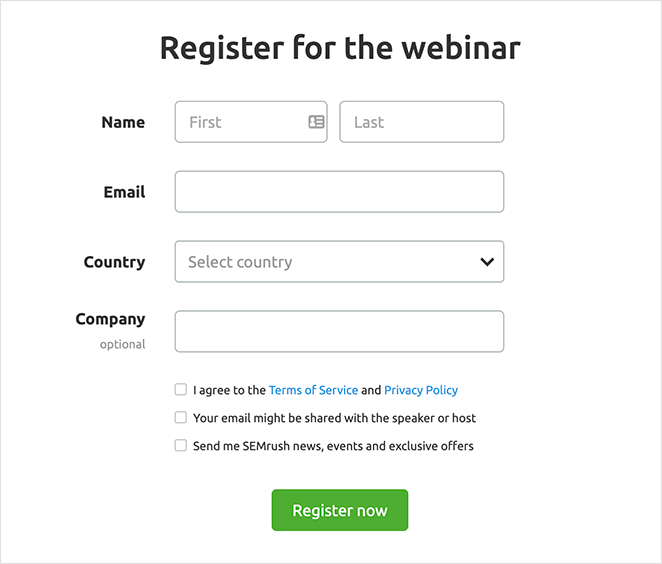
30. SEMrush — Webinar-Anmeldung
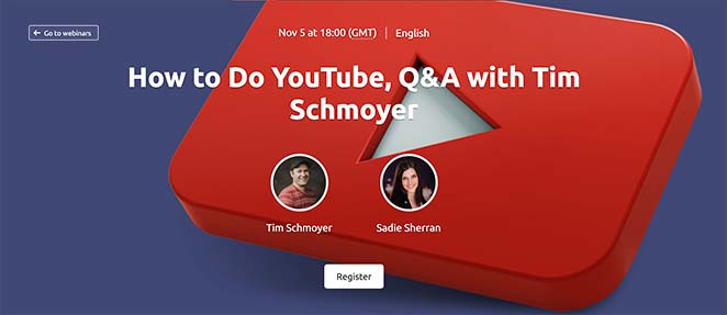
SEMrush veranstaltet regelmäßig Webinare, und ihre Anmeldeseite zeigt genau, was die Leute dazu bringt, sich anzumelden. Das Thema, der Gastgeber und die Agenda sind alle oberhalb der Falz sichtbar. Besucher müssen nicht graben, um die Antwort auf die Frage „Ist das meine Zeit wert?“ zu finden.
- Hero-Bereich mit vollem Kontext — Thema, Gastgeber und Datum sind sofort sichtbar. Kein Scrollen erforderlich, um zu verstehen, worum es in dem Webinar geht.
- Referentendetails — Leute melden sich für bestimmte Experten an, nicht für abstrakte Veranstaltungen. SEMrush hebt hervor, wer präsentiert.
- Kurzes Anmeldeformular — Minimale Felder reduzieren die Reibung am Punkt der Verpflichtung.
- Empfohlene Inhalte — Links zu früheren und zukünftigen Episoden fördern die fortlaufende Beteiligung über die einzelne Anmeldung hinaus.
Wichtigste Erkenntnis: Wer präsentiert und was behandelt wird, konvertiert besser als eine generische „Jetzt anmelden“-Seite. Leute melden sich für spezifischen Wert an, nicht für Veranstaltungen im Allgemeinen. Machen Sie den spezifischen Wert vom ersten Scrollen an offensichtlich.
31. Wistia — Webinar-Anmeldung
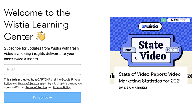
Wistia veranstaltet Webinare über Videomarketing — und ihre Webinar-Anmelde-Landingpage nutzt durchgängig Videoelemente. Die Markenabstimmung ist kein Zufall. Ein Videounternehmen, das Video zur Bewerbung einer videofokussierten Veranstaltung nutzt, schafft Vertrauen durch Konsistenz.
- Durchgängige Videoelemente — Bewerbt eine Videoplattform durch die Nutzung von Videos, was die Expertise der Marke unterstreicht.
- Aufzählungspunkte mit den wichtigsten Erkenntnissen — Besucher können schnell scannen, was sie lernen werden, bevor sie sich zur Anmeldung entscheiden.
- Einfaches Anmeldeformular — Leicht zu finden, leicht auszufüllen. Keine unnötige Reibung.
- Überzeugende Texte — Nutzenorientierte Sprache macht den Wert der Teilnahme deutlich.
Wichtigste Erkenntnis: Das Design Ihrer Landingpage sollte Ihr Produkt widerspiegeln. Ein Videohosting-Unternehmen, das Videos auf seiner Webinar-Seite verwendet, schafft Vertrauen durch Konsistenz — die Seite selbst ist eine Demonstration dessen, was Sie lehren.
32. Dreamforce — Virtuelle Veranstaltungsanmeldung
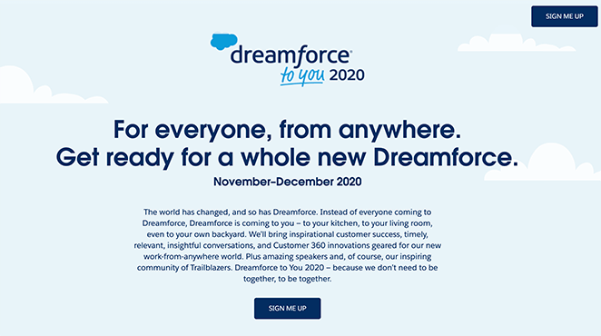
Dreamforce verlagerte seine jährliche Konferenz online und benötigte eine Seite, die die virtuelle Veranstaltung genauso lohnenswert erscheinen ließ wie die persönliche Version. Die Landingpage verwendet Vollbild-Visualisierungen, mehrere Informationsblöcke und verschiedene Möglichkeiten, nach der Anmeldung in Verbindung zu bleiben.
- Vollbild-animierter Hero-Bereich — Vermittelt sofort die Energie und den Umfang der Veranstaltung.
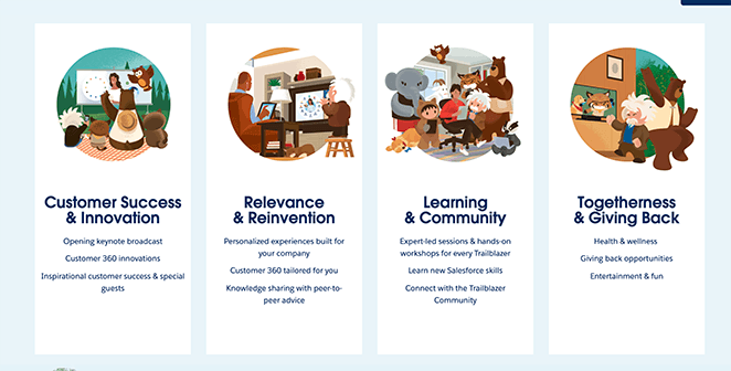
- Vier wichtige Informationsblöcke — Jeder Block beantwortet eine andere „Warum teilnehmen?“-Frage.
- Kontrastierende CTA-Schaltflächen — Mehrere sichtbare Anmeldepunkte auf der gesamten Seite.
- E-Mail- und Kalendererinnerungen — Besucher können wählen, ob sie eine E-Mail-Benachrichtigung erhalten oder das Ereignis ihrem Kalender hinzufügen möchten. Beide Optionen reduzieren die Nichterscheinungsrate drastisch.
Wichtigste Erkenntnis: Geben Sie Besuchern bei großen Veranstaltungen mehrere Möglichkeiten, nach der Registrierung in Verbindung zu bleiben. Die E-Mail-Erinnerung und die Option „Zum Kalender hinzufügen“ erleichtern es den Menschen erheblich, zu erscheinen und nicht nur sich anzumelden.
33. Digital Marketer — Online-Kursanmeldung
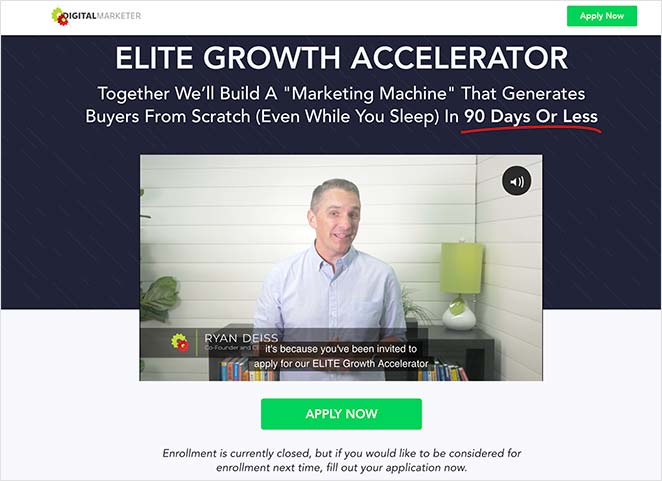
Die Elite Growth Accelerator-Seite von Digital Marketer beginnt mit einem Gründer-Video. Bei komplexen Angeboten – Coaching-Programme, Kurse, Community-Mitgliedschaften – fasst ein Video stundenlange Erklärungen in wenigen Minuten zusammen und baut eine persönliche Verbindung auf, wie es Text allein nicht kann.
- Gründer-Video oben — Stellt sofort fest, wer hinter dem Angebot steckt und baut persönliches Vertrauen auf.
- Schritt-für-Schritt-Erklärung — Führt die Besucher durch die Funktionsweise des Programms und beseitigt Unsicherheiten darüber, was sie kaufen.
- Nutzenorientierter Text — Die Seite erklärt, was das Training nicht ist, was Ängste beseitigt, zusammen mit dem, was es ist.
- Boni — Zusätzliche Vergünstigungen lassen das Angebot im Verhältnis zum Preis wertvoller erscheinen.
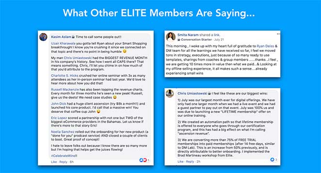
- Social-Proof-Screenshots — Testimonials von bestehenden Mitgliedern sorgen für Authentizität, nicht nur für Glanz.
- Ermäßigter Preis — Ein durchgestrichener Preis bekräftigt, dass sich das Angebot jetzt lohnt.
Wichtigste Erkenntnis: Video funktioniert besonders gut, wenn das Angebot komplex ist. Es fasst die Erklärung in wenigen Minuten zusammen und baut eine persönliche Verbindung zum Präsentierenden auf – beides ist mit reinem Text schwer zu erreichen.
34. LinkedIn — Identitätsgesteuerte Beitrittsseite

Die Anmeldeseite von LinkedIn verkauft keine Plattform – sie verkauft professionelle Identität. Der Text konzentriert sich darauf, wer Sie werden und mit wem Sie sich verbinden werden, nicht auf welche Funktionen Sie erhalten.
- Rahmung der professionellen Identität — Die Überschrift positioniert den Beitritt als Karriereschritt, nicht als Anmeldung für ein soziales Netzwerk. Besucher werden durch das Ergebnis motiviert, nicht durch Funktionen.
- Kontextbezogene Dringlichkeit — LinkedIn zeigt Verbindungen, Unternehmen und Jobs an, die „in Ihrer Nähe“ oder „in Ihrer Branche“ sind, und schafft so persönliche Relevanz, ohne aufdringlich zu sein.
- Minimale Formularreibung — Vorname, Nachname, E-Mail und Passwort. LinkedIn hat das Markenvertrauen, um die anfängliche Anfrage kurz zu halten und später mehr zu sammeln.
- Social Proof durch Skalierung — „Schließen Sie sich über 1 Milliarde Fachleuten an“ signalisiert sowohl Legitimität als auch Netzwerkeffekt. Die Größe der Community ist das Wertversprechen selbst.
Wichtigste Erkenntnis: Wenn der Hauptwert Ihres Produkts die Community ist, leistet die Führung mit Skalierung („Schließen Sie sich einer Milliarde Fachleuten an“) die Arbeit, die Funktionen nicht leisten können. Der Netzwerkeffekt ist die Überschrift und ist überzeugender als jede Funktionsbeschreibung.
WordPress Landingpage-Beispiele (Erstellt mit SeedProd)
Ich nutze SeedProd zum Erstellen von Landing Pages auf WordPress und habe gesehen, wie sehr ein fokussiertes Layout und die richtige Vorlage die Konversionsraten verändern können. Diese Vorlagen eignen sich besonders gut für kleine Unternehmen und Solopreneure, die professionelle, auf Konversionen ausgerichtete Seiten benötigen, ohne zusätzliche Gebühren für eine separate Landing-Page-Plattform zu zahlen.
Was WordPress-Landing-Pages von den oben genannten SaaS-Beispielen unterscheidet, ist nicht das Design, sondern die Kontrolle. Sie besitzen die Seite, die Daten und das Hosting. Sie sind nicht an eine separate Plattformgebühr für jede Landing Page gebunden, die Sie erstellen.
35. Lead-Generierungsseite
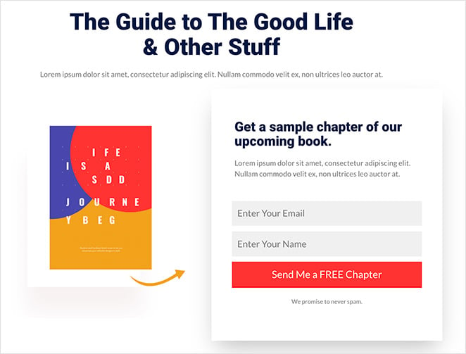
Eine in SeedProd erstellte Lead-Generierungsseite kann die Struktur der obigen Zoom- oder Constant Contact-Beispiele widerspiegeln. Die wichtigsten Konversionselemente – eine nutzenorientierte Überschrift, ein kurzes Formular, eine Vorschau des Lead-Magneten – sind alle als Drag-and-Drop-Blöcke verfügbar.
- E-Mail-Opt-in-Formularblock – Verbindet sich direkt mit Ihrem E-Mail-Marketing-Anbieter. Kein Drittanbieter-Formular-Plugin erforderlich.
- Lead-Magnet-Vorschau-Bereich – Zeigen Sie ein Titelbild des Leitfadens oder Berichts an, um das Angebot greifbar zu machen.
- Social-Proof-Block – Fügen Sie ein Testimonial oder eine Abonnentenzahl hinzu, um sofortige Glaubwürdigkeit aufzubauen.
- Keine Navigationsmenüs – SeedProd-Landing-Pages enthalten standardmäßig nicht den Website-Header, sodass sich die Besucher auf die eine Aktion konzentrieren.
Wichtigste Erkenntnis: Die strukturellen Vorteile einer dedizierten Lead-Generierungsseite (keine Navigation, einzelne CTA, fokussierter Text) sind in WordPress verfügbar, ohne Ihre bestehende Website zu verlassen. Die Vorlagen von SeedProd beginnen mit diesen Best Practices.
36. Verkaufs-/Produktseite
Für den direkten Verkauf eines Produkts oder einer Dienstleistung über WordPress enthalten die Verkaufsseitenvorlagen von SeedProd die wichtigsten Konversionsbereiche: Hero mit CTA, Funktionsvorteile, Testimonials und Preise. Ich habe diese Vorlagen Kunden empfohlen, da sie von einer bewährten Struktur ausgehen und nicht von einer leeren Leinwand.
- Mehrere Abschnitte im Layout – Hero, Features, Social Proof, Preise und finaler CTA – alles in einer Drag-and-Drop-Vorlage.
- WooCommerce-Integration – Verbinden Sie Ihre Produktseite direkt mit der Kasse Ihres Shops.
- Testimonial-Blöcke – Fügen Sie Zitate, Sternebewertungen und Kundenfotos ohne benutzerdefinierten Code hinzu.
- Countdown-Timer-Block – Fügen Sie für Verkaufsaktionen eine echte Frist hinzu, um echten Zeitdruck zu erzeugen.
Wichtigste Erkenntnis: Der Start mit einer Vorlage, die auf einer bewährten Verkaufsseitenstruktur basiert, ist schneller und effektiver, als von Grund auf neu zu gestalten. Die Konversionsprinzipien von OptinMonster, HubSpot und Square oben sind in den Verkaufsvorlagen von SeedProd integriert.
37. Demnächst verfügbar-Seite

Eine „Demnächst verfügbar“-Seite ist oft die erste Landing Page eines Unternehmens und wird häufig unterschätzt. Anstatt nur „Demnächst verfügbar“ zu sagen, beginnen die besten „Demnächst verfügbar“-Seiten damit, Ihre E-Mail-Liste aufzubauen, bevor Sie starten.
- E-Mail-Erfassungsformular – Sammeln Sie Abonnenten während der Vorabstartphase, damit Sie am ersten Tag eine Zielgruppe bereit haben.
- Start-Countdown-Timer — Schafft Vorfreude und gibt Besuchern einen Grund, wiederzukommen.
- Social Proof — Schon frühe Testimonials oder Presseerwähnungen bauen vor dem Launch Glaubwürdigkeit auf.
- Markenkonsistentes Design — Die „Coming Soon“-Vorlagen von SeedProd ermöglichen es Ihnen, den ersten Eindruck zu kontrollieren, bevor Ihre vollständige Website fertig ist.
Wichtigste Erkenntnis: Ihre „Coming Soon“-Seite ist eine Lead-Generierungs-Möglichkeit, kein Platzhalter. Beginnen Sie damit, E-Mails zu sammeln und Vorfreude aufzubauen, bevor Sie starten — die Liste, die Sie jetzt aufbauen, ist das Publikum, an das Sie später starten.
Es gibt einen Anwendungsfall, den die obigen SaaS-Beispiele nicht abdecken: die Seite, die Sie schalten, bevor Sie bereit zum Start sind. Der „Coming Soon“-Modus von SeedProd ermöglicht es Ihnen, eine konversionsbereite Seite zu veröffentlichen, während Ihre vollständige Website noch in der Entwicklung ist. Ich habe ihn genutzt, um eine E-Mail-Liste aufzubauen, bevor ein Produkt live ging, was bedeutet, dass der Starttag mit einem Publikum statt mit Stille beginnt.
38. Webinar-Registrierungsseite

Die Webinar-Landingpage-Vorlagen von SeedProd basieren auf denselben Prinzipien, die die oben genannten Beispiele von SEMrush und Wistia demonstrieren: Thema, Gastgeber, Agenda und ein kurzes Formular. Für WordPress-Benutzer, die Webinare direkt über Zoom oder eine andere Plattform veranstalten, ermöglicht SeedProd den Aufbau der Registrierungsseite auf Ihrer eigenen Domain.
- Gastgebervorstellungsbereich — Fügen Sie die Biografie, das Foto und die Qualifikationen des Sprechers hinzu, um persönliches Vertrauen aufzubauen.
- Agenda/Wichtigste Erkenntnisse-Block — Lassen Sie die Besucher genau wissen, was sie lernen werden, bevor sie sich registrieren.
- Registrierungsformular-Integration — Direkte Verbindung zu Ihrer Webinar-Plattform oder Ihrem E-Mail-Anbieter.
- Countdown-Timer — Schafft Vorfreude und setzt eine echte Frist für die Registrierung.
Wenn eines dieser Beispiele dem entspricht, was Sie erstellen möchten, hat SeedProd Vorlagen für alle. Die vollständige Bibliothek finden Sie unter SeedProd Templates, und unser Leitfaden zur Erstellung einer einfachen Landingpage führt Sie Schritt für Schritt durch die Einrichtung.
Wichtigste Erkenntnis: Wenn Sie Ihre eigene Webinar-Registrierungsseite besitzen, kontrollieren Sie das Besuchererlebnis vom Klick bis zur Konversion, ohne Plattformbeschränkungen. SeedProd ermöglicht den Aufbau dieser Seite in WordPress in weniger als einer Stunde.
Beispiele für Werbe-Landingpages
Werbeseiten konvertieren durch Dringlichkeit, aber die Dringlichkeit muss echt und nicht künstlich erzeugt wirken. Gefälschte Countdown-Timer und künstliche Verknappung haben Besucher dazu trainiert, Dringlichkeitssignale zu ignorieren — die Beispiele, die immer noch funktionieren, sind diejenigen, bei denen die Frist echt ist.
CRO-Prinzip: Dringlichkeit und FOMO
39. Smash Balloon — Black Friday Seite
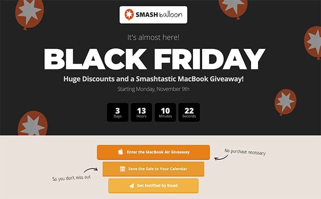
Diese Black Friday Landingpage von Smash Balloon erzeugt Dringlichkeit durch mehrere verstärkende Mechanismen, nicht nur durch einen Countdown-Timer. Der Timer kündigt die Frist an; die anderen Elemente sorgen dafür, dass sich die Besucher daran erinnern.
- Countdown-Timer — Ein echter Countdown-Timer erzeugt Dringlichkeit, wenn die Frist echt ist. Der Timer von Smash Balloon zählt bis zu einem tatsächlichen Ereignis herunter, was ihn glaubwürdig macht.
- Gewinnspiel-Teilnahme — Hinzufügen eines Wettbewerbs erhöht die Bekanntheit der Aktion. Mehr Teilnahmen bedeuten mehr Leute, die über das Angebot sprechen.
- E-Mail-Erinnerungsoption — Besucher können sich anmelden, um eine Benachrichtigung zu erhalten, wenn das Angebot live geht. Dies bringt Leute zurück, die noch nicht bereit sind zu handeln.
- Kalender-Erinnerungsoption — Das Hinzufügen der Aktion zu einem Kalender schafft eine persönliche Verpflichtung zur Rückkehr.
- Markendesign — Konsistentes Branding versichert Besuchern, dass sie am richtigen Ort sind und mit einem legitimen Unternehmen handeln.
Wichtigste Erkenntnis: Ein Countdown-Timer erzeugt nur dann Dringlichkeit, wenn die Frist real ist. Smash Balloon verstärkt echte Dringlichkeit mit Erinnerungen, die Leute zurückbringen, wenn das Angebot live geht, was effektiver ist, als sich nur auf den Timer zu verlassen.
40. RafflePress — Virale Gewinnspiel-Landingpage
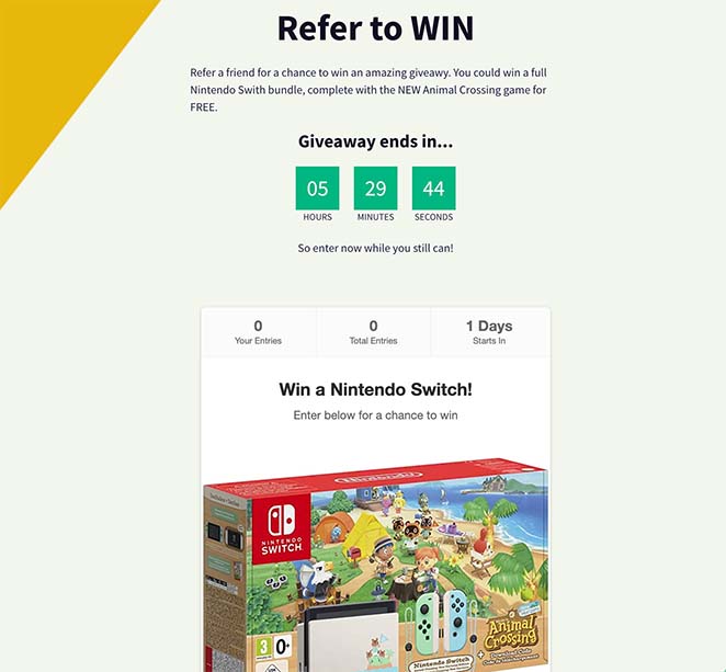
Eine Gewinnspiel-Landingpage ist einer der am höchsten konvertierenden Seitentypen, da der Anreiz klar und die Eintrittsschwelle niedrig ist. RafflePress erstellt Seiten, die speziell für Viralität entwickelt wurden — jede Aktion zur Teilnahme ist auch ein Teil-Auslöser, der organisch neue Besucher anzieht.
- Hochsichtbare Preisdarstellung — Der Preis ist die Schlagzeile. Besucher entscheiden in Sekundenschnelle, ob sich die Teilnahme lohnt, daher muss das Angebot im Mittelpunkt stehen.
- Social-Sharing integriert in die Teilnahme-Mechanik — Aktionen wie „Auf Facebook teilen“ oder „Freund markieren“ bringen zusätzliche Teilnahmen. Jede Teilnahme wird zu einem Verbreitungsereignis.
- Teilnahmeschluss mit Countdown — Ein klares Enddatum schafft echte Dringlichkeit ohne künstliche Knappheit. Der Wettbewerb endet, wenn er endet.
- E-Mail-Erfassung bei der Anmeldung — Jeder Teilnehmer wird zu einem Lead. Der Gewinnspiel-Anreiz macht Besucher bereit, ihre E-Mail-Adresse reibungslos weiterzugeben.
- Bonus-Teilnahmeaktionen — Auf Social Media folgen, Newsletter abonnieren, eine Seite besuchen — jede Aktion vergrößert die Zielgruppe und gibt den Teilnehmern mehr Gewinnchancen.
Wichtigste Erkenntnis: Gewinnspiel-Seiten konvertieren durch Anreize, nicht durch Überzeugung — der Preis verkauft sich selbst. Die clevere Ergänzung besteht darin, jede Teilnahmeaktion zu einem Verbreitungsmechanismus zu machen, sodass die Seite während des gesamten Wettbewerbszeitraums ihre eigene Zielgruppe aufbaut.
Was tun, nachdem Sie diese Beispiele studiert haben
Das Studieren von Beispielen ist nur dann nützlich, wenn Sie danach handeln. Hier ist die Sequenz, die Sie von der Inspiration zu einer live geschalteten, konvertierenden Seite bringt:
- Ziel identifizieren: Anmeldung, Lead-Erfassung, Verkäufe, kostenlose Testversion, Webinar oder Werbeaktion. Ihr Ziel bestimmt, welches CRO-Prinzip am wichtigsten ist.
- Relevanten Typ auswählen: Springen Sie zum Beispielabschnitt, der Ihrem Ziel entspricht, und studieren Sie die 2-3 Einträge, die Ihrer Situation am nächsten kommen.
- Eine Vorlage wählen, die von einer bewährten Struktur ausgeht: Bauen Sie nicht auf einer leeren Leinwand auf. Jede Vorlage in der Bibliothek von SeedProd basiert auf einem der oben genannten Seitentypen.
- Die drei Kernprinzipien anwenden: Einzelner CTA. Nutzenorientierte Headline. Vertrauenssignal vor dem Formular.
- Ein Element nach dem anderen testen: Ändern Sie zuerst die Headline. Messen. Dann den CTA. Dann die Formularfelder. Wenn Sie mehrere Dinge gleichzeitig testen, können Sie nicht wissen, was die Zahl beeinflusst hat.
Weitere Landingpage-Beispiele nach Branche
Wenn Sie Beispiele für Landing Pages für eine bestimmte Nische benötigen, finden Sie hier, wo Sie suchen können. Jede dieser Anleitungen behandelt die Designmuster und Konversionstechniken, die für diese Zielgruppe funktionieren.
- Blog-Landingpage-Beispiele + So erstellen Sie eine — Beispiele für Landingpages für Content-Ersteller, Newsletter und Blog-Lead-Magnete.
- Beispiele für Immobilien-Landingpages — Wie Immobilienmakler und -agenturen Landingpages nutzen, um Leads von Käufern und Verkäufern zu erfassen.
- Top-Beispiele für E-Commerce-Landingpages zur Umsatzsteigerung — Produktspezifische Landingpages und saisonale Aktionsseiten für Online-Shops.
- Beispiele für Social-Media-Landingpages zur Unternehmensförderung — Landingpages, die darauf ausgelegt sind, Social-Media-Traffic zu konvertieren, einschließlich Bio-Link-Seiten.
- Beispiele für Landing Pages für Demoanfragen, die nachweislich Leads generieren — B2B-Demoanfrageseiten und wie man Hürden im Vertriebsprozess reduziert.
- Beispiele für Startup-Landing-Pages und wie man eine erstellt — Validierungsseiten, Wartelisten-Seiten und Early-Stage-Launch-Seiten für neue Produkte.
- Beispiele für E-Book-Landing-Pages — Lead-Magnet-Seiten für herunterladbare Anleitungen, Berichte und PDFs.
Häufige Landingpage-Fehler, die Conversions zunichtemachen
Die meisten Landing Pages, die nicht konvertieren, scheitern aus denselben Gründen. Nach der Überprüfung Hunderter von Seiten über 15 Jahre hinweg habe ich diese fünf Fehler häufiger als alle anderen festgestellt – und alle sind behebbar.
- Zu viele Ziele. Eine Seite, eine Aktion. Mehrere CTAs konkurrieren miteinander und reduzieren die Konversion für alle. Wenn Sie möchten, dass Besucher sich sowohl anmelden als auch einen Blogbeitrag lesen, wählen Sie eines aus und erstellen Sie eine zweite Seite für das andere.
- Beibehaltung des Navigationsmenüs. Wenn Sie Ihre Hauptnavigation auf einer Landing Page belassen, geben Sie den Besuchern einen einfachen Ausweg. Entfernen Sie sie. Seiten ohne Navigationsmenüs übertreffen Seiten, die sie beibehalten, durchweg.
- Vage Überschrift. „Willkommen auf unserer Plattform“ sagt dem Besucher nichts. Ihre Überschrift sollte angeben, was Sie anbieten, für wen es ist und welches Ergebnis sie erzielen werden. Wenn Ihre Überschrift für jedes Unternehmen in Ihrer Branche gelten könnte, schreiben Sie sie neu.
- Zu viele Formularfelder. Jedes zusätzliche Feld reduziert die Abschlussrate. Fragen Sie nur nach dem, was Sie wirklich benötigen, um den nächsten Schritt zu tun.
- Kein Social Proof. Besucher müssen sehen, dass andere diesen Schritt unternommen haben und er erfolgreich war. Ein relevantes Testimonial übertrifft jedes Mal einen Absatz mit Behauptungen.
„Die durchschnittliche Anzahl von Formularfeldern auf einer Landing Page beträgt 5, und viele Experten empfehlen die Verwendung von nur 3 oder 4. Aber meiner Erfahrung nach ist das nicht immer der beste Ansatz. Das Ausfüllen eines kurzen Formulars kann zu mehr Konversionen führen, aber Sie erhalten möglicherweise qualitativ bessere Leads durch die Verwendung eines längeren und detaillierteren Formulars.“— John Turner, Mitbegründer von SeedProd, in einem Interview mit WPBeginner.
Die Regel für Formularfelder hat Nuancen, die es wert sind, beachtet zu werden. Die richtige Anzahl von Feldern hängt von der Qualität des benötigten Leads ab, nicht nur von der gewünschten Konversionsrate. Weitere Informationen hierzu finden Sie in unseren Best Practices für Call-to-Action und unserem Leitfaden für die Gestaltung von Anmeldeseiten.
Häufig gestellte Fragen zu Landing Pages
Was ist eine gute Conversion Rate für Landingpages?
Die durchschnittliche Konversionsrate von Landing Pages liegt laut dem Conversion Benchmark Report von Unbounce bei etwa 3-5 %. Top-performende Seiten in Nischen mit hoher Kaufabsicht können 10-15 % oder mehr erreichen. Wenn Ihre Seite unter 3 % konvertiert, sind die häufigsten Ursachen Reibungsverluste im Formular (zu viele Felder), eine schwache oder vage Headline und fehlende Vertrauenssignale in der Nähe des CTA.
Was sollten Sie auf einer Landing Page per A/B-Test prüfen?
Beginnen Sie mit der Überschrift – sie hat den größten Einfluss darauf, ob ein Besucher bleibt oder geht. Testen Sie von dort aus den Text des CTA-Buttons („Kostenlos starten“ vs. „Meine Testversion starten“), die Anzahl der Formularfelder und die Position Ihrer Vertrauenssignale (Testimonial über oder unter dem CTA). Testen Sie jeweils ein Element, damit Sie wissen, was die Zahl bewegt hat.
Wie viele Landingpage-Beispiele sollten Sie studieren, bevor Sie Ihre eigene erstellen?
Studieren Sie 3-5 Beispiele in Ihrer spezifischen Kategorie (Anmeldung, Verkauf, kostenlose Testversion usw.), anstatt jedes Beispiel in diesem Leitfaden durchzulesen. Achten Sie auf das Conversion-Prinzip, das jede Seite verwendet, nicht nur auf das visuelle Design. Sobald Sie das Prinzip benennen können, können Sie es anwenden. Mehr Beispiele zu studieren, ohne Prinzipien zu extrahieren, ist nur Prokrastination.
Was ist der Unterschied zwischen einer Squeeze Page und einer Landingpage?
Eine Squeeze Page ist ein spezieller Typ einer Landingpage mit einem einzigen Zweck: das Erfassen einer E-Mail-Adresse. Sie ist auf eine Überschrift, eine kurze Wertangabe und ein E-Mail-Opt-in-Formular reduziert, sonst nichts auf der Seite. Alle Squeeze Pages sind Landingpages, aber nicht alle Landingpages sind Squeeze Pages. Die meisten Landingpages enthalten mehr Inhalte, wie Produktmerkmale, Testimonials und Preise.
Müssen Landingpages auf Ihrer Hauptdomain liegen?
Nein. Landingpages können auf einer Subdomain (landing.ihreseite.de), einem Unterverzeichnis (ihreseite.de/angebot) oder einer komplett separaten Domain liegen. Was für die Leistung zählt, ist die Seitengeschwindigkeit, die Übereinstimmung der Botschaft zwischen Ihrer Anzeige und der Landingpage sowie das Fehlen von Navigationsmenüs – nicht die URL-Struktur. Für WordPress-Benutzer bietet die Erstellung von Landingpages innerhalb Ihrer bestehenden Domain mit SeedProd die volle Kontrolle ohne eine separate Plattform oder zusätzliche Hostingkosten.
Ist eine Landingpage dasselbe wie eine Homepage?
Nein. Eine Homepage dient mehreren Zielen: Vorstellung der Marke, Präsentation von Produkten, Bereitstellung von Navigation zu anderen Seiten und Bereitstellung eines allgemeinen Ausgangspunkts für Besucher. Eine Landingpage hat genau ein Ziel. Sie entfernt die Navigation, reduziert die Auswahlmöglichkeiten und konzentriert alles auf eine einzige Aktion. Das Senden von bezahltem Traffic auf eine Homepage anstelle einer dedizierten Landingpage ist einer der häufigsten Conversion-Fehler – die Homepage gibt Besuchern zu viele Anlaufstellen.
Bereit, Ihre eigene Landingpage zu erstellen?
Sie haben nun gesehen, wie echte Unternehmen Landingpages nutzen, um Besucher in Leads und Kunden zu verwandeln. Die Prinzipien sind bei allen gleich: ein Ziel, klare Texte, minimale Reibung und soziale Beweise bei jedem Zögern.
Der nächste Schritt ist die Erstellung Ihrer eigenen.
Unser Leitfaden zum Thema Erstellung einer einfachen Landingpage führt Sie durch die Einrichtung, ohne dass Design- oder Programmierkenntnisse erforderlich sind.
SeedProd bietet Ihnen Drag-and-Drop-Vorlagen, die auf denselben Konversionsprinzipien basieren, die Sie in diesem Leitfaden gesehen haben, sodass Sie eine hochkonvertierende Seite in WordPress live schalten können, ohne bei Null anfangen zu müssen.
Starten Sie noch heute mit SeedProd
Weitere Inspiration finden Sie in diesen Beispielen für 404-Landingpages und in unserem Leitfaden zum A/B-Testen von Landingpages mit den Optimierungstools von Google.
Danke fürs Lesen! Wir würden uns freuen, Ihre Gedanken zu hören. Treten Sie also gerne der Unterhaltung auf YouTube, X und Facebook bei, um weitere hilfreiche Ratschläge und Inhalte für das Wachstum Ihres Unternehmens zu erhalten.


