
TL;DR
A product landing page is a single, focused page built to sell one product, with no menu to wander off through. Here is what these 10 examples have in common.
- What it is: One page, one product, one action, unlike a product page sitting inside a full store.
- The big difference: A landing page strips out navigation so the only path forward is the buy or sign-up button.
- Pattern one: Every page earns the scroll with a benefit-led headline and a full-width hero image above the fold.
- Pattern two: Social proof and a repeating call to action sit close to the decision, not buried at the bottom.
- Build your own: Jump to the four-step creation walkthrough to make one in WordPress.
You have a product to sell, and you already know a focused landing page converts better than dropping people on a busy product page. What you don’t have is a clear picture of what “high-converting” actually looks like in practice.
Most product landing page examples roundups don’t help with that. They show you a screenshot of a pretty page and move on, so you end up with inspiration you can’t actually apply.
I went through these 10 pages to work out the mechanics: what each one does to move a visitor toward the button, and what you can copy. According to Unbounce’s analysis of 41,000 landing pages, the median landing page converts at about 6.6%, and the gap between an average page and a great one usually comes down to the patterns below.
- The product landing page examples worth studying, and the use case each one fits
- The conversion mechanics that make them work, not just how they look
- The exact techniques you can steal for your own page
- How I Chose These Product Landing Pages
- What Is a Product Landing Page?
- Product Landing Page vs Product Page: What's the Difference?
- The 3 Types of Product Landing Pages
- Best Product Landing Page Examples of 2026
- What These Landing Pages Have in Common
- How Do You Create a Landing Page for a Product?
- How Do You Measure a Product Landing Page's Performance?
- More Product Landing Page Examples Worth Studying
- Product Landing Page FAQs
How I Chose These Product Landing Pages
I have built and reviewed landing pages across 13+ years of WordPress work, so I judged these on whether they convert, not just whether they look good. Here is what I evaluated:
- Above-fold clarity: Can you tell what the product is and why it matters before you scroll?
- Social proof placement: Are reviews and trust signals near the decision point, not stranded at the footer?
- CTA prominence: Does the button stand out, and does it follow you as you scroll?
- Speed-aware design: Do the visual choices serve the message instead of slowing the page down?
- Message consistency: Does the page keep one promise from headline to button?
What Is a Product Landing Page?
A product landing page is a web page designed to promote a specific product or service to potential customers. Its one job is to turn a visitor into a customer by giving them everything they need to decide, on a single focused page.
What separates a high-converting page from a forgettable one isn’t the design polish. It’s a handful of conversion principles you can see at work in every example below.
- Lead with the value above the fold: The content people see before scrolling gets 57% of their viewing time, so your headline and hero image have to land the promise fast.
- Match the message: The headline should echo the ad or link that sent the visitor there, so the page confirms they’re in the right place instead of making them re-orient.
- Cut form friction: Baymard’s checkout research finds completion rates drop with every extra field, so ask for the minimum and nothing more.
- Put social proof near the CTA: Reviews and testimonials resolve doubt at the exact moment someone is deciding whether to click.
You won’t see all four executed perfectly on every page. You will see most of them in the examples coming up.
Product Landing Page vs Product Page: What’s the Difference?
A product page lives inside your store with full navigation, related items, and reviews, and it sells your whole catalog. A product landing page strips all of that away to sell one thing to one type of visitor, usually someone who just clicked an ad.
Think of the Apple AirPods Max example below. The store version sits in Apple’s full site with the top menu and links to every other product. A dedicated landing page for the same headphones would remove all of that, so the only choice left is “Buy” or leave.
| Feature | Product Page | Product Landing Page |
|---|---|---|
| Navigation menu | Present (full site nav) | Removed or minimal |
| Number of CTAs | Several competing actions | One repeated action |
| Primary traffic source | Organic search and on-site browsing | Paid ads, email, social campaigns |
| Conversion focus | Browse and compare across products | One product, one decision |
| Built for testing | Rarely tested in isolation | Built to A/B test headlines and CTAs |
One of the fastest wins is removing the navigation menu entirely, which is exactly what most of the pages below do.
The 3 Types of Product Landing Pages
Before you copy any example, it helps to know which type of page you actually need. Most product landing pages fall into one of three buckets:
- Single-product: One product, one tight message, ideal for matching a paid ad. Apple, Cowboy, and Flowkit below all run this way.
- Multi-product: A category or campaign page that helps visitors self-select between a few related options, closer to the ecommerce landing page style.
- Launch: A pre-order or waitlist page built around urgency, used when the product is new or not yet shipping.
I’ve labeled each example below with its type so you can skip straight to the ones that match your situation.
Best Product Landing Page Examples of 2026
Here are the 10 product landing page examples I keep coming back to. Use this table to scan by product type and find the technique you want to steal first.
| Brand | Product Type | Page Category | Standout Technique |
|---|---|---|---|
| Apple AirPods Max | Physical (electronics) | Single-product | Scroll-reveal, one idea per section |
| Cowboy 4 | Physical (e-bike) | Single-product | Expandable accordion for specs |
| Maserati MC20 | Physical (luxury auto) | Single-product | Scroll-locked single CTA |
| Oura Ring | Physical (wearable) | Single-product | Community-driven social proof |
| Bellroy | Physical (wallet) | Single-product | Interactive size slider |
| Absurd Design | Digital (illustrations) | Single-product | Brand-matched quirky copy |
| Square Reader | Physical (hardware) | Launch / sign-up | Skimmable bullets, repeated CTA |
| Orangina | Physical (beverage) | Multi-product | Active-verb headlines |
| Flowkit | SaaS (B2B tool) | Single-product | Logo and testimonial proof |
| Mailbrew | SaaS (email tool) | Launch / sign-up | Single-field email capture |
1. Apple AirPods Max
Physical product, premium consumer electronics, single-product page
If you need product landing page inspiration, you can’t go wrong with Apple. Its AirPods Max landing page is a clean lesson in product page design.
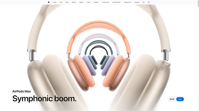
Land on the page and you’re hit with a full-width image of the product, so you get up close before you read a word. Right after comes a benefit-led headline about the perfect listening experience.
The page keeps going with benefit-driven descriptions and pixel-perfect product photos. Plenty of white space and a neutral color scheme make the “Buy” buttons pop, and the price comparison table helps shoppers pick the right model.
Pros:
- High-quality images: Makes the product look appealing.
- Clear headlines: Tells you why you should want the product.
- Easy buying process: Multiple “Buy Now” buttons.
- Good use of space: White space makes everything easy to read.
Cons:
- Minimal information: Some people might want more details.
- Slow load time: Big images might slow the page down.
What to steal: Use a per-section scroll reveal: one feature per scroll section, one headline per feature, and white space separating each idea so nothing competes for attention.
My Verdict: The blueprint to copy if you sell one premium product and want the design to carry the message.
2. Cowboy 4
Physical product, premium e-bike, single-product page
Cowboy takes an Apple-style approach for its Cowboy 4 page. You get a full visual experience with full-width images, video, and product photos.
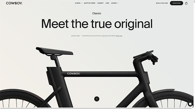
The copy is friendly and simple, explaining how the electric bike transforms your riding. Phrases like “break free,” “newfound freedom,” and “fear less” pull an emotional response from visitors.
The standout feature is the accordion that expands to show specs for people who want detail, without cluttering the page for everyone else. A comparison table then helps shoppers land on the right model.
Pros:
- Interactive features: Keeps users engaged.
- Emotional connection: Video and images create a bond.
- Simple messaging: Text is easy to read and understand.
- Credible reviews: Testimonials build trust.
Cons:
- More detail needed: Could offer more specifics about the bike’s features.
- Load time: High-quality visuals might slow the page.
What to steal: Hide your spec sheet inside an accordion. Keep the page clean for browsers, but give detail-hungry buyers a one-click way to dig in without scrolling past a wall of text.
My Verdict: Worth modeling when your product needs emotional pull up front and technical depth on demand.
3. Maserati MC20
Physical product, luxury automotive, single-product page
Maserati’s MC20 page exudes the class and sophistication shoppers expect from a luxury product. It reads as a showroom you can visit from your couch.
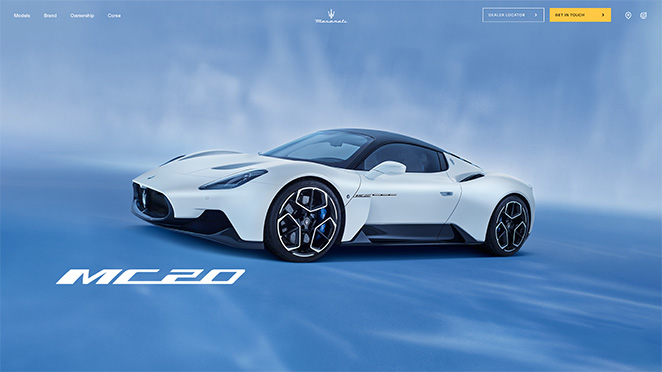
With clever animations and video, Maserati turns the page into a visual experience that lets you feel the car from home. Language like “beating heart,” “lightning fast,” and “hot-blooded” stirs an emotional response.
The only CTA invites you to “Create Your MC20,” and it scrolls with you, so the chance to convert is always one tap away.
Pros:
- Emotional impact: Images and words evoke strong feelings.
- Detailed specs: Information about performance and features.
- Custom options: Lets you explore different models and features.
- Persistent CTA: Scroll-lock button ensures you always see it.
Cons:
- Overwhelming info: Can be too much for some visitors.
- Page speed: Rich media can slow down the page.
What to steal: Lock a single CTA to the screen as the visitor scrolls. One persistent button beats five scattered ones because the decision is always in reach.
My Verdict: A strong reference for high-ticket products where the experience has to feel as premium as the price tag.
4. Oura Ring
Physical product, health wearable, single-product page
Here’s a clean product landing page example from Oura Ring, a health monitoring and activity tracking ring. The whole page guides you down through clearly defined sections.
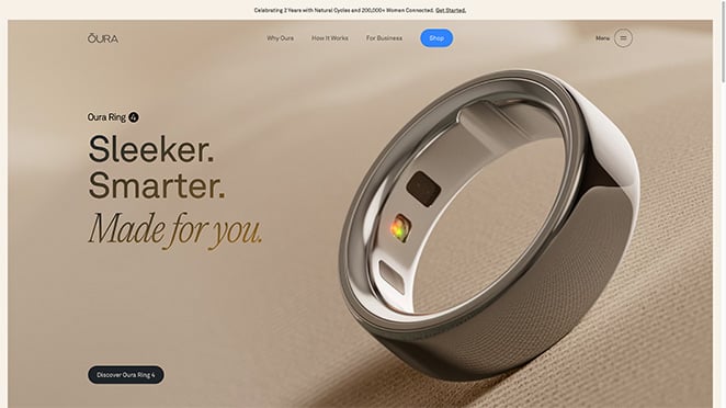
Each section explains a different benefit, and multiple product photos show how it works. The “Meet the Community” section acts as strong social proof with reviews and real user stories.
The page closes with a CTA inviting you to claim an offer, a smart nudge to buy now before the chance slips.
Pros:
- Clean design: Easy to follow and visually appealing.
- Informative: Sections detail different benefits and features.
- Strong reviews: User stories add credibility.
- Effective CTA: Clear call to action encourages buying.
Cons:
- More CTAs needed: Could use more call-to-action buttons.
- Detailed specs needed: Some users may want more technical detail.
What to steal: Build a “community” block of real customer stories instead of a generic testimonial strip. Named people and photos resolve doubt better than star ratings alone.
My Verdict: Best fit if your product is data-driven and trust is the thing standing between a visitor and a purchase.
5. Bellroy Wallet
Physical product, everyday carry, single-product page
Bellroy builds an interactive experience for anyone shopping for a slim wallet. An image slider shows the wallet’s size against a typical one, so you know exactly what to expect.
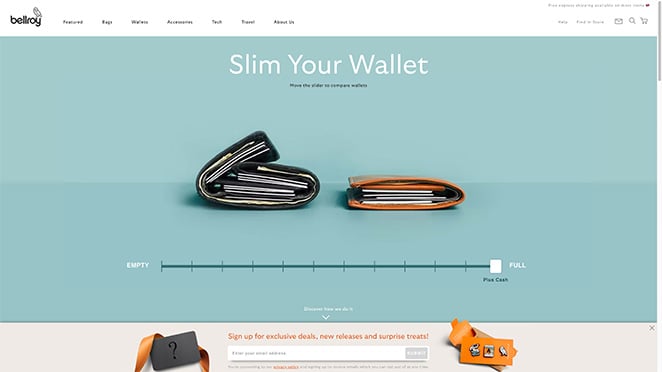
That’s backed by a product demo video, and a product grid lets shoppers dig into the wallet they like best.
If anyone is still on the fence, the testimonials ease the last bit of hesitation.
Pros:
- Interactive elements: Keeps users engaged and informed.
- Clear comparisons: Helps users understand product benefits.
- Engaging content: Video and grid make it interesting.
- Credible testimonials: User reviews build trust.
Cons:
- More CTAs needed: Could include more call-to-action buttons.
- Detailed specs needed: Might need more product details.
What to steal: Demonstrate size or fit interactively instead of describing it. An interactive slider removes the biggest objection for physical products without a line of copy.
My Verdict: The page to study when “will it actually fit my needs?” is the objection that loses you sales.
6. Absurd Design
Digital product, creative assets, single-product page
Absurd Design sells surrealist illustrations and vector art. The page runs a monochrome color scheme and shows off its illustrations so you immediately get what’s on offer.
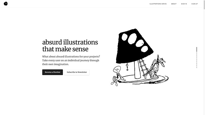
The copy is quirky and matches the brand’s playful persona. Visitors can preview design packs, and if they hesitate, they can see the illustrations in action on real websites.
The whole journey leads to a pricing table where you can download illustrations or sign up for membership.
Pros:
- Eye-catching design: Unique style stands out.
- Consistent theme: The monochrome scheme keeps focus on the content.
- Real use cases: Shows how illustrations can be used.
- Effective CTA: Clear directions for what to do next.
Cons:
- More color needed: Could add a touch of color for emphasis.
- Detailed info needed: Might need more information about the illustrations.
What to steal: Show the product doing its job in the wild. “Used by” screenshots of real sites prove value for a digital product far faster than a feature list.
My Verdict: A great model for creative or digital products where personality is part of the pitch.
7. Square Hardware Reader
Physical product, payment hardware, launch / sign-up page
Payment processor Square runs a professional page for its mobile credit card reader. It pulls you in with a bold headline and a CTA to grab a free reader.
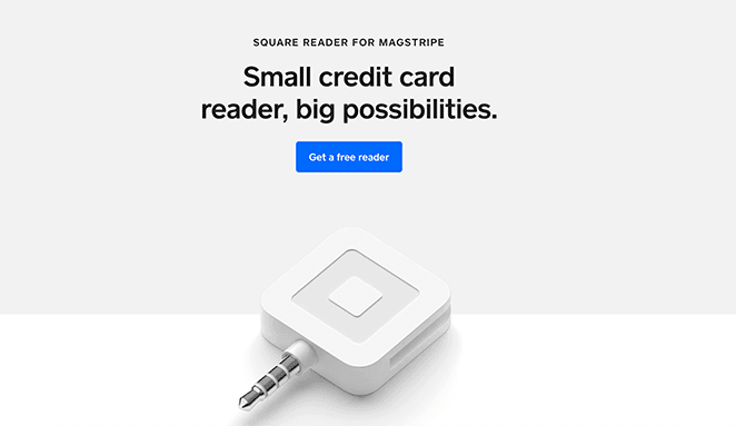
Not ready to commit? Keep scrolling to see how the reader works and what you get. Some of the tactics Square leans on:
- Short, actionable sentences
- Easy-to-skim bullet lists
- Lifestyle product photos
- Trust badges for mobile apps
- Multiple CTA buttons
At the bottom, one more CTA nudges you to sign up for free.
Pros:
- Simple and to the point.
- Clear buttons and sections.
- Reviews and badges add credibility.
- Encourages users to get started.
Cons:
- Could offer more information about features.
- Adding videos or demos could improve the experience.
What to steal: Lead with a free or low-commitment offer, then repeat the same CTA at the top and bottom. The page works for the visitor who’s ready now and the one who needs to scroll first.
My Verdict: Ideal reference when your goal is sign-ups and the first step needs to feel free and easy.
8. Orangina
Physical product, consumer beverage, multi-product page
Orangina nails its brand personality with a fun, vibrant page. Each section plays a short animation as you move your cursor over it, which keeps you exploring.
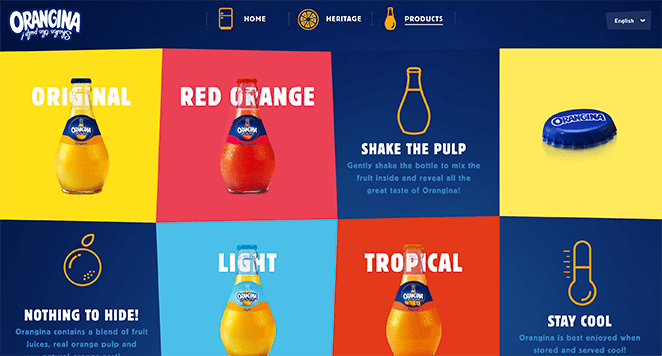
I like how the headlines use active words like “shake the pulp” and “stay cool,” because they put you inside the experience before you’ve read a sentence.
Each CTA button leads to an equally vibrant page explaining what to expect from each bottle of juice.
Pros:
- Fun design: Bright and engaging visuals.
- Interactive: Animations keep it interesting.
- Clear messaging: Active language makes it lively.
- Effective CTAs: Clear buttons lead to more info.
Cons:
- More information needed: Could have more product details.
- Page speed: Animations might slow down the page.
What to steal: Write headlines with active verbs that put the reader inside the moment (“shake the pulp,” “stay cool”). It beats describing the product from the outside.
My Verdict: A fun blueprint for consumer brands selling a feeling as much as a product.
9. Flowkit
SaaS product, B2B flowchart tool, single-product page
What do you picture when you hear the word “flow”? Flowkit takes its name literally and demonstrates flow in all the right ways.
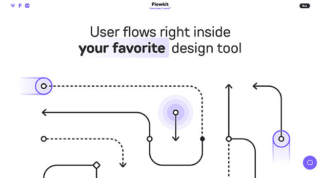
As you learn about this flowchart tool, you flow down the page. From a demo video to a step-by-step guide, each scroll moves you toward the CTA.
Flowkit also uses social proof well, with logos from well-known brands and testimonials from real users. It’s a tidy lead generation setup.
Pros:
- Flowing layout: The page flows well, just like the product name.
- Detailed demo: The step-by-step guide makes it easy to understand.
- Trustworthy: Testimonials and brand logos build credibility.
- Strong CTA: Clear call to action to start using the product.
Cons:
- More visuals needed: Could show the product in action more.
- More interactive elements: Could improve engagement.
What to steal: Use brand logos as the first proof element. For a B2B SaaS product, “these companies trust us” lowers the risk a visitor feels before any feature pitch.
My Verdict: The page to copy if you sell software and need to build trust fast with a busy decision-maker.
10. Mailbrew
SaaS product, email digest tool, launch / sign-up page
Want a product landing page example that’s a little different? Mailbrew is small but mighty by design.
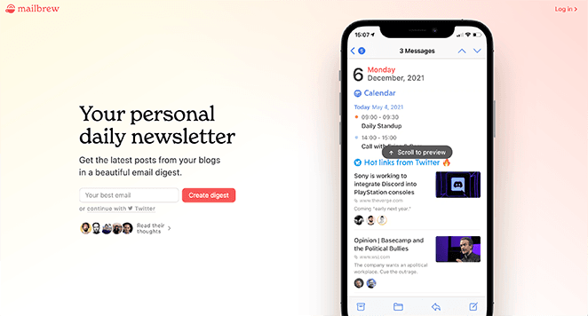
Mailbrew delivers a personal email digest from your favorite blogs, social platforms, calendar events, and more. To sign up, you just enter your email address.
Even though it’s shorter than the other examples, it still hits the best practices that capture leads.
Pros:
- Straightforward design: Easy to understand.
- Clear messaging: Explains the value quickly.
- Trustworthy: Testimonials add credibility.
- Simple sign-up: Easy-to-use email form.
Cons:
- More detail needed: Could provide more information about features.
- More visuals needed: Could use more images to illustrate benefits.
What to steal: Ask for one field. A single email input removes nearly all form friction, which matters most when the offer is free and the commitment is low.
My Verdict: Proof that a short page converts when the offer is simple and the ask is tiny.
What These Landing Pages Have in Common
After going through all 10, the same handful of moves keep showing up. None of them are about design taste. They’re about removing reasons to leave.
They lead with a benefit, not a feature. Apple opens on the listening experience, Cowboy on freedom, Oura on insight. The product’s job in life comes before its spec sheet, every time.
They earn the scroll above the fold. Every page puts a strong hero image and a clear promise in the first screen, which tracks with how much attention that space gets.
They repeat one action instead of offering many. Maserati uses a single scroll-locked CTA, Square repeats the same offer top and bottom. The choice stays simple all the way down.
They put proof where the doubt lives. Oura’s community block, Flowkit’s brand logos, Bellroy’s testimonials all sit near the decision, not stranded in the footer.
They keep the ask small. Mailbrew asks for one field. The less friction between interest and action, the more people finish.
How Do You Create a Landing Page for a Product?
You’ve seen what works. Now let’s turn it into a page of your own in four steps.
1. Get to Know Your Customers and Goals
Before you design anything, get clear on who you’re selling to and what they’re trying to solve. The page should speak to their problem, not your product features.
Then set one clear goal. Are you collecting email leads, driving sales, or building awareness? One page, one goal.
Finally, look at how your competitors handle their landing pages. Note what works and where you can do better.
2. Write Words That Sell
Now write your copy. Your headline is the first thing visitors see, so make it benefit-led and impossible to misread.
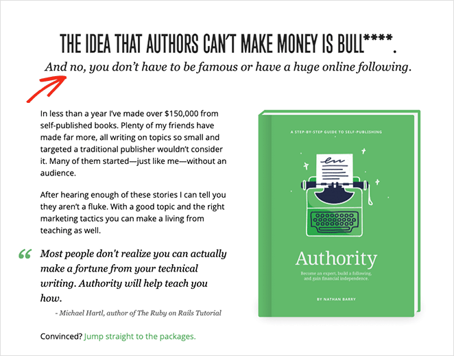
In the rest of the copy, show how the product solves the reader’s problem. Keep it plain and use the words your audience actually uses.
Then add a strong call to action. Make it obvious what you want people to do, like “Buy Now” or “Get Started for Free.”
3. Design a Page That Pops
Go for a clean design that guides visitors through the page without overwhelming them. Use high-quality images and video that show your product at its best.
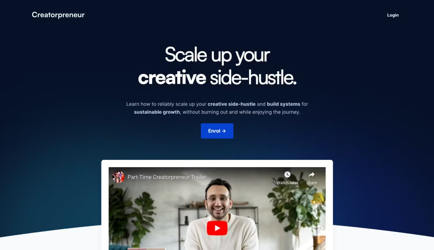
Most people will view your page on a phone, so make sure it looks right on mobile. Keep everything consistent with your brand’s look and feel.
This is also the step where the build can stall if you’re on WordPress and don’t code. That’s where I reach for SeedProd, a drag-and-drop WordPress website builder.
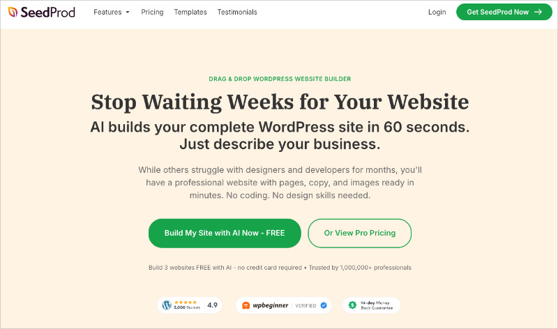
SeedProd has landing page templates built for product pages, so you pick a layout, swap in your headline and product image, and the page goes live on your WordPress site without touching code.
I’ve used it to build my own site, and it’s the fastest way I’ve found to get from a blank page to a live one. Here’s a guide on how to create a landing page in WordPress with it.
4. Test and Optimize
Once your page is live, the work isn’t done. This is where landing page optimization earns its keep.
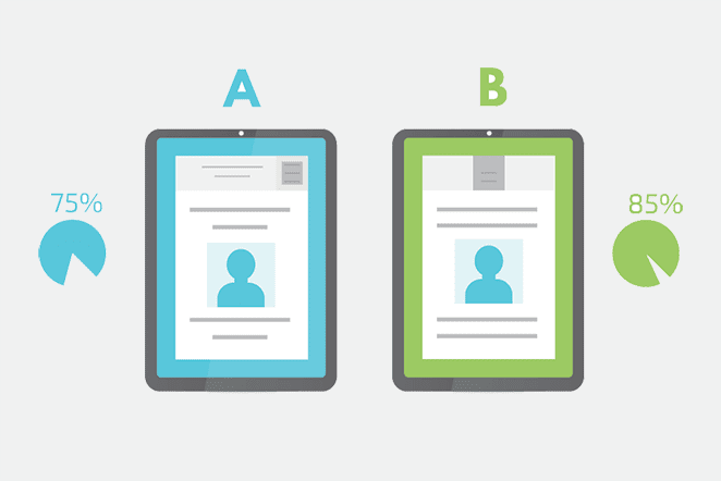
Try A/B testing different headlines, CTAs, or images to see what wins. The winning version is the one that converts more visitors.
Make sure your page loads fast, because no one waits around. Our guide on how to speed up WordPress can help.
Adding relevant keywords to your copy can also lift your search rankings, and tools like Google Analytics show you how the page is performing over time. A few more landing page best practices worth applying:
- Removing your navigation menu
- Using minimal form fields
- Adding urgency with countdown timers
Get started with SeedProd today if you want to build and test your own product landing page this week.
How Do You Measure a Product Landing Page’s Performance?
Once your page is live, four numbers tell you whether it’s actually working. Track these and you’ll know what to test next.
| KPI | What it tells you |
|---|---|
| Conversion rate | The share of visitors who take your goal action. This is your primary success metric. |
| Bounce rate | How many visitors leave without engaging, which signals whether your traffic matches your message. |
| Cost per conversion | What you pay to win one customer, which makes the business case for the page. |
| Core Web Vitals | Your speed and experience scores, which affect both rankings and how many people stay. |
More Product Landing Page Examples Worth Studying
If you want more inspiration, here are a few other product pages worth a look:
- Notion Calendar: A SaaS launch page that leads with a single calendar screenshot and one download button, proving a product can sell itself with almost no copy.
- Stripe: A developer-focused page that pairs a clear value statement with live code, so the proof is the product working in front of you.
- Figma: Uses a bright interactive hero that lets you play with the product before you sign up, lowering the commitment to try it.
- Magic Spoon: A physical-product page that handles a price objection head-on with a “cost per bowl” breakdown right next to the buy button.
- ClickUp: Stacks recognizable customer logos and hard numbers near the top to build trust before it asks for the sign-up.
Product Landing Page FAQs
What is the difference between a product landing page and a product page?
A product page lives inside your store with full navigation and links to your whole catalog, built for browsing and comparing. A product landing page strips the navigation away to sell one product to one type of visitor.
The landing page usually receives paid ad, email, or social traffic and pushes a single action. That focus is what makes it convert better than a standard product page.
What should a product landing page include?
At minimum, a benefit-led headline above the fold, a strong hero image or video, and one clear call to action. Add social proof like reviews or brand logos near the button, plus the key details a buyer needs to decide.
Keep any form short and remove your site navigation so the only path forward is the action you want.
How do I create a product landing page in WordPress?
The fastest way is a drag-and-drop builder like SeedProd. You pick a product-focused template, swap in your own headline, images, and copy, then publish without writing code.
From there, connect your email service or payment processor, remove the navigation, and you have a working page in an afternoon.
What makes a good product landing page headline?
A good headline names the main benefit in plain language and matches the ad or link that sent the visitor there. It should answer “what’s in this for me?” before the reader has to scroll.
Active, specific wording beats clever or vague. “Slim your wallet” works because the reader can picture the result instantly.
How do I know if my product landing page is converting well?
Start with your conversion rate, the share of visitors who take your goal action. The Unbounce benchmark of about 6.6% across 41,000 pages is a useful reference point, though good rates vary by industry.
Watch bounce rate and cost per conversion alongside it, then A/B test your headline and CTA to push the number up.
I hope this guide helped you find some product landing page examples worth stealing from. For more inspiration, check out these showcases:
- 8 Blog Landing Page Examples + How to Make One
- 7 Social Media Landing Page Examples to Grow Your Company
- 7 Request a Demo Landing Page Examples Proven to Boost Leads
- 9 Top eCommerce Landing Page Examples to Drive Sales
- 9 Startup Landing Page Examples and How to Make One
- 7 Lead Generation Landing Page Examples + Optimizations
- 11 Real Estate Landing Page Ideas & Examples
- 10 Best Free Trial Landing Pages: Examples, Ideas + Tips
Thanks for reading! We’d love to hear your thoughts, so join the conversation on YouTube, X, and Facebook for more advice on growing your business.