

TL;DR: A blog landing page is a focused page designed to convert new visitors — here’s what the best ones do.
- Single focused CTA above the fold: One clear next step, not a menu of options.
- Curated post selection: 3-6 of your best posts, not your full archive.
- Email opt-in form with a lead magnet: Give visitors a reason to subscribe.
- Minimal navigation: No sidebars or menus to pull focus away.
- Clear headline naming who the blog is for: Visitors should know in seconds if they’re in the right place.
- Use SeedProd to build one in WordPress without code: Drag-and-drop blocks, live preview, and templates designed for this exact use case.
I used to think my blog homepage was doing enough. It had my latest posts, a search bar, and a sidebar with categories. But the numbers told a different story. People weren’t sticking around, and almost no one signed up for my newsletter.
So I tried something different. I built a blog landing page that focused on just a few of my best posts, with a clear call to action and no distractions. No menus. No sidebars. Just a simple layout that guided visitors to the next step.
That one change made a big difference. My email signups went up. My bounce rate went down. And more people started coming back.
In this post, I’ll walk you through some of the best blog landing page examples I’ve seen. I’ll also show you how to create one for your own site, even if you don’t know how to code.
Quick Summary of Blog Landing Page Examples
| Example | Style | Standout Feature |
| Blog Tyrant | Personal brand | Smart CTA + ebook lead magnet |
| HubSpot | Corporate blog | Modular layout + free resources |
| Slack Design | Minimalist | Interactive emoji + clean layout |
| Dropbox | Editorial style | Content categories + email opt-in |
| Copyblogger | Content-driven | Straight-to-content homepage |
| Tobias Ahlin | Portfolio/blog hybrid | Clean showcase + personal projects |
| The Recipe Critic | Food blog | Recipe categories + signup CTA |
| Dan Flying Solo | Travel blog | YouTube embed + personal intro |
What Is a Blog Landing Page (and Can Your Blog Be One)?
A blog landing page is a focused, standalone page that highlights a curated selection of your blog posts and drives visitors toward one action, usually subscribing to your email list.
A regular blog shows every post in reverse chronological order. It often includes sidebars, menus, and links that send readers in a dozen directions. The purpose of a blog is to get visitors to read, share, and engage with your content.
A landing page for your blog is different. It highlights a selection of posts, usually 4 to 6 of your best, and keeps the focus on one clear action. The page may also include a welcome video, testimonials from subscribers, and a sign-up form with a call-to-action button (CTA) to join your email list.
To make the difference clearer, here’s how a typical blog page compares to a blog landing page:
| Blog Page | Blog Landing Page |
| Shows every blog post in reverse chronological order | Highlights a curated selection of posts |
| Often includes sidebars, menus, and unrelated content | Clean layout with no distractions |
| Designed for browsing | Designed to get visitors to take action (sign up, read more, etc.) |
| Little control over user journey | Clear structure that guides visitors |
Research from Unbounce’s analysis of 18,639 landing pages found that pages with a single CTA convert at 13.5%, versus 10.5% for pages with five or more CTAs. A focused blog landing page puts that conversion advantage to work for your list.
Many small businesses use their blog as a landing page. This is fine if your main goal is content consumption.
But if you’re running a business alongside your blog, it’s worth having both — a dedicated landing page for campaigns and your blog for ongoing traffic. Send visitors to your about page or a high-converting landing page when you want to control what they do next.
For example, if you want to grow your email list, promote a webinar, or encourage sales of a specific product, it’s best to create a dedicated landing page rather than sending traffic to your blog archive.
Here’s what separates a blog landing page that grows your list from one that people scroll past.
What Makes a Good Blog Landing Page?
After studying dozens of high-performing blog pages over the years, I keep seeing the same six elements on the ones that actually convert.
- Single focused CTA: One action above the fold. Subscribe, read this post, or download this guide — pick one and commit.
- Email opt-in form with a lead magnet: A free checklist, guide, or email series gives visitors a reason to hand over their address.
- Curated post selection: 3 to 6 of your most useful posts. Not your full archive, just the ones that show new visitors what your blog is about at its best.
- Social proof: A subscriber count, a testimonial, or logos from sites that have featured your work. Even one credibility signal helps.
- Minimal navigation: No sidebar, no header menu full of links. Every extra click is a reason to leave before subscribing.
- Clear headline naming who the blog is for: “Tips for new food bloggers” beats “Welcome to my blog” every time. Be specific about your audience.
Blog Landing Page Examples
After looking at the explanations above, it’s clear that a blog page designed for conversions is a standalone page designed to get visitors to take a specific action. Check out the best blog landing page examples below to see how they work in practice.
1. Blog Tyrant
| Style: | Personal Brand |
| Focus: | Lead generation through content |
| Standout Element: | Smart CTA with ebook incentive |
| Best For: | New bloggers or solo creators |
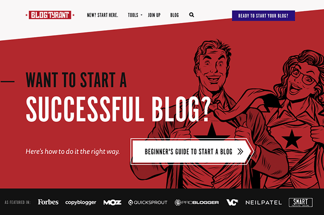
First is a great blog landing page example from Blog Tyrant. This blog focuses on helping other bloggers build better blogs, so much of the page is geared towards showcasing its best content.
At the top of the page is an eye-catching header posing a question for readers: “Want to start a successful blog?” If the answer to that question is yes, users can click a call-to-action button to learn how to do it the right way, which is a fantastic way to drive clicks to the most important post on Blog Tyrant’s site.
Some of the other great features on this page are as follows:
- Logos from high-authority sites showing social proof
- Plenty of white space to help users focus on the content
- Categories to organize different content types for better navigation
- Contrasting CTA buttons that stand out
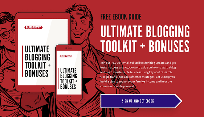
- Free ebook incentive to sign up for email marketing messages
2. HubSpot Blog

| Style: | Corporate Blog |
| Focus: | Content segmentation for marketers |
| Standout Element: | Modular layout with multiple lead magnets |
| Best For: | Marketing teams and business blogs |
HubSpot’s blog landing page is another example of how they focus on providing the right content to the right audience. This page is aimed at marketers and includes content related to online marketing.
At the top are the most popular topics and top picks from HubSpot’s editors. Then, as you move down the page, you’ll see a modular layout for further recommended reading.
Included in the layout is a call to action to subscribe to HubSpot’s email list, and further down, you can opt-in to download their free ebook.

Here are some of the key features of this landing page example:
- Clear, compelling headlines
- Eye-catching CTAs
- Topic categories
- Ebook lead magnet
3. Slack Design

| Style: | Minimalist Design |
| Focus: | Showcasing design culture and process |
| Standout Element: | Interactive emoji click feature |
| Best For: | Design blogs or brand storytelling |
Slack is a Software as a Service (SaaS) company, and its blog landing page has a minimalistic yet welcoming design that reflects its personality.
This page has a simple layout featuring a collection of the latest design articles and a CTA to view more. Even though it doesn’t include any lead generation features, it does an excellent job focusing on exactly what its audience is looking for.

Continuing with the light-hearted vibe and showcasing its impressive web design skills, this page has a nifty feature. Click the emoji icon, and a new random emoji will appear whenever you click on the page.

I have to warn you it can be quite addictive.
4. Dropbox Blog

| Style: | Editorial |
| Focus: | Content categories and customer stories |
| Standout Element: | Sticky CTA carousel for email signups |
| Best For: | Product blogs with a storytelling angle |
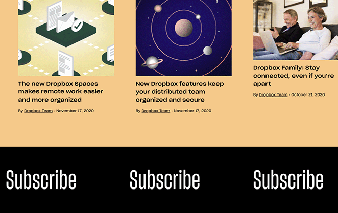
Now, let’s take a look at Dropbox’s Work in Progress blog landing page design. It has a vibrant design that instantly commands attention, and the layout has different sections for easier browsing.
For instance, there are sections on customer stories, news, work culture, and product tips. They also offer featured collections or blog posts on specific themes.
I particularly like the scrolling CTA button in the footer area. When you click on it, you’ll see a static email sign-up form encouraging you to join the email list.
5. Copyblogger
| Style: | Content-First |
| Focus: | Immersing readers directly in articles |
| Standout Element: | Email CTA embedded in blog flow |
| Best For: | Writers, marketers, and educators |
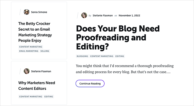
Next is an effective blog landing page example from Copyblogger, a brand that offers content marketing tips and training. Unlike other examples on this list, Copyblogger uses its blog as its homepage and landing page because they want visitors to consume their content immediately.
The page has a minimalist design, preferring to focus on the content rather than high-quality images and videos. Plus, the layout is distraction-free, with clear fonts you can read easily.
When you land on the page, you’ll see a clear CTA to subscribe to Copyblogger’s free email series. The CTA is also repeated at the bottom of the page, offering visitors one more chance to subscribe.
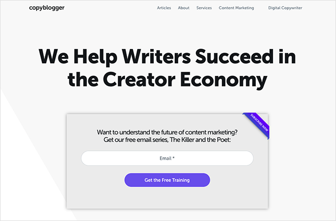
This type of lead magnet is an excellent way to grow your list and nurture relationships with valuable content.
6. Tobias Ahlin
| Style: | Portfolio Blog |
| Focus: | Combining content with personal projects |
| Standout Element: | Project and blog sections on the same page |
| Best For: | Developers, designers, and freelancers |
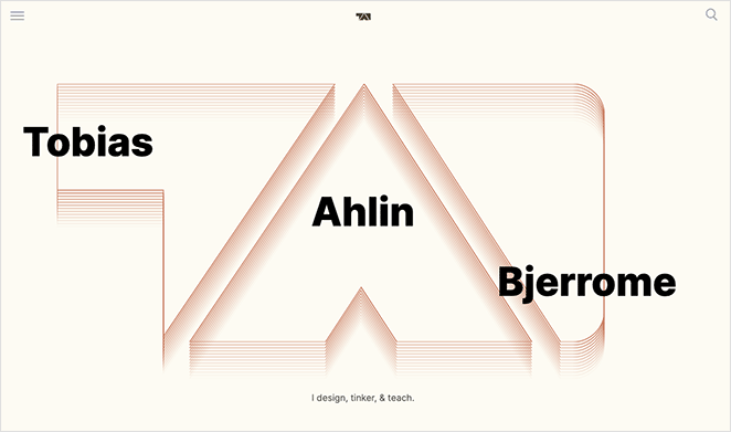
This blog landing page example from Tobias Ahlin is the perfect way to showcase his design and development skills. The top section features a collection of recent blog posts with buttons to read more.
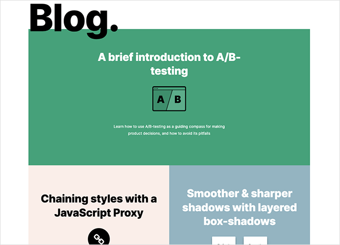
Further down the page, you can see some of Tobias’ projects, recent work, and methods to get in touch.
Overall it’s one of the best landing page examples we’ve seen used for a blog and personal brand.
7. The Recipe Critic
| Style: | Food Blog |
| Focus: | Helping readers browse by meal type |
| Standout Element: | Recipe categories and a central opt-in form |
| Best For: | Recipe creators and niche lifestyle bloggers |
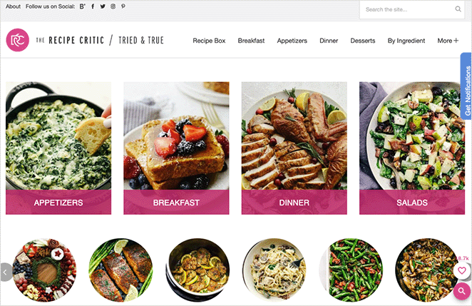
The Recipe Critic is a food blog with a beautifully designed landing page. The main design offers different sections like breakfast, dinner, salads, slow cooker meals, and more, which helps visitors easily find the recipe they need.
In the center of the page is a large call to action, encouraging users to sign up for free recipes.

The page also includes a search box, and social media follow buttons.
8. Dan Flying Solo
| Style: | Travel Blog |
| Focus: | Sharing personal travel stories and guides |
| Standout Element: | YouTube embeds and content highlights |
| Best For: | Solo travelers and content creators |
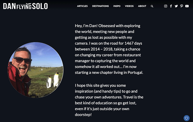
Dan Flying Solo has a simple yet effective blog landing page design that focuses on the content.
The header section helps readers learn more about Dan, the topics he covers, and the places he visits. As you scroll down, you can see Dan’s latest blog posts, with large buttons to read more.
You’ll also notice that Dan embeds his YouTube videos on the page, which is a fantastic way to grow his YouTube fan base.

How to Create a Blog Landing Page in WordPress
You can use a page builder plugin to create a custom blog page and bring your vision to life without coding.
I recommend using SeedProd, the drag-and-drop website builder I use on my own site. SeedProd lets you build a custom blog landing page without touching code and see every change live as you make it.
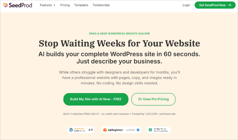
SeedProd has tons of professionally designed landing page templates so you can get started quickly. From there, you can use ready-made landing page blocks to design the perfect content landing page, generate leads, and boost conversions.
Here are some of the landing page blocks you can customize:
- Animated headlines to pop up from the page and capture attention
- Contact form so users can get in touch
- Countdown timers to create a sense of urgency
- Social profiles for Facebook, LinkedIn, Twitter, etc.
- Image carousels for engagement
- Testimonials to improve social proof
- Pricing tables to highlight product price comparisons
- Optin forms to collect email addresses
You can even promote eCommerce products to potential customers with WooCommerce blocks like popular products, shopping carts, checkout, and more. All you have to do is drag and drop each block onto your page and see the changes in real time.
One approach I’ve used is building a “start here” page that acts as a blog landing page — a single SeedProd page that lists my 5 most useful articles with a lead magnet at the top. It loads faster than a standard WordPress blog archive and I have full control over what new visitors see first.
SeedProd is fully-responsive, search engine (SEO) friendly, works with any WordPress theme, and even lets you create a WordPress theme from scratch.
You can read this tutorial to create a landing page in WordPress without hiring a developer.
💡 Expert Tip
You can also use SEOBoost to optimize your content. Its AI tools help improve the structure, keywords, and overall SEO performance of your blog landing pages.
How to Tailor Your Blog Landing Page
Before you design your landing page, understanding who you want to reach with your blog is key. Here’s how different audiences shape the page.
What Should a Food Blogger Put on Their Landing Page?
Your goal is likely to inspire readers to try your recipes and become regular visitors. Your landing page should prioritize:
- Visually appealing food photography
- Recipe categories for easy browsing (breakfast, desserts, etc.)
- Clear CTAs to subscribe for recipe updates
What Should a Tech Blogger Prioritize?
You probably want to establish yourself as an expert and build an audience of tech enthusiasts. Your landing page should focus on:
- Showcasing your most in-depth, insightful articles
- A prominent bio highlighting your expertise
- CTAs to join a newsletter for the latest tech news or reviews
What Should a Lifestyle Blogger Feature?
Your aim is likely to create a sense of community and inspire readers. Your landing page could feature:
- High-quality images showcasing their aesthetic/lifestyle preferences
- Links to categories focused on fashion, home decor, travel, etc.
- An invitation to join an exclusive email list for special tips or content
What Should a Business Blogger Include?
Your focus is probably lead generation and building authority in your industry. Consider these elements for your blog’s landing page:
- Emphasize lead magnets like free guides, webinars, or consultations
- Case studies or testimonials to build credibility
- A clear CTA to schedule a call or inquire about services
FAQ: Blog Landing Page Basics
What should a blog landing page include?
A good blog landing page includes a clear headline naming who the blog is for, a curated selection of 3-6 of your best posts, and an email opt-in form with a lead magnet.
Minimal navigation keeps visitors focused. A single CTA above the fold tells them exactly what to do next.
How do I create a blog landing page in WordPress without code?
Use a drag-and-drop website builder like SeedProd. It lets you choose a landing page template, customize it with blocks for opt-in forms, images, and text, and publish without writing any code.
The whole process takes about an hour from install to live page. You can read the full step-by-step guide here.
What’s the difference between a blog page and a blog landing page?
A blog page shows all your posts in reverse chronological order, with sidebars, menus, and links pulling visitors in different directions.
A blog landing page is curated and focused. It highlights your best content and points every visitor toward one action — usually subscribing to your email list.
How do I make my blog landing page convert visitors to subscribers?
Lead with a strong opt-in offer — a free checklist, email course, or resource your audience genuinely wants. Place the form above the fold so it’s the first thing visitors see.
Remove navigation menus and sidebars so nothing competes with your CTA. A/B test your headline to find the version that resonates most with your audience.
A blog landing page isn’t just a nicer-looking version of your blog. It’s a focused tool that helps guide new visitors, grow your list, and make your content work harder for you.
If your blog page feels cluttered or you’re not seeing the results you want, this is a simple change that can make a big difference. A dedicated landing page makes it easier for visitors to know where to go next.
You don’t need to code or start from scratch. Just use the right tool.
Want to build your own blog landing page that gets results?
Try SeedProd, the drag-and-drop builder I use myself.
You might also like the following tutorials and tips:
- Best Blog WordPress Themes for Bloggers + Writers
- Blog Layout Examples to Revamp Your Site
- Best WordPress Blog Plugins for Easy Blog Management
- Your Guide to A/B Testing Landing Pages
- Expert Landing Page Optimization Tips
- How to Make Your Blog Page Look Like a Website
Thanks for reading! We’d love to hear your thoughts, so please feel free to join the conversation on YouTube, X and Facebook for more helpful advice and content to grow your business.