Struggling to turn website visitors into real sales calls? A request a demo landing page solves that by showing prospects your product in action and collecting their details in one simple step.
In this post, you’ll see real-world demo page examples from SaaS leaders like OptinMonster and Salesforce, plus tips you can use to design a page that actually gets booked demos.
What Is a Request a Demo Landing Page?
A request a demo landing page is a dedicated web page where visitors sign up to see your product in action. It’s most common for SaaS businesses because it turns casual interest into qualified sales leads.
The strongest demo pages include key landing page elements like:
- Reviews, testimonials, or case studies for social proof
- Short videos that show how the product works
- Screenshots or graphics highlighting features
- Bullet points tackling common pain points
- A clear call-to-action button to book the demo
- A simple sign-up form for follow-up by your sales team
Why Is a Request a Demo Page Important for SaaS?
A request a demo page is vital for SaaS because it captures qualified leads and gives prospects a focused place to experience your product—something a general homepage can’t do.
Instead of sending visitors to a busy homepage where they may click away, a demo landing page collects emails and keeps the conversation going through follow-ups and marketing.
Other key benefits include:
- Letting users preview your product through an embedded demo or live webinar
- Moving prospects further down the decision-making path
- Working as a lead magnet in your content strategy
- Supporting social media ad campaigns that drive awareness
- Attracting organic traffic when optimized for SEO
That’s why a request a demo page isn’t just helpful—it’s a core part of any SaaS lead-generation strategy.
Creative Request a Demo Landing Page Examples
Below you’ll find some of our favorite request a demo landing page examples from real companies on the web. We’ll explain which landing page elements they use and why they work so well.
1. OptinMonster
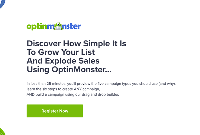
OptinMonster’s demo page works because it removes friction: a clean layout, a bold headline, and a promise that the demo takes less than 25 minutes. Visitors know exactly what they’ll get and how long it will take, which makes clicking the big green CTA button an easy choice.
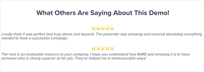
Trust is layered throughout the page. Testimonials reassure hesitant users, while awards and accolades confirm credibility before the final CTA.
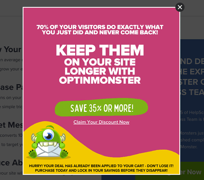
To catch last-minute drop-offs, an exit-intent popup offers a discount—turning an abandoned visit into a second chance at conversion.
Bottom line: this page blends clarity, urgency, and trust to drive high-quality demo signups—a playbook SaaS businesses can easily adapt.
2. Nextiva
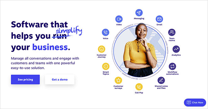
Nextiva makes booking a demo impossible to miss. Its homepage highlights the option right beside pricing, and clicking opens a full-screen form dedicated to demo requests.
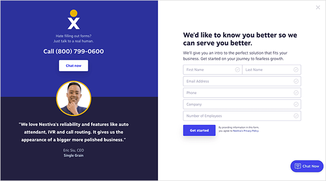
The contact form is simple but slightly heavy, asking for five fields. Cutting it to three can reduce abandonment rates, though businesses may choose to collect more data upfront.
What makes this page stand out is choice: users can fill the form, click the phone number to call a sales rep, or use the live chat window. This flexibility caters to different preferences, reducing friction.
Trust signals seal the deal—customer testimonials with headshots, a clean branded design, and clear CTAs guide visitors smoothly to the next step.
- Multiple demo request options (form, call, or chat)
- Simple, minimal design that keeps focus
- Testimonials and branding that build credibility
Want a similar look? Try this SeedProd landing page template to design your own demo page.
3. Salesforce
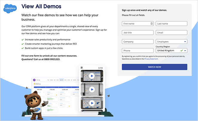
Salesforce’s demo page goes beyond a single product walk-through—it uses one form to unlock access to all of its content resources. This creates a higher perceived value while making the lead capture process simple.
The form is supported by clear copy that spells out what visitors will gain, helping reduce hesitation about sharing contact details. For those who prefer not to fill in a form, a phone number is also provided—removing one more barrier to booking a demo.
- Single form = access to multiple resources
- Compelling copy explains benefits upfront
- Alternative option to call instead of form-fill
4. Hootsuite
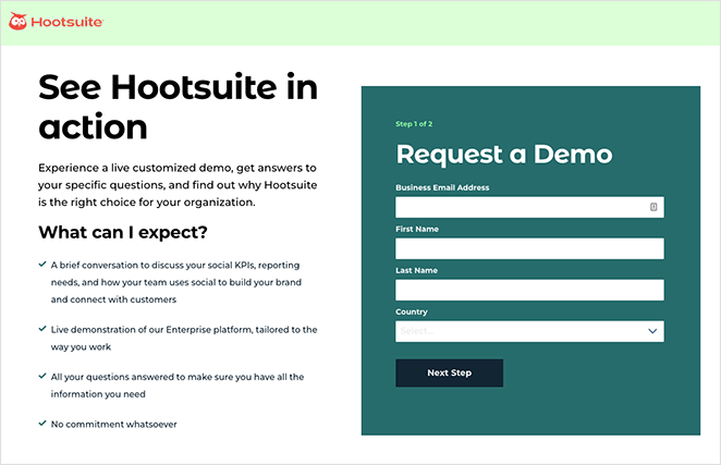
Hootsuite’s demo page grabs attention with a bold headline and backs it up with actionable copy that tells visitors exactly what they’ll learn. The design is clean, distraction-free, and makes the signup form the focal point with a contrasting background color.
The form itself is short and supported by trust builders like award badges, reducing friction and boosting credibility.
- Multi-step form sets expectations and eases completion
- Minimalist design keeps focus on conversion
- Award badges add authority and reassurance

Want this look? Use this SeedProd template to build a similar high-converting demo page.
5. Podia
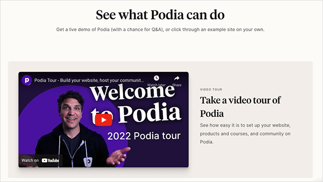
Podia takes a more interactive approach to demos. Instead of just a form, it leads with a video tour of the platform so prospects can see exactly how it works before signing up.
Visitors can also click through to a live demo site, giving them a “test drive” of real course and product pages. At the bottom, a quick 3-field registration form makes it easy to join a weekly live webinar and ask questions directly to Podia’s team.
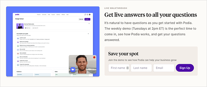
What could improve this page? Removing the navigation and footer menus to cut exits, adding testimonials and trust badges, and using a countdown timer to build urgency would likely boost conversions even further.
- Video + live demo = instant product value
- 3-field webinar registration form = low friction
- Could improve with trust signals and urgency elements
Want to try something similar? Start with this SeedProd landing page template.
6. SharpSpring
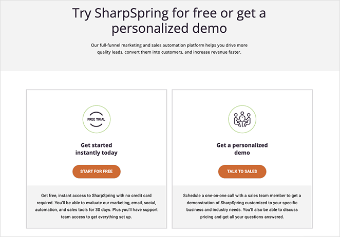
SharpSpring makes its demo page flexible by offering two clear paths: start with a free trial or book a personalized demo with sales. This split approach lets users choose based on where they are in the buying journey.
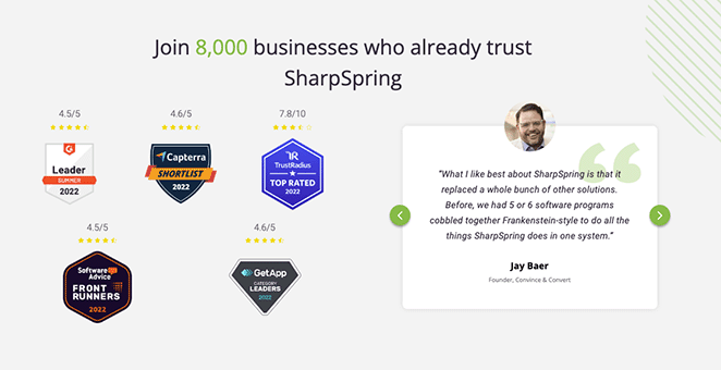
Scrolling down adds extra reassurance—testimonials, award badges, and feature highlights build trust for undecided visitors.
The “Talk to Sales” option opens a multi-step form followed by a calendar, letting prospects book a 30-minute chat at a time that suits them. This personalized scheduling flow helps reduce back-and-forth and keeps momentum high.
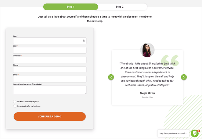
- Two conversion options: free trial or custom demo
- Trust signals: testimonials and award badges
- Built-in scheduling = frictionless next step
Bottom line: SharpSpring’s page feels personalized, giving prospects multiple ways to engage without overwhelming them.
7. Keap
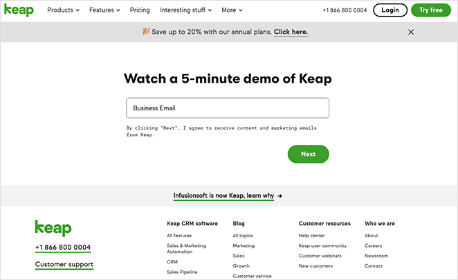
Keap proves that even a simple demo page can convert when it includes the essentials: a clear headline, a minimal sign-up form, and a bold CTA button. Nothing extra distracts from the goal.
- Action-driven headline sets expectations
- Short form reduces friction
- Bold CTA button directs attention
Still, the page could perform better with a few tweaks. Adding visuals like a product gif or explainer video would make it more engaging, while testimonials and a no-spam disclaimer could build trust. Removing extra menu links would also keep visitors focused on converting.
- Use a testimonial carousel for social proof
- Add a visual element before the form
- Include a trust disclaimer below the form
- Limit navigation links to prevent exits
Bottom line: Keap nails the basics but leaves room for optimization with trust elements and tighter focus.
How to Create a Request a Demo Page in WordPress
The fastest way to build a high-converting demo page in WordPress is with a landing page builder, and SeedProd is the best tool for the job.
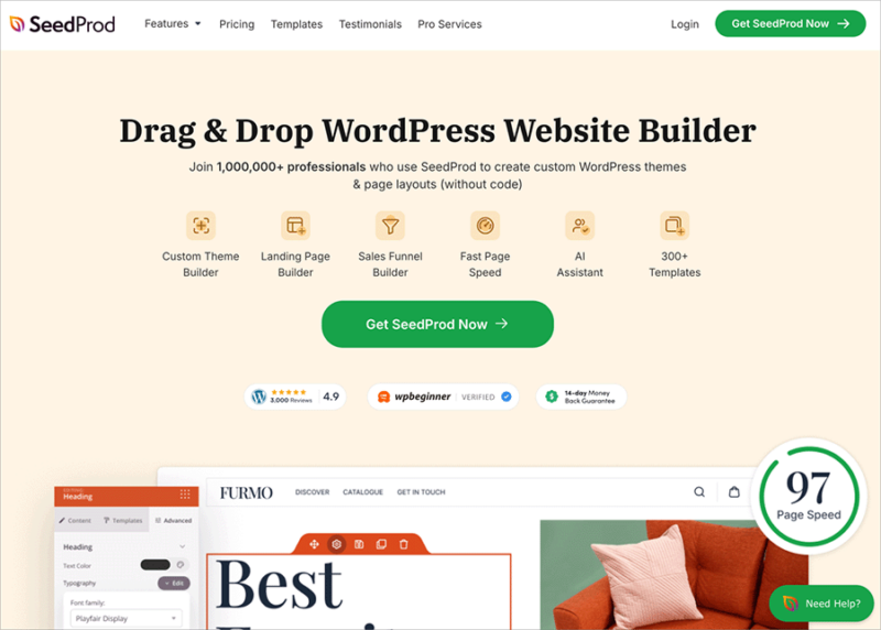
With SeedProd, you can drag and drop your way to custom themes, landing pages, and full layouts, with no coding required. It includes 180+ responsive templates plus conversion-focused blocks like forms, countdown timers, testimonials, and social buttons.
- Optin, contact, and login forms
- Giveaways and lead magnets
- Countdown timers and progress bars
- Testimonials, reviews, and star ratings
- Tabs, accordions, and image carousels
- Maps, business hours, and social profiles
It also integrates with top email marketing tools, works with your favorite plugins, and is lightweight for speed and SEO.
Follow this step-by-step guide to build your demo landing page page or click below to get started now.
FAQs About Request a Demo Landing Pages
I hope this article has helped you find the best request a demo landing page examples to use. You might also like the following examples posts for even more inspiration:
- 7 Landing Page URL Examples and Best Practices
- 8 Effective Email Unsubscribe Page Examples + Easy Tutorial
- 9 Top eCommerce Landing Page Examples to Drive Sales
- How to Create a Quick Landing Page to Test Ideas
You can also follow this guide on a/b testing to increase landing page conversions.
Thanks for reading! We’d love to hear your thoughts, so please feel free to join the conversation on YouTube, X and Facebook for more helpful advice and content to grow your business.


