Struggling to get people to click, sign up, or buy? In this guide, I’ll share 11 proven call to action examples (with real screenshots) that you can copy to boost your email signups, sales, and conversions.
Each example shows exactly why the CTA works and how you can adapt it for your own website, landing pages, or email campaigns. Whether you’re just starting or looking to improve your results, you’ll find inspiration you can use right away.
Quick look at my top call to action examples:
- 1. OptinMonster: Urgency-Driven CTA
- 2. IsItWP: Lead Magnet CTA
- 3. WPForms: Community Join CTA
- 4. Crazy Egg: Demo Request CTA
- 5. Moz: Event Registration CTA
- 6. Uber: Sign-Up CTA
- 7. Madewell: Ecommerce Product CTA
- 8. Traffic & Conversion: Discount Offer CTA
- 9. Yoga International: Free Trial CTA
- 10. GiftRocket: Unique Brand CTA
- 11. I Will Teach You to Be Reach: Quiz CTA
What Is a Call to Action?
A call to action (CTA) is simply the prompt you give your visitors to tell them what to do next. I think of it as the “next step” button or phrase that guides people through your site.
It could be as small as asking someone to “Leave a Comment” on a blog post or as direct as a button asking them to sign up for your email newsletter. The best CTAs remove guesswork. They’re clear, specific, and easy to click.
Why Do You Need a Powerful Call to Action?
I see a lot of sites using weak CTAs like “Sign up” or “Click here” and hoping for the best. After you’ve spent time and money driving traffic, a vague CTA just won’t get the results you want.
A strong call to action does two things: it tells people exactly what to do and gives them a reason to do it. If you leave out the “why,” your click-through rates will suffer. That’s why I always add one short sentence or benefit right before the button — it can make a big difference.
Your value proposition should set up the CTA, but don’t be afraid to reinforce it in the button copy. This simple tweak often leads to better conversions in my own tests.
Need more ideas? Check out my call to action best practices for examples you can copy.
How Long Should a Call to Action Be?
In my experience, the best CTAs are short and to the point. One or two words like “Join Now” or “Get Started” can work really well if they’re clear.
What matters most is that your button or phrase tells people exactly what to do and doesn’t get buried in extra words. If the copy feels cluttered, I cut it down until it’s crystal clear.
11 Call to Action Examples for Websites & Emails
Now that you know what an effective CTA is, let’s look at some real-world call-to-action examples to help your content marketing efforts.
1. OptinMonster: Urgency-Driven CTA
| CTA: Get OptinMonster Now |
| Best For: Landing pages and popups |
| Why It Works: Uses urgency words and instant benefit |
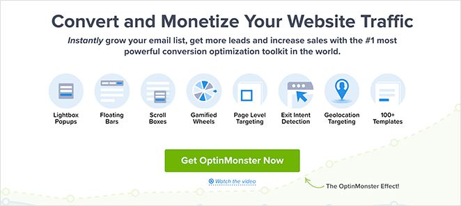
I’ve always liked how OptinMonster uses urgency in its calls to action. The homepage headline grabs your attention immediately, and the button text, “Get OptinMonster Now,” makes you feel like you should act fast.
As a business owner, I’m drawn to CTAs that show me the benefits upfront, and this one does exactly that. It promises to help you grow your email list, get more leads, and increase sales, all things I know readers are looking for.
Even better, the word “instantly” sets the expectation that you’ll see results right away, which can be a huge motivator to click. This is one of those CTAs I think anyone can borrow for their own landing pages.
2. IsItWP: Lead Magnet CTA
| CTA: Yes, Send Me the Free eBook! |
| Best For: Email signups with lead magnets |
| Why It Works: Clear value exchange + action verbs |
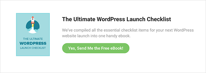
Whenever I visit IsItWP, I notice how they consistently use lead magnets to drive signups. The “Yes, Send Me the Free eBook!” CTA is a great example of how to offer something valuable in exchange for an email address.
I like that the offer is front and center and tied to a clear benefit, you’re getting a free eBook with all the essentials for a WordPress launch. It’s exactly the kind of resource their readers would want.
The action verb “Send” also makes the process feel quick and easy, and I’ve found this type of first-person copy works well to boost conversions.
3. WPForms: Community Join CTA
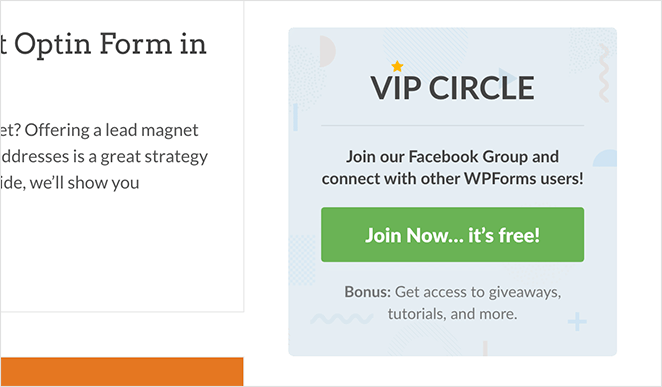
| CTA: Join Now… it’s free! |
| Best For: Growing online groups |
| Why It Works: Highlights no cost + exclusivity |
On the WPForms blog, I spotted a simple but effective ad encouraging readers to join the WPForms VIP Circle Facebook Group. The CTA, “Join Now… it’s free!” is exactly the type of language I use when I want people to act right away.
I think this works because it removes any hesitation. It’s free, it’s exclusive, and it’s relevant to the readers already browsing their content. The design also stands out enough on the page that you can’t miss it.
When I see CTAs like this, I’m reminded how well community-building offers perform. People want to feel connected and get access to extras, so this is a great approach to try if you’re growing a group.
4. Crazy Egg: Demo Request CTA
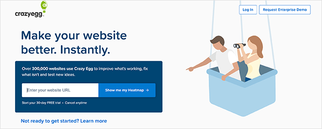
| CTA: Show me my Heatmap |
| Best For: Product demos |
| Why It Works: Speaks in user’s voice + builds curiosity |
I love how Crazy Egg uses its “Show me my Heatmap” button. It’s in the customer’s voice, which makes the offer feel personal. If you’ve ever wanted to see exactly how visitors interact with your site, this CTA makes it hard to resist.
The button copy is clear and builds curiosity at the same time. I also like how they back it up with social proof, showing you how many companies already use Crazy Egg gives you extra confidence before you click.
Plus, the free trial and cancel-anytime note removes risk. I think this is one of the smartest demo CTAs you’ll find.
5. Moz: Event Registration CTA

| CTA: Grab my ticket! |
| Best For: Event signups |
| Why It Works: Scarcity language + urgency |
Moz has always been good at marketing, so it’s no surprise their event CTA stands out. The “Grab my ticket!” button is fun and urgent without being pushy.
I like that the surrounding copy builds excitement by asking if you’re ready and then tells you exactly what you’ll get at their virtual event. There’s no guesswork, which makes it easier to click.
Whenever I run events, I try to use this same approach; a bold headline, clear benefits, and CTA text that makes the reader want to take action now.
6. Uber: Sign-Up CTA
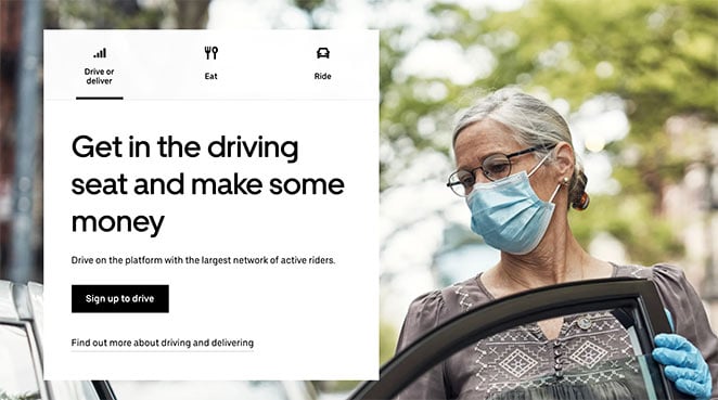
| CTA: Sign up to Drive |
| Best For: Service sign-ups |
| Why It Works: Simple, action-focused copy |
Uber’s “Sign up to Drive” call to action is a perfect example of keeping things simple. It’s direct, action-focused, and tells you exactly what you’re signing up for.
I also like how the headline reinforces the benefit — you can make money by driving. That’s a powerful motivator, and it helps the reader visualize what success looks like if they click.
This CTA works because it’s so easy to understand. If you’re creating your own, don’t overthink it. Be clear and show the reader what’s in it for them.
7. Madewell: Ecommerce Product CTA
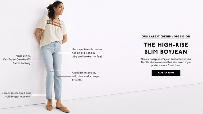
| CTA: Make ‘em Yours |
| Best For: Ecommerce product pages |
| Why It Works: Emotional trigger + ownership language |
Madewell’s “Make ’em Yours” button is one of my favorite ecommerce CTAs. It’s short, playful, and taps into the emotional side of shopping.
What I like most is how it connects with the product imagery. If you’ve ever struggled to find the perfect pair of jeans, the surrounding copy makes you feel like Madewell has the answer. Then the button invites you to claim them as your own.
In my experience, CTAs like this, that focus on ownership, drive more clicks than generic “Buy Now” buttons.
8. Traffic & Conversion: Discount Offer CTA

| CTA: Claim Your Discounted Ticket |
| Best For: Event promotions |
| Why It Works: Strong incentive + clear benefit |
Digital Marketer’s Traffic & Conversion Summit has a standout CTA: “Claim Your Discounted Ticket.” I like that it pairs the incentive (a discount) with a sense of ownership (“claim”), which makes the offer feel more valuable.
The bullet points leading up to the button are also strong. They clearly list what you’ll get by attending, so the CTA doesn’t feel like a gamble.
If I were optimizing this page further, I’d add a countdown timer to create urgency. In my own campaigns, I’ve seen limited-time CTAs convert significantly better.
9. Yoga International: Free Trial CTA
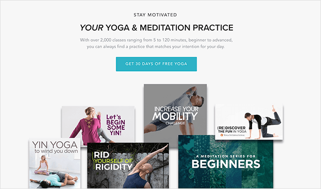
| CTA: Get 30 Days of Free Yoga |
| Best For: Subscription free trials |
| Why It Works: Risk-free offer + clear time limit |
I appreciate how Yoga International repeats its main CTA multiple times throughout the landing page. The “Get 30 Days of Free Yoga” button is risk-free and clear, two things I look for in a good free trial offer.
Placing the button at the top, middle, and bottom makes it easy for visitors to click when they’re ready. I often use this same strategy on product pages because it catches people at different decision points.
And of course, the promise of “free” is always a strong motivator. This is a great example of a low-friction offer done well.
10. GiftRocket: Unique Brand CTA

| CTA: Send a GiftRocket |
| Best For: Gift card purchases |
| Why It Works: Branded language + fun tone |
I think GiftRocket does a great job with its branded CTA. Instead of using something boring like “Buy Now,” they invite you to “Send a GiftRocket.”
That small wording change makes the action sound special, and the interactive images on the page add to the experience. I also like the “as seen in” logos, which give the brand extra credibility.
This is a reminder that you don’t have to use the same CTA copy everyone else uses. A little creativity can go a long way.
11. I Will Teach You to Be Reach: Quiz CTA

| CTA: Start the quiz |
| Best For: Segmenting leads |
| Why It Works: Low commitment + curiosity hook |
Ramit Sethi’s “Start the quiz” CTA is one I’ve borrowed for my own funnels. It’s low commitment, but it leads to highly personalized follow-ups.
What I like most is how it’s framed: you’re taking a quiz to get content that fits your needs. That’s much more appealing than just signing up for a generic newsletter.
This approach is especially effective if your products or courses are expensive. It gives you a chance to build trust before asking for a bigger commitment.
More Common Questions About Calls to Action
Final Thoughts on Creating Great CTAs
Good CTAs guide people to take the next step. Whether you use a simple two-word button or a playful phrase, the goal is the same: be clear and give people a reason to click.
If you’re ready to put these ideas into practice, you can build a landing page with SeedProd in just a few minutes. That way, you can test different CTAs and see what converts best for your audience.
Related Guides You Might Like
- 24 Landing Page Examples PROVEN to Convert
- How to Make a Click to Call Link in WordPress
- Top 12 Mistakes Beginners Make Building WordPress Sites
- Your Website Isn’t as Unique as You Think (Let’s Fix That)
- 15 Business Website Examples (And What Makes Them Great)
Thanks for reading! We’d love to hear your thoughts, so please feel free to join the conversation on YouTube, X and Facebook for more helpful advice and content to grow your business.

