
TL;DR: How to Create a White Paper Download Landing Page
A white paper landing page captures qualified leads by trading a research-backed document for an email address. Here’s how to build one that converts.
- Define your offer: A white paper is a detailed B2B document that educates prospects on a business problem; it attracts more qualified leads than general content offers.
- Keep the form short: Name and email only. Each extra field reduces conversions by roughly 10-15%.
- Add social proof near the form: A testimonial or logo bar above the gate removes hesitation before visitors commit.
- Write benefit-driven CTA copy: “Get the 2025 Benchmark Report” outperforms “Download” every time.
- Automate delivery: Redirect to a thank-you page with the download link and connect your email service to follow up automatically.
- Follow the 6-step WordPress tutorial below: Install SeedProd, choose a template, customize, connect your email service, configure settings, and publish.
Need a fast way to build a white paper download landing page that actually converts?
If you spent months writing a white paper and buried the download link in a blog post sidebar, most of your potential leads never saw it.
A white paper download landing page lets you trade real value for an email address, then turn those new leads into sales with follow-up. In this quick guide, I’ll show you the essentials, real examples, and the exact steps to build it in WordPress.
What Is a White Paper Download Landing Page?
A white paper landing page is a standalone web page where visitors enter their email addresses to download the white paper. Because white paper readers are already researching solutions, they convert at higher rates than visitors who land on general blog posts or ebook pages. A dedicated page keeps that intent focused. It’s different from your website’s home page because it:
- Has fewer distractions (like blog posts)
- Offers valuable information about one topic
- Urges visitors to do one thing rather than many
- Pushes visitors to convert instead of browse
A dedicated landing page removes navigation distractions and directs attention to one action. That single-goal focus is why white paper landing pages typically convert at 3-5x the rate of download links embedded in blog posts.
Essentially, your white paper landing page is the ideal way to serve gated content to visitors without the distractions of a standard home page. As a result, you can focus attention on your promotional content and improve conversion rates.
What Does a White Paper Landing Page Need?
Every high-converting white paper landing page shares the same six elements. I’ve reviewed dozens of B2B download pages, and the ones that underperform are almost always missing at least two of these.
- Outcome-focused headline: Promise a specific result, not just a topic label. “How High-Performing Teams Work Differently” beats “Anatomy of Work Global Index.”
- Tight value list: Three bullets on what the reader will learn, each under 12 words. Name the audience, the pain, and the payoff.
- Simple opt-in form: Name and email only. Each additional field reduces completions by roughly 10-15%.
- Social proof near the form: A testimonial, expert quote, or logo bar placed above the gate removes hesitation at the moment of commitment.
- Benefit-driven CTA button text: “Get the 2025 Benchmark Report” tells visitors what they receive. “Download” only tells them what to do.
- Mobile-optimized layout: Test on a phone before publishing. A form that’s hard to fill on mobile kills conversions before you’ve had a chance to optimize anything else.
Real White Paper Landing Page Examples
The best way to understand what works is to see it in action. Each of the six examples below uses a different conversion angle. I’ve pulled out what each one does well and what’s worth testing.
1. HubSpot: 2026 State of Marketing Report

HubSpot’s State of Marketing report page leads with social proof before the gate.
What works:
- Quotes from named marketing leaders build credibility before visitors commit to the form
- Key statistics appear above the gate, creating FOMO that drives sign-ups
What to test: Whether showing more data before the gate increases or decreases form completions.
2. Salesforce: Data Cloud White Paper
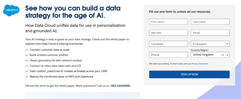
Salesforce’s Data Cloud page uses a value bullet list to tell visitors exactly what they’ll learn before they download.
What works:
- The bullet list names specific outcomes, not just topic labels
- The Salesforce brand name on the form adds instant trust
What to test: Trimming the multi-field form to email and company only to reduce abandonment.
3. HubSpot: The Science of Scaling (ICP Expansion Guide)
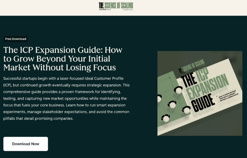
This HubSpot guide page leads with an outcome-first headline that names the exact revenue goal readers will achieve.
What works:
- The headline frames the guide around a business result rather than a topic
- A content preview carousel shows what’s inside without giving the findings away
What to test: Adding a social proof stat near the form (“Downloaded by 10,000+ revenue teams”) to reduce opt-in hesitation.
4. Mailchimp: Email Marketing Benchmarks
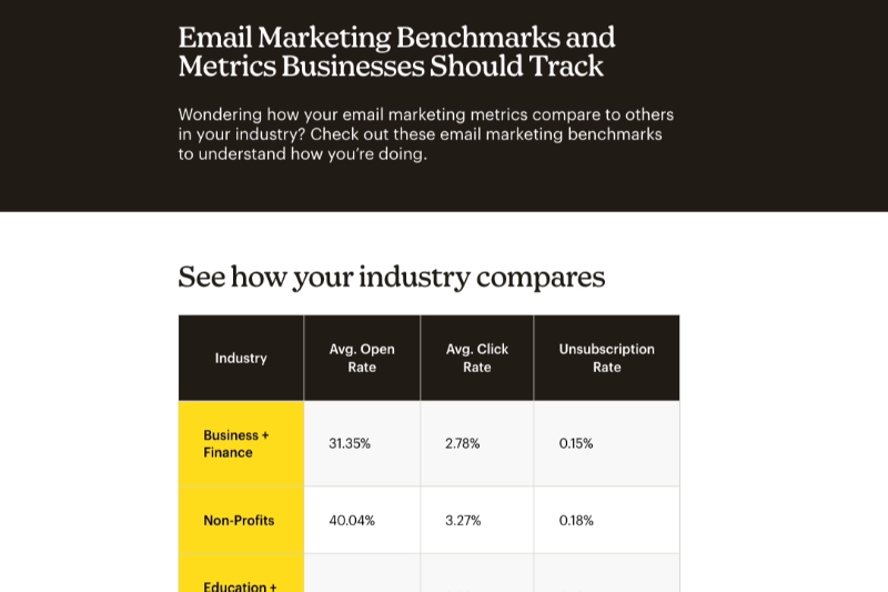
Mailchimp’s benchmarks page uses the shortest form of these six examples: email address and country only.
What works:
- Removes all friction except an email address
- The gate appears after stats previews that prime the reader, so intent is already established before the ask
What to test: CTA button copy. “Get the 2025 Benchmarks” versus a generic label to see whether specificity lifts conversions.
5. Asana: Anatomy of Work Global Index

Asana’s report page uses benefit-driven CTA copy that frames the action as delivery, not submission.
What works:
- “Get the insights” and “Get full report” both tell visitors what they receive rather than what they do
- Key productivity stats appear above the fold to create urgency before the scroll
What to test: The headline. “Anatomy of Work Global Index” is a label, not an outcome. Test rewriting it as a direct result (“How High-Performing Teams Work Differently”).
6. ServiceNow: Gartner Magic Quadrant for Low-Code Application Platforms
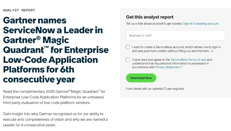
ServiceNow’s Gartner report page uses third-party credibility as the entire value proposition.
What works:
- “Leader for 6 consecutive years” uses Gartner recognition as the headline proof point, removing the need for a separate testimonial
- Framing a complimentary third-party report as the download positions ServiceNow as confident in independent evaluation
What to test: The 8-field form is far above the 2-field minimum. Trimming to email and company would reduce qualification friction significantly.
How to Create a White Paper Download Landing Page in WordPress
By now, you’re probably wondering how to create a white paper download landing page. SeedProd is a drag-and-drop website builder that lets you create professional white paper landing pages in WordPress without touching code.
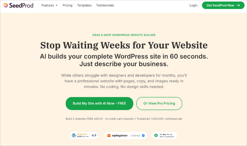
SeedProd includes 300+ responsive templates and 90+ content blocks specifically for landing pages. You can build a professional white paper landing page without hiring a developer.
To learn how to create a white paper download landing page with SeedProd, follow the steps below.
Step 1. Install and Activate SeedProd
The first step is to download a copy of the SeedProd plugin.
Then you need to install and activate the plugin on your WordPress website. Follow this guide on installing a WordPress plugin if you need help.
After installing SeedProd, the plugin sends you to a welcome screen automatically. On that page, you can enter your license key.
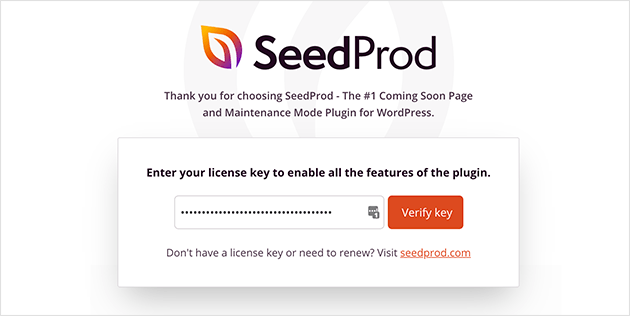
You can find your license key by logging in to your SeedProd account and copying the key from the Downloads section.
Now, paste your key into the license key field, and click Verify Key.
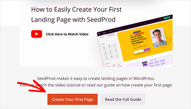
After activating your key, scroll down and click the Create Your First Page button.
Step 2. Create a New Landing Page
The next page is SeedProd’s landing page dashboard.
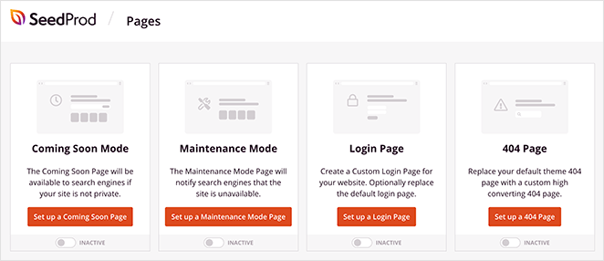
At the top are page modes you can turn on and off with a single click, including:
- Coming soon page to hide your site while it’s under construction.
- Maintenance mode to show a maintenance screen during updates
- 404 page so users see a custom 404 error page when visiting broken links
- Login page to customize the default WordPress login screen
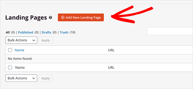
After that section is where you’ll see any other landing page you create with SeedProd. So click the Add New Landing Page button to create your first page.
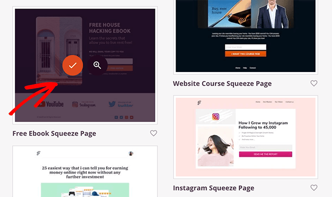
On the next screen is SeedProd’s library of mobile responsive landing page templates. You can use any design to create your white paper landing page and customize it in the drag and drop editor.
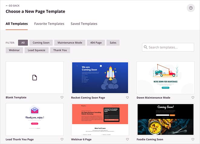
To choose a template, hover over it with your cursor and click the checkmark icon.
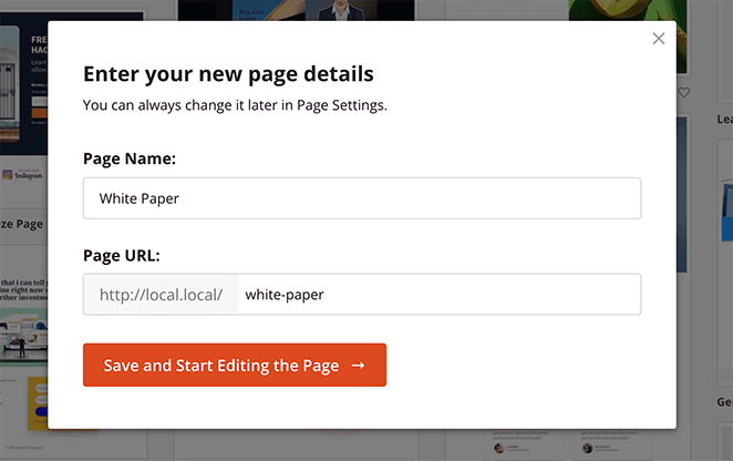
After, you can enter a name and URL for your page. Click the Save and Start Editing the Page button to launch your template in the visual editor.
Step 3. Customize Your Landing Page Design
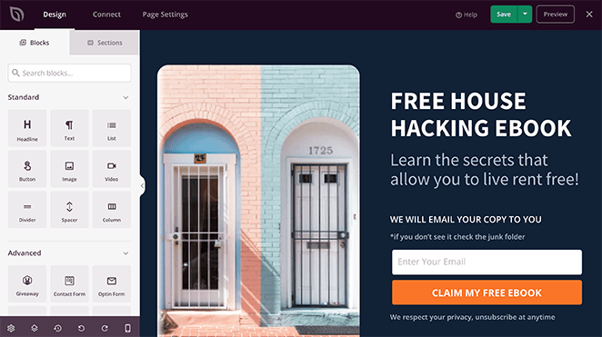
On the left are blocks and sections to add new content and customize your design. Then, you can preview any changes you make on the right.
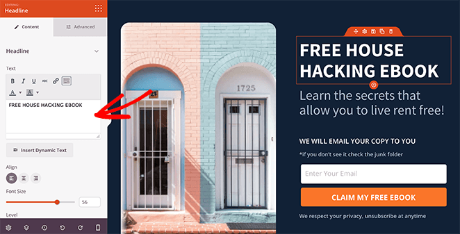
To customize your template, click any element, and its settings will open in the left panel. For example, you can click the headline and change the text in the content settings panel on the left.
Changing the template’s images works the same way. Just click any image element to see its settings panel.
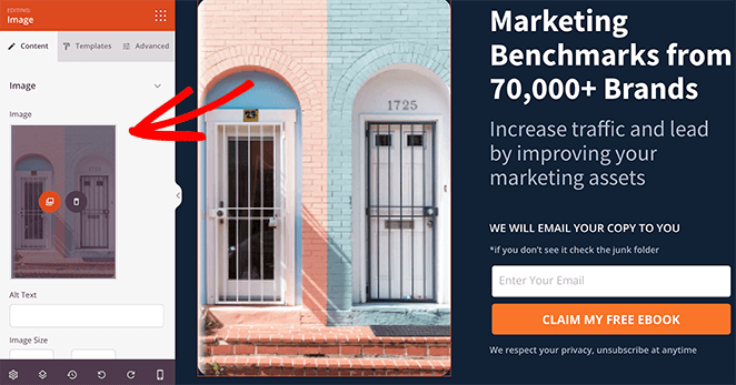
Then you can delete the image and upload one from your computer or WordPress media library.
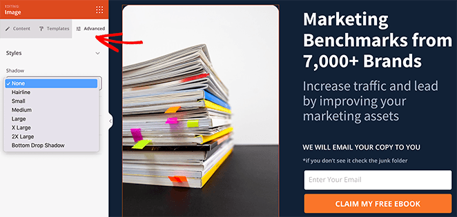
From there, you can click the Templates and Advanced tabs to adjust your image borders, spacing, and more.
Earlier in this post, we discussed adding urgency to your landing page with countdown timers. SeedProd has that feature as part of its lead generation blocks.
To add a countdown timer to your white paper page, drag the countdown block from the left panel and drop it onto your design.
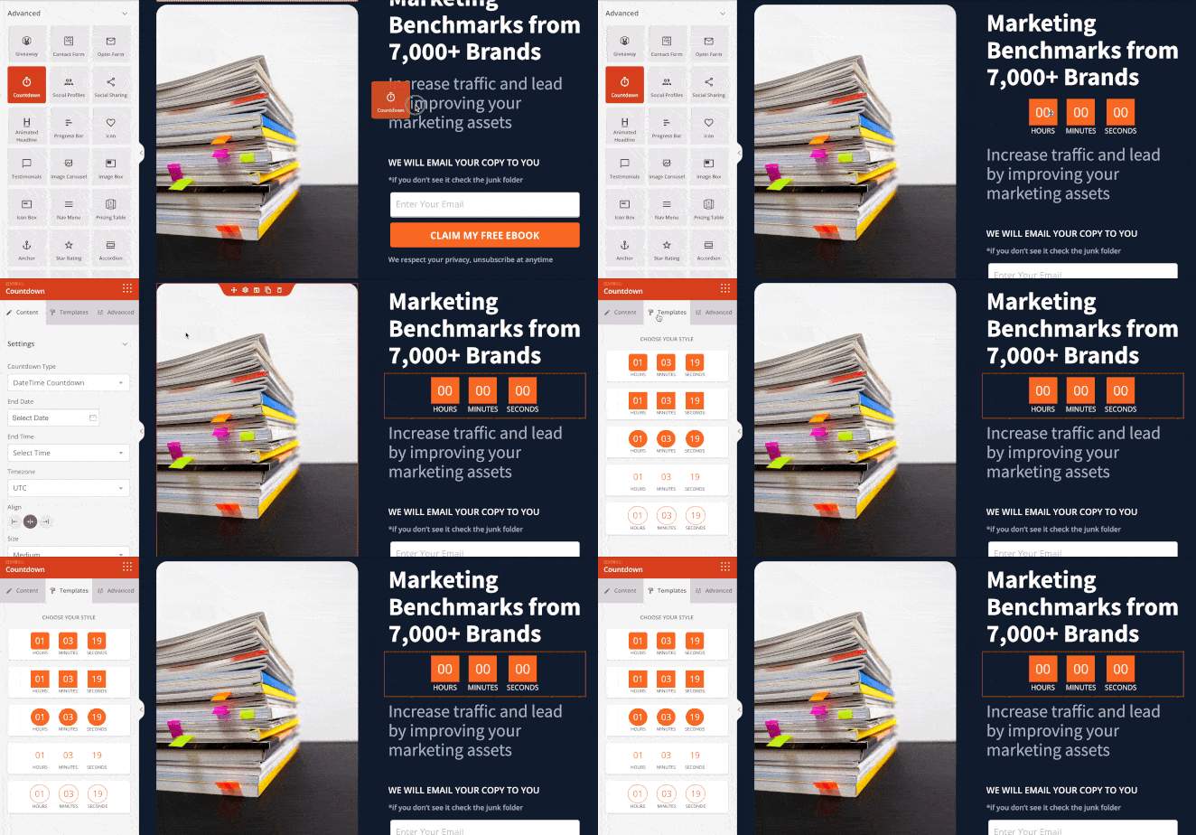
After that, you can click the Templates tab to choose a different timer style and the Advanced tab to adjust the colors, spacing, and more.
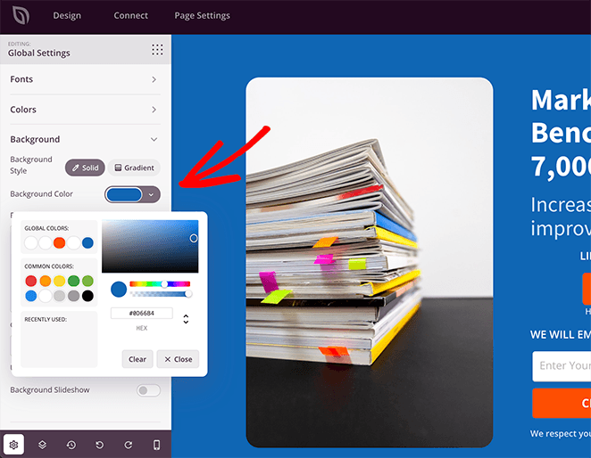
Let’s say you want to change your white paper landing page’s background color. In that case, you can visit SeedProd’s Global Settings panel and control the color there.
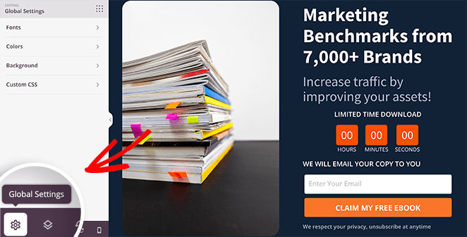
To do that, click the cog icon in the bottom-right corner of your screen.
Then, click the Background heading, and select a new color with the color picker.
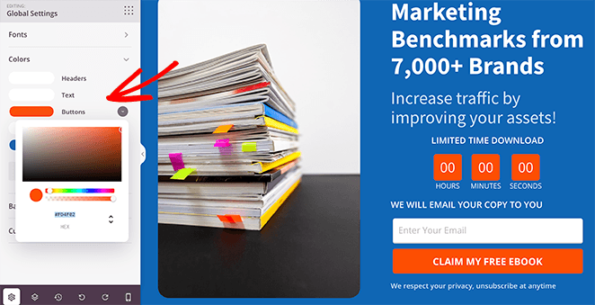
And if you want all the buttons on your page to be the same color, you can also control that setting in the same panel. So click the Colors tab and choose a color from the color picker for all buttons on your page.
Keep adjusting your design until you’re happy with the results. Then go ahead and click the Save button to store your changes.
Step 4. Connect Your Email Marketing Service
One of the primary goals of any white paper landing page is to collect email addresses from your target audience. Because our white paper page design has a sign-up form, the next step is to link it to your email marketing service.
Click the Connect tab at the top of your screen and choose from the list of direct integrations.
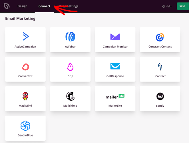
This plugin integrates with all the popular email marketing services, along with Google Analytics, Zapier, and Recaptcha.
Pick your integration and follow the instructions to connect your account. After that, SeedProd will add any new leads who download your whitepaper to your email list automatically.
Step 5. Configure Your Settings
Now, let’s switch to the Page Settings tab, where you can adjust some more landing page settings.
You can edit your landing page information and enter a Facebook App ID if needed on the General Settings screen.
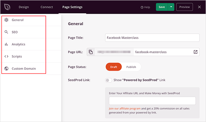
Then, if you have a Google Analytics and SEO plugin on your WordPress site, you can access their settings in the Analytics and SEO panels. We suggest using MonsterInsights for Google Analytics and All In One SEO for your landing page SEO.
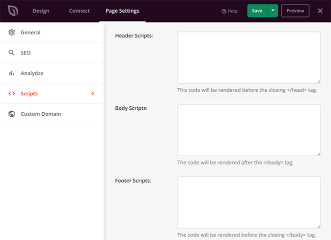
Next is the Scripts panel, where you can add tracking and retargeting scripts for cookies, pixels, and other useful tools.
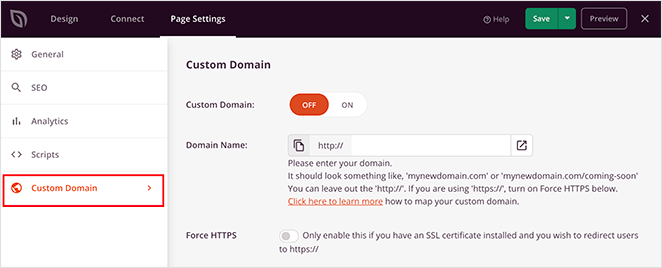
And if you have a SeedProd Elite license, you can use the Custom Domain panel to assign a custom URL to your white paper download page. That feature is helpful if you want to have multiple landing pages with custom domains on a single WordPress site.
Step 6. Publish Your White Paper Download Landing Page
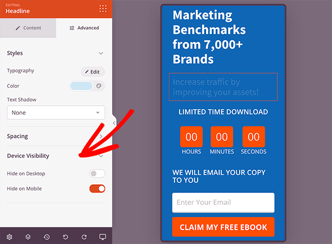
When your settings are complete, you’re ready to publish your white paper landing page. First, let’s make sure it looks good on mobile devices by clicking the mobile icon in the bottom navigation bar.
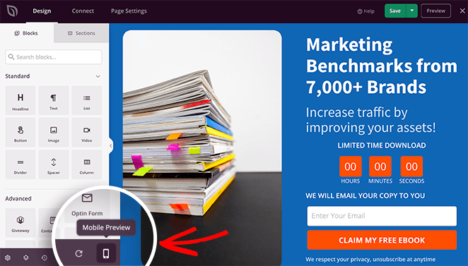
With that setting, you can preview your landing page on mobile screens, enabling you to see how it looks on smaller devices.
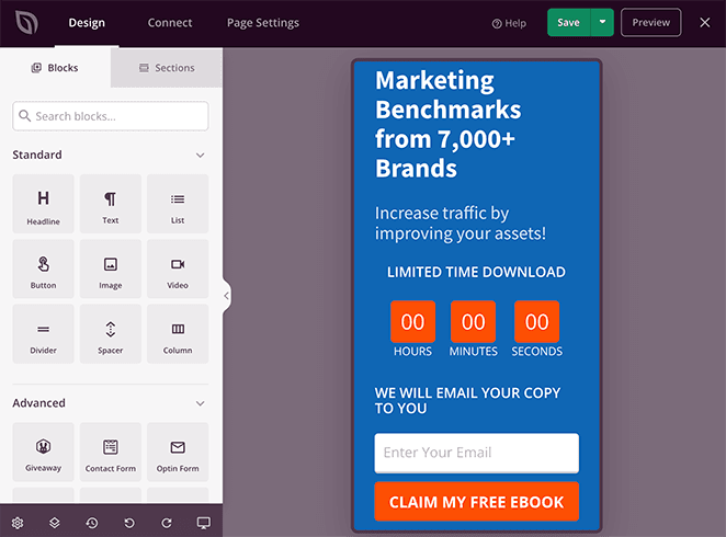
If anything doesn’t look right, you can easily adjust your design and even hide some elements from showing.
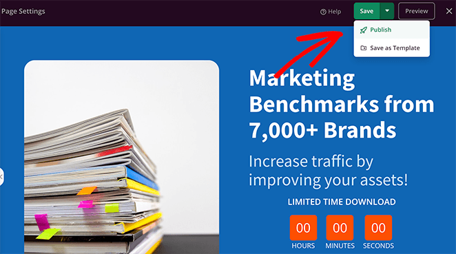
When you’re ready to publish your page, click the dropdown arrow on the Save button and click Publish.
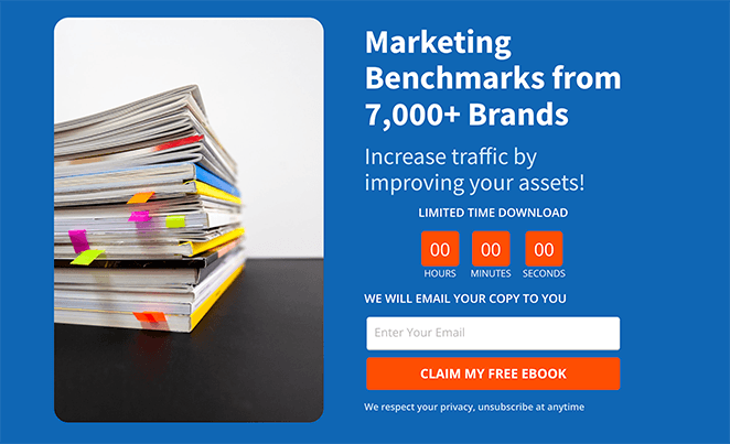
Now you can view your page live on your website and see the results.
How to Deliver Your White Paper Automatically
Your page is live — but the conversion doesn’t end at the form submission. The delivery step is where most white paper funnels drop the ball.
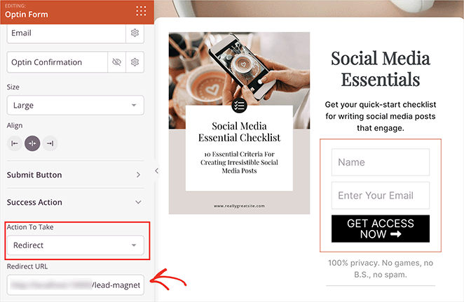
The cleanest setup is a two-step delivery: form submission redirects to a custom thank-you page with the download link, and a confirmation email delivers the same link so the reader can find it later.
In SeedProd, you can set up the redirect in the form block settings. Click the opt-in form on your landing page, open the Action Settings tab, and choose Redirect to a URL. Enter the URL of your thank-you page.
Your thank-you page should do three things: deliver the file (a button linking directly to the PDF works well), confirm what the reader will receive next (a follow-up email, a related guide, or a next-step CTA like a free trial), and give them a reason to stay.
I also use SeedProd to build thank-you pages with a prominent download button and one clear next action. Keeping it simple avoids the choice paralysis that buries the download link.
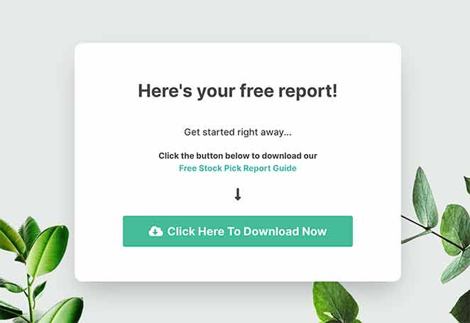
Connect your email service in the Connect tab (as covered in Step 4) and set up a confirmation email that includes the same download link. This gives you two tracked touchpoints and a place to start your follow-up sequence.
Frequently Asked Questions (FAQ)
What should a white paper landing page include?
A white paper landing page needs six things: an outcome-focused headline that promises a specific result, a tight 3-bullet value list naming what the reader will learn, a short opt-in form with name and email only, social proof near the form, benefit-driven CTA button text, and a mobile-optimized layout.
Each element works together. Miss one — especially the social proof or the benefit-driven CTA — and conversion rates drop noticeably.
How many form fields should a white paper download form have?
Ask for first name and email only. Short forms convert best. Each additional field reduces completions by roughly 10-15%.
If sales needs more information, use progressive profiling later. Ask company size or job role on the next email click, not on the download gate.
What’s a good conversion rate for a white paper landing page?
A well-optimized white paper landing page converts at 10-15%. If you’re below 5%, test your headline first: it’s the highest-leverage variable on the page.
Each additional form field reduces conversions by roughly 10-15%, so keeping it to name and email only is the single fastest fix for a low-converting page.
Should I gate my white paper behind an email form?
Yes. Keep the gate simple and clearly state the value and format (for example, “PDF, 18 pages”). Make delivery instant with an on-page thank-you page plus an email link so the asset is easy to find later.
Gating works because white paper readers are already in research mode, and they’re more willing to exchange an email for substantive content than a casual blog reader would be.
What’s the best way to automatically deliver my white paper after a form submission?
Redirect to a dedicated thank-you page with the download link and add the same link to the confirmation email. This gives you two tracked touchpoints and a place to add a next step (demo, related post, or free trial).
In SeedProd, set up the redirect in the form block’s Action Settings tab. Connect your email service in the Connect tab to trigger the confirmation email automatically.
What’s the difference between a white paper and an ebook landing page?
White papers target B2B buyers who are already evaluating solutions, so the copy can be more direct: the reader already believes they have a problem. Ebook landing pages need more persuasive copy because the audience is broader.
The page design principles are nearly identical, but white paper copy typically needs less convincing to justify the email gate. Lead with the outcome and the credentials; skip the extended persuasion.
That’s it!
Your white paper landing page is live. Set up your thank-you page redirect in SeedProd to deliver the file automatically, then connect your email service to follow up with new leads.
You may also find the following landing page guides helpful:
- Call-to-Action Best Practices
- Landing Page Headline Formulas
- Landing Page URL Examples
- What Is a Good Landing Page Conversion Rate
- Anatomy of a Landing Page
Thanks for reading! We’d love to hear your thoughts, so please feel free to join the conversation on YouTube, X and Facebook for more helpful advice and content to grow your business.