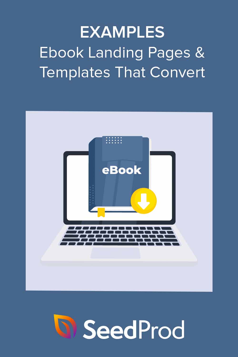
I’ve analyzed over 50 ebook landing pages from successful companies. I hand-picked these 8 based on conversion performance, industry diversity, and how easily you can recreate them in WordPress.
According to HubSpot, 43.6% of marketers say generating leads is their main goal. Ebook landing pages are perfect for just that.
In this guide, I’ll share some of my favorite ebook landing page examples. We’ll look at why they work so well and how you can use the same ideas to create your own high-converting pages.
- Why Create a Landing Page for Your Ebook?
- 5 Principles All High-Converting Ebook Landing Pages Share
- What's the Conversion Rate for Ebook Landing Pages?
- Ebook Landing Page Examples That Convert
- Ebook Landing Page Examples: Quick Comparison
- How to Create an Ebook Landing Page in WordPress
- 6 Easy to Use Ebook Landing Page Templates
- FAQs About Ebook Landing Pages
Why Create a Landing Page for Your Ebook?
You’ve put a ton of work into creating your ebook. But even the best content fails if nobody sees it.
Dedicated landing pages solve this. For example, Qintil, a company that makes learning software, needed more leads. They created an ebook about their software and promoted it through a special landing page.

The page clearly showed the ebook’s value, made signup easy, and used visuals to build trust. The result? A high-performing page that turned visitors into qualified leads. You can see the full case study here.
A well-optimized landing page gives you laser focus on conversion, measurable results you can track, and SEO benefits from targeted content.
5 Principles All High-Converting Ebook Landing Pages Share
I’ve analyzed dozens of high-performing pages and these 5 principles show up every time.
| Principle | What It Means | Why It Works |
|---|---|---|
| Single CTA Focus | One goal only: capture the email. No navigation menus, no sidebar links, no competing calls-to-action. | Removing choices reduces decision fatigue. Visitors either want the ebook or they don’t. |
| Above-the-Fold Value Prop | Your headline, ebook cover, and primary benefit must appear without scrolling. Visitors understand what they’re getting in under 3 seconds. | The ebook cover provides visual proof your offer exists. A benefit-focused headline explains why they should care. |
| Short Forms (3-5 Fields Max) | Most ebook landing pages only ask for name and email. Forms with 3-5 fields convert 15-20% better than forms with 7+ fields. | Every additional form field increases completion time and reduces conversions. Only request information you’ll actually use. |
| Strategic Social Proof | Testimonials, case study mentions, or download counts placed mid-page, after you’ve explained the value but before the final CTA. | Social proof works best when it addresses specific doubts visitors have about whether your ebook delivers. |
| Mobile-First Design | Single-column layouts, large tap targets for buttons, and forms that don’t require zooming. | Over 60% of web traffic comes from mobile devices. Your ebook landing page must work perfectly on phones. |
These principles aren’t about being fancy. They’re about removing friction and making it easy for visitors to say yes.
What’s the Conversion Rate for Ebook Landing Pages?
Ebook landing pages convert at 24% according to Leadpages data. Standard landing pages average 11%.
The performance difference comes from the clear value exchange. Visitors receive immediate value (the ebook) in return for their email address. This transactional clarity reduces hesitation.
For content marketers, ebook landing pages are the highest-converting lead magnet format available.
Ready to see what makes a great ebook landing page tick? Let’s dive into some standout examples.
Ebook Landing Page Examples That Convert
I’ve analyzed these 8 examples across SaaS, marketing, and enterprise companies. Each demonstrates different approaches to the same goal: converting visitors into leads.
1. Flywheel
Flywheel, a WordPress hosting company, uses a single-column ebook landing page. The page includes three key elements: a benefit-focused headline, a 3D ebook cover mockup, and a one-click download button.
This design converts well because it follows the principle of cognitive ease. Visitors see the complete offer above the fold without requiring a form.
Flywheel’s approach demonstrates that SaaS companies can build trust by offering value before asking for anything in return.

The call-to-action is straightforward – a simple button that takes you directly to the PDF download. To convince you it’s worth downloading, they’ve included a few bullet points explaining what you’ll learn from the ebook.

| What Flywheel Does | How to Use This Idea |
|---|---|
| Clear, descriptive headline | Write a clear title that explains your ebook’s subject in 10 words or less |
| One-click “Download PDF” button | Consider offering immediate downloads without requiring signup to build trust first |
| Bullet points of ebook topics | Use bullet points to show specific topics covered |
| Professional ebook cover image | Create an attractive ebook cover that looks professional |
| Page works well on all devices | Test your page on mobile devices |
| Simple, focused design | Remove any elements that don’t support the conversion goal |
2. BlogTyrant
BlogTyrant, a blogging education site, positions their ebook offer at the bottom of their homepage. The page displays a “Free Ebook Guide” label, the ebook title, and a cover image.
This homepage integration approach works because it captures visitors who are already engaged with the content. The popup email signup converts traffic that’s already warming up.
BlogTyrant’s strategy shows that content sites can use strategic placement instead of dedicated landing pages.

There’s a clear “Sign up and get ebook” button below, so you know exactly what to do next. Click it, and a small window pops up asking for your email address.

Now, using a pop-up is a bit of a gamble. Some folks find them helpful, while others might be annoyed. But BlogTyrant is confident their ebook is valuable enough to make it worthwhile.
| What BlogTyrant Does | How to Use This Idea |
|---|---|
| Positions ebook offer at homepage bottom | Consider strategic homepage placement if your site gets consistent traffic |
| Says “Free Ebook Guide” | Emphasize “free” to increase interest and reduce download friction |
| Shows ebook title clearly | Make titles immediately understandable and benefit-focused |
| Shows ebook cover picture | Use professional cover images that look like real books |
| Uses “sign up and get ebook” button | Provide clear calls-to-action that explain exactly what happens next |
| Uses popup for email signup | Explore popup conversion methods to grow your email list from existing traffic |
3. Microsoft
Microsoft, a technology corporation, uses longer forms with multiple fields on their ebook landing pages. The forms request company name, job title, and industry in addition to basic contact information.
This approach prioritizes lead quality over quantity. Microsoft accepts lower conversion rates in exchange for more qualified leads.
Microsoft’s page demonstrates that enterprise companies with longer sales cycles benefit from detailed lead qualification upfront.

Interestingly, Microsoft asks for a lot of information. This is tricky because people usually don’t like filling out long forms.
Dan Zarrella, a marketing expert, found that as the number of form fields increases, fewer people tend to complete the form. But the drop isn’t as big as you might think.

Microsoft must believe that the quality of leads they get from more detailed forms is worth losing some
| What Microsoft Does | How to Use This Idea |
|---|---|
| Uses a big, eye-catching image | Add attractive imagery that visually represents your ebook’s value |
| Has a clever, relevant title | Create titles that address specific reader needs or pain points |
| Lists clear benefits of the ebook | Explicitly state what visitors will learn in concrete terms |
| Uses a longer form for lead quality | Consider whether detailed forms align with your goals—more fields mean fewer conversions but better-qualified leads |
| Offers additional resources | Provide supplementary learning resources to increase perceived value |
4. HubSpot
HubSpot, a marketing software company, includes content previews via slideshow on their ebook landing pages. The pages feature the ebook cover, topic lists, FAQ sections, and multiple download buttons throughout.
This comprehensive approach works because it removes conversion barriers by answering objections before they arise.
HubSpot’s strategy shows that providing extensive information can increase conversions when your audience needs reassurance.

As you scroll down, HubSpot builds your interest. They list out the topics covered in the ebook, touching on key management skills like building a positive work environment and resolving conflicts.

For those who need more convincing, HubSpot goes the extra mile. They dive deeper into the ebook’s content, explain who it’s for, and answer common questions with a handy FAQ section.

| What HubSpot Does | How to Use This Idea |
|---|---|
| Emphasizes that it’s free | Make “free” prominent in your headline and subheadings |
| Shows ebook cover image | Display covers professionally at multiple sizes for different screen widths |
| Lists topics covered | Detail specific learning outcomes using bullet points |
| Uses a slideshow of contents | Provide content previews showing actual ebook pages or chapters |
| Includes FAQs | Answer common questions through an FAQ section |
| Has two download buttons | Place conversion opportunities strategically throughout the page rather than only at the top |
5. Pixelgrade
Pixelgrade, a WordPress theme company, includes personal author messages on their ebook landing pages. The pages feature the author’s photo, background, main takeaways, and customer testimonials.
This personal approach works because it makes the ebook feel like trusted advice from a knowledgeable friend rather than corporate content.
Pixelgrade’s page demonstrates that creator-driven companies benefit from highlighting individual expertise.
As you scroll down, the page unfolds like a story. You’ll see the main takeaways from the ebook, almost like a movie trailer showing the best parts.

Finally, you get to know the author a bit better. This isn’t just any ebook; it’s advice from someone who knows their stuff and wants to help.

| What Pixelgrade Does | How to Use This Idea |
|---|---|
| Shows a big ebook cover image | Display covers prominently at the top of the page |
| Uses a personal message from the author | Add personal author introductions with photos to build connection |
| Lists key takeaways | Highlight key learnings visitors will gain from reading |
| Includes testimonials | Include social proof through testimonials from previous readers |
| Introduces the author | Establish author credibility by mentioning relevant experience |
| Uses casual, friendly language | Maintain an approachable, conversational tone that feels personal rather than corporate |
6. Salesforce
Salesforce, a CRM software company, keeps their ebook landing pages simple. The pages show the cover, promise access to a broader resource library, and use straightforward forms.
This minimal approach works because Salesforce has strong brand recognition. Their existing audience already knows and trusts them.
Salesforce’s page demonstrates that established brands can succeed with simpler pages when visitor trust is already high.

| What Salesforce Does | How to Use This Idea |
|---|---|
| Shows an ebook cover image | Display covers professionally without clutter |
| Promises access to more resources | Suggest additional value beyond the single ebook to increase perceived benefit |
| Uses a clear, action-oriented CTA | Make download buttons obvious and use descriptive text like “Get Your Free Ebook” |
| Keeps the page simple | Avoid unnecessary design elements that distract from the conversion goal |
| Asks for detailed information | Request strategically valuable user data that helps with lead scoring, but keep forms reasonable |
7. Optimizely
Optimizely, an experimentation platform, provides detailed ebook descriptions and includes educational content directly on the landing page. The pages use eye-catching graphics and friendly form language.
This educational approach works because teaching visitors immediately establishes expertise and builds authority.
Optimizely’s strategy shows that companies selling complex products benefit from demonstrating knowledge upfront.

| What Optimizely Does | How to Use This Idea |
|---|---|
| Uses a bold, clear title | Make your ebook title stand out visually and ensure it’s immediately understandable |
| Provides a detailed description | Explain why your ebook is valuable and what it covers |
| Includes educational content | Give readers a taste of what they’ll learn |
| Uses eye-catching graphics | Make your page visually appealing to grab attention |
| Keeps the form simple | Don’t ask for too much information upfront |
| Uses a friendly form heading | Make your form feel inviting and personal |
8. Marigold
Marigold, a relationship marketing platform, uses clear titles and mentions recognizable case studies like American Airlines and Magnolia Bakery. The page keeps copy concise and CTAs obvious.
This straightforward approach works for B2B audiences who want quick information without excessive marketing language.
Marigold’s page could be strengthened with more images and a shorter form, but it demonstrates that clarity matters more than design complexity.

| What Marigold Does | How to Use This Idea |
|---|---|
| Uses a clear, concise title | Keep your ebook title simple, relevant, and directly focused on the benefit |
| Explains why the topic matters now | Show why timing matters for your specific topic |
| Previews ebook content | Preview content structure with chapter or section descriptions |
| Mentions case studies | Highlight real-world examples and recognizable brands if applicable |
| Includes a clear CTA | Provide obvious next steps with a single, clear CTA |
Ebook Landing Page Examples: Quick Comparison
Here’s how these 8 examples compare across key conversion factors:
| Example | Industry | Key Features | Best For | Conversion Focus |
|---|---|---|---|---|
| Flywheel | WordPress Hosting (SaaS) | No-signup download, bullet points, minimal design | Trust-building with new audiences | Removing all friction |
| BlogTyrant | Blogging Education | Homepage placement, popup signup, cover display | Content sites with existing traffic | Converting warm visitors |
| Microsoft | Enterprise Technology | Long forms (6-8 fields), eye-catching images, multiple resources | B2B with long sales cycles | Lead qualification over quantity |
| HubSpot | Marketing Software (SaaS) | Content preview, slideshow, FAQ, multiple CTAs | Cautious buyers needing reassurance | Objection removal |
| Pixelgrade | WordPress Themes | Author bio, testimonials, personal message, friendly tone | Creator-driven brands | Personal connection |
| Salesforce | CRM Software (Enterprise) | Simple layout, library access, brand trust | Established brands with recognition | Leveraging existing credibility |
| Optimizely | Experimentation Platform (SaaS) | Educational content, detailed descriptions, visual design | Complex products needing explanation | Demonstrating expertise |
| Marigold | Marketing Platform (B2B) | Clear copy, case study mentions, minimal design | B2B audiences wanting quick info | Clarity without fluff |
How to Create an Ebook Landing Page in WordPress
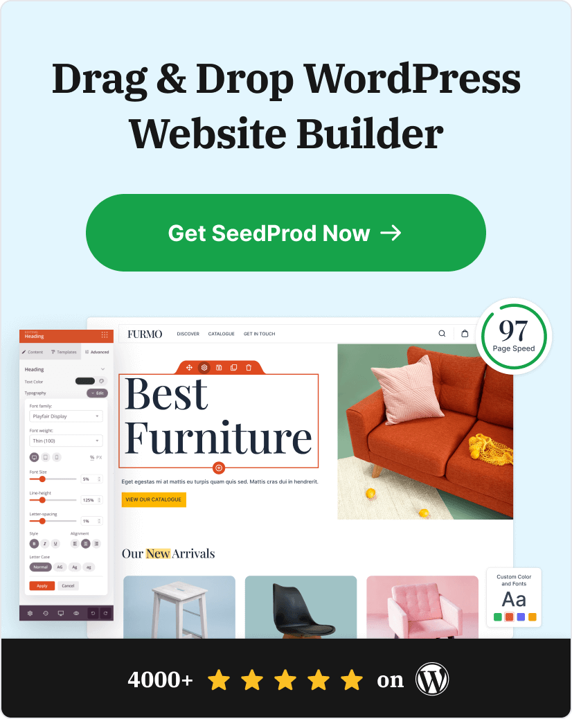
You can create a high-converting ebook landing page in WordPress without coding. The process takes about 15-20 minutes.
I use SeedProd myself because it handles the layout and spacing automatically. You don’t need design skills.

SeedProd is a drag-and-drop WordPress website builder trusted by over 1 million websites. You can use it to create custom WordPress themes, custom landing pages, and custom WooCommerce stores without any code.
The basic steps are: choose a template, customize your headline and copy, upload your ebook cover, connect your email service, and publish. For detailed step-by-step instructions, see our complete guide on how to create an ebook landing page in WordPress.
6 Easy to Use Ebook Landing Page Templates
SeedProd includes six pre-designed templates specifically for ebook promotions. They use industry best practices and responsive layouts, so you can be confident they’ll convert well.
| Template Name | Layout Style | Best For |
|---|---|---|
| Ebook Landing Page | Split-screen with large image | Highlighting cover art and clear copy |
| Ebook Download Page | Flipped split-screen (Above fold) | Immediate visibility and social sharing |
| Free Ebook Landing Page | Long-form detailed scrolling | Detailed offers requiring testimonials |
| Ebook Squeeze Page | Short, dark background | High-focus lead capture |
| Ebook Sales Page | Minimalist with Sneak Peek | Convincing visitors to buy or download |
| Ebook Opt-In Page | Colorful long-form | Answering FAQs and providing details |
All of these templates are fully customizable. You can change colors, add your own images, adjust layouts, and more. This means you can make your landing page match your brand perfectly.
FAQs About Ebook Landing Pages
Next, Learn More About Landing Pages
A good ebook landing page converts visitors into leads by removing distractions and clearly showing value. The 8 examples above demonstrate different approaches, but they all follow the same core principles: single CTA focus, above-the-fold value props, short forms, and mobile-first design.
With SeedProd, you can create a clean, high-converting ebook landing page in minutes without touching code. Choose a template, customize your headline and cover, connect your email service, and publish.
Ready to capture more leads? See these helpful resources:
- How to Create a Landing Page with a Form
- A/B Testing for Landing Pages: What You Need to Know
- Powerful Landing Page Headline Formulas That Convert
- The Anatomy of a Perfect Landing Page
Thanks for reading! We’d love to hear your thoughts, so please feel free to join the conversation on YouTube, X and Facebook for more helpful advice and content to grow your business.