When I started experimenting with Instagram ads and “link in bio” tools, I realized that sending visitors to my homepage wasn’t working. They’d land there, scroll a bit, and leave.
That’s when I tried building a social media landing page — a page designed specifically for clicks from social media. The difference in conversions was huge.
In this guide, I’ll show you some real examples of social media landing pages that work. Whether you’re running Facebook ads, using Instagram bio links, or promoting offers on Reddit or Twitter, these pages can help you get more leads, clicks, and sales.
Quick Comparison: Social Media Landing Page Examples
| Brand | Platform | Page Goal | Tactics Used | Jump to Example |
|---|---|---|---|---|
| Adobe Max | Event Sign-up | Testimonials, speaker images, CTAs | View Adobe Max | |
| Readly | Subscription Offer | Ad/page match, trust badges, ratings | View Readly | |
| Hawes & Curtis | Product Discovery | Lifestyle visuals, sustainability message | View Hawes & Curtis | |
| Walnut | Demo Request | Video, client logos, trust badge | View Walnut | |
| Nordace | Product Promotion | Gifs, features, star reviews | View Nordace | |
| Shudder | Seasonal Promo | Urgency, trailer, FAQs | View Shudder | |
| Amazon Music | Free Trial Signup | Short page, cancel-anytime trust signal | View Amazon Music |
What Is a Social Media Landing Page?
A social media landing page is a standalone web page built specifically for traffic from social platforms like Instagram, Facebook, Twitter, or Pinterest. Rather than sending visitors to your homepage, you send them to a tailored page with one goal — like signing up, buying a product, or claiming a limited-time offer.
These pages are most often used for:
- Link in bio destinations: A single page with multiple links or content highlights
- Social ad campaigns: Targeted landing pages that match the message in your ads
- Product launches and signups: Time-sensitive offers or waitlists

They help increase conversions, keep visitors focused, and let you track clicks, time on page, and other campaign metrics easily.
What Makes a Social Media Landing Page Actually Work?
Before we look at real examples, it helps to know what good social media landing pages have in common.
Here’s what I’ve found makes the biggest difference:
- Clear, matching message: The headline and design should match the social ad or bio link that brought the visitor there.
- One focused goal: Whether it’s signing up, buying, or reading more — keep the page centered on one clear action.
- Fast and mobile-friendly: Most social clicks come from mobile, so your page should load quickly and look great on small screens.
- Strong visual hierarchy: Use clean layouts, clear fonts, and eye-catching images or buttons to guide attention.
- Trust elements: Add testimonials, reviews, awards, or partner logos to build credibility and reduce hesitation.
- Easy to measure: Track what happens on the page — clicks, time on site, and conversions — to know what’s working.
You’ll see each of these strategies in action in the examples below.
Inspirational Social Media Landing Page Examples
The examples below are connected to ads from different social media platforms. We’ll show you what works for each company and how you can use these examples to improve your social media marketing strategy.
- 1. Adobe Max (Facebook Ad → Event Landing Page)
- 2. Readly (Facebook Ad → Subscription Landing Page)
- 3. Hawes & Curtis (Pinterest Ad → Product Discovery Page)
- 4. Walnut (LinkedIn Ad → Demo Request Page)
- 5. Nordace (Twitter Ad → Single Product Landing Page)
- 6. Shudder (Reddit Ad → Seasonal Offer Landing Page)
- 7. Amazon Music (Instagram Ad → Free Trial Landing Page)
1. Adobe Max (Facebook Ad → Event Landing Page)
Platform Used: Facebook
Landing Page Goal: Drive sign-ups for the Adobe Max Creativity Conference

What Works Well:
- Key event details like date, location, and registration are visible above the fold
- Minimalist design with strong visuals keeps attention focused
- Speaker headshots add trust and credibility
- Multiple CTA buttons make it easy to take action throughout the page

Extra Touches That Help:
- Social proof from past attendees
- Bold visuals and branded colors that match the ad
- Simple layout with multiple CTAs
Takeaway:
Want to boost sign-ups for your own event? Make sure your event landing page includes speaker photos, event info, and a visible CTA near the top — that’s where most clicks happen.
2. Readly (Facebook Ad → Subscription Landing Page)
Platform Used: Facebook
Landing Page Goal: Convert clicks into magazine subscription sign-ups

This is a great example of how important it is to match your ad design with your landing page layout.

What Works Well:
- Ad and page share similar colors, copy, and CTAs
- Consistent messaging creates trust and credibility
- Star ratings, testimonials, and trust badges boost conversions
- Clear product visuals show exactly what you get
Extra Touches That Help:
- Examples of magazine covers build product familiarity
- Simple layout that puts the focus on the offer
- Testimonials improve social proof
Takeaway:
Make sure your landing page looks and feels like your ad. This kind of design alignment builds trust fast and keeps bounce rates low. One small change? We’d recommend removing the top header navigation to reduce exit points.
3. Hawes & Curtis (Pinterest Ad → Product Discovery Page)
Platform Used: Pinterest
Landing Page Goal: Guide Pinterest users to shop menswear products

Pinterest is a great platform for brands in fashion, food, or lifestyle. In this case, Hawes & Curtis used a promoted pin to bring users to a product page for their menswear line.
While it’s not a classic landing page, it still acts as a strong entry point from social media — and could easily be turned into a dedicated campaign page.
What Works Well:
- Product visuals match Pinterest’s style perfectly
- Clear copy communicates their sustainability goals
- Multiple CTA buttons make shopping easy
Extra Touches That Help:
- High-quality product photos boost confidence
- Clean layout makes browsing simple
- Category-based filtering helps users navigate options
Takeaway:
For fashion or lifestyle brands, social media traffic works best when you show real products in context. Consider creating a dedicated Pinterest-style landing page using dynamic headlines or influencer photos to increase engagement. Something like “Most Pinned Looks This Month” can feel more personal and perform better than a generic product page.
4. Walnut (LinkedIn Ad → Demo Request Page)
Platform Used: LinkedIn
Landing Page Goal: Encourage users to request a live product demo

This B2B SaaS landing page is designed to convert busy professionals. It does a great job of establishing trust and showcasing the product right away.
What Works Well:
- Trust badge highlights that Walnut is LinkedIn’s #1 top startup
- Bold headline clearly communicates the value proposition
- Animated GIF gives a quick demo of how the tool works
- Client logos and customer testimonials build credibility
- Bullet points make benefits easy to scan
- Video increases time on page and product understanding
- Multiple CTA buttons reduce friction
Extra Touches That Help:
- Simple layout with no unnecessary distractions
- Social proof is placed right next to the form
- CTA buttons use strong, clear language
Takeaway:
Pages like this are perfect for demo requests or free trial offers. To boost performance, we’d recommend A/B testing different CTA button texts, video placements, or testimonial layouts to see what converts best.
5. Nordace (Twitter Ad → Single Product Landing Page)
Platform Used: Twitter
Landing Page Goal: Promote the Nordace Siena backpack with a feature-focused product page

This is a great example of a high-converting landing page for a single product. It uses strong visuals, scannable content, and storytelling to walk visitors through each benefit.
What Works Well:
- Benefit-focused copy addresses real-world pain points like comfort, security, and storage
- High-quality photos and animated GIFs show the backpack in use
- Color options and product variations are easy to browse
- Star ratings and customer reviews build trust
Extra Touches That Help:
- Sections are clearly divided to explain each feature
- Visual hierarchy makes the page easy to scroll on mobile
- Strong CTA at the bottom encourages immediate purchase
Takeaway:
This type of product landing page works great when you’re promoting a hero item via social ads. Focus on features, benefits, and proof. The better the story your page tells, the more likely visitors are to click “Buy Now.”
6. Shudder (Reddit Ad → Seasonal Offer Landing Page)
Platform Used: Reddit
Landing Page Goal: Promote a limited-time Halloween offer for Shudder’s video streaming service

Shudder used Reddit ads to promote its horror content just in time for Halloween — perfect timing for their target audience. The creative drives users to a themed landing page with a seasonal discount.

What Works Well:
- Halloween-themed visuals match the timing and ad creative
- “Limited time” messaging creates urgency
- Trailer previews content without needing to scroll
- Testimonials and ratings improve trust
- FAQ section handles common objections
- Official AMC branding builds credibility
Extra Touches That Help:
- Dark color scheme fits the brand and genre
- Offer is clear and shown right under the headline
- Short layout helps reduce distractions
Takeaway:
Seasonal campaigns are a great time to run social ads to landing pages. But make sure you remove anything that pulls visitors away. In this case, we’d suggest limiting exit links — like social media icons or unnecessary menu navigation — to keep people focused on the offer.
7. Amazon Music (Instagram Ad → Free Trial Landing Page)
Platform Used: Instagram
Landing Page Goal: Promote Amazon Music Unlimited’s 90-day free trial

This landing page is built for clarity. There’s no fluff — just a strong headline, the offer front and center, and a short scroll to the CTA.
What Works Well:
- The “Cancel anytime” line eases subscription anxiety
- Headline and offer appear immediately on page load
- Pricing is shown clearly under the CTA
- Short layout keeps the focus on conversion
Extra Touches That Help:
- Minimal distractions from other content or navigation
- Bold design keeps things visually sharp and clear
- Uses urgency (“Limited time”) without feeling aggressive
Takeaway:
If you’re running a free trial or limited-time deal, follow Amazon’s lead. Keep your social media landing page short, focused, and friction-free — and show the most important info (like pricing and cancellation terms) upfront. That’s what builds trust quickly.
How to Create a Social Media Landing Page in WordPress
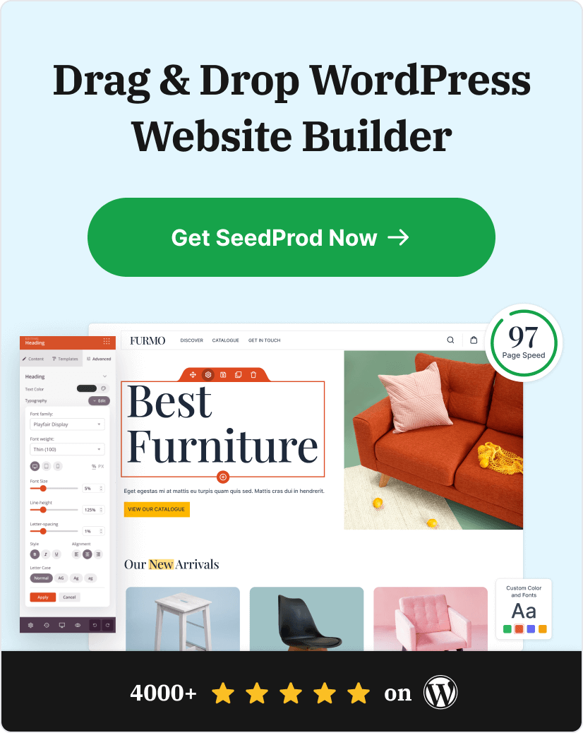
The easiest way to create any type of landing page in WordPress is with a landing page builder. Allow us to introduce SeedProd, the best WordPress page builder plugin.

SeedProd comes with hundreds of pre-made landing page templates and a visual drag-and-drop editor that makes building any WordPress layout a breeze. It offers countless WordPress blocks for adding the page elements you need, including:
- CTA buttons
- Testimonials
- Countdown timers
- FAQs
- Video embeds
- Pricing tables
- WooCommerce products
- Add-to-Cart buttons
- And much more
You can also use it to create a custom WordPress theme from scratch; no coding required.
This powerful page builder integrates seamlessly with popular email marketing services, WordPress themes, and other WordPress plugins. It also adapts effortlessly to different mobile devices for the ultimate user experience.
Follow this step-by-step guide to create a landing page in WordPress for your social media campaigns.
There you have it!
We hope this article has helped you find the best social media landing page examples for future digital marketing campaigns.
Ready to create a successful social media landing page design?
Frequently Asked Questions
Still have questions about building or using social media landing pages? Here are some quick answers:
Final Thoughts on Social Media Landing Pages
Social media landing pages give you a better way to turn clicks into real results. Instead of sending visitors to a homepage that tries to do everything, these focused pages guide them to take one clear action — like signing up, buying, or learning more.
The best examples all follow the same pattern: strong visuals, clear copy, a single goal, and trust signals like testimonials or badges.
If you’re running ads or sharing links on Instagram, Facebook, Pinterest, or Twitter, a well-designed landing page can make a big difference.
And with a tool like SeedProd, you don’t need a developer to build one. You can choose a template, drag and drop the content blocks you need, and launch in minutes.
Ready to create your own high-converting landing page? Let’s get started.
If you’re interested in more social media management tips, check out these other guides:
- How to Add Custom WordPress Social Media Icons to Your Website (2 Ways)
- 9+ Social Media Lead Generation Strategies You Need to Try
- How to Pick a Random Winner for Social Media Contests
Thanks for reading! We’d love to hear your thoughts, so please feel free to join the conversation on YouTube, X and Facebook for more helpful advice and content to grow your business.