Looking for real estate landing page examples that actually convert? The right landing page can help you capture more leads, book showings, and close deals faster.
In real estate marketing, getting a prospect’s contact details is key. But before that happens, you need to grab their attention with a page built to match their needs.
In this article, I’ll share the best real estate landing page examples you can use for inspiration, plus practical tips for creating your own high-converting page.
The best real estate landing page examples:
What Is a Real Estate Landing Page?
A real estate landing page is a dedicated web page designed for one goal — turning visitors into leads or clients. Unlike your homepage or property listings, this type of landing page stands alone and is only accessed through ads, emails, or social links.
The purpose is focus: instead of showing everything about your real estate website, the page matches the ad a visitor clicked and guides them toward a single call to action, such as booking a showing, requesting a valuation, or joining your email list.
This makes real estate landing pages the best place to send ad traffic. They remove distractions, stay consistent with your offer, and boost conversions with a clear call to action (CTA).
Why Do You Need a Real Estate Landing Page?
You need a real estate landing page because it captures targeted leads more effectively than a homepage or generic listing. Each page is built around one offer and one call to action, so every visitor knows exactly what step to take next.
Here are the main benefits of using real estate landing pages:
- Direct match with ads: Send traffic from “Florida beach house” ads to a page focused only on Florida beach houses.
- Grow your email list: Add a lead capture form to collect contact info for nurturing campaigns.
- Highlight property details: Showcase high-value features, photos, or virtual tours without distractions.
- Build urgency: Use sneak peeks, time-sensitive offers, or countdowns to drive action.
- Track performance: Unlike listings, landing pages let you measure conversions and see which ads bring in leads.
What Should a Real Estate Landing Page Include?
A high-converting real estate landing page keeps things simple and focused. The goal is to guide visitors toward one clear action.
- Social proof: Add testimonials or reviews to build trust.
- Clear call to action: Tell users exactly what to do next.
- Compelling visuals: Use quality photos, tours, or videos.
- Benefit-driven copy: Explain how the offer helps buyers or sellers.
In real estate marketing, landing pages consistently outperform generic websites. The median conversion rate for landing pages across industries is about 6.6%. Real estate landing pages see slightly lower results, with median form submission rates around 2.1%, but that’s still far better than the 0.6% average for general websites.
Adding video can lift conversions by up to 80%, and listings with video receive up to 403% more inquiries and sell as much as 68% faster.
With those numbers in mind, let’s look at some real estate landing page examples that show exactly how these best practices work in action.
1. YHM Property Solutions
Video Landing Page Example
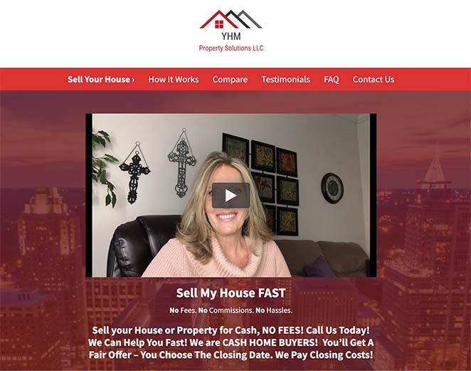
YHM Property Solutions keeps its landing page simple and effective. It works because it builds trust immediately with a welcome video, short copy, and repeated calls to action.
- Video introduction adds personality and credibility
- Short signup form reduces friction for conversions
- Benefit-driven copy explains the offer clearly
- Text and video testimonials reinforce social proof
- CTA form repeated multiple times for higher visibility
This mix of video, testimonials, and simple forms shows how even a straightforward design can capture leads effectively.
You learn how to create a video landing page in this guide.
2. Quick Move
Seller Landing Page Example
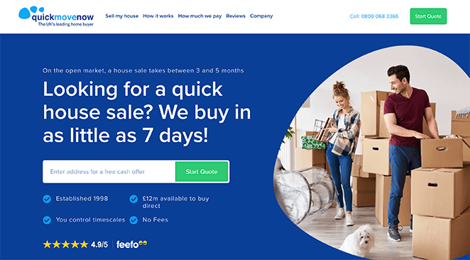
Quick Move offers one of the most striking real estate landing page examples for sellers. It grabs attention with bold branding, a benefit-driven headline, and a streamlined form designed for fast lead capture.
- Bold, seller-focused headline addresses pain points
- Short, skimmable copy that’s easy to read
- Relevant images that create trust and context
- Star ratings and testimonials to boost credibility
- Minimal form fields to encourage conversions
- Contrasting CTA button color for visibility
The combination of clear messaging and social proof makes this page both professional and persuasive, showing how design and trust signals can work together to drive leads.
3. Agent Home Values
Minimal Landing Page Example
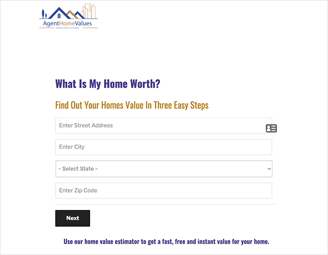
Agent Home Values proves that sometimes less is more. This lead generation landing page strips away distractions and focuses only on the essential action: entering your address for a free valuation.
- Clean, minimal design with no extra clutter
- Simple 3-step process lowers friction for users
- Primary CTA button (“Next”) makes the next step obvious
- Logo placement reinforces brand trust
This approach shows how a straightforward design can remove barriers to entry, though adding testimonials or images could make it feel more professional and trustworthy.
4. Property Wealth System
Webinar Landing Page Example

Property Wealth System uses its landing page to promote a real estate webinar, following many landing page best practices. The design is persuasive and drives registrations through urgency and clear value.
- Strong headline and benefit-driven subhead
- Webinar features presented in short, scannable bullets
- Countdown timer creates urgency to sign up
- Customer reviews and testimonials add credibility
- Bold CTA button stands out on the page
- FAQ section answers common objections
This page shows how combining urgency with trust signals can dramatically increase sign-ups, making it an excellent template for real estate events or training sessions.
5. Agent Pronto
Agent Matching Landing Page Example
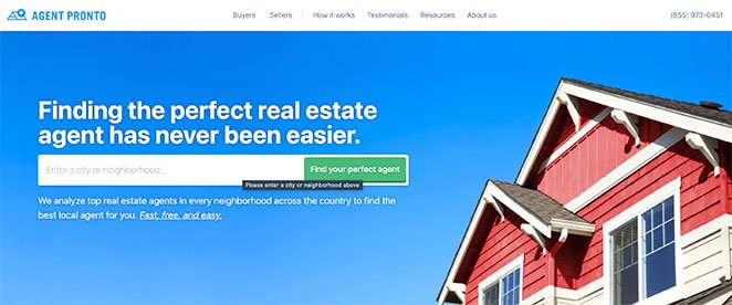
Agent Pronto’s page is a great example of an interactive landing page built around a single goal: helping visitors find the right agent. It combines a clean design with repeated calls to action for maximum conversions.
- Clear headline promises to connect users with the perfect agent
- Search box doubles as the primary CTA
- Short service overview builds trust without clutter
- Customer testimonials highlight successful matches
- CTA repeated at the bottom for an extra conversion opportunity
This shows how keeping the journey simple and repeating your main call to action can make a landing page feel both user-friendly and persuasive.
6. Real Estate Investar
Ebook Landing Page Example

Real Estate Investar uses a simple but effective ebook landing page to generate leads. The design removes distractions and focuses only on what matters: convincing users to download the guide.
- Headline clearly explains the ebook’s value
- Supporting subtext adds more detail without clutter
- High-quality ebook image provides a tangible preview
- Bulleted feature list makes the content easy to skim
- Short signup form collects only essential details
This example shows how a no-frills design can still drive results when the offer is clear, the copy is concise, and the form feels quick to complete.
7. The Kingdom Real Estate
Training Landing Page Example

The Kingdom Real Estate takes a different approach with its real estate landing page, offering two distinct calls to action that still lead to the same goal: signing up for training. It shows how you can bend the “one CTA rule” if both options point to the same outcome.
- Two CTAs (“Join Training” or “Speak to Someone”) lead to the same goal
- Genuine testimonials from real conversations build trust
- Yellow and black color scheme makes the page instantly recognizable
- Simple layout avoids overwhelming visitors with too much info
This page is a great reminder that consistency and credibility matter most — if both paths lead to conversion, offering more than one CTA can still work.
8. Capital Concept Group
Step-by-Step Landing Page Example
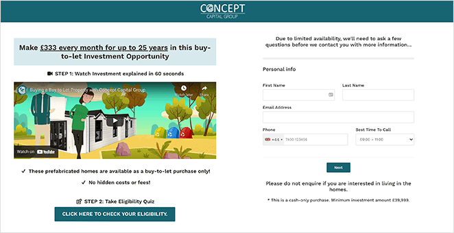
Capital Concept Group’s landing page stands out because it guides users through a step-by-step process. Instead of overwhelming visitors, it breaks the journey into clear actions that lead naturally toward conversion. This approach follows many landing page best practices.
- Explainer video immediately grabs attention
- Step-by-step instructions show users what to do next
- Short form keeps data entry simple
- Concise, actionable paragraphs make scrolling easy
This page shows how hand-holding can be effective — by guiding users with clear steps, it removes uncertainty and builds confidence to convert.
9. Habitat Sales Page
SeedProd Template Example
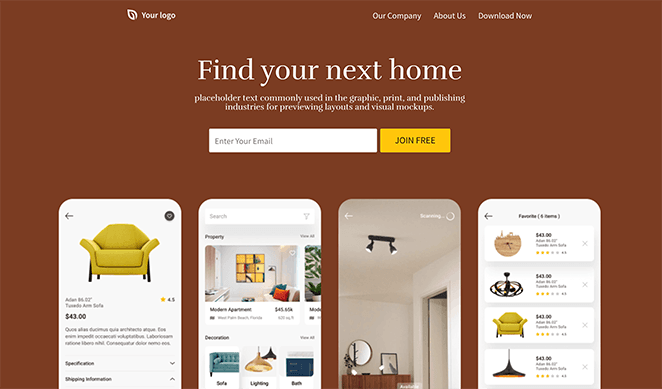
The Habitat template is a ready-to-use design built in SeedProd. It’s ideal for real estate professionals who want a polished look without starting from scratch.
- Opt-in form to collect emails directly on the page
- High-quality imagery to showcase homes or services
- Testimonial section for building credibility
- Social profile buttons for connecting with prospects
This template shows how you can launch a professional real estate landing page in minutes while keeping all the key conversion elements in place.
10. Real Estate Sales Page
SeedProd Template Example
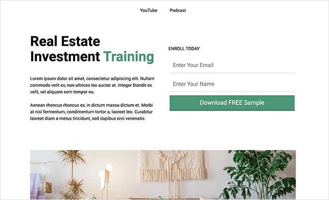
The Real Estate Sales Page template is designed for promoting services, training, or coaching. Built with SeedProd templates, it combines a strong hero section with customizable content blocks.
- Bold headline and supporting subtext to hook visitors
- Short signup form for quick lead capture
- Customizable info boxes and bullet lists for details
- Strong CTA button placed above and below the fold
This template is flexible enough for agencies, consultants, or real estate educators who want to drive sign-ups without custom coding.
11. Real Estate Squeeze Page (SP)
SeedProd Template Example
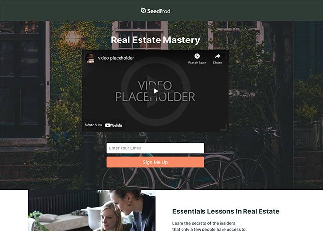
The Real Estate Squeeze Page is perfect for ebooks, courses, or special offers. As a squeeze page template, it’s focused on one thing: collecting leads fast.
- Video hero section to grab attention instantly
- Signup form placed directly below the video
- Bullet list for highlighting benefits or features
- Second CTA further down the page for reinforcement
This template shows how keeping the design minimal and lead-focused can quickly grow your email list or generate interest in a real estate offer.
How to Create a Real Estate Landing Page
After looking at the examples above, you might be wondering how to make a real estate landing page for your website. If you’re a WordPress website owner, we have the ideal landing page solution.
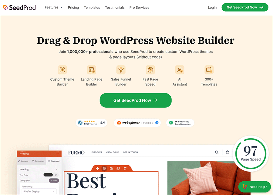
SeedProd is the best WordPress page builder with drag-and-drop functionality. It helps you create any type of landing page in WordPress without writing a single line of code.
With hundreds of responsive landing page templates, you can create a real estate landing page in less than 30 minutes. And the live visual editor allows you to customize your design without help from a developer.
SeedProd offers tons of lead-generation tools to increase landing page conversions. You can also integrate with popular email marketing tools and make your page work with any WordPress theme.
Best of all, SeedProd is fast and bloat-free, so your design will always load fast, offering the best experience for your target audience.
Follow this guide to learn how to create a landing page in WordPress with seedProd.
FAQs About Real Estate Landing Pages
That’s it for our roundup of real estate landing page examples. Use these designs as inspiration to create pages that capture more leads, book showings, and close deals faster.
For next steps, check out this guide on adding testimonials to WordPress to boost social proof, or explore the best real estate WordPress themes to build a full-featured property website.
Thanks for reading. Please follow us on Twitter, Facebook, and YouTube for more helpful content to grow your business.

