EN BREF
Une page de destination ne fait qu'une chose : elle échange une offre précieuse contre une adresse e-mail. Ces 21 exemples montrent à quoi ressemble une conception à fort taux de conversion dans des secteurs réels.
- Page de destination – Une page Web ciblée qui collecte des adresses e-mail en offrant quelque chose de précieux en échange, sans navigation ni distractions.
- Indicateur de conversion – Les pages de destination bien optimisées convertissent entre 12 % et 27 %, ce qui est 3 à 5 fois supérieur aux pages de destination standard.
- Ce qui distingue les meilleures – Une offre claire, un seul champ de formulaire, aucun lien de navigation et au moins un signal de confiance (témoignage, logo ou nombre d'abonnés).
- Quand en utiliser une – La création de listes d'e-mails, le lancement de produits, les inscriptions à des webinaires et la livraison de lead magnets bénéficient tous d'une page de destination dédiée.
- Comment en créer une – L'outil de création par glisser-déposer de SeedProd vous permet de lancer une page de destination professionnelle dans WordPress sans écrire de code.
Les pages de destination sont de courtes pages Web conçues pour capturer des e-mails ou d'autres coordonnées en échange de quelque chose de précieux comme un ebook, un essai gratuit ou un webinaire. Elles utilisent une conception ciblée, des distractions minimales et des appels à l'action clairs pour transformer les visiteurs en abonnés.
D'après mon expérience dans la création de pages de destination, les meilleures pages de destination restent simples et axées sur les avantages. Dans ce guide, je partagerai des exemples concrets qui convertissent bien et j'expliquerai ce qui les rend efficaces, afin que vous puissiez appliquer les mêmes principes à votre propre site.
Comment j'ai choisi ces exemples
J'écris sur WordPress et je teste des conceptions de pages de destination depuis plus de 15 ans. Chaque exemple de cette liste répondait à quatre critères.
- Les fondamentaux de la conversion d'abord. Chaque page ici utilise au moins trois principes de base : un titre axé sur les avantages, des champs de formulaire minimaux et une mise en page sans distraction. Les pages qui étaient belles mais négligeaient les bases n'ont pas été retenues.
- Variété sectorielle. Votre entreprise immobilière ou votre blog de bien-être ne se soucie pas de la manière dont HubSpot gère la génération de prospects. J'ai tiré des exemples de la santé, de la finance, du divertissement, du coaching et du commerce électronique afin que vous puissiez trouver quelque chose de proche de votre contexte.
- Un mélange de tailles de marques. Netflix et HubSpot montrent ce qui fonctionne auprès d'un public massif. Des opérateurs plus petits comme Turbine et Rated Trips prouvent que vous n'avez pas besoin d'une grande reconnaissance de marque pour convertir.
- Pages réelles et actives. Chaque exemple ici est actuellement actif ou l'a été récemment. Vous pouvez visiter chacun d'eux et étudier la conception vous-même.
Qu'est-ce qu'une page de destination ?
Une page de destination est une page Web simple créée pour collecter les coordonnées d'un visiteur, généralement une adresse e-mail, en échange de quelque chose de précieux comme un cadeau, un guide ou une réduction. Son objectif principal est de développer votre liste d'e-mails en gardant le message court, clair et axé sur un seul appel à l'action.
| Type | Objectif | Champs de formulaire | Distractions |
|---|---|---|---|
| Page Squeeze | Inscription par e-mail | Généralement 1 (e-mail) | Non |
| Page de destination | Varié (achat, enregistrement, etc.) | Plusieurs possibles | Peut inclure la navigation, le pied de page |
Avantages de l'utilisation d'une page de capture
La plupart des entreprises disposant de listes d'e-mails solides les ont créées à l'aide de pages de capture dédiées. Voici l'argument stratégique pour en utiliser une.
- Vous possédez la liste. Les abonnés aux réseaux sociaux disparaissent lorsqu'un algorithme change. Une liste d'e-mails vous appartient, quelles que soient les décisions de la plateforme.
- Seules les personnes intéressées s'inscrivent. Une page à objectif unique filtre les simples visiteurs. Les personnes qui s'inscrivent veulent réellement ce que vous proposez.
- Cela déclenche une séquence automatisée. Une page de capture recueille l'e-mail ; votre fournisseur d'e-mails gère le suivi. La gestion des prospects se fait sans vous.
- Cela réduit la dépendance vis-à-vis des tiers. Si les publicités Facebook deviennent coûteuses ou qu'Instagram réduit sa portée, une liste d'e-mails permet à votre marketing de continuer à fonctionner.
- Vous pouvez tester rapidement les offres. Une page de capture a un seul élément à optimiser : l'offre. Changer le titre ou le lead magnet prend quelques minutes et montre des résultats rapidement.
Qu'est-ce qui rend une page de capture hautement performante ?
Une page de capture hautement performante donne aux visiteurs une raison claire de s'inscrire. Elle supprime les distractions et met en évidence la valeur de rejoindre votre liste en quelques secondes seulement. Voici ce que chaque page de capture efficace inclut :
- Titre axé sur les avantages : Concentrez-vous sur le gain du visiteur, pas sur votre offre.
- Champs de formulaire minimaux : Généralement juste un champ d'e-mail pour réduire les frictions.
- Appel à l'action clair : Utilisez un texte axé sur l'action comme « Obtenir mon guide gratuit ».
- Signaux de confiance : Ajoutez des témoignages, des noms d'experts ou des nombres d'abonnés.
- Conception sans distraction : Pas de navigation ni de liens supplémentaires qui détournent les utilisateurs.
D'après ce que j'ai vu, les pages qui cochent les cinq cases obtiennent des résultats constants par rapport à celles qui se concentrent sur deux ou trois. Les pages de destination les plus performantes atteignent 12 % à 27 %, contre environ 3 % pour une page de destination typique.
Quand utiliser une page de capture ?
Vous n'avez pas besoin d'une page de capture sur chaque partie de votre site, mais il y a des moments où elle peut vraiment faire la différence. Voici quelques situations où son utilisation est judicieuse :
- Avant un lancement : Créez une liste d'attente ou une liste d'anticipation pour un produit, un cours ou un événement que vous êtes sur le point de lancer.
- Lors de l'offre d'une ressource gratuite : Si vous avez créé une checklist, un guide, une réduction ou un modèle, utilisez une page de capture pour collecter des e-mails en échange.
- Dans les bios de réseaux sociaux ou les publicités : Dirigez le trafic d'Instagram, de Facebook ou des publicités payantes vers une page d'inscription sans distraction.
- Pour tester de nouveaux lead magnets : Les pages de capture sont idéales pour tester rapidement quel type d'offre suscite le plus d'inscriptions.
- Dans le cadre d'un entonnoir de vente : Placez une page de capture avant votre page de vente ou votre page de remerciement pour collecter les informations de contact dès le début.
Si vous travaillez à constituer votre liste ou à lancer quelque chose de nouveau, l'ajout d'une page de capture est l'un des moyens les plus simples de commencer à obtenir des résultats.
Les meilleurs exemples de pages de capture
Voici un bref aperçu des 21 exemples, regroupés pour vous aider à trouver ceux qui correspondent le mieux à votre cas d'utilisation.
| # | Marque / Nom | Type d'offre | Idéal pour |
|---|---|---|---|
| 1 | eBook gratuit de marketing | eBook gratuit | Création de listes de contenu et de marketing |
| 2 | HubSpot | Modèle gratuit | Contenu B2B et génération de prospects |
| 3 | Ramsay & White | Guide sectoriel | Finance et services professionnels |
| 4 | Mindful | Guide bien-être | Marques de santé et de bien-être |
| 5 | Sloane’s Media | Guide de voyage | Blogs de voyage et de style de vie |
| 6 | Rated Trips | Ressource PDF | Marques d'hôtellerie et de voyage |
| 7 | Kochava | Guide marketing | Entreprises B2B SaaS et technologiques |
| 8 | ZOE | Guide santé | Marques de bien-être scientifiquement prouvé |
| 9 | Vestd | Guide des affaires | Services professionnels B2B |
| 10 | Turbine | Guide du travail à distance | Outils SaaS et de productivité |
| 11 | Modèle d'inscription | Guide de vente gratuit | Premiers pas dans la création de listes |
| 12 | Netflix | Essai gratuit | Produits d'abonnement et SaaS |
| 13 | Modèle d'entreprise | Conseils de croissance d'entreprise | Entreprises de services et coachs |
| 14 | Cours par e-mail sur l'immobilier | Cours par e-mail gratuit | Immobilier et éducation en ligne |
| 15 | Inscription au webinaire | Inscription au webinaire | Promotion d'événements et de webinaires |
| 16 | Aperçu | Chapitre de livre gratuit | Auteurs et créateurs de cours |
| 17 | Exemple d'urgence | Guide de cours gratuit | Créateurs de cours avec des audiences réceptives |
| 18 | Squeeze vidéo | Accès gratuit au cours | Éducateurs en ligne |
| 19 | Page de coaching | Conseils de coaching quotidiens | Coachs et consultants |
| 20 | Page du podcast | Podcast + Inscription par e-mail | Podcasteurs et marques médiatiques |
| 21 | Black Friday | Accès anticipé aux offres | Ventes flash e-commerce |
Plongeons maintenant dans quelques-uns des meilleurs exemples de pages de capture que vous pouvez utiliser sur votre propre site Web.
- 1. eBook gratuit sur les astuces marketing
- 2. Modèle gratuit de plan marketing
- 3. Guide du financement transitoire
- 4. Guide sur la façon de méditer
- 5. Guide instantané gratuit
- 6. Guide des meilleurs spas du Royaume-Uni
- 7. Guide du marketeur pour SKAdNetwork
- 8. Guide gratuit sur la santé intestinale
- 9. Guide des meilleurs régimes d'actionnariat
- 10. Votre bureau dans un sac à dos
- 11. Modèle de page de capture d'inscription
- 12. Service de streaming d'essai gratuit
- 13. Modèle de page de capture e-commerce
- 14. Page de capture immobilière
- 15. Page de capture d'inscription à un webinaire
- 16. Page de capture d'aperçu
- 17. Exemple de page de capture d'urgence
- 18. Page de capture vidéo engageante
- 19. Page de capture de coaching
- 20. Page de capture de podcast
- 21. Page de capture Black Friday
- Comment créer une page de capture dans WordPress ?
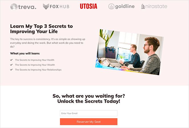
1. eBook gratuit sur les astuces marketing
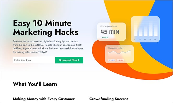
Cet exemple de page de capture propose un eBook gratuit sur les astuces marketing. Il utilise un titre audacieux, un seul champ de formulaire d'e-mail et une preuve sociale avec des noms d'experts et des témoignages de lecteurs pour établir la confiance et encourager les inscriptions. La mise en page est plus longue que la moyenne mais reste axée sur la valeur du guide gratuit.
Les visiteurs n'ont qu'à entrer leur adresse e-mail pour obtenir le téléchargement, ce qui en fait un exemple clair d'un aimant à prospects performant en action.
| Type d’offre : eBook gratuit |
| Note de conversion : B+ |
| Pourquoi ça fonctionne : 🔹 Titre axé sur les avantages, utilisant « facile » et « astuces » 🔹 Crédibilité grâce aux noms d’experts et aux témoignages 🔹 Formulaire d’inscription minimaliste à un seul champ 🔹 Conception visuelle cohérente renforce la confiance |
| Moyens de l’améliorer : 🔹 Ajouter un titre plus spécifique, axé sur les résultats 🔹 Inclure une petite image de la couverture de l’eBook 🔹 Augmenter l’espace blanc pour la lisibilité |
Verdict : Idéal pour les créateurs de contenu et les spécialistes du marketing qui créent une liste autour d’un sujet spécifique. L’approche par preuve sociale fonctionne bien lorsque vous n’avez pas une marque bien connue sur laquelle vous appuyer.
2. Modèle gratuit de plan marketing
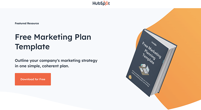
La page de capture de HubSpot pour son modèle de plan marketing gratuit présente une mise en page épurée et directe avec un titre clair et un formulaire d’inscription court. La conception met l’accent sur la simplicité et la faible friction, aidant les utilisateurs à comprendre l’offre instantanément et à terminer l’inscription sans distractions.
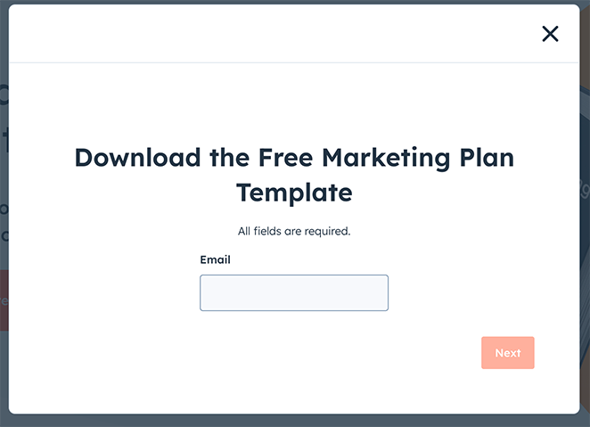
| Type d’offre : Modèle marketing gratuit |
| Note de conversion : A |
| Pourquoi ça fonctionne : 🔹 Le titre met en avant « gratuit » et « modèle » 🔹 Le formulaire court réduit les obstacles à l’inscription 🔹 Texte simple et axé sur les avantages 🔹 Appel à l’action clair et axé sur l’action |
| Moyens de l’améliorer : 🔹 Ajouter une image d’aperçu du modèle 🔹 Inclure un court témoignage pour la confiance 🔹 Proposer une case à cocher facultative pour l’inscription à la newsletter |
Verdict : Idéal pour les spécialistes du marketing qui souhaitent un modèle épuré et sans friction à étudier et à adapter. La retenue de HubSpot ici est intentionnelle, et elle porte ses fruits en termes de simplicité de conversion.
3. Guide du financement transitoire
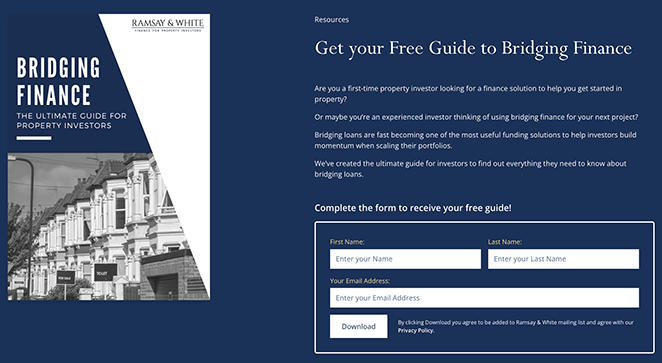
Ramsay & White utilise cette page pour proposer un guide d’une apparence professionnelle sur le financement relais. La conception inspire confiance et le formulaire minimaliste maintient une faible barrière à l’entrée. C’est un bon choix pour les services financiers et les experts du secteur.
| Type d’offre : Guide sectoriel |
| Note de conversion : A- |
| Pourquoi ça fonctionne : 🔹 Titre clair qui explique le but du guide 🔹 Visuels de haute qualité renforcent la crédibilité 🔹 Formulaire minimaliste rend l’inscription facile 🔹 Éléments de confiance mettant en avant l’expertise |
| Moyens de l’améliorer : 🔹 Utiliser une image plus pertinente liée au financement relais 🔹 Ajouter un témoignage ou un badge de confiance 🔹 Simplifier le formulaire en commençant par l’e-mail uniquement |
Verdict : Idéal pour les professionnels de la finance et les entreprises de services B2B qui ont besoin de gagner rapidement la confiance. La conception conservatrice renforce la crédibilité sans paraître fade.
4. Guide sur la façon de méditer
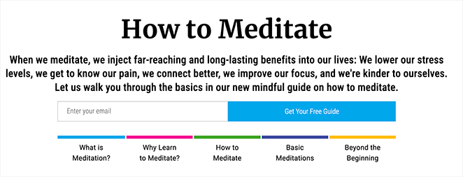
Cette conception apaisante de Mindful correspond parfaitement à son message. Les images sont relaxantes, le formulaire est court et le titre est clair. C’est un excellent choix pour les sujets liés au bien-être où le ton et la confiance sont importants.
| Type d’offre : Guide bien-être |
| Note de conversion : A |
| Pourquoi ça fonctionne : 🔹 Titre clair et axé sur les avantages 🔹 Images apaisantes adaptées au thème de la méditation 🔹 Formulaire d’inscription simple et à faible friction 🔹 Confiance grâce aux témoignages et à la cohérence de la conception |
| Comment l'améliorer : 🔹 Ajouter plus de témoignages d'utilisateurs 🔹 Utiliser une animation subtile ou un effet de survol sur le bouton CTA 🔹 Envisager une brève présentation de l'auteur pour plus de connexion |
Verdict : Idéal pour les marques de santé, de bien-être ou de pleine conscience. Lorsque la conception de la page correspond au ton émotionnel du sujet, les visiteurs font confiance à l'offre avant même d'avoir lu un seul point.
5. Guide instantané gratuit
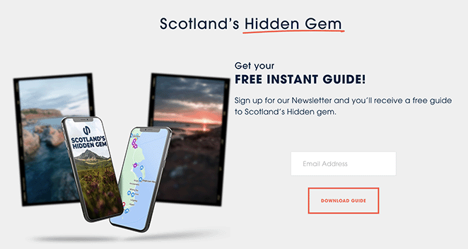
Cette page de Sloane’s Media promeut un guide de voyage gratuit avec une mise en page épurée et une inscription rapide. La valeur est claire dès le départ, mais une image plus pittoresque pourrait aider à faire correspondre le visuel au sujet.
| Type d'offre : Guide de voyage |
| Note de conversion : B |
| Pourquoi ça marche : 🔹 Le titre promet une valeur instantanée et gratuite 🔹 Le texte axé sur les avantages indique aux utilisateurs ce qu'ils vont gagner 🔹 Formulaire d'inscription simple avec juste un champ e-mail 🔹 Le bouton CTA est clair et orienté vers l'action |
| Comment l'améliorer : 🔹 Utiliser une image plus pittoresque pour refléter le sujet du voyage 🔹 Rendre la description plus vivante et sensorielle 🔹 Ajouter une citation ou une statistique pour renforcer la crédibilité |
Verdict : Idéal pour les blogueurs de voyage ou les sites de contenu de niche testant un nouveau lead magnet. La structure principale est solide, mais des visuels plus percutants combleraient l'écart entre bien et excellent.
6. Guide des meilleurs spas du Royaume-Uni
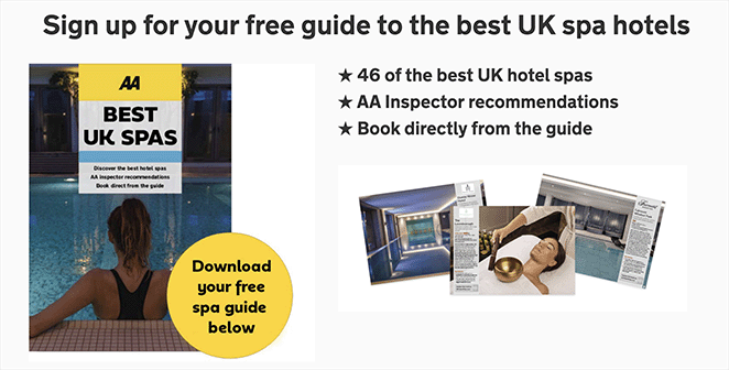
Rated Trips utilise cette page pour partager un guide de spa organisé avec un minimum de distractions. Les visuels luxueux sont le point fort, mais déplacer le formulaire au-dessus de la ligne de flottaison pourrait faciliter encore plus les conversions.
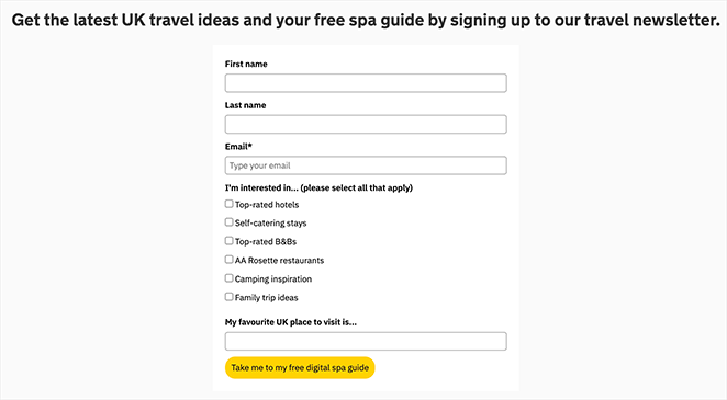
| Type d'offre : Guide de ressources PDF |
| Note de conversion : B+ |
| Pourquoi ça marche : 🔹 Titre clair et attrayant 🔹 L'imagerie de spa de haute qualité améliore l'attrait visuel 🔹 Les champs de formulaire minimaux réduisent les frictions 🔹 Preuve sociale grâce aux logos et à la reconnaissance de la marque |
| Comment l'améliorer : 🔹 Déplacer le formulaire au-dessus de la ligne de flottaison 🔹 Inclure un témoignage ou un extrait du guide 🔹 Ajouter de l'urgence avec un langage de durée limitée |
Verdict : Idéal pour les marques d'hôtellerie, de voyage ou de style de vie disposant d'atouts photographiques solides. L'imagerie de luxe fait un réel travail de conversion ici, mais un formulaire sous la ligne de flottaison signifie que vous comptez sur les visiteurs qui font défiler pour convertir.
7. Guide du marketeur pour SKAdNetwork
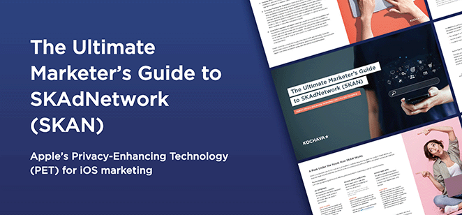
Cette page de Kochava propose un guide détaillé pour les spécialistes du marketing naviguant dans SKAdNetwork. La conception est soignée et professionnelle, avec un titre direct et un formulaire qui ne complique pas les choses.
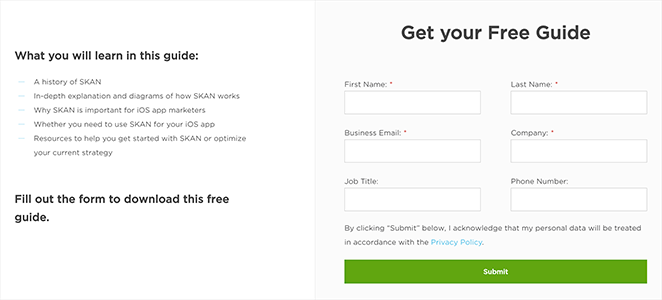
| Type d'offre : Guide de l'industrie du marketing |
| Note de conversion : A- |
| Pourquoi ça marche : 🔹 Le titre est direct et axé sur la valeur 🔹 La conception professionnelle renforce la confiance 🔹 Le formulaire est court et facile à remplir 🔹 Le bouton CTA utilise un langage clair et basé sur l'action |
| Comment l'améliorer : 🔹 Rendre le titre plus axé sur les avantages 🔹 Ajouter un court aperçu ou une table des matières du guide 🔹 Inclure un témoignage ou une statistique pour créer un sentiment d'urgence |
Verdict : Idéal pour les entreprises B2B SaaS et technologiques ciblant des publics informés et techniques. La conception professionnelle renforce la crédibilité sans submerger de détails.
8. Guide gratuit sur la santé intestinale
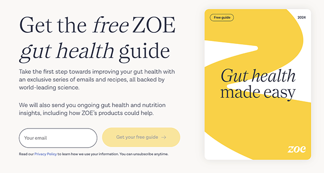
ZOE maintient cette page propre et informative, avec des visuels liés à la santé intestinale et un formulaire d'inscription facile. Elle est soutenue par une autorité scientifique, ce qui ajoute du poids à l'offre.
| Type d'offre : Guide Santé & Bien-être |
| Note de conversion : A |
| Pourquoi ça marche : 🔹 Le titre clair explique exactement ce que les utilisateurs obtiendront 🔹 L'imagerie pertinente se connecte visuellement au sujet 🔹 Le formulaire d'inscription simple encourage les inscriptions 🔹 La crédibilité scientifique et la marque renforcent la confiance |
| Moyens de l'améliorer : 🔹 Ajouter une courte vidéo ou une citation d'expert 🔹 Utiliser une statistique ou un témoignage pour renforcer la preuve sociale 🔹 Mettre en évidence le contenu du guide en 1-2 points |
Verdict : Idéal pour les marques de santé axées sur la science qui ont besoin de convertir des visiteurs sceptiques. ZOE gagne la confiance avant de demander l'e-mail, ce qui est le bon ordre.
9. Guide des meilleurs régimes d'actionnariat
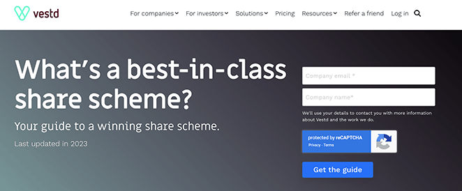
Vestd cible les propriétaires d'entreprise avec cette offre, en utilisant un design soigné et des aimants à prospects pour renforcer la crédibilité. Une courte vidéo explicative ou des logos de clients l'amélioreraient encore.
| Type d'offre : Guide de stratégie commerciale |
| Note de conversion : A- |
| Pourquoi ça marche : 🔹 Titre clair avec une forte promesse de valeur 🔹 Visuels et mise en page professionnels créent de l'autorité 🔹 Conception de formulaire minimaliste réduit la friction 🔹 Preuve sociale via des témoignages et des badges de confiance |
| Moyens de l'améliorer : 🔹 Ajouter des logos d'entreprises qui utilisent le service 🔹 Inclure une courte vidéo explicative pour les points clés 🔹 Utiliser un CTA plus spécifique lié aux résultats commerciaux |
Verdict : Idéal pour les cabinets de services professionnels et les consultants ayant une offre complexe à expliquer. La mise en page épurée permet au titre et aux éléments de confiance de faire le gros du travail.
10. Votre bureau dans un sac à dos
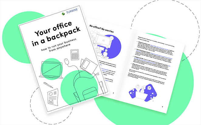
Turbine propose un guide intelligent pour rationaliser votre espace de travail mobile. Le design est épuré et va droit au but, avec des visuels qui aident les utilisateurs à imaginer ce qu'ils obtiennent avant de s'inscrire.
| Type d'offre : Guide de configuration du travail à distance |
| Note de conversion : B+ |
| Pourquoi ça marche : 🔹 Le titre clair communique le bénéfice instantanément 🔹 Les visuels montrent le produit et rendent l'offre tangible 🔹 Le formulaire minimaliste maintient une faible friction d'inscription 🔹 Le bouton CTA se démarque par un fort contraste |
| Moyens de l'améliorer : 🔹 Utiliser un CTA plus convaincant comme « Obtenir mon guide de bureau mobile » 🔹 Ajouter un élément de confiance tel qu'un avis ou un badge 🔹 Envisager d'afficher une liste rapide des avantages sous le formulaire |
Verdict : Idéal pour les entreprises SaaS ou les outils de productivité ciblant les travailleurs à distance. Ajoutez un témoignage client et cette page passe de B+ à A.
11. Modèle de page de capture d'inscription
Cet exemple reste simple : un titre audacieux, un formulaire à un seul champ et une description claire du guide proposé. C'est un rappel que même les modèles de pages de destination de base peuvent bien fonctionner lorsque le message est clair et la valeur évidente.
| Type d'offre : Guide de vente gratuit |
| Note de conversion : B |
| Pourquoi ça marche : 🔹 Le titre accrocheur met en évidence les avantages clairs 🔹 La description définit les attentes pour le contenu 🔹 Le formulaire à champ unique réduit les obstacles à l'inscription 🔹 Le CTA se démarque visuellement sur la page |
| Comment l'améliorer : 🔹 Utiliser une image de fond plus pertinente liée au sujet 🔹 Développer la description avec des points clés spécifiques 🔹 Ajouter un témoignage ou un résultat de quelqu'un qui a utilisé le guide |
Verdict : Idéal pour les débutants qui créent leur première liste ou testent une idée de lead magnet. C'est fonctionnel sans être impressionnant, et parfois c'est exactement ce dont vous avez besoin pour valider une offre avant d'investir dans le design.
12. Service de streaming d'essai gratuit
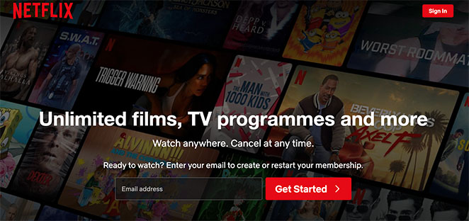
Netflix concentre cette page entièrement sur la création de compte, en utilisant un minimum de texte et une forte reconnaissance de marque. La simplicité fonctionne, mais l'ajout d'urgence ou d'avantages d'essai spécifiques pourrait générer encore plus d'inscriptions.
| Type d'offre : Offre d'essai gratuit |
| Note de conversion : A- |
| Pourquoi ça marche : 🔹 Le titre promeut clairement l'essai gratuit 🔹 La conception minimaliste maintient l'attention sur l'inscription 🔹 Le formulaire ne demande que l'essentiel 🔹 L'autorité de la marque (Netflix) instaure une confiance immédiate |
| Comment l'améliorer : 🔹 Mettre en évidence les avantages spécifiques de l'essai (par ex. sans publicité, contenu exclusif) 🔹 Ajouter un compte à rebours pour augmenter l'urgence 🔹 Inclure quelques logos ou évaluations d'utilisateurs pour la preuve sociale |
Verdict : Idéal pour les produits par abonnement ou les entreprises SaaS ayant une forte reconnaissance de marque. Sans la réputation de Netflix, une page aussi minimale aurait du mal à convertir un trafic froid.
13. Modèle de page de capture e-commerce
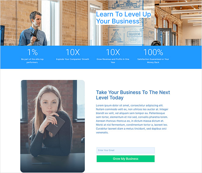
Cet exemple utilise un titre axé sur les chiffres et des images de personnes réelles pour établir rapidement la confiance. C'est une option solide si vous faites la promotion d'un service ou d'un lead magnet lié à la croissance des entreprises. Assurez-vous simplement que les chiffres que vous utilisez sont clairs et crédibles.
| Type d'offre : Conseils pour la croissance des entreprises |
| Note de conversion : B+ |
| Pourquoi ça marche : 🔹 Visuels attrayants avec des personnes pour établir la confiance 🔹 Le titre basé sur des chiffres fait une promesse audacieuse 🔹 Le formulaire court assure des conversions rapides 🔹 Le texte du CTA est clairement lié aux avantages de croissance |
| Comment l'améliorer : 🔹 Ajouter du contexte aux chiffres du titre 🔹 Affiner le CTA pour qu'il soit plus spécifique (« Obtenir mon plan de croissance maintenant ») 🔹 Inclure un bref résumé de ce que le souscripteur recevra |
Verdict : Idéal pour les entreprises de services et les coachs qui peuvent étayer leurs chiffres de titre par un contexte réel. Ajoutez une explication rapide de la métrique et la page convertira beaucoup mieux.
14. Page de capture immobilière
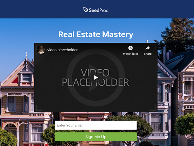
Cette conception, présentée dans notre guide des exemples de pages de destination immobilières, utilise la vidéo et un formulaire court pour promouvoir un cours par e-mail. La mise en page supprime les distractions, de sorte que les visiteurs peuvent se concentrer sur l'offre, et la vidéo rend la présentation plus mémorable.
| Type d'offre : Cours par e-mail gratuit sur l'immobilier |
| Note de conversion : A- |
| Pourquoi ça marche : 🔹 Aucune navigation ne maintient l'attention sur le message 🔹 La vidéo intégrée ajoute de la personnalité et de la clarté 🔹 Le formulaire court encourage des inscriptions rapides 🔹 Un CTA clair indique aux utilisateurs quoi faire |
| Comment l'améliorer : 🔹 Rendez le titre plus axé sur les avantages 🔹 Incluez des témoignages ou des résultats d'anciens participants 🔹 Mettez en avant 1 ou 2 résultats promis par le cours par e-mail |
Verdict : Idéal pour les professionnels de l'immobilier et les créateurs de cours en ligne. La vidéo sur une page de capture ajoute de la personnalité et réduit le fossé de confiance avant l'inscription.
15. Page de capture d'inscription à un webinaire

Cette page est entièrement consacrée à l'inscription. Il n'y a pas de menu, pas de barre latérale, juste un titre audacieux, quelques points clés rapides et plusieurs CTA. Elle pourrait également servir de page de destination pour liste d'attente, selon votre objectif.
| Type d'offre : Inscription gratuite à un webinaire |
| Note de conversion : B+ |
| Pourquoi ça marche : 🔹 Le titre rend le sujet du webinaire parfaitement clair 🔹 Aucune navigation ne maintient l'attention des utilisateurs sur l'inscription 🔹 Les signaux de confiance incluent des logos de clients et des marqueurs de crédibilité 🔹 Une courte liste à puces explique rapidement les avantages |
| Comment l'améliorer : 🔹 Ajoutez une courte vidéo de présentation de l'intervenant pour l'engagement 🔹 Rendez les deux formulaires d'inscription visuellement distincts 🔹 Utilisez un CTA basé sur le temps comme « Réservez ma place maintenant » |
Verdict : Idéal pour les hôtes de webinaires ciblant des audiences froides. La mise en page ciblée fonctionne, bien que la présence de deux formulaires d'inscription distincts sur une seule page crée une friction inutile pour les visiteurs qui souhaitent simplement s'inscrire.
16. Page de capture d'aperçu
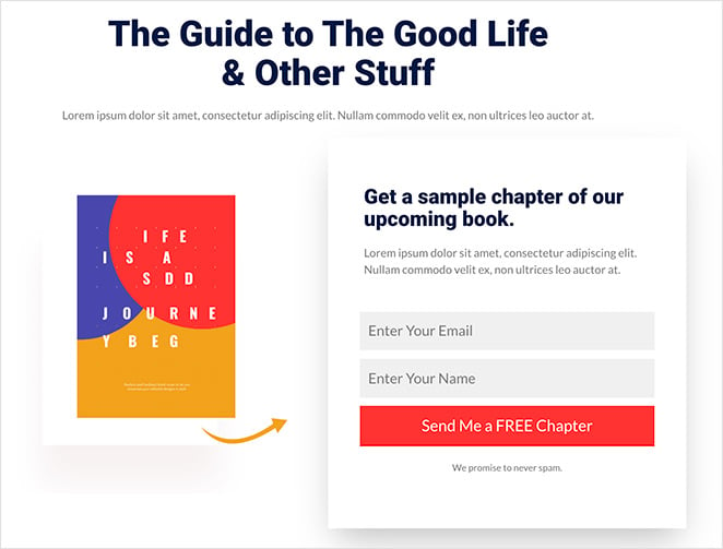
Au lieu d'offrir un ebook complet, cette page propose un chapitre gratuit, comme une mini page de destination d'essai gratuit. La mise en page simple et l'image du produit font un excellent travail pour laisser le contenu parler de lui-même.
| Type d'offre : Chapitre de livre gratuit |
| Note de conversion : B+ |
| Pourquoi ça marche : 🔹 Le titre direct explique l'offre 🔹 L'image du produit rend l'aperçu tangible 🔹 Le formulaire d'inscription court est rapide à remplir 🔹 Le bouton CTA correspond à la marque de la page |
| Comment l'améliorer : 🔹 Ajoutez une brève biographie et une photo de l'auteur 🔹 Utilisez un design de CTA plus accrocheur 🔹 Incluez une citation du chapitre ou d'un premier lecteur |
Verdict : Idéal pour les auteurs, les créateurs de cours et les coachs qui souhaitent qualifier leurs abonnés avec un aperçu de leur contenu avant de leur demander un engagement par e-mail complet.
17. Exemple de page de capture d'urgence
Celle-ci attire l'attention avec le mot « Attendez ! » et un court argumentaire sur un guide gratuit pour les créateurs de cours. C'est rapide, émotionnel et utilise bien l'urgence. Une image plus pertinente pourrait aider à lier visuellement l'offre.
| Type d'offre : Guide gratuit de cours en ligne |
| Note de conversion : A- |
| Pourquoi ça marche : 🔹 Le titre urgent attire l'attention (« Attendez ! ») 🔹 La description concise élimine les hésitations 🔹 Le formulaire simple par e-mail réduit les frictions 🔹 Le texte du CTA émotionnel aide à susciter l'action |
| Comment l'améliorer : 🔹 Utilisez un visuel plus percutant lié au contenu du cours 🔹 Ajoutez des témoignages de personnes ayant trouvé le guide utile 🔹 Supprimez la navigation pour que les utilisateurs restent concentrés |
Verdict : Idéal pour les créateurs de cours et les coachs ciblant des audiences chaudes qui quittent déjà une page. L'accroche « Attendez ! » capte l'attention au moment où les visiteurs sont les plus susceptibles de reconsidérer.
18. Page de capture vidéo engageante
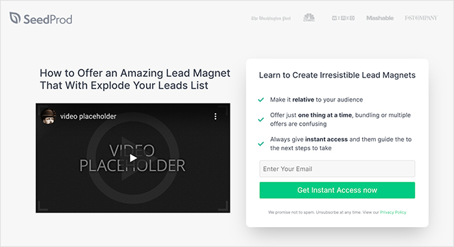
La vidéo fait la majeure partie du travail ici. La mise en page est conçue pour la soutenir, avec un titre fort « Comment » et des puces qui renforcent ce que les utilisateurs obtiendront. Si vous proposez un cours, un aperçu comme celui-ci peut grandement contribuer à établir la confiance et l'intérêt.
| Type d'offre : Accès gratuit à un cours en ligne |
| Note de conversion : A- |
| Pourquoi ça marche : 🔹 Le titre « Comment » promet une valeur claire 🔹 La vidéo renforce l'offre et établit la confiance 🔹 La liste à puces sous le formulaire met en évidence les avantages 🔹 L'appel à l'action promet un accès instantané pour une récompense immédiate |
| Comment l'améliorer : 🔹 Ajoutez des légendes ou des animations à la vidéo 🔹 Incluez un compte à rebours pour créer un sentiment d'urgence 🔹 Envisagez de montrer un aperçu du contenu du cours |
Verdict : Idéal pour les éducateurs en ligne et les créateurs de cours. L'intégration d'une vidéo d'aperçu avant le formulaire montre aux visiteurs ce qu'ils obtiennent, ce qui réduit les hésitations avant qu'ils ne s'inscrivent.
19. Page de capture de coaching
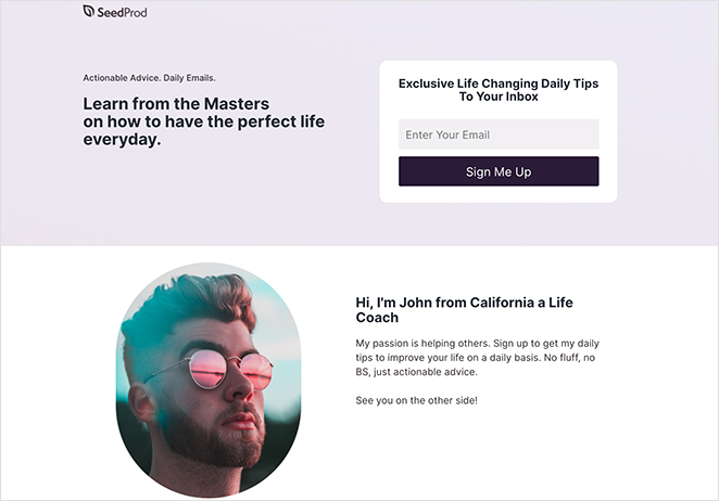
Cette page reste personnelle. Le texte est amical, le formulaire est court et la promesse de conseils quotidiens de la part de grands coachs la rend précieuse. L'ajout d'une citation de client renforcerait encore le message.
| Type d'offre : Conseils de coaching quotidiens |
| Note de conversion : B+ |
| Pourquoi ça marche : 🔹 Le titre promet des conseils d'experts de la part de « maîtres » 🔹 La description explique clairement ce que les abonnés recevront 🔹 L'introduction personnelle ajoute une connexion humaine 🔹 Le formulaire court avec un appel à l'action ciblé facilite l'inscription |
| Comment l'améliorer : 🔹 Ajoutez des témoignages de clients de coaching 🔹 Utilisez l'urgence dans l'appel à l'action (« Places limitées disponibles ») 🔹 Incluez un échantillon de ce à quoi ressemblent les conseils |
Verdict : Idéal pour les coachs et consultants qui souhaitent établir une relation personnelle basée sur la confiance avant de proposer un programme. Le style de texte conversationnel fonctionne bien avec des audiences chaudes.
20. Page de capture de podcast
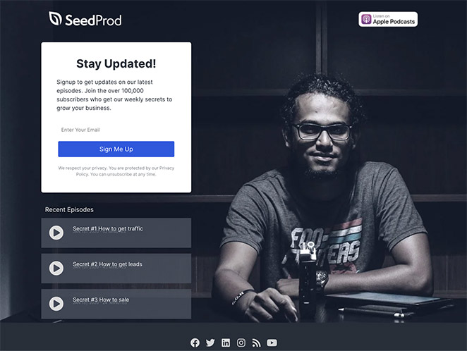
Avec des badges de plateformes de podcast et des épisodes jouables directement sur la page, cette conception permet aux visiteurs d'essayer facilement le contenu avant de s'abonner. Elle est également présentée dans notre sélection d'exemples de pages de destination de podcast.
| Type d'offre : Accès au podcast + Inscription à la liste d'e-mails |
| Note de conversion : A |
| Pourquoi ça marche : 🔹 Les badges de plateforme montrent qu'il est disponible sur les applications populaires 🔹 Les épisodes récents intégrés permettent aux visiteurs d'avoir un aperçu du contenu 🔹 Les boutons sociaux aident à développer votre audience sur différents canaux 🔹 Aucune navigation ne maintient l'attention sur l'abonnement ou l'écoute |
| Comment l'améliorer : 🔹 Ajoutez une bande-annonce ou un montage des meilleurs moments du podcast 🔹 Incluez des avis ou des témoignages d'auditeurs 🔹 Mentionnez la fréquence de sortie des nouveaux épisodes |
Verdict : Idéal pour les podcasteurs qui souhaitent convertir leurs auditeurs en abonnés par e-mail. Permettre aux visiteurs de lire un épisode avant de s'inscrire est un moyen intelligent de prouver la valeur d'abord.
21. Page de capture Black Friday
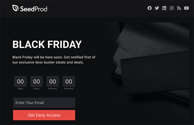
L'urgence est le maître mot ici, du compte à rebours à la mise en page sans sortie. C'est audacieux, percutant et conçu pour collecter rapidement des e-mails avant la fin de la vente. Un aperçu des meilleures offres le rendrait encore plus fort.
| Type d'offre : Accès anticipé aux offres du Black Friday |
| Note de conversion : A- |
| Pourquoi ça marche : 🔹 Aucune navigation ne permet aux visiteurs de se concentrer sur l'offre 🔹 Le titre est simple mais accrocheur 🔹 Une copie urgente et spirituelle pousse à l'action immédiate 🔹 Le compte à rebours renforce la peur de manquer quelque chose (FOMO) |
| Moyens de l'améliorer : 🔹 Montrez un aperçu des meilleures offres pour susciter l'intérêt 🔹 Ajoutez une barre de progression pour gamifier les inscriptions 🔹 Incluez des témoignages ou des preuves sociales si disponibles |
Verdict : Idéal pour les marques de commerce électronique qui organisent des ventes flash ou des promotions saisonnières. Le compte à rebours et la mise en page sans sortie créent une urgence sans paraître manipulateur.
Exemples de pages de destination pour le commerce électronique
Si vous gérez une boutique en ligne, trois exemples de cette liste s'appliquent directement aux contextes du commerce électronique.
- Exemple 21 (Black Friday) utilise un compte à rebours et une mise en page sans sortie pour capturer les e-mails avant une vente flash. C'est le modèle de commerce électronique le plus direct de la liste.
- Exemple 12 (Essai gratuit Netflix) montre comment utiliser un formulaire à champ unique et l'autorité de la marque pour convertir un produit par abonnement. Les marques de commerce électronique peuvent l'adapter pour des offres d'essai ou des lancements de produits en accès anticipé.
- Exemple 13 (Modèle d'entreprise) utilise des titres basés sur des chiffres pour établir rapidement la confiance, une technique qui fonctionne bien pour les campagnes de lancement de produits et les offres promotionnelles.
Une page de destination pour un essai gratuit, une page d'offre en accès anticipé ou une liste d'attente pour le lancement d'un produit sont les trois cas d'utilisation les plus courants dans le commerce électronique. Chacun de ces exemples vous donne un modèle de conception réel à adapter.

« Une page de destination est un appât à clics conçu pour capturer des prospects en demandant les informations des visiteurs :
D'autre part, une page de destination est un outil plus polyvalent qui permet aux créateurs de suivre le nombre de personnes qui l'ont consultée et de mettre à jour le contenu.
Demander aux gens de s'inscrire sur le site Web ou de se connecter avec leurs informations Facebook. »
— Jackie Durbin – KvCORE Coaching
Comment créer une page de capture dans WordPress ?
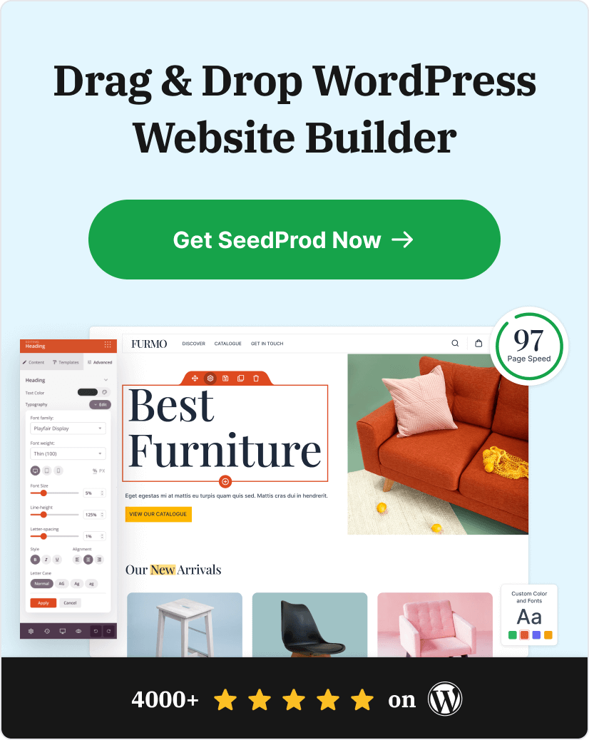
Le moyen le plus rapide de créer une page de destination dans WordPress est d'utiliser un constructeur de sites Web par glisser-déposer comme SeedProd. Il est convivial, vous pouvez donc concevoir une page professionnelle sans codage ni embauche d'un développeur.
Si vous n'avez besoin que d'un formulaire d'inscription de base intégré dans une page existante plutôt qu'une page de destination autonome, un plugin de formulaire comme WPForms peut être plus rapide.

Voici comment créer votre page de destination étape par étape :
- Installer SeedProd – Ajoutez et activez le plugin sur votre site WordPress.
- Choisir un Modèle de page de destination – Choisissez un design pré-fait qui correspond à votre objectif.
- Personnaliser le contenu – Utilisez l'éditeur glisser-déposer pour modifier le texte, les couleurs et les images.
- Ajouter votre formulaire d'opt-in – Incluez un court formulaire d'e-mail pour collecter les inscriptions.
- Connecter votre service d'e-mail – Liez votre fournisseur d'e-mail pour automatiser les entrées des nouveaux abonnés.
- Publier votre page – Prévisualisez et lancez-la en direct sur votre domaine.
Ce processus vous permet de créer rapidement des pages à forte conversion tout en gardant le contrôle total de votre contenu et de votre liste. Pour une présentation complète, consultez ce guide sur Comment créer une page de capture en WordPress.
Cas d'utilisation populaires pour les pages de capture
Les pages de capture sont idéales lorsque votre objectif principal est de développer votre liste d'e-mails ou de générer des prospects avec un minimum de distractions. Voici les moments les plus courants pour en utiliser une :
- Aimants à prospects : Vous proposez un guide gratuit, une checklist ou un e-book ? Une page de capture est parfaite pour demander une inscription rapide avant de permettre le téléchargement.
- Lancements de produits : Créez une liste d'attente avant le lancement en dirigeant le trafic vers une page de capture qui promet un accès anticipé ou des avantages spéciaux.
- Trafic des réseaux sociaux : Utilisez votre bio Instagram, le lien dans la bio de TikTok ou les publicités Facebook pour envoyer les utilisateurs vers une page de capture, pas vers votre page d'accueil.
- Inscriptions aux webinaires : Collectez les inscriptions pour une formation ou un atelier à venir en utilisant un formulaire simple et un titre accrocheur.
- Essais gratuits et aperçus : Permettez aux utilisateurs d'accéder à un chapitre d'échantillon, à un aperçu vidéo ou à un compte d'essai après avoir saisi leur e-mail.
- Ventes flash ou promotions saisonnières : Associez une offre à durée limitée (comme les soldes du Black Friday) à une page de capture sans sortie et à un compte à rebours.
Questions supplémentaires sur les pages de capture
Quelle est la différence entre une page de capture et une page de destination ?
La principale différence entre une page de capture et une page de destination réside dans leur objectif. Une page de capture collecte spécifiquement les e-mails ou les informations de contact des visiteurs, en se concentrant sur la génération de prospects à forte conversion. En revanche, une page de destination est plus large, visant souvent à encourager une action particulière, telle qu'un achat ou le téléchargement de contenu.
Quel est un bon taux de conversion pour une page de capture ?
Un bon taux de conversion pour une page de capture est d'au moins 12 %, ce qui est 3 à 5 fois supérieur au taux de conversion moyen d'une page de destination. Avec une meilleure optimisation, le taux de conversion d'une page de capture peut augmenter à 27 % ou plus.
Quel est un autre nom pour une page de capture ?
Une page de capture est également appelée page de collecte de prospects, page d'opt-in ou page de destination pour la collecte d'e-mails. Ces trois termes décrivent le même format : une page ciblée et sans distraction conçue pour collecter une adresse e-mail en échange d'une offre précieuse. « Page de capture » est le terme le plus courant dans la communauté du marketing numérique et de la création de listes d'e-mails.
À quoi ressemble une page de capture ?
Une page de destination (squeeze page) comporte généralement un titre unique et percutant, une brève description de l’offre et un formulaire court avec un ou deux champs (généralement juste une adresse e-mail). Il n’y a pas de menu de navigation, de liens en pied de page ou de barre latérale. La seule action qu’un visiteur peut entreprendre est de s’inscrire ou de partir. La plupart des exemples de cet article suivent ce format exact.
Comment puis-je intégrer ma page de destination à un logiciel d’e-mailing ?
La plupart des fournisseurs de logiciels d’e-mailing proposent des outils pour vous aider à créer et intégrer des pages de destination. Dans SeedProd, vous pouvez utiliser le bloc de formulaire d’inscription et intégrer votre logiciel d’e-mailing dans l’onglet Connexion.
Ensuite, plus d’inspiration pour les pages de destination
Nous espérons que cet article vous a donné suffisamment d’exemples de pages de destination pour inspirer votre prochaine conception.
Prêt à créer une page de destination à forte conversion sans écrire de code ?
Si vous avez besoin de plus d’inspiration, consultez les exemples de pages de destination suivants :
- Exemples de pages de destination de blog + Comment en créer une
- Meilleurs plugins de pop-up d’abonnement par e-mail
- Exemples de pages de destination sur les réseaux sociaux pour développer votre entreprise
- Exemples de pages de destination de demande de démo qui ont prouvé leur efficacité pour augmenter les prospects
- Exemples de pages de désabonnement efficaces + tutoriel facile
- Meilleurs exemples de pages de destination e-commerce pour générer des ventes
- Bonnes pratiques pour les appels à l’action
Merci de votre lecture ! Nous serions ravis d’entendre vos réflexions, alors n’hésitez pas à participer à la conversation sur YouTube, X et Facebook pour plus de conseils et de contenu utiles pour développer votre entreprise.