When I built my first WordPress site, I made almost every mistake you can think of. I chose the wrong theme, added far too many plugins, and had no idea what a clear layout even looked like.
If you’re just getting started, it’s easy to fall into the same traps. There are so many tools to choose from, and it’s hard to know what actually matters.
The good news is every mistake on this list is easy to fix once you know what to look for. In this post, I’ll walk you through some of the most common beginner mistakes building WordPress sites and show you how to avoid them.
- Why Your Site’s First Impression Counts
- Beginners Mistakes Building WordPress Sites
- 1. Skipping the Layout Plan
- 2. Designing Without a Clear Goal
- 3. Choosing a Complicated or Bloated Theme
- 4. Poor Visual Design Choices
- 5. Confusing Navigation Menus
- 6. Uploading Unoptimized Images
- 7. Neglecting Mobile Design and Device Testing
- 8. Forgetting to Optimize for Speed
- 9. Using Generic or Placeholder Content
- 10. Skipping Accessibility Basics
- 11. Ignoring Lead Generation Basics
- 12. Forgetting to Add Trust Signals
- Frequently Asked Questions
Why Your Site’s First Impression Counts
Your website has a fraction of a second to make a good first impression. In fact, one study found that it takes users just 0.05 seconds to form an opinion about a website’s design and decide whether to stay or leave.
If your site loads slowly or looks confusing, people will leave before they even read a word. Fixing problems after the fact takes way more time than doing things right from the start.
Most of the mistakes in this guide have nothing to do with coding. They’re about how your site looks, how easy it is to use, and if it does what it’s supposed to do. By understanding these early on, you’ll save yourself hours of frustration and end up with a site that feels more polished and professional.
Beginners Mistakes Building WordPress Sites
When you’re building your first WordPress site, it’s easy to get caught up in picking colors, choosing plugins, or trying to make everything look “just right.” But without a solid foundation, even the best-looking sites can fall flat.
Here are the top mistakes I see beginners make and what you can do instead to build a site that’s simple, professional, and actually works.
1. Skipping the Layout Plan
It’s tempting to jump straight into the editor and start dragging things around. But without a layout in mind, your pages can end up cluttered, hard to follow, or missing important elements.
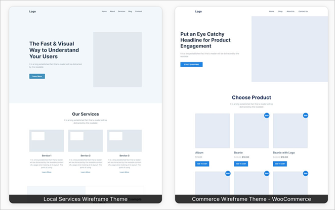
Before you start designing, it helps to sketch out a rough wireframe or jot down a quick outline. Ask yourself: What do I want someone to do on this page? Should they fill out a form, click a button, or read more?
Once you know the goal, it’s much easier to build around it.
I like using SeedProd’s wireframe website templates to quickly test different layouts.
And if you need more ideas on how to set up your theme and design, you can check out how to create a custom WordPress theme without code.
2. Designing Without a Clear Goal
It’s easy to get carried away with colors, images, and fun design elements. I’ve definitely been there. But the truth is, a good-looking page isn’t always a useful one.
Every page on your website should have one clear goal. That might be collecting an email address, getting someone to book a call, or encouraging them to read another blog post.
When there’s no goal, visitors aren’t sure what to do next. They scroll, get a little lost, and leave.
The best way to stay focused is to choose your goal first, then build your page around it. For example, if your goal is email signups, you’ll want to keep the form above the fold and use a strong call-to-action that stands out.
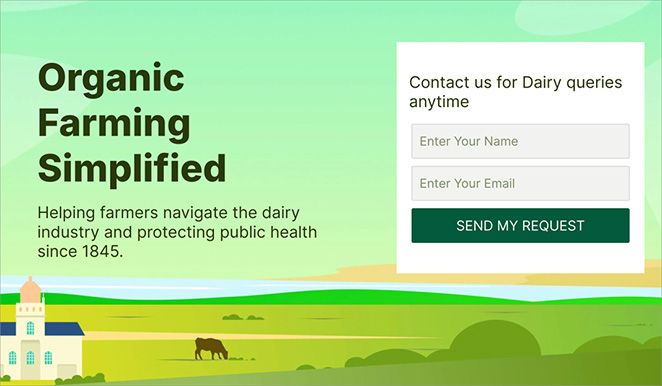
Websites with a contact form above the fold see higher conversion rates, like the 2.5% conversion rate compared to 1% when the form is placed further down the page.
For more help with crafting high-converting pages, check out how to create a landing page that achieves your goals.
3. Choosing a Complicated or Bloated Theme
It’s easy to get drawn in by flashy demo themes with sliders, animations, and built-in features for everything. But these “do-it-all” themes often come with extra code that slows your site down and makes simple edits frustrating.
Lightweight themes are usually a better choice. They load faster, are easier to manage, and give you more control over how your site works. The fewer moving parts you have, the less likely something will break or need troubleshooting.
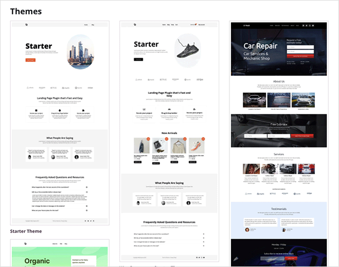
That’s why I prefer using a WordPress page builder with a clean foundation. You can start with what you need and add custom sections without digging through settings.
If you’re looking for some great theme options, see the best WordPress themes for speed and simplicity.
4. Poor Visual Design Choices
When I made my first site, I wanted it to “stand out.” So I used three different fonts, lots of bold colors, and every design trick I could find. It ended up looking more like a flyer for a school talent show than a professional website.
It’s a mistake I see a lot. New site owners try to make things “pop” by adding too many styles or flashy elements. But more often than not, it just creates clutter and makes your site harder to read.
Here’s what works better:
Stick to one or two fonts, choose two base colors with one accent, and give everything plenty of breathing room. Whitespace isn’t empty, it actually helps guide people’s eyes and makes your content easier to digest.
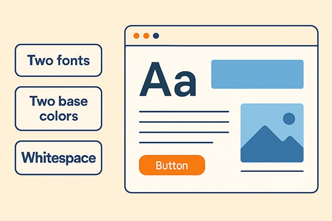
Visual builders like SeedProd often make this easier by offering global style settings. You can set your fonts and colors once, and apply them across the whole site to keep everything consistent.
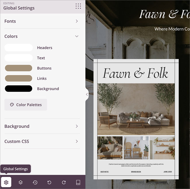
That way, your pages look like they belong together, and visitors can focus on your message instead of a rainbow of design choices.
If you need more content ideas, check out how to write an about us page that fits seamlessly into your design.
5. Confusing Navigation Menus
One of the fastest ways to lose a visitor is to make them think too hard about where to click next. I’ve seen menus with ten or more items crammed into the top bar, each with dropdowns, icons, and clever labels that mean nothing to someone new.
The truth is, your navigation doesn’t need to be clever. It needs to be clear.
Try to limit your top-level menu to five to seven items. Use simple, direct labels like “About,” “Services,” or “Contact.”
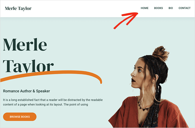
And always think about what someone might be looking for when they land on your site. If it takes more than a few seconds to find it, there’s a good chance they’ll leave.
Your homepage design might grab their attention, but your menu is what helps them take the next step. If people can’t find the content they came for, they’re more likely to give up.
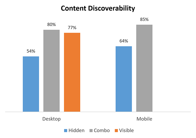
In fact, one study found that websites with hidden navigation menus saw a 20% drop in content discoverability compared to sites with visible or combo-style navigation.
For more help with your menu, see this guide on how to customize the WordPress menu.
6. Uploading Unoptimized Images
This one’s an easy mistake to make. I used to grab images straight from my phone or design tool and upload them without a second thought. The problem? Those files were huge, and my pages took forever to load.
Large image files are one of the biggest reasons WordPress sites slow down. And when your site is slow, people leave.
According to the HTTP Archive, images make up more than 50% of the average page weight.
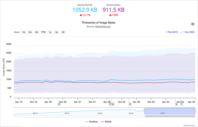
The fix is simple. Before you upload an image, run it through a free tool like TinyPNG or Squoosh. Try to keep images under 200 KB whenever you can, especially for hero sections or blog post graphics.
Clean, lightweight images make your site feel faster and more professional. They’ll help with SEO too.
7. Neglecting Mobile Design and Device Testing
It’s easy to forget about mobile when you’re building on a laptop or desktop. But what looks great on a big screen can fall apart on a phone. Text gets too small, buttons are hard to tap, and layouts shift in strange ways.
Mobile traffic now accounts for more than half of all website visits. So if your site doesn’t work well on a phone, most people won’t stick around long.
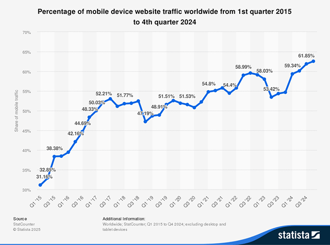
To avoid this, take a mobile-first approach. Design for smaller screens first, then check how things scale up.
Drag-and-drop page builders make this easy by letting you preview and adjust layouts on different devices before you hit publish.
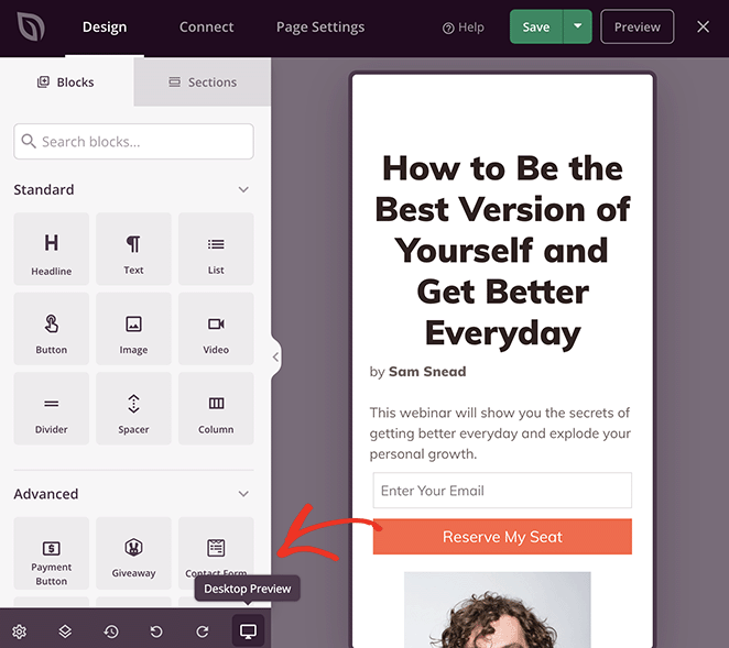
For a more detailed guide on optimizing your landing pages for mobile, check out how to create a mobile-friendly landing page.
8. Forgetting to Optimize for Speed
Speed is one of those things you don’t always notice until it becomes a problem. I’ve clicked on plenty of websites that looked promising, only to back out because the page didn’t load fast enough.
Site speed affects everything. It impacts how long people stay on your site, how well it ranks in search results, and how likely visitors are to take action.
One of the most common issues I see on beginner sites is having too much going on behind the scenes. Too many plugins, oversized images, and bloated themes can all slow things down.
This is one of the reasons I like using SeedProd. It’s lightweight, fast, and doesn’t add a bunch of extra code you don’t need. You can build entire pages or even full themes while keeping your site running smoothly.
Here’s an example of a personal website that I built using SeedProd and it’s Google Page Speed Insights score:
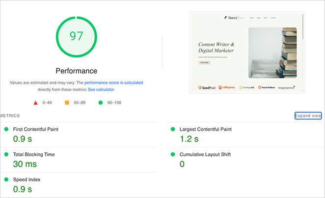
A faster site creates a better experience, builds trust, and gives your visitors a reason to stick around.
9. Using Generic or Placeholder Content
I can’t tell you how many times I’ve visited a site and seen “Lorem ipsum” still sitting on the page. It might seem like a small detail, but placeholder text can make your site feel unfinished and untrustworthy.
Writing content is one of the hardest parts of building a website, so it’s no surprise that people put it off. But even a rough draft is better than nothing. Real words give your site personality, help with SEO, and show visitors that you’re a real business.
Some page builders, including SeedProd, offer built-in AI text tools that can help you get started. It’s a quick way to generate ideas or fill in common sections when you don’t know what to write.
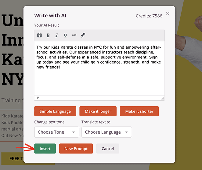
For help getting started, see my guide on how to use AI to write content for your website.
10. Skipping Accessibility Basics
Accessibility can feel like an advanced topic, but it’s something every site should include from the beginning. If your site is hard to read, navigate, or interact with, you could be locking out a big group of people.
Simple things make a big difference. Use readable font sizes, make sure your text has enough contrast against the background, and add alt text to your images so screen readers can describe them.
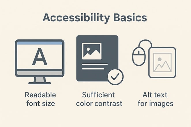
These small changes help more people use your site and improve your SEO too.
11. Ignoring Lead Generation Basics
A lot of new site owners focus on design and content but forget to include a way to stay in touch with visitors. If there’s no signup form or email capture, people might visit once and never come back.
Lead generation might sound like a marketing term, but it’s really just about building relationships. A simple email form on your homepage, landing page, or blog sidebar gives people a way to hear from you again.
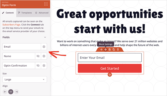
You don’t need anything fancy. A clear headline, a short description, and one field for an email address is enough to get started.
For more on converting visitors, see how to convert website visitors into customers.
12. Forgetting to Add Trust Signals
When someone lands on your website for the first time, they’re asking themselves one big question: can I trust this?
That’s why adding a few simple trust signals is so important. These include things like customer testimonials, star ratings, logos from companies you’ve worked with, or even a quick line that explains how long you’ve been in business.
With SeedProd, you can use the testimonial blocks to highlight reviews from past clients.
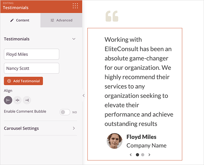
You can also add logos, trust badges, or a brief “About Us” section with your credentials and experience, right on the page you’re building.
These elements will help build credibility and make visitors feel more confident about your website.
Frequently Asked Questions
Build Smarter from the Start
Every mistake on this list is something I’ve either made myself or seen others run into. The good news is you don’t need to get everything perfect on the first try. What matters most is building your site with a clear plan, learning as you go, and focusing on what actually helps your visitors.
Using a drag-and-drop builder like SeedProd has made the whole process easier for me. It removes the guesswork and lets you focus on creating pages that look great and work well without needing to mess with code or hiring developers.
If you’re looking to dive deeper into WordPress and improve your site, check out these helpful guides:
- How to Build a Personal Trainer Website
- How to Create a Real Estate Website in WordPress
- How to Create a Sales Funnel in WordPress
- How to Design a Restaurant Website
- How to Create a Webinar Registration Page
- How to Add Google Analytics to WordPress
Thanks for reading! We’d love to hear your thoughts, so please feel free to join the conversation on YouTube, X and Facebook for more helpful advice and content to grow your business.

