The best law firm website examples all have one thing in common: clarity. They instantly show how the firm can solve a client’s problem, which builds trust and drives more inquiries.
Yet too many legal sites are cluttered or confusing, leaving stressed visitors without clear answers. Your site should do the opposite, making it simple for people to see how you can help and take the next step.
In this guide, I’ll share 7 real attorney websites that get it right and give you a step-by-step plan to create a professional site of your own.
Skip to the law firm website examples:
What Is a Law Firm Website (and Why Your Firm Needs One)
A law firm website is your firm’s digital office. It explains who you are, what you do, and how clients can reach you — available 24/7, even when your office is closed.
The core elements usually include a homepage, practice area pages, attorney bios, and a contact page. Many firms also add blogs, testimonials, or client portals to build trust and answer questions before the first call.
A strong website gives you visibility in search, makes your firm look credible, and brings in new leads. In fact, organic search drives up to 66% of call conversions in the legal industry, proving that people who find you online are ready to take action.
Without a professional site, potential clients may struggle to find you or question whether your firm can meet their needs. In today’s market, that missed opportunity can make a real difference.
My Favorite Attorney Website Examples from Real Law Firms
Looking at real-world designs is the best way to see what works. The following attorney websites all stand out for different reasons, from bold homepages to mobile-friendly layouts, and each one shows how smart design choices can help a firm win more clients.
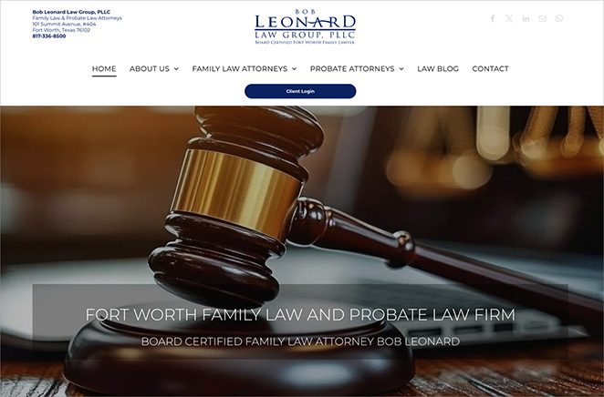
1. Dynamic Homepage Hero: Bob Leonard Law Group
| Website: https://www.bobleonard.com/ |
| Key Feature: Large, impactful hero image with bold tagline |
| Standout Elements: |
| 🔹 High-quality background image 🔹 Clear, memorable tagline 🔹 Professional branding |
| Best For: Firms wanting an instant impact |
This law firm website sets a professional tone from the moment you land on the homepage. The bold hero image grabs attention right away, and the short tagline states the firm’s focus without overwhelming visitors with too much text.
It’s a strong balance between visuals and messaging that builds trust quickly.
To create a similar design, I would use a full-width hero section with a background image or video, then layer a headline and short subheadline that speak directly to the client’s needs.
Making sure the text contrast stays sharp is especially important, since around 2.2 billion people globally experience visual impairments. Good contrast helps ensure the site is easy to read and accessible to as many people as possible, no matter what device they use.
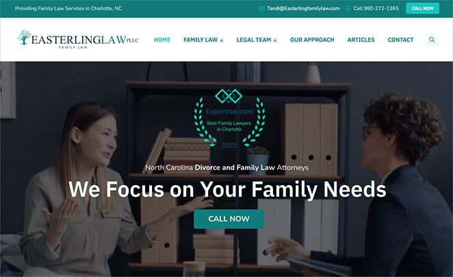
2. Mobile-First Layout: Easterling Family Law
| Website: https://easterlingfamilylaw.com/ |
| Key Feature: Optimized mobile experience with sticky CTA |
| Standout Elements: |
| 🔹 Responsive design 🔹 Large, easy-to-tap buttons 🔹 Sticky bottom call-to-action |
| Best For: Firms targeting mobile search traffic |
This attorney website is designed with mobile users in mind, which is crucial since 53% of legal website visits now occur on mobile devices. The layout is responsive, the buttons are large enough to tap easily, and the sticky call-to-action at the bottom of the screen keeps the next step always visible.
This matters even more in family law, where visitors may be under stress and need a site that is simple to navigate and quick to use.
When building this type of design, I would start with a single-column layout for mobile, use readable font sizes, and test it across different devices. Keeping the call-to-action visible at all times helps make sure no opportunity for contact is missed.
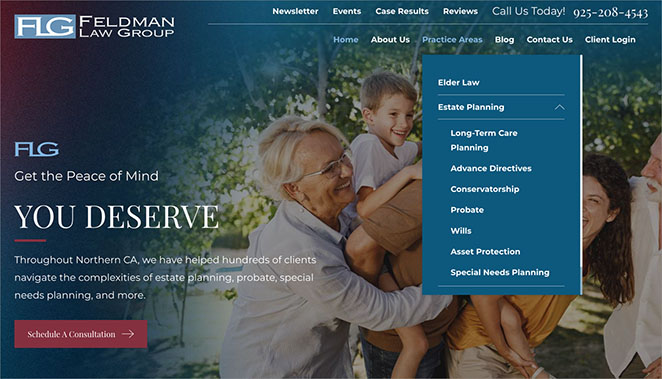
3. Service Landing Pages: Feldman Law Group
| Website: https://www.feldmanlawgroup.com/ |
| Key Feature: Dedicated landing pages for each practice area |
| Standout Elements: |
| 🔹 Service-specific headlines 🔹 Tailored content for each page 🔹 Clear contact options |
| Best For: Firms offering multiple services |
What makes this law firm website effective is the way it organizes content by practice area. Instead of one generic “services” page, each area of law has its own dedicated landing page with a clear headline, tailored copy, and easy contact options.
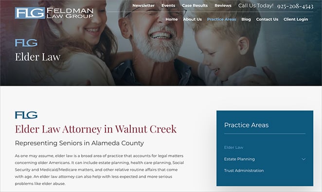
This structure not only helps potential clients quickly find the information they need but also improves Search Engine Optimization (SEO) by targeting specific keywords for each service.
To build something similar, I would create a separate landing page for each service, use practice-specific keywords naturally in the headings, and include testimonials or case studies where relevant.
Linking related services together also helps guide visitors who may need more than one type of support.
Follow my step-by-step guide on how to create a landing page in WordPress to get started.
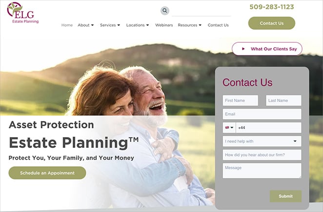
4. Smart Contact Form: ELG Estate Planning
| Website: https://elderlawgroupwa.com/ |
| Key Feature: Simple, conversion-optimized contact form |
| Standout Elements: |
| 🔹 Above-the-fold placement 🔹 Minimal fields 🔹 Friendly intro text |
| Best For: Firms prioritizing quick lead capture |
This law firm website keeps the contact form front and center, making it easy for visitors to get in touch without scrolling. By limiting the form to just a few fields and adding a short, friendly message, the firm reduces friction and encourages more people to reach out.
For attorney websites, a well-placed form can make the difference between a visitor bouncing or converting into a lead. In fact, studies show that removing just one field can boost conversions by nearly 50%.
Keeping things simple is almost always better than overwhelming people with too many questions.
5. Client Portal Intro: Gonzalez & Morales Law Offices
| Website: https://www.gonzalezmorales.com/ |
| Key Feature: Secure client portal with onboarding info |
| Standout Elements: |
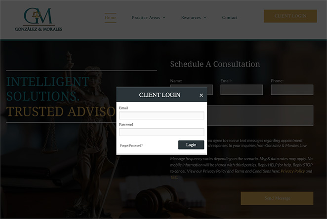
| 🔹 Benefit-focused intro 🔹 Embedded login form 🔹 Walkthrough video |
| Best For: Firms offering digital case management |
This law firm website stands out by offering a secure client portal right from the homepage. The intro explains the benefits clearly, and the popup login form makes it easy for clients to access their case details without hunting through menus.
For firms that manage ongoing client relationships, a portal like this signals professionalism and builds trust. It also saves time by reducing repetitive support requests since clients can find documents and updates themselves.
To build something similar, I would dedicate a page to the portal, add a short overview of its benefits, and embed a simple login widget.
Follow my guide to learn how to create a client login page in WordPress.
6. Award-Winning Clean Design: Bick Law LLP

| Website: https://www.bicklawllp.com/ |
| Key Feature: Minimalist, award-winning layout |
| Standout Elements: |
| 🔹 Ample white space 🔹 Professional photography 🔹 Consistent brand colors and typography |
| Best For: Firms seeking premium, high-trust branding |
This attorney website shows how clean design signals confidence. The layout is simple, the photography is polished, and the brand colors stay consistent across each section. Nothing competes with the core message, which keeps attention on the work and the team.
To create a similar feel, I would start with a minimalist grid, limit the color palette to two or three brand shades, and use professional portraits.
Pair clear headlines with short copy, keep navigation uncluttered, and make sure spacing and typography are consistent from page to page.
7. Content-Rich SEO Homepage: Dolman Law Group

| Website: https://www.dolmanlaw.com/ |
| Key Feature: SEO-optimized homepage with diverse content blocks |
| Standout Elements: |
| 🔹 Clear sectioning for services, results, and FAQs 🔹 Prominent testimonials and reviews 🔹 Natural use of local keywords and internal links |
| Best For: Firms in competitive markets |
This law firm homepage works because it covers what new clients want in one place. It highlights core services, shows proof through reviews and results, and answers common questions with short, scannable sections.
The internal links and local phrasing help search engines understand the practice areas and locations served.
To build a similar attorney website, I would stack clear sections in this order:
- Hero
- Services
- Case results or reviews
- Attorney intro
- FAQs
- Latest resources
- Simple contact block.
I would use location terms naturally in headings, add internal links to practice pages, and keep each section short with one action to take.
Common Design Patterns Across the Best Law Firm Sites
The top law firm websites share the same core patterns. Use this as a quick checklist.
- Professional photos. Real team photos, consistent style, clean backgrounds.
- Clear, visible CTAs. “Call,” “Book a consult,” or “Email us” in the header and at section ends.
- Mobile optimization. Single-column layouts, readable fonts, large tap targets, fast load times.
- Trust signals. Awards, testimonials, reviews, case results (where allowed), and bar affiliations.
- Logical page structure. One H1 per page, descriptive H2s, internal links to practice areas and locations.
How to Build Your Own Law Firm Website
Once you’ve seen what the best attorney websites look like, the next step is building your own. The good news is you don’t need to hire a developer or learn code to get a professional result.
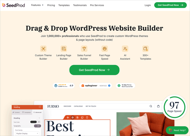
I recommend using SeedProd because it makes the process simple and fast. It’s a drag-and-drop WordPress website builder that lets you create full themes, landing pages, and service pages inside WordPress with a visual editor anyone can use.
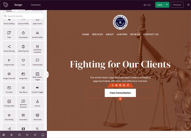
Everything is built in, including templates, contact forms, testimonials, WooCommerce blocks, and even coming soon mode.
In my experience, SeedProd is lighter and easier to manage than other builders I’ve tried. Sites load quickly, work on mobile, and you don’t need a stack of extra plugins to get the features you need.
And if you want to launch even faster, SeedProd AI can generate a complete WordPress site in about 60 seconds based on your business description. From there, you just fine-tune the design with the drag-and-drop editor.
Here’s an example of how I did just that:
For full setup instructions, see our guide on how to create a WordPress website or how to build a WordPress website with AI.
FAQs About Law Firm Websites
Start Building Your Law Firm Website Today
The best law firm websites build trust fast and make it easy for clients to get in touch. Clear design, mobile-friendly pages, and strong calls to action all play a role in winning new business.
You can create the same results without coding. With SeedProd, you can launch a professional site in minutes and customize it for your firm.
You may also find the following guides helpful when building your legal website:
- How to Create a Contact Form in WordPress
- How to Create an About Page in WordPress
- How to Create a Meet The Team Page in WordPress
- How to Add Business Hours to WordPress
Thanks for reading! We’d love to hear your thoughts, so please feel free to join the conversation on YouTube, X and Facebook for more helpful advice and content to grow your business.


