Crear una página de destino SaaS que realmente convierta puede parecer imposible. Ves que otras empresas obtienen miles de registros, pero tu página se queda ahí luciendo bonita mientras los visitantes se van.
He pasado incontables horas estudiando qué separa a las páginas SaaS de alta conversión de las que fracasan. La diferencia no es un diseño elegante ni una copia ingeniosa, sino comprender qué hace que los visitantes hagan clic en "registrar" en lugar de presionar el botón de retroceso.
He recopilado 10 ejemplos de páginas de destino SaaS que están triunfando ahora mismo. Cada una enseña una lección específica que puedes aplicar a tus propias páginas.
¿Qué Hace que una Página de Destino SaaS Convierta?
Crear una página de destino de alta conversión para tu producto SaaS se reduce a unos pocos elementos clave que veo en todas las páginas exitosas.
- Valor claro en 5 segundos o menos. Tus visitantes deben entender qué hace tu software y por qué lo necesitan antes de que piensen en desplazarse. Omite los eslóganes ingeniosos y ve directo al beneficio.
- Muestra tu producto en acción. Las capturas de pantalla, las demostraciones o los vídeos de tu software real funcionan mejor que las fotos de stock o las ilustraciones. La gente quiere ver para qué se está registrando.
- Elimina las preocupaciones obvias de antemano. Aborda el precio, la seguridad y la facilidad de uso antes de entrar en detalles sobre las características. Estas son las preguntas que hacen dudar a la gente.
- Un único paso siguiente claro. Cada elemento de tu página debe guiar a los visitantes hacia tu llamada a la acción principal. Múltiples botones compitiendo solo crean confusión.
- Prueba social que importa. Logotipos de clientes, testimonios reales o estadísticas de uso generan confianza más rápido que las listas de características. Demuestra que otras personas ya aman tu software.
Ahora veamos cómo las empresas SaaS exitosas ponen estos principios en práctica.
10 Mejores Ejemplos de Páginas de Destino SaaS
Los siguientes ejemplos ofrecen una excelente visión general de diseños de páginas de destino efectivos. Veremos cada diseño, exploraremos los diferentes elementos que utilizan y explicaremos por qué funcionan.
De esa manera, puedes usar tácticas similares para el diseño de tu página SaaS.
- Guía en vídeo
- 1. OptinMonster – Simplicidad por Encima del Pliegue
- 2. TrustPulse – Diseño Minimalista con Máximo Impacto
- 3. MonsterInsights – Página de Actualización Enfocada
- 4. WPForms – Página de PPC Impulsada por la Urgencia
- 5. Asana – Experiencia de Demostración Interactiva
- 6. Muzzle – Enfoque de Mostrar, No Contar
- 7. Mouseflow – Estrategia de Comparación con Competidores
- 8. Close CRM – Estrategia de Conversión de Doble Vía
- 9. Helpwise – Estrategia de Posicionamiento Alternativo
- 10. MOZ – Colocación estratégica de vídeos
Guía en vídeo
1. OptinMonster – Simplicidad por Encima del Pliegue

El equipo de OptinMonster creó esta página para dirigirse a usuarios que buscan constructores de formularios de opción a través de campañas de PPC. Lo que hace que este ejemplo sea perfecto para empezar es cómo empaquetan todo lo que un visitante necesita para tomar una decisión en la primera pantalla que ves.
Lo que hacen bien:
- Todo lo que los visitantes necesitan aparece por encima del pliegue (encabezado, descripción, GIF de demostración, CTA)
- El GIF animado muestra el producto funcionando en tiempo real
- Múltiplos botones de llamada a la acción en cada sección
- Sección de prueba social con logotipos de marcas reconocibles y número de usuarios
- Guía visual de 3 pasos elimina la confusión sobre cómo funciona el software

Por qué funciona: Los visitantes pueden decidir en 5 segundos sin desplazarse. El GIF animado demuestra que el software realmente funciona en lugar de solo describirlo. Cada sección termina con una CTA, por lo que capturan a las personas en diferentes etapas del proceso de decisión.

Roba esta idea: Coloca tu propuesta de valor principal, demostración del producto y llamada a la acción por encima del pliegue. Si alguien tiene que desplazarse para entender lo que vendes, ya los has perdido. Usa GIFs o vídeos para mostrar tu software en acción en lugar de capturas de pantalla estáticas.
2. TrustPulse – Diseño Minimalista con Máximo Impacto

Esta página de destino de TrustPulse muestra lo poderosa que puede ser la simplicidad para las conversiones de SaaS. En lugar de abarrotar cada función en la página, se centran en el beneficio principal y dejan que la demostración de su producto hable por sí sola.
Lo que hacen bien:
- Encabezado centrado en el valor que promete un resultado específico
- La descripción incluye números de prueba social directamente en el texto
- Demostración en vivo del software que muestra notificaciones reales en acción
- La sección de preguntas frecuentes estratégica aborda las objeciones comunes
- Botones de llamada a la acción en cada sección sin ser insistentes

Por qué funciona: La demostración en vivo elimina toda la incertidumbre sobre lo que hace el producto. Los visitantes pueden ver las notificaciones reales apareciendo en pantalla, lo cual es mucho más convincente que describir un "software de prueba social". La sección de preguntas frecuentes aborda las dudas antes de que se conviertan en razones para irse.

Roba esta idea: Muestra tu software funcionando en tiempo real en tu página de destino. Si tu producto tiene una salida visual (notificaciones, paneles, informes), demuéstralo en vivo en lugar de usar capturas de pantalla estáticas. Añade una sección de preguntas frecuentes para resolver dudas comunes antes de que los visitantes tengan que preguntar.
¿Necesitas más inspiración? Estos ejemplos de sitios web de negocios tienen algunos diseños excelentes.
3. MonsterInsights – Página de Actualización Enfocada

MonsterInsights creó esta página de actualización específicamente para usuarios existentes de su plan básico. A diferencia de otros ejemplos que necesitan explicar lo que hace el software, esta página se centra completamente en convencer a los usuarios actuales de actualizar con urgencia y beneficios claros.
Lo que hacen bien:
- El encabezado explica inmediatamente el propósito de la página (oferta de actualización)
- El temporizador de cuenta regresiva crea urgencia desde el principio
- Razones centradas en los beneficios para actualizar (no solo listas de características)
- Porcentaje de descuento grande mostrado de forma destacada
- Menú de navegación eliminado para eliminar distracciones
- Solo dos opciones: actualizar o salir de la página
Por qué funciona: Esta página sabe que su audiencia ya entiende el producto, por lo que omite la educación y va directamente a la motivación. El temporizador de cuenta regresiva activa el miedo a perderse algo, mientras que el descuento hace que la actualización parezca una decisión financiera inteligente. Eliminar la navegación mantiene a los usuarios enfocados en el objetivo único.
Roba esta idea: Para usuarios existentes o clientes potenciales interesados, crea páginas dedicadas que omitan lo básico y se centren en los beneficios. Utiliza la urgencia (temporizadores de cuenta atrás, ofertas limitadas) para decidir a la gente. Elimina toda la navegación excepto tu llamada a la acción principal para eliminar rutas de escape.
4. WPForms – Página de PPC impulsada por la urgencia

WPForms diseñó esta página de destino de PPC para convertir a los visitantes que provienen de anuncios de búsqueda de pago. La página capta inmediatamente la atención con un temporizador de cuenta atrás en la parte superior, haciendo que la oferta por tiempo limitado sea imposible de ignorar.
Lo que hacen bien:
- El temporizador de cuenta atrás en la parte superior crea urgencia inmediata
- El titular centrado en los beneficios se enfoca en los resultados, no en las características
- Propuesta de valor clara en la descripción
- La marca reconocible genera confianza con los usuarios de WordPress
- Las características en viñetas son fáciles de escanear rápidamente
- Sin menú de navegación que distraiga del objetivo principal
- Múltiples botones de llamada a la acción en toda la página

Por qué funciona: El temporizador de cuenta atrás golpea a los visitantes con urgencia antes de que lean el titular. Para el tráfico de PPC que ya está motivado a encontrar una solución, esto los impulsa a actuar rápidamente en lugar de comparar opciones. El diseño optimizado mantiene el enfoque en la oferta de descuento.
Roba esta idea: Usa temporizadores de cuenta atrás para ofertas por tiempo limitado, especialmente en páginas de PPC donde la gente está lista para comprar. Coloca el temporizador en la parte superior para que sea lo primero que vean los visitantes. Elimina los menús de navegación en las páginas promocionales para mantener a la gente enfocada en tu oferta.
Antes de pasar al siguiente ejemplo, hay una cosa más que los 4 ejemplos anteriores tienen en común: todos están hechos usando SeedProd sin escribir una sola línea de código. Te mostraré cómo puedes crear páginas de destino de SaaS sin código más adelante.
5. Asana – Experiencia de demostración interactiva

La página de destino de Asana aborda el desafío que enfrenta cada herramienta de gestión de proyectos: ¿cómo explicar flujos de trabajo complejos de manera sencilla? Su solución es brillante: en lugar de describir la gestión de proyectos, te permiten experimentarla a través de elementos interactivos y narración visual.
Lo que hacen bien:
- Titular atractivo combinado con un vídeo que se abre en un popup de lightbox
- GIF animados que muestran flujos de trabajo reales del producto en acción
- Panel de estudios de caso con desplazamiento optimizado para deslizar en móvil
- Características y beneficios explicados a través de ejemplos visuales
- Múltiples llamadas a la acción sin resultar abrumador

Por qué funciona: La gestión de proyectos es compleja de explicar pero fácil de entender cuando la ves en acción. Los GIF animados y los elementos interactivos eliminan las conjeturas sobre cómo funciona realmente el software. El deslizador de estudios de caso optimizado para móviles permite a las personas revisar rápidamente historias de éxito sin abrumar la página.
Roba esta idea: Para software complejo, muestra los flujos de trabajo en acción en lugar de describirlos. Utiliza GIF animados o vídeos cortos para demostrar las características clave de tu producto. Crea elementos interactivos optimizados para móviles, como deslizadores para prueba social, que funcionen bien en pantallas pequeñas.
6. Muzzle – Enfoque de mostrar, no contar

Muzzle ofrece una sencilla aplicación para Mac que silencia las notificaciones cuando compartes tu pantalla. Su página de destino es una clase magistral de demostración de producto: te muestran exactamente lo que hace la aplicación en tiempo real, haciendo que el valor sea instantáneamente claro.
Lo que hacen bien:
- Demostración en vivo del producto funcionando en la página real
- El texto mínimo deja que la demostración del producto hable por sí misma
- Punto de dolor instantáneamente relatable (notificaciones embarazosas durante presentaciones)
- Diseño limpio y sin distracciones centra la atención en la demostración
- Propuesta de valor simple que cualquiera puede entender de inmediato
Por qué funciona: La página resuelve un problema universalmente embarazoso que todo presentador ha experimentado. En lugar de explicar cómo funciona el bloqueo de notificaciones, lo demuestran en tiempo real. La simplicidad es poderosa: los visitantes entienden toda la propuesta de valor en segundos.
Roba esta idea: Si tu producto resuelve un problema específico y relatable, demuestra la solución visualmente en tu página de destino. A veces, mostrar supera a explicar, especialmente para herramientas sencillas que resuelven puntos débiles obvios. Mantén el texto al mínimo cuando la demostración de tu producto cuente toda la historia.
7. Mouseflow – Estrategia de comparación de competidores

Mouseflow creó esta página de comparación para capturar usuarios que buscan específicamente "Hotjar" en Google. Es una estrategia competitiva inteligente: interceptan a las personas que buscan a su principal competidor y se presentan como la mejor alternativa con comparaciones directas de características.
Lo que hacen bien:
- El titular de comparación directa se dirige a las búsquedas de competidores
- La descripción detallada del software establece su experiencia
- Rápida tabla de comparación para usuarios que desean respuestas rápidas
- Tabla de comparación de características ampliada para una evaluación detallada
- Ubicación estratégica de los botones de llamada a la acción en toda la página
- La comparación visual lado a lado muestra claras ventajas
Por qué funciona: Las personas que buscan "Hotjar" ya están informadas sobre la categoría de productos y listas para comprar. Mouseflow se posiciona como la mejora lógica con mejores características y capacidades. Las tablas de comparación detalladas permiten a los prospectos evaluar todo antes de tomar una decisión.
Roba esta idea: Crea páginas de comparación dirigidas a los nombres de marca de tus principales competidores. Enfócate en tus ventajas únicas y mejores características en lugar de atacar a la competencia. Utiliza tablas de comparación detalladas para ayudar a los prospectos a tomar decisiones informadas a tu favor.
8. Close CRM – Estrategia de conversión de doble vía

Close CRM utiliza animaciones inteligentes y narración visual para mostrar cómo su software brinda a los equipos de ventas una imagen completa de las relaciones con los clientes. Su página se destaca porque ofrece dos caminos de conversión claros en lugar de forzar a todos a través del mismo embudo.
Lo que hacen bien:
- Titular accionable que promete un resultado específico
- Descripción clara de lo que logra el software
- Formulario de registro y botón de llamada a la acción, ambos visibles al principio
- Vídeo explicativo para personas que necesitan más información
- Dos opciones de conversión: prueba gratuita o consulta de ventas
- Las animaciones y los testimonios respaldan las afirmaciones más abajo

Por qué funciona: El software CRM atrae tanto a pequeñas empresas (que quieren probarlo por sí mismas) como a grandes empresas (que prefieren consultas de ventas). El enfoque de doble vía capta a ambas audiencias en lugar de perder a un grupo. Ambas acciones generan clientes potenciales cualificados para su negocio.
Copia esta idea: Si tu SaaS atiende a diferentes segmentos de clientes, ofrece múltiples vías de conversión en tu página de destino. Combina opciones de autoservicio (pruebas gratuitas, demostraciones) con ventas asistidas (consultas, llamadas) para capturar clientes potenciales en diferentes etapas del proceso de compra.
9. Helpwise – Estrategia de posicionamiento alternativa

Helpwise se dirige a usuarios que buscan específicamente "alternativa a Hiver" con esta página de destino dedicada. Entienden que las personas que buscan alternativas ya están frustradas con su solución actual y listas para cambiar; solo necesitan estar convencidas de que Helpwise es la mejor opción.
Lo que hacen bien:
- El titular aborda directamente la intención de búsqueda ("alternativa a Hiver")
- Tabla de comparación clara que muestra las principales diferencias de características
- Ahorro de costes mostrado de forma destacada al final de la comparación
- Puntos clave fáciles de digerir que explican las ventajas principales
- Testimonios de clientes con valoraciones de estrellas para dar credibilidad
- Múltiples botones de llamada a la acción sin abrumar la página
- Un útil acordeón de preguntas frecuentes aborda las preocupaciones sobre el cambio

Por qué funciona: Las personas que buscan alternativas ya están motivadas para cambiar; solo necesitan pruebas de que la nueva opción es mejor. La tabla de comparación y el ahorro de costes atraen a la toma de decisiones lógica, mientras que los testimonios proporcionan prueba social. La sección de preguntas frecuentes aborda de antemano las objeciones comunes al cambio.
Copia esta idea: Crea páginas dedicadas de "alternativa a [competidor]" dirigidas a la intención de cambio. Céntrate en tus ventajas clave y beneficios de costes en lugar de características generales. Incluye una sección de preguntas frecuentes que aborde las preocupaciones comunes sobre el cambio de su solución actual.
10. MOZ – Colocación estratégica de vídeos

MOZ diseñó esta página de destino para convertir visitantes en usuarios de prueba gratuita de sus herramientas SEO. Lo que hace que esta página sea efectiva es cómo utilizan el vídeo estratégicamente como una herramienta de conversión final en lugar de una simple decoración en la parte superior.
Lo que hacen bien:
- El titular centrado en los beneficios se enfoca en los resultados, no en las características
- El subtítulo descriptivo aclara exactamente lo que obtienen los visitantes
- El botón de llamada a la acción en negrita destaca sin ser abrumador
- La sección de características y beneficios aborda las necesidades clave del usuario
- Los logotipos de clientes proporcionan credibilidad inmediata
- Vídeo explicativo posicionado antes de la llamada a la acción final

Por qué funciona: La colocación del vídeo es brillante: aparece justo antes de la llamada a la acción final, cuando las personas están decidiendo si registrarse. Para los visitantes que necesitan ese impulso adicional, el vídeo explicativo proporciona la información detallada que desean. El diseño sencillo mantiene el enfoque en la oferta de prueba gratuita sin distracciones.
Roba esta idea: Coloca vídeos explicativos estratégicamente cerca de tu llamada final a la acción en lugar de solo en la parte superior de tu página. Esto capta a las personas que han leído todo pero aún necesitan más convicción. Mantén el diseño de tu página simple cuando ofrezcas pruebas gratuitas: elimina la fricción, no añadas más elementos.
Cómo Crear Tu Propia Página de Destino de SaaS de Alta Conversión
Después de estudiar estos 10 ejemplos, podrías preguntarte cómo aplicar estas ideas a tu propia página de destino de SaaS. Aquí tienes un enfoque paso a paso basado en lo que realmente funciona:
Paso 1: Elige Tu Estrategia de Página de Destino
Primero, decide qué tipo de página de destino de SaaS necesitas:
- Página para nuevos visitantes (como OptinMonster) – Explica tu producto desde cero
- Página de actualización (como MonsterInsights) – Convence a los usuarios existentes para que paguen más
- Página de alternativa a la competencia (como Helpwise) – Se dirige a personas que cambian de rivales
- Página de prueba gratuita (como MOZ) – Se centra completamente en conseguir que la gente pruebe tu software
Tu estrategia determina todo lo demás sobre el diseño y el mensaje de tu página.
Paso 2: Diseña Tu Sección Inicial
Basándonos en lo que aprendimos de estos ejemplos, tu sección principal necesita:
- Encabezado centrado en los beneficios – ¿Qué resultado obtienen los usuarios? (No lo que hace tu software)
- Demostración visual del producto – Captura de pantalla, GIF o vídeo de tu software en funcionamiento
- Llamada a la acción clara – Un siguiente paso obvio (iniciar prueba, obtener demo, etc.)
- Señal de confianza – Logotipo de cliente, número de usuarios o calificación que genera credibilidad
Recuerda: los visitantes deciden si quedarse o irse en los primeros 5 segundos. Haz que esos segundos cuenten.
Paso 3: Añade Prueba Social Estratégica
Cada ejemplo de alta conversión que estudiamos utiliza prueba social, pero la colocan estratégicamente:
- Logotipos de clientes cerca de la parte superior para credibilidad inmediata
- Testimonios en el medio para superar objeciones
- Estadísticas de uso que muestran la escala y la adopción
- Estudios de caso o historias de éxito para la convicción final
No añadas testimonios solo porque crees que deberías. Colócalos donde la gente necesite ese empujón adicional para convertir.
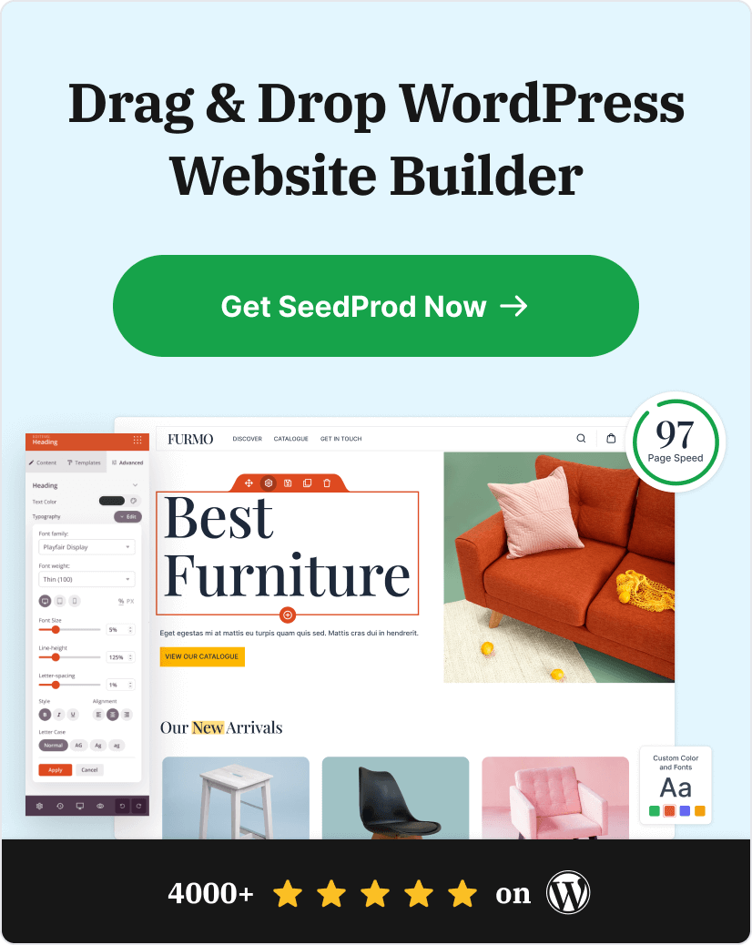
Paso 4: Construye Tu Página con SeedProd
La forma más fácil de crear una página de destino de SaaS que convierta es con SeedProd. Puedes crear páginas como los ejemplos que estudiamos sin escribir código.

SeedProd es el mejor constructor de páginas de WordPress para crear páginas de destino de SaaS. Incluye todo lo que necesitas para crear páginas de alta conversión:
- Más de 150 plantillas responsivas, incluidos diseños específicos para SaaS
- Editor de arrastrar y soltar para una fácil personalización
- Bloques centrados en la conversión para llamadas a la acción, formularios, testimonios y tablas de precios
- Funciones de prueba A/B para optimizar tus tasas de conversión
- Integraciones de marketing por correo electrónico para captar y nutrir clientes potenciales
Además, cada diseño es 100% adaptable a móviles, lo cual es crucial ya que la mayor parte del tráfico de tu SaaS provendrá de dispositivos móviles.
Paso 5: Prueba y Mejora tus Resultados
Las mejores páginas de destino para SaaS nunca están "terminadas". Esto es lo que debes probar primero:
- Titulares: Prueba versiones centradas en los beneficios frente a versiones centradas en las características
- Botones de llamada a la acción: Prueba diferentes colores, tamaños y textos
- Ubicación de la prueba social: Mueve los testimonios para ver qué funciona
- Vídeo vs. imágenes estáticas: Algunas audiencias prefieren diferentes tipos de medios
Las pruebas A/B integradas de SeedProd facilitan la prueba de diferentes versiones y la visualización de cuál convierte mejor.
¿Listo para empezar? Sigue nuestra guía paso a paso para crear una página de destino con SeedProd.
Empieza a Crear tu Página de Destino SaaS de Alta Conversión
Estos 10 ejemplos de páginas de destino para SaaS demuestran que la conversión se reduce a unos pocos principios clave: propuestas de valor claras, pruebas sociales estratégicas y eliminación de la fricción en tu proceso de registro.
No necesitas reinventar la rueda. Elige un ejemplo que coincida con el posicionamiento de tu SaaS y adapta su enfoque:
- Si te diriges a nuevos usuarios: Sigue la simplicidad de OptinMonster sobre la línea de flotación
- Si tienes un producto complejo: Utiliza el enfoque de demostración interactiva de Asana
- Si compites con jugadores establecidos: Prueba la estrategia de comparación de Mouseflow
- Si resuelves un punto de dolor específico: Copia el método de "mostrar, no contar" de Muzzle
¿Lo más importante? Empieza a construir y a probar. Tu primera página de destino no será perfecta, pero será mejor que enviar tráfico a una página de inicio genérica.
Recuerda: tu página de destino es a menudo la primera interacción real que las personas tienen con tu producto SaaS. Haz que cuente centrándote en lo que realmente les importa a los visitantes: resolver sus problemas de forma rápida y fiable.
¿Listo para crear tu propia página de destino SaaS de alta conversión? Empieza con SeedProd y utiliza una de nuestras plantillas probadas como base.
También te pueden interesar estos plugins complementarios para la página de inicio de sesión de WordPress.
Gracias por leernos. Por favor, síguenos en YouTube, Twitter y Facebook para más contenido útil para hacer crecer tu negocio si te ha gustado este artículo.