I once built a landing page that got tons of traffic but barely any signups. The headline was solid. The design looked clean. But the call to action? It just said “Submit.”
That one word was killing my conversions.
If your CTA doesn’t follow proven call to action best practices, even a great-looking page can fall short. Things like button text, color, placement, and nearby content all affect whether someone clicks or scrolls past.
In this guide, I’ll walk you through 10 simple ways to improve your CTAs, and show you how I’ve applied these tips to boost clicks on real landing pages.
Call-to-action best practices:
- 1. Use the Right CTA for the Right Spot on the Page
- 2. Write CTA Text That Focuses on the Benefit
- 3. Make Your CTA Visually Stand Out
- 4. Choose Button Colors That Attract Clicks
- 5. Use Psychology to Boost CTA Performance
- 6. Keep Your CTA Short, Clear, and Focused
- 7. Test and Tweak Your CTA to Improve Results
- 8. Make Sure Your CTA Works on Mobile
- 9. Add Helpful Copy and Proof Around Your CTA
- 10. Use Proper Markup to Make CTAs Accessible and SEO-Friendly
What Is a Call to Action?
A call to action (CTA) is any prompt that tells your visitor what to do next.
It’s usually a short line of text paired with a button, like “Download Now,” “Start Free Trial,” or “Get My Guide.” CTAs can also appear as links, banners, or opt-in forms across your site.
On a landing page, your CTA is the moment of decision. It’s where visitors either take action or leave.
That’s why strong CTAs matter. The right wording, design, and placement can lead to more clicks, signups, and sales.
What Great CTAs Look Like (With Real Examples)
So, what does a high-converting call to action look like?
Here are three real examples that use smart copy, strong offers, and intentional design to drive clicks:
1. “Yes, Send Me the Free eBook!”
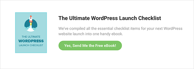
This CTA is personal, specific, and focused on value. It tells visitors exactly what they’ll get and uses first-person phrasing to make the action feel more direct.
2. “Get 30 Days of Free Yoga”
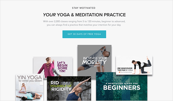
This one highlights a clear benefit and removes friction with the word “free.” It also appears in multiple spots on the page, which helps capture users who are ready at different moments.
3. “Show Me My Heatmap”
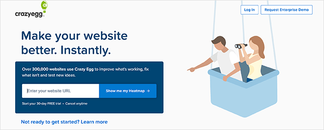
Instead of a generic button, this CTA speaks in the user’s voice. It tells people what to expect and reinforces that the result will be instant and useful.
Looking for more ideas? See these call to action examples you can’t help clicking for buttons, banners, and opt-ins that convert.
10 Call to Action Best Practices to Try Now
Improving your CTA isn’t just about writing better button text. It’s about understanding what makes people click.
I’ve tested dozens of variations on different pages. In some cases, changing just one word or moving a button slightly made a real difference in conversions.
But random guesses won’t help. These call to action best practices are based on what actually works and why.
Let’s start with placement, because where your CTA goes matters just as much as what it says.
1. Use the Right CTA for the Right Spot on the Page
Not every CTA belongs at the top of your page. Where you place it should match where your visitor is in their decision-making process.
Here’s a simple way to think about it:
- Top of the page: Use soft CTAs like “Learn More” or “See How It Works.” These work best for visitors who are just getting familiar with your offer.
Middle of the page: Try a mid-intent CTA like “Start Free Trial” or “Download the Guide.” By now, your reader has more context. - Bottom of the page: This is where to put high-intent CTAs like “Buy Now,” “Book Your Call,” or “Join Today.” They’ve seen the full pitch and are more likely to take action.
I’ve had good results using multiple CTAs on the same page, each matched to the section it appears in.
2. Write CTA Text That Focuses on the Benefit
Your CTA should answer one simple question: What will I get?
Benefit-focused text, like “Download My Free Guide” or “Start My Free Trial”, works better than vague commands like “Submit” or “Click Here.”
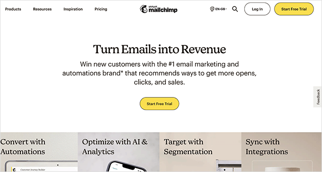
One test showed that clearly stating the benefit can increase conversions by up to 161 percent.
That’s because it speaks directly to what your visitor wants. Instead of telling them what to do, you’re showing them what they’ll get.
| Weak CTA | What’s Missing | Better CTA |
|---|---|---|
| Submit | No context or value | Download My Free Checklist |
| Sign Up | Vague action | Start My Free Trial |
| Learn More | No clear benefit | See How to Boost Conversions |
Tip: Try using first-person language when it fits.
3. Make Your CTA Visually Stand Out
Your CTA button should be impossible to miss. If it blends into the background, visitors are more likely to scroll past it than click.
Start by making the button feel clickable. Use a bold font, clear shape, and enough padding around the text. It should look like something that invites action, not like part of the background.
Spacing matters just as much. Add white space around the button so it has room to breathe. Avoid cramming it between other elements or placing it on a busy background.
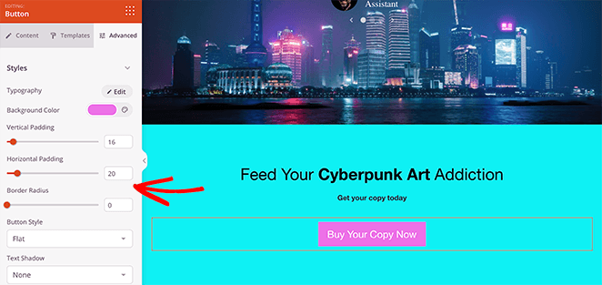
Keep it clean, clear, and focused. A good CTA should draw the eye the moment the visitor is ready to act.
4. Choose Button Colors That Attract Clicks
Color plays a major role in whether people notice and act on your CTA. Here’s what to keep in mind:
A/B tests show that a high-contrast button can significantly outperform one that blends into the background. In one case, using a bold red instead of green increased clicks by 21% on the same page design.

That kind of gain comes purely from choosing the right color.
When choosing your CTA color:
- Pick a hue that stands out against your primary site palette.
- Use accessibility tools to ensure there’s enough contrast for all users.
- Stick to one attention-grabbing color per page to avoid visual competition.
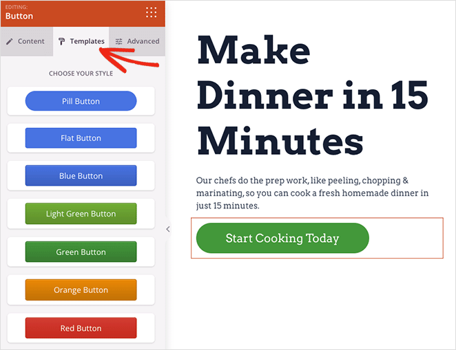
Tip: SeedProd’s button styling options make it easy to test and update button colors without needing a developer.
5. Use Psychology to Boost CTA Performance
To make your CTA more compelling, tap into basic human psychology. Techniques like urgency, reciprocity, and social proof can all increase clicks.
Urgency gives people a reason to act now instead of waiting. Adding limited-time phrases like “Offer ends soon” can increase conversions by up to 332 percent compared to CTAs without urgency.
Reciprocity is about giving something before asking for action. A free guide, checklist, or trial makes people feel more willing to opt in or take the next step.
Social proof builds trust by showing that others have already taken action. Nearby testimonials, ratings, or real-time activity can make your offer feel safer and more credible.
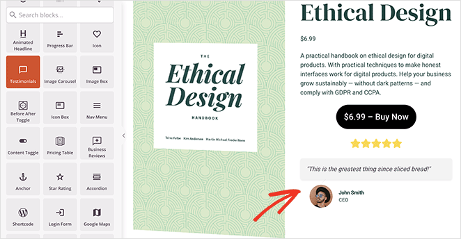
Use emotionally charged words like “Now,” “Instant,” or “Exclusive” to add extra motivation.
6. Keep Your CTA Short, Clear, and Focused
Short CTA copy performs better because it’s faster to read and easier to act on. One study found that the average high-performing CTA contains just 3 to 4 words, which makes brevity a consistent trait in buttons that convert.

Your goal is clarity, not cleverness. Avoid vague phrases like “Click Here” or “Submit.” Instead, lead with an action word that matches the benefit, such as “Download Guide” or “Start Trial.”
Watch out for friction words that sound like effort or commitment. Terms like “Buy,” “Order,” or “Register” can create hesitation. Softer alternatives like “Get,” “Try,” or “See” often feel more approachable.
A helpful test: can someone understand your CTA in two seconds or less? If not, simplify it.
7. Test and Tweak Your CTA to Improve Results
The best CTAs come from testing, not guessing. A/B testing helps you compare two versions of a CTA to see which one actually gets more clicks and conversions.
Start small. Test one change at a time, like the wording, color, size, or placement of your button. Keep everything else the same so you can isolate what’s working.
One real-world example comes from Leadferno’s A/B test for Fox Pest Control. Simply replacing a standard phone-based CTA with a “Text With Us” widget led to a 201% increase in conversion rate.
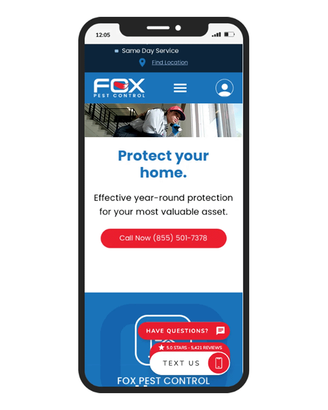
In just over a month, leads tripled, without increasing traffic or changing the rest of the page.
If you’re using WordPress, you can follow this guide on how to set up A/B testing for landing pages to start gathering data.
Even small changes can lead to big results. Testing helps you build CTAs based on real user behavior, not assumptions.
8. Make Sure Your CTA Works on Mobile
More than half of web traffic now comes from mobile devices. If your CTA isn’t easy to tap, you’re missing out on clicks.
Interactive targets should be at least 44 × 44 CSS pixels, as required by WCAG 2.5.5 and recommended by Apple in its Human Interface Guidelines (HIG). For Android and Material Design, the minimum is 48 × 48 dp.
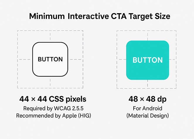
Spacing matters too. Buttons that are too close together or placed in cluttered layouts can lead to mis-taps. Some studies have found that poor mobile design leads to “rage taps,” where users tap repeatedly out of frustration.
To improve CTA performance on mobile:
- Use large, thumb-friendly buttons with plenty of padding
- Avoid stacking buttons too closely
- Keep your most important CTA near the bottom of the screen where thumbs can reach
- Test it on a real phone to make sure it’s easy to tap and read
Even a well-written CTA can fail if users can’t easily click it. Make it mobile-friendly, so every visitor has a chance to convert.
9. Add Helpful Copy and Proof Around Your CTA
Your CTA doesn’t exist on its own. The words and visuals around it shape how people feel about clicking.
A strong headline or subheadline can remind visitors of the value they’re getting. A short list of benefits reinforces the offer. And a trust badge or testimonial nearby helps build confidence.
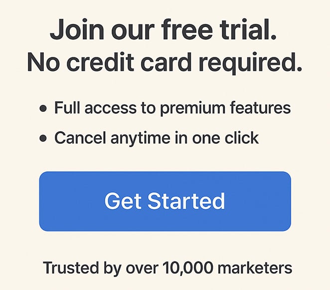
Here’s an example of what that might look like:
Headline/Subhead
“Join our free trial. No credit card required.”
Bullet list
- Full access to premium features
- Cancel anytime in one click
Trust element
“Trusted by over 10,000 marketers”
This kind of supporting content answers key questions like “What do I get?” and “Can I trust this?” right at the point of decision.
When everything around the button supports the click, your CTA feels more natural and more convincing.
10. Use Proper Markup to Make CTAs Accessible and SEO-Friendly
Your CTA needs to be easy for people to use and clear for search engines to understand. That means writing good copy, but also using the right HTML structure.
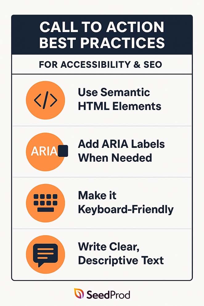
Use Semantic HTML Elements
Always wrap your CTA in a <button> or <a role=”button”> tag. This tells assistive technology and search engines that it’s interactive.
Add ARIA Labels When Needed
If the button text is short or unclear, use an aria-label to add context.
Example:
<button aria-label=”Start my free trial”>Start Trial</button>
Make it Keyboard-Friendly
Your CTA should work for users who navigate with a keyboard. Make sure they can tab to the button and press Enter or Space to activate it.
Write Clear, Descriptive Text
CTAs like “Download the Free Guide” give search engines more context than generic phrases like “Click Here.” This also helps your content appear in rich results or AI summaries.
Clean, accessible markup helps your CTA reach more people and support your page’s visibility in search.
How I Built a High-Converting CTA With SeedProd
I’ve tested a lot of CTA tools, but for WordPress landing pages, I keep coming back to SeedProd.
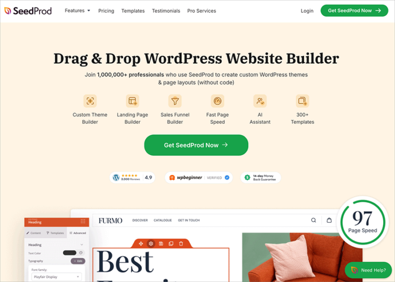
It’s a drag-and-drop page builder that lets you create custom landing pages, opt-ins, and CTA sections without writing any code.
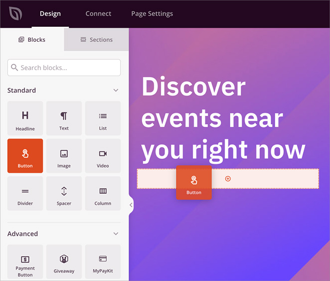
To build one of my favorite CTA sections, I started by opening the SeedProd editor and dragging in the Call to Action block.
From there, I updated the headline and button text to focus on the benefit. Instead of a generic label like “Submit,” I used “Get Your Free Trial,” and added a short subheadline to explain what the trial includes.
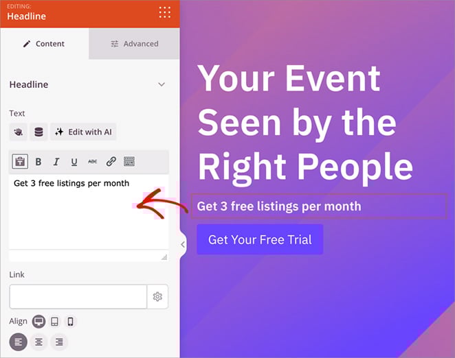
Next, I adjusted the button styling. I picked a bold color that stood out from the rest of the page and increased the font size so it would be easy to tap on mobile.
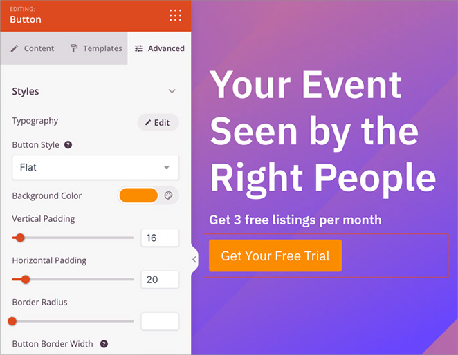
I also left plenty of white space around the CTA to make it feel clean and focused, and added a short testimonial underneath for extra trust.
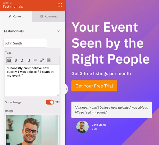
SeedProd made the entire process simple. I could build and preview the full section in real time, with no need for custom code or extra plugins.
For a full walkthrough, see my guide on how to create a landing page in WordPress.
FAQs About Call to Action Best Practices
Ready to Build a CTA That Converts?
Strong CTAs don’t happen by accident. Every detail matters, from the words you choose to the color, placement, and context around the button.
By following these call to action best practices, you’ll give visitors more reasons to click and fewer chances to walk away. And with a tool like SeedProd, you can build, test, and improve high-converting CTAs quickly without extra plugins or code.
If you want to keep improving your landing pages, here are a few more guides I recommend. Each one focuses on a specific part of building high-converting CTAs and the pages around them.
- How to Add a Button in WordPress (Step by Step)
- Expert Landing Page Optimization Tips
- How to Build a Sales Page in WordPress
- How to Create a Lead Capture Page in WordPress
- How to Create a Squeeze Page in WordPress
Thanks for reading! We’d love to hear your thoughts, so please feel free to leave a comment with any questions and feedback.
You can also follow us on YouTube, X (formerly Twitter), and Facebook for more helpful content to grow your business.

