
TL;DR
Responsive WordPress themes reflow every section to fit the screen it’s on, and these ten are the ones I’d install in 2026.
- SeedProd – my pick, because its theme builder replaces your theme with layouts you design visually, starting from 162 responsive kits (Plus plan and above).
- Astra, Kadence, GeneratePress and Blocksy – the free themes with the strongest WordPress.org records, all rated 98 to 100 out of 100.
- OceanWP, Neve and Hestia – free themes with cheap Pro upgrades, from about $42 a year.
- Divi – paid only at $89 a year, for people who want the visual builder built into the theme.
- KnowAll – the one to pick for a documentation site, now bundled with Heroic KB.
Your site looks right on your laptop. Then you open it on your phone. The menu sits on top of the logo, the headline runs off the edge, and the button you need people to tap is three screens down under a pile of stacked widgets.
Responsive WordPress themes fix that at the layout level, because every section reflows to the screen it’s on instead of shrinking a desktop page down. Most themes claim to be responsive now, so the useful question is which ones do it well and are still being maintained.
I won’t pretend I’m neutral: I use SeedProd on my own site and it’s first on this list. The other nine are themes I’ve built with or checked against their WordPress.org numbers and current prices this week, and seven of them are free to start.
- What Makes a WordPress Theme Responsive?
- The Best Responsive WordPress Themes
- Responsive WordPress Themes Compared
- What to Do Right Now
- FAQs About Responsive WordPress Themes
What Makes a WordPress Theme Responsive?
A responsive WordPress theme is one whose layout adapts to the width of the screen, so columns stack, menus collapse and images resize on a phone instead of forcing you to pinch and zoom.
That matters more than it did a few years ago, because Google now indexes and ranks your pages using the mobile version. If your theme breaks on a phone, the broken version is the one Google is looking at.
Back when I was customizing client sites with Divi and Beaver Builder, the phone check was the one step nobody asked for and everybody needed. A theme that only resizes the desktop page passes a quick glance and fails the moment someone tries to tap a menu item that’s 8 pixels tall.
So the bar for this list is higher than “the demo looks fine on my phone”. Every theme here has been updated in 2026 (with one exception I flag), has real WordPress.org numbers or a price I checked on the day, and gets out of the way of the plugins you already use.
The Best Responsive WordPress Themes
1. SeedProd
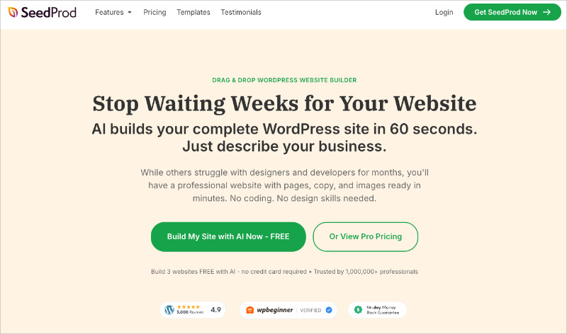
I know, SeedProd is our own product, but hear me out. It’s a drag-and-drop WordPress website builder plugin, and its theme builder does something the other nine entries can’t. It replaces your theme entirely with a header, footer, page and blog layout you design yourself, without touching a template file.
You don’t start from a blank canvas. The gallery currently holds 162 theme template kits, and every one of them is responsive out of the box. You pick a kit, and SeedProd creates the whole set of templates for you.
The part I lean on most is the device preview. You can switch between desktop, tablet and mobile views inside the builder, and any block can be hidden on one device and shown on another.
So you could keep a hero video on desktop and swap in a still image on phones, where autoplay would eat someone’s data. I checked that setting against the current plugin code (version 6.20.9) rather than trusting my memory.
The honest limit is that the theme builder isn’t in the free plugin or the Basic plan. You need Plus ($199 a year at list price) or above, and WooCommerce templates need Elite. If you only want a free theme, skip to Astra below.
Here are five of the kits I’d start from.
Starter
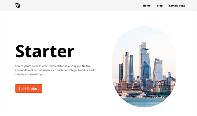
Starter is the plain one, and that’s the point. It gives you every standard section from header to footer with nothing decorative to strip out. That makes it the fastest route I know to a custom WordPress theme that looks like yours.
Modern Business
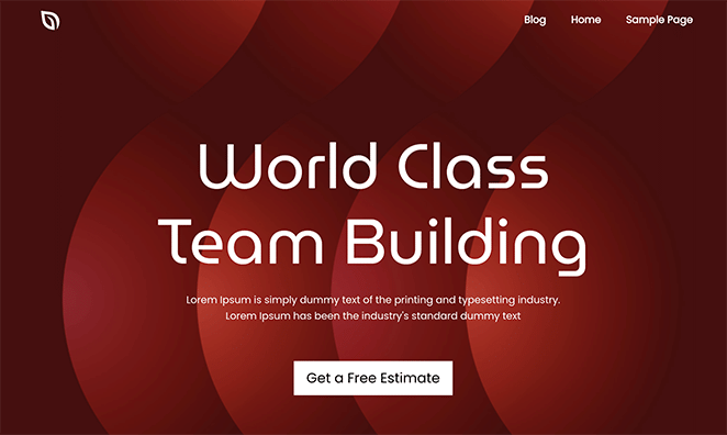
Modern Business leads with a big typographic hero and scrolling testimonials, and its blog page runs a two-column layout with a right sidebar. On a phone that sidebar drops below the posts rather than squashing them, which is the behaviour you want from a responsive layout.
Restaurant

Restaurant is built around a full-width photo hero, opening hours and a menu section. Most people who land on a restaurant website are on a phone looking for hours or a booking button, and this kit keeps both near the top on mobile.
Mortgage Broker
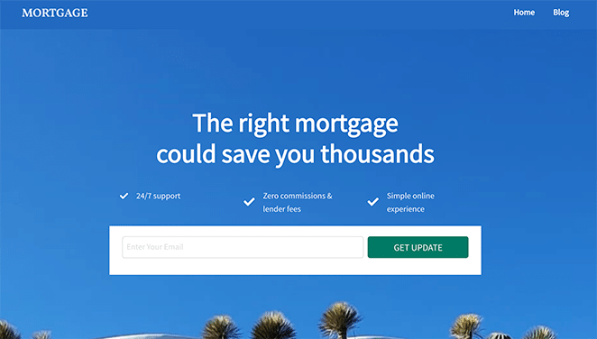
Mortgage Broker is a clean, minimal layout with room for property listings, a Google Maps block and a team section. It’s the kit I’d point anyone at who’s building a real estate website. You want it to look like a firm rather than a template, and this one does.
Gaming
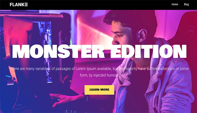
Gaming is the loud one, with a dark palette and big slots for video embeds and stream schedules. I include it because the same builder that produces the quiet mortgage site produces this, and both pass the phone test.
Whichever kit you start with, you can swap sections, change every colour and font, and drop in any of the 90+ blocks, from opt-in forms to countdown timers. The result is a site that’s yours rather than a template with your logo on it.
It also loads light. When I built the same landing page in three builders and ran them through GTmetrix for our Beaver Builder vs Elementor vs SeedProd test, the SeedProd version loaded in 556ms against 1,882ms for Elementor, with half the requests.
2. Astra
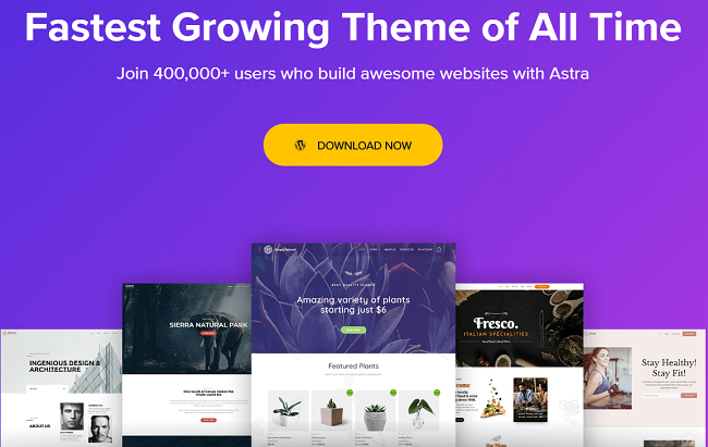
Astra is a free multipurpose theme and the most-installed one on this list, with over a million active installs and a 98 out of 100 rating from 6,522 reviews on WordPress.org (updated 19 August 2026). It works with the block editor and with page-building plugins, so it doesn’t fight whatever you’re already using.
What earns it second place is the header. Astra lets you set the width at which the desktop header switches to the mobile one, and design the mobile header separately, so your logo and menu don’t end up wedged together at tablet size. That’s the exact problem most “responsive” themes leave you to fix with custom CSS.
The free version covers most sites. The Pro add-on is $69 a year and adds the full header and footer builder, more typography and colour controls, and a WooCommerce speed layer.
If you want a free theme and don’t want to think about it again, this is the one I’d hand you.
3. Kadence

Kadence is a free theme with a drag-and-drop header and footer builder in the free version, which is rare. It has about 500,000 active installs and a 98 out of 100 rating on WordPress.org, and it was updated in July 2026.
The header builder is the reason to choose it over Astra’s free version. You get three rows on desktop and a separate set of rows for mobile, so you can put a phone number in the mobile header and hide it on desktop without a plugin.
Pair it with the Kadence Blocks plugin and you have a block-based site builder for free.
The paid Essentials bundle is $99 a year and adds the Pro theme features, premium starter templates and the Pro blocks.
I’d pick Kadence over Astra when you want more layout control for free and don’t mind a busier settings panel.
4. GeneratePress
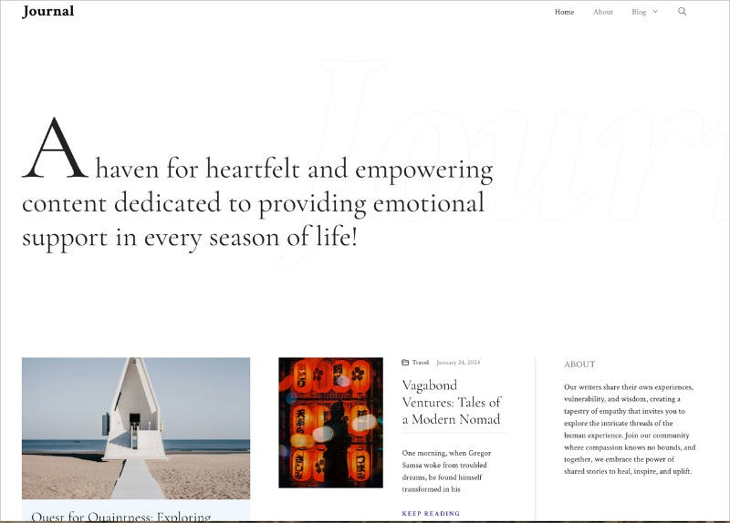
GeneratePress is a free, deliberately minimal theme with the best rating on this list: 100 out of 100 from 1,426 reviews on WordPress.org, on about 500,000 active installs. It ships with almost nothing, and that’s what people love about it.
Because there’s so little of it, pages built on GeneratePress tend to be light, and the responsive behaviour is predictable: a content column, an optional sidebar, and a menu that collapses on tablets and phones. There’s no header builder in the free version, so the design work happens in the block editor or in the Premium add-on.
The one flag is the update cadence. The last release on WordPress.org was in December 2025, nine months ago as I write this. That’s normal for a mature theme that isn’t chasing features, and it still runs on current WordPress, but it’s worth knowing before you pick it over Kadence or Blocksy.
GeneratePress Premium costs $59 a year and unlocks the Elements module, which is where the header, footer and hook layouts live.
5. Blocksy
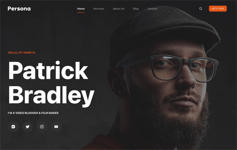
Blocksy is a free theme built for the block editor, with about 300,000 active installs and a perfect 100 out of 100 from 872 reviews on WordPress.org. It was updated on 3 September 2026, so it’s actively maintained.
It has the nicest customizer of the free themes here. Most settings carry desktop, tablet and mobile values side by side, so you can set a 48-pixel heading on desktop and a 30-pixel one on phones without leaving the panel. The free header builder is close to Kadence’s.
Blocksy Pro starts at $69 a year for one site, or $199 for a lifetime licence, which is the cheapest lifetime deal in this roundup.
I’d choose Blocksy over the other free picks for a design-led blog or portfolio where the per-device typography controls do real work.
6. OceanWP
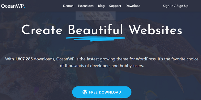
OceanWP is a free multipurpose theme with about 500,000 active installs and a 98 out of 100 rating on WordPress.org, last updated on 31 August 2026. It’s built for people who want a full demo site to import and edit rather than a blank theme.
The free version includes 17 full-site templates, and the Pro bundle adds 201 more, covering restaurants, gyms and hotels among others. OceanWP has WooCommerce styling built in too, so the cart and checkout look like the rest of the site on a phone.
Pro bundle pricing starts at $42 a year for one site on the current sale ($52 at list price), which makes it the cheapest paid upgrade here.
I’d put a small shop or service business on it when the owner wants to import a finished site and change the words and photos, not design one.
7. Neve
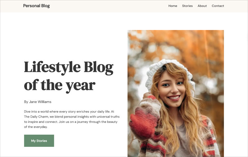
Neve is a free theme from Themeisle designed mobile-first, meaning the phone layout is the starting point and the desktop layout is built up from it. It has about 200,000 active installs and a 94 out of 100 rating on WordPress.org, updated in August 2026.
The mobile-first approach shows in small ways. Padding and font sizes are set for phones first, so you’re rarely fixing a layout that was designed for a 1,400-pixel monitor and squeezed down. It also has a header and footer builder in the free version and works with the block editor and Elementor.
Neve Pro starts at $69 a year on the current sale (normally $139) and adds more starter sites, extra blog layouts and WooCommerce features like quick view and wishlists.
Its rating is the lowest of the free themes here, though 94 out of 100 is hardly a warning sign. I’d reach for it over Astra when the site is going to be read mostly on phones, because the layout was designed there first.
8. Hestia
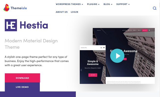
Hestia is a free one-page business theme, also from Themeisle, with about 70,000 active installs and a 96 out of 100 rating on WordPress.org. It was updated on 7 September 2026, the day before I wrote this, so it’s very much alive.
It’s the smallest of the free picks by install count, and I’ve kept it because it does one thing well. You get a single scrolling homepage whose sections stack cleanly on a phone, and for a freelancer or a one-location business that’s often the whole site.
Hestia Pro is $69 a year on the current sale (normally $139) and adds more section types, starter sites and WooCommerce layouts.
9. Divi

Divi is a paid theme with a visual page builder built in, from Elegant Themes, and there’s no free version. It costs $89 a year for unlimited sites, or $236 a year with the Pro services bundle. It’s also the one theme on this list I’ve built client sites on.
Its responsive controls are the most detailed here. Almost every setting has a desktop, tablet and phone value, and you can disable any module on any device.
The trade-off is weight. When I measured a comparable page with Query Monitor for our best WordPress themes roundup, Divi used 13 MB of memory and 86 database queries against SeedProd’s 4.3 MB and 34.
That doesn’t make it a bad theme. It makes it a theme for people who want total visual control and are willing to pay for it in page weight and a steeper learning curve.
10. KnowAll
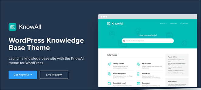
KnowAll is a knowledge base theme from HeroThemes, and it’s the specialist on this list. It’s no longer sold on its own: it comes bundled with the Heroic KB plugin, which starts at $67.60 for the first year on the current sale (normally $169).
I run our documentation on Heroic Knowledge Base, so I’ve spent a lot of time in this pairing. On a phone, the search and category navigation rearrange for the small screen, and long articles get a table of contents so you’re not scrolling back to the top to find the next section.
Those are the two things help sites most often get wrong on mobile, and KnowAll was built around getting them right.
If you’re building anything other than a help centre or a product manual, it’s not for you. If you are, I wouldn’t look at anything else.
Responsive WordPress Themes Compared
Prices and WordPress.org figures were checked on 8 September 2026. Sale prices change, so treat the paid column as a starting point.
| Theme | Free version | Paid from | Active installs | Best for |
|---|---|---|---|---|
| SeedProd | Plugin only, no theme builder | $199 a year (Plus) | 1,000,000+ (plugin) | Designing your own theme visually |
| Astra | Yes | $69 a year | 1,000,000+ | A free theme you never think about again |
| Kadence | Yes | $99 a year | 500,000 | Free header and footer builder |
| GeneratePress | Yes | $59 a year | 500,000 | Lightest pages, minimal settings |
| Blocksy | Yes | $69 a year or $199 lifetime | 300,000 | Per-device typography and design control |
| OceanWP | Yes | $42 a year (sale) | 500,000 | Importing a finished demo site |
| Neve | Yes | $69 a year (sale) | 200,000 | Mobile-first layouts |
| Hestia | Yes | $69 a year (sale) | 70,000 | One-page business sites |
| Divi | No | $89 a year | Not on WordPress.org | Total visual control in the theme |
| KnowAll | No | $67.60 first year (with Heroic KB) | Not on WordPress.org | Documentation and help sites |
What to Do Right Now
Open your site on your phone before you pick anything. If the menu, the headline and your main button all work on the first screen, your current theme may be fine and the job is a tidy-up, not a switch.
If it isn’t fine, decide whether you want to design or to install. Designing means SeedProd’s theme builder or Divi, where you shape every section yourself. Installing means one of the free themes above, and Astra or Kadence are the two I’d narrow it to.
Then switch on a staging copy or with a coming soon page up, because changing themes moves your menus and widgets around. Our guide to changing your WordPress theme without losing anything walks through that order.
FAQs About Responsive WordPress Themes
Are All WordPress Themes Responsive?
No. Any theme updated in the last few years will be responsive, but the WordPress.org directory still lists older themes that were built for desktop screens and never revised. Before you install one, check the last-updated date on its WordPress.org page. If it’s more than a year or two old, assume the mobile layout hasn’t been looked at either.
How Do I Check Whether My Current Theme Is Responsive?
Drag your browser window narrower and watch whether the layout reflows or a horizontal scrollbar appears. For a proper check, open Chrome’s developer tools (right-click, ‘Inspect’) and click the phone icon to preview common device sizes. Google’s old Mobile-Friendly Test tool was retired at the end of 2023, so if you go looking for it you’ll find a dead link.
Can I Make an Existing Theme Responsive Without Switching?
Sometimes, with custom CSS that adds breakpoints and stacks the columns, but it’s rarely worth it. A theme that was built for desktop has layout assumptions baked into every template, and you end up patching each one. Our guide to making a desktop-only website mobile-friendly covers both routes and when each one makes sense.
Do I Need a Theme Builder if My Theme Is Already Responsive?
Not for responsiveness. You need one when you want to change the parts a theme locks down, such as the header, the footer and the blog layouts. A theme builder like SeedProd’s lets you redesign those visually and preview each on mobile, where a normal theme would need a child theme and template code.
Pick a Theme That Works on Every Screen
Any of the ten themes above will give you a site that works on a phone. The free ones get you there fastest if you’re happy to work inside the theme’s layout, and SeedProd is what I’d use if you’d rather design the layout yourself.
You don’t need to code anything or hire anyone to do it. Pick a kit, check it on your phone, and publish today.
Want a wider shortlist? Our roundup of the best multipurpose WordPress themes covers themes built to handle any type of site.
Thanks for reading! We’d love to hear your thoughts, so please feel free to join the conversation on YouTube, X and Facebook for more helpful advice and content to grow your business.