

TL;DR: The Best FAQ Pages
A great FAQ page answers the questions people ask before they buy, so it cuts support tickets and builds trust at the same time. I scored 15 of the best FAQ pages against a 5-pillar test, and here is what stood out.
- Findability first: Dropbox, Pinterest, and Slack put search and clear categories at the top so answers are seconds away.
- Trust through data: Stripe shows a live helpfulness score on its popular articles, which few FAQ pages ever expose.
- Conversion built in: Etsy and Notion keep contact and next-step links inside the answers, not buried at the bottom.
- The 5 pillars: Findability, Clarity, Trust, Conversion, and Evolution are the traits every strong FAQ page shares.
- Build your own: In WordPress, SeedProd lets you assemble a searchable FAQ page with accordion and search blocks, no code needed.
Your support inbox keeps filling up with the same handful of questions. Where is my order, how do refunds work, can I change my plan, the same three emails on repeat while the real work waits.
A good FAQ page answers those questions once and quietly, so people get unstuck without emailing you. In 13 years building and reviewing WordPress sites for clients, I keep coming back to the same five traits that separate a FAQ page that works from one that just sits there: Findability, Clarity, Trust, Conversion, and Evolution.
I scored 15 real FAQ pages against those five pillars. Steal what works, skip what doesn’t, then build your own.
- Why Do You Need a FAQ Page?
- What Makes a Good FAQ Page?
- FAQ Page vs. Help Center vs. Knowledge Base
- Where Should You Put Your FAQ Page?
- The 5 Pillars of High-Converting FAQ Pages
- Best FAQ Page Examples and Ideas
- How These FAQ Pages Measure Up
- How to Create a FAQ Page in WordPress
- FAQs on Building the Best FAQ Pages
Why Do You Need a FAQ Page?
You have probably heard that FAQ pages are an outdated crutch, a dumping ground for questions a better website would have answered already. That belief is wrong for one simple reason: a clear FAQ page still deflects support tickets, removes buying objections, and now feeds the AI tools people use to research before they ever land on your site.
A FAQ page does more than answer common questions. It saves time for your support team, builds trust with visitors, and helps remove the objections that stop people from buying.
Here are a few key reasons every website can benefit from a FAQ page:
- Saves time: Customers find quick answers without waiting on support, and your team spends less time answering repeat questions.
- Builds trust: Showing you understand customer pain points makes visitors more confident in choosing your product or service.
- Reduces complaints: Clear answers to shipping, returns, or policy questions prevent confusion and negative reviews.
- Improves SEO: Optimized FAQ pages often appear in Google results, giving you more visibility and traffic to related product pages.
What Makes a Good FAQ Page?
You make a good FAQ page by writing the questions in your customers’ words, not yours, and basing them on the emails and calls support actually gets. Keep it to 8 to 15 high-impact questions grouped by category, give short direct answers, and add accordions and a search bar so people find what they need fast.
Here is what that looks like in practice:
- Organized layout: Use categories, accordions, or anchor links so visitors find answers quickly.
- Clear language: Keep answers short and direct, linking to more detailed resources if needed.
- Regular updates: Add or edit questions as your business, products, or policies change.
- Prioritized questions: Place your most common or important questions at the top of the page.
- Search option: Consider adding a site search feature for quick navigation.
- Helpful links: Point to related guides, support docs, or product pages to move visitors forward.
Adding FAQ schema is still a smart move, even though Google no longer displays FAQ snippets in search results for most sites. Schema helps search engines understand your content, supports accessibility tools, and can improve visibility in AI-powered results and voice search.
FAQ Page vs. Help Center vs. Knowledge Base
These three get used interchangeably, but they solve different jobs. Pick based on how much your customers need to self-serve, not on which word sounds more polished.
- FAQ page: A single page answering your most common questions, usually 8 to 15 of them. Best for small sites and simple products where a few clear answers cover most of the demand.
- Help center: A hub that bundles a search bar, browsable categories, and contact options in one place. Best when people need to find answers and reach support from the same spot, which is why most of the examples below are help centers.
- Knowledge base: A deeper library of articles, tutorials, and how-to guides organized by topic. Best for complex software with many features that need step-by-step documentation.
Most small business sites start with a FAQ page and grow into a help center as the questions pile up. You do not need all three on day one.
Where Should You Put Your FAQ Page?
Put your main FAQ on a dedicated page and link to it from your footer, your contact page, and your checkout. That gives people one reliable place to look and gives search engines one clear page to rank.
Beyond the dedicated page, two patterns work well depending on your content:
- Per-page FAQs: Add a short FAQ block to a product or service page answering questions specific to that item. This catches buyers at the moment of hesitation.
- Category FAQs: Group questions by topic on a collection page when one flat list would get too long to scan.
That leaves the single-page versus multi-page question. A single-page FAQ, like the Pure App example below, keeps everything on one scrollable page with a table of contents, which suits a short, text-based list. Split questions across multiple pages only when you have so many that one page becomes a wall of text, since extra pages add navigation friction for the reader.
The 5 Pillars of High-Converting FAQ Pages
From reviewing FAQ pages across industries, I keep seeing the strong ones share five traits. Use these pillars as a quick checklist when designing your own FAQ page.
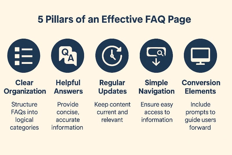
- Findability: People can locate any answer in seconds using search, categories, or accordions. The test: can a visitor reach the right answer in two clicks or less?
- Clarity: Answers are short, plain, and free of jargon, with links to more detail when needed. The test: does each answer make sense on its own, without reading the others?
- Trust: The information is accurate, consistent, and on-brand, so people believe it. The test: would a first-time visitor feel safe acting on what they read?
- Conversion: Subtle CTAs or product links guide visitors toward the next step. The test: does an answer ever point the reader somewhere useful next?
- Evolution: The page gets updated as customer questions change. The test: do the questions reflect what people ask now, not two years ago?
Best FAQ Page Examples and Ideas
I picked these examples across industries, from SaaS and retail to ecommerce and finance, and scored each one against the five pillars. The goal is not to copy a layout but to see how a specific pillar plays out in the wild.
1. Dropbox
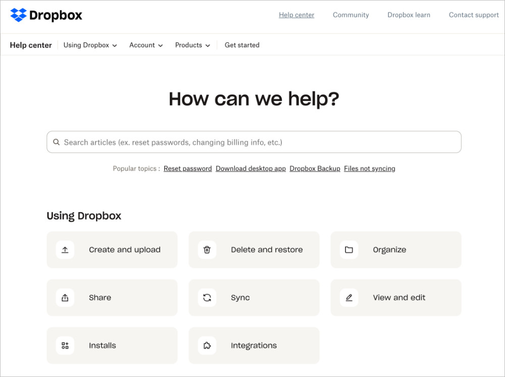
Dropbox combines clean design with strong findability. The most common questions sit at the top, while a search bar and clear categories make it easy to dive deeper.
The detail I keep noticing is that answers are short by default and link out to longer guides, so the page never overwhelms a first-time visitor. That restraint is what carries its clarity. The one weak spot is conversion, since there are few calls to action within the page.
Takeaway: This is a great model if you want your FAQ page to prioritize fast answers and usability above everything else.
2. Pinterest
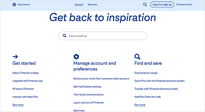
Pinterest takes a search-first approach. A bold search bar dominates the top, while categories and quick links guide visitors to common topics.
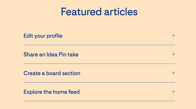
What makes this one smart is the featured-articles accordion, which doubles as a soft conversion element by nudging visitors toward tutorials that deepen their use of the platform. It scores well on findability, clarity, and even conversion.
Takeaway: Pinterest shows how an FAQ page can support both quick problem-solving and gentle onboarding, keeping visitors engaged with the product.
3. Twitter (X)
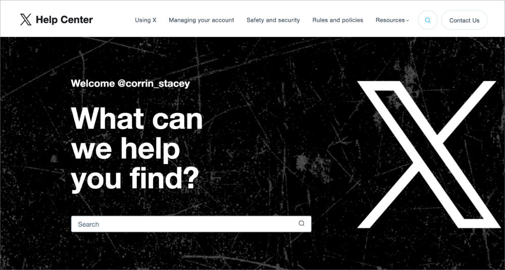
Twitter’s help center takes a straightforward approach with a prominent search bar at the top and neatly organized categories beneath it. That structure makes answers easy to find and leans hard on findability.
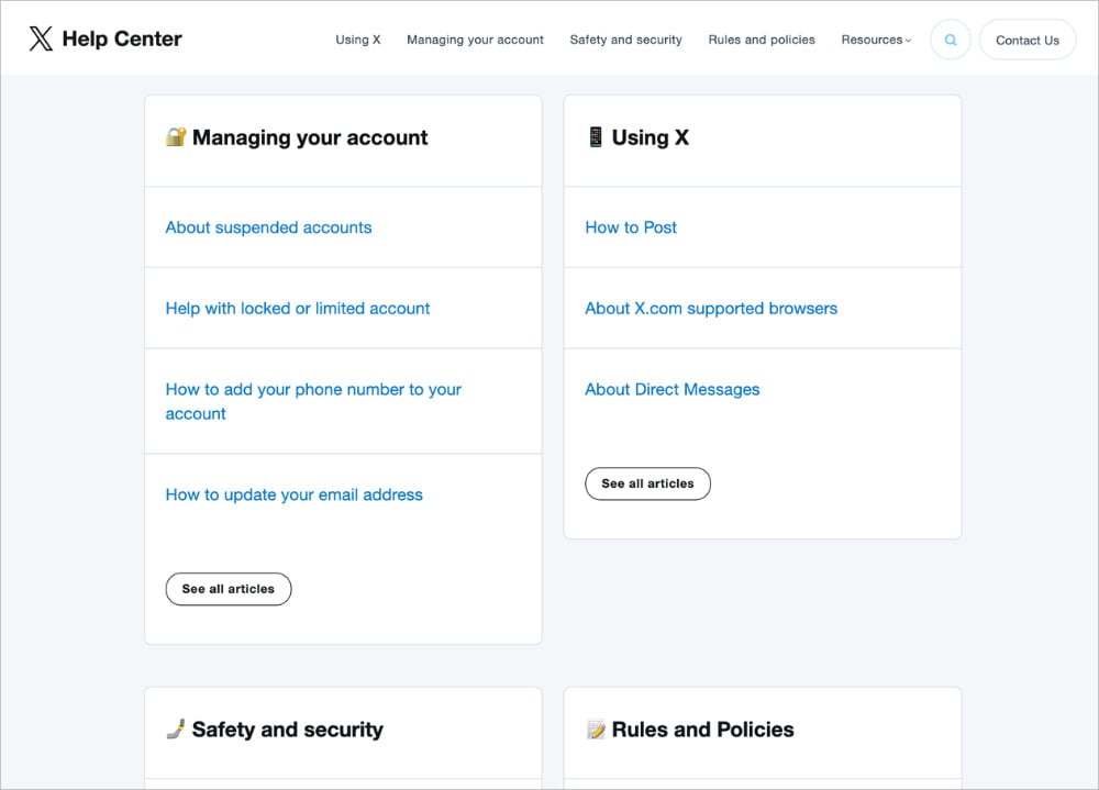
The layout is uniform and distraction-free, which adds clarity. Like many help centers, it keeps conversion elements light because the focus is purely on support content.
Takeaway: Twitter’s FAQ is a clean, no-frills design that works well if your main goal is reducing support requests with clear navigation and simple answers.
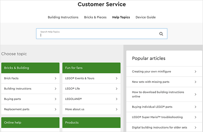
4. Nintendo Switch
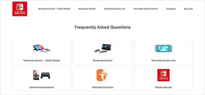
Nintendo Switch keeps its FAQ page simple and highly accessible, which matters because the audience spans adults and younger users. Visual icons link straight to the most common questions, boosting findability without overwhelming anyone.
The accordion design lets questions expand and collapse, which supports clarity by keeping the layout clean on desktop and mobile. The page is light on conversion elements but excels at quick problem-solving.
Takeaway: Nintendo’s FAQ page shows the value of simplicity. If your audience spans different age groups, straightforward navigation and visual cues make the experience more user-friendly.
5. Etsy
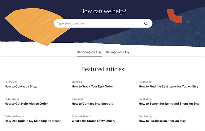
Etsy’s FAQ page is clean and professional, with a search bar at the top and featured articles grouped by topic. That makes it strong on findability and clarity, helping shoppers and sellers locate what they need.
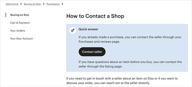
The detail worth stealing here is that each article carries links to related topics and a contact-support call to action, so an answer rarely dead-ends. That earns Etsy its conversion pillar. Consistent branding and regular updates round out trust and evolution.
Takeaway: Etsy’s FAQ page is a good model for ecommerce, balancing clarity with helpful links that move visitors toward the next step.
6. McDonald’s UK
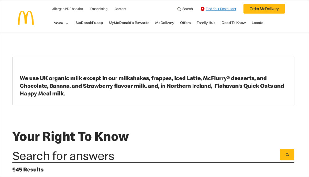
McDonald’s UK offers a tidy help center with several ways to find answers. A search bar sits up top, and filters let you narrow by category, which strongly supports findability.
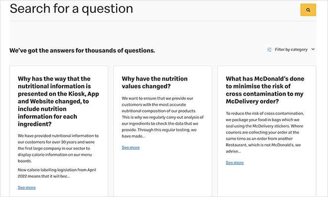
The layout is compact and easy to scan on mobile, which reinforces clarity. The “Load more” pattern is the clever touch, keeping the page short while still giving access to deeper content. Clear policy details and consistent branding build trust, and links to contact options help with the next step even though direct conversion CTAs are light.
Takeaway: If you serve a broad audience, prioritize fast search, simple filters, and a mobile-friendly layout to reduce friction.
7. Lego VIP
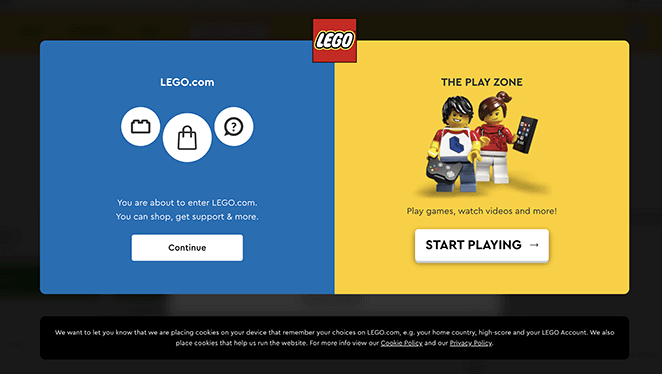
Lego’s help center recognizes different user goals from the start, offering clear paths to the main site or the play zone. That routing supports findability by sending visitors to the right place fast.
Inside the knowledge base, topics are grouped with a search bar and popular articles in the sidebar, which boosts clarity. The standout detail is the range of contact options, email, live chat, phone, and mail, which adds trust and gently supports conversion when self-serve falls short.
Takeaway: If your audience includes parents and kids with very different needs, offer clear paths for each and keep help options easy to find.
8. Pure App
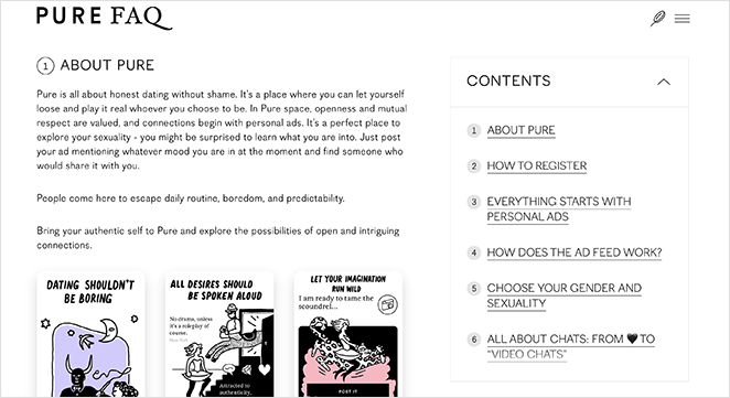
Pure App uses a minimalist, single-page FAQ design split into numbered sections. That gives it solid clarity, since visitors can scroll or use the table of contents to jump straight to what they need.
Screenshots inside the answers add visual context, and links to detailed articles support findability. The honest limitation is that without accordions or collapsible sections, the page is harder to scan on a phone.
Takeaway: If your FAQ content is straightforward and text-based, a minimalist website design like Pure App’s works well. Just add collapsible sections for better mobile usability.
9. Potion
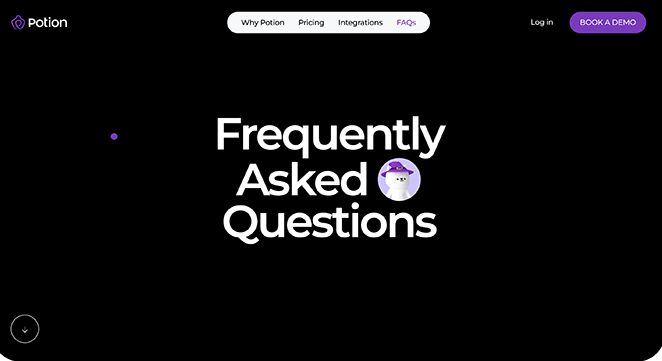
Potion’s FAQ page pairs playful design with strong usability. The expanding accordion format gives it excellent findability and clarity, since visitors browse questions without feeling overwhelmed.
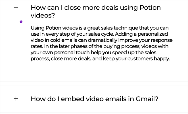
Larger fonts and a fully mobile-friendly design boost accessibility, while the quirky cursor and branding keep the experience on-brand and add trust. It is light on conversion cues but excels at user experience.
Takeaway: Potion proves FAQ pages do not have to be boring. If your brand personality is fun or creative, reflect it in your FAQ design while keeping usability front and center.
10. First Direct
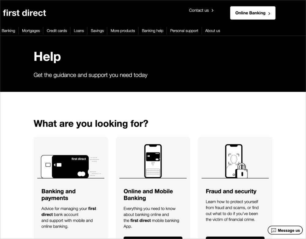
First Direct keeps things straightforward with popular questions at the top and expandable sections beneath. That makes answers quick to scan and strongly supports findability and clarity.
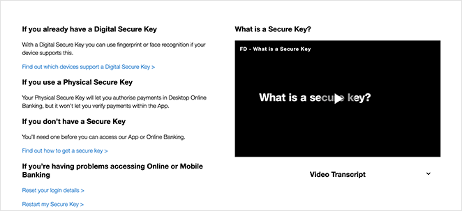
Clear categories like accounts, security, and payments, plus the occasional embedded video, add context and build trust, which matters a lot in banking. Internal links guide visitors to deeper help, though direct conversion prompts are minimal.
Takeaway: If your topic is complex or regulated, combine simple navigation with short answers and deeper resources to keep visitors confident and moving forward.
11. Headspace
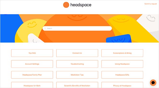
Headspace’s FAQ page is vibrant and on-brand, building trust the moment you land. A clear search bar sits at the top, while clickable topic boxes make navigation easy and strengthen findability.
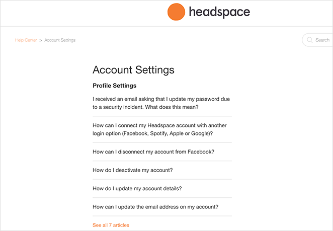
Each subtopic leads to more detailed answers, which supports clarity. The design stays calm and consistent with the app’s purpose, which is the whole point: the page feels as approachable as the product.
Takeaway: If brand identity is central to your business, follow Headspace’s example. Let your FAQ page reflect your style while keeping answers clear and easy to navigate.
12. Stripe

Stripe’s help center is the clearest example of trust and evolution working together. Its popular articles carry a live helpfulness metric, a line like “This article helped 95% of Stripe users,” which most FAQ pages never expose.
That single data point does two jobs at once. It tells you the answer is reliable before you read it, and it shows Stripe prioritizes content based on what actually helps people, not guesswork.
Takeaway: If you handle money or sensitive data, showing how helpful an answer has been to other people builds confidence faster than any reassurance you could write yourself.
13. Slack

Slack leans into findability with an AI-powered search hero, badged “Powered by Agentforce,” that sits above everything else. This is where help centers are heading: you describe your problem in plain language instead of guessing which category it lives under.
Below the search, six behavior-flow categories like Getting started and Using Slack organize the rest, with three featured popular questions for quick wins. The structure matches how people actually move through a product.
Takeaway: If your customers ask varied, hard-to-categorize questions, an AI or natural-language search box up top removes the guesswork that kills findability.
14. HubSpot

HubSpot’s knowledge base balances findability and evolution. A 12-tile icon category grid sits under the search bar, so you can browse by topic or search by keyword, whichever fits how you think.
The detail that ties to evolution is the “Highest rated articles” section, which surfaces content readers found most useful and keeps the best answers visible. Support for 13 languages shows the same commitment to maintaining the resource over time.
Takeaway: A category grid plus a “highest rated” section gives people two ways in and quietly signals which answers are worth their time.
15. Notion

Notion’s help center is a strong study in clarity and conversion. Categories are organized by user-journey stage, Get started, Workspace basics, and so on, so the page meets people wherever they are with the product.
Illustrated popular-topic cards make the page feel approachable rather than technical, and a visible “Chat with us” option runs throughout so help is never more than a click away. That persistent escalation path is the conversion lesson here.
Takeaway: Organizing answers by where someone is in their journey, paired with an always-visible chat option, turns a support page into a smooth path forward.
How These FAQ Pages Measure Up
Here is how the strongest examples in this guide score against my 5 Pillars framework. Pay attention to the cells with specifics, since those are the design choices worth copying.
| FAQ Example | Findability | Clarity | Trust | Conversion | Evolution |
|---|---|---|---|---|---|
| Dropbox | Search bar + categories | Short answers, links to guides | Consistent branding | Few CTAs | Regular updates |
| Search-first hero | Short, direct answers | Minimal authority cues | Featured-articles accordion | Ongoing content additions | |
| Etsy | Search + topic groups | Clear topic clusters | Strong brand and credibility | Contact CTAs + related links | Regular article updates |
| Stripe | Search + popular articles | Concise answers | Live “% helped” metric | Links to next steps | Data-driven prioritization |
| Slack | AI-powered search hero | Behavior-flow categories | Brand-backed answers | Featured popular questions | Continually expanded content |
| HubSpot | 12-tile grid + search | Topic-based articles | 13-language support | Related-article links | “Highest rated” section |
| Notion | Journey-stage categories | Illustrated topic cards | On-brand, approachable | Persistent “Chat with us” | Updated as features ship |
Dropbox, Slack, and Pinterest win on making information easy to find. Stripe and HubSpot stand out by tying their FAQ content to real usage data, which is the Evolution pillar most pages ignore. The best FAQ pages succeed because they cover more than one or two pillars.
Skip the comparison
Build a FAQ page that hits all five pillars
You have seen what findability, clarity, and conversion look like in the wild. SeedProd lets you assemble all of it in WordPress with drag-and-drop accordion and search blocks, no code.
I want to build my FAQ pageHow to Create a FAQ Page in WordPress
Now that you know what a strong FAQ page looks like, you probably want to build one. While you can use a WordPress FAQ plugin, the easiest way to add a full FAQ page is with a drag-and-drop website builder like SeedProd.

I built my own FAQ page in SeedProd in an afternoon by dropping an accordion section onto a blank page and typing the questions straight in. No developer, no theme wrestling, and I could see every change live as I made it.
What makes SeedProd a good fit for FAQ pages is that it hands you the exact pieces the best examples above use:
- Accordion block: Lets answers expand and collapse so the page stays tidy on every screen.
- Search block: Adds a search bar so visitors find an answer in seconds.
- Anchor block: Creates jump links so people land on the right FAQ from a table of contents.
- Section templates: Premade page and section layouts you customize instead of starting from a blank canvas.
Here is the short version of how it goes:
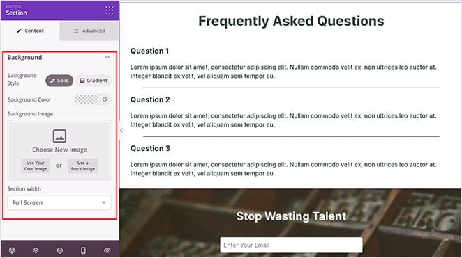
Step 1: Add an Accordion Section
Open the SeedProd builder, start from a blank page or a section template, and drag an Accordion block into your layout. Each accordion item becomes one question and answer.
Step 2: Add Your Questions and Answers
Type each customer question as the accordion title and the answer inside it. Group related questions together and put the most common ones at the top.
Step 3: Enable Search and Anchor Links
Drop in a Search block above the accordions so visitors can find answers fast, and add Anchor links if you want a jump-to menu for a long list.
Step 4: Publish Your FAQ Page
Preview the page on desktop and mobile, then hit publish. You can edit any part later in the visual editor without touching code.
For the full walkthrough with screenshots, follow our step-by-step guide on creating a FAQ page with SeedProd. SeedProd also lets you create custom WordPress themes and landing pages on the same platform.
FAQs on Building the Best FAQ Pages
How do you make a good FAQ page?
Write the questions in your customers’ own words and base them on the emails and calls your support team actually gets. Keep the list to 8 to 15 high-impact questions grouped by category.
Give short, direct answers, then add accordions and a search bar so people find what they need in seconds.
What is the difference between a FAQ page and a help center or knowledge base?
A FAQ page is a single page answering your most common questions, usually 8 to 15. A help center bundles search, browsable categories, and contact options in one hub.
A knowledge base goes deeper, with a full library of articles and tutorials organized by topic. Small sites start with a FAQ page and grow into a help center as questions pile up.
Where should you put your FAQ page on your website?
Put your main FAQ on a dedicated page and link to it from your footer, contact page, and checkout. That gives visitors one reliable place to look and search engines one clear page to rank.
You can also add short, page-specific FAQ blocks to individual product or service pages to catch buyers at the moment of hesitation.
Start Building Your Best FAQ Page Today
The best FAQ pages all do the same thing: they answer real questions clearly, build trust, and quietly point people toward the next step. Pick the one pillar your current page is weakest on, fix that first, then work through the rest.
When you are ready to build, SeedProd gives you the accordion, search, and anchor blocks to assemble a searchable FAQ page in WordPress without code. Get started with SeedProd today.
I hope this article helped you find the best FAQ pages, examples, and ideas. You might also like these other helpful guides:
- How to Make a Page Full Width in WordPress
- 8 Best WordPress Accordion Plugins for FAQ
- 25+ Best WordPress Plugins to Revamp Your Site
Thanks for reading! We’d love to hear your thoughts, so please feel free to join the conversation on YouTube, X and Facebook for more helpful advice and content to grow your business.


