Looking for real login page examples to help shape your next design?
When I started building custom login pages, I kept running into the same problem. The default forms felt clunky and didn’t match the rest of the site. Even small design tweaks made a big difference in how polished and trustworthy the page felt.
So I began saving great examples. Some were simple. Others were bold and creative. But all of them gave me ideas I could use.
In this guide, I’ll show you my favorite login page examples and what makes each one stand out. I’ll also walk you through what a good login page needs and how to create one in WordPress without writing a single line of code.
What Is a Login Page?
A login page is where registered users can securely access their account. These pages usually include a username or email field, a password field, and a submit button. Many also offer links to reset passwords or sign up for a new account.

A well-designed login screen isn’t just about function — it sets the tone for your site, builds trust, and can even boost conversions.
What Should a Login Page Have?
At minimum, a login page needs a username/email field, a password field, and a login button. But strong designs go further. Here’s what I recommend including:
- ✅ Your logo: helps with brand recognition
- 🔒 Forgot password link: standard UX feature
- 🔗 Social login options: for faster access
- ✍️ Short headline or welcome text: to clarify the page’s purpose
- 📝 Sign-up prompt: for new users who don’t have an account
Bonus tip: Your login page is a great spot to highlight a new feature or promote an offer to returning users.
14 Best Login Page Examples (And Why They Work)
Now that you know what a login page is, here are some excellent login page design examples you can use for inspiration.
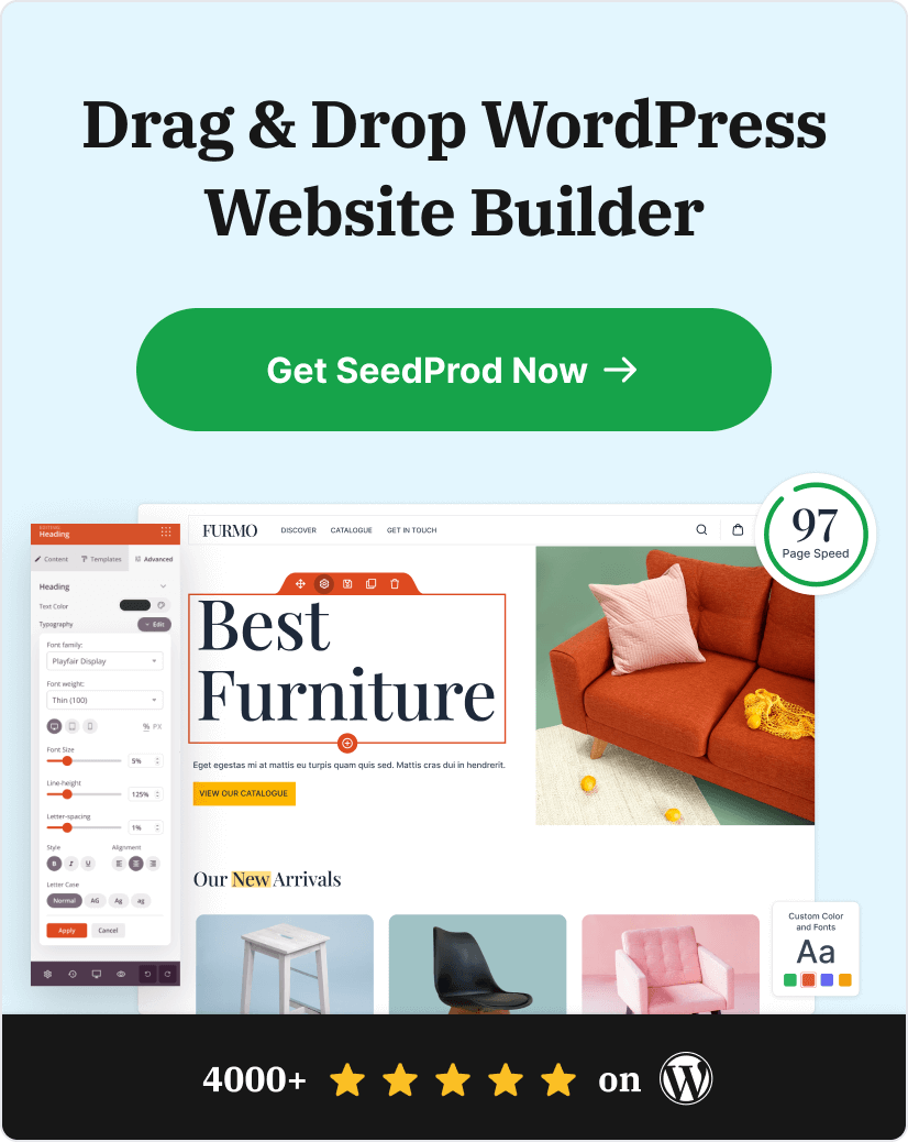
1. SeedProd

Why It Stands Out:
- Two-column layout with distraction-free login form
- Visual section for sign-up CTA
- Clean, modern design that feels professional
Design Takeaway:
At SeedProd, our login page is built to do two things: help existing users log in and make it easy for new users to sign up. The layout keeps the form on the left and places an attention-grabbing image on the right. That way, the focus stays on the login action without feeling too plain.
There’s also a clear call-to-action for anyone who doesn’t have an account yet. By linking to the SeedProd pricing page, we make it easy to learn more and get started.
2. OptinMonster

Why It Stands Out:
- Highlights new features for returning users
- Simple layout that keeps focus on the form
- Uses smart copy instead of images to add value
Design Takeaway:
This login page from OptinMonster takes a clever approach. Instead of adding a big image or graphic, they use the sidebar to tell returning users about new features. That way, users feel informed without being distracted.
This kind of messaging adds value for existing customers and gives new visitors another reason to sign up. It’s a subtle way to turn a login screen into a helpful part of the user journey.
3. WPForms

Why It Stands Out:
- Promotes new plugin features directly on the login screen
- Includes a bold call-to-action button to learn more
- Clean design with clear value for both new and returning users
Design Takeaway:
Like OptinMonster, WPForms uses its login page to tell users what’s new. But they also include a strong call-to-action button that links to the announcement post for even more detail.
This works well for educating returning users and giving new visitors a reason to explore the plugin further. It’s a smart way to turn routine logins into engagement opportunities.
4. MonsterInsights

Why It Stands Out:
- Promotes a related product right on the login screen
- Minimalist design with clear form fields
- Smart use of internal product ecosystem for cross-promotion
Design Takeaway:
Besides helping users log in or create an account, MonsterInsights uses its login page to promote its sister product, WPForms.
This is a great example of how you can use the login screen as a promotional space. If someone already trusts one of your products, they’re more likely to check out another — especially if it’s clearly useful and easy to access.
You can apply this same strategy by promoting your own products, affiliate offers, or helpful content right where your users sign in.
5. Medium

Why It Stands Out:
- Fully minimalist design with no distractions
- All login options are social or email-based
- Brand-aligned experience that’s fast and simple
Design Takeaway:
Medium skips the traditional login form entirely and offers a clean interface with just a few login methods. You can sign in using Google, Facebook, Apple, Twitter, or email — and that’s it.
This approach matches Medium’s overall brand, which focuses on content and simplicity. The minimalist login page supports that goal by keeping users focused and eliminating friction.
6. Spotify

Why It Stands Out:
- Clean, white background with no visual clutter
- Supports multiple login options including Google, Apple, and Facebook
- Built-in error handling for incorrect login attempts
Design Takeaway:
Spotify uses a distraction-free layout that makes logging in quick and simple. The design includes just enough branding with the logo and color scheme, while focusing the user’s attention on getting into their account.
If you don’t have an account, there’s a clear button to create one right from the login screen — no hunting for links or extra clicks required.
7. TED

Why It Stands Out:
- Split-screen layout with bold visuals
- Login form with minimal fields
- Rotating background images to keep things fresh
Design Takeaway:
TED uses a colorful, high-impact login screen that still keeps things simple. One side features an image and headline to welcome users. The other contains a clean login form with just one input field and a few login options like Apple, Facebook, and Google.
I especially liked the rotating background images. It adds a fresh feel for repeat users without disrupting the main action.

8. Dribbble

Why It Stands Out:
- Beautiful illustration on the left side of the page
- Highlights user-submitted design work
- Simple, brand-aligned login form
Design Takeaway:
Dribbble’s login page balances functionality with inspiration. While the right side has a clean form and social login buttons, the left showcases art from their creative community.
This is a smart way to turn a simple login screen into a moment of brand expression. Plus, the option to sign in with Google or Twitter makes the process quick and easy.
9. Awwwards

Why It Stands Out:
- Popup-style login form keeps users on the same page
- Minimal field design with a stay-logged-in option
- Supports Google, Facebook, and Twitter logins
Design Takeaway:
Unlike most examples here, Awwwards doesn’t use a separate login page. Instead, it uses a lightbox popup that overlays the content you’re already viewing. This creates a smooth experience and reduces the chance of visitors bouncing away mid-browse.
It’s a small touch, but keeping users on the same screen while they log in can really help with engagement — especially when paired with simple styling and familiar login options.
10. Headspace

Why It Stands Out:
- Soft, calming colors match the brand tone
- Minimalist form with multiple login options
- Includes Spotify login to support recent integrations
Design Takeaway:
Everything about Headspace’s login page feels intentional. From the muted palette to the simple layout, it aligns with their focus on mindfulness and ease. There’s no clutter — just a peaceful interface that welcomes users in.
You can log in with email, Apple, Google, Facebook, or even Spotify. Since Headspace content is available on Spotify, this extra option adds convenience for returning users.
11. Pocket

Why It Stands Out:
- Split-screen layout showing Pocket across devices
- Clean form with clear login methods
- Multiple options: Apple, Google, Firefox, and email login
Design Takeaway:
Pocket’s login page uses real product imagery to communicate its value right away. The screenshot on the left shows how the app works across desktop and mobile, giving users a quick look at what they’re logging into.
The form itself is simple, with just a few fields and trusted login methods. It’s a practical, user-friendly design that builds confidence without overloading the screen.
12. Dropbox

Why It Stands Out:
- Minimalist design with trusted login options
- Clear fields and CTA for account creation
- Smart product promotion integrated into the page
Design Takeaway:
Dropbox keeps things simple with just the essentials: login form, Google and Apple sign-in, and a button to create a new account. The layout is clean and functional without any distractions.
What stands out here is the small message promoting Dropbox Passwords — a helpful tool for users logging in. It’s relevant, subtle, and shows how even login screens can be used to cross-promote features in a way that feels natural.
13. Epic Games

Why It Stands Out:
- Clean single-column layout with strong branding
- Supports 8+ login methods across gaming platforms
- Focus on ease and familiarity for returning players
Design Takeaway:
Epic Games knows their audience, and it shows. This login page is simple, branded, and tailored for gamers. Instead of just email and password, it gives users the option to log in with nearly every major gaming platform.
- Epic Games
- Xbox Live
- PlayStation Network
- Nintendo
- Steam
- Apple
This approach makes it easy for users to jump into their games with the account they already use, which is exactly what most people want from a login screen.
14. BBC

Why It Stands Out:
- Seasonal background image from a popular BBC show
- Simple login form with brand visuals for trust
- Dynamic design that changes with events or holidays
Design Takeaway:
BBC’s login page design shows how a simple background image can connect users with the brand instantly. This example features a festive visual that fans of the show will recognize right away, creating a familiar and trustworthy feeling.
Even though the layout is basic, the regularly updated visuals help keep the experience fresh. It’s a smart way to show personality on a page that often gets overlooked.
How to Make a Custom WordPress Login Page (No Code Needed)
After checking out all these login page examples, you might be wondering how to create one for your own site. If you’re using WordPress, the easiest way is with the SeedProd plugin.

SeedProd is the best drag and drop WordPress builder with a built-in login page feature. You can use it to make a custom login page without writing any code.
Here’s how to do it:
- Install and activate the SeedProd plugin
- Go to SeedProd » Pages and click “Add New Landing Page”
- Select the “Login” template category
- Choose a design you like and open the visual editor
- Customize the form, text, images, and layout
- Click “Save” and publish your login page
You can also change your WordPress login URL to protect your site from spam and brute force attacks. SeedProd makes the whole process fast, secure, and beginner-friendly.
Frequently Asked Questions About Login Pages
A login page lets registered users securely access their account. Most sites use it to protect member-only content, personal dashboards, or admin areas.
The easiest way is with a plugin like SeedProd. It lets you choose a template, customize the design, and publish your login page with no coding.
Yes. Many login pages include a sign-up link or form so new users can register without leaving the page. SeedProd makes it easy to add both forms to one layout.
A good login page is clear, fast, and easy to use. Add your logo, keep the form simple, offer social login options, and make sure users know where to go if they forget their password.
Yes, and it’s actually a smart way to reduce spam and brute force attacks. You can follow this guide to change your WordPress login URL safely.
Great login page design isn’t just about how it looks. It’s about making people feel welcome, secure, and ready to take action. Whether it’s signing in, signing up, or checking out a new feature — your login page sets the tone.
If you’re ready to build your own, SeedProd makes it simple. With ready-made login templates, a drag-and-drop builder, and no coding required, you can have a professional login page live in minutes.
Want to go even further? You might also like our guide on how to create a client login page in WordPress.
Thanks for reading! We’d love to hear your thoughts, so please feel free to join the conversation on YouTube, X and Facebook for more helpful advice and content to grow your business.