

Resumen: Cómo Crear una Página de Destino Móvil en WordPress – Puedes crear una página de destino optimizada para móviles sin tocar código. Aquí tienes los 5 pasos usando SeedProd:
- Instalar SeedProd – Descarga y activa el plugin, luego introduce tu clave de licencia.
- Elegir una plantilla – Selecciona una plantilla adaptable a móviles y ponle nombre a tu página.
- Personalizar para móviles – Añade tu contenido, ajusta los tamaños de fuente y sigue los principios de la zona del pulgar.
- Configurar ajustes – Conecta tu servicio de correo electrónico y añade códigos de seguimiento.
- Previsualizar y publicar – Usa el modo de vista previa móvil para comprobar tu diseño, luego publícalo.
He pasado por eso, visitando un sitio en mi teléfono solo para encontrar texto diminuto, tiempos de carga lentos y botones que no podía tocar. Por eso empecé a crear páginas mobile-first con SeedProd.
Una página de destino móvil en WordPress es una página única y enfocada diseñada para verse bien y convertir bien en smartphones. Puedes crear una rápidamente con un plugin constructor de sitios web de arrastrar y soltar, sin necesidad de codificación.
En esta guía paso a paso, te mostraré exactamente cómo crear una página de destino móvil en WordPress usando un constructor de arrastrar y soltar.
¿Por qué hacer tu página de destino adaptable a móviles?
Hoy en día, más gente accede a internet desde sus dispositivos móviles que desde ordenadores de escritorio. Esto significa que si tu página de destino no es adaptable a móviles, te estás perdiendo una gran parte de clientes potenciales.
Piénsalo: si un sitio web tarda demasiado en cargarse en tu teléfono o es difícil de navegar, ¿no te irías a buscar una mejor opción? La investigación de Google muestra que el 53% de los usuarios móviles abandonarán un sitio que tarde más de 3 segundos en cargar.

Google sabe que los usuarios móviles son importantes, por eso prioriza el diseño mobile-first en los resultados de búsqueda. Por lo tanto, un diseño adaptable a móviles no solo es bueno para la experiencia del usuario, sino que es crucial para el SEO.
En mis pruebas de GTmetrix, una página de destino creada con SeedProd cargó en 556 ms, en comparación con 1.882 ms para la misma página creada con Elementor.
Ahora, podrías estar preguntándote: “¿Cuál es el mejor proceso para diseñar páginas de destino móviles en WordPress?” Hay dos formas principales:
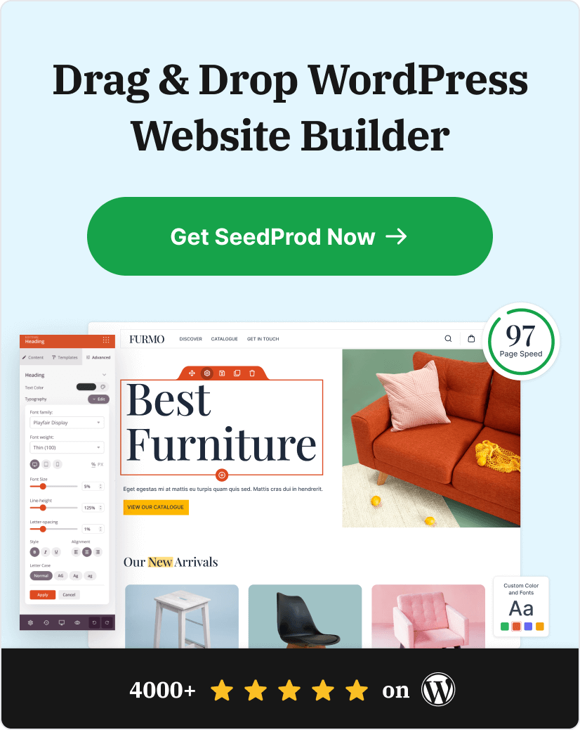
- Usar un plugin de páginas de destino para WordPress: Esta es la opción más fácil, ya que no requiere codificación. Un plugin como SeedProd, el mejor plugin de WordPress para páginas de destino efectivas para móviles, proporciona plantillas adaptables a móviles y un constructor de arrastrar y soltar para simplificar el proceso.
- Codificar un diseño adaptable personalizado: Esta opción te da más flexibilidad pero requiere conocimientos de codificación y puede llevar mucho tiempo.
Esta guía se centra en el método más sencillo: usar un plugin de páginas de destino para WordPress. De esta manera, puedes crear una página de destino móvil de alta conversión de forma rápida y sencilla.
Cómo crear una página de destino móvil
Paso 1. Instalar el plugin constructor de páginas de destino SeedProd
Listo para crear una página de destino móvil? El primer paso es instalar el plugin de páginas de destino SeedProd.

SeedProd es un creador de sitios web de arrastrar y soltar para WordPress que te permite crear una página de destino de alta conversión en menos de una hora.
No te preocupes; no se requiere codificación. SeedProd tiene una interfaz de arrastrar y soltar y plantillas preconstruidas, lo que facilita que cualquiera cree excelentes páginas de destino móviles.
Si bien SeedProd tiene una versión gratuita, esta guía utiliza SeedProd Pro. La versión pro ofrece funciones más avanzadas y opciones de personalización para optimizar las páginas de destino para conversiones.
Y en el plan élite, puedes usar sus bloques de WooCommerce para crear páginas de destino de comercio electrónico que impulsen las ventas.
Así es como se instala SeedProd Pro:
- Compra SeedProd Pro en la página de precios.
- Descarga el archivo del plugin desde tu cuenta de SeedProd.
- Ve a tu panel de WordPress y navega a Plugins » Añadir nuevo.
- Haz clic en Subir plugin y selecciona el archivo zip de SeedProd Pro.
- Haz clic en Instalar ahora, y una vez instalado, haz clic en Activar plugin.

Una vez activado, se te pedirá que introduzcas tu clave de licencia. Puedes encontrar esta clave en el panel de tu cuenta de SeedProd. Después de introducirla, estarás listo para empezar a crear.

Paso 2. Elegir una plantilla adaptable a móviles
Ahora que tienes SeedProd instalado, vamos a crear tu página de destino optimizada para móviles.
SeedProd ofrece una variedad de plantillas de páginas de destino responsivas, por lo que no tienes que empezar desde cero. Estas plantillas de páginas de destino móviles ya están optimizadas para la capacidad de respuesta móvil, lo que garantiza que tu página se vea genial en cualquier tamaño de pantalla.
Para elegir una plantilla:
- Ve a tu panel de WordPress y haz clic en SeedProd » Páginas de destino.
- Haz clic en el botón Añadir nueva página de destino.

- Verás una biblioteca de plantillas. Busca entre las opciones o utiliza los filtros para acotar tu búsqueda. Por ejemplo, si quieres una página móvil para tu webinar, selecciona el filtro de página de destino de webinar.

Consejos para elegir una plantilla optimizada para móviles:
- Busca un diseño limpio y sencillo: Evita las plantillas con demasiadas columnas o diseños recargados, ya que pueden ser abrumadores en pantallas más pequeñas.
- Prioriza la legibilidad: Asegúrate de que el texto sea lo suficientemente grande como para leerlo cómodamente en un dispositivo móvil.
- Elige botones grandes y fáciles de tocar: Los botones deben ser fáciles de pulsar con un dedo.
Recuerda que puedes personalizar cualquier plantilla para que se ajuste a tu marca y mensaje, así que no tengas miedo de experimentar.
Una vez que hayas encontrado una plantilla que te guste, pasa el ratón por encima y haz clic en la marca de verificación para seleccionarla.

Se te pedirá que le des un nombre y una URL a tu página. Siempre puedes cambiarlos más tarde. Cuando estés listo, haz clic en Guardar y empezar a editar la página para abrir el editor de arrastrar y soltar.

Paso 3. Personaliza tu página de destino para móvil
Ahora viene la parte divertida: personalizar tu página de destino para móvil.

El editor de arrastrar y soltar de SeedProd hace que este proceso sea fácil e intuitivo. Verás una biblioteca de bloques predefinidos en el lado izquierdo de tu pantalla, como imágenes, texto, botones, formularios y más.
Simplemente arrastra y suelta los elementos que necesites en la vista previa de la página. A medida que realices cambios, los verás reflejados en tiempo real, lo que facilita la visualización de tu diseño.

Principios de diseño específicos para móviles
Al diseñar para móviles, ten en cuenta estos principios adicionales:
Zonas de navegación accesibles con el pulgar
Considera la "zona del pulgar", el área de la pantalla fácilmente accesible con el pulgar al sostener un smartphone. Coloca botones importantes y elementos interactivos en esta zona para facilitar la navegación.

Tamaños de fuente apropiados
Utiliza tamaños de fuente más grandes para garantizar la legibilidad en pantallas pequeñas. Una buena regla general es:
- Texto del cuerpo: 16-18px
- Encabezados: 22px o más
- Botones de llamada a la acción: 14px o más
SeedProd te permite ajustar fácilmente los tamaños de fuente. Simplemente selecciona cualquier bloque de texto o encabezado y ajusta el control deslizante del tamaño de fuente para adaptarlo a tus necesidades.

Manejo de contenido complejo
Para contenido complejo o tablas grandes, considera:
- Usar acordeones o secciones colapsables para ahorrar espacio
- Simplificar tablas para la vista móvil o permitir el desplazamiento horizontal
- Usar listas con viñetas en lugar de párrafos siempre que sea posible
Así es como puedes añadir un acordeón en SeedProd:

Navegación optimizada
Usa un menú "hamburguesa" para ahorrar espacio y mantener la navegación limpia. El bloque de navegación de SeedProd te permite crear fácilmente un menú optimizado para móviles:

Continúa añadiendo contenido a tu página hasta que estés satisfecho con su apariencia. Luego, haz clic en el botón verde Guardar en la esquina superior derecha para almacenar tu configuración.
Paso 4. Configura tus ajustes
Ahora que tu página de destino está optimizada para móviles, vamos a configurar algunos ajustes importantes para ayudarte a rastrear el rendimiento y capturar clientes potenciales.
Conecta tu servicio de marketing por correo electrónico
SeedProd se conecta directamente con populares servicios de marketing por correo electrónico como Constant Contact, MailChimp y más. Esta integración te permite hacer crecer tu lista de correo electrónico fácilmente capturando clientes potenciales directamente desde tu página de destino móvil.
Para conectar tu servicio de marketing por correo electrónico:
- En el constructor de SeedProd, haz clic en la pestaña Conectar.

- Elige tu proveedor de correo electrónico de la lista y sigue las instrucciones en pantalla para conectar tu cuenta.

Configurar los ajustes de la página
Ahora, haz clic en la pestaña Ajustes de página para ver los ajustes de tu página de destino. Puedes editar el nombre y la URL de tu página de destino y elegir si quieres activar el Modo de aislamiento.

¿Qué es el Modo de aislamiento?
El Modo de aislamiento hace que tu página de destino se cargue más rápido al evitar conflictos con tu tema de WordPress y tus plugins. Si experimentas algún problema de visualización, activar esta opción puede ayudar.
SeedProd también te permite optimizar tu página de destino para los motores de búsqueda y realizar un seguimiento de métricas clave con Google Analytics. Puedes personalizar el título y la meta descripción de tu página y añadir códigos de seguimiento.

Luego, la pestaña Scripts te permite pegar scripts personalizados de encabezado, cuerpo y pie de página. Esto es útil para la retargeting de visitantes de la página con tu píxel de seguimiento de Facebook, etc.
Paso 5. Previsualizar y publicar tu página de destino móvil
Antes de lanzar tu nueva página de destino, es crucial ver cómo se ve en diferentes dispositivos. Por suerte, SeedProd lo hace fácil con su función de vista previa móvil integrada.
Así es como puedes previsualizar tu página de destino:
- En el constructor de SeedProd, busca el icono del teléfono móvil en la parte inferior de la pantalla.

- Haz clic en el icono para alternar entre las vistas de escritorio, tableta y móvil.

Esta vista previa te permite comprobar que tu diseño, tamaño de texto y botones están optimizados para pantallas más pequeñas. Si algo no se ve bien, puedes hacer ajustes fácilmente directamente en el modo de vista previa móvil.
¿Listo para publicar?
- Haz clic en el botón verde Guardar para guardar tus cambios.
- Junto al botón de guardar, haz clic en la flecha para guardar tu página de destino como plantilla para usarla más tarde o haz clic en Publicar para que esté activa en tu sitio web.

¡Enhorabuena! Has creado con éxito una página de destino optimizada para móviles en WordPress. Ahora estás listo para empezar a generar más clientes potenciales y conversiones de tus visitantes móviles.
Aquí tienes la versión final de una página que creé en mi sitio web de prueba:

Ejemplos e inspiración de páginas de destino móviles
Echa un vistazo a estos mejores ejemplos de páginas de destino móviles que he encontrado si necesitas algo de inspiración antes de diseñar tu página.
1. Bugaboo

La primera es un ejemplo de página móvil de Bugaboo, un minorista en línea de productos para bebés y niños. Me gusta cómo el diseño de su página de destino tiene un diseño de una sola columna y es limpio, moderno y fácil de navegar desde cualquier dispositivo.
2. Etsy
Como puedes ver, Etsy oculta el menú de navegación de la página principal con un menú móvil. Las imágenes son nítidas y los botones son lo suficientemente grandes para que los compradores puedan tocarlos.

Además, el cuadro de búsqueda ocupa todo el ancho de la página móvil, lo que facilita mucho su uso en pantallas más pequeñas.
3. Slack

Me encanta especialmente la página de destino móvil de Slack porque la han adaptado al dispositivo del usuario. Como usé un iPhone, personalizaron la página para la tienda de Apple.
Ese enfoque es una excelente manera de dirigirse a audiencias específicas. Y dado que la página satisface las necesidades de esa audiencia, es más probable que conviertan.
4. Maped Helix

El nítido diseño de página de destino móvil de Maped Helix no deja nada al azar. Presenta una barra fija en la parte superior de la página para animar a los usuarios a suscribirse y botones de llamada a la acción claramente etiquetados que dirigen a los usuarios a secciones populares del sitio.
Mejor aún, los colores de los botones de llamada a la acción varían según la importancia, y el color más llamativo indica qué botón deben hacer clic primero los usuarios.
5. Evernote

Evernote mantiene las cosas simples con este ejemplo. La llamada a la acción es clara, procesable y la página carga muy rápido. Dado que la página prácticamente no tiene imágenes, es sorprendentemente llamativa.
Una página de destino móvil solo de texto puede no ser la mejor solución para todos, pero es efectiva para las marcas adecuadas.
6. Headspace

La página de destino móvil de Headspace utiliza texto grande y legible combinado con un amplio espacio en blanco para una experiencia limpia y enfocada que atrae tu atención a la llamada a la acción principal de la empresa.
Preguntas frecuentes sobre páginas de destino móviles
¿Puedo crear una página de destino con mi teléfono?
Puedes acceder a tu panel de WordPress desde un navegador de teléfono y realizar ediciones básicas, pero el constructor de arrastrar y soltar de SeedProd funciona mejor en un ordenador de sobremesa o portátil. Las páginas de destino que creas son totalmente responsivas para móviles, por lo que tus visitantes obtienen una gran experiencia en cualquier dispositivo.
¿Es SeedProd gratuito para páginas de destino móviles?
SeedProd tiene una versión gratuita en WordPress.org con funciones básicas de página de destino. Para plantillas responsivas para móviles, integraciones de correo electrónico y bloques centrados en la conversión, necesitarás SeedProd Pro. Consulta todas las opciones de planes en la página de precios de SeedProd.
¿Cómo pruebo si mi página de destino móvil funciona en todos los dispositivos?
El modo de vista previa para móviles integrado de SeedProd te permite comprobar tu diseño antes de publicarlo. Haz clic en el icono del teléfono en la parte inferior del editor para cambiar entre las vistas de escritorio, tableta y móvil. Después de publicar, prueba en dispositivos reales o utiliza Chrome DevTools para confirmar que tu página se muestra correctamente en todos los tamaños de pantalla.
¿Mi tema de WordPress afecta a la apariencia de mi página de destino móvil?
El modo de aislamiento de SeedProd evita que tu tema de WordPress afecte a la apariencia de tu página de destino. Habilítalo en la pestaña Configuración de página para cargar tu página sin los CSS y scripts de tu tema. Esto es especialmente útil si ves conflictos de diseño o tiempos de carga lentos.
A continuación, más consejos para móviles
Tu página de destino móvil está lista para empezar a convertir visitantes en clientes potenciales. Consigue SeedProd ahora y publica tu primera página de destino móvil hoy mismo.
Si te ha gustado este artículo, puede que te resulten útiles estos consejos adicionales de diseño para móviles:
- Cómo editar menús móviles en WordPress (Guía para principiantes)
- Mejores prácticas para páginas de destino con tasas de conversión increíbles
- Cómo ocultar imágenes en la vista móvil en WordPress
- 9 Ejemplos de sitios web optimizados para móviles para inspiración de diseño adaptable
- Cómo hacer que un sitio web solo para escritorio sea compatible con dispositivos móviles (pasos sencillos)
- Los 11 mejores plugins móviles de WordPress para sitios web adaptables a móviles
¡Gracias por leer! Nos encantaría conocer tu opinión, así que únete a la conversación en YouTube, X y Facebook para obtener más consejos y contenido útil para hacer crecer tu negocio.