Si vous voulez comprendre ce qui fait une bonne page de vente, le moyen le plus simple est de regarder des exemples concrets. Une page de vente est une page ciblée conçue pour persuader les visiteurs d'acheter un produit spécifique, et la structure, le texte et les visuels jouent tous un rôle dans son efficacité.
Dans ce guide, je vais vous présenter 15 exemples de pages de vente de cours en ligne, d'outils logiciels, de marques de commerce électronique et de programmes de coaching. Vous verrez pourquoi chaque page fonctionne et ce que vous pouvez emprunter pour améliorer la vôtre.
Chaque analyse est rapide et pratique, vous pouvez donc prendre les idées qui correspondent à votre entreprise et les appliquer sans trop réfléchir au processus de conception.
- Qu'est-ce qu'une page de vente ?
- 15 High-Converting Sales Page Examples
- 1. Arrêtez de vous battre avec la nourriture (Exemple de page de vente de cours)
- 2. Vivez de votre passion (Exemple de page de vente de cours en ligne)
- 3. Digital Marketer (Exemple de page de vente de tunnel de vente)
- 4. OptinMonster University (Exemple de page de vente de formation)
- 5. Zoma Sleep (Exemple de page de vente e-commerce)
- 6. Somnifix (Exemple de page de vente de produit)
- 7. PR Couture (Exemple de page de vente de coaching)
- 8. ConvertKit (Exemple de page de vente de logiciel)
- 9. Ontrapalooza (Exemple de page de vente d'événement)
- 10. Design Sprint Masterclass (Exemple de page de vente de Masterclass)
- 11. Dinnerly (Exemple de page de vente par abonnement)
- 12. Eat Fat, Get Thin (Exemple de page de vente de défi santé)
- 13. Slack (Exemple de page de vente SaaS)
- 14. WPForms (Exemple de page de vente du Black Friday)
- 15. SeedProd (Exemple de page de vente de constructeur WordPress)
- FAQ sur les pages de vente
Qu'est-ce qu'une page de vente ?
Une page de vente est une page dédiée conçue pour convaincre les visiteurs d'acheter un produit ou une offre spécifique. Elle élimine les distractions et se concentre sur les avantages clairs, les preuves et les appels à l'action qui guident les lecteurs vers un achat.
Contrairement à une page de destination générale qui peut collecter des prospects ou des inscriptions, une page de vente a un seul objectif : transformer l'intérêt en vente.
Les éléments courants comprennent des titres accrocheurs, un texte axé sur les avantages, des preuves sociales, des blocs de comparaison et un appel à l'action clair.
15 exemples de pages de vente à forte conversion
Maintenant que vous savez ce qu'est une page de vente et comment elle fonctionne, il est utile de regarder des exemples concrets. Voir comment d'autres entreprises structurent leurs pages facilite l'identification des modèles que vous pouvez utiliser vous-même.
Ci-dessous, vous trouverez un mélange de pages de différentes industries, ainsi que des notes rapides sur ce que chacune fait bien.
1. Arrêtez de vous battre avec la nourriture (Exemple de page de vente de cours)
Cette page convertit car elle aborde un problème douloureux et offre un chemin clair et plein d'espoir. Elle semble personnelle, ce qui fait que le message est rapidement compris.

Stop Fighting Food est une masterclass d'Isabel Foxen Duke. J'aime la façon dont la page utilise un langage émotionnel réel, car cela rend l'offre plus solidaire que commerciale. La mise en page est simple et chaque section vous mène à l'étape suivante sans pression.
| Pourquoi ça marche | Domaines à améliorer |
|---|---|
| Des titres pertinents parlent directement aux peurs et aux frustrations des lecteurs. | Certaines images semblent déplacées et rompent le flux visuel. |
| Les accents rouges soulignent les avantages clés et guident l'attention sur la page. | Certaines sections pourraient bénéficier d'un espacement plus serré pour un balayage plus net. |
| Les puces énumèrent les difficultés courantes et proposent des étapes suivantes simples et claires. | |
| Les témoignages et les vidéos fournissent des preuves crédibles et concrètes. | |
| Le texte de l'appel à l'action est fort et rend la prochaine action facile. |
Consultez ces bonnes pratiques en matière d'appels à l'action pour plus d'aide.
2. Vivez de votre passion (Exemple de page de vente de cours en ligne)
Cette page convertit car elle utilise une narration forte et des preuves personnelles pour montrer aux lecteurs ce qui est possible. Elle est chaleureuse et inspirante, ce qui correspond bien au sujet.

Live Off Your Passion est un cours en ligne qui aide les gens à trouver un travail significatif. J'aime la façon dont la page mélange vidéo, images pertinentes et texte calme pour rendre l'idée de changer de carrière plus réalisable.
| Pourquoi ça marche | Domaines à améliorer |
|---|---|
| Une courte vidéo donne un aperçu rapide sans submerger les visiteurs. | Le réglage de lecture automatique peut frustrer certains utilisateurs et pourrait être facultatif. |
| Le copywriting fait preuve d'empathie envers les défis des lecteurs et offre un chemin clair vers l'avant. | Tester une couleur d'appel à l'action plus contrastée pourrait augmenter les clics. |
| La garantie de remboursement réduit l'hésitation au point de décision. | |
| Les études de cas et les témoignages renforcent la confiance et ajoutent des preuves concrètes. | |
| Plusieurs appels à l'action apparaissent naturellement tout au long de la page. |
Vous pouvez également consulter ces conseils de conversion de page de destination si vous souhaitez plus d'idées.
3. Digital Marketer (Exemple de page de vente de tunnel de vente)
La première chose qui ressort ici est la clarté avec laquelle la page explique l'offre. La mise en page est longue, mais le rythme est régulier et vous fait avancer sans effort.

Digital Marketer utilise cette page pour promouvoir son cours Conversion Funnel Mastery. J'aime la façon dont le texte reste concentré sur les résultats et décompose les grandes idées en points simples et faciles à parcourir. Il semble pratique et facile à digérer, même s'il y a beaucoup à couvrir.
| Pourquoi ça marche | Domaines à améliorer |
|---|---|
| Les titres et sous-titres clarifient la valeur avant de lire les détails. | Le texte principal de l'appel à l'action est générique et pourrait être plus spécifique. |
| Les listes à puces résument les leçons clés d'une manière rapide à parcourir. | Augmenter le contraste de l'appel à l'action pourrait aider à le faire ressortir davantage. |
| Les images et les sauts de section rendent le texte long léger. | |
| La FAQ aborde les préoccupations courantes sans allonger la page. | |
| L'absence de navigation maintient l'attention sur l'offre. |
4. OptinMonster University (Exemple de page de vente de formation)
La caractéristique remarquable de cette page est la rapidité avec laquelle elle établit la confiance. Le titre est clair, la mise en page est organisée et la preuve sociale ajoute du poids sans submerger le lecteur.

OptinMonster University propose une formation en marketing numérique. J'aime la façon dont la page s'adresse directement aux propriétaires d'entreprise et aux spécialistes du marketing, en utilisant un texte simple et des visuels familiers qui rendent le programme crédible et accessible.
| Pourquoi ça marche | Domaines à améliorer |
|---|---|
| Le titre et le sous-titre expliquent la valeur immédiatement. | La suppression de la navigation pourrait réduire les distractions. |
| Une courte vidéo présente le programme sans envahir la page. | Remplacer les icônes génériques de témoignages par de vraies photos serait plus authentique. |
| Les logos de marques connues ajoutent de l'autorité et de la reconnaissance. | |
| Les témoignages renforcent la confiance grâce à des expériences claires et pertinentes. | |
| Des sections comme « Qui devrait s'inscrire » aident à qualifier le bon public. | |
| La FAQ clarifie les questions courantes vers la fin. |
5. Zoma Sleep (Exemple de page de vente e-commerce)
La force la plus notable ici est la rapidité avec laquelle la page communique sa valeur. Les visuels du produit, les badges de confiance et les explications claires permettent de comprendre facilement ce que vous achetez et pourquoi cela vaut la peine d'y réfléchir.

Zoma Sleep utilise cette page pour promouvoir ses matelas, et la structure est pratique et rassurante. J'aime la façon dont les avantages, les avis et les garanties apparaissent aux bons moments, de sorte que vous savez toujours ce qui rend le produit digne de confiance.
| Pourquoi ça marche | Domaines à améliorer |
|---|---|
| Des images de haute qualité montrent le produit sous des angles utiles. | La couleur du CTA se fond dans la mise en page et pourrait ressortir davantage. |
| Une section « Dans l'actualité » ajoute une forte crédibilité de la part de tiers. | Reformuler « Acheter maintenant » avec un avantage plus spécifique pourrait augmenter les clics. |
| Les garanties, la livraison gratuite et une longue période de garantie réduisent l'anxiété d'achat. | |
| Les avis clients avec des notes par étoiles aident à prendre des décisions rapides. | |
| La FAQ répond aux questions pratiques qui bloquent souvent un achat. |
6. Somnifix (Exemple de page de vente de produit)
La première chose que vous remarquez sur cette page est la clarté avec laquelle elle expose le problème. Elle établit le contexte rapidement, et le reste du contenu s'appuie sur cette base d'une manière facile à suivre.

Somnifix vend des produits pour le sommeil conçus pour améliorer la qualité de la respiration. J'aime la façon dont la page utilise des explications simples et des visuels clairs, car le produit est inconnu de nombreuses personnes. Le mélange d'éducation et de réassurance fonctionne bien ici.
| Pourquoi ça marche | Domaines à améliorer |
|---|---|
| Le titre nomme un problème courant et établit rapidement les attentes. | Le GIF animé dans la section « Comment ça marche » peut être distrayant. |
| Les puces axées sur les avantages expliquent les résultats en langage clair. | Une courte vidéo avec une légende pourrait démontrer le produit plus clairement. |
| Une section explicative (« Pourquoi la respiration buccale est mauvaise ») ajoute un contexte utile. | |
| Les avis clients et les notes par étoiles renforcent la confiance autour d'un produit inhabituel. | |
| Le quiz interactif aide les visiteurs à décider si le produit correspond à leurs besoins. |
7. PR Couture (Exemple de page de vente de coaching)
Cette page attire immédiatement votre attention avec une image de marque confiante et une idée claire de à qui elle s'adresse. Le ton semble adapté aux professionnels des relations publiques, ce qui rend l'ensemble de l'offre plus pertinente.

PR Couture y fait la promotion de son cours PRISM, et la page a une touche éditoriale soignée. J'aime la façon dont le texte parle le langage du public sans trop expliquer, ce qui contribue à créer un sentiment de confiance immédiat.
| Pourquoi ça marche | Domaines à améliorer |
|---|---|
| Un aperçu clair de ce qui est inclus aide les visiteurs à voir la valeur en un coup d'œil. | Déplacer la vidéo du fondateur plus haut pourrait renforcer le lien personnel. |
| La section « La vie après PRISM » dépeint une image forte du résultat souhaité. | |
| La copie correspond aux objectifs et aux défis quotidiens des professionnels des relations publiques. | |
| Une image de marque cohérente et une couleur vive pour l'appel à l'action aident à guider le regard. | |
| La FAQ aborde les questions courantes sans ajouter de longueur inutile. | |
| Une invitation à envoyer un e-mail directement ajoute une touche humaine chaleureuse. |
8. ConvertKit (Exemple de page de vente de logiciel)
Le message sur cette page est clair dès le départ. Il s'adresse directement aux créateurs et montre comment l'outil s'intègre dans leur travail quotidien, ce qui rend l'offre pratique et accessible.

ConvertKit se concentre sur les créateurs, et la page de vente le reflète. J'aime la façon dont le texte reste concret et utilise des visuels simples pour vous guider à travers le produit. Rien ne semble trop technique, ce qui rend la page facile à aborder.
| Pourquoi ça marche | Domaines à améliorer |
|---|---|
| Le titre s'adresse à un public clair et définit rapidement les attentes. | Le module « Nouveautés » détourne l'attention du message principal. |
| Une courte animation dans la section principale montre le fonctionnement de l'outil en un coup d'œil. | Remplacer cette section par une FAQ compacte pourrait améliorer le flux. |
| Les témoignages proviennent de vrais créateurs, ce qui renforce la pertinence. | |
| L'essai gratuit élimine les obstacles et encourage les inscriptions rapides. | |
| Les sections sont courtes et faciles à parcourir, même pour les nouveaux utilisateurs. |
9. Ontrapalooza (Exemple de page de vente d'événement)
Ce qui ressort ici, c'est la rapidité avec laquelle la page suscite l'enthousiasme autour de l'événement. Le mélange de vidéo, de couleur et d'appels à l'action clairs rend l'expérience dynamique et facile à suivre.

Ontrapalooza est une conférence pour les utilisateurs d'Ontraport, et la page fait un bon travail pour montrer à quoi ressemble l'expérience. J'aime la façon dont le contenu alterne entre les avantages, les visuels et l'urgence sans donner l'impression d'être précipité.
| Pourquoi ça marche | Domaines à améliorer |
|---|---|
| La vidéo donne un aperçu rapide de l'événement et définit clairement les attentes. | L'ajout de logos de confiance pourrait donner plus d'autorité à la page. |
| La navigation fixe maintient l'appel à l'action visible pendant que vous explorez. | Plus de témoignages d'anciens participants pourraient ajouter une preuve sociale utile. |
| Des accents de couleur vive guident le lecteur à travers les différentes sections. | |
| Les messages d'urgence aident les visiteurs à agir pendant que l'intérêt est élevé. | |
| Le formulaire d'inscription offre des détails supplémentaires aux personnes qui ne sont pas encore prêtes à s'engager. |
10. Design Sprint Masterclass (Exemple de page de vente de Masterclass)
Le design ici est audacieux et confiant, ce qui convient à un cours destiné aux professionnels. La présence des fondateurs se fait sentir dès le début, et cette touche personnelle aide à établir rapidement la confiance.

La Design Sprint Masterclass enseigne la méthodologie des sprints, et la page de vente reflète la clarté que l'on attend du cours. J'aime la façon dont les visuels, la vidéo et les logos de confiance fonctionnent ensemble pour montrer que l'équipe connaît bien son domaine.
| Pourquoi ça marche | Domaines à améliorer |
|---|---|
| La proposition de valeur est claire et définit des attentes fortes dès le départ. | Il y a plus de témoignages que nécessaire, ce qui peut diluer l'impact. |
| La vidéo des fondateurs ajoute de la personnalité et de l'autorité. | Certaines sections de contenu « aperçu » semblent légèrement hors marque. |
| Les logos d'entreprises bien connues créent une crédibilité instantanée. | |
| Les témoignages de clients reconnaissables soutiennent l'offre. | |
| Le chat en direct offre un support immédiat aux visiteurs hésitants. | |
| Les boutons d'appel à l'action audacieux apparaissent aux moments opportuns sans paraître insistants. |
11. Dinnerly (Exemple de page de vente par abonnement)
Cette page se démarque car elle va droit au but sur la valeur. Le message est simple, les visuels sont attrayants et l'offre semble facile à comprendre, même si vous n'avez jamais essayé de kit repas auparavant.

Dinnerly se positionne comme un kit repas à faible coût, et la page soutient ce message avec un texte simple et des visuels clairs. J'aime la façon dont le contenu n'essaie pas de trop vendre. Au lieu de cela, il se concentre sur ce que vous obtenez et pourquoi c'est une bonne affaire.
| Pourquoi ça marche | Domaines à améliorer |
|---|---|
| Le titre s'adresse directement à un public spécifique (la communauté Reddit dans ce cas). | Une couleur d'appel à l'action plus forte pourrait aider à augmenter les clics. |
| Les images de nourriture de haute qualité rendent l'offre tangible. | Une courte vidéo explicative près du haut pourrait aider les nouveaux clients à comprendre le processus. |
| Les avantages et les prix sont divisés en sections simples et faciles à parcourir. | |
| Les appels à l'action apparaissent après le contenu clé pour soutenir la prise de décision naturelle. | |
| Le sélecteur de plan est facile à utiliser et aide les visiteurs à avancer rapidement. |
12. Eat Fat, Get Thin (Exemple de page de vente de défi santé)
Le titre audacieux est la première chose qui vous accroche. Il remet en question les hypothèses courantes, ce qui rend les gens suffisamment curieux pour continuer à lire. Le reste de la page renforce cette promesse avec des données et des histoires de réussite réelles.

Eat Fat, Get Thin est un défi de style de vie et de perte de poids du Dr Hyman. J'aime la façon dont la page utilise un mélange de marqueurs de crédibilité - logos des médias, données et témoignages - pour aider les lecteurs à se sentir plus confiants quant à leur participation.
| Pourquoi ça marche | Domaines à améliorer |
|---|---|
| Le titre suscite la curiosité en allant à l'encontre des conseils diététiques familiers. | Placer le bouton « En savoir plus » plus loin dans la page pourrait réduire les sorties prématurées. |
| Les logos « Tel qu'aperçu sur » fournissent de solides signaux d'autorité. | Certaines sections pourraient bénéficier d'un objectif d'appel à l'action unique et plus clair. |
| Les sous-titres axés sur les avantages aident les lecteurs à se concentrer sur les résultats. | |
| Les résultats basés sur des données confèrent une réelle crédibilité au programme. | |
| Les témoignages mettent en évidence des transformations significatives de participants précédents. | |
| Les aperçus de contenu montrent exactement ce que les participants recevront. |
13. Slack (Exemple de page de vente SaaS)
Cette page fait une forte première impression en montrant le produit en action. Les démonstrations et les éléments interactifs vous aident à comprendre comment Slack s'intègre dans le travail d'équipe quotidien sans avoir besoin d'une longue explication.

Slack se concentre sur la clarté et la convivialité, et la page de vente reflète cette approche. J'aime la façon dont la mise en page alterne entre les vues du produit, les témoignages clients et les options d'inscription rapide. Elle semble équilibrée et directe.
| Pourquoi ça marche | Domaines à améliorer |
|---|---|
| Le titre communique le bénéfice principal en une seule phrase. | Une courte vidéo dans la section principale pourrait ajouter une introduction plus personnelle. |
| Les démonstrations interactives permettent aux utilisateurs d'explorer les fonctionnalités instantanément. | |
| Les logos et les témoignages clients renforcent la confiance grâce à des marques familières. | |
| L'option de lancer une démo en direct supprime les obstacles à l'essai du produit. | |
| Les appels à l'action apparaissent souvent mais semblent naturels dans le flux. |
14. WPForms (Exemple de page de vente du Black Friday)
Cette page a une sensation très ciblée, ce qui fonctionne bien pour une offre à durée limitée. Le design est épuré, l'offre est facile à comprendre et l'urgence est gérée d'une manière qui pousse à l'action sans être écrasante.

WPForms crée une page spéciale chaque année pour sa promotion du Black Friday. J'aime la façon dont la mise en page reste simple et attire toute l'attention sur la réduction et l'offre bonus. Rien ne détourne de la décision.
| Pourquoi ça marche | Domaines à améliorer |
|---|---|
| La combinaison du cadeau et de la réduction rend l'offre plus précieuse. | L'ajout d'insignes de confiance ou de logos de clients pourrait renforcer la confiance. |
| La fonctionnalité « Rappelez-moi » permet de maintenir l'engagement des acheteurs potentiels. | |
| Un compte à rebours ajoute de l'urgence et encourage des décisions plus rapides. | |
| La mise en page est simple et maintient l'attention sur l'offre. | |
| Aucune navigation signifie moins de raisons de quitter la page. |
Si vous planifiez votre propre offre saisonnière, ce guide sur les pages de destination du Black Friday pourrait vous donner quelques idées.
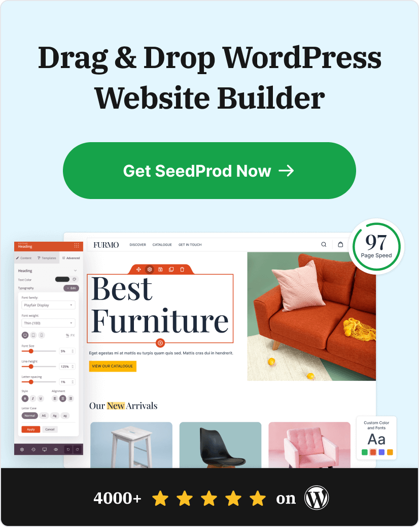
15. SeedProd (Exemple de page de vente de constructeur WordPress)
Ce qui ressort de cette page, c'est à quel point tout semble propre et organisé. La mise en page est simple, le message est direct et la page utilise des éléments familiers qui aident les gens à comprendre l'offre sans trop réfléchir.

Cet exemple a été créé avec l'un des modèles de page de destination SeedProd prédéfinis. J'aime la flexibilité de la structure. Vous pouvez échanger des sections, ajuster les couleurs ou réécrire le texte sans casser la mise en page, ce qui la rend accessible aux débutants.
| Pourquoi ça marche | Domaines à améliorer |
|---|---|
| La conception globale est épurée et cohérente, ce qui contribue à établir la confiance. | La personnalisation du texte est essentielle pour éviter une impression de « modèle ». |
| Un formulaire d'inscription intégré permet aux visiteurs de passer facilement à l'étape suivante. | |
| Les avis et les évaluations par étoiles ajoutent une preuve sociale aux bons moments. | |
| Plusieurs CTA offrent aux visiteurs plusieurs points naturels pour convertir. |

SeedProd facilite la création de pages de vente à forte conversion, de pages « bientôt disponibles » et de sites Web complets avec un éditeur glisser-déposer et plus de 100 modèles prêts à l'emploi.
Chaque conception se charge rapidement et est optimisée pour les conversions, vous n'avez donc pas à vous soucier des performances.
FAQ sur les pages de vente
J'espère que ces exemples de pages de vente vous ont donné des idées que vous pouvez utiliser sur votre propre site. L'étude de pages réelles est l'un des moyens les plus rapides de comprendre ce qui fonctionne et pourquoi.
Si vous souhaitez créer une page comme celle-ci sans repartir de zéro, SeedProd facilite la conception de mises en page épurées et à forte conversion avec des blocs glisser-déposer simples et des modèles prêts à l'emploi.
Si vous souhaitez plus d'inspiration, consultez ces guides ensuite :
- Meilleurs exemples de pages 404
- Exemples de pages d'inscription aux webinaires
- Meilleures pratiques pour les pages de destination
Et si cet article vous a plu, suivez-nous sur Twitter et Facebook pour plus de contenu utile pour développer votre entreprise.