The Nav Menu block allows you to incorporate navigation menus on your SeedProd landing pages and website templates. You have the flexibility to create a simple custom menu directly within the builder, or connect any existing WordPress menu from your site.
The block supports horizontal and vertical layouts, a collapsible mobile menu toggle, sub menus with full styling control, and per-item link settings — making it a flexible navigation solution for headers, footers, and sidebars.
Adding the Nav Menu Block to Your Pages
Follow these steps to add a Nav Menu block to your SeedProd page:
Step 1: Add the Block
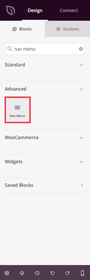
Under Design > Blocks, drag and drop the Nav Menu block into the desired section of your page.
Step 2: Configure Content Settings
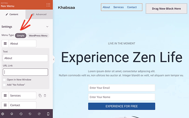
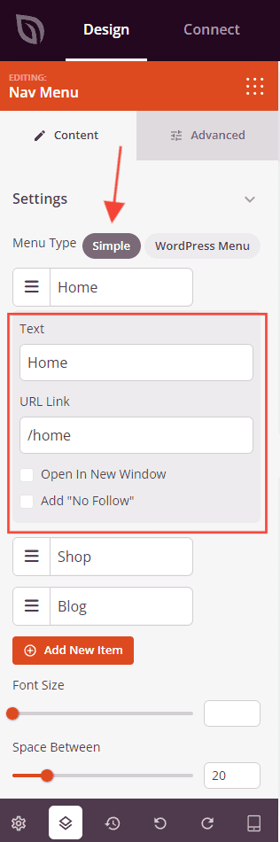
Once added, click on the Nav Menu block to open its settings. In the Content tab, start by selecting your menu type under the Settings section.
Menu Type:
- Simple: Build a custom menu directly in SeedProd by adding items manually. Each item can be dragged to reorder, duplicated, or deleted. Click any item to expand its settings and configure the Text (the visible link label), URL Link (the destination URL), Open In New Window, and No Follow options. Click + Add New Item to add more links to the menu.
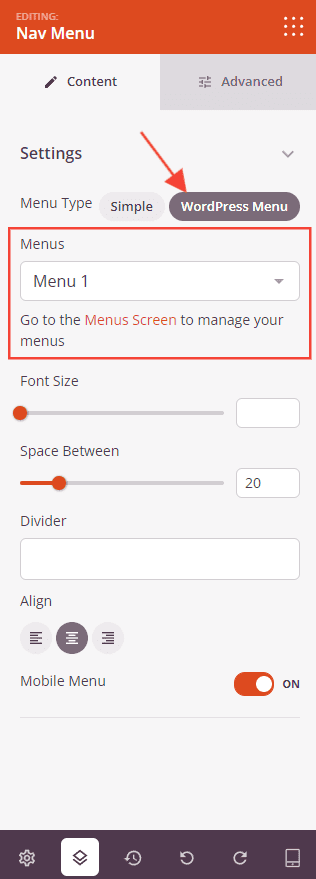
- WordPress Menu: Connect an existing WordPress menu to this block. Select a menu from the dropdown list of menus registered in your site. A link to the WordPress Menus screen is provided to create or manage menus if needed.
Settings:
- Font Size: Set the font size of menu item links from 10 to 72px.
- Space Between: Set the spacing between menu items from 1 to 100px.
- Divider: Enter a character or string to use as a visual separator between menu items (e.g.,
|). - Alignment: Set the horizontal alignment of the menu — Left, Center, or Right. Supports per-device values for desktop, tablet, and mobile.
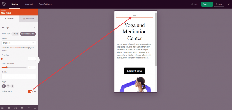
- Mobile Menu: Toggle on to enable a collapsible hamburger menu on mobile devices, replacing the full menu with a compact toggle button on smaller screens.
The Mobile Menu toggle displays a hamburger menu icon on mobile devices. When tapped, it expands to show the full menu.
Step 3: Customize the Design
In the Advanced tab, you can customize the typography, colors, sub menu styling, and spacing of your Nav Menu block.
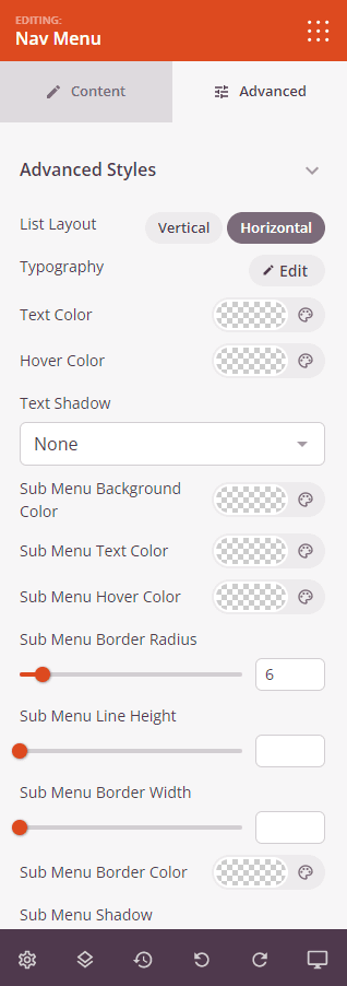
Advanced Styles:
- List Layout: Choose whether menu items display in a Vertical (stacked) or Horizontal (side-by-side) layout.
- Typography: Fine-tune the font family, font weight, size, line height, letter spacing, and text transform for menu item links. Supports per-device values for desktop, tablet, and mobile.
- Active Text Color: Set the color of the currently active menu item link.
- Hover Text Color: Set the color of menu item links on hover.
- Text Shadow: Add a shadow to the menu link text. Choose from None, Hairline, Small, Medium, Large, X Large, or 2X Large.
Sub Menu:
- Sub Menu Background Color: Set the background color of dropdown sub menu panels.
- Sub Menu Text Color: Set the text color of sub menu links.
- Sub Menu Hover Color: Set the hover text color of sub menu links.
- Sub Menu Border Radius: Set the corner radius of sub menu panels from 1 to 50px.
- Sub Menu Line Height: Set the line height of sub menu items from 1 to 60px.
- Sub Menu Border Width: Set the border width of sub menu panels from 1 to 60px.
- Sub Menu Border Color: Set the border color of sub menu panels.
- Sub Menu Shadow: Add a drop shadow to sub menu panels.
- Sub Menu Padding: Set the inner padding of the sub menu panel (Top, Right, Bottom, Left).
Spacing:
- Margin: Control the outer spacing around your Nav Menu block (Top, Right, Bottom, Left). This determines how much space appears between the menu and surrounding elements on the page.
- Padding: Adjust the inner spacing within your Nav Menu block (Top, Right, Bottom, Left). This creates breathing room between the menu links and the block edges.
Attributes:
- CSS ID: Displays the auto-generated unique identifier for your Nav Menu block. This ID is created automatically by SeedProd for custom styling or JavaScript targeting.
- Custom Class: Add custom CSS classes to apply specific styles from your theme or custom CSS.
- Custom Attributes: Add any HTML attributes to the block wrapper element. Enter each attribute on a new line using the format: attribute-name|value.
Device Visibility:
- Hide on Desktop: Hide the Nav Menu block on desktop screens.
- Hide on Tablet: Hide the Nav Menu block on tablet devices.
- Hide on Mobile: Hide the Nav Menu block on mobile devices.
Animation Effects:
- Entrance Animation: Choose from various animation effects that play when the Nav Menu block scrolls into view. Options include Bounce, Fade In, Zoom In, Rotate In, and many more.
Step 4: Save Your Changes
Once you have finished configuring the Nav Menu block and customizing its appearance, make sure to save your work.
You’ve successfully added a Nav Menu block to your page! A well-placed navigation menu helps visitors find what they’re looking for quickly and keeps them engaged with your site. Use the Simple menu type for quick custom link lists, or connect a WordPress menu to keep your navigation consistent with the rest of your site.