The Image Carousel block allows you to display a rotating slideshow of images on your SeedProd page. Each slide supports an optional caption, header text, sub header, and a call-to-action button — making it a flexible block for photo galleries, featured image showcases, and banner-style hero sections.
The carousel supports autoplay, navigation arrows, lightbox display, image overlays, and per-slide banner content with fully customizable typography and animation effects.
Adding the Image Carousel Block to Your Pages
Follow these steps to add an Image Carousel block to your SeedProd page:
Step 1: Add the Block
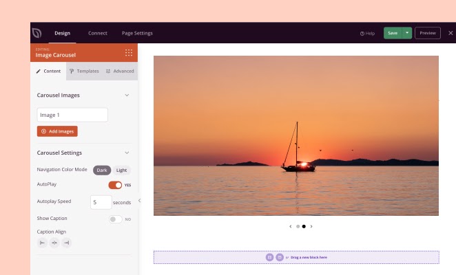
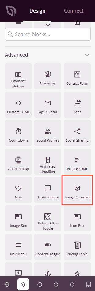
Under Design > Blocks, drag and drop the Image Carousel block into the desired section of your page.
Step 2: Configure Content Settings
Once added, click on the Image Carousel block to open its settings. The Content tab is organized into two sections: Carousel Images and Carousel Settings.
Carousel Images:
This section lists all slides in your carousel. Click a slide row to expand its individual settings, or drag slides to reorder them. You can also duplicate or delete any slide using the icons that appear on hover.
- Image: Upload or select an image from your WordPress media library for this slide, or enter a direct image URL.
- Caption: Enter optional caption text that appears below the image when captions are enabled.
- Show Header Text: Toggle on to reveal header and sub header text fields that display as an overlay on the slide.
- Header: Enter the heading text displayed on the slide overlay (visible when Show Header Text is enabled).
- Sub Header: Enter the sub heading text displayed below the header on the slide overlay (visible when Show Header Text is enabled).
- Show Button: Toggle on to add a call-to-action button on the slide overlay.
- Button Text: Enter the label for the button (visible when Show Button is enabled).
- Button Link: Enter the URL the button links to. Click the settings icon to reveal Open In New Window and No Follow options.
Click + Add Images at the bottom of the list to add a new slide to your carousel.
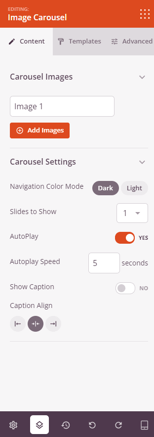
Carousel Settings:
- Navigation Color Mode: Choose the color of the navigation arrows and dots — Dark or Light — to ensure they contrast with your images.
- Slides to Show: Set how many slides are visible at once — 1 through 6.
- AutoPlay: Toggle autoplay on or off to control whether slides advance automatically.
- Autoplay Speed: Set the delay between slide transitions in seconds (visible when AutoPlay is enabled).
- Show Caption: Toggle on to display the caption text beneath each slide.
- Show Navigation: Toggle the navigation arrows and dots on or off.
- Image Overlay Color: Add a color overlay on top of each slide image using the color picker.
- Image Overlay Opacity: Set the opacity of the overlay from 0 (transparent) to 1 (fully opaque).
- Caption Align: Set the horizontal alignment of caption text — Left, Center, or Right.
Carousel Banner Settings:
- Vertical Position: Set the vertical position of the header/button overlay content on the slide as a percentage from 0 to 100.
- Horizontal Position: Set the horizontal position of the overlay content as a percentage from 0 to 100.
- Banner Button Color: Set the background color of the call-to-action button on each slide.
- Button Size: Choose the size of the banner button — Small, Medium, Large, X Large, or 2X Large.
- Banner Button Radius: Set the border radius of the banner button from 0 to 100px to control corner rounding.
- Header Text Align: Set the horizontal alignment of the header overlay text — Left, Center, or Right. Supports per-device values.
- Subheader Text Align: Set the horizontal alignment of the sub header overlay text — Left, Center, or Right. Supports per-device values.
- Carousel Button Align: Set the horizontal alignment of the overlay button — Left, Center, or Right. Supports per-device values.
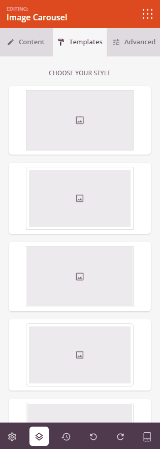
Step 3: Choose a Template (Optional)
The Templates tab offers pre-designed style presets for your carousel. Click any template thumbnail to instantly apply a combination of border, shadow, and image styling to all slides in your carousel.
Step 4: Customize the Design
In the Advanced tab, you can customize the typography, image styling, and spacing of your Image Carousel block.
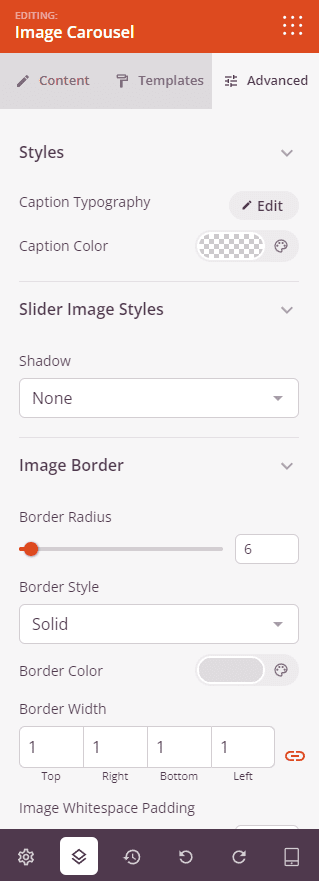
Styles:
- Caption Typography: Fine-tune the caption font family, weight, size, line height, letter spacing, and text transform. Supports per-device values.
- Caption Color: Set the text color for captions.
- Banner Header Typography: Fine-tune the font settings for the slide overlay header text.
- Banner Header Color: Set the text color for the slide overlay header.
- Banner Subheader Typography: Fine-tune the font settings for the slide overlay sub header text.
- Banner Subheader Color: Set the text color for the slide overlay sub header.
- Banner Button Typography: Fine-tune the font settings for the slide overlay button text.
Slider Image Styles:
- Shadow: Add a drop shadow to each slide image. Choose from None, Hairline, Small, Medium, Large, X Large, or 2X Large.
- Image Border: Add a border around each slide image, with Border Radius control to round the corners.
Spacing:
- Margin: Control the outer spacing around your Image Carousel block (Top, Right, Bottom, Left). Supports per-device values for desktop, tablet, and mobile.
- Padding: Adjust the inner spacing within your Image Carousel block (Top, Right, Bottom, Left). Supports per-device values for desktop, tablet, and mobile.
Attributes:
- CSS ID: Displays the auto-generated unique identifier for your Image Carousel block, created automatically by SeedProd for custom styling or JavaScript targeting.
- Custom Class: Add custom CSS classes to apply specific styles from your theme or custom CSS.
- Custom Attributes: Add any HTML attributes to the block wrapper element. Enter each attribute on a new line using the format: attribute-name|value.
Device Visibility:
- Hide on Desktop: Hide the Image Carousel block on desktop screens.
- Hide on Tablet: Hide the Image Carousel block on tablet devices.
- Hide on Mobile: Hide the Image Carousel block on mobile devices.
Animation Effects:
- Entrance Animation: Choose an animation effect for when the carousel block scrolls into view.
- Header Animation Effects: Choose an animation for the slide overlay header text as each slide appears.
- Sub Header Animation Effects: Choose an animation for the slide overlay sub header text.
- Button Animation Effects: Choose an animation for the slide overlay button.
Step 5: Save Your Changes
Once you have finished configuring the Image Carousel block and customizing its appearance, make sure to save your work.
You’ve successfully added an Image Carousel block to your page! Carousels are a great way to showcase multiple images in a compact, engaging format. Use the banner settings to add overlay text and calls to action on each slide, or keep it simple as a clean image gallery. Experiment with autoplay speeds, navigation styles, and image overlays to create a carousel that fits your page perfectly.