Web design color theory isn’t about having an eye for design. It’s a simple system that tells you which colors guide attention, trigger emotion, and push people to take action.
People judge your site in 90 seconds, and up to 90% of that decision is based on color alone, according to research from the Institute for Color Research.
If you’re staring at a blank website wondering whether the wrong shade of blue will make your business look cheap, I get it. But most “bad design” isn’t caused by ugly colors, but by using too many colors in the wrong places.
This guide will show you the exact rules professional designers follow so you can apply them yourself.
What Is Web Design Color Theory?
Color theory is the set of rules that tells you which colors look good together and which ones hurt your eyes.
It’s based on the color wheel. You’ve got Primary colors (red, blue, yellow), Secondary colors (made by mixing primaries), and Tertiary colors (everything in between).
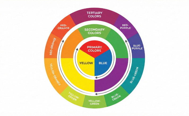
Professional designers don’t make up new combinations. They follow patterns that already look natural to the human eye.
Here are the four schemes you’ll see everywhere:
- Monochromatic: One color in different shades. Safe and clean, but can look boring if you don’t mix light and dark versions.
- Analogous: Colors next to each other on the wheel (like blue, blue-green, and green). Easy on the eyes.
- Complementary: Colors across from each other on the wheel (like blue and orange). High contrast that grabs attention, but can feel too loud if you use it everywhere.
- Split-Complementary: One main color plus the two colors on either side of its opposite. Gives you contrast without the headache.
You don’t need to reinvent the wheel here. Pick one of these patterns and your colors will automatically look more polished than 90% of websites out there.
The Golden Rule of Web Color: 60-30-10
The 60-30-10 rule states that 60% of your site should be a neutral background, 30% a brand color, and 10% an accent color.
Most beginners pick great colors but use them in the wrong amounts. They slap their brand color everywhere, throw in three accent colors, and wonder why it feels chaotic. The fix is simple math.
The 60% (Your Foundation)

This is your background. White, light gray, or a dark neutral like charcoal. It creates breathing room so your content doesn’t compete with itself.
The 30% (Your Identity)

This is your main brand color. Use it for section backgrounds, cards, headers, and footers. It shows up enough that people associate it with your business, but not so much that it overwhelms the page.
The 10% (The Action)
This is your brightest, highest-contrast color. Reserve it strictly for buttons, links, and calls to action.

When only 10% of your site uses this color, it’s impossible to ignore. You’re guiding people to click, sign up, or buy, and high contrast makes that decision automatic. This ties directly into call-to-action best practices where contrast and clarity win every time.
Here’s how it breaks down:
| Percentage | Role | Where to Use It |
|---|---|---|
| 60% | Neutral Background | Page backgrounds, white space, content areas |
| 30% | Brand Color | Headers, footers, section backgrounds, cards |
| 10% | Accent Color | Buttons, links, CTAs, highlights |
Color Psychology Without Overthinking It
Colors trigger subconscious emotional responses before a user reads a single word of text, according to research published in Management Decision.
Warm colors (red, orange, yellow) create energy and urgency. Cool colors (blue, green, purple) create trust and calm. That’s the shorthand version, and honestly, it’s most of what you need to know.
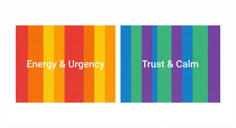
Here’s how industries use color:
| Color | Common Industries | What It Signals |
|---|---|---|
| Blue | Tech, finance, healthcare | Trust and stability |
| Green | Health, wealth, sustainability | Growth and safety |
| Black | Luxury, fashion, high-end services | Exclusivity |
| Red/Orange | Food, sales, clearance events | Urgency and appetite |
These aren’t hard and fast rules though. You’ll see exceptions everywhere. But if you’re a local business or just getting started, sticking to industry norms is the safer bet.
Context Matters More Than Hue
Here’s what most color psychology articles won’t tell you: High contrast is more important for conversion than the specific emotion of a color.
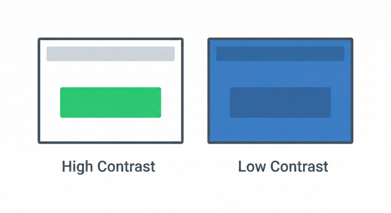
A bright green button on a white background will outperform a “psychologically perfect” blue button that blends into a blue header. Your goal isn’t to trigger the right emotion, but to make the action obvious.
How to Choose a Color Palette Without Design Skills
You don’t need to guess which colors work together. Tools and generators can do the math for you.
Websites like Adobe Color and Coolors let you pick one base color and automatically generate complementary schemes.
You input your brand color (or a color you like), and the tool spits out a full palette using the color theory rules we covered earlier. It’s instant, free, and eliminates the guesswork.
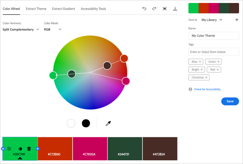
Don’t even have a starting color? Ask ChatGPT or another AI tool to “generate a color palette for a bakery website” or “suggest colors for a law firm.” You’ll get hex codes and explanations in seconds. Then, you can plug those into a palette generator to refine them.
Or skip the tools entirely and build a WordPress website with AI that comes with a pre-designed color scheme already applied.
How to Apply Color Theory to Your Website
The hardest part of color theory isn’t choosing colors, but keeping them consistent across your entire website.
Manually updating hex codes on 50 different pages is a nightmare. You’ll miss buttons, forget sections, and end up with a site that looks half-finished.
That’s where SeedProd helps. SeedProd is a drag-and-drop WordPress website builder trusted by over 1 million websites. You can use it to create custom WordPress themes, custom landing pages, and custom WooCommerce stores without any code.

But for color theory, the game-changer is its Global Design options that let you set your colors once and apply them everywhere automatically.
Here’s how it works:
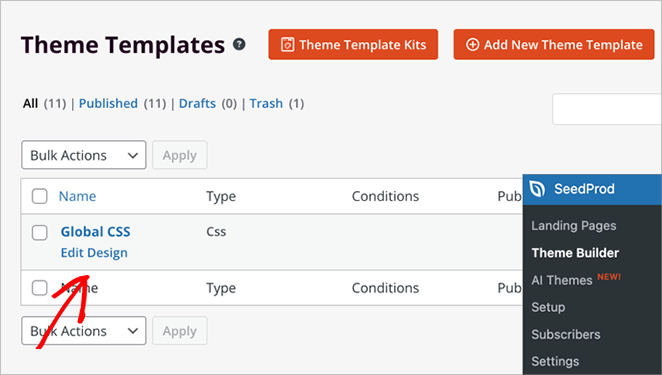
FIrst, edit your Global CSS template in SeedProd.
Then select Colors and define your 60-30-10 palette.
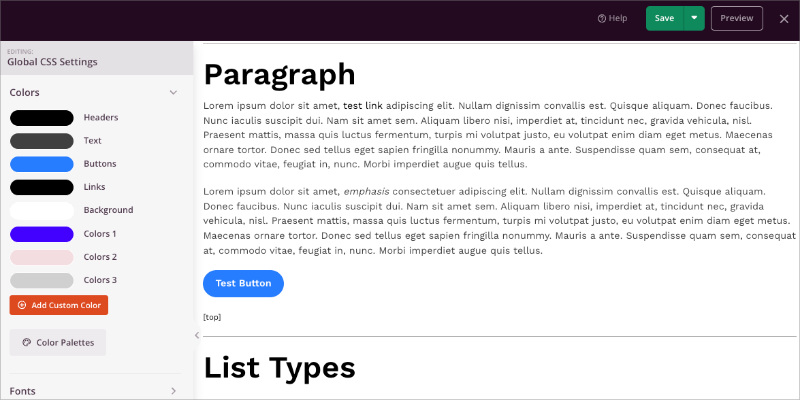
Set your neutral background color, your primary brand color, and your accent color for buttons. SeedProd lets you customize colors for headers, text, buttons, links, and background separately.
Now every time you add a button, section, or text block, you can choose from your saved global colors instead of typing hex codes. Change a color in Global Settings, and that element updates on your site instantly.
If you’re stuck and don’t want to build a palette from scratch, SeedProd has 20+ pre-made color themes created by professional designers.
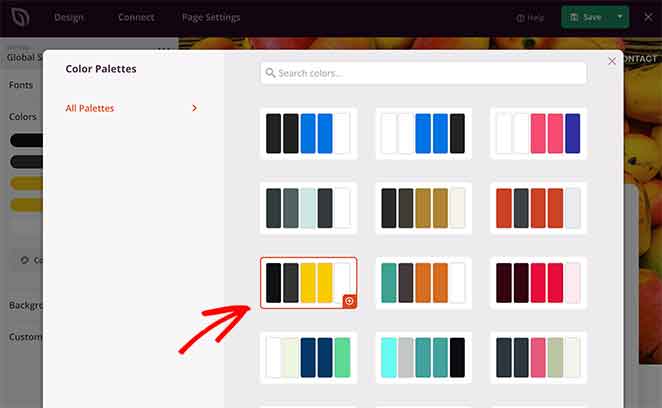
Just click the Color Palettes button. You can apply one with a single click and your entire site instantly looks polished.
This is how you build a professional site without needing to hire an agency. The system does the consistency work for you.
FAQs About Web Design Color Theory
What is the 60-30-10 rule in web design?
The 60-30-10 rule in web design is a color distribution formula where 60% of your website uses a neutral background color, 30% uses your primary brand color, and 10% uses an accent color for calls to action. This ratio prevents visual chaos and guides user attention to the most important elements on your page.
How many colors should a website use?
A website should use 3 to 5 colors maximum for a clean, professional look. This typically includes one neutral background color, one or two brand colors, and one high-contrast accent color for buttons and links. Using more than 5 colors creates visual clutter and makes your site look unprofessional.
What is the difference between RGB and CMYK?
RGB is a color model for digital screens that uses red, green, and blue light, while CMYK is a color model for print that uses cyan, magenta, yellow, and black ink. For web design, you should always use RGB or Hex codes because screens display colors using light, not ink. CMYK colors will look different on screens than intended.
Which color converts the best on websites?
There is no single “best” converting color for websites. The color with the highest contrast against your background typically converts best because it makes buttons and calls to action impossible to miss. For example, an orange button on a white background will outperform a blue button on a blue background, regardless of color psychology claims.
How do I make sure my website colors are accessible?
To make sure your website colors are accessible, use a contrast checker tool like WebAIM’s Contrast Checker to test your text against backgrounds. WCAG accessibility standards require a minimum contrast ratio of 4.5:1 for normal text and 3:1 for large text. Meeting these standards ensures people with visual impairments can read your content.
Color theory is a system, not a talent.
You don’t need to be creative or artistic to pick colors that work. You need to follow proven patterns, use the 60-30-10 rule, and let tools do the heavy lifting.
Stop stressing over the color wheel. Use SeedProd to lock in your palette once and create a unique website in minutes.
Thanks for reading! We’d love to hear your thoughts, so please feel free to join the conversation on YouTube, X and Facebook for more helpful advice and content to grow your business.

