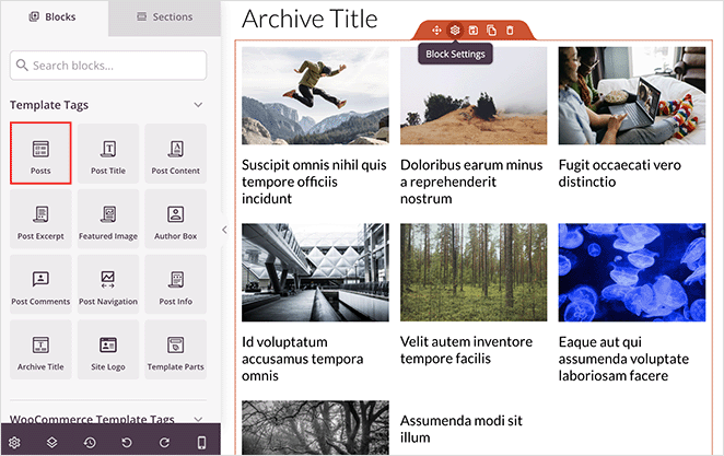
The Posts block allows you to showcase a collection of posts on a single page, giving you full control over how your content is queried, organized, and displayed. Choose from multiple skins, layouts, and display options to create a post feed that matches your site’s design.
The block supports powerful query filtering by post type, category, tag, and author, and offers rich layout options including Grid, Masonry, and Carousel. You can also control what post information is shown — featured images, titles, meta, excerpts, badges, and read more links — all from a single settings panel.
Adding the Posts Block to Your Pages
Follow these steps to add a Posts block to your SeedProd page:
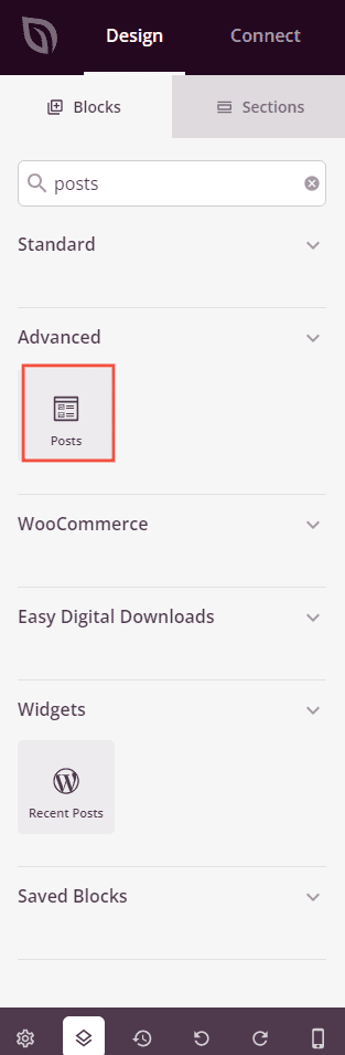
Step 1: Add the Block
Under Blocks > Advanced, drag and drop the Posts block into the desired section of your page.
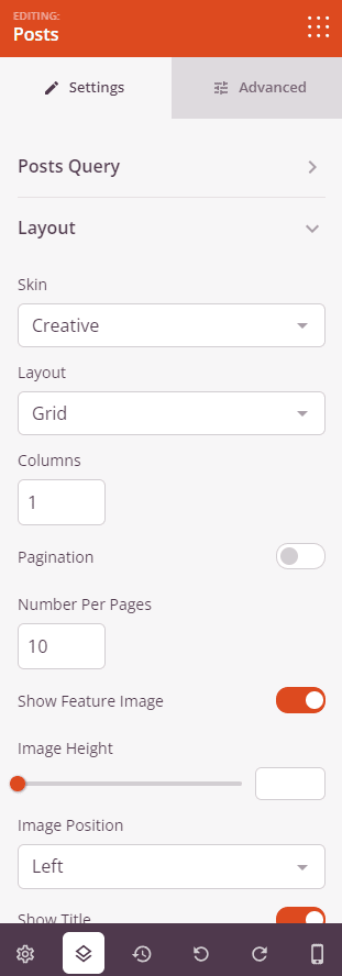
Step 2: Configure Content Settings
Once added, click on the Posts block to open its settings. The Settings tab is organized into two sections: Posts Query and Layout.
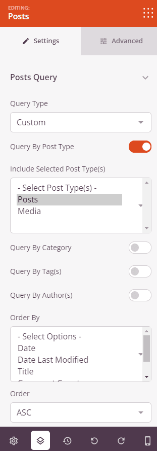
Posts Query:
- Query Type: Choose how posts are retrieved. Default uses the page’s existing query parameters, Custom lets you filter by post type, category, tag, and author, and Manual lets you enter a raw WP_Query query string for full control.
- Query By Post Type: Toggle on to filter results by one or more post types. Select the post types to include from the dropdown (available when Custom is selected).
- Query By Category: Toggle on to filter results by one or more categories. Select the categories to include from the dropdown.
- Query By Tag(s): Toggle on to filter results by one or more tags. Select the tags to include from the dropdown.
- Query By Author(s): Toggle on to filter results by one or more authors. Select the authors to include from the dropdown.
- Order By: Choose the field used to sort results — Date, Date Last Modified, Title, Comment Count, or Menu Order.
- Order: Set the sort direction — ASC (oldest/A-Z first) or DESC (newest/Z-A first).
- Query Params: Enter a manual WP_Query string (available when Manual is selected), for example:
post_type=post&posts_per_page=3&order=desc.
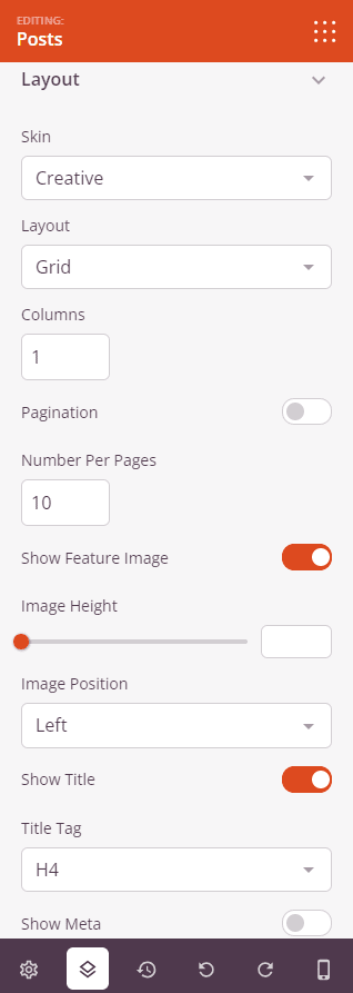
Layout:
- Skin: Choose the overall post card design — Classic (standard list/grid), Card (boxed card with image on top), Creative (image with overlapping content area), or Minimal (clean, lightweight layout).
- Layout: Choose how posts are arranged — Grid (uniform columns), Masonry (variable-height columns), or Carousel (horizontally scrolling slideshow). Carousel options include Slides to Show (1–10), AutoPlay toggle, Autoplay Speed, Navigation position (Top/Bottom), Navigation style (Arrows and Dots/Arrows/Dots), and Navigation Color.
- Columns: Set the number of columns to display (Grid and Masonry layouts).
- Pagination: Toggle on to add pagination links below the posts.
- Number Per Page: Set how many posts to display per page (available when Custom or Manual query type is selected).
- Show Featured Image: Toggle on to display each post’s featured image. When enabled, you can also set the Image Height (0–500px) and, for Creative and Minimal skins, the Image Position (Left or Right).
- Show Title: Toggle on to display each post’s title. When enabled, choose the Title Tag — H1 through H6, div, span, or p.
- Show Meta: Toggle on to display post metadata. Individual toggles let you show/hide Date Modified, Author, Date, Time, and Comment Count. Set a Separator character to appear between meta items.
- Show Excerpt: Toggle on to display each post’s excerpt. When enabled, set the Excerpt Length (number of words).
- Show Read More: Toggle on to display a read more link below the excerpt. When enabled, customize the Read More Text.
- Badge: Toggle on to display a taxonomy label badge on each post (available for Card and Creative skins). When enabled, choose the Badge Taxonomy — Category or Tags.
- Avatar: Toggle on to display the author’s avatar (Card skin only).
Step 3: Customize the Design
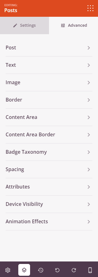
In the Advanced tab, you can fine-tune the visual styling of every element of your Posts block. Settings are organized into the following sections:
Post:
- Post Padding: Set the inner spacing around the content inside each post card (Top, Right, Bottom, Left).
- Post Background Color: Set the background color for each individual post card.
- Post Shadow: Add a shadow effect around each post card — choose from None, Hairline, Small, Medium, Large, X Large, 2X Large, or a custom shadow.
- Space Bottom: Set the vertical spacing between post cards from 0 to 100px.
Text:
- Title Typography: Set the font family, size, weight, and style for post titles (supports per-device settings).
- Title Color: Set the color of the post title text.
- Meta Text Typography: Set the typography for the post meta information (per-device).
- Meta Text Color: Set the color of the meta text.
- Excerpt Typography: Set the typography for the post excerpt (per-device).
- Excerpt Color: Set the color of the excerpt text.
- Read More Text Typography: Set the typography for the read more link (per-device).
- Read More Text Color: Set the color of the read more link.
- Pagination Typography: Set the typography for pagination links (per-device).
- Pagination Color: Set the color of pagination link text.
Image:
- Image Height: Set the height of featured images from 0 to 500px (shown when featured images are enabled).
- Shadow: Add a shadow effect to the featured image — choose from None, Hairline, Small, Medium, Large, X Large, 2X Large, or Bottom Drop Shadow.
- Image Margin: Set the spacing around the featured image (Top, Right, Bottom, Left).
- Image Border: Set the image border style (Solid, Dotted, Dashed), color, width, and corner radius (including per-corner radius: Top Right, Top Left, Bottom Right, Bottom Left).
- Image Whitespace Padding: Add inner padding around the featured image.
Border:
- Border Radius: Set the corner rounding of each post card from 0 to 100px.
- Border Style: Set the border style for each post card — Solid, Dotted, or Dashed.
- Border Color: Set the border color of each post card.
- Border Width: Set the border width per side (Top, Right, Bottom, Left).
Content Area:
- Content Padding: Set the inner padding of the text content area within each post card (Top, Right, Bottom, Left).
- Content Background Color: Set the background color of the content area inside each post card.
- Content Shadow: Add a shadow to the content area — choose from None, Hairline, Small, Medium, Large, X Large, 2X Large, or a custom shadow.
- Content Area Border: Set the content area border style (Solid, Dotted, Dashed), color, width per side, and border radius.
Badge Taxonomy:
- Taxonomy Padding: Set the inner padding of the badge label (Top, Right, Bottom, Left).
- Border Radius: Set the corner rounding of the badge per corner (Top Right, Top Left, Bottom Right, Bottom Left).
- Background Color: Set the background color of the taxonomy badge.
- Color: Set the text color of the taxonomy badge label.
- Taxonomy Typography: Set the font family, size, and style for the badge text (per-device).
- Bottom Spacing: Set the spacing below the badge from 0 to 100px.
Spacing:
- Margin: Control the outer spacing around your Posts block (Top, Right, Bottom, Left). Supports per-device settings for desktop, tablet, and mobile.
- Padding: Adjust the inner spacing within your Posts block (Top, Right, Bottom, Left). Supports per-device settings.
Attributes:
- CSS ID: Displays the auto-generated unique identifier for your Posts block. This ID is created automatically by SeedProd for custom styling or JavaScript targeting.
- Custom Class: Add custom CSS classes to apply specific styles from your theme or custom CSS.
- Custom Attributes: Add any HTML attributes to the block wrapper element. Enter each attribute on a new line using the format: attribute-name|value.
Device Visibility:
- Hide on Desktop: Hide the Posts block on desktop screens.
- Hide on Tablet: Hide the Posts block on tablet devices.
- Hide on Mobile: Hide the Posts block on mobile devices.
Animation Effects:
- Entrance Animation: Choose from various animation effects that play when the Posts block scrolls into view. Options include Bounce, Fade In, Zoom In, Rotate In, and many more.
Step 4: Save Your Changes
Once you have finished configuring the Posts block and customizing its appearance, make sure to save your work.
You’ve successfully added a Posts block to your page! Use it to elegantly display your content in a visually engaging and organized layout that encourages readers to explore more of your site. Experiment with different skins, layouts, and query settings to create a post feed that perfectly matches your brand and content strategy.