The Divider block allows you to insert visually appealing line separators between different sections of content on your page. These dividers help improve readability and create a more structured, engaging layout.
Beyond a simple line, the Divider block lets you place a text label or icon in the center of the divider, making it a versatile design element for breaking up content with style.
Adding the Divider Block to Your Pages
Follow these steps to add a Divider block to your SeedProd page:
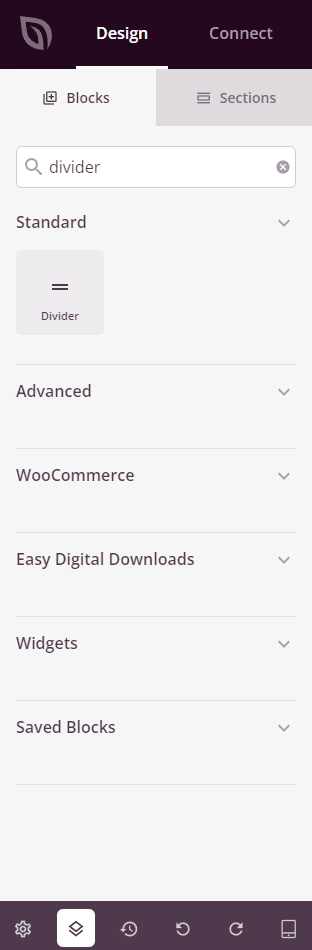
Step 1: Add the Block
Under Design > Blocks, drag and drop the Divider block into the desired section of your page.
Step 2: Configure Content Settings
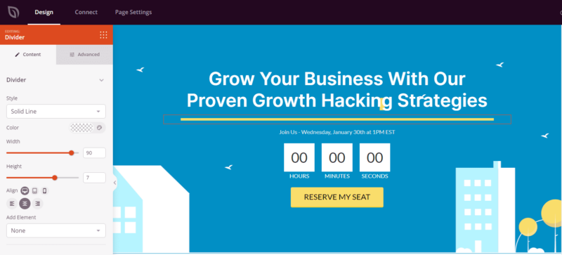
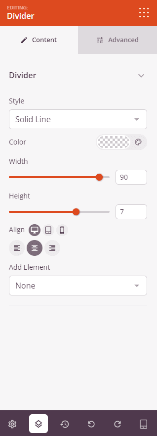
Once added, click on the Divider block to open its settings. In the Content tab, configure the appearance and style of your divider.
Divider:
- Style: Choose the line style for your divider — Solid Line, Dotted, Dashed, or Double.
- Color: Set the color of the divider line.
- Width: Control how wide the divider is as a percentage of its container, from 1% to 100%.
- Height: Set the thickness of the divider line in pixels, from 1px to 10px.
- Alignment: Align the divider to the Left, Center, or Right. Supports per-device alignment for desktop, tablet, and mobile.
- Add Element: Optionally place an element in the center of the divider line. Choose from None (just the line), Text (a text label), or Icon (a Font Awesome icon).
- When Text is selected: Enter the label text and choose an HTML Tag (H1–H6 or span) to control its semantic markup.
- When Icon is selected: Choose your icon using the icon picker and set the Icon Size.
Step 3: Customize the Design
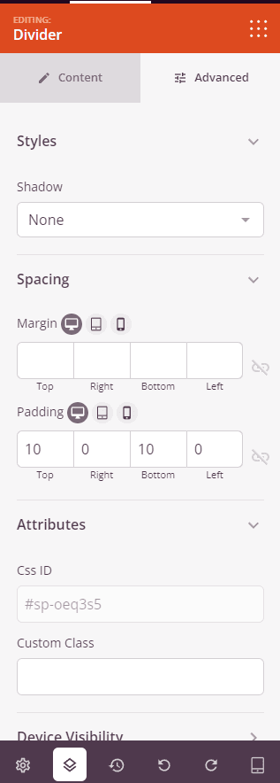
In the Advanced tab, you can further customize the appearance of your Divider block.
Styles:
- Shadow: Add a shadow effect to the divider. Choose from None, Hairline, Small, Medium, or Large.
- Header Typography (visible when Add Element is set to Text): Customize the font family, weight, size, line height, letter spacing, and text transform for the text element.
- Text Color (visible when Add Element is set to Text): Set the color of the text label on the divider.
- Icon Color (visible when Add Element is set to Icon): Set the color of the icon displayed on the divider.
Spacing:
- Margin: Control the outer spacing around your Divider block (Top, Right, Bottom, Left). This determines how much space appears between the divider and surrounding elements on the page.
- Padding: Adjust the inner spacing within your Divider block (Top, Right, Bottom, Left). Supports per-device values for desktop, tablet, and mobile.
Attributes:
- CSS ID: Displays the auto-generated unique identifier for your Divider block, created automatically by SeedProd for custom styling or JavaScript targeting.
- Custom Class: Add custom CSS classes to apply specific styles from your theme or custom CSS.
- Custom Attributes: Add any HTML attributes to the divider wrapper element. Enter each attribute on a new line using the format: attribute-name|value.
Device Visibility:
- Hide on Desktop: Hide the Divider block on desktop screens.
- Hide on Tablet: Hide the Divider block on tablet devices.
- Hide on Mobile: Hide the Divider block on mobile devices.
Animation Effects:
- Entrance Animation: Choose an animation effect that plays when the Divider block scrolls into view, such as Bounce, Fade In, Zoom In, Rotate In, and many more.
Step 4: Save Your Changes
Once you have finished configuring the Divider block and customizing its appearance, make sure to save your work.
You’ve successfully added a Divider block to your page! Dividers are a simple but effective way to create visual structure and guide your visitors through your content. Experiment with different line styles, colors, widths, and center elements to find the right look for your design.