The Alert block allows you to add eye-catching, colored alert boxes to your SeedProd pages. This block helps you communicate important messages, announcements, warnings, or success notifications to your visitors in a visually prominent way.
Alert boxes are perfect for highlighting critical information that needs immediate attention, such as special promotions, important updates, system notifications, or time-sensitive announcements. With customizable styles and colors, you can ensure your messages stand out and capture your visitors’ attention.
Adding the Alert Block to Your Pages
Follow these steps to add an Alert block to your SeedProd page:
Step 1: Add the Block
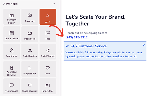
Under Design > Blocks, drag and drop the Alert block into the desired section of your page.
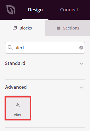
The Alert block is located under Design > Advanced and can be dragged into any section of your page.
Step 2: Configure Content Settings
Once added, click on the Alert block to open its settings. In the Content tab, you can customize your alert message and appearance.
Alert:
- Type: Choose from predefined alert styles – Info (blue, for general information), Success (green, for positive confirmations), Warning (yellow/orange, for cautions), or Danger (red, for critical alerts). Each type comes with appropriate colors to convey the right message tone
- Dismiss Button: Toggle to show or hide a close button that allows visitors to dismiss the alert. Enable this for non-critical messages that users may want to hide
- Title: Enter the main heading for your alert message. This should be concise and attention-grabbing
- Description: Add detailed text to explain your alert message. This provides context and additional information beyond the title
- Title Align: Set the horizontal alignment for your alert title (left, center, or right)
- Description Align: Set the horizontal alignment for your alert description text
- Title Font Size: Adjust the size of the title text to ensure it’s prominent and readable
- Description Font Size: Control the size of the description text for optimal readability
- Title Tag: Choose the HTML heading tag for your title (h1, h2, h3, h4, h5, or h6). This affects both SEO and visual hierarchy
- Show Icon: Toggle to display or hide an icon next to your alert message. Icons provide quick visual cues about the alert type
- Icon: Select a custom icon to display with your alert. Choose an icon that matches your message purpose
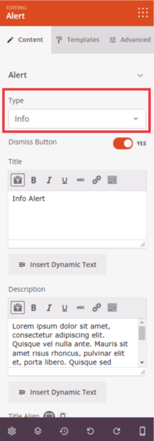
The Content tab lets you configure the alert type, message content, alignment, and icon settings.
Step 2a: Choose a Template Style
In the Templates tab, you can select from pre-designed alert styles to quickly change the overall appearance of your alert box.
- Choose from four different template designs, each with unique layouts and visual treatments. Preview each style to find the one that best matches your page design
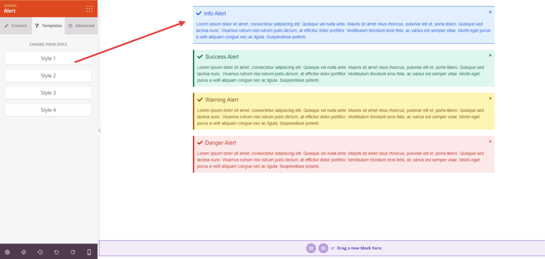
The Templates tab provides four pre-designed styles to quickly customize your alert’s appearance.
Step 3: Customize the Design
In the Advanced tab, you can customize the visual appearance of your Alert block:
Styles:
- Typography: Control the font properties for your alert title, including font family, weight, and style
- Text Typography: Customize the font properties for your alert description text
- Color: Set the color for your alert title text
- Description Color: Choose the color for your alert description text
- Dismiss Color: Set the color for the dismiss button (X icon) that closes the alert
- Title Background: Add a background color specifically for the title area of your alert
- Background Color: Set the overall background color for the entire alert box
- Text Shadow: Add shadow effects to your alert text for depth and readability. Choose from None, Hairline, Small, Medium, Large, X Large, 2X Large, or Custom
Spacing:
- Margin: Control the outer spacing around your alert block (Top, Right, Bottom, Left). This determines how much space appears between the alert and surrounding elements
- Padding: Adjust the inner spacing within your alert box (Top, Right, Bottom, Left). This creates breathing room between the content and the alert borders
Attributes:
- CSS ID: Displays the auto-generated unique identifier for your alert block. This ID is created automatically by SeedProd for custom styling or JavaScript targeting
- Custom Class: Add custom CSS classes to apply specific styles from your theme or custom CSS
- Custom Attributes: Add any HTML attributes to the alert wrapper element. Enter each attribute on a new line using the format: attribute-name|value (e.g., role|alert)
Device Visibility:
- Hide on Desktop: Hide the alert block on desktop screens
- Hide on Tablet: Hide the alert block on tablet devices
- Hide on Mobile: Hide the alert block on mobile devices
Animation Effects:
- Entrance Animation: Choose from various animation effects that play when the alert scrolls into view. Options include Bounce, Fade In, Zoom In, Rotate In, and many more. This draws immediate attention to your important messages
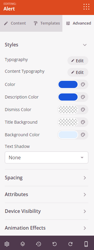
The Advanced tab provides extensive styling options including typography, colors, spacing, and animation effects.
Step 4: Save Your Changes
Once you have finished configuring the Alert block and customizing its appearance, make sure to save your work.
You’ve successfully added an Alert block to your page! This powerful block helps you deliver important information effectively and capture visitor attention with eye-catching, color-coded messages. Experiment with different alert types, template styles, and custom colors to create alerts that match your brand and communicate your message clearly.