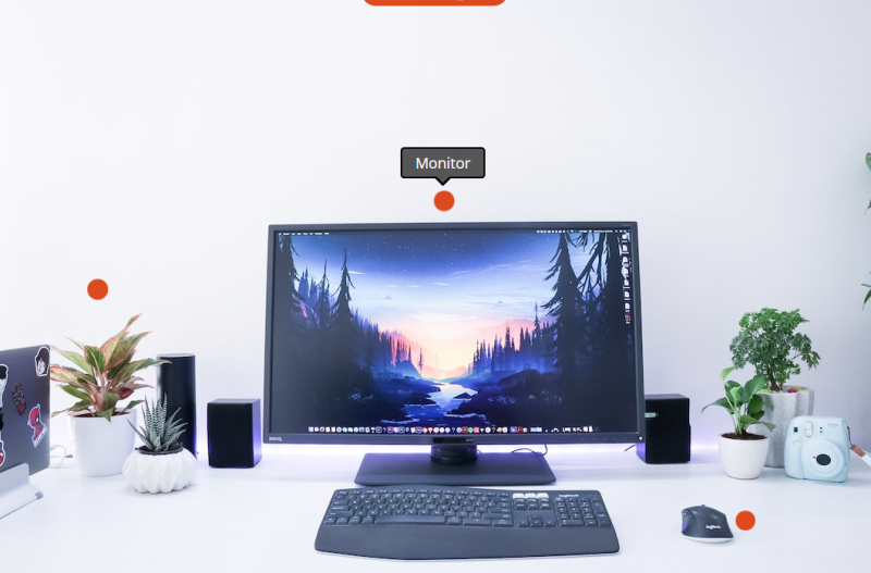
The Hotspot block allows you to transform any static image into an interactive, clickable experience by placing hotspot markers directly on top of it. When visitors hover over or click a hotspot, a tooltip pops up with your custom content — making it a powerful way to highlight product features, annotate diagrams, showcase room designs, or guide visitors through any visual.
Each hotspot is fully customizable with its own icon, color, position, tooltip content, and link. You can add as many hotspots as you need and control the animation style for both the markers and their tooltip popups.
Adding the Hotspot Block to Your Pages
Follow these steps to add a Hotspot block to your SeedProd page:
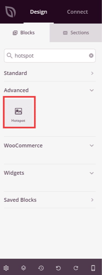
Step 1: Add the Block
Under Design > Blocks, drag and drop the Hotspot block into the desired section of your page.
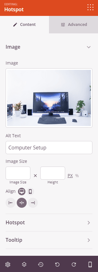
Step 2: Configure Content Settings
Once added, click on the Hotspot block to open its settings. The Content tab is organized into three sections: Image, Hotspot, and Tooltip.
Image:
- Image: Upload or select the background image that your hotspots will be placed on top of.
- Alt Text: Enter descriptive alternative text for the image to improve accessibility and SEO.
- Image Size: Set the width and height of the image in pixels (px) or as a percentage (%).
- Alignment: Set the horizontal alignment of the Hotspot block within its section — Left, Center, or Right. Supports per-device values for desktop, tablet, and mobile.
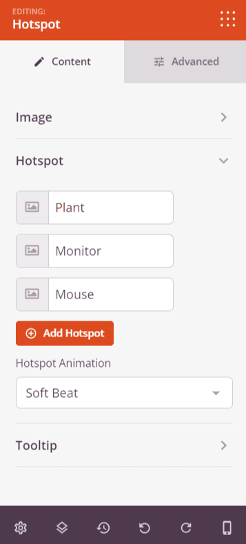
Hotspot:
The Hotspot section lists all hotspot markers added to your image. Each hotspot row shows its icon and tooltip content preview. You can drag hotspots to reorder them, duplicate them, or delete them. Click a hotspot row to expand its individual settings:
- Horizontal Orientation: Set the horizontal position of the hotspot marker on the image as a percentage from 0 to 100.
- Vertical Orientation: Set the vertical position of the hotspot marker on the image as a percentage from 0 to 100.
- Tooltip Content: Enter the content that appears inside the tooltip popup when the hotspot is triggered. Supports rich text formatting including bold, italic, links, and inline colors.
- Color: Set the color of the hotspot icon marker.
- Advanced Settings: Toggle on to reveal additional per-hotspot options including Label, Link (with Open In New Window and No Follow options), Icon Position (Left or Right), Icon picker, Custom Icon Size toggle, and Icon Size slider (10–150px, visible when Custom Icon Size is enabled).
Click + Add Hotspot at the bottom of the list to add a new hotspot marker to your image.
Below the hotspot list, the Hotspot Animation dropdown sets the continuous animation style applied to all hotspot markers — choose from None, Soft Beat, or Expand.
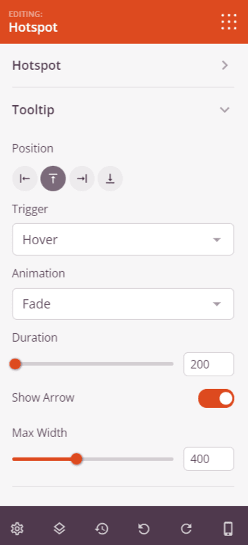
Tooltip:
- Position: Choose where the tooltip appears relative to the hotspot marker — Top, Right, Bottom, or Left.
- Trigger: Set what action opens the tooltip — None, Hover, or Click.
- Animation: Choose the animation style used when the tooltip appears — Fade, Grow, Swing, Slide, or Fall.
- Duration: Set the length of the tooltip open/close animation in milliseconds (0–10,000ms).
- Show Arrow: Toggle the small directional arrow on the tooltip bubble on or off.
- Max Width: Set the maximum width of the tooltip popup in pixels (0–1000px).
Step 3: Customize the Design
In the Advanced tab, you can customize the image styling and spacing of your Hotspot block.
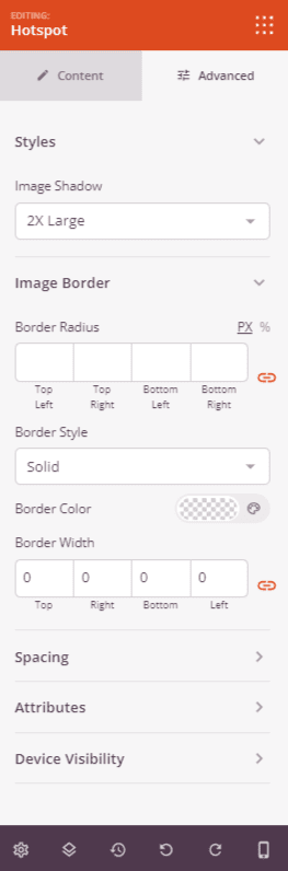
Styles:
- Image Shadow: Add a drop shadow behind the image. Choose from None, Hairline, Small, Medium, Large, X Large, or 2X Large.
- Image Border: Add a border around the image. Set the Border Style (Solid, Dotted, or Dashed), Border Color, Border Width (Top, Right, Bottom, Left), and Border Radius to round the corners.
Spacing:
- Margin: Control the outer spacing around your Hotspot block (Top, Right, Bottom, Left). Supports per-device values for desktop, tablet, and mobile.
- Padding: Adjust the inner spacing within your Hotspot block (Top, Right, Bottom, Left). Supports per-device values for desktop, tablet, and mobile.
Attributes:
- CSS ID: Displays the auto-generated unique identifier for your Hotspot block, created automatically by SeedProd for custom styling or JavaScript targeting.
- Custom Class: Add custom CSS classes to apply specific styles from your theme or custom CSS.
- Custom Attributes: Add any HTML attributes to the block wrapper element. Enter each attribute on a new line using the format: attribute-name|value.
Device Visibility:
- Hide on Desktop: Hide the Hotspot block on desktop screens.
- Hide on Tablet: Hide the Hotspot block on tablet devices.
- Hide on Mobile: Hide the Hotspot block on mobile devices.
Step 4: Save Your Changes
Once you have finished configuring the Hotspot block and customizing its appearance, make sure to save your work.
You’ve successfully added a Hotspot block to your page! By turning static images into interactive experiences, you can guide visitors’ attention, highlight key details, and increase engagement. Experiment with different hotspot animations, tooltip positions, and icon styles to create an experience that fits your brand and keeps visitors exploring your content.