El bloque Botón te permite añadir botones de llamada a la acción (CTA) a tus páginas de SeedProd. Este bloque te ayuda a guiar a los visitantes para que realicen acciones específicas, ya sea comprar, suscribirse a un boletín, descargar un recurso o navegar a otra página.
Los botones son elementos esenciales para las conversiones y la interacción del usuario. Con texto, enlaces, estilos, iconos y efectos visuales personalizables, puedes crear botones que destaquen y animen a los visitantes a actuar. El bloque Botón admite enlaces internos (a otras páginas de tu sitio) y enlaces externos (a otros sitios web), así como enlaces de anclaje para una navegación fluida a secciones específicas de la misma página.
Añadir el Bloque de Botón a tus Páginas
Sigue estos pasos para añadir un bloque Botón a tu página de SeedProd:
Paso 1: Añadir el Bloque
En Diseño > Bloques, arrastra y suelta el bloque Botón en la sección deseada de tu página.
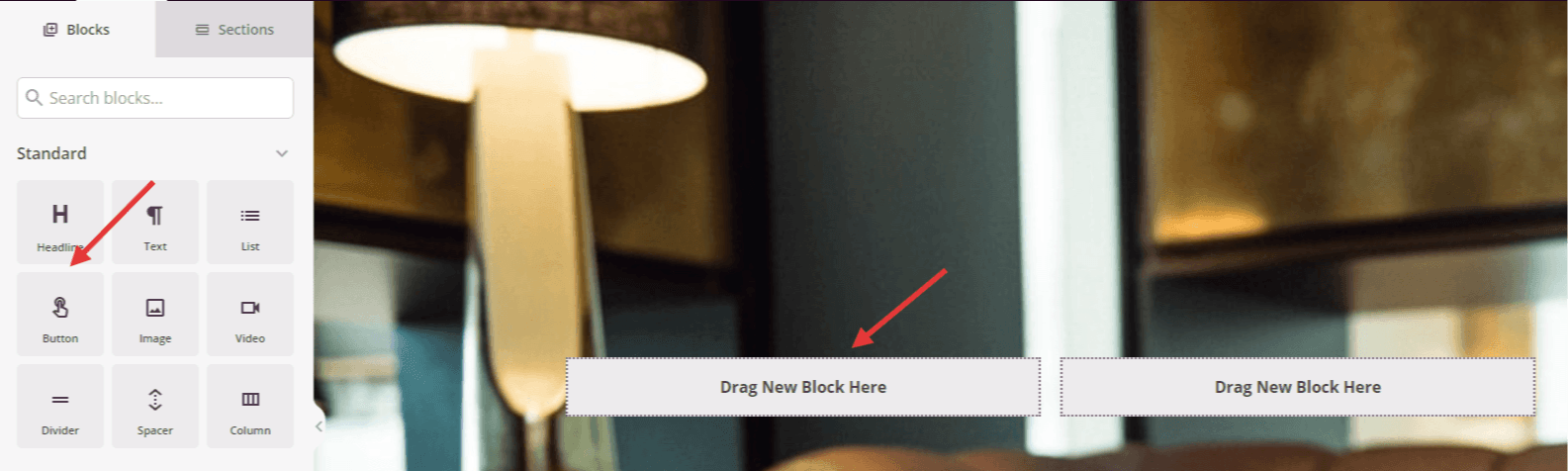
El bloque Botón aparece en el panel de Bloques y se puede arrastrar a cualquier sección o columna de tu página.
Paso 2: Configurar los Ajustes de Contenido
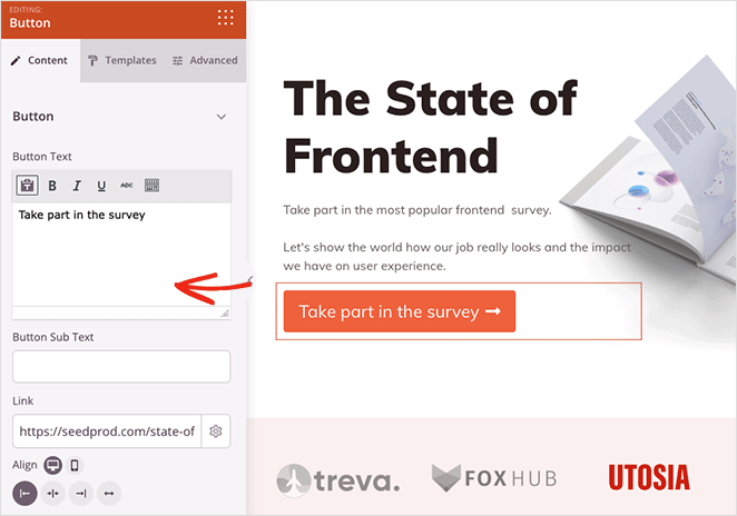
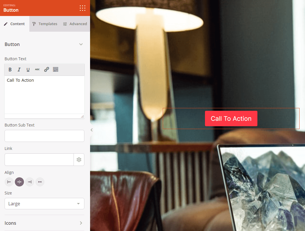
Una vez añadido, haz clic en el bloque Botón para abrir su configuración. En la pestaña Contenido, puedes personalizar el texto del botón, el destino del enlace y la apariencia.
Botón:
- Texto del Botón: Introduce el texto principal que aparece en tu botón (por ejemplo, "Empezar", "Comprar ahora", "Saber más"). Mantenlo conciso y orientado a la acción.
- Subtexto del Botón: Añade un texto secundario opcional que aparezca debajo del texto principal del botón. Esto es útil para añadir información complementaria como precios, ofertas por tiempo limitado o contexto adicional.
- Enlace: Introduce la URL a la que se dirigirán los visitantes al hacer clic en el botón. Puede ser una URL completa (https://ejemplo.com), una ruta relativa (/acerca-de) o un enlace de anclaje (#seccion-nombre) para la navegación dentro de la misma página.
- Alinear: Establece la alineación horizontal del botón dentro de su contenedor (izquierda, centro o derecha)
- Tamaño: Elige el tamaño del botón entre Pequeño, Mediano, Grande, Muy Grande o Extra Grande. Los botones más grandes son más prominentes y funcionan bien para las llamadas a la acción principales.
Iconos:
- Icono antes del texto: Añade un icono que aparezca a la izquierda del texto de tu botón. Haz clic en Elegir Icono para buscar y seleccionar entre cientos de iconos disponibles.
- Icono después del texto: Añade un icono que aparezca a la derecha del texto de tu botón. Esto se usa comúnmente para indicaciones direccionales como flechas o indicadores de enlace externo.
La pestaña Contenido te permite personalizar el texto del botón, los enlaces, la alineación, el tamaño y añadir iconos decorativos.
Paso 2a: Elegir un Estilo de Plantilla
En la pestaña Plantillas, puedes seleccionar entre estilos de botones prediseñados para cambiar rápidamente la apariencia general de tu botón.
- Botón Ovalado, Botón Plano, Botón Azul, Botón Verde Claro, Botón Verde, Botón Naranja, Botón Rojo, Botón Amarillo, Botón Blanco, Botón Gris, Botón Negro: Elige entre once diseños de plantilla diferentes, cada uno con colores y estilos únicos. Previsualiza cada estilo para encontrar el que mejor se adapte al diseño de tu página y a los colores de tu marca.
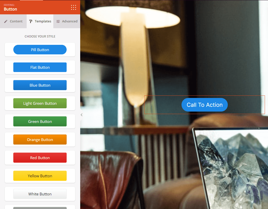
La pestaña Plantillas ofrece once estilos prediseñados para personalizar rápidamente la apariencia de tu botón.
Paso 3: Personaliza el Diseño
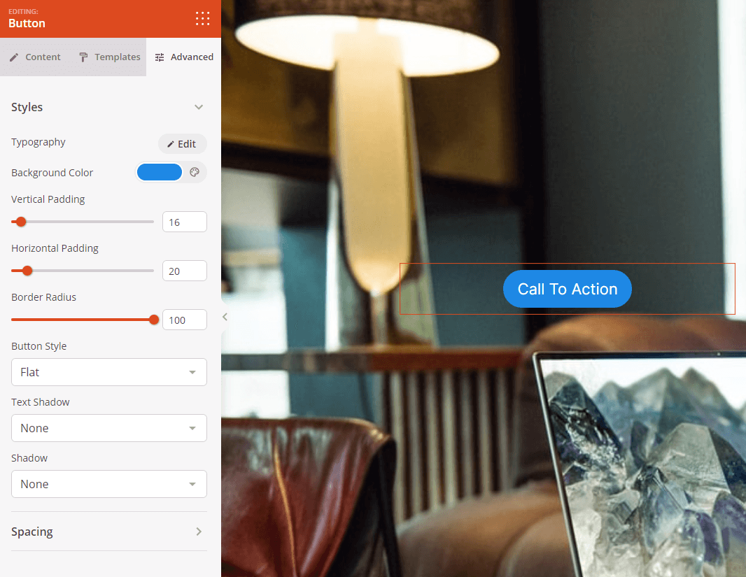
En la pestaña Avanzado, puedes personalizar la apariencia visual de tu bloque de Botón:
Estilos:
- Tipografía: Controla las propiedades de fuente para el texto de tu botón, incluyendo familia de fuentes, tamaño, peso y estilo.
- Estilo del botón: Elige el tratamiento visual para tu botón. Las opciones incluyen Plano (diseño plano moderno), 2D (profundidad sutil), Vintage (aspecto clásico), Fantasma (transparente con borde), Enlace (enlace de texto simple) o Personalizado (control manual completo)
- Color de fondo: Establece el color de fondo de tu botón para que coincida con tu marca o cree contraste
- Relleno vertical: Controla el espaciado superior e inferior dentro del botón, afectando su altura.
- Relleno horizontal: Controla el espaciado izquierdo y derecho dentro del botón, afectando su anchura.
- Radio del Borde: Ajusta la redondez de las esquinas de los botones. Valores más altos crean botones más redondeados, mientras que cero crea esquinas afiladas.
- Ancho del borde del botón: Establece el grosor del contorno del borde del botón
- Color del borde del botón: Elige el color del borde del botón
- Sombra del texto: Añade efectos de sombra al texto del botón para darle profundidad y legibilidad. Elige entre Ninguna, Capilar, Pequeña, Mediana, Grande, Muy Grande, Extra Grande o Personalizada.
- Sombra: Aplica efectos de sombra a todo el botón para darle profundidad. Elige entre Ninguna, Capilar, Pequeña, Mediana, Grande, Muy Grande, Extra Grande o Personalizada.
Espaciado:
- Margen: Controla el espaciado exterior alrededor de tu bloque de botón (Superior, Derecho, Inferior, Izquierdo). Esto determina cuánto espacio aparece entre el botón y los elementos circundantes.
- Relleno: Ajusta el espaciado interior dentro del contenedor de tu bloque de botón (Superior, Derecho, Inferior, Izquierdo). Esto crea espacio libre alrededor del botón en sí.
Atributos:
- ID de CSS: Muestra el identificador único autogenerado para tu bloque de botón. Esta ID es creada automáticamente por SeedProd para estilos personalizados o para apuntar con JavaScript.
- Clase personalizada: Agrega clases CSS personalizadas para aplicar estilos específicos de tu tema o CSS personalizado.
- Atributos personalizados: Añade cualquier atributo HTML al elemento contenedor del botón. Introduce cada atributo en una nueva línea usando el formato: nombre-atributo|valor (por ejemplo, data-action|signup)
Visibilidad del Dispositivo:
- Ocultar en escritorio: Oculta el bloque de botón en pantallas de escritorio.
- Ocultar en tableta: Oculta el bloque de botón en dispositivos tableta.
- Ocultar en móvil: Oculta el bloque de botón en dispositivos móviles.
Efectos de Animación:
- Animación de entrada: Elige entre varios efectos de animación que se reproducen cuando el botón aparece a la vista. Las opciones incluyen Rebote, Fundido de entrada, Zoom de entrada, Girar de entrada y muchas más. Esto atrae la atención inmediata a tu llamada a la acción
La pestaña Avanzado proporciona amplias opciones de estilo, incluyendo tipografía, colores, relleno, bordes, sombras y efectos de animación.
Paso 4: Guarde sus Cambios
Una vez que hayas terminado de configurar el bloque de Botón y personalizar su apariencia, asegúrate de guardar tu trabajo.
¡Has añadido con éxito un bloque de Botón a tu página! Este bloque esencial te ayuda a crear llamadas a la acción claras que guían a los visitantes hacia tus objetivos de conversión. Experimenta con diferentes estilos de botón, colores, tamaños y animaciones para crear botones que destaquen e impulsen las acciones que deseas que los visitantes realicen.