Building a business website can feel daunting. You want it to look professional, engage visitors, and drive sales. But where do you even start?
Don’t worry—you’re not alone! When I first started building websites, I’d spend hours browsing the web for inspiration, trying to learn what made a good website tick. Over the years, I’ve learned that the best websites are designed with the user in mind.
In this article, I’ll look at examples of business websites from various industries. I’ll break down what makes each site effective and highlight key design elements you can implement on your own site.
Business Website Examples:
What Are Business Websites?
In the simplest terms, a business website is your digital storefront. It’s a place where potential customers can learn about your company, browse your products or services, and get in touch with you.
Do I Really Need a Website for My Business?
You might be thinking, “Do I really need a website? I have a Facebook page!” And while social media is important, having your own website is still essential for any business today.
He aquí por qué:
- Your website is your space. You decide what to say, how it looks, and what information you share. You’re not at the mercy of social media algorithms or changing rules.
- People trust businesses with websites. It shows you’re serious and makes it easy for customers to learn about you.
- A website lets anyone in the world find your business online, 24/7.
- Put information on your website that answers common questions and makes it easier for people to contact you.
- A website is the center of your online marketing. You can use it to collect leads, share content, and track how well your efforts are working.
Bill Gates famously said, “If your business is not on the internet, then your business will be out of business.” And he’s right! In the modern business world, a website isn’t optional—it’s essential.
Inspiring Business Website Examples
Now that we’ve covered the essentials, let’s look at some real-world inspiration. Here are 15 business website examples that are killing it in their industries.
1. The People vs. Coffee
The People vs Coffee is an Aussie pop-up espresso cafe, and their website makes you want to hunt them down for your next coffee fix.
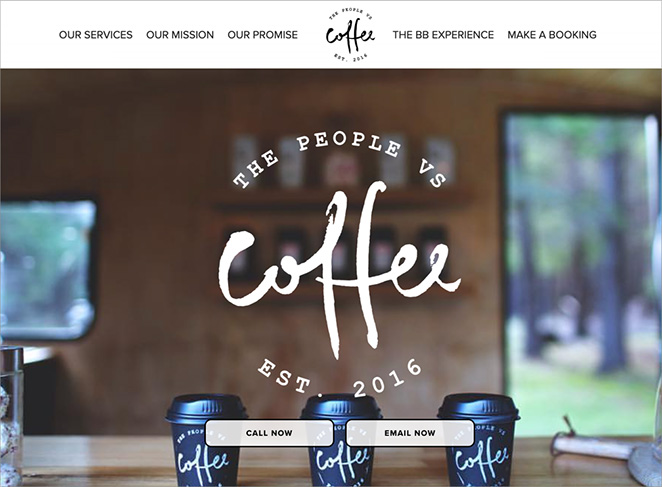
Right off the bat, you see a cool, retro-style logo and pictures that scream “great coffee.” The photos are so good you can almost smell the fresh espresso through your screen.
What’s neat is how they show off their services section. Whether you’re looking for coffee at your wedding or just want to know where their next pop-up will be, it’s all easy to find.
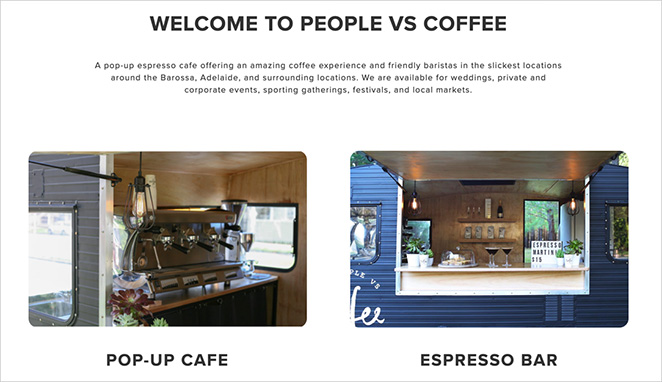
They do a great job of explaining what makes their coffee special. You can tell these folks are serious about their brews, but they keep it fun and not too stuffy.
The website has a hip, laid-back vibe that perfectly matches the brand. It’s simple and straightforward, focusing on what matters most—their coffee and where to find it.
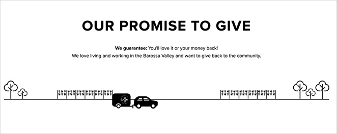
One thing they could add is more info about their upcoming locations or events. This would make it easier for coffee lovers to track them down and enjoy their brews.
2. SurfTwins Essaouira
SurfTwins Essaouira is a Moroccan surf camp, and their website makes you feel like you’re already catching waves in the sun.
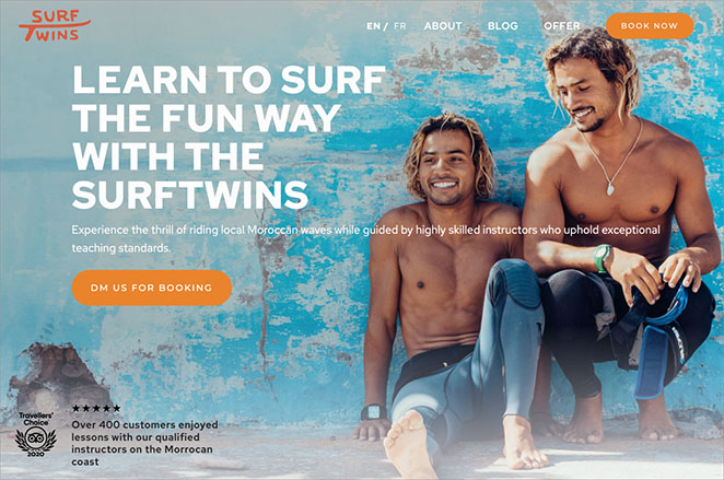
The first thing you see is a stunning image of the twins. It immediately makes you want to pack your bags and head to Morocco. The bright colors and laid-back vibe are really eye-catching.
What’s great is how easy they make it to find what you need. Whether you’re looking for info on surf lessons, places to stay, or other fun things to do, it’s all there and easy to find.

They do a fantastic job of showing off what makes their surf camp special. You get a real sense of the local culture and the experienced instructors who’ll be teaching you.
One cool feature is their testimonials. They give you a great look at how other customers have found the experience and what to expect.
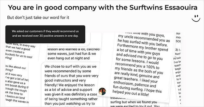
The website has a fun, laid-back vibe that perfectly matches the surf culture. It’s the kind of site that makes you want to book a trip right away and catch some waves in Morocco.
See how to make a travel business website with WordPress.
3. Bones Co.
The Bones Co. is a creative studio run by a husband-and-wife team, and their website is as minimalist as it gets.
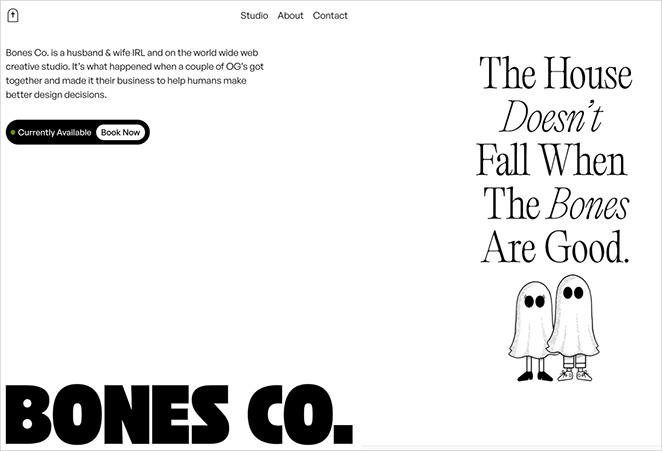
When you land on the homepage, you’re met with a super clean, simple design. There’s hardly anything there – just the studio’s name and a brief description of what they do. It’s bold in its simplicity.
What’s interesting is how little they show upfront. Instead of bombarding you with information, they let their minimal design speak for itself. They’re saying, “Our work is so good, we don’t need to show it off right away.”
The navigation menu is as simple as it gets, with just a few options to explore more about their work and the studio.
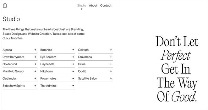
This ultra-minimal approach is pretty daring. It shows confidence in their design skills and makes you curious to see more. It’s the kind of website that does not try too hard to stand out.
4. Standard Bots
Ever wondered what the Apple of robotics would look like? Standard Bots is giving us a pretty good idea. This US-based company makes robotic arms, and their website is as sleek as their tech.
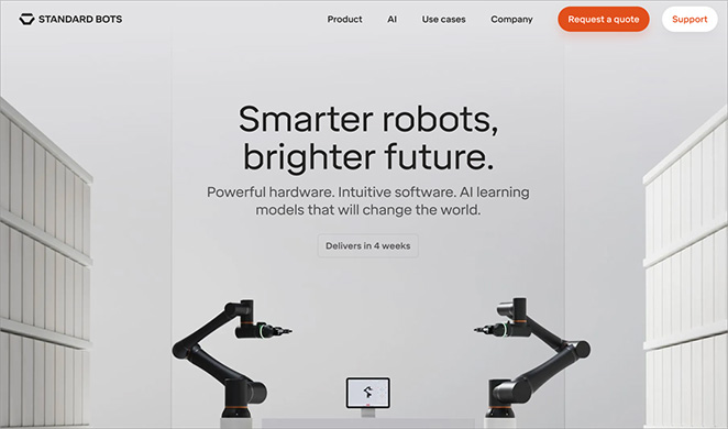
The site shows visitors amazing photos and videos of their robotic arms in action. They’ve done a fantastic job of explaining complex tech in a way that’s easy for anyone to understand. You’ll quickly grasp what they do and why it’s important.
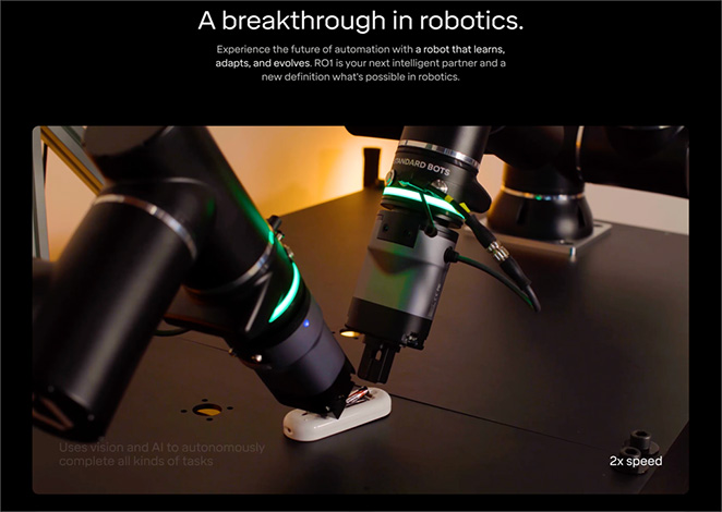
To make their site even better, they could add some real-life success stories. Seeing how other businesses use their robotic arms would be super helpful.
Also, a big “Try It Out” button would be great for getting more people to reach out and test their products.
5. Bellroy
Bellroy’s website will be a breath of fresh air if you’ve ever struggled with a bulky wallet. This Australian company specializes in slim wallets and bags, and its site is just as streamlined as its products.
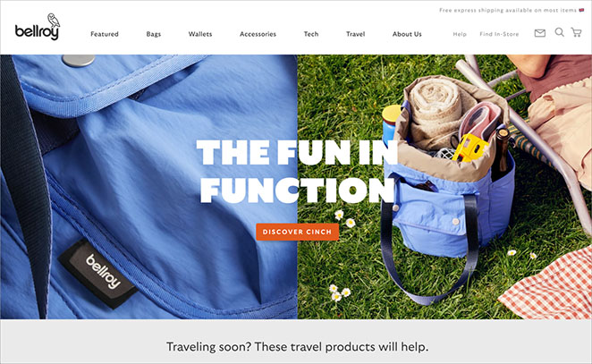
Bellroy’s website is a masterclass in product presentation. They use clever animations and comparison tools to show how their wallets slim down your everyday carry. It’s like they’re solving a problem you didn’t even know you had.
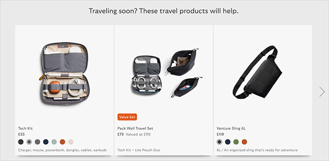
One thing they could improve is making their sustainability efforts more prominent. They mention it, but given how vital eco-friendliness is to many shoppers today, they could really emphasize this aspect of their brand.
6. Animal House Fitness
Animal House Fitness takes a fresh approach to home workouts, and its website showcases this well. Right from the homepage, you can see its cool fitness products front and center.
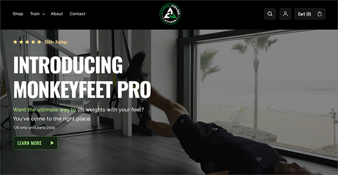
The site is bright and energetic, matching the vibe you’d want for a great workout. It does a good job showcasing its innovative fitness solutions, from resistance bands to foam rollers. It’s clear it’s all about helping you reach your fitness goals.
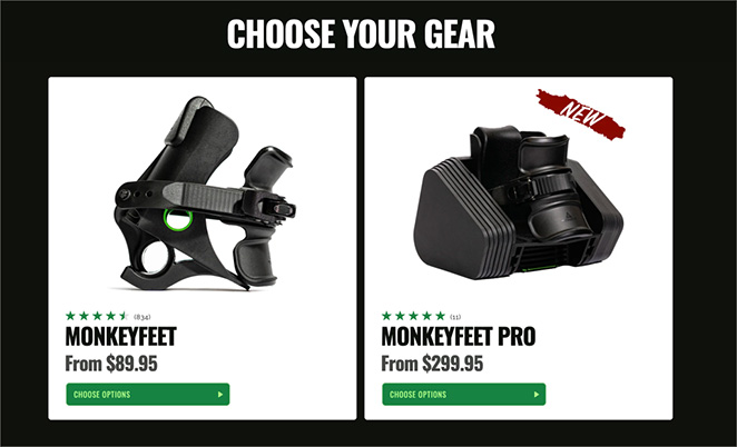
What really stands out is its social proof from well-known influencers, like Joe Rogan. It adds credibility to the website and an element of trust it wouldn’t have without it.
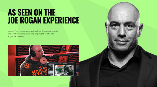
One thing they could improve is providing more details about their guided workouts right on the homepage. While their products are easy to spot, adding a section about their workout plans could help visitors see the full range of what Animal House Fitness offers.
7. A24
A24 is a cool movie company that makes unique films, and their website is just as interesting as their movies.
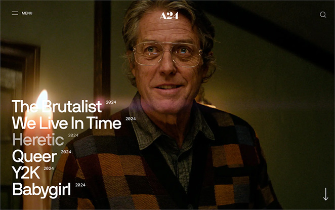
The site looks simple at first, but it’s full of surprises. It changes all the time to show off their latest films. They use big, bold text and eye-catching images that make you want to click and learn more about each movie.
What’s really neat is how they sell movie merchandise right on the site. You can buy things like books, clothes, and even candles related to their films. It’s a fun way for fans to connect with their favorite A24 movies.
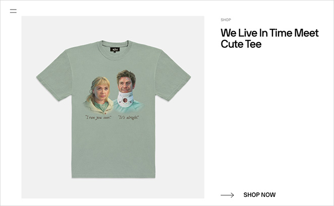
The site’s clean, minimalist design lets the movies and products speak for themselves. It’s easy to navigate and find what you’re looking for, whether it’s information about their latest film or a piece of unique movie merchandise.
8. Grovemade
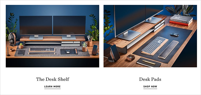
Grovemade makes beautiful desk accessories and office furniture, and their website is just as sleek as their products.
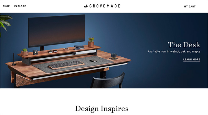
The first thing you notice is the stunning photos of their items. They show off the craftsmanship and attention to detail that goes into each piece. You can almost feel the smooth wood through your screen.
What’s cool is how they organize their products. They group things by where you’d use them – like “Desk” or “Apple Accessories.” This makes it super easy to find exactly what you’re looking for.
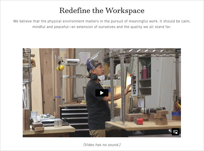
They also do a great job of telling their story. There’s a whole section about how they make their products and the people behind them. It really makes you feel connected to the brand and appreciate the work that goes into each item.
One thing they could add is more customer reviews right on the product pages. While they have a few, seeing more feedback from real users could help shoppers feel confident about purchasing.
9. Notion
Notion is a tool for organizing work and ideas, and its website does a great job of showing how it can make life easier.
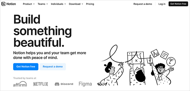
Right away, you see a simple message about what Notion does: “One workspace. Every team.” They use fun, colorful illustrations to show how people can use Notion, like taking notes or planning projects.
What’s really cool is how they show off the product. They have little videos that let you see Notion in action. It’s like getting a sneak peek of how it works without signing up first.
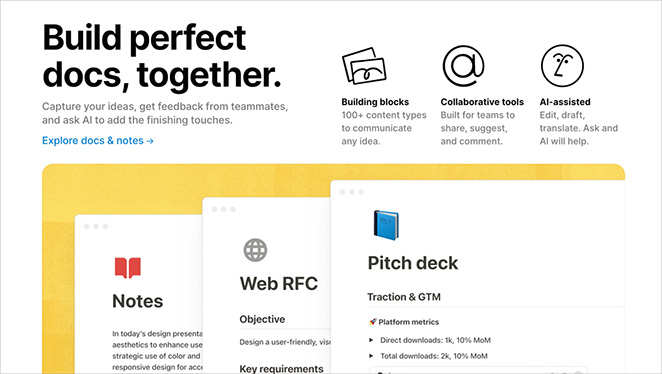
They also have a section where different types of people (like students or project managers) can see how Notion would work for them. This makes it easy to understand how you might use it in your own life.
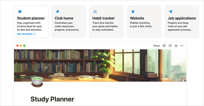
One thing they do well is offering a free plan right up front. This makes it easy for people to try Notion without worrying about cost. For more info on creating pages like this, see our free trial landing page examples.
10. Charity: Water
Charity: Water is all about bringing clean water to people who need it, and their website makes you want to jump in and help right away.
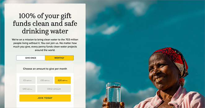
The first thing you see is a big, beautiful photo of a lady getting clean water. It shows you the impact they’re making. They use simple, powerful messages like “Water changes everything” that get right to the point.
What’s great is how they make understanding the problem and the solution easy. They use clear numbers and facts to show how many people need clean water and how your donation can help.

They do a fantastic job of showing where your money goes. A whole section breaks down how they use donations, which makes you feel good about giving.
One cool feature is their “The Spring” program, where you can donate monthly. They make it sound exciting like you’re joining a special group of world-changers.
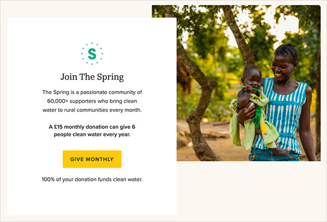
This charity website does a great job of balancing emotion with action. The stories and photos move you, but there’s always a clear way to help, whether by donating or spreading the word.
11. Teux Deux
TeuxDeux is a simple to-do list app, and their website is just as straightforward as their product.
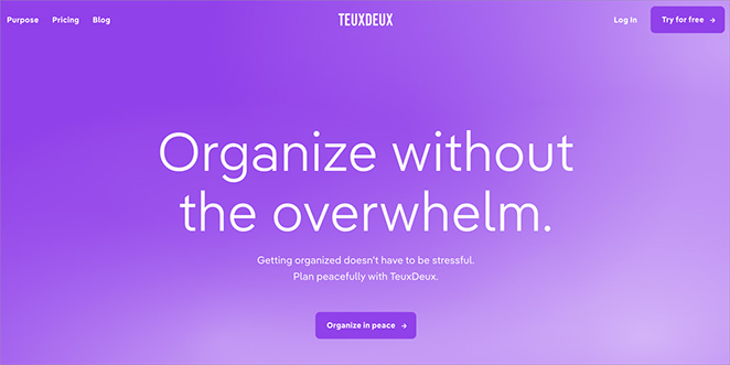
Right off the bat, you see what TeuxDeux is all about: “Optimize without the overwhelm.” They show a clear image of the app in action, so you immediately get a feel for how it works.
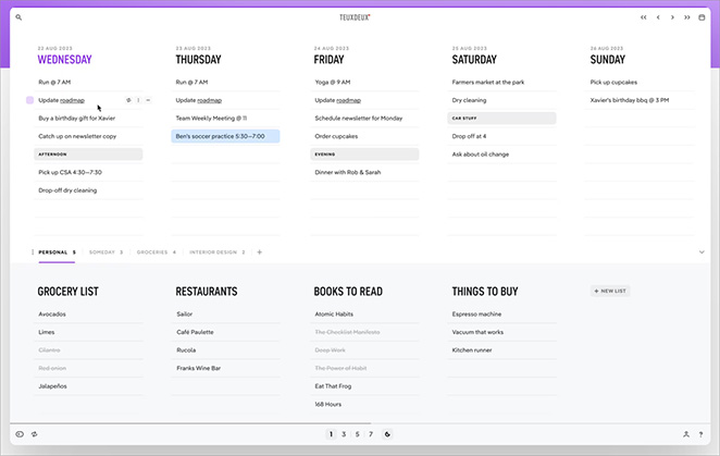
What’s cool is how they keep things super simple. The whole site is primarily purple and white. It’s like they’re saying, “We’re here to help you focus, not distract you.”
They do a great job showing off the app’s features without overwhelming you. Using video demos they show how easy it is to add tasks, cross them off, and move them around.
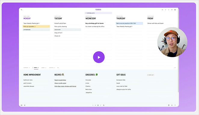
They make it easy to try the app with a free trial offer right on the homepage. And if you scroll down, you can see the pricing clearly laid out.
12. Impossible Foods
Impossible Foods makes plant-based meat, and their website makes you hungry just looking at it.
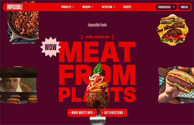
The first thing you see is a big, juicy burger that looks so real you might not believe it’s made from plants. The bold text says, “Delicious Meat from Plants.” It really grabs your attention.
What’s great is how they show off their products. They have mouthwatering photos of dishes made with Impossible meat, from tacos to meatballs. It makes you want to try cooking with it yourself.
They do a good job explaining why plant-based meat is important for the planet. They use simple graphics to show how their products use less land and water than animal meat.
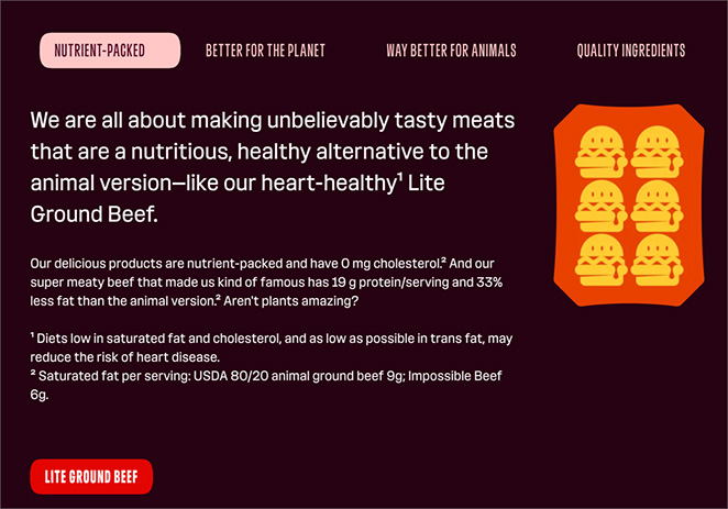
One cool feature is their recipe section. It’s full of ideas for using Impossible meat in your cooking, which is helpful if you’re new to plant-based foods.
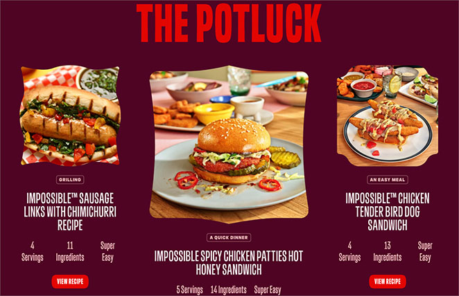
They also have a section about their mission and the science behind their products. Seeing how they create plant-based meat that looks and tastes like the real thing is interesting.
13. The Outline
The Outline’s website is unlike anything you’ve probably seen before. It’s bold, it’s colorful, and it’s definitely not your typical news site.
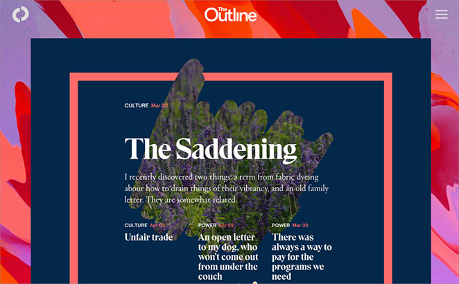
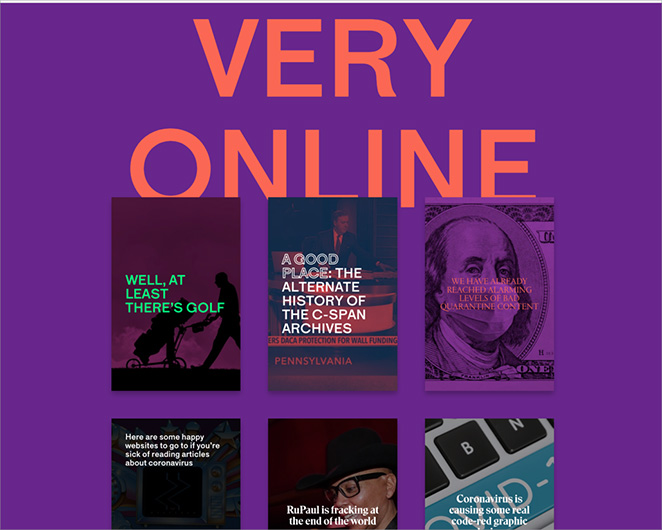
The first thing you notice is the unique design. Instead of a traditional layout, you see a bunch of colorful thumbnails that move when you scroll. Each thumbnail is actually a story you can click on. It’s like a digital art gallery of news.
What’s cool is how they organize their content. They use different colors for different topics, making it easy to find what interests you. The bright colors and unusual thumbnail designs make scrolling through news fun and exciting.
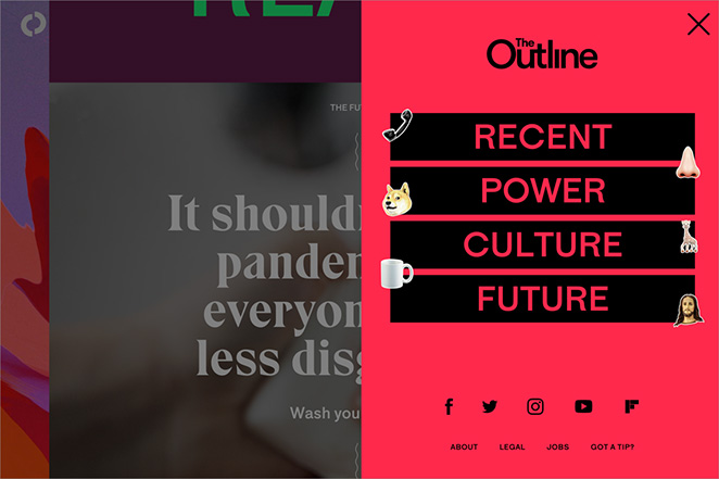
They also have a menu that pops out from the side, letting you jump to specific sections if you’re looking for something in particular.
One thing that stands out is their commitment to ad-free content. They make it clear that they value their readers’ experience over cramming in ads.
The site might take a bit of getting used to, but it’s definitely memorable. It’s a great example of how news doesn’t have to be presented in a boring way.
14. Buck Mason
Buck Mason sells clothes for guys, and their website feels as relaxed and laid-back as their style.
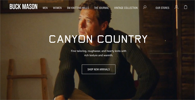
When you land on the page, you see big, clear photos of their clothes being worn. It’s like flipping through a magazine, but you can buy what you see right away.
What’s neat is how simple they keep things. The menu at the top is easy to understand – you can shop by type of clothes or check out their newest stuff. They don’t overwhelm you with too many choices.
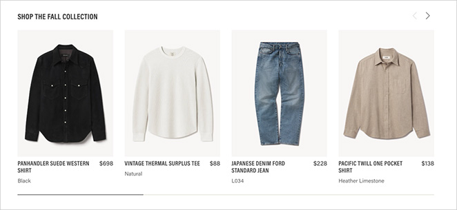
They do a great job showing off their brand story. There’s a section that tells you about how they started and why they make clothes the way they do. It makes you feel like you’re buying from real people, not just another big company.
The website uses calm colors and lots of white space, which matches their simple, quality clothing style. It’s a no-fuss shopping experience that feels just right for the guy who wants to look good without trying too hard.
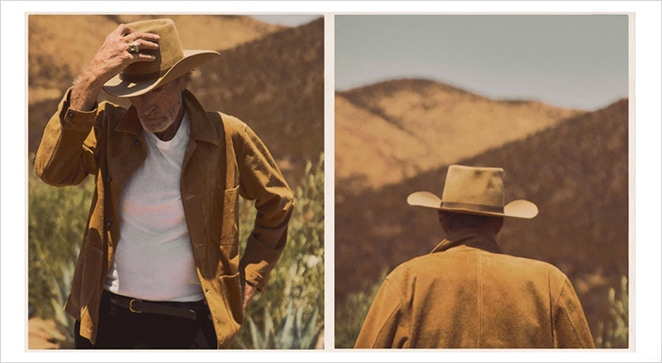
One nice touch is how they show clothes on different body types. It gives you a better idea of how things might look on you.
15. Austin Eastciders
Austin Eastciders makes hard cider, and their website immediately hits you with a cool vibe.
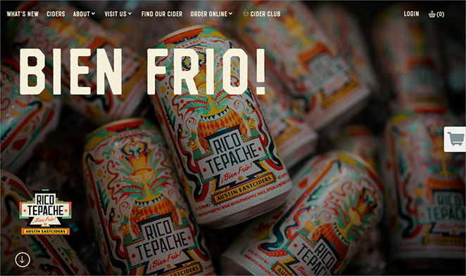
You first see “BIEN FRIO!” in big, bold letters. That’s Spanish for “very cold,” it immediately makes you think of a refreshing, ice-cold cider. It’s a great way to grab your attention and set the mood.
Below that, they showcase their ciders with colorful images of the cans. It’s easy to get a quick look at their different flavors, each with its own distinct style.
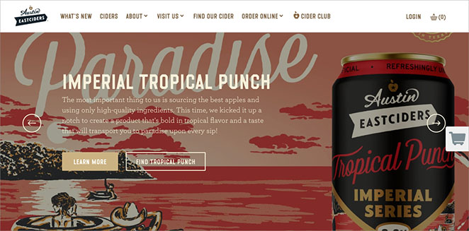
They keep the rest of the site simple and easy to navigate. You can find info about their ciders, where to buy them, and the story behind the company without any fuss.
One handy feature is the “Find Our Cider” section. It makes it super easy to locate their products near you.
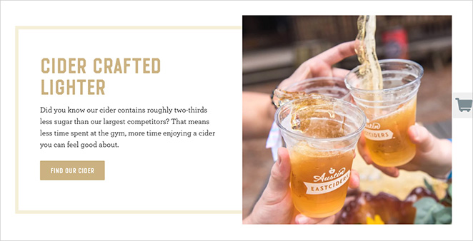
The whole site has a laid-back, Austin-style feel. It’s the type of website that makes you want to kick back with a cold cider and enjoy life.
Takeaways from These Business Website Examples
After looking at all these great business websites, I can spot some common themes that make them stand out. Let’s break down what we’ve learned and how you can use these ideas for your own site.
- Keep it Simple: Many of these sites use clean, uncluttered designs. They focus on what’s important without overwhelming visitors.
- Strong Visuals: Whether it’s high-quality photos, videos, or graphics, eye-catching visuals are a must.
- Clear Messaging: The best sites quickly tell visitors what the business does and why it matters.
- Easy Navigation: Users should be able to find what they need without thinking too hard.
- Mobile-Friendly Design: All these sites look great on phones and tablets, not just computers.
- Unique Brand Personality: Each site reflects the company’s unique style and values.
- Call-to-Action (CTA): The best sites make it clear what they want visitors to do next.
How Do I Create a Business Website?
Now that you’ve seen some inspiring examples and learned key elements of effective business websites, you might wonder how to create your own. That’s where SeedProd comes in handy.
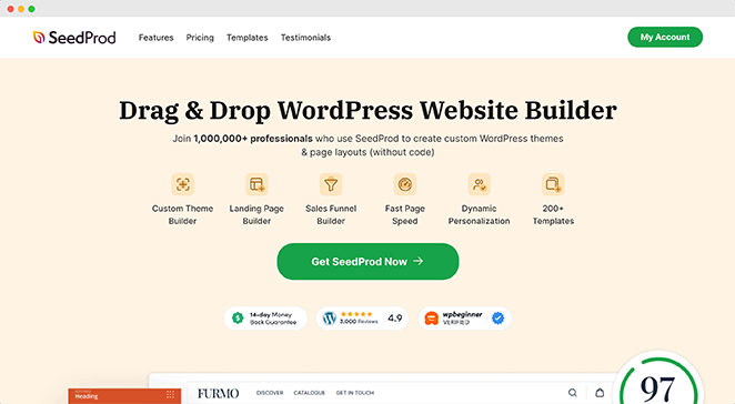
SeedProd is a powerful website builder that makes creating a professional business website easy, even if you’re a beginner.
Here’s how SeedProd can help you build your business website:
- Easy-to-Use Templates: Start with a professionally designed template and customize it to fit your brand.
- Drag-and-Drop Editor: Easily add and arrange elements on your pages without any coding knowledge.
- Mobile-Responsive Design: Ensure your website looks great on all devices, from desktops to smartphones.
- Customization Options: Tailor your site’s colors, fonts, and layouts to match your brand’s unique style.
- Built-in SEO Tools: Optimize your website to rank better in search engines and attract more visitors.
- Integration with Popular Tools: Connect your website with email marketing services, analytics tools, and more.
SeedProd allows you to create a stunning business website quickly and easily, without the need for technical skills or a big budget.
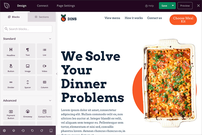
For a step-by-step guide, check out our tutorial on how to create a WordPress website for beginners.
This tutorial will walk you through every step of the process, from setting up WordPress to launching your finished site.
Alternatively, launch a custom website in seconds using SeedProd’s AI website builder. Simply provide a brief description of your site, and it will generate a fully custom theme, helping you save time and get online faster.
Build Your Business Website Today
A well-designed business website is crucial for attracting customers and driving growth. The best sites combine attractive design, clear messaging, and user-friendliness. With SeedProd, creating one is easy and affordable, whether you’re starting from scratch or upgrading an existing site.
Ready to build your business website?
For more tips on growing your business online, check out these helpful guides:
- Las mejores herramientas de automatización del marketing para pequeñas empresas
- Must-Have WordPress Plugins for Business Websites
- Cómo empezar a crear una lista de correo electrónico para hacer crecer su negocio
- WooCommerce vs Shopify: What’s Best for Your Business?
- Comparación de los mejores sistemas de telefonía para empresas
- How to Add Business Hours to WordPress
- Top VoIP Providers for Small Business Compared
Gracias por leernos. Nos encantaría conocer tu opinión, así que no dudes en dejarnos un comentario con tus preguntas y comentarios.
También puede seguirnos en YouTube, X (antes Twitter) y Facebook para obtener más contenidos útiles para hacer crecer su negocio.


