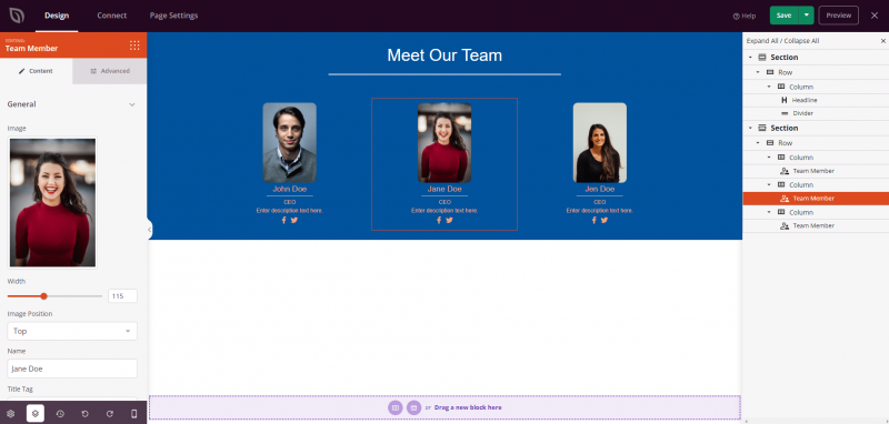
The Team Member block allows you to showcase your team members on any SeedProd page with a fully customizable profile layout. Display each person’s photo, name, job title, description, and social media links in a polished, professional card.
This block is ideal for About pages, landing pages, and any section where building trust and credibility matters. You have full control over image shape, separator styling, social icon appearance, and the typographic style of every text element — giving your team section a look that matches your brand.
Adding the Team Member Block to Your Pages
Follow these steps to add a Team Member block to your SeedProd page:
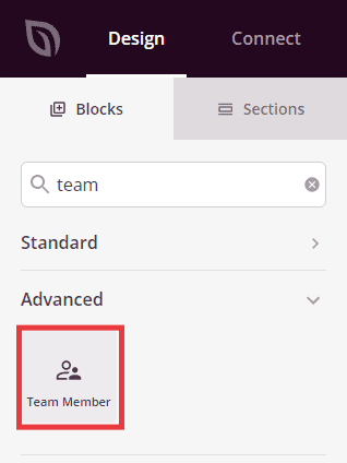
Step 1: Add the Block
Under Design > Blocks, drag and drop the Team Member block into the desired section of your page.
Step 2: Configure Content Settings
Once added, click on the Team Member block to open its settings. In the Content tab, settings are organized into four sections.
General:
- Image: Upload or select the team member’s photo. Set the image width (in px or %) and optionally set a fixed height. Enter alt text to describe the image for accessibility.
- Image Position: Choose where the image appears relative to the text — Top, Left, or Right.
- Name: Enter the team member’s name (default: “John Doe”). Choose the HTML tag used to render it (H1–H6, div, span, or p), set the text alignment, and adjust the bottom margin.
- Show Designation: Toggle the job title on or off (Yes/No). When enabled, enter the designation text, set its alignment, and adjust the bottom margin.
- Show Description: Toggle the bio or description on or off (Yes/No). When enabled, enter the description text, set its alignment, and adjust the bottom margin.
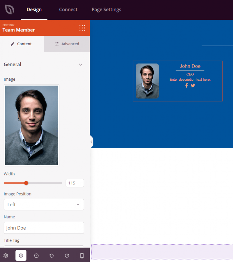
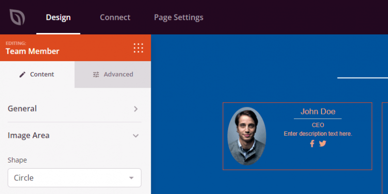
Image Area:
- Shape: Choose the shape applied to the team member’s photo — Default, Rounded, Circle, or Custom (which enables individual corner radius controls).
- Image Margin Bottom: Set the spacing below the image.
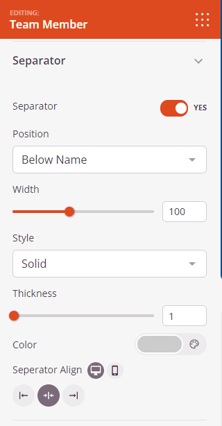
Separator:
- Separator: Toggle a decorative line on or off (Yes/No).
- Position: Choose where the separator line appears — Below Name, Below Designation, or Below Description.
- Width: Set the width of the separator line.
- Style: Choose the line style — Solid, Dotted, or Dashed.
- Thickness: Set the thickness of the separator line in pixels.
- Color: Choose the color of the separator line.
- Separator Align: Set the horizontal alignment of the separator — Left, Center, or Right.
- Separator Margin Bottom: Set the spacing below the separator line.
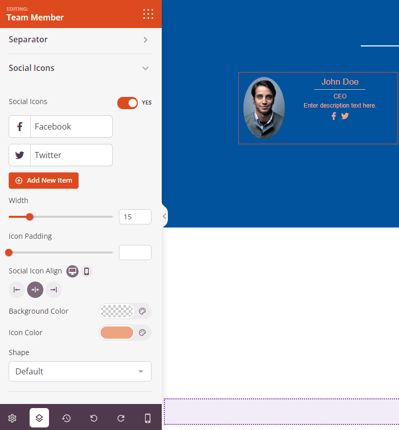
Social Icons:
- Social Icons: Toggle social media icons on or off (Yes/No).
- Icon Items: Add, reorder, and configure individual social links. For each item, choose an icon, enter the display title, and enter the destination URL. Use Add New Item to add additional icons, or drag items to reorder them.
- Icon Width: Set the size of the social icons.
- Icon Padding: Set the spacing inside each icon button.
- Shape: Choose the shape of the icon containers — Default, Rounded, Circle, or Custom.
- Social Icon Align: Set the horizontal alignment of the social icons row — Left, Center, or Right.
Step 2a: Choose a Template Style
In the Templates tab, you can apply a preset design to your Team Member block. Three templates are available: Striped Effect, Divider, and Background. Selecting a template instantly applies its styling, which you can then further customize in the Content and Advanced tabs.
Step 3: Customize the Design
In the Advanced tab, you can customize the visual appearance of your Team Member block.
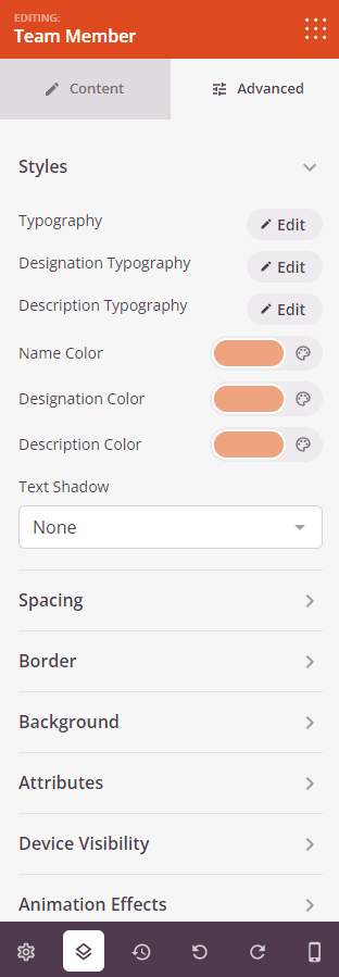
Styles:
- Name Typography: Set the font family, size, weight, style, line height, letter spacing, and letter case for the team member’s name.
- Designation Typography: Set the typographic properties for the job title text.
- Description Typography: Set the typographic properties for the bio or description text.
- Name Color: Set the color for the team member’s name.
- Designation Color: Set the color for the job title.
- Description Color: Set the color for the description text.
- Text Shadow: Apply a shadow to the text using preset sizes (None, Hairline, and larger presets).
Spacing:
- Margin: Set the outer spacing around the block on all four sides, with independent controls for desktop, tablet, and mobile.
- Padding: Set the inner spacing inside the block wrapper on all four sides, with per-device controls.
Border:
- Border Style: Choose from None, Solid, Dotted, or Dashed.
- Border Width: Set individual widths for the top, right, bottom, and left borders.
- Border Color: Choose the border color.
- Border Radius: Round the corners of the block independently for each corner, or use the sync toggle to apply a uniform radius.
Background:
- Background Style: Choose Solid color, Gradient (with type, angle, position, and two color stops), or Image background (with position, repeat, size, and attachment options).
- Background Dimming: Add an overlay with adjustable opacity on top of a background image to improve text readability.
Attributes:
- Custom Class: Add one or more custom CSS classes to the block wrapper for targeted styling.
- CSS ID: SeedProd automatically generates a unique CSS ID for this block. You can use it to reference the block in custom CSS or JavaScript.
- Custom Attributes: Add custom HTML attributes to the block wrapper element. Enter each attribute on a new line using the key|value format.
Device Visibility:
- Hide on Desktop: Toggle to hide the block when viewed on desktop screens.
- Hide on Tablet: Toggle to hide the block when viewed on tablet screens.
- Hide on Mobile: Toggle to hide the block when viewed on mobile screens.
Animation Effects:
- Scrolling Effect: Apply a scroll-triggered animation to the block, including Vertical Scroll and Horizontal Scroll options with direction, speed, and viewport offset controls.
- Mouse Effect: Apply a mouse movement-driven parallax effect to the block.
Step 4: Save Your Changes
Once you have finished configuring the Team Member block and customizing its appearance, make sure to save your work.
You’ve successfully added a Team Member block to your page! A well-designed team section builds credibility and helps visitors connect with the people behind your brand. Experiment with image shapes, separator styles, and background options to create a team showcase that feels polished and on-brand.