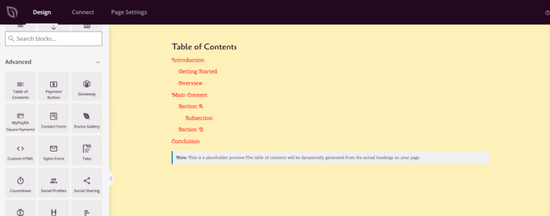
The Table of Contents block automatically generates a clickable navigation menu based on the headings found on your SeedProd page. Visitors can scan all your sections at a glance and jump directly to the content they need — without scrolling through the entire page.
This block is especially useful for long-form content such as detailed guides, tutorials, product documentation, and multi-section landing pages. You control which heading levels are included, whether numbering is shown, how nested items are indented, and whether the box can be collapsed by visitors. The design is fully customizable with separate typography, color, and border controls for the title, links, and container.
Adding the Table of Contents Block to Your Pages
Follow these steps to add a Table of Contents block to your SeedProd page:
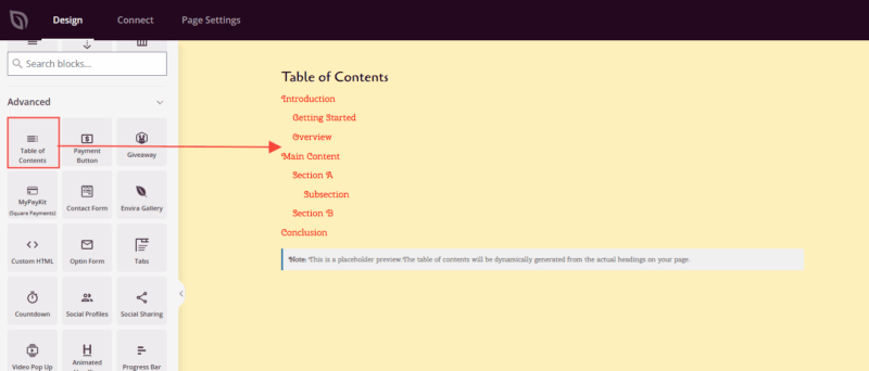
Step 1: Add the Block
Under Design > Blocks, drag and drop the Table of Contents block into the desired section of your page. This block is typically placed near the top of your content, after a brief introduction but before the main sections begin.
Step 2: Configure Content Settings
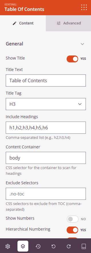
Once added, click on the Table of Contents block to open its settings. In the Content tab, settings are organized into two groups.
General:
- Show Title: Toggle whether a title is displayed above the table of contents. Set to Yes to show a heading label, or No to display links only.
- Title Text: Enter the text that appears as the table of contents heading when Show Title is enabled (default: “Table of Contents”).
- Title Tag: Choose the HTML heading tag used to render the title — H2, H3, H4, or DIV.
- Include Headings: Enter a comma-separated list of heading levels to scan for links (e.g., h2,h3,h4). Only headings matching these tags appear in the generated navigation.
- Content Container: Enter a CSS selector to limit heading scanning to a specific area of the page. Leave blank to scan the entire page.
- Exclude Selectors: Enter comma-separated CSS selectors for any headings you want omitted from the table of contents.
- Show Numbers: Toggle automatic numbering for table of contents items (Yes/No).
- Hierarchical Numbering: Use nested numbering for sub-headings when Show Numbers is enabled (e.g., 1.1, 1.2, 2.1).
- Smooth Scroll: Enable a smooth scrolling animation when visitors click a table of contents link (Yes/No).
- Scroll Offset (px): Set the number of pixels to offset the scroll destination — useful when your page has a fixed header that would otherwise obscure the target heading.
- List Style: Choose the bullet style for table of contents items: None, Disc, Circle, Square, or Decimal.
Additional Options:
- Minimize Box: Allow visitors to collapse and expand the entire table of contents using a toggle button (Yes/No).
- Expand Icon: Choose the icon displayed on the toggle button when the table of contents is collapsed.
- Collapse Icon: Choose the icon displayed on the toggle button when the table of contents is expanded.
Step 3: Customize the Design
In the Advanced tab, you can customize the visual appearance and behavior of your Table of Contents block.
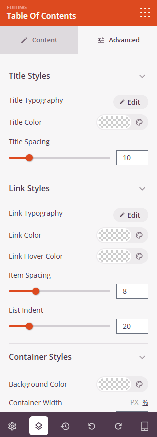
Title Styles (visible only when Show Title is enabled):
- Title Typography: Set the font family, size, weight, style, line height, letter spacing, and letter case for the table of contents heading.
- Title Color: Choose the text color for the heading.
- Title Spacing: Adjust the bottom margin between the title and the list of links (0–50px).
Link Styles:
- Link Typography: Set the font family, size, weight, style, and other typographic properties for the navigation links.
- Link Color: Set the default color for table of contents links.
- Link Hover Color: Set the color links display when visitors hover over them.
- Item Spacing: Control the vertical gap between each item in the list (0–30px).
- List Indent: Set the horizontal indentation applied to nested heading levels (0–100px).
Container Styles:
- Background Color: Set the background color for the entire table of contents container.
- Container Width: Adjust the width of the container using a slider, with a unit toggle to switch between pixels (0–1200) and percentage (0–100).
- Container Padding: Set the inner spacing between the container edges and the content inside (1–100px).
- Border: Add and configure a border around the container — choose the border style, set individual widths for each side (Top, Right, Bottom, Left), and pick a border color.
- Border Radius: Round the corners of the container (0–50px).
Spacing:
- Margin: Set the outer spacing around the block on all four sides, with independent controls for desktop, tablet, and mobile.
- Padding: Set the inner spacing inside the block wrapper on all four sides, with per-device controls.
Attributes:
- Custom Class: Add one or more custom CSS classes to the block wrapper for targeted styling.
- CSS ID: SeedProd automatically generates a unique CSS ID for this block. You can use it to reference the block in custom CSS or JavaScript.
- Custom Attributes: Add custom HTML attributes to the block wrapper element. Enter each attribute on a new line using the key|value format.
Position:
- Position: Set the CSS positioning of the block — Static, Relative, Fixed, Absolute, or Sticky — with independent values for desktop, tablet, and mobile.
- Offset: When using Fixed, Absolute, or Sticky positioning, set the Top, Right, Bottom, and Left offset distances per device.
- Z-Index: Set the stacking order of the block relative to other elements on the page, with per-device values.
- Overflow: Control how content that extends beyond the block boundaries is handled — Visible, Hidden, Scroll, or Auto — per device.
Device Visibility:
- Hide on Desktop: Toggle to hide the block when viewed on desktop screens.
- Hide on Tablet: Toggle to hide the block when viewed on tablet screens.
- Hide on Mobile: Toggle to hide the block when viewed on mobile screens.
Animation Effects:
- Scrolling Effect: Apply a scroll-triggered animation to the block, including Vertical Scroll and Horizontal Scroll options with direction, speed, and viewport offset controls.
- Mouse Effect: Apply a mouse movement-driven parallax effect to the block.
Step 4: Save Your Changes
Once you have finished configuring the Table of Contents block and customizing its appearance, make sure to save your work.
You’ve successfully added a Table of Contents block to your page! This navigation tool helps visitors immediately understand your page structure and reach the sections most relevant to them. Experiment with heading levels, list styles, and container styling to create a table of contents that feels natural within your page design and keeps your audience engaged.