The Advanced Gallery block allows you to easily incorporate single or multiple image galleries on your SeedProd pages. This block gives you complete control over how your images are presented, with options for columns, spacing, overlays, and interactive effects.
Whether you’re showcasing a portfolio, displaying product photos, creating a photo gallery, or highlighting team members, the Advanced Gallery block offers the flexibility and styling options you need to create visually stunning image collections that engage your visitors.
Adding the Advanced Gallery Block to Your Pages
Follow these steps to add an Advanced Gallery block to your SeedProd page:
Step 1: Add the Block
Under Design > Blocks, drag and drop the Advanced Gallery block into the desired section of your page.
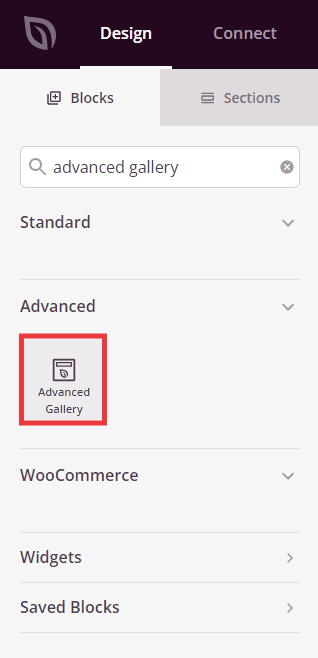
The Advanced Gallery block is located under Design > Advanced and can be dragged into any section of your page.
Step 2: Configure Content Settings
Once added, click on the Advanced Gallery block to open its settings. In the Content tab, you can add images and configure how your gallery displays.
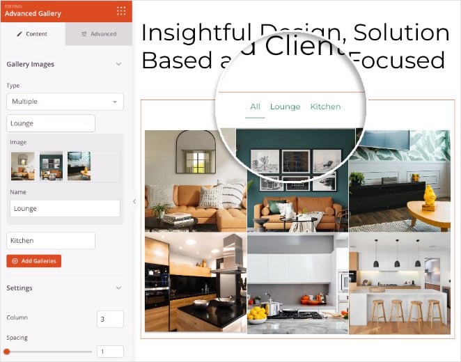
Gallery Images:
- Type: Choose between Single (one image) or Multiple (image gallery) display mode
- Image / Choose New Image: For Single type, click to select an image from your media library
- Add Gallery Images: For Multiple type, click to select multiple images at once to create your gallery. You can select as many images as you need
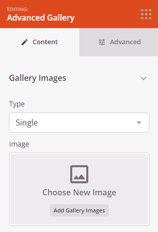
Select Single to display one image, or Multiple to create a multi-image gallery.
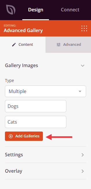
Click Add Gallery Images to select multiple images from your media library.
Settings:
- Column: Set the number of columns in your gallery grid. More columns create a tighter layout, while fewer columns give each image more prominence
- Spacing: Control the gap between images in your gallery. Adjust this value to create tighter or more spacious layouts
- Link: Choose where images link when clicked. Options include None (no link), Media File (opens full-size image), or Custom URL (links to a specific page)
- Aspect Ratio: Select the proportions for your images. Options include 1:1 (square), 3:2, 4:3, 9:16 (portrait), 16:9 (landscape), and 21:9 (ultra-wide). This ensures all images display consistently
- Image Size: Choose which size version of your images to display: Thumbnail, Medium, or Large. Larger sizes show more detail but load slower
Overlay:
- Background Overlay: Toggle to enable or disable a color overlay that appears over your images. This helps text and information stand out
- Title: Choose what to display as the title overlay on images. Options include None, Title, Caption, Alt text, or Description from your image metadata
- Description: Choose what to display as the description overlay. Options include None, Title, Caption, Alt text, or Description
- Text Color: Set the color for overlay text to ensure good contrast and readability
- Background Color: Choose the color of the overlay background that appears behind text
- Header Typography: Customize the font properties for overlay titles, including font family, size, weight, and style
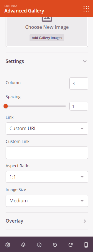
The Settings section lets you customize columns, spacing, links, aspect ratio, image size, and overlay options.
Step 3: Customize the Design
In the Advanced tab, you can customize the visual appearance of your Advanced Gallery block:
Styles:
- Image Shadow: Add shadow effects to your images for depth. Choose from None, Hairline, Small, Medium, Large, X Large, 2X Large, or Bottom Drop Shadow
- Image Border: Enable borders around your gallery images
- Border Radius: Control the roundness of image corners. Higher values create more rounded corners, while zero creates sharp corners
- Border Style: Choose the border appearance: Solid (continuous line), Dotted (small dots), or Dashed (short dashes)
- Border Color: Select the color for your image borders
- Border Width: Set individual border thickness for each side (Top, Right, Bottom, Left). This allows you to create unique border effects
Spacing:
- Margin: Control the outer spacing around your gallery block (Top, Right, Bottom, Left). This determines how much space appears between the gallery and surrounding elements
- Padding: Adjust the inner spacing within your gallery block (Top, Right, Bottom, Left). This creates breathing room between the gallery content and its edges
Attributes:
- CSS ID: Displays the auto-generated unique identifier for your gallery block. This ID is created automatically by SeedProd for custom styling or JavaScript targeting
- Custom Class: Add custom CSS classes to apply specific styles from your theme or custom CSS
- Custom Attributes: Add any HTML attributes to the gallery wrapper element. Enter each attribute on a new line using the format: attribute-name|value (e.g., data-gallery|portfolio)
Device Visibility:
- Hide on Desktop: Hide the gallery block on desktop screens
- Hide on Tablet: Hide the gallery block on tablet devices
- Hide on Mobile: Hide the gallery block on mobile devices
Animation Effects:
- Entrance Animation: Choose from various animation effects that play when the gallery scrolls into view. Options include Bounce, Fade In, Zoom In, Rotate In, and many more. This adds visual interest and draws attention to your gallery
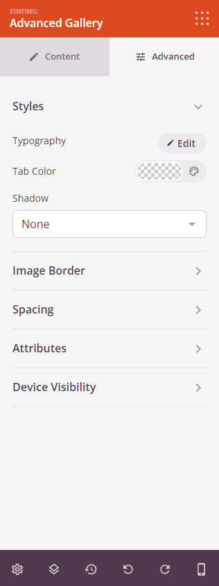
The Advanced tab provides options for image shadows, borders, spacing, attributes, device visibility, and animation effects.
Step 4: Save Your Changes
Once you have finished configuring the Advanced Gallery block and customizing its appearance, make sure to save your work.
You’ve successfully added an Advanced Gallery block to your page! This powerful block lets you showcase single or multiple image galleries with complete control over layout, styling, and interactive effects. Experiment with different column layouts, aspect ratios, and overlay styles to create a gallery that perfectly matches your brand and engages your audience.