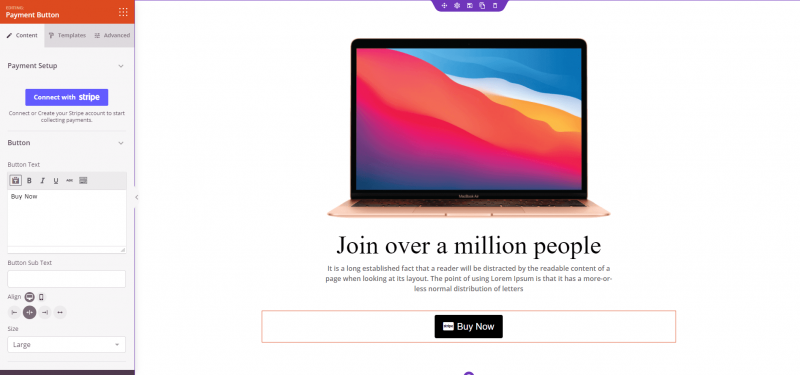
The Payment Button block lets you accept Stripe payments directly on any SeedProd page — no WooCommerce store, no complex checkout setup required. Simply connect your Stripe account, set an amount and description, and a fully functional payment button appears on your page ready to collect money.
This block is ideal for selling individual products, digital downloads, services, event tickets, or donation campaigns without the overhead of a full e-commerce store. The button is styled with the same flexible design system as SeedProd’s standard Button block, giving you templates, gradient backgrounds, border controls, and icon support to make it match your page design perfectly.
Adding the Payment Button Block to Your Pages
Follow these steps to add a Payment Button block to your SeedProd page:
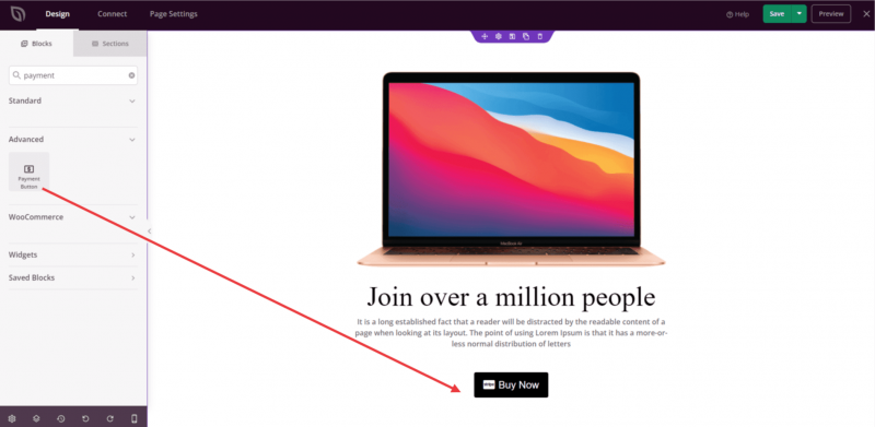
Step 1: Add the Block
Under Design > Blocks, drag and drop the Payment Button block into the desired section of your page.
Step 2: Configure Content Settings
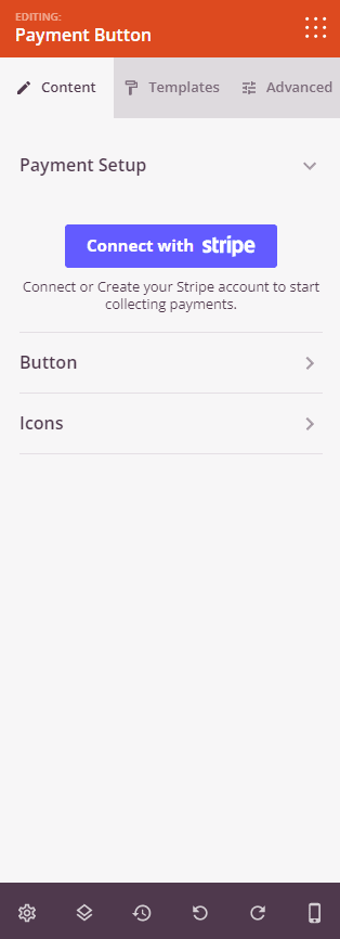
Once added, click on the Payment Button block to open its settings. The Content tab is divided into three sections.
Payment Setup:
Before configuring payment details, you must connect your Stripe account. Click Connect with Stripe to authorize SeedProd to process payments through your account. Once connected, you can fill in the following fields:
- Amount: Enter the payment amount to charge (required). This value is passed to Stripe when the button is clicked.
- Payment Description: Enter a short description of what the customer is paying for (required). This appears in your Stripe dashboard and on the customer’s receipt.
- Payment Currency: Select the currency for the transaction from a comprehensive list of world currencies (default: USD).
- Success URL: Enter the URL to redirect customers to after a successful payment, such as a thank-you page.
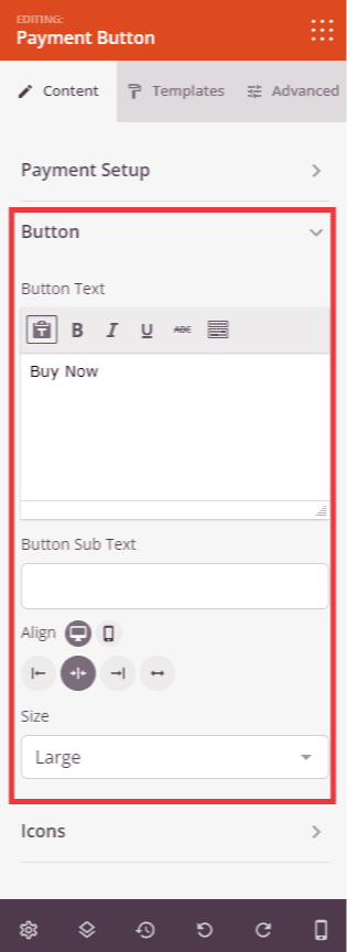
Button:
- Button Text: Enter the main label displayed on the button (default: “Pay Now”).
- Button Sub Text: Optionally add a secondary line of smaller text below the main button label.
- Alignment: Set the horizontal alignment of the button — Left, Center, or Right — with per-device control for desktop, tablet, and mobile.
- Size: Choose the button size from Tiny, Small, Medium, Large, X Large, or 2X Large.
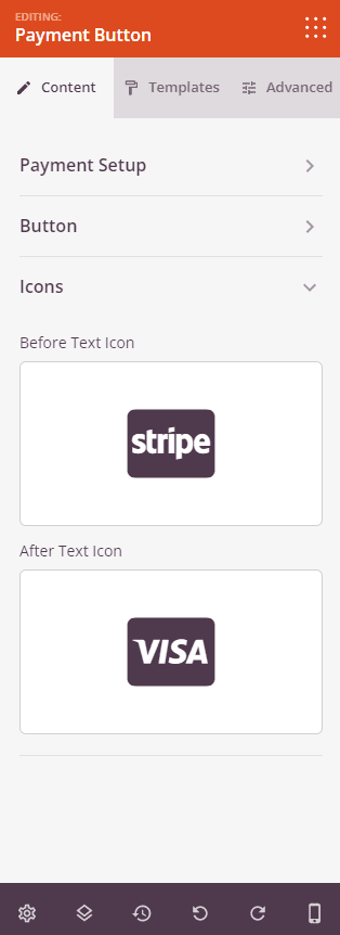
Icons:
- Before Text Icon: Select an icon to display to the left of the button text using the icon picker.
- After Text Icon: Select an icon to display to the right of the button text using the icon picker.
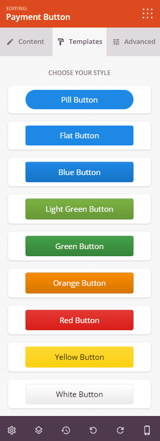
Step 2a: Choose a Template Style
In the Templates tab, you can apply a pre-built style to your Payment Button in a single click. Available templates include Pill Button, Flat Button, Blue Button, Light Green Button, Green Button, Orange Button, Red Button, Yellow Button, White Button, Grey Button, and Black Button. Applying a template instantly updates the button’s colors, shape, and style to match the chosen preset.
Step 3: Customize the Design
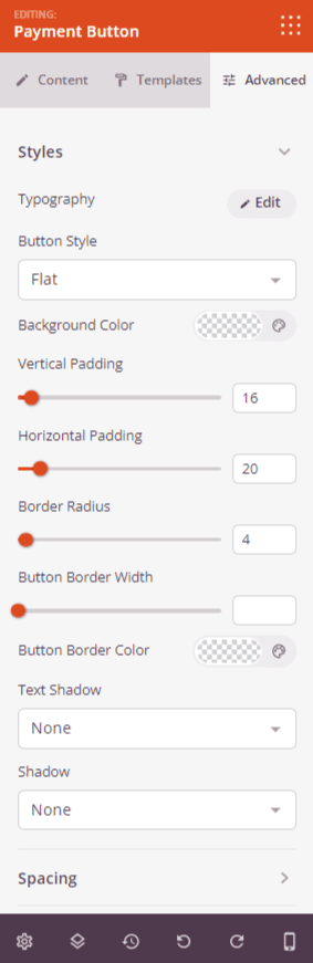
In the Advanced tab, the Styles section gives you granular control over the button’s visual appearance:
- Typography: Set the font family, size, weight, style, line height, letter spacing, and letter case for the button text.
- Button Style: Choose from Flat, 2D, Vintage, or Ghost button rendering styles.
- Background Color: Set the button’s background color for both normal and hover states.
- Button Text Color: Set the button label color for both normal and hover states.
- Button Background Style: Switch between Solid and Gradient backgrounds. Gradient mode exposes type (Radial/Linear), angle, position, first and second colors, and their location stops.
- Vertical Padding: Control the top and bottom inner spacing of the button.
- Horizontal Padding: Control the left and right inner spacing of the button.
- Border Radius: Round the button corners by adjusting the border radius value.
- Button Border Width: Set the border thickness around the button.
- Button Border Color: Choose the color of the button border.
- Text Shadow: Add a text shadow to the button label using preset size options (None, Hairline, Small, Medium, Large, X Large, 2X Large).
- Shadow: Add a box shadow to the button using the same preset size options.
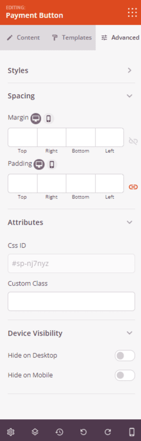
The Advanced tab also provides controls for spacing (margin and padding), custom CSS attributes, device visibility, and entrance animations.
Step 4: Save Your Changes
Once you have finished configuring the Payment Button block and customizing its appearance, make sure to save your work.
You’ve successfully added a Payment Button block to your page! With your Stripe account connected and payment details configured, your page can now accept real transactions without requiring a shopping cart or full e-commerce setup. Experiment with templates, button styles, and icon combinations to create a payment button that fits naturally within your page’s design and encourages visitors to complete their purchase.