Le bloc Accordéon vous permet d'ajouter des sections de texte extensibles et rétractables à vos pages SeedProd. Ce bloc vous aide à organiser de grandes quantités de contenu dans un format compact et convivial que les visiteurs peuvent explorer à leur rythme.
Les blocs Accordéon sont parfaits pour les FAQ, les listes de fonctionnalités, les spécifications de produits, les conditions générales, ou tout contenu où vous souhaitez présenter des informations clairement sans submerger les visiteurs avec des murs de texte. En permettant aux utilisateurs de cliquer pour révéler uniquement les informations dont ils ont besoin, vous créez une expérience de page plus propre et plus attrayante.
Ajouter le bloc Accordéon à vos pages
Suivez ces étapes pour ajouter un bloc Accordéon à votre page SeedProd :
Étape 1 : Ajouter le bloc
Sous Conception > Blocs, faites glisser le bloc Accordéon dans la section souhaitée de votre page.
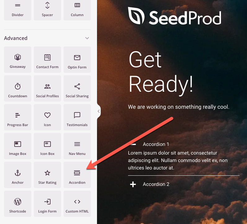
Le bloc Accordéon apparaît dans le panneau Blocs et peut être glissé dans n'importe quelle section ou colonne de votre page.
Étape 2 : Configurer les paramètres de contenu
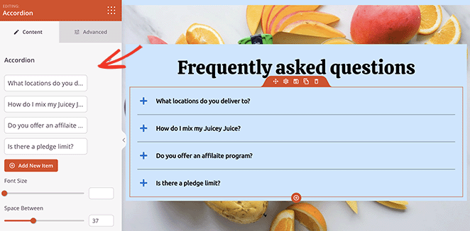
Une fois ajouté, cliquez sur le bloc Accordéon pour ouvrir ses paramètres. Dans l'onglet Contenu, vous pouvez gérer vos éléments d'accordéon et personnaliser leur apparence.
Éléments d'accordéon :
- Accordéon 1, Accordéon 2, etc. : Cliquez sur chaque élément d'accordéon pour modifier son titre et son contenu. Chaque élément représente une section rétractable que les utilisateurs peuvent développer ou réduire.
- Ajouter un nouvel élément : Cliquez sur ce bouton pour ajouter des sections d'accordéon supplémentaires à votre bloc. Vous pouvez ajouter autant d'éléments que nécessaire pour organiser efficacement votre contenu.
Typographie et espacement :
- Taille de la police : Ajustez la taille du texte dans le contenu de votre accordéon pour correspondre à vos préférences de conception.
- Espace entre : Contrôlez l'espacement vertical entre les éléments d'accordéon (par défaut, 24 pixels). Augmentez cette valeur pour plus d'espace ou diminuez-la pour une mise en page plus compacte.
Personnalisation des icônes :
- Alignement de l'icône : Choisissez où l'icône d'extension/réduction apparaît par rapport au titre de l'accordéon (généralement alignement à gauche ou à droite).
- Icône fermée : Sélectionnez l'icône qui s'affiche lorsqu'une section d'accordéon est réduite. Cela aide les utilisateurs à identifier les sections qu'ils peuvent développer.
- Couleur de l'icône fermée : Choisissez la couleur de l'icône lorsque l'accordéon est dans son état réduit.
- Icône ouverte : Sélectionnez l'icône qui s'affiche lorsqu'une section d'accordéon est développée, fournissant un retour visuel sur l'état de la section.
- Couleur de l'icône ouverte : Choisissez la couleur de l'icône lorsque l'accordéon est dans son état développé.
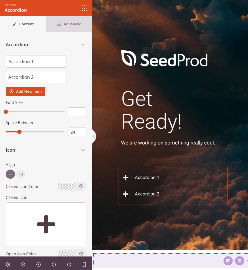
L'onglet Contenu offre des options pour gérer les éléments d'accordéon, ajuster la typographie, contrôler l'espacement et personnaliser les icônes d'extension/réduction.
Étape 3 : Personnaliser le design
Dans l'onglet Avancé, vous pouvez personnaliser l'apparence visuelle de votre bloc Accordéon :
Styles :
- Typographie : Ajustez finement la famille de polices, le poids, le style et d'autres propriétés de texte pour le contenu de l'accordéon.
- Couleur du texte : Définissez la couleur du texte dans les sections de contenu de l'accordéon
- Typographie de l'en-tête : Contrôlez les propriétés de la police spécifiquement pour les titres/en-têtes de l'accordéon
- Couleur de l'en-tête : Choisissez la couleur des en-têtes de l'accordéon lorsqu'ils sont fermés
- Couleur de l'en-tête ouvert : Définissez une couleur différente pour les en-têtes lorsque leurs sections sont développées, offrant un retour visuel clair
- Couleur d'arrière-plan : Ajoutez une couleur d'arrière-plan à vos sections d'accordéon pour une meilleure séparation visuelle
- Couleur du séparateur : Choisissez la couleur des lignes qui séparent les éléments de l'accordéon
- Ombre du texte : Ajoutez des effets d'ombre à votre texte d'accordéon pour la profondeur et la lisibilité
- Ombre : Appliquez des effets d'ombre à l'ensemble du bloc d'accordéon ou à des éléments individuels
Espacement :
- Marge : Contrôlez l'espacement extérieur autour de votre bloc d'accordéon (Haut, Droite, Bas, Gauche). Cela détermine l'espace entre l'accordéon et les éléments environnants
- Rembourrage : Ajustez l'espacement intérieur de vos sections d'accordéon (Haut, Droite, Bas, Gauche). Cela crée un espace entre le contenu et les bordures de l'accordéon
Attributs :
- ID CSS : Affiche l'identifiant unique généré automatiquement pour votre bloc d'accordéon. Cet ID est créé automatiquement par SeedProd pour un style personnalisé ou un ciblage JavaScript
- Classe personnalisée : Ajoutez des classes CSS personnalisées pour appliquer des styles spécifiques de votre thème ou de votre CSS personnalisé
- Attributs personnalisés : Ajoutez des attributs HTML à l'élément conteneur de l'accordéon. Entrez chaque attribut sur une nouvelle ligne en utilisant le format : nom-attribut|valeur (par exemple, aria-label|Section FAQ)
Visibilité de l'appareil :
- Masquer sur ordinateur : Masquer le bloc d'accordéon sur les écrans d'ordinateur
- Masquer sur tablette : Masquer le bloc d'accordéon sur les appareils tablettes
- Masquer sur mobile : Masquer le bloc d'accordéon sur les appareils mobiles
Effets d'animation :
- Animation d'entrée : Choisissez parmi divers effets d'animation qui se jouent lorsque l'accordéon apparaît à l'écran. Cela ajoute un intérêt visuel et attire l'attention sur votre contenu
L'onglet Avancé offre des options de style étendues, notamment la typographie, les couleurs, l'espacement et les effets visuels pour correspondre à votre marque.
Étape 4 : Enregistrez vos modifications
Une fois que vous avez terminé de configurer le bloc Accordéon et de personnaliser son apparence, assurez-vous de sauvegarder votre travail.
Vous avez ajouté avec succès un bloc Accordéon à votre page ! Ce bloc polyvalent vous aide à présenter une grande quantité d'informations dans un format clair et convivial qui encourage l'engagement sans submerger les visiteurs. Expérimentez avec différentes couleurs d'en-tête, styles d'icônes et options d'espacement pour créer un accordéon qui correspond à votre marque et sert votre public.